在做小程序时需要用到图表,今天就研究了下Echarts在小程序中怎么使用。在官方文档上看了下如何使用及基本配置方法,包括如何在json、js中引入,具体配置和引入方法可以多看下Echart官方文档。(官方文档地址:https://echarts.apache.org/zh/tutorial.html#%E5%9C%A8%E5%BE%AE%E4%BF%A1%E5%B0%8F%E7%A8%8B%E5%BA%8F%E4%B8%AD%E4%BD%BF%E7%94%A8%20ECharts)
这个是Echart官方在GitHub上提供的图表组件代码:https://github.com/ecomfe/echarts-for-weixin
下载组件后在项目中引入,网上有好多引入的方法,大家也可以百度下,这里就不过多的介绍了。在对应的目录中的json文件中引入组件,这步很重要。
"usingComponents": {"ec-canvas": "../../ec-canvas/ec-canvas"}
1、取消图例上的点击事件
legend:{
    selectedMode:flase;//取消图例上的点击事件, 默认显示
    orient: 'horizontal', // 布局方式,默认为水平布局 // 'horizontal' ¦ 'vertical
}
2、解决 X轴 文字显示不全或文字倾斜。
 xAxis: [
    axisLabel: {
          show: true,
          color: '#666',
          interval: 0,
          formatter:function(value){
            var ret = "";//拼接加\n返回的类目项
            var maxLength = 2;//每项显示文字个数
            var valLength = value.length;//X轴类目项的文字个数
            var rowN = Math.ceil(valLength / maxLength); //类目项需要换行的行数
            if (rowN > 1)//如果类目项的文字大于3,
            {
                for (var i = 0; i < rowN; i++) {
                    var temp = "";//每次截取的字符串
                    var start = i * maxLength;//开始截取的位置
                    var end = start + maxLength;//结束截取的位置
                    //这里也可以加一个是否是最后一行的判断,但是不加也没有影响,那就不加吧
                    temp = value.substring(start, end) + "\n";
                    ret += temp; //凭借最终的字符串
                }
                return ret;
            }
            else {
                return value;
            }
          }
        }
]
3、网格线设置 边线颜色、类型、是否显示
yAxis: [{
    splitLine :{//网格线
          lineStyle:{
            type:'dashed',    //设置网格线类型 dotted:虚线   solid:实线
            color:'#ededed'  //网格线颜色
          },
          show:true //隐藏或显示   false时隐藏网格线
        },
}]
4、更换X、Y轴刻度线颜色
 axisLine: {
      show:true //隐藏或显示   false时隐藏刻度线
      lineStyle: {
        color: '#dadada',//X、Y轴刻度线颜色
      }
  },
5、图形中颜色渐变
series: [
{
name: '上半年',
type: 'bar',
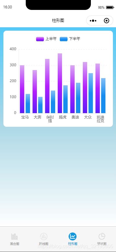
data: [300, 270, 340, 374, 300, 320, 310],
itemStyle: {
color: new echarts.graphic.LinearGradient(//图形渐变
0, 0, 0, 1,
[
{offset: 0, color: '#d9a8f2'},
{offset: 0.5, color: '#b31fff'},
{offset: 1, color: '#5c1cff'}
]
)
}
}]
6、legend图例上的文字要和series中的name一致,不然图例不显示。
legend: {
      selectedMode:false,//取消图例上的点击事件
      padding: 10, // 图例内边距,单位px,默认各方向内边距为5,
      data: ['上半年',  '下半年']
    },
series: [
      {
        name: '上半年',
        type: 'bar',
        data: [300, 270, 340, 374, 300, 320, 310],
        itemStyle: {
          color: new echarts.graphic.LinearGradient(
              0, 0, 0, 1,
              [
                  {offset: 0, color: '#d9a8f2'},
                  {offset: 0.5, color: '#b31fff'},
                  {offset: 1, color: '#5c1cff'}
              ]
          )
      }
      },
      {
        name: '下半年',
        type: 'bar',
        itemStyle: {
          color: new echarts.graphic.LinearGradient(
              0, 0, 0, 1,
              [
                  {offset: 0, color: '#83bff6'},
                  {offset: 0.5, color: '#188df0'},
                  {offset: 1, color: '#188df0'}
              ]
          )
      },
        data: [120, 102, 141, 174, 190, 250, 220]
      }
    ]
7、图形上显示每个节点的数据,要在series中添加 label,如果不需要节点数据的话,则不用添加。
label: {
          normal: {
            show: true,
            position: 'center',
            color: '#666'
        }
  },
下面看下实际效果图:

20200622163034938.png

20200622163051974.png
20200622163107617.png

20200622165343482 (1).png