微信小程序_笔记_03_tabbar_条件编译_生词列表_个人中心
微信小程序3天课程学习的第2天笔记
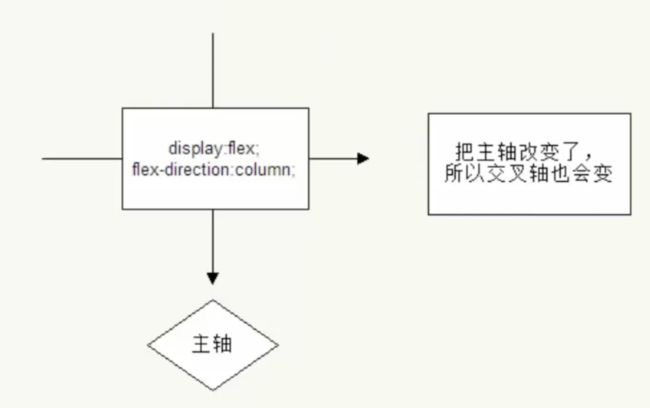
以下是flex布局的总结:

以下是关于主轴与交叉轴的示意图:
如图所示: 主轴是可以变化的, 它与flex-direction有关

如果垂直排列, 那么垂直方向上就是主轴:
介绍了ionic框架, 它是基于Angular的app flatform
官网: ionicframework.com
https://ionicframework.com/docs/components/#alert-prompt
Ionic is the app platform for web developers.
Build amazing mobile, web, and desktop apps all with one shared code base .
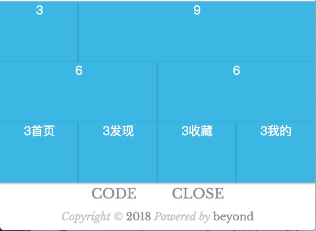
自己来实现一下栅格式布局
代码如下:
3
9
6
6
3首页
3发现
3收藏
3我的
效果如下:
关于tab bar 官方文档建议 图片大小是 : 81px * 81px
代码如下:
  "tabBar": {
    "color": "#595b6c",
    "selectedColor": "#1782d2",
    "list": [{
      "pagePath": "pages/index/index",
      "text": "首页",
      "iconPath": "/img/home_normal.png",
      "selectedIconPath": "/img/home_high.png"
    },{
      "pagePath": "pages/index/index",
      "text": "查询",
      "iconPath": "/img/search_normal.png",
      "selectedIconPath": "/img/search_high.png"
    },{
      "pagePath": "pages/index/index",
      "text": "我的",
      "iconPath": "/img/user_normal.png",
      "selectedIconPath": "/img/user_high.png"
    }]
  }
效果如下:

tabBar
如果小程序是一个多 tab 应用(客户端窗口的底部或顶部有 tab 栏可以切换页面),
可以通过 tabBar 配置项指定 tab 栏的表现,以及 tab 切换时显示的对应页面。
Tip:
- 当设置 position 为 top 时,将不会显示 icon
- tabBar 中的 list 是一个数组,只能配置最少2个、最多5个 tab,tab 按数组的顺序排序。
属性说明:
| 属性 | 类型 | 必填 | 默认值 | 描述 |
|---|---|---|---|---|
| color | HexColor | 是 | tab 上的文字默认颜色 | |
| selectedColor | HexColor | 是 | tab 上的文字选中时的颜色 | |
| backgroundColor | HexColor | 是 | tab 的背景色 | |
| borderStyle | String | 否 | black | tabbar上边框的颜色, 仅支持 black/white |
| list | Array | 是 | tab 的列表,详见 list 属性说明,最少2个、最多5个 tab | |
| position | String | 否 | bottom | 可选值 bottom、top |
其中 list 接受一个数组,数组中的每个项都是一个对象,其属性值如下:
| 属性 | 类型 | 必填 | 说明 |
|---|---|---|---|
| pagePath | String | 是 | 页面路径,必须在 pages 中先定义 |
| text | String | 是 | tab 上按钮文字 |
| iconPath | String | 否 | 图片路径,icon 大小限制为40kb,建议尺寸为 81px * 81px,当 postion 为 top 时,此参数无效,不支持网络图片 |
| selectedIconPath | String | 否 | 选中时的图片路径,icon 大小限制为40kb,建议尺寸为 81px * 81px ,当 postion 为 top 时,此参数无效 |
如果把tabbar的position属性设置为: "top",那么效果如下:
下面开始写「动漫列表」页面
为了使程序一保存编译,直接来到「动漫列表」页面, 有3种实现方法
1. 在app.json中, 把pages数组中的anime路径放到第1个位置
那么程序一编译,就来到了anime页面
如下所示:
  "pages":[
    "pages/anime/anime",
    "pages/index/index",
    "pages/girl/girl",
    "pages/user/user",
    "pages/setting/setting"
  ],
2. 使用条件编译

3. 在index.js的onload方法中,调用 API wx.navigateTo手动进行跳转
代码如下:
//index.js
//获取应用实例
const app = getApp()

Page({
  data: {
      // 驱动视图的ViewModel数据
  },

  //事件处理函数
  onLoad: function () {
    wx.navigateTo({
      url: '../anime/anime',
    })
  }

})
4. 手动点击首页的九宫格中的 按钮进行跳转
代码如下:
动漫推荐
下面开始实现动漫列表菜单项中的卡片效果
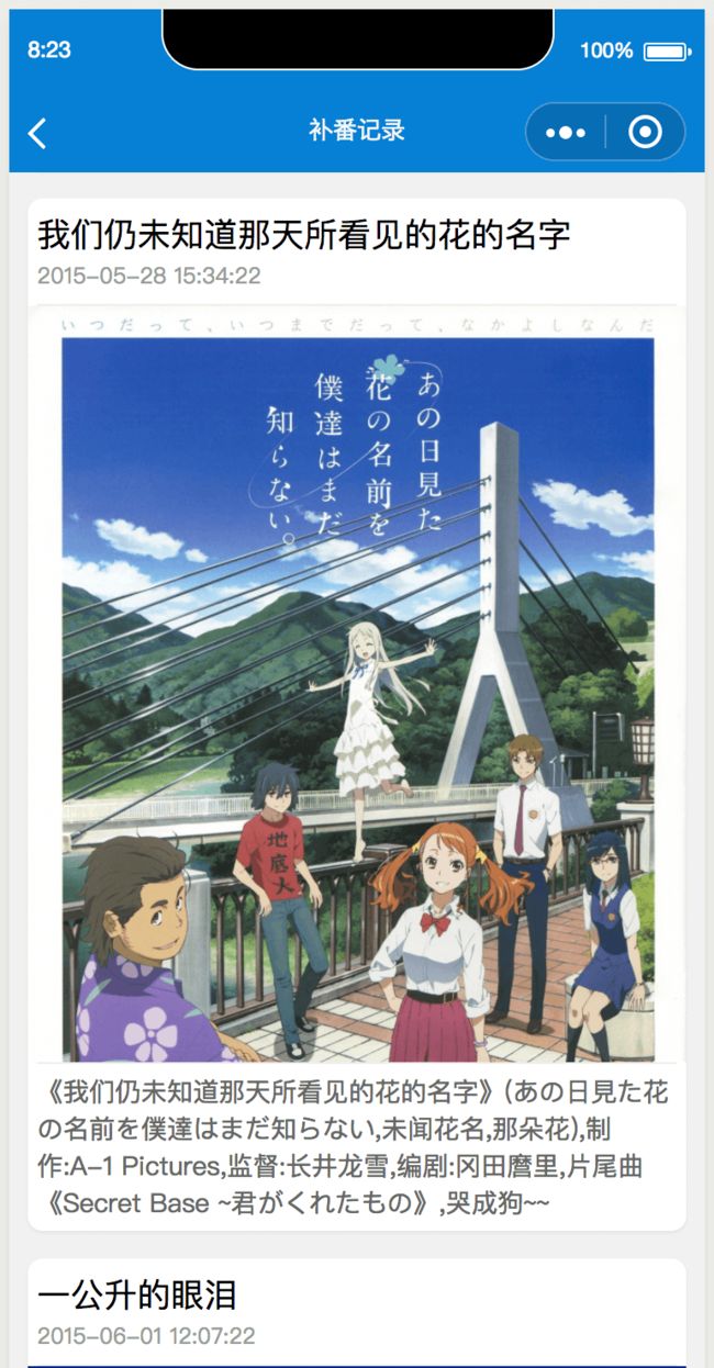
anime.json 修改导航栏标题(注意: 这儿的根节点就是window)
如下:
{
  "navigationBarTitleText": "补番记录"
}anime.wxml文档结构如下:
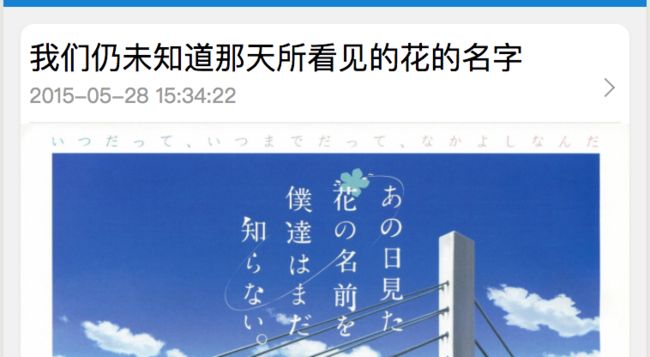
    我们仍未知道那天所看见的花的名字


    2010年4月


  《我们仍未知道那天所看见的花的名字》(あの日見た花の名前を僕達はまだ知らない,未闻花名,那朵花),制作:A-1 Pictures,监督:长井龙雪,编剧:冈田麿里,片尾曲《Secret Base ~君がくれたもの》,哭成狗~
如何使用了循环生成列表的话, 则代码如下:
    {
    {anime.titleFull}}


    {
    {anime.pubtime}}


  {
    { anime.content }}~
anime.wxss样式代码如下:
/* pages/anime/anime.wxss */
page {
  background-color: #f1f1f1;
  box-sizing: border-box;
}
.class_view_anime {
  margin: 20rpx 20rpx 30rpx 20rpx;
  padding: 0 10rpx;

  border-radius: 16rpx;
  background-color: #fff;

  /* 阴影  */
  box-shadow: 0 1px 2px rgba(0, 0, 0, 0.07);

  /* flex  */
  display: flex;
  flex-direction: column;
}
/* 标题  */
.class_title {
  font-size: 18px;
  line-height: 20rpx;
  padding-top: 10rpx;
  padding-bottom: 5rpx;

}

/* 日期  */
.class_pubtime {
  font-size: 12px;
  color: #999;
  display: block;
  line-height: 20rpx;
  padding: 0;
  padding-bottom: 20rpx;

  /* 分隔线  */
  border-bottom: 1rpx solid #eee;
  margin-bottom: 0rpx;


}

/* 图片  */
.class_img {
  box-sizing: border-box;
  border:0prx solid red;
  width: 102.8%;
  padding: 0;
  margin-left:-9rpx;

}

/* 介绍  */
.class_description {

  margin-top: 0rpx;
  /* 分隔线  */
  border-top: 1rpx solid #eee;

  padding-top: 10rpx;
  padding-bottom: 10rpx;

  /* 字体颜色  */
  font-size: 14px;
  color: #666


}
效果如下:
封闭一个右箭头类, 思路:
1. 使用伪类
2. 盒子宽高15rpx
3. 不要左边框,底边框
4. 旋转45度
5. space-between,左右对齐
6. 抽取到公共的样式app.wxss里
代码如下:
/* ==============================  */
/* 1. 封装右箭头  */
.class_arrow {
  display: flex;
  /* 水平均布  */
  justify-content: space-between;
  /* 垂直居中  */
  align-items: center;
}
.class_arrow::after {
  content: '';
  /* 当设置成伸缩盒子后,可以不用写block了  */
  /* display: block;   */
  width: 15rpx;
  height: 15rpx;
  border-top:1rpx solid #999;
  border-right:1rpx solid #999;
   margin-right: 10rpx;
  transform: rotate(45deg);
}
/* ==============================  */
右箭头 效果如下:
补充一下,关于外边距合并的问题
如果item盒子的上 下 边距都是 60, 那么两个item盒子之间的距离 也只有60
下面将 水平垂直居中 进行一下全局封装:
/* ==============================  */
/* 2. 封装垂直居中  */
.class_flex_center {
  display: flex;
  justify-content: center;
  align-items: center;
}
接下来,实现 用户页面的 顶部头像
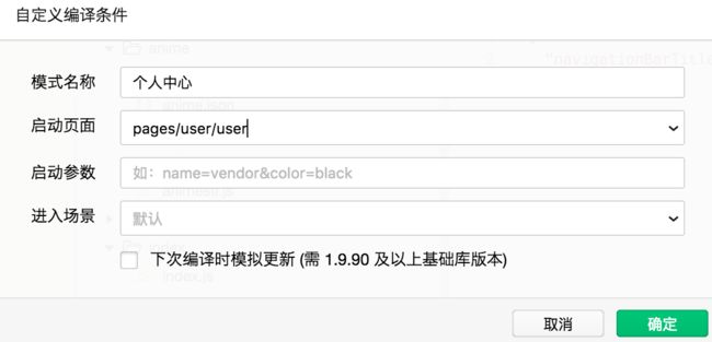
先新建一个条件编译:
修改导航标题
user.json代码如下:
{
  "navigationBarTitleText": "个人中心"
}
user.wxml结构代码如下:
(也可使用数据源 + wx-for 循环动态生成)
    个人资料


    我的计划


    我的收藏


    分享


    设置


    留言本


    实用工具


    关于我们
样式代码如下:
/* ================  */
/* 列表 */
.class_view_group {
  font-size: 16px;
  color: #333;
  background-color: #fff;
}
.class_nav_cell {
  border-bottom: 1rpx solid #eee;
  padding:20rpx 30rpx;
}
效果如下:

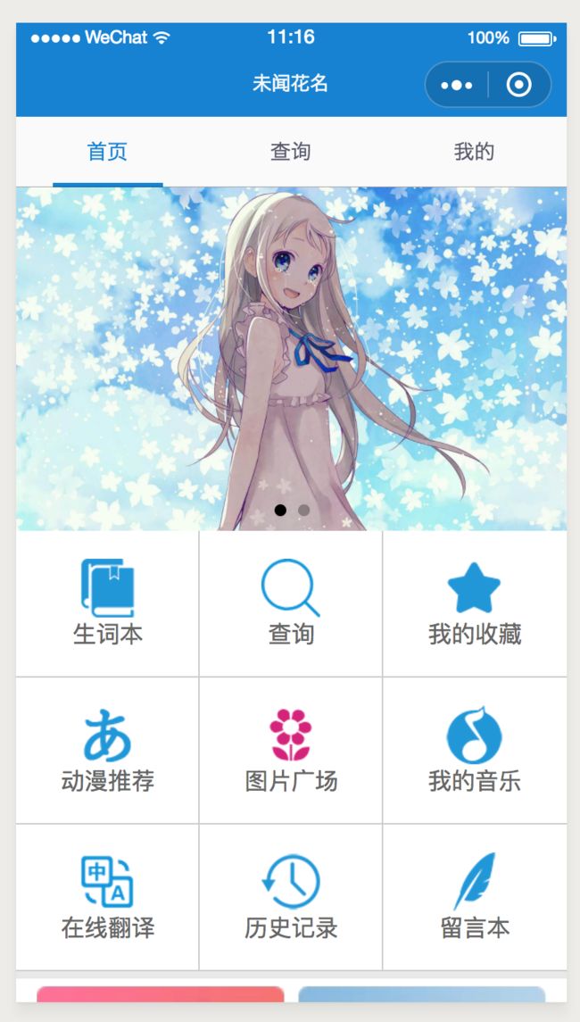
单词列表 页面
english.wxml代码如下:
{
{english.title}}
难度系数: {
{english.hard}}
★★★★★
★★★★★
english.wxss代码如下:
/* pages/english/english.wxss */
page {
  background-color: #fff;
}
.class_item {
  padding: 10rpx 10rpx;
  /* background-color: red; */
  /* 图片,文字,评分  三者水平排列*/
  display: flex;

  /* 专门提供给 rank这个绝对定位  */
  position: relative;

  /* 底部线  */
  border-bottom: 1rpx solid #eee;
}
/* 图片  */
.class_img {
  width: 300rpx;
  margin-right: 10rpx;
}

/* 正文  应该垂直排列*/
.class_view_body {
  /* background-color: violet; */
  /* 应该设置一个宽高  */
  width:420rpx;
  display: flex;
  flex-direction: column;
  /* 行高,不同字号会自动计算  */
  line-height: 1.5;

  /* 文字颜色  */
  color: #ddd;
}


.class_text_word {
   color:#444;
  font-size: 28px;
}

/* 评分 为绝对定位  */
.class_view_rank {
  color: #e2e2e2;
  /* background-color: royalblue; */
  position: absolute;
  right:10rpx;
  bottom: 10rpx;
}


/* 底层的星星为灰色, 不动  */

/* 顶层的星星为高亮, 绝对定位,宽度按百分比,overflow:hidden  */
.class_view_rank_top {
  color: #1782d2;
  position: absolute;
  top: 0;
  /* 核心代码  */

  overflow: hidden;
}
效果如下:

未完待续,下一章节,つづく