数据可视化——R语言多种方式绘制分组数据(箱形图、小提琴图、散点图、误差条图等及相互组合并自动添加P值)
数据可视化——R语言多种方式绘制分组数据(箱形图、小提琴图、散点图、误差条图等及相互组合并自动添加P值)
- 准备
- 分组的离散变量
- 分组的连续变量
-
- 箱形图(Box plots)
- 小提琴图(Violin plots)
- 点图(Dot plots)
- 一维散点图(Stripcharts)
- Sinaplot
- 带有误差条的均值和中值图
- 添加P值和显著性水平
- 总结
- 扩展阅读
- References
本文内容为一篇英文博客的翻译内容,博客原文链接:Plot Grouped Data: Box plot, Bar Plot and More
概述:本文重点介绍各种用于分组数据(基于类别变量分组)的绘图方式。包括箱形图(Box plots)、小提琴图(Violin plots)、点图(Dot plots)、一维散点图(Stripcharts)、Sinaplot、条形图及折线图等多种形式及各种图形的相互组合。类型多样,灵活易用。算作是对之前博文很好的总结。另外,本文还实现了对分组变量组间比较自动添加P值(T检验或wilcoxon检验的P值)和显著性水平。
使用工具:R语言中的ggplot2包和ggpubr包
准备
加载所需的包,并使用函数theme_set()设定主题样式为theme_pubclean()
library(dplyr)
library(ggplot2)
library(ggpubr)
theme_set(theme_pubclean())
分组的离散变量
- 绘图类型:条形图,用于表示每个组别数据的频数。关键函数:geom_bar()
- 示例数据集:ggplot2包中的diamonds,是一个表示钻石性质的数据集
- cut:分类变量,表示钻石切割的质量,由坏到好共5个等级:Fair, Good, Very Good, Premium, Ideal
- color:分类变量,表示钻石的颜色,“J”表示较差,“D”表示较好
仅采用diamonds中的一个子集数据用于图形绘制,子集数据选择流程如下:
- 仅保留颜色为“J”或“D”的数据
- 按cut和color两个属性对数据分组
- 统计每组的数量
- 采用geom_bar()绘制条形图
- 筛选数据并统计每个分组的数量
df <- diamonds %>%
  filter(color %in% c("J", "D")) %>%
  group_by(cut, color) %>%
  summarise(counts = n())
head(df, 4)
数据形式如下:
## # A tibble: 4 x 3
## # Groups:   cut [2]
##     cut color counts
##
## 1  Fair     D    163
## 2  Fair     J    119
## 3  Good     D    662
## 4  Good     J    307
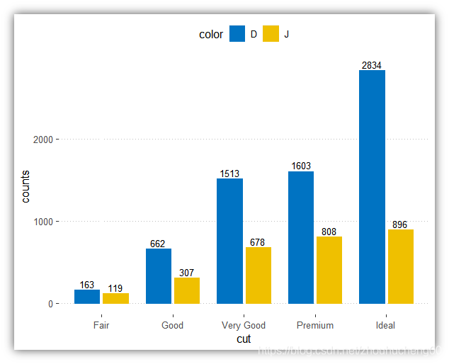
- 绘制各分组的条形图
- 关键函数:geom_bar();关键参数:stat = “identity”,按原始方式绘制图形
- scale_color_manual()和scale_fill_manual()可以设置条形图的边框颜色和填充颜色
# Stacked bar plots of y = counts by x = cut,
# colored by the variable color
ggplot(df, aes(x = cut, y = counts)) +
  geom_bar(
    aes(color = color, fill = color),
    stat = "identity", position = position_stack()
    ) +
  scale_color_manual(values = c("#0073C2FF", "#EFC000FF"))+
  scale_fill_manual(values = c("#0073C2FF", "#EFC000FF"))
# Use position = position_dodge()
p <- ggplot(df, aes(x = cut, y = counts)) +
  geom_bar(
    aes(color = color, fill = color),
    stat = "identity", position = position_dodge(0.8),
    width = 0.7
    ) +
  scale_color_manual(values = c("#0073C2FF", "#EFC000FF"))+
  scale_fill_manual(values = c("#0073C2FF", "#EFC000FF"))
p

注意:设置position = position_stack(reverse = TRUE)后可改变条形图的堆叠顺序,即可改变color为”D“和”J“的两个组堆叠顺序,reverse = FALSE时”D“在上,reverse = TRUE时”J“在上。
另外,也可以采用点图替代条形图。
ggplot(df, aes(cut, counts)) +
  geom_linerange(
    aes(x = cut, ymin = 0, ymax = counts, group = color),
    color = "lightgray", size = 1.5,
    position = position_dodge(0.3)
    )+
  geom_point(
    aes(color = color),
    position = position_dodge(0.3), size = 3
    )+
  scale_color_manual(values = c("#0073C2FF", "#EFC000FF"))+
  theme_pubclean()

3. 为分离条形图添加数值
p + geom_text(
  aes(label = counts, group = color),
  position = position_dodge(0.8),
  vjust = -0.3, size = 3.5
)
4. 为堆叠条形图添加数值
包括三步:
- 将数据按cut和color排序,由于position_stack()会颠倒顺序,color按降序排列。
- 计算每个cut分类的累计数量和,用于作为数值显示时的Y轴位置。将数值显示于条形图的中间位置,即cumsum(counts) - 0.5 * counts处。
- 创建条形图并添加数值
# Arrange/sort and compute cumulative summs
 df <- df %>%
  arrange(cut, desc(color)) %>%
  mutate(lab_ypos = cumsum(counts) - 0.5 * counts)
head(df, 4)
数据形式如下:
## # A tibble: 4 x 4
## # Groups:   cut [2]
##     cut color counts lab_ypos
##
## 1  Fair     J    119     59.5
## 2  Fair     D    163    200.5
## 3  Good     J    307    153.5
## 4  Good     D    662    638.0
# Create stacked bar graphs with labels
ggplot(df, aes(x = cut, y = counts)) +
  geom_bar(aes(color = color, fill = color), stat = "identity") +
  geom_text(
    aes(y = lab_ypos, label = counts, group = color),
    color = "white"
  ) +
  scale_color_manual(values = c("#0073C2FF", "#EFC000FF"))+
  scale_fill_manual(values = c("#0073C2FF", "#EFC000FF"))

- 或者,可以使用ggpubr包中的ggbarplot()函数快速创建上图
ggbarplot(df, x = "cut", y = "counts",
          color = "color", fill = "color",
          palette = c("#0073C2FF", "#EFC000FF"),
          label = TRUE, lab.pos = "in", lab.col = "white",
          ggtheme = theme_pubclean()
          )
- 条形图的替代方案
用点的数量表示各组中的记录数。X轴和Y轴均表示分类变量,每一个点隶属于一个分组。对于给定的组,点数与该组中的记录数相对应。
- 关键函数:geom_jitter()
- 关键参数:alpha, color, fill, shape 和size
下列示例仅绘制了一小部分数据(整个diamonds 中的1/5)。
diamonds.frac <- dplyr::sample_frac(diamonds, 1/5)
ggplot(diamonds.frac, aes(cut, color)) +
  geom_jitter(aes(color = cut), size = 0.3)+
  ggpubr::color_palette("jco")+
  ggpubr::theme_pubclean()

分组的连续变量
采用箱形图、小提琴图、点图等方式呈现分组连续变量的数据分布;
同时,还描述了如何自动添加组间比较的P值。
设置主题样式为theme_bw()
theme_set(theme_bw())
- 示例数据集:ToothGrowth
- len:连续变量,表示牙齿的长度,用作Y轴
- dose:分类变量,表示维生素C的剂量水平,取值分别为0.5, 1, 和 2 毫克/天,用作X轴
首先将变量dose从数值型转换为离散因子型。
data("ToothGrowth")
ToothGrowth$dose <- as.factor(ToothGrowth$dose)
head(ToothGrowth)
数据形式如下:
##    len supp dose
## 1  4.2   VC  0.5
## 2 11.5   VC  0.5
## 3  7.3   VC  0.5
## 4  5.8   VC  0.5
## 5  6.4   VC  0.5
## 6 10.0   VC  0.5
箱形图(Box plots)
- 关键函数:geom_boxplot()
- 可自定义的关键参数
- width:指定箱形图的宽度。
- notch:逻辑变量,如果为TRUE,创建具有凹槽的箱形图,凹槽范围表示围绕中位数的置信区间,median ± 1.58*IQR/sqrt(n)。凹槽可用于组间比较:如果两个箱形图的凹槽不重叠,说明这两组间的中位数存在差异。
- color, size, linetype: 指定箱形图边框的颜色,粗细及线型。
- fill:指定箱形图的填充颜色。
- outlier.colour, outlier.shape, outlier.size:指定异常点的颜色、形状和大小。
1.创建最基本的箱形图
- 标准的带凹槽的箱形图
# Default plot
e <- ggplot(ToothGrowth, aes(x = dose, y = len))
e + geom_boxplot()
# Notched box plot with mean points
e + geom_boxplot(notch = TRUE, fill = "lightgray")+
  stat_summary(fun.y = mean, geom = "point",
               shape = 18, size = 2.5, color = "#FC4E07")

- 依据组别改变箱形图的颜色
# Color by group (dose)
e + geom_boxplot(aes(color = dose))+
  scale_color_manual(values = c("#00AFBB", "#E7B800", "#FC4E07"))
# Change fill color by group (dose)
e + geom_boxplot(aes(fill = dose)) +
  scale_fill_manual(values = c("#00AFBB", "#E7B800", "#FC4E07"))

注意:scale_x_discrete()的灵活使用
- 如设置scale_x_discrete(limits = c(“0.5”, “2”))仅显示dose为"0.5"和"2"的两个分组
- 改变scale_x_discrete(limits = c(“2”, “0.5”, “1”))可改变X轴分类变量的显示顺序
例如:
# Choose which items to display: group "0.5" and "2"
e + geom_boxplot() +
  scale_x_discrete(limits=c("0.5", "2"))
# Change the default order of items
e + geom_boxplot() +
  scale_x_discrete(limits=c("2", "0.5", "1"))

2. 创建具有多个分组的箱形图
- 将两个分类变量用于数据分组,dose和supp
- 使用position_dodge()可以调整多个分组的箱形图之间的间隔
e2 <- e + geom_boxplot(
  aes(fill = supp),
  position = position_dodge(0.9)
  ) +
  scale_fill_manual(values = c("#999999", "#E69F00"))
e2

- 还可以依据facet_wrap()函数将不同分组显示于不同面板
e2 + facet_wrap(~supp)

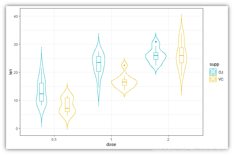
小提琴图(Violin plots)
小提琴图类似于箱形图,不同之处在于小提琴图还显示了数据的核概率密度估计。通常,小提琴图还包含数据分布的中位数及四分位数范围的框,与标准箱形图类似。
关键函数:
- geom_violin(),用于创建小提琴图。关键参数:
- color, size, linetype:指定边框的颜色,粗细及线型。
- fill:指定填充颜色。
- trim:逻辑变量,如果为TRUE(默认),将小提琴的尾部修整到与数据范围一致,如果为FALSE,将不修整尾部。
- stat_summary(),用于在绘制小提琴图时添加汇总统计信息,如添加均值,中值等。
- 使用汇总统计创建基本的小提琴图
# Add mean points +/- SD
# Use geom = "pointrange" or geom = "crossbar"
e + geom_violin(trim = FALSE) +
  stat_summary(
    fun.data = "mean_sdl",  fun.args = list(mult = 1),
    geom = "pointrange", color = "black"
    )

# Combine with box plot to add median and quartiles
# Change color by groups
e + geom_violin(aes(fill = dose), trim = FALSE) +
  geom_boxplot(width = 0.2)+
  scale_fill_manual(values = c("#00AFBB", "#E7B800", "#FC4E07"))+
  theme(legend.position = "none")

注意:函数mean_sdl()用于添加平均值和标准差,以误差条形式显示均值 ± 标准差。参数 mult需被设置为常数,在上面的R代码中, mult设为1,表示均值±(1倍)标准差;默认情况下,mult = 2,表示均值±(2倍)标准差
- 创建具有多个分组的小提琴图
e + geom_violin(
  aes(color = supp), trim = FALSE,
  position = position_dodge(0.9)
  ) +
  geom_boxplot(
    aes(color = supp), width = 0.15,
    position = position_dodge(0.9)
    ) +
  scale_color_manual(values = c("#00AFBB", "#E7B800"))
点图(Dot plots)
- 关键函数:geom_dotplot(),创建堆叠的点,每个点代表一个观测值
- 关键参数:
- stackdir:表示向哪个方向堆放点,默认值为“up”,向上;“down”,向下;“center”, 居中;“centerwhole”,居中,但点与点间也需对齐。
- stackratio:点之间堆放的间距。默认为1,表示点与点之间只是接触,设置更小的值将使得点之间靠得更近,点间将存在重叠。
- color, fill:设置点的边缘颜色或填充颜色。
- dotsize:点相对于binwidth的直径,默认为1。
也可以将汇总统计与点图叠加。
- 创建基本的点图
# Violin plots with mean points +/- SD
e + geom_dotplot(
  binaxis = "y", stackdir = "center",
  fill = "lightgray"
  ) +
  stat_summary(
    fun.data = "mean_sdl", fun.args = list(mult=1),
    geom = "pointrange", color = "red"
    )
# Combine with box plots
e + geom_boxplot(width = 0.5) +
  geom_dotplot(
    binaxis = "y", stackdir = "center",
    fill = "white"
    )
# Dot plot + violin plot + stat summary
e + geom_violin(trim = FALSE) +
  geom_dotplot(
    binaxis='y', stackdir='center',
    color = "black", fill = "#999999"
    ) +
  stat_summary(
    fun.data="mean_sdl",  fun.args = list(mult=1),
    geom = "pointrange", color = "#FC4E07", size = 0.4
    )

2. 创建具有多个分组的点图
# Color dots by groups
e + geom_boxplot(width = 0.5, size = 0.4) +
  geom_dotplot(
    aes(fill = supp), trim = FALSE,
    binaxis='y', stackdir='center'
  )+
  scale_fill_manual(values = c("#00AFBB", "#E7B800"))
# Change the position : interval between dot plot of the same group
e + geom_boxplot(
  aes(color = supp), width = 0.5, size = 0.4,
  position = position_dodge(0.8)
  ) +
  geom_dotplot(
    aes(fill = supp, color = supp), trim = FALSE,
    binaxis='y', stackdir='center', dotsize = 0.8,
    position = position_dodge(0.8)
  )+
  scale_fill_manual(values = c("#00AFBB", "#E7B800"))+
  scale_color_manual(values = c("#00AFBB", "#E7B800"))

一维散点图(Stripcharts)
当样本量较小时,可绘制一维散点图,将比箱形图更合适
- 关键函数:geom_jitter()
- 关键参数:color, fill, size, shape:指定点的边缘颜色、填充颜色、大小及形状。
- 创建基本的一维散点图
- 按组别来设定点的形状和颜色
- 调整抖动程度:position_jitter(0.2)
- 添加汇总统计
e + geom_jitter(
  aes(shape = dose, color = dose),
  position = position_jitter(0.2),
  size = 1.2
  ) +
  stat_summary(
    aes(color = dose),
    fun.data="mean_sdl",  fun.args = list(mult=1),
    geom = "pointrange",  size = 0.4
    )+
  scale_color_manual(values =  c("#00AFBB", "#E7B800", "#FC4E07"))

2. 创建具有多个分组的一维散点图
代码类似于点图的绘制,但需要注意的是,使用函数position_jitterdodge()来调整点之间的抖动程度,而不是position_dodge()。
e + geom_jitter(
  aes(shape = supp, color = supp),
  position = position_jitterdodge(jitter.width = 0.2, dodge.width = 0.8),
  size = 1.2
  ) +
  stat_summary(
    aes(color = supp),
    fun.data="mean_sdl",  fun.args = list(mult=1),
    geom = "pointrange",  size = 0.4,
    position = position_dodge(0.8)
    )+
  scale_color_manual(values =  c("#00AFBB", "#E7B800"))

Sinaplot
- Sinaplot能结合一维散点图和小提琴图。点沿X轴抖动,点的抖动密度与数据分布的密度对应,该图显示的轮廓与小提琴图相似,但又类似于少量数据点的一维散点图 (Sidiropoulos et al. 2015)。
- sinaplot以精简和易于理解的方式呈现数据分布信息,能表示点数量、密度分布、离群值和散布信息等。
- 关键函数:geom_sina()
library(ggforce)
# Create some data
d1 <- data.frame(
  y = c(rnorm(200, 4, 1), rnorm(200, 5, 2), rnorm(400, 6, 1.5)),
  group = rep(c("Grp1", "Grp2", "Grp3"), c(200, 200, 400))
  )
# Sinaplot
ggplot(d1, aes(group, y)) +
  geom_sina(aes(color = group), size = 0.7)+
  scale_color_manual(values =  c("#00AFBB", "#E7B800", "#FC4E07"))

带有误差条的均值和中值图
将展示如何绘制具有一个组别或多个组别的连续变量的汇总统计信息。
ggpubr软件包提供了一种简单的方法,只需较少的输入即可创建均值/中位数图。请参考以下相关文章:ggpubr-Plot Means/Medians and Error Bars
设置主题样式为:theme_pubr()
theme_set(ggpubr::theme_pubr())
- 基本的均值/中位数图。一个连续变量和一个分组变量的情况:
- 示例数据集:ToothGrowth。
df <- ToothGrowth
df$dose <- as.factor(df$dose)
head(df, 3)
数据形式如下:
##    len supp dose
## 1  4.2   VC  0.5
## 2 11.5   VC  0.5
## 3  7.3   VC  0.5
- 计算按dose分组的len的汇总统计量
library(dplyr)
df.summary <- df %>%
  group_by(dose) %>%
  summarise(
    sd = sd(len, na.rm = TRUE),
    len = mean(len)
  )
df.summary
数据形式如下:
## # A tibble: 3 x 3
##     dose    sd   len
##
## 1    0.5  4.50  10.6
## 2      1  4.42  19.7
## 3      2  3.77  26.1
- 使用汇总统计数据创建误差条。关键函数:
- geom_crossbar():用于绘制中间带有水平线的hollow bar,
- geom_errorbar():用于绘制误差条
- geom_errorbarh():用于绘制水平误差条
- geom_linerange():用于绘制用垂直线表示的线段(区间)
- geom_pointrange():用于绘制用垂直线表示的线段(区间),但中间有一个点
首先使用汇总统计数据初始化ggplot,指定x、y、ymin和ymax,通常指定ymin = len-sd,ymax = len+sd 来添加向下和向上的误差条(均值 ± 标准差)。如果仅需要向上的误差条而不需要向下的误差条,可设置 ymin = len ,ymax = len+sd
# Initialize ggplot with data
f <- ggplot(
  df.summary,
  aes(x = dose, y = len, ymin = len-sd, ymax = len+sd)
  )
f + geom_crossbar() +ggtitle("f + geom_crossbar()")
f + geom_errorbar(width = 0.4) +ggtitle("f + geom_errorbar()")
f + geom_linerange() +ggtitle("f + geom_linerange()")
f + geom_pointrange() +ggtitle("f + geom_pointrange()")
各种误差条类型:

创建简单的误差条:
# Vertical line with point in the middle
f + geom_pointrange()
# Standard error bars
f + geom_errorbar(width = 0.2) +
  geom_point(size = 1.5)
创建水平的误差条,Y轴表示dose ,X轴表示len,还需指定xmin和xmax。
# Horizontal error bars with mean points
# Change the color by groups
ggplot(
  df.summary,
  aes(x = len, y = dose, xmin = len-sd, xmax = len+sd)
  ) +
  geom_point(aes(color = dose)) +
  geom_errorbarh(aes(color = dose), height=.2)+
  theme_light()

- 添加一维散点图和小提琴图。为此,需要使用df初始化ggplot中的数据data(绘制一维散点图时使用);将df.summary汇总统计信息用作函数geom_pointrange()的输入(绘制小提琴图时使用)
# Combine with jitter points
ggplot(df, aes(dose, len)) +
  geom_jitter(
    position = position_jitter(0.2), color = "darkgray"
    ) +
  geom_pointrange(
    aes(ymin = len-sd, ymax = len+sd),
    data = df.summary
    )
# Combine with violin plots
ggplot(df, aes(dose, len)) +
  geom_violin(color = "darkgray", trim = FALSE) +
  geom_pointrange(
    aes(ymin = len-sd, ymax = len+sd),
    data = df.summary
    )

- 创建均值 ± 误差的基本折线图/条形图,仅需使用df.summary 数据
- 为折线图添加向下或向上的误差条:设置ymin = len-sd 和ymax = len+sd
- 只为条形图添加向上的误差条:设置ymin = len和ymax = len+sd
值得注意的是:绘制折线图时,如果仅有一个分组时,应始终在aes()中设置group = 1
# (1) Line plot
ggplot(df.summary, aes(dose, len)) +
  geom_line(aes(group = 1)) +
  geom_errorbar( aes(ymin = len-sd, ymax = len+sd),width = 0.2) +
  geom_point(size = 2)
# (2) Bar plot
ggplot(df.summary, aes(dose, len)) +
  geom_bar(stat = "identity", fill = "lightgray",
           color = "black") +
  geom_errorbar(aes(ymin = len, ymax = len+sd), width = 0.2)

对于折线图,可以设置X轴为数值型变量,而非因子变量
df.sum2 <- df.summary
df.sum2$dose <- as.numeric(df.sum2$dose)
ggplot(df.sum2, aes(dose, len)) +
  geom_line() +
  geom_errorbar( aes(ymin = len-sd, ymax = len+sd),width = 0.2) +
  geom_point(size = 2)

- 折线图 + 一维散点图:将df作为一维散点图的输入,将df.summary 作为其他geom的输入
- 对于折线图,首先添加一维散点,再添加折线,再添加误差条,再添加均值点
- 对于条形图,首先添加条形图,再添加一维散点,再添加误差条
# (1) Create a line plot of means +
# individual jitter points + error bars
ggplot(df, aes(dose, len)) +
  geom_jitter( position = position_jitter(0.2),
               color = "darkgray") +
  geom_line(aes(group = 1), data = df.summary) +
  geom_errorbar(
    aes(ymin = len-sd, ymax = len+sd),
    data = df.summary, width = 0.2) +
  geom_point(data = df.summary, size = 2)
# (2) Bar plots of means + individual jitter points + errors
ggplot(df, aes(dose, len)) +
  geom_bar(stat = "identity", data = df.summary,
           fill = NA, color = "black") +
  geom_jitter( position = position_jitter(0.2),
               color = "black") +
  geom_errorbar(
    aes(ymin = len-sd, ymax = len+sd),
    data = df.summary, width = 0.2)

2. 具有多个分组的均值/中位数图。一个连续变量(len),两个分组变量(dose, supp)的情况
- 计算len按dose 和supp分组的汇总统计:
library(dplyr)
df.summary2 <- df %>%
  group_by(dose, supp) %>%
  summarise(
    sd = sd(len),
    len = mean(len)
  )
df.summary2
示例数据如下:
## # A tibble: 6 x 4
## # Groups:   dose [?]
##     dose   supp    sd   len
##
## 1    0.5     OJ  4.46 13.23
## 2    0.5     VC  2.75  7.98
## 3      1     OJ  3.91 22.70
## 4      1     VC  2.52 16.77
## 5      2     OJ  2.66 26.06
## 6      2     VC  4.80 26.14
- 创建具有多个分组的误差条
- geom_pointrange()按组别supp设置不同的颜色
- 误差条和均值点按组别supp设置不同的颜色
# (1) Pointrange: Vertical line with point in the middle
ggplot(df.summary2, aes(dose, len)) +
  geom_pointrange(
    aes(ymin = len-sd, ymax = len+sd, color = supp),
    position = position_dodge(0.3)
    )+
  scale_color_manual(values = c("#00AFBB", "#E7B800"))
# (2) Standard error bars
ggplot(df.summary2, aes(dose, len)) +
  geom_errorbar(
    aes(ymin = len-sd, ymax = len+sd, color = supp),
    position = position_dodge(0.3), width = 0.2
    )+
  geom_point(aes(color = supp), position = position_dodge(0.3)) +
  scale_color_manual(values = c("#00AFBB", "#E7B800"))

-
创建具有多个分组的折线图/条形图
- 折线图:按组别supp设置不同的线型
- 条形图:按组别supp设置不同的填充颜色
# (1) Line plot + error bars
ggplot(df.summary2, aes(dose, len)) +
  geom_line(aes(linetype = supp, group = supp))+
  geom_point()+
  geom_errorbar(
    aes(ymin = len-sd, ymax = len+sd, group = supp),
     width = 0.2
    )
# (2) Bar plots + upper error bars.
ggplot(df.summary2, aes(dose, len)) +
  geom_bar(aes(fill = supp), stat = "identity",
           position = position_dodge(0.8), width = 0.7)+
  geom_errorbar(
    aes(ymin = len, ymax = len+sd, group = supp),
    width = 0.2, position = position_dodge(0.8)
    )+
  scale_fill_manual(values = c("grey80", "grey30"))

- 创建具有多个分组的均值 ± 标准差图。使用ggpubr包,将自动计算汇总统计信息并创建图形。
library(ggpubr)
# Create line plots of means
ggline(ToothGrowth, x = "dose", y = "len",
       add = c("mean_sd", "jitter"),
       color = "supp", palette = c("#00AFBB", "#E7B800"))
# Create bar plots of means
ggbarplot(ToothGrowth, x = "dose", y = "len",
          add = c("mean_se", "jitter"),
          color = "supp", palette = c("#00AFBB", "#E7B800"),
          position = position_dodge(0.8))

- 使用ggplot2包绘制上图
# Create line plots
ggplot(df, aes(dose, len)) +
  geom_jitter(
    aes(color = supp),
    position = position_jitter(0.2)
    ) +
  geom_line(
    aes(group = supp, color = supp),
    data = df.summary2
    ) +
  geom_errorbar(
    aes(ymin = len-sd, ymax = len+sd, color = supp),
    data = df.summary2, width = 0.2
    )+
  scale_color_manual(values = c("#00AFBB", "#E7B800"))
添加P值和显著性水平
介绍如何轻松地 i)比较两个或多个组的均值; ii)并将p值和显著性水平自动添加到ggplot图中。
关键函数:
- compare_means():计算单次或多次均值比较的结果
- stat_compare_means:可将P值和显著性水平自动添加到ggplot图中
比较均值的最常用方法包括:
| 方法 | R实现函数 | 描述 |
|---|---|---|
| T-test | t.test() | 比较两组(参数检验) |
| Wilcoxon test | wilcox.test() | 比较两组(非参数检验) |
| ANOVA | aov() or anova() | 比较多组(参数检验) |
| Kruskal-Wallis | kruskal.test() | 比较多组(非参数检验) |
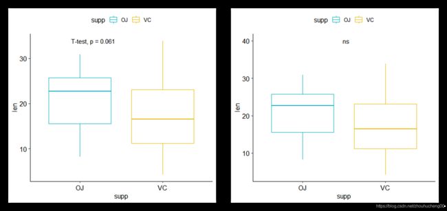
- 比较两个独立组
- T检验
library(ggpubr)
compare_means(len ~ supp, data = ToothGrowth,
              method = "t.test")
示例结果如下:
## # A tibble: 1 x 8
##     .y. group1 group2      p  p.adj p.format p.signif method
##
## 1   len     OJ     VC 0.0606 0.0606    0.061       ns T-test
- 创建箱形图并添加P值。操作时设置method = "t.test或method = “wilcox.test”(默认值)。
# Create a simple box plot and add p-values
p <- ggplot(ToothGrowth, aes(supp, len)) +
  geom_boxplot(aes(color = supp)) +
  scale_color_manual(values = c("#00AFBB", "#E7B800"))
p + stat_compare_means(method = "t.test")
# Display the significance level instead of the p-value
# Adjust label position
p + stat_compare_means(
  aes(label = ..p.signif..), label.x = 1.5, label.y = 40
  )
2. 比较两个配对样本
ggpaired(ToothGrowth, x = "supp", y = "len",
         color = "supp", line.color = "gray", line.size = 0.4,
         palette = "jco")+
  stat_compare_means(paired = TRUE)

3. 比较多组(超过两组)
如果分类变量包含两个以上组别时,则将自动执行成对测试(pairwise tests)。 默认方法是“ wilcox.test”。 也可以将其更改为“t.test”。
# Perorm pairwise comparisons
compare_means(len ~ dose,  data = ToothGrowth)
示例结果如下:
## # A tibble: 3 x 8
##     .y. group1 group2        p    p.adj p.format p.signif   method
##
## 1   len    0.5      1 7.02e-06 1.40e-05  7.0e-06     **** Wilcoxon
## 2   len    0.5      2 8.41e-08 2.52e-07  8.4e-08     **** Wilcoxon
## 3   len      1      2 1.77e-04 1.77e-04  0.00018      *** Wilcoxon
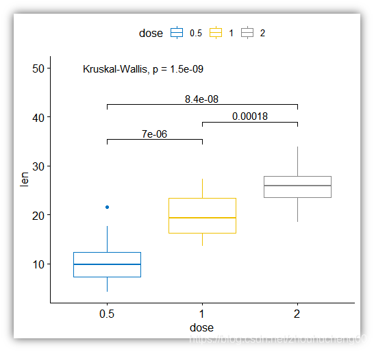
# Visualize: Specify the comparisons you want
my_comparisons <- list( c("0.5", "1"), c("1", "2"), c("0.5", "2") )
ggboxplot(ToothGrowth, x = "dose", y = "len",
          color = "dose", palette = "jco")+
  stat_compare_means(comparisons = my_comparisons)+
  stat_compare_means(label.y = 50)
- 多个分组变量
- (1) 创建一个按组划分的多面板框图(此处为dose)
# Use only p.format as label. Remove method name.
ggplot(ToothGrowth, aes(supp, len)) +
  geom_boxplot(aes(color = supp))+
  facet_wrap(~dose) +
  scale_color_manual(values = c("#00AFBB", "#E7B800")) +
  stat_compare_means(label = "p.format")

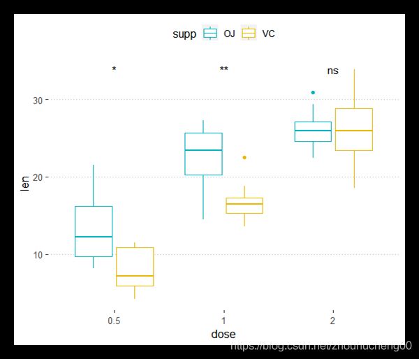
- (2) 创建一个包含所有框图的单一面板。X表示dose,Y表示len,颜色表示supp,stat_compare_means()中的group可设置分组。
ggplot(ToothGrowth, aes(dose, len)) +
  geom_boxplot(aes(color = supp))+
  scale_color_manual(values = c("#00AFBB", "#E7B800")) +
  stat_compare_means(aes(group = supp), label = "p.signif")
注意出现如下信息时,说明显著性绘制失败,需要更新ggpubr包
Warning message:
Computation failed in `stat_compare_means()`:
Column `p` must be length 1 (the group size), not 3
- 多组配对比较
# Box plot facetted by "dose"
p <- ggpaired(ToothGrowth, x = "supp", y = "len",
          color = "supp", palette = "jco",
          line.color = "gray", line.size = 0.4,
          facet.by = "dose", short.panel.labs = FALSE)
# Use only p.format as label. Remove method name.
p + stat_compare_means(label = "p.format", paired = TRUE)

阅读更多: Add P-values and Significance Levels to ggplots
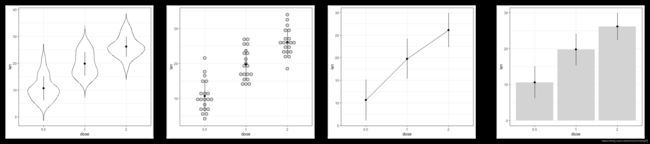
总结
- 可视化分组连续变量的数据分布:X轴表示分组变量,Y轴表示连续变量。
ggplot2中包含的函数:
- geom_boxplot() 用于绘制箱形图
- geom_violin() 用于绘制小提琴图
- geom_dotplot() 用于绘制点图
- geom_jitter()用于绘制一维散点图
- geom_line() 用于绘制折线图
- geom_bar() 用于绘制条形图
R示例代码:首先创建一个名为 e 的图,然后添加一个图层:
ToothGrowth$dose <- as.factor(ToothGrowth$dose)
e <- ggplot(ToothGrowth, aes(x = dose, y = len))
e + geom_boxplot()  + ggtitle("e + geom_boxplot()")
e + geom_violin(trim = FALSE)  + ggtitle("e + geom_violin()")
e + geom_dotplot(binaxis = "y", stackdir = "center",
                 fill = "lightgray")  + ggtitle("e + geom_dotplot()")
e + geom_jitter(position = position_jitter(0.2))  + ggtitle("e + geom_jitter()")

library(dplyr)
df <- ToothGrowth
df$dose <- as.factor(df$dose)

df.summary <- df %>%
  group_by(dose) %>%
  summarise(
    sd = sd(len, na.rm = TRUE),
    len = mean(len)
  )
df.summary


e = ggplot(df.summary, aes(dose, len))
e + geom_line(aes(group = 1))   + geom_point(size = 2)+ ggtitle("e + geom_line() ")
e + geom_bar(stat = "identity",
             color = "black")   + ggtitle("e + geom_bar() ")

2. 创建均值和中值的误差条图
X轴表示分组变量;Y轴表示连续变量的汇总统计(均值/中值)。
- 计算汇总统计数据并使用汇总数据初始化ggplot
# Summary statistics
library(dplyr)
df.summary <- ToothGrowth %>%
  group_by(dose) %>%
  summarise(
    sd = sd(len, na.rm = TRUE),
    len = mean(len)
  )
# Initialize ggplot with data
f <- ggplot(
  df.summary,
  aes(x = dose, y = len, ymin = len-sd, ymax = len+sd)
  )

f + geom_crossbar() +ggtitle("f + geom_crossbar()")
f + geom_linerange() +ggtitle("f + geom_linerange()")
f + geom_errorbar(width = 0.4) +ggtitle("f + geom_errorbar()")
f + geom_pointrange() +ggtitle("f + geom_pointrange()")
- 各种误差条类型:

- 将误差条图与小提琴图、点图、折线图及条形图结合。
# Combine with violin plots
ggplot(ToothGrowth, aes(dose, len))+
  geom_violin(trim = FALSE) +
  geom_pointrange(aes(ymin = len-sd, ymax = len + sd),
                  data = df.summary)
# Combine with dot plots
ggplot(ToothGrowth, aes(dose, len))+
  geom_dotplot(stackdir = "center", binaxis = "y",
               fill = "lightgray", dotsize = 1) +
  geom_pointrange(aes(ymin = len-sd, ymax = len + sd),
                  data = df.summary)
# Combine with line plot
ggplot(df.summary, aes(dose, len))+
  geom_line(aes(group = 1)) +
  geom_pointrange(aes(ymin = len-sd, ymax = len + sd))
# Combine with bar plots
ggplot(df.summary, aes(dose, len))+
  geom_bar(stat = "identity", fill = "lightgray") +
  geom_pointrange(aes(ymin = len-sd, ymax = len + sd))
扩展阅读
- ggpubr: Publication Ready Plots. https://goo.gl/7uySha
- Facilitating Exploratory Data Visualization: Application to TCGA
Genomic Data. https://goo.gl/9LNsRi - Add P-values and Significance Levels to ggplots.
https://goo.gl/VH7Yq7 - Plot Means/Medians and Error Bars. https://goo.gl/zRwAeV
References
原文链接:Plot Grouped Data: Box plot, Bar Plot and More
Sidiropoulos, Nikos, Sina Hadi Sohi, Nicolas Rapin, and Frederik Otzen Bagger. 2015. “SinaPlot: An Enhanced Chart for Simple and Truthful Representation of Single Observations over Multiple Classes.” bioRxiv. Cold Spring Harbor Laboratory. doi:10.1101/028191.