介绍(Introduction)
The goal of this article is to introduce you to the most common categorical plots using Seaborn’s
catplot()function.本文的目的是使用Seaborn的
catplot()函数向您介绍最常见的分类图。
While doing Exploratory or Explanatory data analysis, you will have to choose from a wide range of plot types. Choosing one which depicts the relationships in your data accurately can be tricky.
在进行探索性或解释性数据分析时,您将不得不从多种绘图类型中进行选择。 选择一个准确地描述数据中的关系的方法可能很棘手。
If you are working with data that involves any categorical variables like survey responses, your best tools to visualize and compare different features of your data would be categorical plots. Fortunately, a data visualization library Seaborn encompasses several types of categorical plots into a single function: catplot().
如果您使用的数据涉及任何分类变量,例如调查答复,那么可视化和比较数据不同特征的最佳工具就是分类图。 幸运的是,一个数据可视化库Seaborn在单个函数中包含了几种类型的分类图: catplot() 。
Seaborn library offers many advantages over other plotting libraries:
与其他绘图库相比,Seaborn库具有许多优势:
1. It is very easy to use and requires less code syntax

2. Works really well with `pandas` data structures, which is just what you need as a data scientist.

3. It is built on top of Matplotlib, another vast and deep data visualization library.
BTW, my golden rule for Data Visualization is “Do it in Seabron if you can do it in Seaborn”.
顺便说一句,我对数据可视化的黄金法则是“如果可以在Seaborn中做到,那就在Seabron中做到”。
In SB’s (I will be abbreviating from now on) documentation, it states that catplot() function includes 8 different types of categorical plots. But in this guide, I will cover the three most common plots: count plots, bar plots, and box plots.
在SB的文档(我将从现在开始简称)中,该文档指出catplot()函数包括8种不同类型的分类图。 但是在本指南中,我将介绍三个最常见的图:计数图,条形图和箱形图。
总览 (Overview)
  I. Introduction II. SetupIII. Seaborn Count Plot
         1. Changing the order of categories IV. Seaborn Bar Plot
         1. Confidence intervals in a bar plot
         2. Changing the orientation in bar plots  V. Seaborn Box Plot
         1. Overall understanding
         2. Working with outliers
         3. Working with whiskers VI. Conclusion
You can get the sample data and the notebook of the article on this GitHub repo.
您可以在此GitHub存储库上获得示例数据和文章的笔记本。
建立 (Setup)
If you have not SB already installed, you can install it using pip along with other libraries we will be using:
如果尚未安装SB,则可以使用pip以及我们将要使用的其他库来安装它:
pip install numpy pandas seaborn matplotlib# Load necessary libraries
import pandas as pd
import matplotlib.pyplot as plt
import seaborn as sns
import numpy as np
# Plotting pretty figures and avoid blurry images
%config InlineBackend.figure_format = 'retina'
# Larger scale for plots in notebooks
sns.set_context('notebook')
# Ignore warnings
import warnings
warnings.filterwarnings('ignore')
# Enable multiple cell outputs
from IPython.core.interactiveshell import InteractiveShell
InteractiveShell.ast_node_interactivity = 'all'If you are wondering why we don’t alias Seaborn as sb like a normal person, that's because the initials sns were named after a fictional character Samuel Norman Seaborn from the TV show "The West Wing". What can you say? (shrugs).
如果您想知道为什么我们不像普通人那样将Seaborn冠以sb的名字,那是因为名字的首字母缩写sns是根据电视节目“西翼”中的虚构人物Samuel Norman Seaborn来命名的。 你能说什么? (耸耸肩) 。
For the dataset, we will be using the classic diamonds dataset. It contains the price and quality data of 54000 diamonds. It is a great dataset for Data Visualization. One version of the data comes pre-loaded in Seaborn. You can get other loaded datasets with sns.get_dataset_names() function (there are many). But in this guide, we will be using the full version which I downloaded from Kaggle.
对于数据集,我们将使用经典的diamonds数据集。 它包含54000颗钻石的价格和质量数据。 对于数据可视化来说,它是一个很好的数据集。 数据的一个版本已预装在Seaborn中。 您可以使用sns.get_dataset_names()函数获取其他已加载的数据集(有很多)。 但是在本指南中,我们将使用从Kaggle下载的完整版本。
# Load sample data
diamonds = pd.read_csv('data/diamonds.csv', index_col=0)
基础探索 (Basic Exploration)
diamonds.head()
diamonds.info()
diamonds.describe()
Int64Index: 53940 entries, 1 to 53940
Data columns (total 10 columns):
 #   Column   Non-Null Count  Dtype
---  ------   --------------  -----
 0   carat    53940 non-null  float64
 1   cut      53940 non-null  object
 2   color    53940 non-null  object
 3   clarity  53940 non-null  object
 4   depth    53940 non-null  float64
 5   table    53940 non-null  float64
 6   price    53940 non-null  int64
 7   x        53940 non-null  float64
 8   y        53940 non-null  float64
 9   z        53940 non-null  float64
dtypes: float64(6), int64(1), object(3)
memory usage: 4.5+ MB
diamonds.shape(53940, 10)Seaborn计数图 (Seaborn count plot)
As the name suggests, a count plot displays the number of observations in each category of your variable. Throughout this article, we will be using catplot() function changing its kind parameter to create different plots. For the count plot, we set kind parameter to count and feed in the data using data parameter. Let's start by exploring the diamond cut quality.
顾名思义,计数图显示变量的每个类别中的观测值数量。 在整个本文中,我们将使用catplot()函数更改其kind参数来创建不同的图。 对于计数图,我们设置kind参数以使用data参数count并输入数据。 让我们开始探讨钻石切割质量。
sns.catplot(x='cut', data=diamonds, kind='count');
We start off with catplot() function and use x argument to specify the axis we want to show the categories. You can use y to make the chart horizontal. The count plot automatically counts the number of values in each category and displays them on YAxis.
我们从catplot()函数开始,并使用x参数指定要显示类别的轴。 您可以使用y使图表水平。 计数图会自动计算每个类别中的值数,并将其显示在YAxis 。
更改类别的顺序 (Changing the order of categories)
In our plot, the quality of the cut is from best to worst. But let’s reverse the order:
在我们的情节中,削减的质量从最佳到最差。 但是让我们颠倒顺序:
category_order = ['Fair', 'Good', 'Very Good', 'Premium', 'Ideal']

sns.catplot(x='cut', data=diamonds, kind='count', order=category_order);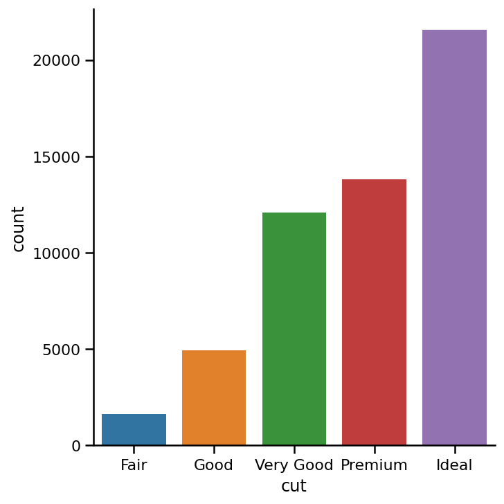
It is best to create a list of categories in the order you want and then passing it to order. This improves code readability.
最好按照所需顺序创建类别列表,然后将其传递给order 。 这样可以提高代码的可读性。
Seaborn条形图 (Seaborn bar plot)
Another popular choice for plotting categorical data is a bar plot. In the count plot example, our plot only needed a single variable. In the bar plot, we often use one categorical variable and one quantitative. Let’s see how the prices of different diamond cuts compare to each other.
绘制分类数据的另一个流行选择是条形图。 在计数图示例中,我们的图仅需要一个变量。 在条形图中,我们经常使用一个分类变量和一个定量变量。 让我们看看不同钻石切割的价格如何相互比较。
To create a bar plot, we feed the values for XAxis, YAxis separately and set kind parameter to bar:
要创建柱状图,我们喂值XAxis , YAxis单独并设置kind参数bar :
sns.catplot(x='cut',
            y='price',
            data=diamonds,
            kind='bar',
            order=category_order);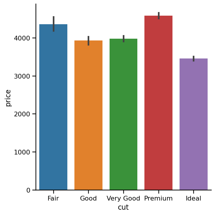
The height of each bar represents the mean value in each category. In our plot, each bar is showing the mean price of diamonds in each category. I think you are also surprised to see that low-quality cuts also have significantly high prices. Lowest quality diamonds are, on average, even more expensive than ideal diamonds. This surprising trend is worth exploring but it would be beyond the scope of this article.
每个条形的高度代表每个类别中的平均值。 在我们的图中,每个柱形图显示每个类别中钻石的平ASP格。 我想您也很惊讶地看到低质量的切割也有明显的高价格。 平均而言,最低质量的钻石比理想的钻石还要昂贵。 这种令人惊讶的趋势值得探索,但这超出了本文的范围。
条形图中的置信区间 (Confidence Intervals in a Bar Plot)
Black lines at the top of each bar represent 95% confidence intervals for the mean which can be thought of as the uncertainty in our sample data. Simply put, the tips of each line are the interval where you would expect the real mean price of all the diamonds (nut just 54000) in each category. If you don’t know statistics, best to skip this part. You can turn off confidence intervals setting the ci parameter to None:
每条顶部的黑线表示平均值的95%置信区间,可以将其视为样本数据中的不确定性。 简而言之,每行的提示是您期望每个类别中所有钻石(仅54000螺母)的真实平ASP格的时间间隔。 如果您不了解统计信息,则最好跳过这一部分。 您可以将ci参数设置为None来关闭置信区间:
sns.catplot(x='cut',
            y='price',
            data=diamonds,
            kind='bar',
            order=category_order,
            ci=None);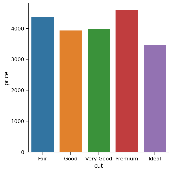
更改条形图中的方向 (Changing the Orientation In Bar Plots)
When you have lots of categories/bars, or long category names, it is a good idea to change the orientation. Just swap the x and y-axis values:
当您有很多类别/栏或较长的类别名称时,最好更改方向。 只需交换x和y轴值即可:
sns.catplot(x='price',
            y='cut',
            data=diamonds,
            kind='bar',
            order=category_order,
            ci=None);
Seaborn箱形图 (Seaborn box plot)
Box plots are visuals that can be a little difficult to understand but depict the distribution of data very beautifully. It is best to start the explanation with an example of a box plot. I am going to use one of the common built-in datasets in Seaborn:
箱形图是可能很难理解但可以非常漂亮地描述数据分布的视觉效果。 最好以箱形图为例开始说明。 我将使用Seaborn中常见的内置数据集之一:
tips = sns.load_dataset('tips')

sns.catplot(x='day', y='total_bill', data=tips, kind='box');
全面了解 (Overall Understanding)
This box plot shows the distribution of bill amounts in a sample restaurant per day. Let’s start by interpreting Thursday’s.
该箱形图显示了示例餐厅每天的账单金额分布。 让我们从解释星期四开始。

The edges of the blue box are the 25th and 75th percentiles of the distribution of all bills. This means that 75% of all the bills on Thursday were lower than 20 dollars, while another 75% (from the bottom to the top) was higher than almost 13 dollars. The horizontal line in the box shows the median value of the distribution.
蓝色框的边缘是所有钞票分配的25%和75%。 这意味着周四所有账单中的75%低于20美元,而另外75%(从底部到顶部)高于近13美元。 框中的水平线显示了分布的中间值。
The dots above the whisker are called outliers. Outliers are calculated in three steps:
晶须上方的点称为离群值。 离群值的计算分为三个步骤:
Find Inter Quartile Range (IQR) by subtracting the 25th percentile from the 75th: 75% — 25%
通过从第75个位中减去第25个百分位来找到四分位数间距(IQR): 75%— 25%
The lower outlier limit is calculated by subtracting 1.5 times of IQR from the 25th: 25% — 1.5*IQR
下限是通过从25号减去IQR的1.5倍来计算的: 25%— 1.5 * IQR
The upper outlier limit is calculated by adding 1.5 times of IQR to the 75th: 75% + 1.5*IQR
通过将IQR的1.5倍加到第75个值来计算离群上限: 75%+ 1.5 * IQR
Any values above and below the outlier limits become dots in a box plot.
高于和低于异常值限制的任何值都将成为箱形图中的点。
Now that you understand box plots a little better, let’s get back to shiny diamonds:
现在,您对箱形图有了更好的了解,让我们回到闪亮的钻石上:
sns.catplot(x='cut',
            y='price',
            data=diamonds,
            kind='box',
            order=category_order);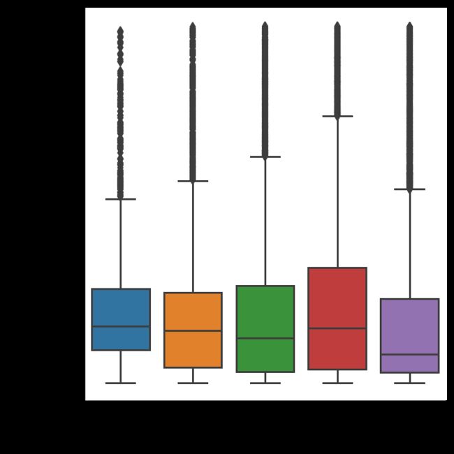
We create a box plot in the same way as any other plot. The key difference is that we set kind parameter to box. This box plot shows the distribution of prices of different quality cut diamonds. As you see, there are a lot of outliers for each category. And the distributions are highly skewed.
我们以与其他任何图相同的方式创建箱形图。 关键区别在于我们将kind参数设置为box 。 该箱形图显示了不同质量切工钻石的价格分布。 如您所见,每个类别都有很多离群值。 并且分布高度偏斜。
Box plots are very useful because they:
箱形图非常有用,因为它们:
- Show outliers, skewness, spread, and distribution in a single plot 在单个图中显示异常值,偏度,散布和分布
- Great for comparing different groups非常适合比较不同的人群
箱图中的异常值(Outliers in Box Plot)
It is also possible to turn off the outliers in a box plot by setting the sym parameter to an empty string:
通过将sym参数设置为empty string还可以关闭箱形图中的离群值:
sns.catplot(x='cut',
            y='price',
            data=diamonds,
            kind='box',
            order=category_order,
            sym='');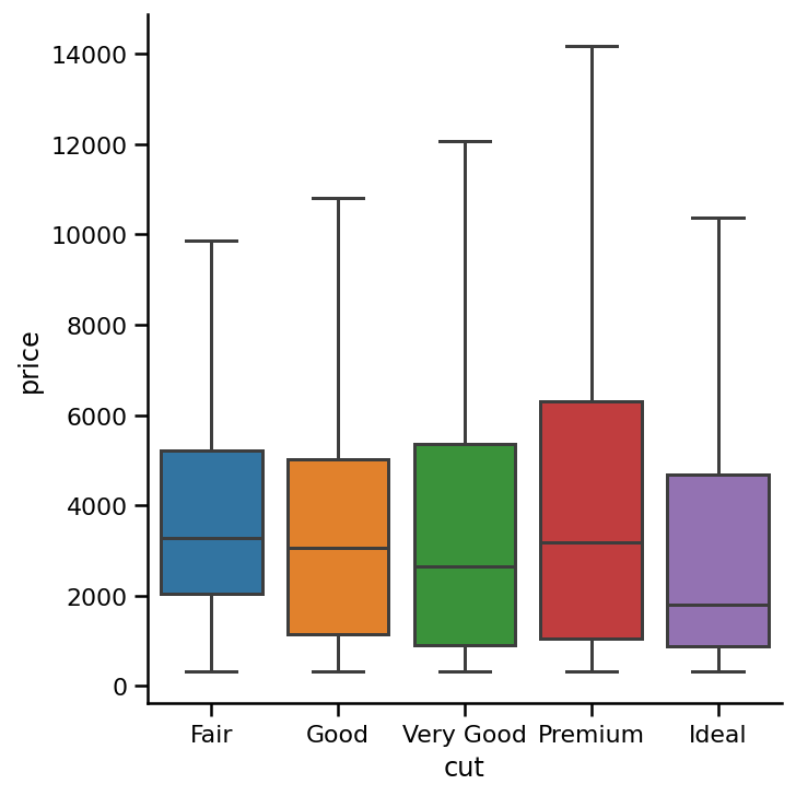
The outliers in a box plot is by default calculated using the method I introduced earlier. However, you can change it by passing different values for whis parameter:
默认情况下,箱形图中的离群值使用我之前介绍的方法计算。 但是,您可以通过为whis参数传递不同的值来更改它:
sns.catplot(x='cut',
            y='price',
            data=diamonds,
            kind='box',
            order=category_order,
            whis=2);   # Using 2 times of IQR to calculate outliers
使用晶须 (Working With Whiskers)
Using different percentiles:
使用不同的百分位数:
sns.catplot(x='cut',
            y='price',
            data=diamonds,
            kind='box',
            order=category_order,
            whis=[5, 95]); # Whiskers show 5th and 95th percentiles
Or make the whiskers show minimum and max values:
或使晶须显示最小值和最大值:
sns.catplot(x='cut',
            y='price',
            data=diamonds,
            kind='box',
            order=category_order,
            whis=[0, 100]);   # Min and max values in distribution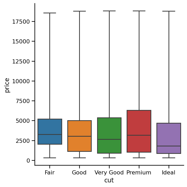
结语 (Wrapping Up)
We have covered the three most common categorical plots. I did not include how to create subplots using the catplot() function even though it is one of the advantages of catplot()'s flexibility. I recently wrote another article for a similar function relplot() which is used to plot relational variables. I have discussed how to create subplots in detail there and the same techniques can be applied here.
我们已经介绍了三种最常见的分类图。 我没有介绍如何使用catplot()函数创建子图,即使它是catplot()灵活性的优点之一。 我最近写了另一篇关于类似函数relplot()文章,该函数用于绘制关系变量。 我已经在此处详细讨论了如何创建子图,并且可以在此处应用相同的技术。
Check out this story about Matplotlib fig and ax objects:
查看有关Matplotlib fig和ax对象的故事:
翻译自: https://towardsdatascience.com/mastering-catplot-in-seaborn-categorical-data-visualization-guide-abab7b2067af