Understand Input and Output in Custom Components
A component needs a way for data to flow in and flow out. Data can flow into the component (from its parent component) through its @Input, and data can flow out of the component (up to its parent component) through its @Output. We can use property binding to provide a component with input, and we can make the component fire an event to create output.
Setting up @Input and @Output in a component might look like this:
import { Component, Input, Output, EventEmitter } from '@angular/core';

@Component({
  selector: 'my-component',
  templateUrl: 'my-component.html'
})
export class MyComponent {

    @Input('propertyName') myValue;
    @Output() eventName = new EventEmitter();

    constructor(){ }

}
If we want to pass in some data to this component now, we can use the propertyName input to do that, like this:
Once we do that, whatever someValue is will be available anywhere inside of our custom component as this.myValue since we set that up using @Input. If we want to trigger an event from within the component then we can just emit some data using the EventEmitter we set up using @Output like this:
this.eventName.emit({data: someData});
which would then allow us to listen for that even like this:
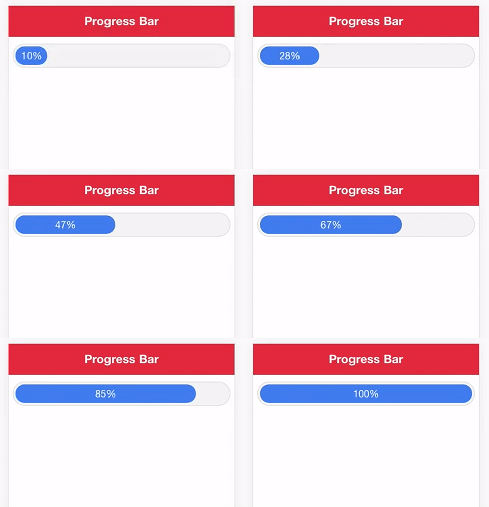
For the progress bar component, we will just be using @Input as we have no need to send any data back to the parent component. We just want to be able to supply our progress bar component with a value that it should use to display a certain percentage of progress.
Generate the progress bar component
ionic g component ProgressBar
This will generate the component for us, but we are also going to have to import and declare it in our app.module.ts file.
import { ProgressBarComponent } from '../components/progress-bar/progress-bar';

@NgModule({
  declarations: [
    ...
    ProgressBarComponent
  ]
})
export class AppModule {}
Note that you only need to include the custom component in the declarations array, you don’t need to add it to the entryComponents as well.
Modify progress-bar.ts
import { Component, Input } from '@angular/core';

@Component({
  selector: 'progress-bar',
  templateUrl: 'progress-bar.html'
})
export class ProgressBarComponent {
  @Input('progress') progress;

  constructor() { }

}
All we are doing here is setting up an @Input called progress that we will use to control how full the progress bar should be. This is actually all we need to do for this file, the rest of the logic will be handled in the template.
Modify progress-bar.html
{{progress}}%
We create a container That will control how full the progress bar should be, and all we have left to do is add a bit of styling. All this really does is style the component so that it looks like a loading bar. Now you can just use the following syntax in any of your templates: This example would bind the progress input to the width property for the element (along with a percentage symbol). So if we give this component an input of 50, it will set the width of that inner 50%. Then we just render out that value as text inside of the Modify progress-bar.scss
progress-bar {
.progress-outer {
width: 100%;
margin: 10px 2%;
padding: 3px;
text-align: center;
background-color: #f4f4f4;
border: 1px solid #dcdcdc;
color: #fff;
border-radius: 20px;
}
.progress-inner {
min-width: 15%;
white-space: nowrap;
overflow: hidden;
padding: 5px;
border-radius: 20px;
background-color: map-get($colors, primary);
}
}
Use the Component
progress property to a member variable called loadProgress that would be set up in the TypeScript file. You can even change this loadProgress variable dynamically (as a download is progressing, for example) to create an animated effect like this:

