Data Visualization plays a very important role in Data mining. Various data scientist spent their time exploring data through visualization. To accelerate this process we need to have a well-documentation of all the plots.
d ATA可视化起着数据挖掘非常重要的作用。 各种各样的数据科学家花时间通过可视化来探索数据。 为了加快这一过程,我们需要对所有地块都有完整的文档记录。
Even plenty of resources can’t be transformed into valuable goods without planning and architecture. Therefore I hope this article would provide you a good architecture of all plots and their documentation.
没有规划和架构,就连大量资源也无法转化为有价值的商品。 因此,我希望本文能为您提供所有图表及其文档的良好架构。
内容 (Content)
Introduction
介绍
Know your Data
了解您的数据
Distribution Plotsa. Dist-Plotb. Joint Plotc. Pair Plotd. Rug Plot
分布图。 Dist-Plotb。 联合绘图 对图。 地毯图
Categorical Plotsa. Bar Plotb. Count Plotc. Box Plotd. Violin Plot
分类Plotsa。 酒吧Plotb。 计数Plotc。 箱图。 小提琴图
Advanced Plotsa. Strip Plotb. Swarm Plot
进阶Plotsa。 带状花鼓。 群图
Matrix Plotsa. Heat Mapb. Cluster Map
Matrix Plotsa。 热图 集群图
Gridsa. Facet Grid
Gridsa。 刻面网格
Regression Plots
回归图
介绍 (Introduction)
Seaborn is a Python data visualization library based on matplotlib. It provides a high-level interface for drawing attractive and informative statistical graphics.
Seaborn是基于matplotlib的Python数据可视化库。 它提供了一个高级界面,用于绘制引人入胜且内容丰富的统计图形。
For the installation of Seaborn, you may run any of the following in your command line.
对于Seaborn的安装,您可以在命令行中运行以下任一命令。
pip install seaborn
conda install seaborn
To import seaborn you can run the following command.
要导入seaborn,您可以运行以下命令。
import seaborn as sns了解您的数据 (Know Your Data)
The data set used in these plots is famous titanic data set (Fig. 1). Hereafter the data set is represented by the variable ‘df’.
这些图中使用的数据集是著名的泰坦尼克号数据集 (图1)。 此后,数据集由变量“ df ”表示。
分布图 (Distribution Plots)
These plots help us to visualize the distribution of data. We can use these plots to understand the mean, median, range, variance, deviation, etc of the data.
这些图帮助我们可视化数据的分布 。 我们可以使用这些图来了解数据的平均值,中位数,范围,方差,偏差等。
一个。 距离图 (a. Distplot)
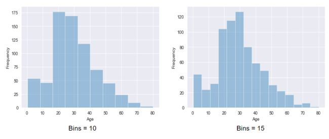
- Dist plot gives us the histogram of the selected continuous variable. 距离图可为我们提供所选连续变量的直方图。
- It is an example of a univariate analysis. 这是单变量分析的一个例子。
- We can change the number of bins i.e. number of vertical bars in a histogram 我们可以更改柱状图的数量,即直方图中垂直条的数量
import seaborn as sns
sns.distplot(x = df['age'], bins = 10)- Here x-axis is the age and the y-axis displays frequency. For example, for bins = 10, there are around 50 people having age 0 to 10 x轴是年龄,y轴显示频率。 例如,对于垃圾箱= 10,大约有50个人的年龄在0到10岁之间
b。 联合图 (b. Joint Plot)
- It is the combination of the distplot of two variables. 它是两个变量的分布图的组合。
- It is an example of bivariate analysis. 这是双变量分析的一个例子。
- We additionally obtain a scatter plot between the variable to reflecting their linear relationship. We can customize the scatter plot into a hexagonal plot, where, more the color intensity, the more will be the number of observations. 我们还获得了变量之间的散点图,以反映它们的线性关系。 我们可以将散点图定制为六边形图,其中,颜色强度越大,观察到的数量就越多。
import seaborn as sns
# For Plot 1
sns.jointplot(x = df['age'], y = df['Fare'], kind = 'scatter')# For Plot 2
sns.jointplot(x = df['age'], y = df['Fare'], kind = 'hex')- We can see that there no appropriate linear relation between age and fare. 我们可以看到年龄和票价之间没有适当的线性关系。
- kind = ‘hex’ provides the hexagonal plot and kind = ‘reg’ provides a regression line on the graph. kind ='hex'提供六边形图,而kind ='reg'提供图形上的回归线。
C。 对图 (c. Pair Plot)
- It takes all the numerical attributes of the data and plot pairwise scatter plot for two different variables and histograms from the same variables. 它具有数据的所有数值属性,并针对两个不同的变量和来自同一变量的直方图绘制成对散点图。
import seaborn as sns
sns.pairplot(df)分类图 (Categorical Plots)
These plots help us understand the categorical variables. We can use them for both univariate and bivariate analysis.
这些图帮助我们理解分类变量。 我们可以将它们用于单变量和双变量分析。
一个。 条形图 (a. Bar Plot)
- It is an example of bivariate analysis. 这是双变量分析的一个例子。
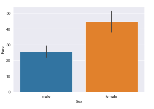
- On the x-axis, we have a categorical variable and on the y-axis, we have a continuous variable. 在x轴上,我们有一个类别变量,在y轴上,我们有一个连续变量。
import seaborn as sns
sns.barplot(x = df['Sex'], y = df['Fare'])- We can infer that the average fare is higher for females than males. 我们可以推断出,女性的平均票价要高于男性。
b。 计数图 (b. Count Plot)
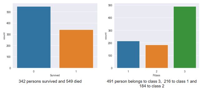
- It counts the number of occurrences of categorical variables. 它计算分类变量的出现次数。
- It is an example of a univariate analysis. 这是单变量分析的一个例子。
import seaborn as sns
sns.countplot(df['Pclass'])C。 箱形图 (c. Box Plot)
It is a 5 point summary plot. It gives the information about the maximum, minimum, mean, first quartile, and third quartile of a continuous variable. Also, it equips us with knowledge of outliers.
这是一个5点汇总图 。 它提供有关连续变量的最大值,最小值,平均值,第一四分位数和第三四分位数的信息。 同样,它为我们提供了离群值的知识。
- We can plot this for a single continuous variable or can analyze different categorical variables based on a continuous variable. 我们可以为单个连续变量绘制此图,也可以基于连续变量分析不同的类别变量。
import seaborn as sns
#For plot 1
sns.countplot(df['Pclass'])#For plot 2
sns.boxplot(y = df['Age'], x = df['Sex'])d。 小提琴图 (d. Violin Plot)
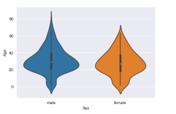
- It is similar to the Box plot, but it gives supplementary information about the distribution too. 它类似于Box图,但也提供有关分布的补充信息。
import seaborn as sns
sns.violinplot(y = df['Age'], x = df['Sex'])高级图 (Advanced Plots)
As the name suggests, they are advanced because they ought to fuse the distribution and categorical encodings.
顾名思义,它们是高级的,因为它们应该融合分发和分类编码。
一个。 带状图 (a. Strip Plot)
- It’s a plot between a continuous variable and a categorical variable. 它是连续变量和分类变量之间的关系图。
- It plots as a scatter plot but supplementarily uses categorical encodings of the categorical variable. 它以散点图的形式绘制,但补充使用类别变量的类别编码。
import seaborn as sns
sns.stripplot(y = df['Age'], x = df['Pclass'])- We can observe that in class 1 and class 2, children around 10 years are not present and the people having age above 60 are mostly accommodated in class 1. 我们可以观察到,在第1级和第2级中,不存在10岁左右的孩子,而在60岁以上的人大多是在第1级中居住的。
- Usually, these types of observations are used to impute missing values. 通常,这些类型的观察值用于估算缺失值。
b。 群图 (b. Swarm Plot)
- It is the combination of a strip plot and a violin plot. 它是带状图和小提琴图的组合。
- Along with the number of data points, it also provides their respective distribution. 除了数据点的数量外,它还提供了它们各自的分布。
import seaborn as sns
sns.swarmplot(y = train['Age'], x = train['Pclass'])矩阵图 (Matrix Plots)
These are the special types of plots that use two-dimensional matrix data for visualization. It is difficult to analyze and generate patterns from matrix data because of its large dimensions. So, this makes the process easier by providing color coding to matrix data.
这些是使用二维矩阵数据进行可视化的特殊类型的图。 由于矩阵数据的维数较大,因此难以分析和生成模式。 因此,通过为矩阵数据提供颜色编码,这使过程变得更容易。
一个。 热图 (a. Heat Map)
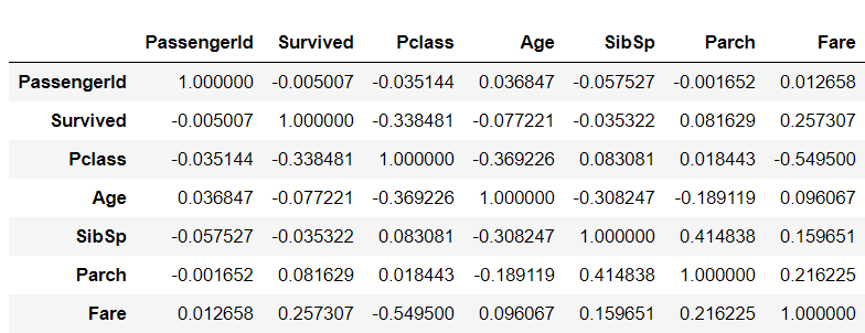
- In the given raw dataset ‘df’, we have seven numeric variables. So, let us generate a correlation matrix between these seven variables. 在给定的原始数据集“ df”中,我们有七个数字变量。 因此,让我们生成这七个变量之间的相关矩阵。
df.corr()It seems very difficult to read every value even though there are only 49 values. The intricacy intensifies as we traverse towards thousands of features.
即使只有49个值,读取每个值似乎也很困难。 当我们遍历数以千计的功能部件时,复杂性加剧了。
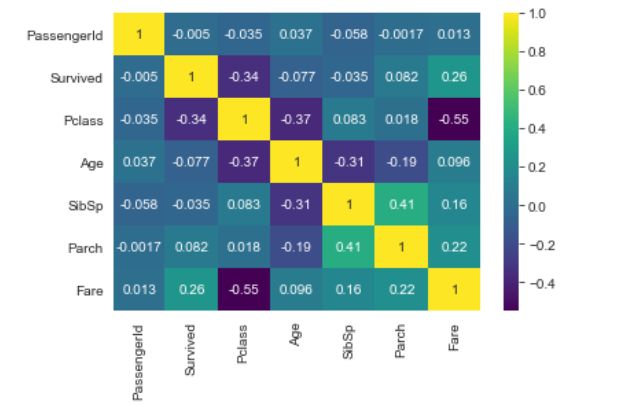
So, let us try to implement some color coding and see how easy the interpretation becomes.
因此,让我们尝试实现一些颜色编码,看看解释变得多么容易。
sns.heatmap(df.corr(), annot = True, cmap = 'viridis')- The same matrix is now articulating more information. 现在,同一矩阵可以表达更多信息。
- Another very obvious example is to use heatmaps to understand the missing value patterns. In Fig. 14, the yellow dash represents a missing value, hence it makes our tasks more effortless to identify the missing values. 另一个非常明显的示例是使用热图来了解缺失值模式。 在图14中,黄色破折号代表缺失值,因此使我们的任务更加轻松地识别缺失值。
sns.heatmap(df.isnull(),yticklabels=False,cbar=False,cmap='viridis')b。 集群图 (b. Cluster Map)
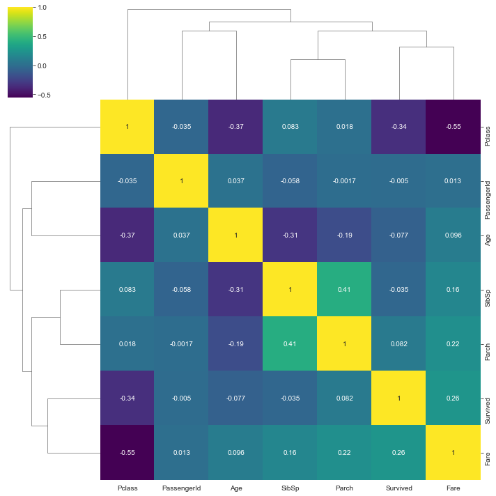
- If we have a matrix data and want to group some features according to their similarity, cluster maps can assist us. Once, have a look at the heat map (Fig. 13) and then look at the cluster map (Fig. 15). 如果我们有一个矩阵数据,并想根据某些特征的相似性对其进行分组,则聚类图可以为我们提供帮助。 一次,查看热图(图13),然后查看聚类图(图15)。
sns.clustermap(tran.corr(), annot='True',cmap='viridis')- The x-label and y-label are the same but they harmonized differently. That is because they are grouped according to their similarity. x标签和y标签相同,但协调不同。 那是因为它们是根据它们的相似性分组的。
- The flow-chart like structure at the top and left describe their degree of similarity. 顶部和左侧的流程图状结构描述了它们的相似程度。
Cluster maps use Hierarchical clustering to form different clusters.
集群图使用层次集群来形成不同的集群。
格网 (Grids)
Grid plots provide us more control over visualizations and plots various assorted graphs with a single line of code.
网格图为我们提供了对可视化的更多控制,并通过一行代码即可绘制出各种图表。
一个。 刻面网格 (a. Facet Grid)
- Suppose we want to plot the age distribution of males and females in all the three classes of tickets. Hence, we would be having in a total of 6 graphs. 假设我们要绘制所有三种票证中男性和女性的年龄分布。 因此,我们总共将拥有6张图。
sns.FacetGrid(train, col = 'Pclass', row = 'Sex').map(sns.distplot, 'Age')- The Facet grids provide very clear graphs as per requirements. 根据需求,“构面”网格提供了非常清晰的图形。
sns.FacetGrid( col = ‘col’, row = ‘row’, data = data) provides an empty grid of all unique categories in the col and row. Later, we can use different plots and common variables for peculiar variations.
sns.FacetGrid ( col =' col ', row =' row ', data = data)提供了col和row中所有唯一类别的空网格。 以后,我们可以使用不同的图和通用变量来进行特殊的变化。
回归图 (Regression Plot)
This is a more advanced statistical plot that provides a scatter plot along with a linear fitting on the data.
这是更高级的统计图,它提供了散点图以及对数据的线性拟合。
sns.lmplot(x = 'Age', y = 'PassengerId', data = df, hue = 'Sex)Fig. 17 displays the linear regression fitting between Passenger ID and Age for both males and females.
图17显示了男性和女性的乘客ID和年龄之间的线性回归拟合。
结语 (Wrap Up)
In this article, we have seen 14 different visualization techniques using seaborn.
在本文中,我们已经看到了14种使用seaborn的不同可视化技术。
I believe data visualization enhances our understanding and potential for interpreting data. It gives us more satisfying skills to represent data, impute missing values, identify outliers, detect anomalies, and a lot more.
我相信数据可视化会增强我们的理解力和解释数据的潜力。 它为我们提供了更令人满意的技能来表示数据,估算缺失值,识别异常值,检测异常等等。
Data Analysts are like cops that need to interrogate data and extract information via them. It is extremely necessary to have optimistic tools to do the job. Therefore, I hope this article would serve you as a tool for interrogating your data.
数据分析师就像警察一样,需要审问数据并通过它们提取信息。 拥有乐观的工具来完成这项工作是非常必要的。 因此,我希望本文能为您提供一个查询数据的工具。
For the Guide for Exploratory data analysis, visit-
有关探索性数据分析指南,请访问-
学习愉快! (Happy Learning!)
翻译自: https://towardsdatascience.com/14-data-visualization-plots-of-seaborn-14a7bdd16cd7

