python数据可视化05
一.学习的内容
(1)绘制单子图
(2)实例1
(3)绘制多子图
(4)实例2
(5)绘制自定义区域
(6)实例3
(7)共享子图
(8)共享相邻子图和共享非相邻子图
(9)实例4
(10)子图布局:约束布局,紧密布局,自定义布局
(11)实例5
(12)定制刻度
(13)代码及效果图如下:
1)
#绘制两个子图
import matplotlib.pyplot as plt
ax_one = plt.subplot(326)
ax_one.plot([1,2,3,4,5])
ax_two = plt.subplot(312)
ax_two.plot([1,2,3,4,5])
plt.title('2020080603043')
plt.show()

2)
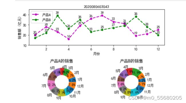
#实例1
import numpy as np
import matplotlib.pyplot as plt
plt.rcParams['font.sans-serif']=["SimHei"]
x = [x for x in range(1,13)]
y1 = [20,28,23,16,29,36,39,33,31,19,21,25]
y2 = [17,22,39,26,35,23,25,27,29,38,28,20]
labels = ['1月','2月','3月','4月','5月','6月',
          '7月','8月','9月','10月','11月','12月']
ax1 = plt.subplot(211)
ax1.plot(x,y1,'m--o',lw=2,ms=5,label='产品A')
ax1.plot(x,y2,'g--o',lw=2,ms=5,label='产品B')
ax1.set_title("2020080603043",fontsize=11)
ax1.set_ylim(10,45)
ax1.set_ylabel('销售额 (亿元)')
ax1.set_xlabel('月份')
for xy1 in zip (x,y1):
    ax1.annotate("%s" % xy1[1],xy=xy1,xytext=(-5,5),textcoords='offset points')
for xy2 in zip (x,y2):
    ax1.annotate("%s" % xy2[1],xy=xy2,xytext=(-5,5),textcoords='offset points')
ax1.legend()
ax2 = plt.subplot(223)
ax2.pie(y1,radius=1,wedgeprops={'width':0.5},labels=labels,
        autopct='%3.1f%%',pctdistance=0.75)
ax2.set_title('产品A的销售')
ax3 = plt.subplot(224)
ax3.pie(y2,radius=1,wedgeprops={'width':0.5},labels=labels,
        autopct='%3.1f%%',pctdistance=0.75)
ax3.set_title('产品B的销售')
plt.tight_layout()
plt.show()
3)
#绘制多子图
import numpy as np
import matplotlib.pyplot as plt
fig,ax_arr = plt.subplots(2,2)
ax_thr = ax_arr[1,0]
ax_thr.plot([1,2,3,4,5])
plt.title('2020080603043')
plt.show()
4)
#实例2
import numpy as np
import matplotlib.pyplot as plt
plt.rcParams['font.sans-serif']=["SimHei"]
def autolabel(ax,rects):
    for rect in rects:
        width = rect.get_width()
        ax.text(width +3, rect.get_y() ,s='{}'.format(width),
                   ha='center',va='bottom')
y= np.arange(12)
x1 = np.array([19,33,28,29,14,24,57,6,26,15,27,39])
x2 = np.array([25,33,58,39,15,64,29,23,22,11,27,50])
labels =np.array(['中国','加拿大','巴西','澳大利亚','日本','墨西哥','俄罗斯','韩国','瑞士','土耳其','英国','美国'])
fig, (ax1,ax2)= plt.subplots(1,2)
barh1_rects=ax1.barh(y,x1,height=0.5,tick_label=labels,color='#FFA500')
ax1.set_xlabel('人群比例(%)')
ax1.set_title('2020080603043')
ax1.set_xlim(0,x1.max()+10)
autolabel(ax1,barh1_rects)
barh2_rects= ax2.barh(y,x1,height=0.5,tick_label=labels,color='#20B2AA')
ax2.set_xlabel('人群比例(%)')
ax2.set_title('2020080603043')
ax2.set_xlim(0,x2.max()+10)
autolabel(ax2,barh2_rects)
plt.tight_layout()
plt.show()

5)
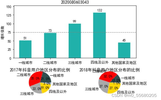
import numpy as np
import matplotlib.pyplot as plt
plt.rcParams['font.sans-serif']=["SimHei"]
data_2017 =np.array([21,35,22,19,3])
data_2018=np.array([13,32,27,27,1])
x= np.arange(5)
y=np.array([51,73,99,132,45])
labels = (['一线城市','二线城市','三线城市','四线及以外','其他国家及地区'])
average =75
bar_width = 0.5
def autolabel(ax,rects):
    for rect in rects:
        height = rect.get_height()
        ax.text(rect.get_x()+ bar_width/2,height + 3 ,s='{}'.format(height),ha='center',va='bottom')
#第一个子图
ax_one = plt.subplot2grid((3,2),(0,0),rowspan=2,colspan=2)
bar_rects = ax_one.bar(x,y,tick_label =labels,color='#20B2AA',width = bar_width)
ax_one.set_title('2020080603043')
ax_one.set_ylabel('增长倍数')
autolabel(ax_one,bar_rects)
ax_one.set_ylim(0,y.max() +20)
ax_one.axhline(y=75,linestyle='--',linewidth=1,color='gray')
#第二个子图
ax_two = plt.subplot2grid((3,2),(2,0))
ax_two.pie(data_2017,radius=1.5,labels=labels,autopct='%3.1f%%',colors= ['#2F4F4F','#FF0000','#A9A9A9','#FFD700','#B0C4DE'])
ax_two.set_title('2017年抖音用户地区分布的比例')
#第三个子图
ax_two = plt.subplot2grid((3,2),(2,1))
ax_two.pie(data_2018,radius=1.5,labels=labels,autopct='%3.1f%%',colors= ['#2F4F4F','#FF0000','#A9A9A9','#FFD700','#B0C4DE'])
ax_two.set_title('2018年抖音用户地区分布的比例')
#距离
plt.tight_layout()
plt.show()
6)
#每一列子图共享
import numpy as np
import matplotlib.pyplot as plt
plt.rcParams['axes.unicode_minus'] = False
x1 = np.linspace(0,2*np.pi,400)
x2 = np.linspace(0.01,10,100)
x3 = np.random.rand(10)
x4 = np.arange(0,6,0.5)
y1 = np.cos(x1**2)
y2 = np.sin(x2)
y3 = np.linspace(0,3,10)
y4 = np.power(x4,3)
#共享每一列子图之间的x轴
fig, ax_arr = plt.subplots(2,2,sharex='col')
ax1 = ax_arr[0,0]
ax1.plot(x1,y1)
ax2 = ax_arr[0,1]
ax2.plot(x2,y2)
ax3 = ax_arr[1,0]
ax3.scatter(x3,y3)
ax4 = ax_arr[1,1]
ax4.scatter(x4,y4)
plt.title('2020080603043')
plt.show()

7)
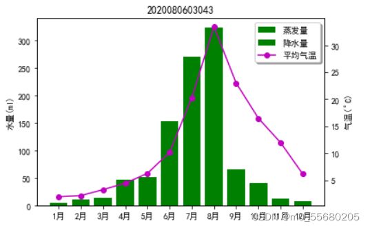
# 实例4
import numpy as np
import matplotlib.pyplot as plt
plt.rcParams['font.sans-serif']=["SimHei"]
plt.rcParams['axes.unicode_minus'] = False
month_x = np.arange(1,13,1)
#平均气温
data__tem = np.array([2.0,2.2,3.3,4.5,6.3,10.2,20.3,33.4,23.0,16.5,12.0,6.2])
#降水量
data_precipitation = np.array([2.6,4.9,7.0,23.2,25.6,76.7,175.6,182.2,47.8,18.8,6.0,2.3])
#蒸发量
data_evaporation = np.array([2.0,4.9,7.0,23.2,25.6,76.7,135.6, 162.2, 32.6 ,20.0 ,6.4 ,3.3])
fig,ax = plt.subplots()
bar_ev = ax.bar(month_x,data_evaporation,color= 'green',tick_label= ['1月','2月','3月','4月','5月','6月','7月','8月','9月','10月','11月','12月'])
bar_pre = ax.bar(month_x,data_evaporation,bottom=data_evaporation,color='green')
ax.set_ylabel('水量(ml)')
ax.set_title('2020080603043')
ax_right = ax.twinx()
line = ax_right.plot(month_x,data__tem,'o-m')
ax_right.set_ylabel('气温($^\circ$C)')
#添加图例
plt.legend([bar_ev,bar_pre,line[0]],['蒸发量','降水量','平均气温'],shadow=True,fancybox=True)
plt.show()
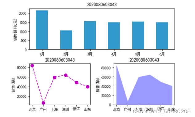
8)
# 实例5
import numpy as np
import matplotlib.pyplot as plt
plt.rcParams['font.sans-serif']=["SimHei"]
plt.rcParams['axes.unicode_minus'] = False
x_month = np.array(['1月','2月','3月','4月','5月','6月'])
y_sales = np.array([2150,1050,1560,1480,1530,1490])
x_citys= np.array(['北京','广州','上海','深圳','浙江','山东'])
y_sale_count = np.array([83775,6280,59176,64205,48671,39968])
#创建画布
fig = plt.figure(constrained_layout=True)
gs = fig.add_gridspec(2,2)
ax_one = fig.add_subplot(gs[0,:])
ax_two = fig.add_subplot(gs[1,0])
ax_thr= fig.add_subplot(gs[1,1])
#第一个子图
ax_one.bar(x_month,y_sales,width=0.5,color='#3299CC')
ax_one.set_title('2020080603043')
ax_one.set_ylabel('销售额(亿元)')
#第二个子图
ax_two.plot(x_citys,y_sale_count,'m--o',ms=8)
ax_two.set_title('2020080603043')
ax_two.set_ylabel('销售(辆)')
#第三个子图
ax_thr.stackplot(x_citys,y_sale_count,color='#9999FF')
ax_thr.set_title('2020080603043')
ax_thr.set_ylabel('销售(辆)')
plt.show()
# 在画中添加多个坐标系
import numpy as np
import matplotlib.pyplot as plt
ax = plt.axes((0.2,0.5,0.3,0.3))
ax.plot([1,2,3,4,5])
ax2 = plt.axes((0.6,0.4,0.3,0.2))
ax2.plot([1,2,3,4,5])
plt.title('2020080603043')
plt.show()

10)
import numpy as np
from datetime import datetime
import matplotlib.pyplot as plt
from matplotlib.dates import DateFormatter,HourLocator
plt.rcParams['font.sans-serif']=["SimHei"]
plt.rcParams['axes.unicode_minus'] = False
dates = ['201910240','2019102402','2019102404','2019102406','2019102408','2019102410','2019102412','2019102414','2019102416','2019102418','2019102420','2019102422','201910250']
x_date = [datetime.strptime(d,'%Y%m%d%H')for d in dates]
y_data = np.array([7,9,11,14,8,15,22,11,10,11,11,13,8])
fig = plt.figure()
ax = fig.add_axes((0.0,0.0,1.0,1.0))
ax.plot(x_date,y_data,'->',ms=8,mfc='#FF9900')
ax.set_title('2020080603043')
ax.set_xlabel('时间')
ax.set_ylabel('平均风速(km/h)')
date_fmt = DateFormatter('%H:%M')
ax.xaxis.set_major_formatter(date_fmt)
ax.xaxis.set_major_locator(HourLocator(interval=2))
ax.tick_params(direction='in',length=6,width=2,labelsize=12)
ax.xaxis.set_tick_params(labelrotation=45)
plt.show()
