matplotlib绘制子图
第三回:布局格式定方圆
import numpy as np
import pandas as pd
import matplotlib.pyplot as plt
plt.rcParams['font.sans-serif'] = ['SimHei']   #用来正常显示中文标签
plt.rcParams['axes.unicode_minus'] = False   #用来正常显示负号
一、子图
1. 使用 plt.subplots 绘制均匀状态下的子图
返回元素分别是画布和子图构成的列表,第一个数字为行,第二个为列
figsize 参数可以指定整个画布的大小
sharex 和 sharey 分别表示是否共享横轴和纵轴刻度
tight_layout 函数可以调整子图的相对大小使字符不会重叠
fig, axs = plt.subplots(2, 5, figsize=(10, 4), sharex=True, sharey=True)
fig.suptitle('样例1', size=20)
for i in range(2):
    for j in range(5):
        axs[i][j].scatter(np.random.randn(10), np.random.randn(10))
        axs[i][j].set_title('第%d行,第%d列'%(i+1,j+1))
        axs[i][j].set_xlim(-5,5)
        axs[i][j].set_ylim(-5,5)
        if i==1: axs[i][j].set_xlabel('横坐标')
        if j==0: axs[i][j].set_ylabel('纵坐标')
fig.tight_layout()
[外链图片转存失败,源站可能有防盗链机制,建议将图片保存下来直接上传(img-zgzoQDjV-1640097107861)(output_3_0.png)]
除了常规的直角坐标系,也可以通过projection方法创建极坐标系下的图表
N = 150
r = 2 * np.random.rand(N)
theta = 2 * np.pi * np.random.rand(N)
area = 200 * r**2
colors = theta


plt.subplot(projection='polar')
plt.scatter(theta, r, c=colors, s=area, cmap='hsv', alpha=0.75)
[外链图片转存失败,源站可能有防盗链机制,建议将图片保存下来直接上传(img-enoakY6G-1640097107865)(output_5_1.png)]
2. 使用 GridSpec 绘制非均匀子图
所谓非均匀包含两层含义,第一是指图的比例大小不同但没有跨行或跨列,第二是指图为跨列或跨行状态
利用 add_gridspec 可以指定相对宽度比例 width_ratios 和相对高度比例参数 height_ratios
fig = plt.figure(figsize=(10, 4))
spec = fig.add_gridspec(nrows=2, ncols=5, width_ratios=[1,2,3,4,5], height_ratios=[1,3])
fig.suptitle('样例2', size=20)
for i in range(2):
    for j in range(5):
        ax = fig.add_subplot(spec[i, j])
        ax.scatter(np.random.randn(10), np.random.randn(10))
        ax.set_title('第%d行,第%d列'%(i+1,j+1))
        if i==1: ax.set_xlabel('横坐标')
        if j==0: ax.set_ylabel('纵坐标')
fig.tight_layout()
[外链图片转存失败,源站可能有防盗链机制,建议将图片保存下来直接上传(img-ukH7DRoQ-1640097107866)(output_7_0.png)]
在上面的例子中出现了 spec[i, j] 的用法,事实上通过切片就可以实现子图的合并而达到跨图的共能
fig = plt.figure(figsize=(10, 4))
spec = fig.add_gridspec(nrows=2, ncols=6, width_ratios=[2,2.5,3,1,1.5,2], height_ratios=[1,2])
fig.suptitle('样例3', size=20)
# sub1
ax = fig.add_subplot(spec[0, :3])
ax.scatter(np.random.randn(10), np.random.randn(10))
# sub2
ax = fig.add_subplot(spec[0, 3:5])
ax.scatter(np.random.randn(10), np.random.randn(10))
# sub3
ax = fig.add_subplot(spec[:, 5])
ax.scatter(np.random.randn(10), np.random.randn(10))
# sub4
ax = fig.add_subplot(spec[1, 0])
ax.scatter(np.random.randn(10), np.random.randn(10))
# sub5
ax = fig.add_subplot(spec[1, 1:5])
ax.scatter(np.random.randn(10), np.random.randn(10))
fig.tight_layout()
[外链图片转存失败,源站可能有防盗链机制,建议将图片保存下来直接上传(img-M5gsuC1V-1640097107867)(output_9_0.png)]
二、子图上的方法
在 ax 对象上定义了和 plt 类似的图形绘制函数,常用的有: plot, hist, scatter, bar, barh, pie
fig, ax = plt.subplots(figsize=(4,3))
ax.plot([1,2],[2,1])
[]
[外链图片转存失败,源站可能有防盗链机制,建议将图片保存下来直接上传(img-SZ2LXeDR-1640097107869)(output_11_1.png)]
fig, ax = plt.subplots(figsize=(4,3))
ax.hist(np.random.randn(1000))
(array([  4.,  21.,  53., 157., 210., 255., 178.,  83.,  32.,   7.]),
 array([-3.21675023, -2.5967257 , -1.97670118, -1.35667665, -0.73665212,
        -0.1166276 ,  0.50339693,  1.12342145,  1.74344598,  2.3634705 ,
         2.98349503]),
 )
[外链图片转存失败,源站可能有防盗链机制,建议将图片保存下来直接上传(img-FFKVM7jt-1640097107870)(output_12_1.png)]
常用直线的画法为: axhline, axvline, axline (水平、垂直、任意方向)
fig, ax = plt.subplots(figsize=(4,3))
ax.axhline(0.5,0.2,0.8)
ax.axvline(0.5,0.2,0.8)
ax.axline([0.3,0.3],[0.7,0.7])
[外链图片转存失败,源站可能有防盗链机制,建议将图片保存下来直接上传(img-NJ3KICEa-1640097107871)(output_14_1.png)]
使用 grid 可以加灰色网格
fig, ax = plt.subplots(figsize=(4,3))
ax.grid(True)
[外链图片转存失败,源站可能有防盗链机制,建议将图片保存下来直接上传(img-ucDJ2Xvs-1640097107872)(output_16_0.png)]
使用 set_xscale, set_title, set_xlabel 分别可以设置坐标轴的规度(指对数坐标等)、标题、轴名
fig, axs = plt.subplots(1, 2, figsize=(10, 4))
fig.suptitle('大标题', size=20)
for j in range(2):
    axs[j].plot(list('abcd'), [10**i for i in range(4)])
    if j==0:
        axs[j].set_yscale('log')
        axs[j].set_title('子标题1')
        axs[j].set_ylabel('对数坐标')
    else:
        axs[j].set_title('子标题1')
        axs[j].set_ylabel('普通坐标')
fig.tight_layout()
[外链图片转存失败,源站可能有防盗链机制,建议将图片保存下来直接上传(img-nhlMFVBH-1640097107873)(output_18_0.png)]
与一般的 plt 方法类似, legend, annotate, arrow, text 对象也可以进行相应的绘制
fig, ax = plt.subplots()
ax.arrow(0, 0, 1, 1, head_width=0.03, head_length=0.05, facecolor='red', edgecolor='blue')
ax.text(x=0, y=0,s='这是一段文字', fontsize=16, rotation=70, rotation_mode='anchor', color='green')
ax.annotate('这是中点', xy=(0.5, 0.5), xytext=(0.8, 0.2), arrowprops=dict(facecolor='yellow', edgecolor='black'), fontsize=16)
Text(0.8, 0.2, '这是中点')
[外链图片转存失败,源站可能有防盗链机制,建议将图片保存下来直接上传(img-6O1buiEP-1640097107874)(output_20_1.png)]
fig, ax = plt.subplots()
ax.plot([1,2],[2,1],label="line1")
ax.plot([1,1],[1,2],label="line1")
ax.legend(loc=1)
[外链图片转存失败,源站可能有防盗链机制,建议将图片保存下来直接上传(img-Bqktqyfj-1640097107875)(output_21_1.png)]
其中,图例的 loc 参数如下:
| string | code |
|---|---|
| best | 0 |
| upper right | 1 |
| upper left | 2 |
| lower left | 3 |
| lower right | 4 |
| right | 5 |
| center left | 6 |
| center right | 7 |
| lower center | 8 |
| upper center | 9 |
| center | 10 |
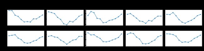
作业
1. 墨尔本1981年至1990年的每月温度情况
ex1 = pd.read_csv('data/layout_ex1.csv')
ex1.head()
| Time | Temperature | |
|---|---|---|
| 0 | 1981-01 | 17.712903 |
| 1 | 1981-02 | 17.678571 |
| 2 | 1981-03 | 13.500000 |
| 3 | 1981-04 | 12.356667 |
| 4 | 1981-05 | 9.490323 |
- 请利用数据,画出如下的图:
2. 画出数据的散点图和边际分布
- 用
np.random.randn(2, 150)生成一组二维数据,使用两种非均匀子图的分割方法,做出该数据对应的散点图和边际分布图
