实践过程
常用属性
因为Seekbar继承自ProgressBar,所以ProgressBar支持的XML属性SeekBar都适用。
【android:max="100"】:设置该进度条的最大值
【android:progress="50"】:设置该进度条的已完成进度值
【android:progressDrawable="@drawable/icon_xinsui"】:自定义drawable显示
【android:secondaryProgress="50"】:定义二级进度值,值介于0到max。该进度在主进度和背景之间。比如用于网络播放视频时,二级进度用于表示缓冲进度,主进度用于表示播放进度。
【android:splitTrack="false"】:设置进度条的滑块图片
【android:thumb="@drawable/icon_xinsui"】:滑块底部 背景样式 (false为透明 )
公共方法总共有14个,小空直接亮个截图

基本使用
Java版
<TextView
    android:id="@+id/tvProgress"
    android:layout_width="match_parent"
    android:layout_height="wrap_content"
    android:gravity="center"
    android:text="数值范围0~100之间,当前值:30"
    android:textSize="20sp" />

<SeekBar
    android:id="@+id/seekBar"
    android:layout_width="match_parent"
    android:layout_height="wrap_content"
    android:layout_marginTop="20dp"
android:progress="30" />
复制代码
seekBar.setOnSeekBarChangeListener(new SeekBar.OnSeekBarChangeListener() {
    @Override
    public void onProgressChanged(SeekBar seekBar, int progress, boolean fromUser) {
        tvProgress.setText("数值范围0~100之间,当前值:"+progress);
    }

    @Override
    public void onStartTrackingTouch(SeekBar seekBar) {

    }

    @Override
    public void onStopTrackingTouch(SeekBar seekBar) {

    }
});
复制代码
Kotlin版
seekBar.setOnSeekBarChangeListener(object : OnSeekBarChangeListener {
           override fun onProgressChanged(seekBar: SeekBar, progress: Int, fromUser: Boolean) {
                tvProgress.setText("数值范围0~100之间,当前值:$progress")
            }

            override fun onStartTrackingTouch(seekBar: SeekBar) {}
            override fun onStopTrackingTouch(seekBar: SeekBar) {}
        })
复制代码

然后使用Progressbar的属性indeterminateDrawable指定即可。
自定义样式
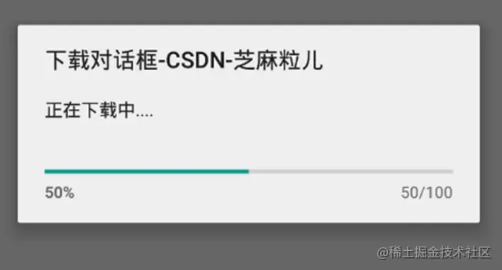
这是系统自带的一个对话框进度条,样式美观度不敢恭维。
@Override
protected void onCreate(@Nullable Bundle savedInstanceState) {
    super.onCreate(savedInstanceState);
    setContentView(R.layout.activity_bar);
    ProgressDialog pb = new ProgressDialog(this);
    pb.setMax(100);
    //点击外部是否可以被取消
    pb.setCancelable(true);
    //设置标题
    pb.setTitle("下载对话框");
    //设置中间文本内容
    pb.setMessage("正在下载中....");
    pb.setProgressStyle(ProgressDialog.STYLE_HORIZONTAL);
    pb.show();
    //在show后调用
    pb.setProgress(50);
}
复制代码
 监听方法 onStartTrackingTouch:当开始滑动滑块时,会执行该方法下的代码 onStopTrackingTouch:当结束滑动滑块时,会执行该方法下的代码 onProgressChanged:当滑块进度改变时,会执行该方法下的代码
自定义样式
不管哪个平台系统样式都无法满足多样的市场需求和审美需求,自定义样式就是每个平台都具有的功能。
<SeekBar
    android:id="@+id/seekBar"
    android:layout_width="match_parent"
    android:layout_height="wrap_content"
    android:layout_marginTop="20dp"
    android:progress="30"
    android:progressDrawable="@drawable/seekbar_one"
    android:thumb="@drawable/icon_xinsui" />
<SeekBar
    android:id="@+id/seekBarTwo"
    android:layout_width="match_parent"
    android:layout_height="wrap_content"
    android:layout_marginTop="20dp"
    android:progress="30"
    android:progressDrawable="@drawable/seekbar_two"
android:thumb="@drawable/icon_xinsui" />
复制代码
seekbar_one.xml
<?xml version="1.0" encoding="utf-8"?>
<layer-list
    xmlns:android="http://schemas.android.com/apk/res/android">
    <item android:id="@android:id/background">
        <shape>
            <solid android:color="#33AADD" />
        </shape>
    </item>
    <item android:id="@android:id/secondaryProgress">
        <clip>
            <shape>
                <solid android:color="#3CC4C4" />
            </shape>
        </clip>
    </item>
    <item android:id="@android:id/progress">
        <clip>
            <shape>
                <solid android:color="#00ff00" />
            </shape>
        </clip>
    </item>
</layer-list>
复制代码
seekbar_two.xmk
<?xml version="1.0" encoding="utf-8"?>
<layer-list xmlns:android="http://schemas.android.com/apk/res/android">
    <item android:id="@android:id/background">
        <shape>
            <corners android:radius="5dp"/>
        </shape>
        <!--    背景颜色-->
        <color android:color="#CCCCCC"/>
    </item>

    <item android:id="@android:id/progress">
        <clip
            android:clipOrientation="horizontal"
            android:gravity="left">
            <shape>
                <corners android:radius="5dp"/>
                <!--  开始颜色,中途颜色,最后颜色-->
                <gradient
                    android:startColor="#00FF00"
                    android:centerColor="#0000FF"
                    android:endColor="#FF0000"/>
            </shape>
        </clip>
    </item>
</layer-list>
复制代码
同理thumb其实也是可以自定义的,只不过这个通常美工给个图就搞定了,如果是动态整个drawable动画即可。
除此以外,通常我们还会遇见双向选择的滑动条,比如购物类App选择价格区间的时候。
可参考:
以上就是Android开发手册SeekBar拖动条使用实例的详细内容,更多关于Android开发SeekBar拖动条的资料请关注脚本之家其它相关文章!