Matplotlib学习笔记
文章目录
- 1 matplotlib介绍与安装
-
- 1.1 matplotlib介绍
- 1.2 matplotlib的安装
- 2 matplotlib绘图
-
-
- 2.1 图片与子图
- 2.2 matplotlit绘制图形
-
- 2.2.1 折线图
- 2.2.2 散点图
- 2.2.3 条形图
- 2.2.4 直方图
- 2.2.5 扇形图(Pie)
- 2.2.6 雷达图
- 2.2.7 箱型图
- 2.3 Axes容器
- 2.4 Axis容器
- 2.5 多图布局
- 2.6 Matplotlib配置项
- 2.7 3D立体图形
-
1 matplotlib介绍与安装
1.1 matplotlib介绍
matplotlib是一个Python的基础绘图库,它可与Numpy一起使用来代替MATLAB,主要用于在Python中创建静态,动画和交互式可视化图形。
1.2 matplotlib的安装
安装命令:pip install matplotlib
注意:优先使用换源安装,安装完成之后可在pythcharm的终端(terminal)输入命令:pip list 可以查看目前安装的所有包名。
2 matplotlib绘图
2.1 图片与子图
matplotlib所绘制的图位于figure对象中,我们可以通过plt.figure生成一个新的figure对象
from matplotlib import pyplot as plt
fig = plt.figure()
注意:在IPthon中,执行该代码会出现一个空白的绘图窗口,但在jupter中则没有任何显示。
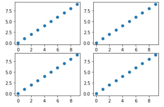
通过plt.subplot()方法创建一个或多个子图,如下面带有四个子图的matplotlib图片:
plt.subplot() 方法参数:plt.subplot(*arg,**kwargs)
'''
Parameters
    ----------
    *args : int, (int, int, *index*), or `.SubplotSpec`, default: (1, 1, 1)
        The position of the subplot described by one of

        - Three integers (*nrows*, *ncols*, *index*). The subplot will take the
          *index* position on a grid with *nrows* rows and *ncols* columns.
          *index* starts at 1 in the upper left corner and increases to the
          right. *index* can also be a two-tuple specifying the (*first*,
          *last*) indices (1-based, and including *last*) of the subplot, e.g.,
          ``fig.add_subplot(3, 1, (1, 2))`` makes a subplot that spans the
          upper 2/3 of the figure.
        - A 3-digit integer. The digits are interpreted as if given separately
          as three single-digit integers, i.e. ``fig.add_subplot(235)`` is the
          same as ``fig.add_subplot(2, 3, 5)``. Note that this can only be used
          if there are no more than 9 subplots.
        - A `.SubplotSpec`.

    projection : {None, 'aitoff', 'hammer', 'lambert', 'mollweide', \
'polar', 'rectilinear', str}, optional
        The projection type of the subplot (`~.axes.Axes`). *str* is the name
        of a custom projection, see `~matplotlib.projections`. The default
        None results in a 'rectilinear' projection.

    polar : bool, default: False
        If True, equivalent to projection='polar'.

    sharex, sharey : `~.axes.Axes`, optional
        Share the x or y `~matplotlib.axis` with sharex and/or sharey. The
        axis will have the same limits, ticks, and scale as the axis of the
        shared axes.

    label : str
        A label for the returned axes.

    Returns
    -------
    `.axes.SubplotBase`, or another subclass of `~.axes.Axes`

        The axes of the subplot. The returned axes base class depends on
        the projection used. It is `~.axes.Axes` if rectilinear projection
        is used and `.projections.polar.PolarAxes` if polar projection
        is used. The returned axes is then a subplot subclass of the
        base class.

    Other Parameters
    ----------------
    **kwargs
        This method also takes the keyword arguments for the returned axes
        base class; except for the *figure* argument. The keyword arguments
        for the rectilinear base class `~.axes.Axes` can be found in
        the following table but there might also be other keyword
        arguments if another projection is used.

        %(Axes)s
'''
该方法具体用法看代码源文件。
实例:
# 从matplotlib中导入pyplot类
from matplotlib import pyplot as plt

# 创建图片对象
fig = plt.figure()

'''
添加子图到figure对象中
-- nrows 行
-- ncols 列
-- index 取子图得索引,从1开始
'''
# 2 x 2 四个子图,如果index的值大于子图的索引范围会报错。
ax1 = plt.subplot(2,2,1)
ax2 = plt.subplot(2,2,2)
ax3 = plt.subplot(2,2,3)
ax4 = plt.subplot(2,2,4)
# plt.subplot(2,2,5)会报错

# 绘制图形。比如散点图(x,y)构成点
ax1.scatter(range(10),range(10))
ax2.scatter(range(10),range(10))
ax3.scatter(range(10),range(10))
ax4.scatter(range(10),range(10))

# 注意,如果通过plt直接绘制,默认在最后一个子图中绘制图形
plt.scatter(range(10),range(10))

# 展示图形,在pycharm中呈现图形必须使用plt.show()方法
另外,matplotlib可以用另一个便捷方法plt.subplots()创建figure对象并设置了子图,因此有两个返回值:figure和axes。
plt.subplots(nrows=1, ncols=1, sharex=False, sharey=False, squeeze=True,subplot_kw=None, gridspec_kw=None, **fig_kw)
参数介绍:
-
nrows,ncols:整型,默认为1,控制子图网格的行数/列数。
-
sharex,sharey:布尔型或者{‘none’, ‘all’, ‘row’, ‘col’},默认为False,用来控制所有子图使用相同的x轴刻度/y轴刻度。其中:
-
True or ‘all’: x- or y-axis will be shared among all subplots.
-
False or ‘none’: each subplot x- or y-axis will be independent.
-
‘row’: each subplot row will share an x- or y-axis.
-
‘col’: each subplot column will share an x- or y-axis.
-
-
squeeze:布尔型,默认为True。
(1) 如果为True,则对子图进行压缩。
-
如果只绘制一个子图(即nrows=ncols=1),则生成单个子图作为标量返回。
-
如果绘制 N x 1 或者 1 x M 个子图,则返回Axes对象的一维numpy数组对象。
-
如果绘制 N x M (N>1,M>1)个子图,则返回一个2维数组。
(2)如果为False,则不对子图进行压缩,返回始终包含Axes实例的2D数组(即使是1x1)
-
实例1:
import matplotlib.pyplot as plt

# 创建2*2的子图
fig,axs = plt.subplots(2,2)

# 通过下标(从0开始)访问子图
# 例如:axs[0][0]

# 绘制图形
axs[0,0].scatter(range(10),range(10))
axs[0,1].scatter(range(10),range(10))
axs[1,0].scatter(range(10),range(10))
axs[1,1].scatter(range(10),range(10))

# 展示图形
plt.show()
实例2 :
import numpy as np
from matplotlib import pyplot as plt

# First create some toy data:
x = np.linspace(0, 2*np.pi, 400)
y = np.sin(x**2)

# Create just a figure and only one subplot
fig, ax = plt.subplots()
ax.plot(x, y)
ax.set_title("Simple plot")
如果不需要使用子图时,可以通过matplotlib.pyplot()方法绘制图形。
2.2 matplotlit绘制图形
matplotlib能够绘制的图形有:折线图、散点图、条形图、直方图、饼图等等。
具体可参考:
https://matplotlib.org/gallery/index.html
2.2.1 折线图
折线图介绍 :以折线的上升或下降来表示统计数量的增减变化的统计图。
特点:能够显示数据的变化趋势,反映事物的变化情况。

折线图绘制:折线图可以通过matplotlib.pyplot.plot()方法来绘制
实例:
import matplotlib.pyplot as plt

x = [1,2,3,4]
y = [2,3,1,2]

plt.plot(x,y)
plt.show()
注意:x和y必须拥有相同的长度,即 len(x) = len(y)。
以上实例,x数组对应图形x轴的值,y数组对应图形y轴的值,并且通过plt.plot()绘制之后, 通过plt.show()展示图片,释放内存。
plt.plot()函数除了传入制图数据,还可以设置线的颜色等:
- color 设置线的颜色
- linestyle 设置线的样式
- marker 标记样式
例如:
import matplotlib.pyplot as plt

x = [1,2,3,4]
y = [2,3,1,2]

plt.plot(x,y,color='g',linestyle='--')
plt.show()
plt.plot()参数使用具体可参考:https://matplotlib.org/api/_as_gen/matplotlib.axes.Axes.plot.html#matplotlib.axes.Axes.plot
图形的组成除了x,y轴,还有很多其他组件,图片地址:
https://cdn.nlark.com/yuque/0/2020/png/704747/1585837534064-b69d73b6-ee2b-42e1-ac5e-b81ed8bd8266.png
| 方法 | 描述 |
|---|---|
| plt.figure(figsize=None,dpi=None) | 生成新的图片,figsize:图片大小,dpi:透明度 |
| plt.savefig(filename) | 保存图片 |
| plt.xticks(ticks=None) | 设置x轴刻度的值 |
| plt.yticks(ticks=None) | 设置y轴刻度的值 |
| plt.xlabel(xlabel) | 设置x轴标签 |
| plt.ylabel(ylabel) | 设置y轴标签 |
| plt.title() | 设置图形标题 |
| plt.grid() | 根据x轴和y轴的数值展示轴网格 |
中文显示问题
当我们需要设置轴标签、标题等,通常会用到中文,但matplotlib默认不显示中文。
解决方法:
- 方法一:全局的方式。注意该方式只支持ttf,不支持ttc。
import matplotlib
font = {
    'family':'SimHei',
    'weight':'bold',
    'size':12
}
matplotlib.rc('font',**font)
- 方法二:通过rcParams参数配置(局部的方式)
import matplotlib.pyplot as plt
plt.rcParams['font.sans-serif'] = ['SimHei']	# 步骤一:替换sans-serif字体
plt.rcParams['axes.unicode_minus'] = False		# 步骤二:解决坐标轴负数的负号显示问题
- 方法三:读取系统自带的字体
from matplotlib import pyplot as plt
from matplotlib.font_manager import FontProperties

font = FontProperties(fname=r'c:\windows\fonts\simsun.ttc',size=14)

x = [1,2,3,4]
y = [3,2,1,3]

plt.plot(x,y)
plt.xlabel('x轴标签',fontproperties=font)
plt.show()
添加注释文本
plt.annatate(text, xy, *args, **kwargs)的参数介绍:
- text:字符串,注释的文本
- xy:元组,需要注释的点的坐标
- xytext:元组,是注释文本的坐标(即注释文本所在的位置)
- arrowprops:箭头的样式属性
实例 :
import matplotlib
font = {
    'family':'SimHei',
    'weight':'bold',
    'size':12
}
matplotlib.rc('font',**font)

import random
import matplotlib.pyplot as plt


# 生成10个 10~30之间的随机整数
li = [random.randint(10,30) for i in range(10)]

x = range(10)

# 绘制图形
plt.plot(x,y,marker='o')

# 给第一个点添加注释
# plt.annotate('(0,29)',xy=(0,29),xytext=(0,29))
# plt.annotate('(0,29)',xy=(0,29),xytext=(0,29),arrowprops={'width':1})

# 需求:将每个点都使用上数据标签
# 获取每个点对应的坐标
for x_i,y_i in list(zip(x,li)):
    plt.annotate(f'{(x_i,y_i)}',xy=(x_i,y_i),xytext=(x_i,y_i))
2.2.2 散点图
散点图介绍:散点图用两组数据构成多个坐标点,考察坐标点的分布,判断两变量之间是否存在某种关联或总结坐标点的分布模式。
特点:判断变量之间是否存在数量关联趋势,表示离群点(分布规律)
比如如下图:
https://cdn.nlark.com/yuque/0/2020/png/704747/1586352732714-3da63b4b-9e02-4e2c-85e4-7c5211347e3f.png?x-oss-process=image%2Fresize%2Cw_441
散点图通过**scatter()**函数绘制:
- plt.scatter(x,y) # 以默认的形状颜色等绘制散点图
实例:
'''
假设通过爬虫你获取到了某市2019年3,10月份每天白天的最高气温(分别位于列表a,b),那么此时如何寻找出气温和随时间变化的某种规律
a = [11,17,16,11,12,11,12,13,10,14,8,13,12,15,14,17,18,21,16,17,30,14,15,15,15,19,21,22,22,22,23]
b = [26,26,28,19,21,17,16,19,18,20,20,19,22,23,17,20,21,20,22,15,11,15,5,13,15,10,11,13,12,13,6]
'''
import matplotlib
font = {
    'family':'SimHei',
    'weight':'bold',
    'size':12
}
matplotlib.rc('font',**font)

import random
import matplotlib.pyplot as plt

y_3 = [11,17,16,11,12,11,12,13,10,14,8,13,12,15,14,17,18,21,16,17,30,14,15,15,15,19,21,22,22,22,23]
y_10 = [26,26,28,19,21,17,16,19,18,20,20,19,22,23,17,20,21,20,22,15,11,15,5,13,15,10,11,13,12,13,6]

# 目的:将3月和10月的数据分开显示在同一张图
x_3 = range(1,32)   # 1~31
x_10 = range(51,82) # 51~81

plt.scatter(x=x_3,x=y_3)
plt.scatter(x=x_10,y=y_10)

# 调整刻度显示:3月1日……3月31日    10月1日……10月31日
x_t = list(x_3) + list(x_10)
x_l = ['4月{}号'.format(i) for i in x_3]
x_l += ['10月{}号'.format(i-50) for i in x_10]
# 设置隔4个刻度显示
plt.xticks(ticks=x_t[::4],labels=x_l[::4],rotation=90)
plt.show()
2.2.3 条形图
条形图介绍:用宽度相同的条形的高度或长短来表示数据多少的图形。条形图可以横置或纵置,纵置时也称为柱形图。
特点:
- 能够使人们一眼看出各个数据的大小。
- 易于比较数据之间的差别。
条形图绘制:条形图通过**bar()**函数绘制
- plt.bar(x,height,width,bottom,align) # 绘制以x为x轴位置;height为y轴位置的竖条形图,;width为条形的宽度,默认为0.8;bottom为height的基线,默认为0;align为柱子相对刻度对齐的方式,默认为’center’,表示居中,如果为’edge’,需要结合width一起使用,比如width为负表示左侧,width为正表示右侧
实例1:普通柱状图
'''
假设你获取到了2019年内地电影票房前20的电影(列表a)和电影票房数据(列表b),那么如何更加直观的展示该数据
a = ["流浪地球","复仇者联盟4:终局之战","哪吒之魔童降世","疯狂的外星人","飞驰人生","蜘蛛侠:英雄远征","扫毒2天地对决","烈火英雄","大黄蜂","惊奇队长","比悲伤更悲伤的故事","哥斯拉2:怪兽之王","阿丽塔:战斗天使","银河补习班","狮子王","反贪风暴4","熊出没","大侦探皮卡丘","新喜剧之王","使徒行者2:谍影行动","千与千寻"]
b = [56.01,26.94,17.53,16.49,15.45,12.96,11.8,11.61,11.28,11.12,10.49,10.3,8.75,7.55,7.32,6.99,6.88,6.86,6.58,6.23,5.22]  单位:亿
'''
import matplotlib
font = {
    'family':'SimHei',
    'weight':'bold',
    'size':12
}
matplotlib.rc('font',**font)

import matplotlib.pyplot as plt

movies_x = ["流浪地球","复仇者联盟4:终局之战","哪吒之魔童降世","疯狂的外星人","飞驰人生","蜘蛛侠:英雄远征","扫毒2天地对决","烈火英雄","大黄蜂","惊奇队长","比悲伤更悲伤的故事","哥斯拉2:怪兽之王","阿丽塔:战斗天使","银河补习班","狮子王","反贪风暴4","熊出没","大侦探皮卡丘","新喜剧之王","使徒行者2:谍影行动","千与千寻"]
movies_height = [56.01,26.94,17.53,16.49,15.45,12.96,11.8,11.61,11.28,11.12,10.49,10.3,8.75,7.55,7.32,6.99,6.88,6.86,6.58,6.23,5.22]

plt.figure(figuresize=(6,6))
plt.bar(x=movies_x,height=movies_height)
# 基线为10,对齐方式为右侧,
# plt.bar(x=movies_x,height=movies_height,width=0.3,bottom=10,align='edge')

# 设置x轴刻度
x_t = range(len(movies_x)
plt.xticks(ticks=x_t,labels=movies_x,rotation=90)

plt.show()
实例2:分组柱状图(除了下面这种方式,也可以用align参数)
import matplotlib
font = {
    'family':'SimHei',
    'weight':'bold',
    'size':12
}
matplotlib.rc('font',**font)

import matplotlib.pyplot as plt

fruits = ['苹果','梨子','车厘子']
Q1_sales = [100,800,3000]
Q2_sales = [1200,700,2800]

# plt.bar(fruits,Q1_sales)
# plt.bar(fruits,Q2_sales)

# 如果柱子居中,柱子索引的位置就是0、1、2,给width设定宽度为0.35
width = 0.35
# plt.bar(x=list(range(len(fruits))),height=Q1_sales,width=width)
# plt.bar(x=list(range(len(fruits))),height=Q2_sales,width=width)

# 蓝黄柱子的宽度都是0.35,怎么实现蓝色柱子在刻度的左边,黄色柱子在刻度的右边
# 蓝色 [0,1,2] --> 在原有的刻度位置左移宽度的1/2, -width/2
# 黄色 [0,1,2] --> 在原有的刻度位置右移宽度的1/2, +width/2
po_l = [i-width/2 for i in range(len(fruits))]
plt.bar(po_l,Q1_sales,width=width,label='Q1_sales')
po_r = [i+width/2 for i in range(len(fruits))]
plt.bar(po_r,Q2_sales,width=width,label='Q2_sales')

# 添加图例
plt.legend()

# 设置刻度
plt.xticks(ticks= range(len(fruits)),labels=fruits)

plt.show()
实例3:堆叠条形图(要用到bottom参数)
import matplotlib
font = {
    'family':'SimHei',
    'weight':'bold',
    'size':12
}
matplotlib.rc('font',**font)

import matplotlib.pyplot as plt

fruits = ['苹果','梨子','车厘子']
Q1_sales = [100,800,3000]
Q2_sales = [1200,700,2800]

plt.bar(x=fruits,height=Q1_sales,width=0.5,label='Q1_sales')
plt.bar(x=fruits,height=Q2_sales,width=0.5,label='Q2_sales',bottom=Q1_sales)

# 添加图例
plt.legend()

# 设置刻度
plt.xticks(ticks= range(len(fruits)),labels=fruits)

plt.show()
水平条形图绘制:水平条形图通过**barh()**函数绘制
- plt.barh(y,width,height) # y为字符串(列表),width为数值的大小,越大则图形越长height为水平条形图的大小。
实例:
import matplotlib
font = {
    'family':'SimHei',
    'weight':'bold',
    'size':12
}
matplotlib.rc('font',**font)

import matplotlib.pyplot as plt

movies_y = ["流浪地球","复仇者联盟4:终局之战","哪吒之魔童降世","疯狂的外星人","飞驰人生","蜘蛛侠:英雄远征","扫毒2天地对决","烈火英雄","大黄蜂","惊奇队长","比悲伤更悲伤的故事","哥斯拉2:怪兽之王","阿丽塔:战斗天使","银河补习班","狮子王","反贪风暴4","熊出没","大侦探皮卡丘","新喜剧之王","使徒行者2:谍影行动","千与千寻"]
movies_width = [56.01,26.94,17.53,16.49,15.45,12.96,11.8,11.61,11.28,11.12,10.49,10.3,8.75,7.55,7.32,6.99,6.88,6.86,6.58,6.23,5.22]

plt.barh(y=movies_y,width=movies_width,height=0.5)

# 设置y轴刻度
y_t = range(len(movies_y))
plt.yticks(ticks=y_t,labels=movies_y,rotation=45)

plt.show()
2.2.4 直方图
直方图介绍:直方图由一系列高度不等的纵向条纹或线段表示数据分析的情况,一般用横轴表示数据范围,纵轴表示分布情况。
特点:绘制连续性的数据,展示一组或者多组数据的分布情况(统计)。
直方图绘制:直方图通过**hist()**函数绘制
- plt.hist(x,bins=None) # 绘制以x为数值,bins为整数,默认为10,表示组数(组数 = 极差/组距)
实例:
某地区连续50年中四月份平均气温数据如下:
temp_li= [6.9,4.1,6.6,5.2,6.4,7.9,8.6,3.0,4.4,6.7,7.1,4.7,9.1,6.8,8.6,5.2,5.8,7.9,5.6,8.8,8.1,5.7,8.4,4.1,6.4,6.2,5.2,6.8,5.6,5.6,6.8,8.2,6.4,4.8,6.9,7.1,9.7,6.4,7.3,6.8,7.1,4.8,5.8,6.5,5.9,7.3,5.5,7.4,6.2,7.7]
根据以上数据,推断该地区四月份平均气温的分布类型。
解析:样本中最小值a=3.0,最大值b=9.7。则分布区间[3,10]等分为7个小区间,区间长度为1,以下为样本值在各小区间的频数与评率。
| 区间 | 频数 | 频率 |
|---|---|---|
| [3,4] | 1 | 1/50 |
| (4,5] | 6 | 6/50 |
| (5,6] | 11 | 11/50 |
| (6,7] | 15 | 15/50 |
| (7,8] | 9 | 9/50 |
| (8,9] | 6 | 6/50 |
| (9,10] | 2 | 2/50 |
import matplotlib
font = {
    'family':'SimHei',
    'weight':'bold',
    'size':12
}
matplotlib.rc('font',**font)

import matplotlib.pyplot as plt

temp_li= [6.9,4.1,6.6,5.2,6.4,7.9,8.6,3.0,4.4,6.7,7.1,4.7,9.1,6.8,8.6,5.2,5.8,7.9,5.6,8.8,8.1,5.7,8.4,4.1,6.4,6.2,5.2,6.8,5.6,5.6,6.8,8.2,6.4,4.8,6.9,7.1,9.7,6.4,7.3,6.8,7.1,4.8,5.8,6.5,5.9,7.3,5.5,7.4,6.2,7.7]

# 计算bins划分的组数
print(max(temp_li))     # 9.7
print(min(temp_li))     # 3.0

# 3~10之间,7份,组距为1
# 计算极差
cha = max(temp_li) - min(temp_li)

# 自定义组距
b = 1

# 求组数
bi = int(round(cha)/b)

# 绘制频次直方图
# plt.hist(temp_li,bi)

# 绘制频率直方图
plt.hist(temp_li,bi,density=True)

plt.show()
2.2.5 扇形图(Pie)
扇形图介绍: 用整个圆表示总数,用圆内各个扇形的大小表示各部分数量占总数的百分数。
扇形图绘制:扇形图通过pie()函数绘制
- plt.pie(x,explode=None,labels=None,autopct,……)
参数:(1) x --> 扇形数据;(2) explode --> 设置某几个分块是否要分离饼图;(3) labels --> 每块扇形标签;(4) autopct --> 百分比数据标签;(5) shadow --> 是否显示阴影。
返回值: (1) patches --> 绘制饼图每一块的对象;(2) texts --> 文本的列表;(3) autotexts --> 百分比的文本列表。
实例:
'''
将以下frac数据绘制扇形图,并且设置其扇形标签为label
frac = [1/50,6/50,11/50,15/50,9/50,6/50,2/50]
label = ['[3,4]','(4,5]','(5,6]','(6,7]','(7,8]','(8,9]','(9,10]']
'''
import matplotlib
font = {
    'family':'SimHei',
    'weight':'bold',
    'size':12
}
matplotlib.rc('font',**font)

import matplotlib.pyplot as plt

# 饼图的比例序列
frac = [1/50,6/50,11/50,15/50,9/50,6/50,2/50]
# 每块扇形图的标签
label = ['[3,4]','(4,5]','(5,6]','(6,7]','(7,8]','(8,9]','(9,10]']

# explode需要指定为数组类的序列,比如列表,序列长度为扇形图的饼块个数,要突出哪一块就设置对应位置的数值大于其他位置的数值
explode = [0,0,0.1,0,0,0,0]

# %.2f为字符串格式化输出的一种方式,表示保留两位小数,%%表示转义后输出%。shadow=True表示显示阴影,textprops设置字体标签大小,radius设置圆的半径大小
# plt.pie(x=frac,labels=label,explode=explode,autopct='%.2f%%',shadow=True,textprops={'size':'smaller'},radius=1)

# 拆包
res = plt.pie(x=frac,labels=label,explode=explode,autopct='%.2f%%',shadow=True)
patches,texts,autotexts = res

print(patches)  # 表示每个扇形的对象
print(texts)    # 表示每个文本的对象
print(autotexts)  # 表示每个百分比的对象

# 需求:修改每一个百分比对象,设置字体颜色为白色
# 方式1
#for autotext in autotexts:
#    autotext.set_color('w')     # set_color()设置字体颜色

# 方式2:设置百分比文本的字体颜色以及大小、粗细。其他对象类似设置
plt.setp(autotexts,size=8,weight='bold',color='w')
# 添加图例,设置图例的位置,bbox_to_anchor设置为(x,y,weight,height)的元组,y为负数表示居中
plt.legend(loc='upper right',bbox_to_anchor=(1,0,0.5,1))

plt.show()
2.2.6 雷达图
雷达图介绍:雷达图(Radar Chart)又被叫做蜘蛛网图,适用于显示三个或更多的维度的变量的强弱情况。比如某个企业在哪些业务方面的投入等,都可以用雷达图方便的表示。
绘制雷达图:在matplotlib.pyplot中,可以通过plt.polar来绘制雷达图,这个方法的参数跟plt.plot类似,不同的是x轴的坐标点应为弧度(2*PI=360°)。
- plt.polar(theta,r)
参数:(1)theta -->弧度(注意 360°对应角度,2PI表示弧度);(2) r --> 数据列表
实例:
import matplotlib
font = {
    'family':'SimHei',
    'weight':'bold',
    'size':12
}
matplotlib.rc('font',**font)

import matplotlib.pyplot as plt
import numpy as np

labels = ['Q1','Q2','Q3','Q4','Q5','Q6','Q7']
sales = [40,91,44,90,20,54,80]

# 求解弧度,需求:将2PI等分成7份。这时需要用numpy模块的numpy.pi和等分函数numpy.linespace(),该函数返回的array对象
angles = list(np.linspace(0,2*np.pi,len(sales),endpoint=False))     # 从0到2pi,等分7份,endpoint设置是否显示终点值。

# 数据处理:如何将雷达图的尾部和头部连接起来
# 解决:给弧度列表添加一个数据:第一个点的弧度;给sales列表添加一个数据:第一个点的数据
angles.append(angles[0])
sales.append(sales[0])

# 绘制雷达图(标记点为箭头、线条颜色为紫色、线宽为1)
plt.polar(theta=angles,r=sales,marker='>-',coloer='purple',linewidth=1)

# 填充颜色,其中alpha设置透明度
plt.fill(angles,sales,facecolor='purple',alpha=0.2)

# 设置刻度标签(注意刻度列表长度和标签列表长度要一致)
del angles[-1]
plt.xticks(ticks=angles,labels=labels)

plt.show()
注意:
- 由于plt.polar()函数绘制雷达图时并不会完成线条的闭合,因此如果想要进行闭合,绘制的时候需要在theta参数对应的列表和r参数对应的列表的最后添加第0个位置的值。
- plt.polar()函数绘制雷达图时只绘制线条,如果需要进行颜色填充,需要调用plt.fill函数来实现。
- plt.polar()函数默认的圆圈的坐标是角度,如果想要改为文字显示,可以通过xticks来设置,但要注意的是刻度列表要去掉最后多添加的那个数据,使得刻度列表长度和标签列表长度一致。
2.2.7 箱型图
箱型图介绍:箱型图是一种直观简洁的方式去呈现一组数据的分布。箱型图广泛用于各个数据分析领域,它能非常简单明了地显示一组数据中5个重要数值,并且还能发现一组数据中存在的异常值。
- 最大值
- 最小值
- 中位数
- 下四分位数(Q1)
- 上四分位数(Q2)
图例:
https://cdn.nlark.com/yuque/0/2020/png/704747/1590057471957-06b10d82-358b-4394-9333-a00ddf142119.png?x-oss-process=image%2Fresize%2Cw_585
箱型图绘制:在Python中,用matplotlib的plt.boxplot(x,notch,sym,vert,whis,positions,widths,labels,meanline,showmean,……)函数绘制箱型图
- x:需要绘制的箱型图的数据
- notch:是否展示置信区间,默认为False
- sym:代表异常点的符号表示,默认为圆点
- vert:是否是垂直的,默认为True
- whis:上下限系数,默认为1.5
- positions:设置每个盒子的位置
- widths:设置每个盒子的宽度
- labels:每个盒子的标签
- meanline和showmean:都为True
实例:
import random
from matplotlib import pyplot as plt

# 生成100个1到100的整数
data = [random.randint(1,100) for i in range(100)]

# 添加两个异常值
data.extend([-100,500,400,200,-300])

# 绘制箱型图
plt.boxplot(x=data,sym="^",widths=0.2,meanline=True,showmeans=True)
plt.show()
思考:
- axes绘图和pyplot绘图有什么关系或者区别?
- 默认配置的颜色怎么修改?
- 如何绘制双y轴图形?
- 如何实现多图布局?
plt.gca()和plt.gcf()以及axes和pyplot绘图的区别:
- 当前图表可以使用plt.gcf()获得
get_current_figure = plt.gcf()
- 当前子图可以使用plt.gca()获得
get_current_axes = plt.gca()
在pyplot模块中,许多函数都是对当前的figure或axes对象进行处理,比如说:plt.plot()实际上会通过plt.gca()获得当前的axes对象ax,然后再调用ax.plot()方法实现真正的绘图。
https://finthon.com/matplotlib-figure-axes/
2.3 Axes容器
Axes介绍:Axes容器是用来创建具体的图形的。比如画曲线、柱状图。通过pyplot绘制的各种图形(比如条形图、直方图、散点图等)都是对Axes的封装。
Axes参考练习:https://matplotlib.org/api/axes_api.html#matplotlib.axes.Axes
设置x和y轴的最大值与最小值:
设置完刻度后,我们还可以设置x轴和y轴的最大值和最小值,可以通过set_xlim/set_ylim来实现
from matplotlib import pyplot as plt

fig = plt.figure()
ax1 = plt.subplot(111)
ax1.plot(range(10),range(10))

# 设置x轴的上下限。设置y轴则是ax1.set_ylim(-2,12)
ax1.set_xlim(-2,12)
ax1.set_xticks(range(10))

plt.show()
添加文本:
之前添加文本我们用的是annotate,但如果不是需要做注释,也可以使用text方法:
fig = plt.figure()
ax1 = plt.subplot(1111)
ax1.plot(range(10),range(10),marker='o')

# 想在(0,0)的位置显示文本
ax1.text(0,0,'(0,0)')

plt.show()
绘制双y轴
- 绘制图1为:ax1
- 通过ax2 = ax1.twinx() 克隆 ax1
- 绘制图2为:ax2
from matplotlib import pyplot as plt
import random

fig = plt.figure()

# 绘制ax1
ax1 = plt.subplot(111)
ax1.bar(range(10),[random.randint(0,40) for i in range(10)])
ax1.set_ylabel('T')

# 克隆ax1,共享x轴
ax2 = ax1.twinx()
ax2.plot(range(10),[random.randint(0,100) for i in range(10)],color='r',marker='o')
ax2.set_ylabel('W')

plt.show()
2.4 Axis容器
Axis介绍:Axis代表的是x轴或者y轴的对象。包含tick(刻度)对象,ticklabel刻度文本对象,以及Axislabel坐标轴文本对象。axis对象有一些方法可以操作刻度和文本等。
参考链接:https://matplotlib.org/api/axis_api.html#matplotlib.axis.Axis
设置x轴和y轴label的位置:
- ax1.yaxis.set_label_coords(x,y)
设置刻度上的刻度格式:
from matplotlib import ticker

# formatter = ticker.FormatStrFormatter("自定义格式")
# 比如%格式
formatter = ticker.FormatStrFormatter("%.2f%%")

ax1.yaxis.set_major_formatter(formatter)
显示子刻度:
- ax1.minorticks_on()
2.5 多图布局
调整子图间距:
- 使用fig.subplots_adjust(left=None,bottom=None,right=None,top=None,wspace=None,hspace=None),其中wspace表示weight space,hspace表示height space。
- 自动调整:使用fig.tight_layout(h_pad=None,w_pad=None),其中h_pad:height padding,w_pad:width space。
自定义布局
from matplotlib import pyplot as plt

fig = plt.figure()
ax1 = plt.subplot(221)
ax2 = plt.subplot(223)
ax3 = plt.subplot(122)
但比较复杂的布局需要借助到gridspec对象,通过fig.add_gridspec(2,2)创建栅栏模式,再使用fig.add_subplot添加子图。
当我们需要调整子图比例时,仍使用
fig.add_gridspec(2,2,width_ratios=[5,1],height_ratios=[1,5])
width_ratios和height_ratios分别表示宽度比例和高度比例,比如宽度比例为5:1,即 0列:1列 的宽度为 5:1,高度比例为1:5,即0行:1行 的宽度为 1:5
- width_ratios:长度为 *ncols* 的数组,可选,定义列的相对宽度。每列都有一个“width_ratios[i] / sum(width_ratios)”的相对宽度。如果未给出,则所有列将具有相同的宽度。
- height_ratios:长度为 *nrows* 的数组,可选,定义行的相对高度。每列都有一个“height_ratios[i] / sum(height_ratios)”的相对高度。如果未给出,则所有行将具有相同的高度。
实例1
from matplotlib import pyplot as plt

fig = plt.figure()
gs = fig.add_gridspec(2,2)

# 可以对行进行切片,也可以对列进行切片,比如[1:,:3]
# 取一整行,列取全部
fig.add_subplot(gs[0,:])
fig.add_subplot(gs[1,0])
fig.add_subplot(gs[1,1])

plt.show()
实例2
from matplotlib import pyplot as plt
import numpy,random
from matplotlib.gridspec import GridSpec

# 构造数据
x1 = [i for i in range(10,35,5)] + [i + 2.5 for i in range(10,30,5)]
x1 = sorted(x1)
y1 = [ random.randint(a=10,b=36) for i in range(len(x1))]
a = list(range(5))
b = numpy.linspace(start=0.0,stop=5.0,num=len(a),endpoint=False)

# 创建画布
fig = plt.figure(constrained_layout=True)

# 设计布局
gs = GridSpec(2,2,figure=fig,width_ratios=[0.5,0.1],height_ratios=[0.1,0.5])

# 添加子图
ax1 = fig.add_subplot(gs[0,0])
ax2 = fig.add_subplot(gs[1,0])
ax3 = fig.add_subplot(gs[1,1])

# 绘制图形
ax1.plot(b,a)
ax2.scatter(x1,y1)
ax3.plot(a,b)

plt.show()
2.6 Matplotlib配置项
修改默认配置项
Python安装路径下\Lib\site-packages\matplotlib\mpl-data路径下的matplotlibrc
,使用 plt.rcParams[“font.size”] = 20 进行设置
自定义文件:
- 自定义:mytest.mplstyle
- 将该文件放置Python安装路径\Lib\site-packages\matplotlib\mpl-data\stylelib下
- 通过plt.style.use(“mytest”)使用自定义配置文件即可
2.7 3D立体图形
之前,我们已经了解了如果使用 Matplotlib 中的 pyplot 模块绘制简单的 2D 图像。其实,Matplotlib 也可以绘制 3D 图像,与二维图像不同的是,绘制三维图像主要通过 mplot3d 模块实现。但是,使用 Matplotlib 绘制三维图像实际上是在二维画布上展示,所以一般绘制三维图像时,同样需要载入 pyplot 模块。
- 3D曲线图
from matplotlib import pyplot as plt
import numpy as np
from mpl_toolkits.mplot3d import Axes3D

z = np.linspace(0,15,1000)
x = np.sin(z)
y = np.cos(z)

fig = plt.figure()
ax = Axes3D(fig)

ax.plot(x,y,z)

plt.show()
- 3D散点图
from matplotlib import pyplot as plt
import numpy as np
from mpl_toolkits.mplot3d import Axes3D

x = np.random.rand(100)
y = np.random.rand(100)
z = np.random.rand(100)

fig = plt.figure()
ax = Axes3D(fig)

ax.scatter(x,y,z,s=10,color="r",marker='o')

plt.show()
- 3D平面图
from matplotlib import pyplot as plt
import numpy as np
from mpl_toolkits.mplot3d import Axes3D

x = [1,2,3,4]
y = [1,2,3,4]
X, Y = np.meshgrid(x, y)

# 创建画布
fig = plt.figure()
# 创建3D坐标系
ax = Axes3D(fig)

ax.plot_surface(X,Y,Z=X+Y)

plt.show()