【matplotlib】对matplotlib加工封装的折线图和柱状图
最近使用matplotlib中折线图和柱状图比较多,但是每次都要添加数据标签和坐标轴等等很麻烦,所以加工封装了一下matplotlib,方便调用。
效果展示
一、带数据标签和标记的折线图
多条折线
m.plots(lines=[value1,value2,value3],labels=['1','2','4'],xlabel='X轴',ylabel='Y轴',xticks=[f'第{t}个月' for t in range(8)])

单个折线
m.plots(lines=value1,labels='1',only_one_plot=True,xlabel='X轴',ylabel='Y轴',xticks=[f'第{t}个月' for t in range(8)])

二、带数据标签的柱状图
m.bars([value1,value2],['A','B'],num_of_bar=2,xlabel='X轴',ylabel='Y轴',xticks=[f'第{t}个月' for t in range(8)])

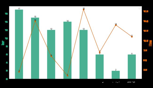
三、折线和柱状组合图
项目代码
class Mat_plus:
    plt.rcParams['font.sans-serif'] = ['SimHei']  # 步骤一(替换sans-serif字体)
    plt.rcParams['axes.unicode_minus'] = False  # 步骤二(解决坐标轴负数的负号显示问题)
    def __init__(self, title, figsize=(32 / 3, 6), colors=cm.Dark2,round_num = 3):
        '''
        title:图表标题
        figsize:图表大小
        colors:配色方案
        round_num:标签小数点个数
        '''
        self.figsize = figsize
        self.colors = colors
        self.title = title
        self.round_num = round_num
    #         pass
    def bars(self, bars, labels = None, only_one_bar=True, xlabel=None, ylabel=None, xticks=None):
        '''
        bars:list 多个或一个柱状图
        labels:和bar对应的标签
        only_one_bar:是否只有一个bar
        xlabel:x轴标签
        ylabel:y轴标签
        xticks:x轴标注
        '''
        plt.figure(figsize=self.figsize)
        if only_one_bar == True:
            x = np.arange(len(bars))
            plt.bar(x, bars,color = self.colors(0),label =labels,width=0.6)
            for i in x:
                plt.text(i,bars[i],round(bars[i],self.round_num),va = 'bottom',ha = 'center')
            plt.grid(ls='-.', alpha=0.7)
        else:
            max_index = np.array([len(i) for i in bars]).max()
            x = np.arange(max_index)
            adjust_dict = {2:([-0.2,0.2],0.35),
                           3:([-0.25,0,0.25],0.21)}
            num_of_bar1 = len(bars)
            for i,bar in enumerate(bars):
                plt.bar(x + adjust_dict[num_of_bar1][0][i], bar, color=self.colors(i), label=labels[i],width=adjust_dict[num_of_bar1][1])
                for j in x:
                    plt.text(j + adjust_dict[num_of_bar1][0][i],bar[j],round(bar[j],self.round_num),ha = 'center',va = 'bottom')
        plt.xticks(x, xticks, fontsize='large')
        plt.title(self.title, fontsize='xx-large', fontweight='bold')
        plt.xlabel(xlabel, fontsize='x-large')
        plt.ylabel(ylabel, fontsize='x-large')
        plt.grid(axis = 'y',ls = '-.',alpha = 0.6)
        plt.legend()
        plt.show()
        plt.savefig(self.title + '.png')
    def plots(self, lines, labels = None, only_one_plot=False, xlabel=None, ylabel=None, xticks=None):
        '''
        lines:list 多个列表或一个列表
        labels:和线条对应的标签
        only_one_plot:是否仅有一个line
        xlabel:x轴标签
        ylabel:y轴标签
        xticks:x轴标注
        '''
        plt.figure(figsize=self.figsize)
        markers = ['o', '*', 'D', 'p', 's', 'h', '4', '5', '6', '7']
        if only_one_plot == False:
            max_index = np.array([len(i) for i in lines]).max()
            x = np.arange(max_index)
            for i, line in enumerate(lines):
                plt.plot(x, line, c=self.colors(i), marker=markers[i], markersize=5, label=labels[i])
                for j in x:
                    plt.text(j, line[j], round(line[j], 3), va='bottom', ha='center')
        else:
            x = np.arange(len(lines))
            plt.plot(x, lines, c=self.colors(0), marker='o', markersize=5, label=labels)
            for j in x:
                plt.text(j, lines[j], round(lines[j], 3), va='bottom', ha='center')
        plt.grid(ls='-.', alpha=0.7)
        plt.xticks(x, xticks, fontsize='large')
        plt.title(self.title, fontsize='xx-large', fontweight='bold')
        plt.xlabel(xlabel, fontsize='x-large')
        plt.ylabel(ylabel, fontsize='x-large')
        plt.legend()
        plt.show()
        plt.savefig(self.title + '.png')
    def bar_plot(self,line,bar,y2_label = None,y1_label = None,xlabel=None, xticks=None):
        '''
        line:线条数据
        bar:柱状数据
        y1_label:bar的label,主坐标轴
        y2_label:line的label,次坐标轴
        xlabel:x轴标签
        xticks:x轴标注
        '''
        plt.figure(figsize=self.figsize)
        x = np.arange(len(bar))
        ax1 = plt.subplot(1,1,1)
        ax1.bar(x,bar,color = self.colors(0),label = bar_label,alpha = 0.8,width = 0.5)
        ax1.set_ylabel(y1_label,color = self.colors(0), fontsize='x-large',fontweight = 'heavy')
        for i in x:
            plt.text(i, bar[i], round(bar[i], self.round_num), va='bottom', ha='center')
        ax1.tick_params(axis='y', labelcolor=self.colors(0))

        ax2 = ax1.twinx()
        ax2.plot(line,c = self.colors(1),label = line_label,marker = 'o')
        ax2.set_ylabel(y2_label,color = self.colors(1), fontsize='x-large')
        ax2.tick_params(axis='y', labelcolor=self.colors(1))
        ax1.set_xlabel(xlabel, fontsize='x-large')
        plt.title(self.title, fontsize='xx-large', weight='heavy')
        for i in x:
            plt.text(i,line[i],round(line[i],self.round_num),va = 'bottom',ha = 'center' )
        plt.legend()
        plt.xticks(x, xticks, fontsize='large')
        plt.show()
        plt.savefig(self.title + '.png')