Python 散点密度图 散点密度图趋势分析 图例位置调整 各参数详解(3)
1.数据下载地址
散点密度图数据:https://download.csdn.net/download/qq_35240689/87006455
import numpy as np
import pandas as pd
import matplotlib.pyplot as plt
from scipy import stats
from scipy.stats import linregress
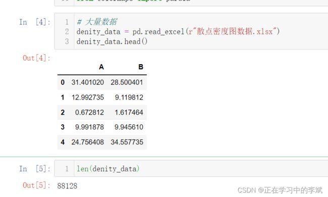
# 大量数据
denity_data = pd.read_excel(r"散点密度图数据.xlsx")
# 数据预处理
x = denity_data["A"]
y = denity_data["B"]
nbins = 150
H, xedges, yedges = np.histogram2d(x, y, bins=nbins)
# H needs to be rotated and flipped
H = np.rot90(H)
H = np.flipud(H)
Hmasked = np.ma.masked_where(H==0,H) # Mask pixels with a value of zero
#开始绘图
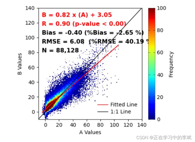
fig,ax = plt.subplots(figsize=(4.5,3.8),dpi=100,facecolor="w")
density_scatter = ax.pcolormesh(xedges, yedges, Hmasked, cmap="jet",vmin=0,vmax=100)
colorbar = fig.colorbar(density_scatter,aspect=17,label="Frequency")
colorbar.ax.tick_params(left=True,direction="in",width=.4,labelsize=10)
colorbar.ax.tick_params(which="minor",right=False)
colorbar.outline.set_linewidth(.4)
# 设置坐标轴区间
ax.set_xlim(-10, 140)
ax.set_ylim(-10, 140)
# 设置坐标轴刻度
ax.set_xticks(ticks=np.arange(0,160,20))
ax.set_yticks(ticks=np.arange(0,160,20))
# 设置坐标轴名称
ax.set_xlabel("A Values")
ax.set_ylabel("B Values")
#添加文本注释信息
#添加文本信息
## Bias (relative Bias), RMSE (relative RMSE), R, slope, intercept, pvalue
Bias = np.mean(x-y)
rBias = (Bias/np.mean(y))*100.0
RMSE = np.sqrt( np.mean((x-y)**2) )
rRMSE = (RMSE/np.mean(y))*100.0
# slope, intercept, r_value, p_value, std_err = stats.linregress(x,y)
slope = linregress(x, y)[0]
intercept = linregress(x, y)[1]
R = linregress(x, y)[2]
Pvalue = linregress(x, y)[3]
N = len(x)
N = "{:,}".format(N)
# 绘制拟合线
lmfit = (slope*x)+intercept
ax.plot(x, lmfit, color='r', linewidth=1,label='Fitted Line')
# 绘制x:y 1:1 线
ax.plot([-10, 140], [-10, 140], color='black',linewidth=1,label="1:1 Line")
# 添加文本信息
# ha 设置文本对齐 left 左居中对齐
fontdict = {"size":11.5,"weight":"bold"}
ax.text(-5,130,"B = %.2f x (A) + %.2f" %(slope,intercept),fontdict=fontdict,color='red',
ha = "left",va="center")
ax.text(-5,118,"R = %.2f (p-value < %.2f)" %(R,Pvalue),fontdict=fontdict,color='red',
ha = "left",va="center")
ax.text(-5,106,"Bias = %.2f (%%Bias = %.2f %%)" %(Bias,rBias),fontdict=fontdict,color='k',
ha = "left",va="center")
ax.text(-5,94,"RMSE = %.2f (%%RMSE = %.2f %%)" %(RMSE,rRMSE),fontdict=fontdict,color='k',
ha = "left",va="center")
ax.text(-5,82,'N = %s' %N,fontdict=fontdict,color='k',
ha = "left",va="center")
ax.legend(loc="lower right",frameon=False,labelspacing=.4,handletextpad=.5,fontsize=10)
# 紧皱布局
plt.tight_layout()
2. 将图例画在里面
import numpy as np
import pandas as pd
import matplotlib.pyplot as plt
from scipy import stats
from scipy.stats import linregress
from mpl_toolkits.axes_grid1.inset_locator import inset_axes
# 大量数据
denity_data = pd.read_excel(r"散点密度图数据.xlsx")
x = denity_data["A"]
y = denity_data["B"]
nbins = 150
H, xedges, yedges = np.histogram2d(x, y, bins=nbins)
# H needs to be rotated and flipped
H = np.rot90(H)
H = np.flipud(H)
# Mask zeros
Hmasked = np.ma.masked_where(H==0,H) # Mask pixels with a value of zero
#开始绘图
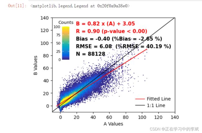
fig,ax = plt.subplots(figsize=(4.8,3.8),dpi=100,facecolor="w")
density_scatter = ax.pcolormesh(xedges, yedges, Hmasked, cmap=parula,
vmin=0, vmax=100)
# colorbar 添加 调整位置 大小
axins = inset_axes(ax,
width="6%",
height="35%",
loc='upper left',
bbox_transform=ax.transAxes,
bbox_to_anchor=(-0.03, 0.05, 1, 1),
borderpad=3)
cbar = fig.colorbar(density_scatter,cax=axins)
#cbar.ax.set_xticks(ticks=np.arange(0,125,25))
# direction 刻度标签指向 内
cbar.ax.tick_params(left=True,labelleft=True,labelright=False,
direction="in",width=.4,labelsize=8,color="w")
cbar.ax.tick_params(which="minor",right=False)
cbar.ax.set_title("Counts",fontsize=9.5)
#cbar.outline.set_linewidth(.4)
# 外边框不显示
cbar.outline.set_visible(False)
ax.set_xlim(-10, 140)
ax.set_ylim(-10, 140)
ax.set_xticks(ticks=np.arange(0,160,20))
ax.set_yticks(ticks=np.arange(0,160,20))
#添加文本信息
## Bias (relative Bias), RMSE (relative RMSE), R, slope, intercept, pvalue
Bias = np.mean(x-y)
rBias = (Bias/np.mean(y))*100.0
RMSE = np.sqrt( np.mean((x-y)**2) )
rRMSE = (RMSE/np.mean(y))*100.0
slope = linregress(x, y)[0]
intercept = linregress(x, y)[1]
R = linregress(x, y)[2]
Pvalue = linregress(x, y)[3]
N = len(x)
lmfit = (slope*x)+intercept
ax.plot(x, lmfit, color='r', linewidth=1,label='Fitted Line')
ax.plot([-10, 140], [-10, 140], color='black',linewidth=1,label="1:1 Line")
# 添加文本信息
fontdict = {"size":11,"weight":"bold"}
ax.text(19,130,"B = %.2f x (A) + %.2f" %(slope,intercept),fontdict=fontdict,color='red',
ha = "left",va="center")
ax.text(19,118,"R = %.2f (p-value < %.2f)" %(R,Pvalue),fontdict=fontdict,color='red',
ha = "left",va="center")
ax.text(19,106,"Bias = %.2f (%%Bias = %.2f %%)" %(Bias,rBias),fontdict=fontdict,color='k',
ha = "left",va="center")
ax.text(19,94,"RMSE = %.2f (%%RMSE = %.2f %%)" %(RMSE,rRMSE),fontdict=fontdict,color='k',
ha = "left",va="center")
ax.text(19,82,'N = %d' %N,fontdict=fontdict,color='k',
ha = "left",va="center")
ax.set_xlabel("A Values")
ax.set_ylabel("B Values")
ax.legend(loc="lower right",frameon=False,labelspacing=.4,handletextpad=.5,fontsize=10)
# plt.tight_layout()
# fig.savefig('散点图_density02.pdf',bbox_inches='tight')
# fig.savefig('散点图_density02.png', bbox_inches='tight',dpi=300)
3. 方式二,不需要自己预处理数据
此时要用 plt.hist2d ,不能用ax
import numpy as np
import pandas as pd
import matplotlib.pyplot as plt
from scipy import stats
from scipy.stats import linregress

denity_data = pd.read_excel(r"散点密度图数据.xlsx")
x = denity_data["A"]
y = denity_data["B"]
nbins = 150
#开始绘图
fig,ax = plt.subplots(figsize=(4.8,3.8),dpi=100,facecolor="w")
plt.hist2d(x=x,y=y,bins=nbins,cmin=0.1, vmax=100)
colorbar = plt.colorbar(aspect=17,label="Frequency")
colorbar.ax.tick_params(left=True,direction="in",width=.4,labelsize=10)
colorbar.ax.tick_params(which="minor",right=False)
colorbar.outline.set_linewidth(.4)

ax.set_xlim(-10, 140)
ax.set_ylim(-10, 140)
ax.set_xticks(ticks=np.arange(0,160,20))
ax.set_yticks(ticks=np.arange(0,160,20))
ax.set_xlabel("A Values")
ax.set_ylabel("B Values")
#添加文本信息
## Bias (relative Bias), RMSE (relative RMSE), R, slope, intercept, pvalue
Bias = np.mean(x-y)
rBias = (Bias/np.mean(y))*100.0
RMSE = np.sqrt( np.mean((x-y)**2) )
rRMSE = (RMSE/np.mean(y))*100.0
slope = linregress(x, y)[0]
intercept = linregress(x, y)[1]
R = linregress(x, y)[2]
Pvalue = linregress(x, y)[3]
N = len(x)
N = "{:,}".format(N)

lmfit = (slope*x)+intercept
ax.plot(x, lmfit, color='r', linewidth=1,label='Fitted Line')
ax.plot([-10, 140], [-10, 140], color='black',linewidth=1,label="1:1 Line")

# 添加文本信息
fontdict = {"size":11.5,"weight":"bold"}
ax.text(-5,130,"B = %.2f x (A) + %.2f" %(slope,intercept),fontdict=fontdict,color='red',
       ha = "left",va="center")
ax.text(-5,118,"R = %.2f (p-value < %.2f)" %(R,Pvalue),fontdict=fontdict,color='red',
       ha = "left",va="center")
ax.text(-5,106,"Bias = %.2f (%%Bias = %.2f %%)" %(Bias,rBias),fontdict=fontdict,color='k',
       ha = "left",va="center")
ax.text(-5,94,"RMSE = %.2f  (%%RMSE = %.2f %%)" %(RMSE,rRMSE),fontdict=fontdict,color='k',
       ha = "left",va="center")
ax.text(-5,82,'N = %s' %N,fontdict=fontdict,color='k',
       ha = "left",va="center")
ax.legend(loc="lower right",frameon=False,labelspacing=.4,handletextpad=.5,fontsize=10)
plt.tight_layout()