我的避难日记-《R:pheatmap》,热图,heatmap,聚类
首先生成测试用的matrix:
library(pheatmap)
test = matrix(rnorm(200), 20, 10)
test[1:10, seq(1, 10, 2)] = test[1:10, seq(1, 10, 2)] + 3
test[11:20, seq(2, 10, 2)] = test[11:20, seq(2, 10, 2)] + 2
test[15:20, seq(2, 10, 2)] = test[15:20, seq(2, 10, 2)] + 4
colnames(test) = paste("Test", 1:10)
rownames(test) = paste("Gene", 1:20, sep = "_")
head(test)
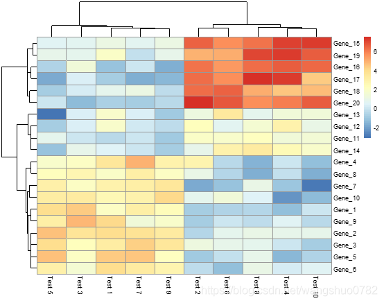
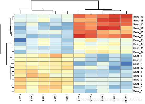
画第一张图
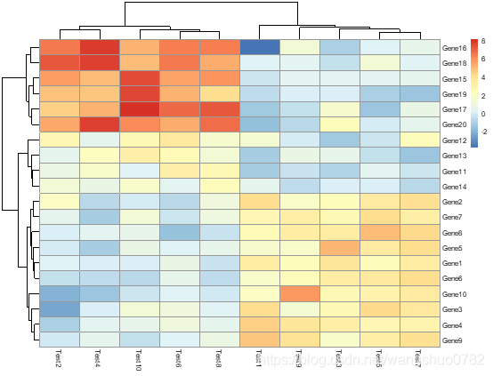
pheatmap(test)
第一个参数
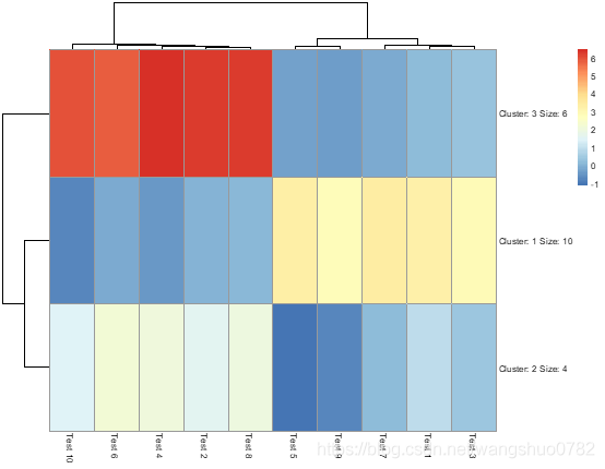
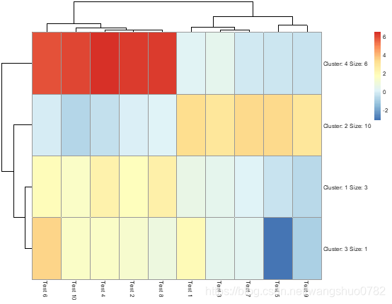
kmeans_k
the number of kmeans clusters to make, if we want to aggregate the rows before drawing heatmap. If NA then the rows are not aggregated.看来这个参数是控制将行合并,
>pheatmap(test, kmeans_k = 3)
>pheatmap(test, kmeans_k = 4)
第二张图中的参数
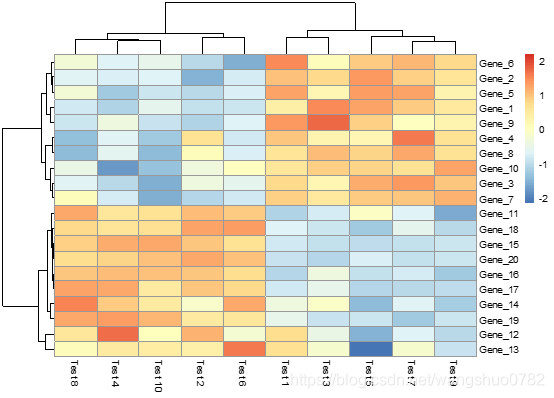
scale
character indicating if the values should be centered and scaled in either the row direction or the column direction, or none. Corresponding values are "row", "column" and "none"
色块的颜色是应该在行方向还是列方向上居中并按比例缩放(应该是归一化)
clustering_distance_rows
distance measure used in clustering rows. Possible values are "correlation" for Pearson correlation and all the distances supported by dist, such as "euclidean", etc. If the value is none of the above it is assumed that a distance matrix is provided.
clustering_distance_cols
distance measure used in clustering columns. Possible values the same as for clustering_distance_rows.
这两个参数指的是聚类距离的计算方式 皮尔逊相关系数是对欧几里德距离的优化?
> pheatmap(test, scale = "row", clustering_distance_rows = "correlation")
按照行归一化色块颜色,并且行的聚类依据是皮尔逊系数
第三张图中的参数
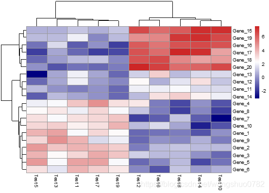
> pheatmap(test, color = colorRampPalette(c("navy", "white", "firebrick3"))(50))
这个配的很好看,color:vector of colors used in heatmap,应该是指的右边的注释条,这个参数的输入格式应该是一个向量
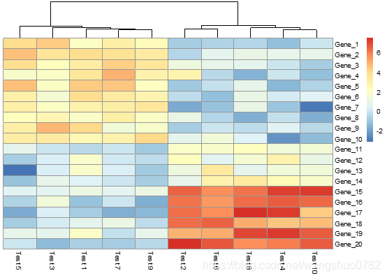
> pheatmap(test, cluster_row = FALSE)
cluster_rows boolean values determining if rows should be clustered or hclust object,
cluster_cols boolean values determining if columns should be clustered or hclust object.
就是说控制行、列的聚类有无
> pheatmap(test, legend = FALSE) -- logical to determine if legend should be drawn or not.
# Show text within cells
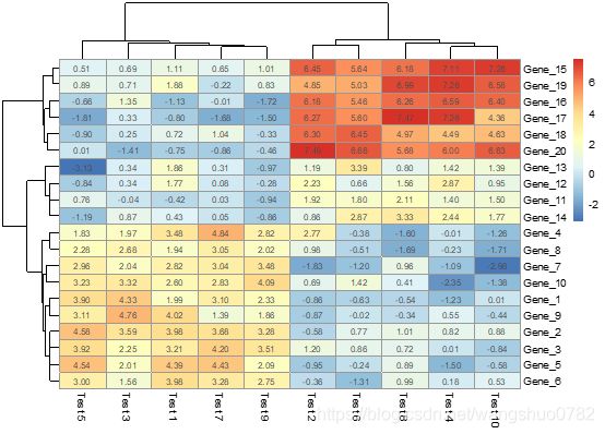
pheatmap(test, display_numbers = TRUE)
pheatmap(test, display_numbers = TRUE, number_format = "\%.1e")
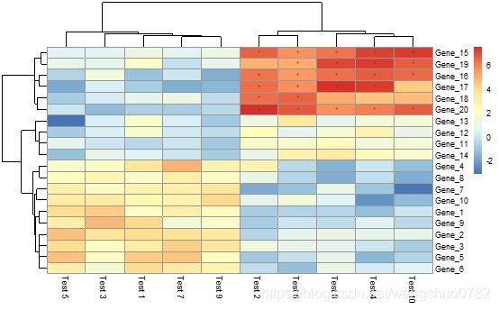
pheatmap(test, display_numbers = matrix(ifelse(test > 5, "*", ""), nrow(test)))
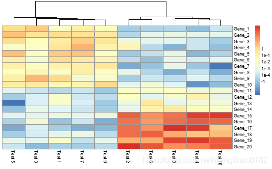
pheatmap(test, cluster_row = FALSE, legend_breaks = -1:4, legend_labels = c("0","1e-4", "1e-3", "1e-2", "1e-1", "1"))
> pheatmap(test, display_numbers = TRUE)
logical determining if the numeric values are also printed to the cells. If this is a matrix (with same dimensions as original matrix), the contents of the matrix are shown instead of original values.
输入值是逻辑值则控制色块内部是否显示数值,如果是输入一个矩阵,那么可以显示矩阵的信息,但是必须有与原矩阵一致的维度
> pheatmap(test, display_numbers = TRUE, number_format = "\%.1e")
format strings (C printf style) of the numbers shown in cells. For example "%.2f" shows 2 decimal places and "%.1e" shows exponential notation (see more in sprintf).
控制表格内部数字的显示格式,是小数点后两位还是科学计数法
pheatmap(test, display_numbers = matrix(ifelse(test > 5, "*", ""), nrow(test)))
matrix(ifelse(test > 5, "*", ""), nrow(test))构建的新矩阵,其实他的代码我没看懂,我根据自己的理解> pheatmap(test, display_numbers = ifelse(test > 5, "*", "")),因为
>ifelse(test > 5, "*", "")的输出结果就是矩阵的形式,可以作为display_numbers的input.
> pheatmap(test, cluster_row = FALSE, legend_breaks = -1:4, legend_labels = c("0","1e-4", "1e-3", "1e-2", "1e-1", "1"))
legend_breaks:vector of breakpoints for the legend.
legend_labels :vector of labels for the legend_breaks—对色度注释进行操作,好像没什么意思。。。。
Lengths of legend_breaks and legend_labels must be the same
# Fix cell sizes and save to file with correct size 好像是没啥用
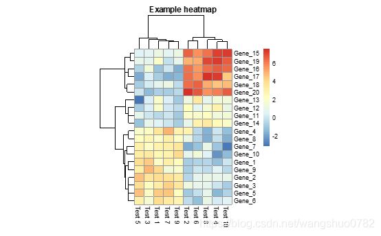
>pheatmap(test, cellwidth = 15, cellheight = 12, main = "Example heatmap")
cellwidth :individual cell width in points. If left as NA, then the values depend on the size of plotting window.
Cellheig:individual cell height in points. If left as NA, then the values depend on the size of plotting window.
Cell的尺寸,如果不指定那么将根据画板的大小进行自适应。
Main:the title of the plot
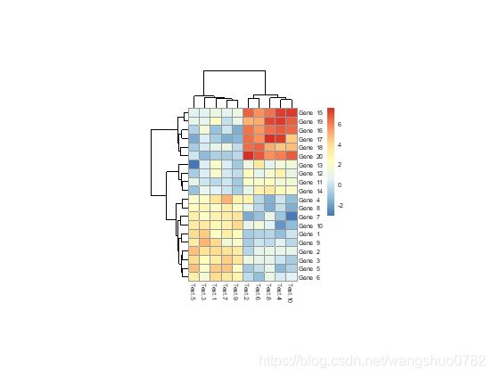
>pheatmap(test, cellwidth = 15, cellheight = 12, fontsize = 8, filename = "test.pdf")
Fontsize:base fontsize for the plot
filename:file path where to save the picture. Filetype is decided by the extension in the path. Currently following formats are supported: png, pdf, tiff, bmp, jpeg. Even if the plot does not fit into the plotting window, the file size is calculated so that the plot would fit there, unless specified otherwise.
保存图片的文件路径。 文件类型由路径中的扩展名决定。 当前支持以下格式:png,pdf,tiff,bmp,jpeg。 除非另有说明,否则即使绘图不适合绘图窗口,也会计算文件大小,以使绘图适合此处。
# Generate annotations for rows and columns
annotation_col = data.frame( CellType = factor(rep(c("CT1", "CT2"), 5)), Time = 1:5)
rownames(annotation_col) = paste("Test", 1:10, sep = "")
annotation_row = data.frame( GeneClass = factor(rep(c("Path1", "Path2", "Path3"), c(10, 4, 6))))
rownames(annotation_row) = paste("Gene", 1:20, sep = "")
# Display row and color annotations
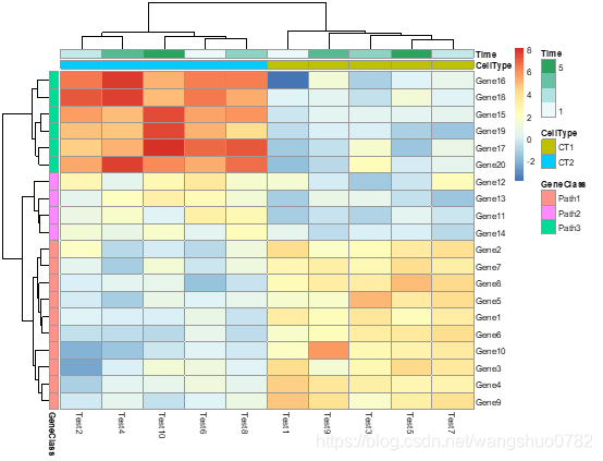
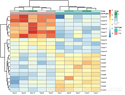
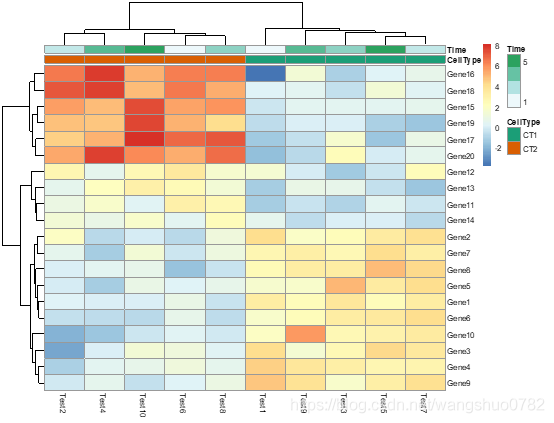
pheatmap(test, annotation_col = annotation_col)
pheatmap(test, annotation_col = annotation_col, annotation_legend = FALSE)
pheatmap(test, annotation_col = annotation_col, annotation_row = annotation_row)
构建注释数据框,名称要一致
annotation_row
data frame that specifies the annotations shown on left side of the heatmap. Each row defines the features for a specific row. The rows in the data and in the annotation are matched using corresponding row names. Note that color schemes takes into account if variable is continuous or discrete.
annotation_col
similar to annotation_row, but for columns.
# Change angle of text in the columns
pheatmap(test, annotation_col = annotation_col, annotation_row = annotation_row, angle_col = "45")
pheatmap(test, annotation_col = annotation_col, angle_col = "0")
angle_col:angle of the column labels, right now one can choose only from few predefined options (0, 45, 90, 270 and 315)
# Specify colors
ann_colors = list(
Time = c("white", "firebrick"),
CellType = c(CT1 = "#1B9E77", CT2 = "#D95F02"),
GeneClass = c(Path1 = "#7570B3", Path2 = "#E7298A", Path3 = "#66A61E")
)
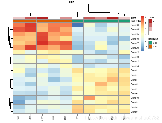
pheatmap(test, annotation_col = annotation_col, annotation_colors = ann_colors, main = "Title")
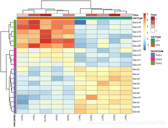
pheatmap(test, annotation_col = annotation_col, annotation_row = annotation_row,
annotation_colors = ann_colors)
pheatmap(test, annotation_col = annotation_col, annotation_colors = ann_colors[2])
annotation_colors 注释用的颜色
list for specifying annotation_row and annotation_col track colors manually. It is possible to define the colors for only some of the features. Check examples for details.
注意输入的值是list,可以指定某一个特定注释特征的颜色,比如第三个例子。首先构建了一个list的对象,一共有三个注释Time、CellType、GeneClass,每个注释有不同的level,有几个level就需要设定几种颜色,之后指定annotation_colors的值就行。
# Show custom strings as row/col names
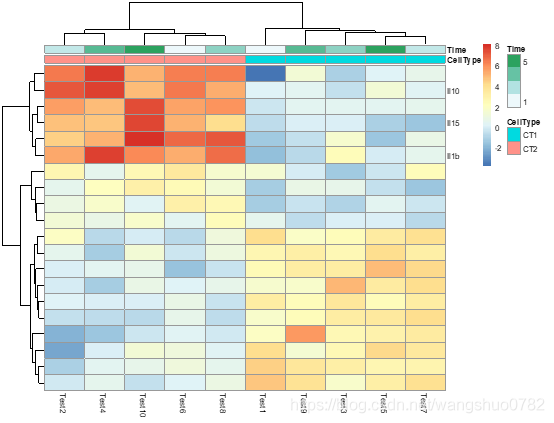
labels_row = c("", "", "", "", "", "", "", "", "", "", "", "", "", "", "",
"", "", "Il10", "Il15", "Il1b")
pheatmap(test, annotation_col = annotation_col, labels_row = labels_row)
labels_row
custom labels for rows that are used instead of rownames.
labels_col
similar to labels_row, but for columns.
可以理解为不使用行列名,我们自己指定每一列行的名字label
# Specifying clustering from distance matrix
drows = dist(test, m(ethod = "minkowski"))
dcols = dist(t(test), method = "minkowski")
pheatmap(test, clustering_distance_rows = drows, clustering_distance_cols = dcols)
自行计算行列的聚类值
调用dist()
This function computes and returns the distance matrix computed by using the specified distance measure to compute the distances between the rows of a data matrix.
计算矩阵行之间的数值距离,对于列之间的数值距离,巧妙的调用了t()转置函数
# Modify ordering of the clusters using clustering callback option
callback = function(hc, mat){
sv = svd(t(mat))$v[,1]
dend = reorder(as.dendrogram(hc), wts = sv)
as.hclust(dend)
}
pheatmap(test, clustering_callback = callback)
clustering_callback
callback function to modify the clustering.
Is called with two parameters: original hclust object and the matrix used for clustering. Must return a hclust object.
应该是一种修正聚类结果的参数,可能是聚类结果更为可信
