【机器学习】基础入门(1) 逻辑回归及代码实现
机器学习入门(1) 逻辑回归
- 1 逻辑回归原理
- 2 demo实践
-
- 2.1 库函数导入
- 2.2 模型训练
- 2.3 查看模型参数
- 2.4 数据可视化
- 2.5 模型预测
- 3 逻辑回归分类实践(基于鸢尾花数据集)
-
- 3.1 数据载入与查看
- 3.2 数据可视化
- 3.3 二分类任务预测
- 3.4 三分类(多分类)任务预测
- 了解逻辑回归的理论
- 掌握逻辑回归的sklearn函数调用使用,并将其运用到鸢尾花数据集预测
1 逻辑回归原理
标记两篇写的很好的博文
- 逻辑回归原理详解
- 机器学习算法(一):逻辑回归模型(Logistic Regression, LR)
2 demo实践
下面用一个简单的demo来初步介绍逻辑回归的实践方式。
2.1 库函数导入
import numpy as np

# 导入两个画图库
import matplotlib.pyplot as plt
import seaborn as sns

# 导入逻辑回归函数
from sklearn.linear_model import LogisticRegression
sklearn(Scikit-learn)是机器学习中常用的第三方模块,对常用的机器学习方法进行了封装,包括回归(Regression)、降维(Dimensionality Reduction)、分类(Classfication)、聚类(Clustering)等方法- 具体使用可查阅sklearn中文官方文档
2.2 模型训练
# 构建一组简单的数据集
x = np.array([[-1, -2], [-2, -1], [-3, -2], [1, 3], [2, 1], [3, 2]])
y = np.array([0, 0, 0, 1, 1, 1])
input_data

# 用逻辑回归模型拟合构造的数据集
lr = LogisticRegression()
lr = lr.fit(x, y) #拟合方程为 y=w0+w1*x1+w2*x2
2.3 查看模型参数
#查看模型的权值 w1,w2
print('逻辑回归模型的权值:',lr.coef_)
##打印模型的w0 (截距)
print('逻辑回归模型的截距(w0) :',lr.intercept_)
![]()
2.4 数据可视化
利用matplotlib.pyplot进行简单的数据可视化
# 可视化构建的数据集
plt.figure()
# 散点图
plt.scatter(x[:,0],x[:,1], c=y, s=50, cmap='viridis')
plt.title('Dataset')
plt.show()

# 可视化决策边界
plt.figure()
plt.scatter(x[:,0],x[:,1], c=y, s=50, cmap='viridis')
plt.title('Dataset')
nx, ny = 200,100
x_min, x_max = plt.xlim()#提取上面图片的X轴大小
y_min, y_max = plt.ylim()#提取上面图片的y轴大小
x_grid, y_grid = np.meshgrid(np.linspace(x_min, x_max, nx),np.linspace(y_min, y_max, ny))
# np.linspace() 返回等间隔的样本共nx个
# np.meshgrid() 生成网格点坐标矩阵
z_proba = lr.predict_proba(np.c_[x_grid.ravel(), y_grid.ravel()])
# ravel()将数据变为一维数组
# predict_proba 返回一个数组,第i行第j列上的数值是模型预测第i个预测样本为某个标签的概率,并且每一行的概率和为1。
z_proba = z_proba[:, 1].reshape(x_grid.shape)
plt.contour(x_grid, y_grid, z_proba, [0.5], linewidths=2., colors='blue')
# contour()对网格中每个点的值等于一系列值的时候做出一条条轮廓线
plt.show()

分类器将决策边界一侧的所有点分类为属于一个类,而将另一侧的所有点分类为属于另一个类。
上述代码(难懂 )主要完成以下几步操作:
- 将数据散点图的x,y轴等距离分为nx,ny份,并构建网格点坐标矩阵。这里的nx,ny值相比于数据很大,即生成了间距很小的网络来覆盖构造的数据集中的点。
- 将稠密的网格数据点输入LR模型中,分别得到每个点的概率值
- 以概率为0.5作为轮廓线进行分割,即结果图中由蓝色的点所构成的直线,并可依次进行分类。
另外记录两个不熟悉的函数:
-
linspace()一般用来创建等差数列,在start和stop之间返回均匀间隔的数据
numpy.linspace(start, stop, num, endpoint, retstep, dtype, axis)start:返回样本数据开始点
stop:返回样本数据结束点
num:生成的样本数据量,默认为50
endpoint:True则包含stop;False则不包含stop
retstep:If True, return (samples, step), where step is the spacing between samples.(即如果为True则结果会给出数据间隔)
dtype:输出数组类型
axis:0(默认)或-1 -
contour()对网格中每个点的值等于一系列值的时候做出一条条轮廓线,相当于等高线
contour([X, Y,] Z, [levels], ** kwargs)- X,Y : array-like,可选值Z的坐标。
X和Y必须都是2-D,且形状与Z相同,或者它们必须都是1-d,这样X的长度 M是Z中的列数,Y的长度N是Z中的行数。 - Z : array-like(N,M)绘制轮廓的高度值。
- levels: int或类似数组,可选
- X,Y : array-like,可选值Z的坐标。
2.5 模型预测
# 新建两个样本点x_new1,x_new2用来预测
x_new1 = np.array([[0, -1]])
x_new2 = np.array([[1, 2]])

# 利用训练好的lr模型进行预测
y_predict1=lr.predict(x_new1)
y_predict2=lr.predict(x_new2)
print('新节点1的分类为:\n',y_predict1)
print('新节点1的分类为:\n',y_predict2)

# 逻辑回归模型实际是概率预测模型,所以我们可以利用predict_proba函数预测其概率
y_predict1_proba=lr.predict_proba(x_new1)
y_predict2_proba=lr.predict_proba(x_new2)
print('新节点1属于0/1类的概率为:\n',y_predict1_proba)
print('新节点1属于0/1类的概率为:\n',y_predict2_proba)

3 逻辑回归分类实践(基于鸢尾花数据集)
3.1 数据载入与查看
鸢尾花数据集(iris)一共包含5个变量,其中4个特征变量,1个目标分类变量,共有150个样本。
# 使用sklearn中自带的iris数据集进行实践
from sklearn.datasets import load_iris
data = load_iris()
iris_target = data.target #得到数据分类标签
iris_features = pd.DataFrame(data=data.data, columns=data.feature_names) #转化为DataFrame格式
print(iris_features.info()) # 查看特征数据整体信息
print(iris_describe()) # 查看特征数据的统计信息


3.2 数据可视化
# 合并标签和特征信息
iris_all = iris_features.copy() # 进行浅拷贝,防止对于原始数据的修改
iris_all['target'] = iris_target
-
(插一句)记录一个
直接赋值 浅拷贝 深度拷贝对比:通过一个例子来直观的说明一下
import copy
a = [1, 2, 3, 4, ['a', 'b']] #原始对象

b = a                       #赋值,传对象的引用
c = a.copy()                #对象拷贝,浅拷贝
d = copy.deepcopy(a)        #对象拷贝,深拷贝

a.append(5)                 #修改对象a
a[4].append('c')            #修改对象a中的['a', 'b']数组对象

print( 'a = ', a )  # (a =  [1, 2, 3, 4, ['a', 'b', 'c'], 5])
print( 'b = ', b )  # (b =  [1, 2, 3, 4, ['a', 'b', 'c'], 5])
print( 'c = ', c )  # (c =  [1, 2, 3, 4, ['a', 'b', 'c']])
print( 'd = ', d )  # (d =  [1, 2, 3, 4, ['a', 'b']])
# c是a的浅拷贝,只要a里面没有对象(比如列表这种)那么对a的修改不会影响c
- 直接赋值:其实就是对象的引用(别名)
- 浅拷贝(copy):拷贝父对象,不会拷贝对象的内部的子对象。
- 深拷贝(deepcopy): copy 模块的 deepcopy 方法,完全拷贝了父对象及其子对象。
# 特征与标签组合的散点可视化
sns.pairplot(data=iris_all,diag_kind='hist', hue= 'target')
plt.show()
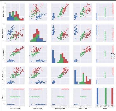
从结果图中可以看到对角线上是各个属性的直方图(分布图),而非对角线上是两个不同属性之间的相关图。
从图中我们发现,花瓣的长度和宽度之间以及萼片的长短和花瓣的长、宽之间具有比较明显的相关关系。
记录一个sns.pairplot() :
Seaborn是基于matplotlib的Python可视化库。它提供了一个高级界面来绘制有吸引力的统计图形。Seaborn其实是在matplotlib的基础上进行了更高级的API封装,从而使得作图更加容易,不需要经过大量的调整就能使你的图变得精致。
pairplot中pair是成对的意思,pairplot主要展现的是变量两两之间的关系(线性或非线性,有无较为明显的相关关系)
kind:用于控制非对角线上的图的类型,可选"scatter"(散点图)与"reg" (散点图拟合出一条回归直线)diag_kind:控制对角线上的图的类型,可选"hist"与"kde"hue:针对某一字段进行分类palette:控制色调markers:控制散点的样式vars,x_vars,y_vars:选择数据中的特定字段,以list形式传入
# 绘制特征信息的箱线图
for col in iris_features.columns:
    sns.boxplot(x='target', y=col, saturation=0.5,palette='pastel', data=iris_all)
    plt.title(col)
plt.show()
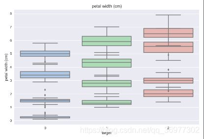
利用箱型图我们也可以得到不同类别在不同特征上的分布差异情况
# 选取其前三个特征绘制三维散点图
from mpl_toolkits.mplot3d import Axes3D

fig = plt.figure(figsize=(10,8))
ax = fig.add_subplot(111, projection='3d')

iris_all_class0 = iris_all[iris_all['target']==0].values
iris_all_class1 = iris_all[iris_all['target']==1].values
iris_all_class2 = iris_all[iris_all['target']==2].values
##'setosa'(0), 'versicolor'(1), 'virginica'(2)
ax.scatter(iris_all_class0[:,0], iris_all_class0[:,1], iris_all_class0[:,2],label='setosa')
ax.scatter(iris_all_class1[:,0], iris_all_class1[:,1], iris_all_class1[:,2],label='versicolor')
ax.scatter(iris_all_class2[:,0], iris_all_class2[:,1], iris_all_class2[:,2],label='virginica')
plt.legend()
plt.show()

3.3 二分类任务预测
# 为了正确评估模型性能,将数据划分为训练集和测试集
from sklearn.model_selection import train_test_split
# 进行二分类任务,选择其类别为0和1的样本(不包括类别为2的样本)
iris_features_part=iris_features.iloc[:100]
iris_target_part=iris_target[:100]

# 将数据划分为80%训练集,20%测试集
x_train,x_test,y_train,y_test=train_test_split(iris_features_part,iris_target_part,test_size=0.2,random_state=2020)

# 逻辑回归模型
from sklearn.linear_model import LogisticRegression
clf=LogisticRegression(random_state=0, solver='lbfgs')
# solver参数表示逻辑回归损失函数的优化方法
# lbfgs:拟牛顿法的一种,利用损失函数二阶导数矩阵即海森矩阵来迭代优化损失函数

# 在训练集上训练逻辑回归模型
clf.fit(x_train,y_train)

# 打印训练得到的模型参数w1,w2  w0
print('the weight of Logistic Regression:',clf.coef_)  # [[ 0.45181973 -0.81743611  2.14470304  0.89838607]]
print('the intercept(w0) of Logistic Regression:',clf.intercept_) # [-6.53367714]
# 在训练集和测试集上利用训练好的模型进行预测
train_predict=clf.predict(x_train)
test_predict=clf.predict(x_test)

# 评估模型效果

# 1.利用accuracy_score表示“预测正确的样本数目占总预测样本数目的比例”
from sklearn import metrics
print('The accuracy of the Logistic Regression is:',metrics.accuracy_score(y_train,train_predict))
print('The accuracy of the Logistic Regression is:',metrics.accuracy_score(y_test,test_predict))

# 2.查看混淆矩阵(预测值和真实值的各类情况统计矩阵)
confusion_matrix_result=metrics.confusion_matrix(test_predict,y_test)
print('The confusion matrix result:\n',confusion_matrix_result)
-
The accuracy of the Logistic Regression is: 1.0
The accuracy of the Logistic Regression is: 1.0 -
The confusion matrix result:
[[ 9 0]
[ 0 11]]
由上述两种测试方法:accuracy_score准确率,confusion_matrix混淆矩阵结果可得,训练所得到的逻辑回归模型在二分类上表现效果非常好,所有样本都被准确预测了。
3.4 三分类(多分类)任务预测
基本操作方法与二分类相同,具体如下:
# 训练集/测试集依然为80%/20%分
x_train,x_test,y_train,y_test=train_test_split(iris_features,iris_target,test_size=0.2,random_state=2020)

# 训练逻辑回归模型
clf=LogisticRegression(random_state=0,solver='lbfgs')
clf.fit(x_train,y_train)
print('the weight of Logistic Regression:\n',clf.coef_)
print('the intercept(w0) of Logistic Regression:\n',clf.intercept_)
the weight of Logistic Regression:
[[-0.43476516 0.88611834 -2.18912786 -0.94014751]
[-0.38565072 -2.66413298 0.75758301 -1.38261087]
[-0.00811281 0.11312037 2.52971372 2.35084911]]
the intercept(w0) of Logistic Regression:
[ 6.26404984 8.32611826 -16.63593196]
由于此任务是3分类任务,所以我们再这里得到了三个逻辑回归模型的参数,组合起来即可实现三分类
# 在训练集和测试集上进行预测
train_predict=clf.predict(x_train)
test_predict=clf.predict(x_test)

train_predict_proba=clf.predict_proba(x_train)
test_predict_proba=clf.predict_proba(x_test)

print('The test predict Probability of each class:\n',test_predict_proba)
所得结果如下,其中第一列代表预测为0类的概率,第二列代表预测为1类的概率,第三列代表预测为2类的概率。
- The test predict Probability of each class:
[[1.34629657e-04 2.39439258e-01 7.60426112e-01]
[6.97709974e-01 3.02286872e-01 3.15488105e-06]
[3.37911357e-02 7.25748311e-01 2.40460553e-01]
[5.66045749e-03 6.54606650e-01 3.39732893e-01]
[1.07001604e-02 6.73571458e-01 3.15728381e-01]
[8.97257212e-04 6.64944383e-01 3.34158360e-01]
[4.09569374e-04 3.85867863e-01 6.13722567e-01]
[1.25656705e-01 8.70776967e-01 3.56632803e-03]
[8.72513103e-01 1.27468517e-01 1.83801129e-05]
[9.08521668e-01 9.14693374e-02 8.99499116e-06]
[3.90118125e-04 3.06201906e-01 6.93407976e-01]
[6.24601292e-03 7.19030139e-01 2.74723848e-01]
[8.87240986e-01 1.12754805e-01 4.20834569e-06]
[2.33796289e-03 4.47048931e-01 5.50613106e-01]
[8.66660871e-04 4.21991280e-01 5.77142059e-01]
[9.22534832e-01 7.74607080e-02 4.45953703e-06]
[1.99868815e-02 9.35481190e-01 4.45319280e-02]
[1.72044043e-02 5.07825694e-01 4.74969902e-01]
[1.86212027e-04 3.16418321e-01 6.83395467e-01]
[5.65903417e-01 4.34094203e-01 2.37989840e-06]
[8.21399340e-01 1.78597706e-01 2.95421913e-06]
[3.06252963e-04 5.16365479e-01 4.83328269e-01]
[4.75225481e-03 2.88747924e-01 7.06499822e-01]
[8.57382205e-01 1.42610982e-01 6.81310902e-06]
[7.08084953e-04 2.47280583e-01 7.52011332e-01]
[5.32353599e-02 8.32113047e-01 1.14651593e-01]
[2.37306175e-02 3.53509337e-01 6.22760046e-01]
[1.64496053e-03 3.48529962e-01 6.49825077e-01]
[7.66906190e-01 2.33089366e-01 4.44392922e-06]
[9.29325598e-01 7.06550525e-02 1.93496160e-05]]
# 模型效果评估
# 1.利用accuracy_score表示“预测正确的样本数目占总预测样本数目的比例”
print('The accuracy of the Logistic Regression is:',metrics.accuracy_score(y_train,train_predict))
print('The accuracy of the Logistic Regression is:',metrics.accuracy_score(y_test,test_predict))

# 2.查看混淆矩阵(预测值和真实值的各类情况统计矩阵)
confusion_matrix_result=metrics.confusion_matrix(test_predict,y_test)
print('The confusion matrix result:\n',confusion_matrix_result)
-
模型效果评估结果如下:
The accuracy of the Logistic Regression is: 0.9583333333333334
The accuracy of the Logistic Regression is: 0.8The confusion matrix result:
[[10 0 0]
[ 0 7 3]
[ 0 3 7]]

用热力图对于结果进行可视化能更直观的看出模型预测效果。
2020.08.20
TBC…