绘制决策曲线decision curve analysis(DCA)
Decision curve analysis-DCA 论文
《Decision Curve Analysis: A Novel Method for Evaluating Prediction Models》
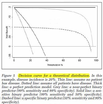
y轴是计算出的收益
x轴是取不同的概率Pt的值
通过不断变换Pt阈值,计算对应的收益值
横直线和点虚线分别为全手术or全不手术的时候对应的收益。如果绘制的DCA曲线高于这两条曲线,则模型是有价值的
绘制步骤
1. Chose a value for pt.
2. Calculate the number of true- and false-positive results using pt as the cut-point for determining a positive or negative result.
3. Calculate the net benefit of the prediction model.
4. Vary pt over an appropriate range and repeat steps 2 and 3.
5. Plot net benefit on the y-axis against pt on the x-axis.
6. Repeat steps 1 through 5 for each model under consideration.
7. Repeat steps 1 through 5 for the strategy of assuming all patients are positive.
8. Draw a straight line parallel to the x-axis at y = 0 representing the net benefit associated with the strategy of assuming that all patients are negative.
理想条件:
例子:
黑实线比较好
R中安装决策曲线工具包
因为R版本问题decisionCurve工具包已经不能直接安装
原网页百度快照:
http://cache.baiducontent.com/c?m=9f65cb4a8c8507ed4fece7631047973545438014688c8d443f93db5f93130b015a23b4eb3a6043558a96293040b23f0bbbab77296a5f51f0db8cdf5786e7c47f659f27432a5ad91f069644ef9d4965d620e118bafe40b4efa72593df84848e0f12910e596d8180da1d40509d&p=8b2a971286cc4afd18fbd13416&newp=8b2a975986cc4afa01b9e62c5f53d83348029f3460c8914212d4984e98700d1a2a22b4fb66794d58dcc17b6c04ab4856eaf630723d072ab09ec88b4fc9fdff6978ca28632c4a9a&user=baidu&fm=sc&query=R+pacage+DecisionCurve&qid=d334a02600075234&p1=3
采用github安装
github说明页面 https://github.com/mdbrown/rmda
教程 https://mdbrown.github.io/rmda/
非常详细的步骤教学 还有画出来的图的展示
在r环境中输入如下语句进行安装
install.packages("rmda")
install.packages("devtools")
library(devtools)
install_github("mdbrown/DecisionCurve")
查看帮助文档
help(decisionCurve)
example(decisionCurve)
Plot the net benefit curves from a decision_curve object or many decision_curve objects
Description
Plot the net benefit curves from a decision_curve object or many decision_curve objects
Usage
plot_decision_curve(x, curve.names, cost.benefit.axis = TRUE,
n.cost.benefits = 6, cost.benefits, standardize = TRUE,
confidence.intervals, col, lty, lwd = 2, xlim, ylim, xlab, ylab,
cost.benefit.xlab, legend.position = c("topright", "right", "bottomright",
"bottom", "bottomleft", "left", "topleft", "top", "none"), ...)
Arguments
x
'decision_curve' object to plot or a list of 'decision_curve' objects. Assumes output from function 'decision_curve'
curve.names
vector of names to use when plotting legends.
cost.benefit.axis
logical (default TRUE) indicating whether to print an additional x-axis showing relative cost:benefit ratios in addition to risk thresholds.
n.cost.benefits
number of cost:benefit ratios to print if cost.benefit.axis = TRUE (default n.cost.benefit = 6).
cost.benefits
Character vector of the form c("c1:b1", "c2:b2", ..., "cn:bn") with integers ci, bi corresponding to specific cost:benefit ratios to print. Default allows the function to calculate these automatically.
standardize
logical (default TRUE) indicating whether to use the standardized net benefit (NB/disease prevalence) or not.
confidence.intervals
logical indicating whether to plot confidence intervals.
col
vector of color names to be used in plotting corresponding to the 'predictors' given. Default colors will be chosen from rainbow(..., v = .8). See details for more information on plot parameters.
lty
vector of linetypes.
lwd
vector of linewidths.
xlim
vector giving c(min, max) of x-axis. Defaults to c(min(thresholds), max(thresholds)).
ylim
vector giving c(min, max) of y-axis.
xlab
label of main x-axis.
ylab
label of y-axis.
cost.benefit.xlab
label of cost:benefit ratio axis.
legend.position
character vector giving position of legend. Options are "topright" (default), "right", "bottomright", "bottom", "bottomleft", "left", "topleft", "top", or "none".
...
other options directly send to plot()
Details
When k decision_curve objects are input, the first k elements of col, lty, lwd ... correspond to the curves provided. The next two elements (..., k+1, k+2) correspond to the attributes of the 'all' and 'none' curves. See below for an example.
Examples
data(dcaData)
set.seed(123)
baseline.model <- decision_curve(Cancer~Age + Female + Smokes,
data = dcaData,
thresholds = seq(0, .4, by = .005),
bootstraps = 10)
#plot using the defaults
plot_decision_curve(baseline.model, curve.names = "baseline model")
set.seed(123)
full.model <- decision_curve(Cancer~Age + Female + Smokes + Marker1 + Marker2,
data = dcaData,
thresholds = seq(0, .4, by = .005),
bootstraps = 10)
# for lwd, the first two positions correspond to the decision curves, then 'all' and 'none'
plot_decision_curve( list(baseline.model, full.model),
curve.names = c("Baseline model", "Full model"),
col = c("blue", "red"),
lty = c(1,2),
lwd = c(3,2, 2, 1),
legend.position = "bottomright")
plot_decision_curve( list(baseline.model, full.model),
curve.names = c("Baseline model", "Full model"),
col = c("blue", "red"),
confidence.intervals = FALSE, #remove confidence intervals
cost.benefit.axis = FALSE, #remove cost benefit axis
legend.position = "none") #remove the legend
#Set specific cost:benefit ratios.
plot_decision_curve( list(baseline.model, full.model),
curve.names = c("Baseline model", "Full model"),
col = c("blue", "red"),
cost.benefits = c("1:1000", "1:4", "1:9", "2:3", "1:3"),
legend.position = "bottomright")
#Plot net benefit instead of standardize net benefit.
plot_decision_curve( list(baseline.model, full.model),
curve.names = c("Baseline model", "Full model"),
col = c("blue", "red"),
ylim = c(-0.05, 0.15), #set ylim
lty = c(2,1),
standardize = FALSE, #plot Net benefit instead of standardized net benefit
legend.position = "topright")


