matplotlib pyplot 教程
Last updated: 2022-09-23, 13:55
简介
matplotlib.pyplot 包含一系列类似 MATLAB 的绘图函数。每个 pyplot 函数对 figure 进行一些修改,如创建 figure,在 figure 中创建 plot,在 plot 中添加线段、标签等。
matplotlib.pyplot 在不同函数调用之间维持状态不变,记录当前 figure 和绘图区域等信息,以及对当前 axes 进行操作的绘图函数。
pyplot 主要用于交互式绘图以及较为简单的绘图,对复杂的绘图,还是建议面向对象 API。且
pyplot的大部分函数Axes对象也有。
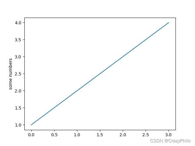
使用 pyplot 生成 figure 很快:
import matplotlib.pyplot as plt

plt.plot([1, 2, 3, 4])
plt.ylabel('some numbers')
plt.show()
如果只为 plot() 函数提供单个列表或数组,matplotlib 默认其为 y 值,并以索引作为 x 值,所以此处 x 为 [0, 1, 2, 3]。
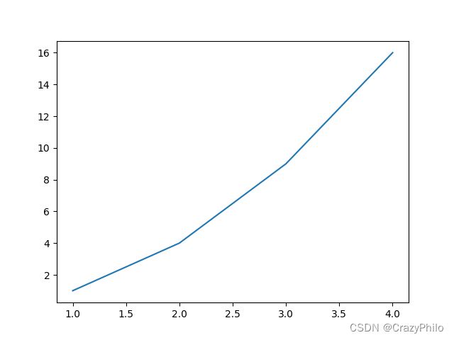
plot() 是一个多功能函数,可以使用多个参数。例如:
plt.plot([1, 2, 3, 4], [1, 4, 9, 16])
样式设置
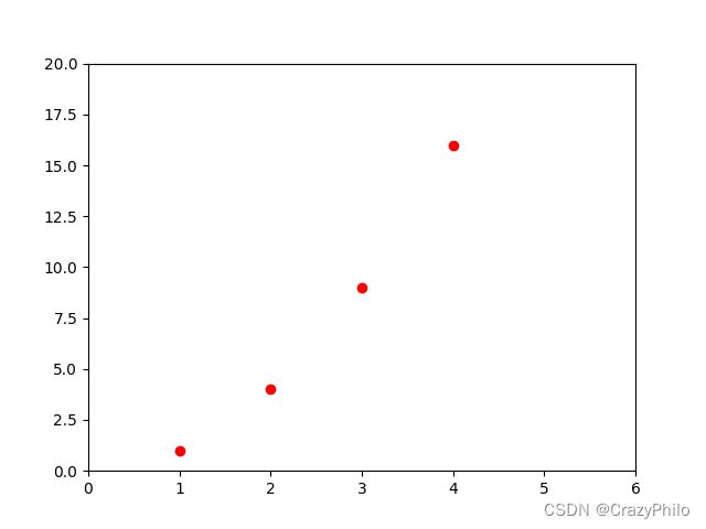
对每个 x, y 参数对,都有第三个可选的格式字符串,用于设置线条类型和颜色。格式字符串来自 MATLAB,可以将颜色和线条样式串一起。默认格式化字符串为 'b-',表示蓝色实线。例如,下面绘制红色圆圈:
plt.plot([1, 2, 3, 4], [1, 4, 9, 16], 'ro')
plt.axis([0, 6, 0, 20])
plt.show()
.axis() 用于指定坐标轴范围,格式为 [xmin, xmax, ymin, ymax]。
matplotlib 内部使用 numpy 存储数据,提供的其它类型数据在内部也被转换为 ndarray。
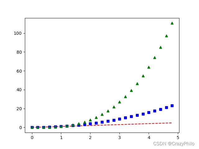
下面使用一个命令绘制多条不同样式的线条:
import numpy as np

# evenly sampled time at 200ms intervals
t = np.arange(0., 5., 0.2)

# red dashes, blue squares and green triangles
plt.plot(t, t, 'r--', t, t**2, 'bs', t, t**3, 'g^')
plt.show()
np.arange(start, end, step) 生成一个 ndarray,然后使用 plot() 函数绘制 y = x y=x y=x, y = x 2 y=x^2 y=x2, y = x 3 y=x^3 y=x3。
‘r–’ 对应红色虚线,‘bs’ 对应红色方块,‘g^’ 对应绿色三角。
关键字参数
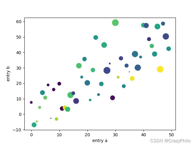
有些数据类型可以通过变量名称访问数据,如 numpy.recarray 和 pandas.DataFrame。
Matplotlib 允许通过 data 关键字参数提供这类数据,然后使用变量名称指定绘图数据。
data = {'a': np.arange(50),
        'c': np.random.randint(0, 50, 50),
        'd': np.random.randn(50)}
data['b'] = data['a'] + 10 * np.random.randn(50)
data['d'] = np.abs(data['d']) * 100

plt.scatter('a', 'b', c='c', s='d', data=data)
plt.xlabel('entry a')
plt.ylabel('entry b')
plt.show()
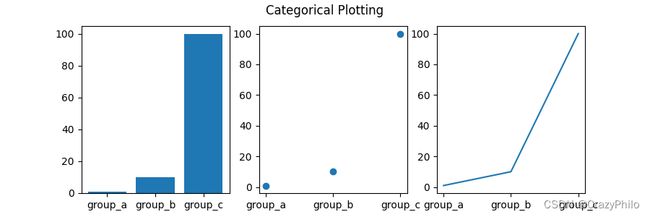
分类变量
Matplotlib 可以直接使用分类变量绘图:
names = ['group_a', 'group_b', 'group_c']
values = [1, 10, 100]

plt.figure(figsize=(9, 3))

plt.subplot(131) # 1 行 3 列第一个
plt.bar(names, values)

plt.subplot(132) # 1 行 3 列第二个
plt.scatter(names, values)

plt.subplot(133)
plt.plot(names, values)

plt.suptitle('Categorical Plotting')
plt.show()
subplot(131) 表示1行3列的第一个。
线段属性设置
线段的属性包括:linewidth, dash style, antialiased 等;线段由 matplotlib.lines.Line2D 类表示。
设置 Line2D 属性的方法有三种:
- 使用关键字参数
plt.plot(x, y, linewidth=2.0)
- 使用
Line2D的setter方法
plot() 函数返回 Line2D 对象列表,例如 line1, line2 = plot(x1, y1, x2, y2)。下面创建一个 Line2D 对象:
line, = plt.plot(x, y, '-')
line.set_antialiased(False) # turn off antialiasing
- 使用
setp
下面使用 MATLAB 风格函数设置多个线条的多个属性。在其中可以使用关键字参数,也可以使用 string/value 设置。例如:
lines = plt.plot(x1, y1, x2, y2)
# 使用关键字参数
plt.setp(lines, color='r', linewidth=2.0)

# 使用 MATLAB 样式 string value pairs
plt.setp(lines, 'color', 'r', 'linewidth', 2.0)
Line2D 属性如下:
| 属性 | 类型 |
|---|---|
| alpha | float |
| animated | `[True |
| antialiased or aa | `[True |
| clip_box | a matplotlib.transform.Bbox instance |
| clip_on | `[True |
| clip_path | a Path instance and a Transform instance, a Patch |
| color or c | any matplotlib color |
| contains | the hit testing function |
| dash_capstyle | `[‘butt’ |
| dash_joinstyle | `[‘miter’ |
| dashes | sequence of on/off ink in points |
| data | (np.array xdata, np.array ydata) |
| figure | a matplotlib.figure.Figure instance |
| label | any string |
| linestyle or ls | `[ ‘-’ |
| linewidth or lw | float value in points |
| marker | `[ ‘+’ |
| markeredgecolor or mec | any matplotlib color |
| markeredgewidth or mew | float value in points |
| markerfacecolor or mfc | any matplotlib color |
| markersize or ms | float |
| markevery | `[ None |
| picker | used in interactive line selection |
| pickradius | the line pick selection radius |
| solid_capstyle | `[‘butt’ |
| solid_joinstyle | `[‘miter’ |
| transform | a matplotlib.transforms.Transform instance |
| visible | `[True |
| xdata | np.array |
| ydata | np.array |
| zorder | any number |
通过 setp 函数可以查看线段可以设置的属性:
In [69]: lines = plt.plot([1, 2, 3])
In [70]: plt.setp(lines)
alpha: float
animated: [True | False]
antialiased or aa: [True | False]
...snip
多图
MATLAB 和 pyplot 都有当前 figure 和当前 axes 的概念。所有绘图函数应用于当前 axes。函数 gca 返回当前 axes (matplotlib.axes.Axes 实例),gcf 返回当前 figure (matplotlib.figure.Figure 实例)。
下面创建两个 subplots:
def f(t):
    return np.exp(-t) * np.cos(2*np.pi*t)

t1 = np.arange(0.0, 5.0, 0.1)
t2 = np.arange(0.0, 5.0, 0.02)

plt.figure()
plt.subplot(211)
plt.plot(t1, f(t1), 'bo', t2, f(t2), 'k')

plt.subplot(212)
plt.plot(t2, np.cos(2*np.pi*t2), 'r--')
plt.show()
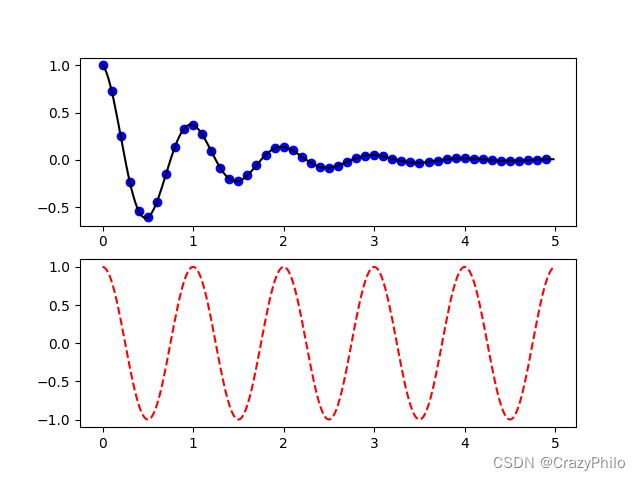
这里调用 figure 是可选的,因为如果没有 Figure,Matplotlib 会自动创建一个。subplot 指定了 numrows, numcols, plot_number,其中 plot_number 范围从 1 到 numrows*numcols。如果 numrows*numcols<10,subplot 中的逗号是可选的,即 subplot(211) 等价于 subplot(2, 1, 1)。
可以创建任意数目的 subplots 和 axes,还可以使用 axes([left, bottom, width, height]) 手动指定 axes 位置,这些值是 (0 to 1) 的比例值。
可以通过数字编号来创建多个 figure:
import matplotlib.pyplot as plt
plt.figure(1)                # the first figure
plt.subplot(211)             # the first subplot in the first figure
plt.plot([1, 2, 3])
plt.subplot(212)             # the second subplot in the first figure
plt.plot([4, 5, 6])


plt.figure(2)                # a second figure
plt.plot([4, 5, 6])          # creates a subplot() by default

plt.figure(1)                # figure 1 current; subplot(212) still current
plt.subplot(211)             # make subplot(211) in figure1 current
plt.title('Easy as 1, 2, 3') # subplot 211 title
使用 clf 清除当前 figure,使用 cla 清除当前 axes。如果你觉得这种当前图像、当前 axes 很烦人,则推荐使用 OO API。
figures 持有的内存不会自动释放,需要调用 close。
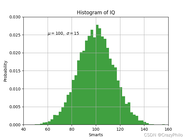
text
text 可以在任意位置添加文本,xlabel, ylabel 和 title 在特定位置添加文本。
mu, sigma = 100, 15
x = mu + sigma * np.random.randn(10000)

# the histogram of the data
n, bins, patches = plt.hist(x, 50, density=1, facecolor='g', alpha=0.75)


plt.xlabel('Smarts')
plt.ylabel('Probability')
plt.title('Histogram of IQ')
plt.text(60, .025, r'$\mu=100,\ \sigma=15$')
plt.axis([40, 160, 0, 0.03])
plt.grid(True)
plt.show()
所有的 text 函数返回 matplotlib.text.Text 实例。可以使用关键字参数或 setp 设置文本属性:
t = plt.xlabel('my data', fontsize=14, color='red')
使用数学表达式
matplotlib 支持 TeX 数学表达式。例如,在标题中写入 σ i = 15 \sigma_i=15 σi=15,可以用 $ 包围 TeX 表达式:
plt.title(r'$\sigma_i=15$')
标签字符串前的 r 很重要,它表示字符串是原始字符串,这样就不会把反斜杠识别为转义。matplotlib 内置一个 TeX 表达式解析引擎和渲染引擎,并包含数学字体,详情参考 Writing mathematical expressions。因此不需要安装 TeX 就能跨平台使用数学文本。对已经安装 LaTeX 和额 dvipng 的用户,还可以使用 LaTeX 来格式化文本,并将输出直接合并到显示的 figure 或保存的 postscript 中,详情请参考 Text rendering with LaTeX。
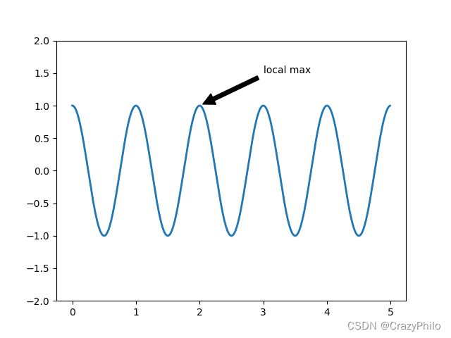
注释文本
text 可以将文本放到 Axes 的任意位置。text 一般用来注释图的某些特征,而 annotate 方法提供了一些辅助功能,使得注释更容易。在注释中,需要考虑两个点:待注释数据点的位置 xy 和注释文本的位置 xytext。这两个参数都是 (x, y) tuple。
import matplotlib.pyplot as plt
import numpy as np

ax = plt.subplot()

t = np.arange(0.0, 5.0, 0.01)
s = np.cos(2 * np.pi * t)
line, = plt.plot(t, s, lw=2)

plt.annotate('local max', xy=(2, 1), xytext=(3, 1.5),
             arrowprops=dict(facecolor='black', shrink=0.05), )

plt.ylim(-2, 2)
plt.show()
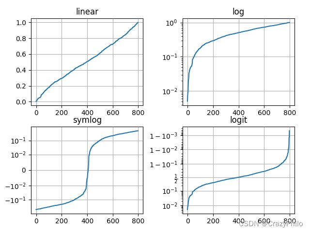
对数轴和其它非线性轴
matplotlib.pyplot 除了线性轴,还支持对数和 logit 轴。如果数据跨度多个数量级,则可以使用该方法。更改轴的 scale 很容易:
plt.xscale('log')
例如,四个具有相同数据,但 y 轴 scale 不同的图:
import matplotlib.pyplot as plt
import numpy as np

# Fixing random state for reproducibility
np.random.seed(19680801)

# make up some data in the open interval (0, 1)
y = np.random.normal(loc=0.5, scale=0.4, size=1000)
y = y[(y > 0) & (y < 1)]
y.sort()
x = np.arange(len(y))

# plot with various axes scales
plt.figure()

# linear
plt.subplot(221)
plt.plot(x, y)
plt.yscale('linear')
plt.title('linear')
plt.grid(True)

# log
plt.subplot(222)
plt.plot(x, y)
plt.yscale('log')
plt.title('log')
plt.grid(True)

# symmetric log
plt.subplot(223)
plt.plot(x, y - y.mean())
plt.yscale('symlog', linthresh=0.01)
plt.title('symlog')
plt.grid(True)

# logit
plt.subplot(224)
plt.plot(x, y)
plt.yscale('logit')
plt.title('logit')
plt.grid(True)
# Adjust the subplot layout, because the logit one may take more space
# than usual, due to y-tick labels like "1 - 10^{-3}"
plt.subplots_adjust(top=0.92, bottom=0.08, left=0.10, right=0.95, hspace=0.25,
                    wspace=0.35)

plt.show()
参考
- https://matplotlib.org/stable/tutorials/introductory/pyplot.html