matplotlib中设置轴标题标签的方法
目录
- 问题描述
- 解决方法
- 总结
问题描述
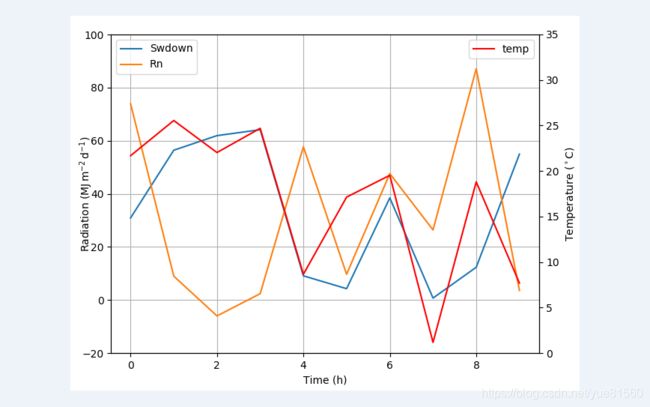
 当我们在用matplotlib画图的时候,有的时候,我们会发现加上轴标签后,图会变小一点,而轴标题离图的边缘比较远,如上图所示(上图y左轴标签的留白也比较严重)。
上图的源码如下:
import numpy as np
import matplotlib.pyplot as plt
from matplotlib import rc
rc('mathtext', default='regular')

time = np.arange(10)
temp = np.random.random(10)*30
Swdown = np.random.random(10)*100-10
Rn = np.random.random(10)*100-10

fig = plt.figure(figsize=(6.8,5))
ax = fig.add_subplot(111)
ax.plot(time, Swdown, '-', label = 'Swdown')
ax.plot(time, Rn, '-', label = 'Rn')
ax2 = ax.twinx()
ax2.plot(time, temp, '-r', label = 'temp')
ax.legend(loc=0)
ax.grid()
ax.set_xlabel("Time (h)")
ax.set_ylabel(r"Radiation ($MJ\,m^{-2}\,d^{-1}$)"")
ax2.set_ylabel(r"Temperature ($^\circ$C)",r")
ax2.set_ylim(0, 35)
ax.set_ylim(-20,100)
ax2.legend(loc=0)
plt.savefig('0.png')
plt.show()
解决方法
查看了matplotlib的相关描述,发现轴标签(label)的文字使调用了text的方法,如下:
 我们知道text的方法是有对齐操作的,所以为了解决留白较大的问题,我们可以设置一下水平对齐ha,垂直对齐va。对齐的时候,是将标签视为水平放置时的情况来定义的,即
我对左右的y标签分别进行了对齐,然后重新绘图,代码如下:
import numpy as np
import matplotlib.pyplot as plt
from matplotlib import rc
rc('mathtext', default='regular')

time = np.arange(10)
temp = np.random.random(10)*30
Swdown = np.random.random(10)*100-10
Rn = np.random.random(10)*100-10

fig = plt.figure(figsize=(6.8,5))
ax = fig.add_subplot(111)
ax.plot(time, Swdown, '-', label = 'Swdown')
ax.plot(time, Rn, '-', label = 'Rn')
ax2 = ax.twinx()
ax2.plot(time, temp, '-r', label = 'temp')
ax.legend(loc=0)
ax.grid()
ax.set_xlabel("Time (h)")
ax.set_ylabel(r"Radiation ($MJ\,m^{-2}\,d^{-1}$)",va="top",ha="center")
ax2.set_ylabel(r"Temperature ($^\circ$C)",va="center",ha="center")
ax2.set_ylim(0, 35)
ax.set_ylim(-20,100)
ax2.legend(loc=0)
plt.savefig('0.png')
plt.show()
得到的结果如下,可见,左右都比较贴近轴:

但是离图片边缘比较远,这个时候可以使用tight_layout,这是matplotlib给的紧密布局方法,有时却无效,这次我尝试了一下,是不成功了,但是我用调整子图的subplots_adjust方法,成功了:
代码如下:
import numpy as np
import matplotlib.pyplot as plt
from matplotlib import rc
rc('mathtext', default='regular')

time = np.arange(10)
temp = np.random.random(10)*30
Swdown = np.random.random(10)*100-10
Rn = np.random.random(10)*100-10

fig = plt.figure(figsize=(6.8,5))
ax = fig.add_subplot(111)
ax.plot(time, Swdown, '-', label = 'Swdown')
ax.plot(time, Rn, '-', label = 'Rn')
ax2 = ax.twinx()
ax2.plot(time, temp, '-r', label = 'temp')
ax.legend(loc=0)
ax.grid()
ax.set_xlabel("Time (h)")
ax.set_ylabel(r"Radiation ($MJ\,m^{-2}\,d^{-1}$)",va="top",ha="center")
ax2.set_ylabel(r"Temperature ($^\circ$C)",va="top",ha="center")
ax2.set_ylim(0, 35)
ax.set_ylim(-20,100)
ax2.legend(loc=1)
fig.subplots_adjust(0.08, 0.1, 0.92, 0.95)
plt.savefig('0.png')
#plt.show()
#无效,啧啧
plt.tight_layout()
总结
matplotlib绘图,入门我觉得挺繁琐,普通的图效率比较低下,但是一些组成图还是比较好…