Pandas | Pandas入门 DataFrame的常用函数(DVwP笔记)
看到个不错的入门笔记。记录下Pandas中有关DataFrame常用的函数,包括数据读取、清理和可视化。防丢失。
Pandas入门 | DataFrame的常用函数
- DataFrame
-
- Read in data
- View the top 5 rows
- Veiw the bottom 5 rows
- Get a summary of dataframe
- Get the list of column headers
- Get the list of indicies
- Get the index and columns as lists
- View the dimensions of the dataframe
- Remove columns
- Rename columns
- Reorder columns
- Add a column that sums up the total columns
- See how many null objects
- Get a quick summary of each column
- Set index
- Select column
- Select row
- Sort on a column
- Convert the column names into strings
- Filtering based on a criteria
- Transpose the dataframe
- Groupby
- Save to (csv json html excel)
- polyfit()
- Visualization
-
- Colors available
- Two types of plotting
- Subplots
- Prepping Data
- --------------------------------------------------------------------
- Line plots
- Area plots
- Histrograms
- Bar charts
- Annotate
- Pie charts
- Box plots
- Scatter plots
- Bubble plots
- Seaborn - Regression plots
- Waffle charts
- Word Clouds
- Folium
DataFrame
Read in data
df_can = pd.read_excel('https://cf-courses-data.s3.us.cloud-object-storage.appdomain.cloud/IBMDeveloperSkillsNetwork-DV0101EN-SkillsNetwork/Data%20Files/Canada.xlsx',
                        sheet_name='Canada by Citizenship',
                       skiprows=range(20),
                       skipfooter=2)
View the top 5 rows
df_can.head()
# tip: You can specify the number of rows you'd like to see as follows: df_can.head(10)
Veiw the bottom 5 rows
df_can.tail()
Get a summary of dataframe
df_can.info(verbose=False)
Get the list of column headers
df_can.columns.values
Get the list of indicies
df_can.index.values
Note: The default type of index and columns is NOT list.
print(type(df_can.columns))
print(type(df_can.index))
Get the index and columns as lists
df_can.columns.tolist()
df_can.index.tolist()

print (type(df_can.columns.tolist()))
print (type(df_can.index.tolist()))
View the dimensions of the dataframe
# size of dataframe (rows, columns)
df_can.shape
Remove columns
# in pandas axis=0 represents rows (default) and axis=1 represents columns.
df_can.drop(['AREA','REG','DEV','Type','Coverage'], axis=1, inplace=True)
Rename columns
df_can.rename(columns={'OdName':'Country', 'AreaName':'Continent', 'RegName':'Region'}, inplace=True)
Reorder columns
order = ['date', 'open', 'high', 'low', 'close']
df = df[order]
Add a column that sums up the total columns
df_can['Total'] = df_can.sum(axis=1)
See how many null objects
df_can.isnull().sum()
Get a quick summary of each column
df_can.describe()
Set index
df_can.set_index('Country', inplace=True)
# tip: The opposite of set is reset. So to reset the index, we can use df_can.reset_index()
# optional: to remove the name of the index
df_can.index.name = None
Select column
There are two ways to filter on a column name:
Method 1: Quick and easy, but only works if the column name does NOT have spaces or special characters.
    df.column_name
        (returns series)
Method 2: More robust, and can filter on multiple columns.
    df['column']
        (returns series)
    df[['column 1', 'column 2']]
        (returns dataframe)
df_can.Country # returns a series
df_can[['Country', 1980, 1981, 1982, 1983, 1984, 1985]] # returns a dataframe
# notice that 'Country' is string, and the years are integers.
# for the sake of consistency, we will convert all column names to string later on.
Select row
There are main 3 ways to select rows:
    df.loc[label]
        #filters by the labels of the index/column
    df.iloc[index]
        #filters by the positions of the index/column
after set the index
Example: Let’s view the number of immigrants from Japan (row 87) for the following scenarios:
1. The full row data (all columns)
2. For year 2013
3. For years 1980 to 1985
# 1. the full row data (all columns)
print(df_can.loc['Japan'])

# alternate methods
print(df_can.iloc[87])
print(df_can[df_can.index == 'Japan'].T.squeeze())


# 2. for year 2013
print(df_can.loc['Japan', 2013])

# alternate method
print(df_can.iloc[87, 36]) # year 2013 is the last column, with a positional index of 36


# 3. for years 1980 to 1985
print(df_can.loc['Japan', [1980, 1981, 1982, 1983, 1984, 1984]])
print(df_can.iloc[87, [3, 4, 5, 6, 7, 8]])
Sort on a column
#inplace = True paramemter saves the changes to the original df_can dataframe
df_can.sort_values(by='Total', ascending=False, axis=0, inplace=True)
Convert the column names into strings
df_can.columns = list(map(str, df_can.columns))
# [print (type(x)) for x in df_can.columns.values] #<-- uncomment to check type of column headers
# declare a variable that will allow us to easily call upon the full range of years
# useful for plotting later on
years = list(map(str, range(1980, 2014)))
years
Filtering based on a criteria
To filter the dataframe based on a condition, we simply pass the condition as a boolean vector.
For example, Let’s filter the dataframe to show the data on Asian countries (AreaName = Asia)
# 1. create the condition boolean series
condition = df_can['Continent'] == 'Asia'
print(condition)

# 2. pass this condition into the dataFrame
df_can[condition]

# we can pass mutliple criteria in the same line.
# let's filter for AreaNAme = Asia and RegName = Southern Asia

df_can[(df_can['Continent']=='Asia') & (df_can['Region']=='Southern Asia')]

# note: When using 'and' and 'or' operators, pandas requires we use '&' and '|' instead of 'and' and 'or'
# don't forget to enclose the two conditions in parentheses
Transpose the dataframe
df_CI = df_CI.transpose()
Groupby
The general process of groupby involves the following steps:
- Split: Splitting the data into groups based on some criteria.
- Apply: Applying a function to each group independently:
.sum()
.count()
.mean()
.std()
.aggregate()
.apply()
.etc… - Combine: Combining the results into a data structure.
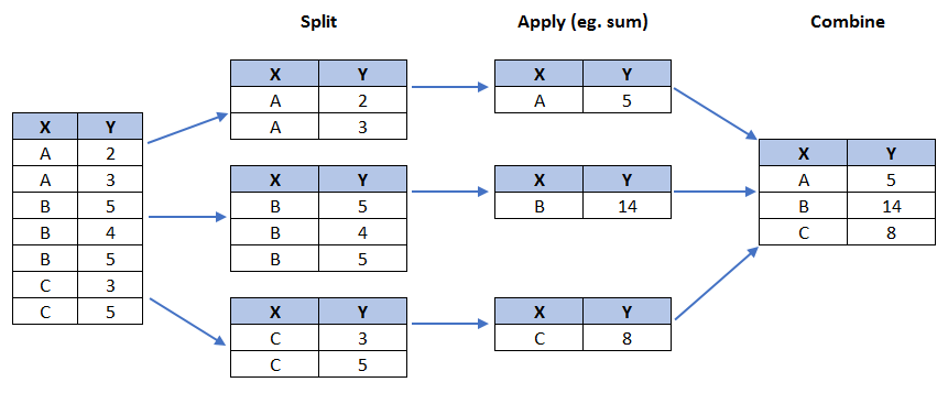
# group countries by continents and apply sum() function
df_continents = df_can.groupby('Continent', axis=0).sum()

# note: the output of the groupby method is a `groupby' object.
# we can not use it further until we apply a function (eg .sum())
print(type(df_can.groupby('Continent', axis=0)))

df_continents.head()
Save to (csv json html excel)
参考这篇博客
DataFrame 数据的保存和读取
df.to_csv 写入到 csv 文件
pd.read_csv 读取 csv 文件
df.to_json 写入到 json 文件
pd.read_json 读取 json 文件
df.to_html 写入到 html 文件
pd.read_html 读取 html 文件
df.to_excel 写入到 excel 文件
pd.read_excel 读取 excel 文件
polyfit()
Get the equation of line of best fit. We will use Numpy’s polyfit() method by passing in the following:
x: x-coordinates of the data.y: y-coordinates of the data.deg: Degree of fitting polynomial. 1 = linear, 2 = quadratic, and so on.
x = df_tot['year']      # year on x-axis
y = df_tot['total']     # total on y-axis
fit = np.polyfit(x, y, deg=1)

fit
array([ 5.56709228e+03, -1.09261952e+07])
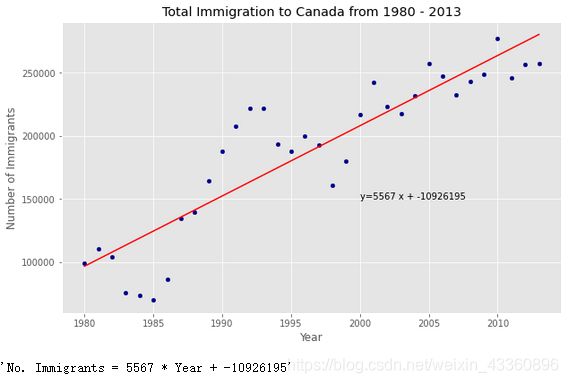
The output is an array with the polynomial coefficients, highest powers first. Since we are plotting a linear regression y= a*x + b, our output has 2 elements [5.56709228e+03, -1.09261952e+07] with the the slope in position 0 and intercept in position 1.
df_tot.plot(kind='scatter', x='year', y='total', figsize=(10, 6), color='darkblue')

plt.title('Total Immigration to Canada from 1980 - 2013')
plt.xlabel('Year')
plt.ylabel('Number of Immigrants')

# plot line of best fit
plt.plot(x, fit[0] * x + fit[1], color='red') # recall that x is the Years
plt.annotate('y={0:.0f} x + {1:.0f}'.format(fit[0], fit[1]), xy=(2000, 150000))

plt.show()

# print out the line of best fit
'No. Immigrants = {0:.0f} * Year + {1:.0f}'.format(fit[0], fit[1])
Visualization
# %matplotlib inline #强制渲染 新窗口 不可添加新元素
%matplotlib notebook #动态渲染

import matplotlib as mpl
import matplotlib.pyplot as plt

# print ('Matplotlib version: ', mpl.__version__) # >= 2.0.0
# print(plt.style.available)
mpl.style.use(['ggplot']) # optional: for ggplot-like style
Colors available
import matplotlib
for name, hex in matplotlib.colors.cnames.items():
    print(name, hex)
Two types of plotting
As we discussed in the video lectures, there are two styles/options of ploting with matplotlib. Plotting using the Artist layer and plotting using the scripting layer.
Option 1: Scripting layer (procedural method) - using matplotlib.pyplot as 'plt’
You can use plt i.e. matplotlib.pyplot and add more elements by calling different methods procedurally; for example, plt.title(...) to add title or plt.xlabel(...) to add label to the x-axis.
# Option 1: This is what we have been using so far
df_top5.plot(kind='area', alpha=0.35, figsize=(20, 10))
plt.title('Immigration trend of top 5 countries')
plt.ylabel('Number of immigrants')
plt.xlabel('Years')
Option 2: Artist layer (Object oriented method) - using an Axes instance from Matplotlib (preferred)
You can use an Axes instance of your current plot and store it in a variable (eg. ax). You can add more elements by calling methods with a little change in syntax (by adding “set_” to the previous methods). For example, use ax.set_title() instead of plt.title() to add title, or ax.set_xlabel() instead of plt.xlabel() to add label to the x-axis.
This option sometimes is more transparent and flexible to use for advanced plots (in particular when having multiple plots).
# option 2: preferred option with more flexibility
ax = df_top5.plot(kind='area', alpha=0.35, figsize=(20, 10))

ax.set_title('Immigration Trend of Top 5 Countries')
ax.set_ylabel('Number of Immigrants')
ax.set_xlabel('Years')
Subplots
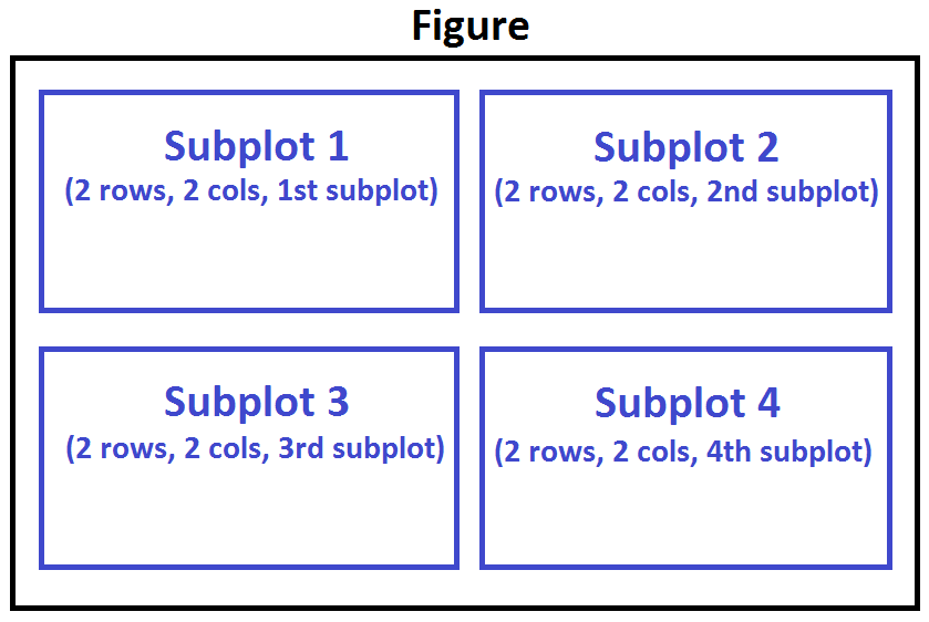
To visualize multiple plots together, we can create a figure (overall canvas) and divide it into subplots, each containing a plot. With subplots, we usually work with the artist layer instead of the scripting layer.
Typical syntax is :
fig = plt.figure() # create figure
ax = fig.add_subplot(nrows, ncols, plot_number) # create subplots
Where
nrowsandncolsare used to notionally split the figure into (nrows*ncols) sub-axes,plot_numberis used to identify the particular subplot that this function is to create within the notional grid.plot_numberstarts at 1, increments across rows first and has a maximum ofnrows*ncolsas shown below.
We can then specify which subplot to place each plot by passing in the ax paramemter in plot() method as follows:
fig = plt.figure() # create figure

ax0 = fig.add_subplot(1, 2, 1) # add subplot 1 (1 row, 2 columns, first plot)
ax1 = fig.add_subplot(1, 2, 2) # add subplot 2 (1 row, 2 columns, second plot). See tip below**

# Subplot 1: Box plot
df_CI.plot(kind='box', color='blue', vert=False, figsize=(20, 6), ax=ax0) # add to subplot 1
ax0.set_title('Box Plots of Immigrants from China and India (1980 - 2013)')
ax0.set_xlabel('Number of Immigrants')
ax0.set_ylabel('Countries')

# Subplot 2: Line plot
df_CI.plot(kind='line', figsize=(20, 6), ax=ax1) # add to subplot 2
ax1.set_title ('Line Plots of Immigrants from China and India (1980 - 2013)')
ax1.set_ylabel('Number of Immigrants')
ax1.set_xlabel('Years')

# plt.show()
Tip regarding subplot convention
In the case when nrows, ncols, and plot_number are all less than 10, a convenience exists such that the a 3 digit number can be given instead, where the hundreds represent nrows, the tens represent ncols and the units represent plot_number. For instance,
subplot(211) == subplot(2, 1, 1)
produces a subaxes in a figure which represents the top plot (i.e. the first) in a 2 rows by 1 column notional grid (no grid actually exists, but conceptually this is how the returned subplot has been positioned).
Prepping Data
Let’s download, import and clean our primary Canadian Immigration dataset using pandas read_excel() method for any visualization.
df_can = pd.read_excel('https://cf-courses-data.s3.us.cloud-object-storage.appdomain.cloud/IBMDeveloperSkillsNetwork-DV0101EN-SkillsNetwork/Data%20Files/Canada.xlsx',
                       sheet_name='Canada by Citizenship',
                       skiprows=range(20),
                       skipfooter=2)

print('Data downloaded and read into a dataframe!')

# clean up the dataset to remove unnecessary columns (eg. REG)
df_can.drop(['AREA','REG','DEV','Type','Coverage'], axis = 1, inplace = True)

# let's rename the columns so that they make sense
df_can.rename (columns = {'OdName':'Country', 'AreaName':'Continent','RegName':'Region'}, inplace = True)

# for sake of consistency, let's also make all column labels of type string
df_can.columns = list(map(str, df_can.columns))

# set the country name as index - useful for quickly looking up countries using .loc method
df_can.set_index('Country', inplace = True)

# add total column
df_can['Total'] =  df_can.sum (axis = 1)

# years that we will be using in this lesson - useful for plotting later on
years = list(map(str, range(1980, 2014)))
# print ('data dimensions:', df_can.shape)
--------------------------------------------------------------------
Line plots
haiti = df_can.loc['Haiti', years] # passing in years 1980 - 2013 to exclude the 'total' column
haiti.head()
# haiti.plot()
pandas automatically populated the x-axis with the index values (years), and the y-axis with the column values (population). However, notice how the years were not displayed because they are of type string. Therefore, let’s change the type of the index values to integer for plotting.
haiti.plot(kind='line')

plt.title('Immigration from Haiti')
plt.ylabel('Number of immigrants')
plt.xlabel('Years')

# annotate the 2010 Earthquake.
# syntax: plt.text(x, y, label)
plt.text(2000, 6000, '2010 Earthquake') # see note below

# plt.show() # need this line to show the updates made to the figure
Quick note on x and y values in plt.text(x, y, label):
Since the x-axis (years) is type ‘integer’, we specified x as a year. The y axis (number of immigrants) is type ‘integer’, so we can just specify the value y = 6000.
plt.text(2000, 6000, '2010 Earthquake') # years stored as type int
If the years were stored as type ‘string’, we would need to specify x as the index position of the year. Eg 20th index is year 2000 since it is the 20th year with a base year of 1980.
plt.text(20, 6000, '2010 Earthquake') # years stored as type int
Area plots
# get the top 5 entries
df_top5 = df_can.head()

# transpose the dataframe
df_top5 = df_top5[years].transpose()

df_top5.head()

df_top5.index = df_top5.index.map(int) # let's change the index values of df_top5 to type integer for plotting
df_top5.plot(kind='area',
             stacked=False,
             figsize=(20, 10), # pass a tuple (x, y) size
             )

plt.title('Immigration Trend of Top 5 Countries')
plt.ylabel('Number of Immigrants')
plt.xlabel('Years')

# plt.show()
The unstacked plot has a default transparency (alpha value) at 0.5. We can modify this value by passing in the alpha parameter.2The unstacked plot has a default transparency (alpha value) at 0.5. We can modify this value by passing in the alpha parameter.
df_top5.plot(kind='area',
             alpha=0.25, # 0-1, default value a= 0.5
             stacked=False,
             figsize=(20, 10),
            )

plt.title('Immigration Trend of Top 5 Countries')
plt.ylabel('Number of Immigrants')
plt.xlabel('Years')

# plt.show()
Histrograms
# np.histogram returns 2 values
count, bin_edges = np.histogram(df_can['2013'])

print(count) # frequency count
print(bin_edges) # bin ranges, default = 10 bins
[178  11   1   2   0   0   0   0   1   2]
[    0.   3412.9  6825.8 10238.7 13651.6 17064.5 20477.4 23890.3 27303.2
 30716.1 34129. ]
By default, the histrogram method breaks up the dataset into 10 bins.
df_can['2013'].plot(kind='hist', figsize=(8, 5))

plt.title('Histogram of Immigration from 195 Countries in 2013') # add a title to the histogram
plt.ylabel('Number of Countries') # add y-label
plt.xlabel('Number of Immigrants') # add x-label

# plt.show()
Notice that the x-axis labels do not match with the bin size. This can be fixed by passing in a xticks keyword that contains the list of the bin sizes, as follows:
# 'bin_edges' is a list of bin intervals
count, bin_edges = np.histogram(df_can['2013'])

df_can['2013'].plot(kind='hist', figsize=(8, 5), xticks=bin_edges)

plt.title('Histogram of Immigration from 195 countries in 2013') # add a title to the histogram
plt.ylabel('Number of Countries') # add y-label
plt.xlabel('Number of Immigrants') # add x-label

# plt.show()
Side Note: We could use df_can['2013'].plot.hist(), instead. In fact, throughout this lesson, using some_data.plot(kind='type_plot', ...) is equivalent to some_data.plot.type_plot(...). That is, passing the type of the plot as argument or method behaves the same.
See the pandas documentation for more info http://pandas.pydata.org/pandas-docs/stable/generated/pandas.Series.plot.html.
We can also plot multiple histograms on the same plot.
# transpose dataframe
df_t = df_can.loc[['Denmark', 'Norway', 'Sweden'], years].transpose()

# generate histogram
df_t.plot(kind='hist', figsize=(10, 6))

plt.title('Histogram of Immigration from Denmark, Norway, and Sweden from 1980 - 2013')
plt.ylabel('Number of Years')
plt.xlabel('Number of Immigrants')

# plt.show()
Let’s make a few modifications to improve the impact and aesthetics of the previous plot:
- increase the bin size to 15 by passing in
binsparameter - set transparency to 60% by passing in
alphaparamemter - label the x-axis by passing in
x-labelparamater - change the colors of the plots by passing in
colorparameter
# let's get the x-tick values
count, bin_edges = np.histogram(df_t, 15)

# un-stacked histogram
df_t.plot(kind ='hist',
          figsize=(10, 6),
          bins=15,
          alpha=0.6,
          xticks=bin_edges,
          color=['coral', 'darkslateblue', 'mediumseagreen']
         )

plt.title('Histogram of Immigration from Denmark, Norway, and Sweden from 1980 - 2013')
plt.ylabel('Number of Years')
plt.xlabel('Number of Immigrants')

plt.show()
If we do no want the plots to overlap each other, we can stack them using the stacked paramemter. Let’s also adjust the min and max x-axis labels to remove the extra gap on the edges of the plot. We can pass a tuple (min,max) using the xlim paramater, as show below.
count, bin_edges = np.histogram(df_t, 15)
xmin = bin_edges[0] - 10   #  first bin value is 31.0, adding buffer of 10 for aesthetic purposes
xmax = bin_edges[-1] + 10  #  last bin value is 308.0, adding buffer of 10 for aesthetic purposes

# stacked Histogram
df_t.plot(kind='hist',
          figsize=(10, 6),
          bins=15,
          xticks=bin_edges,
          color=['coral', 'darkslateblue', 'mediumseagreen'],
          stacked=True,
          xlim=(xmin, xmax)
         )

plt.title('Histogram of Immigration from Denmark, Norway, and Sweden from 1980 - 2013')
plt.ylabel('Number of Years')
plt.xlabel('Number of Immigrants')

# plt.show()
Bar charts
To create a bar plot, we can pass one of two arguments via kind parameter in plot():
kind=barcreates a vertical bar plotkind=barhcreates a horizontal bar plot
Vertical bar plot
In vertical bar graphs, the x-axis is used for labelling, and the length of bars on the y-axis corresponds to the magnitude of the variable being measured. Vertical bar graphs are particuarly useful in analyzing time series data. One disadvantage is that they lack space for text labelling at the foot of each bar.
# step 1: get the data
df_iceland = df_can.loc['Iceland', years]
df_iceland.head()

# step 2: plot data
df_iceland.plot(kind='bar', figsize=(10, 6))

plt.xlabel('Year') # add to x-label to the plot
plt.ylabel('Number of immigrants') # add y-label to the plot
plt.title('Icelandic immigrants to Canada from 1980 to 2013') # add title to the plot

# plt.show()
Horizontal Bar Plot
Sometimes it is more practical to represent the data horizontally, especially if you need more room for labelling the bars. In horizontal bar graphs, the y-axis is used for labelling, and the length of bars on the x-axis corresponds to the magnitude of the variable being measured. As you will see, there is more room on the y-axis to label categetorical variables.
# generate plot
df_top15.plot(kind='barh', figsize=(12, 12), color='steelblue')
plt.xlabel('Number of Immigrants')
plt.title('Top 15 Conuntries Contributing to the Immigration to Canada between 1980 - 2013')

# annotate value labels to each country
for index, value in enumerate(df_top15):
    label = format(int(value), ',') # format int with commas

# place text at the end of bar (subtracting 47000 from x, and 0.1 from y to make it fit within the bar)
plt.annotate(label, xy=(value - 47000, index - 0.10), color='white')

plt.show()
Annotate
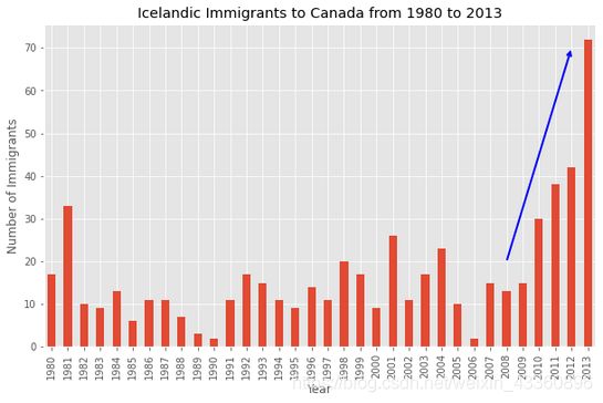
Let’s annotate this on the plot using the annotate method of the scripting layer or the pyplot interface. We will pass in the following parameters:
s: str, the text of annotation.xy: Tuple specifying the (x,y) point to annotate (in this case, end point of arrow).xytext: Tuple specifying the (x,y) point to place the text (in this case, start point of arrow).xycoords: The coordinate system that xy is given in - ‘data’ uses the coordinate system of the object being annotated (default).arrowprops: Takes a dictionary of properties to draw the arrow:arrowstyle: Specifies the arrow style,'->'is standard arrow.connectionstyle: Specifies the connection type.arc3is a straight line.color: Specifes color of arror.lw: Specifies the line width.
I encourage you to read the Matplotlib documentation for more details on annotations:
http://matplotlib.org/api/pyplot_api.html#matplotlib.pyplot.annotate.
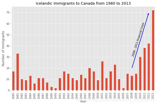
df_iceland.plot(kind='bar', figsize=(10, 6), rot=90) # rotate the xticks(labelled points on x-axis) by 90 degrees

plt.xlabel('Year')
plt.ylabel('Number of Immigrants')
plt.title('Icelandic Immigrants to Canada from 1980 to 2013')

# Annotate arrow
plt.annotate('',                      # s: str. Will leave it blank for no text
             xy=(32, 70),             # place head of the arrow at point (year 2012 , pop 70)
             xytext=(28, 20),         # place base of the arrow at point (year 2008 , pop 20)
             xycoords='data',         # will use the coordinate system of the object being annotated
             arrowprops=dict(arrowstyle='->', connectionstyle='arc3', color='blue', lw=2)
            )

# plt.show()
 Let’s also annotate a text to go over the arrow. We will pass in the following additional parameters:
rotation: rotation angle of text in degrees (counter clockwise)va: vertical alignment of text [‘center’ | ‘top’ | ‘bottom’ | ‘baseline’]ha: horizontal alignment of text [‘center’ | ‘right’ | ‘left’]
df_iceland.plot(kind='bar', figsize=(10, 6), rot=90)

plt.xlabel('Year')
plt.ylabel('Number of Immigrants')
plt.title('Icelandic Immigrants to Canada from 1980 to 2013')

# Annotate arrow
plt.annotate('',                      # s: str. will leave it blank for no text
             xy=(32, 70),             # place head of the arrow at point (year 2012 , pop 70)
             xytext=(28, 20),         # place base of the arrow at point (year 2008 , pop 20)
             xycoords='data',         # will use the coordinate system of the object being annotated
             arrowprops=dict(arrowstyle='->', connectionstyle='arc3', color='blue', lw=2)
            )

# Annotate Text
plt.annotate('2008 - 2011 Financial Crisis', # text to display
             xy=(28, 30),                    # start the text at at point (year 2008 , pop 30)
             rotation=72.5,                  # based on trial and error to match the arrow
             va='bottom',                    # want the text to be vertically 'bottom' aligned
             ha='left',                      # want the text to be horizontally 'left' algned.
            )

# plt.show()
Pie charts
You are most likely already familiar with pie charts as it is widely used in business and media. We can create pie charts in Matplotlib by passing in the kind=pie keyword.
We will pass in kind = 'pie' keyword, along with the following additional parameters:
autopct- is a string or function used to label the wedges with their numeric value. The label will be placed inside the wedge. If it is a format string, the label will befmt%pct.startangle- rotates the start of the pie chart by angle degrees counterclockwise from the x-axis.shadow- Draws a shadow beneath the pie (to give a 3D feel).
# group countries by continents and apply sum() function
df_continents = df_can.groupby('Continent', axis=0).sum()

# note: the output of the groupby method is a `groupby' object.
# we can not use it further until we apply a function (eg .sum())
print(type(df_can.groupby('Continent', axis=0)))

# autopct create %, start angle represent starting point
df_continents['Total'].plot(kind='pie',
                            figsize=(5, 6),
                            autopct='%1.1f%%', # add in percentages
                            startangle=90,     # start angle 90° (Africa)
                            shadow=True,       # add shadow
                            )

plt.title('Immigration to Canada by Continent [1980 - 2013]')
plt.axis('equal') # Sets the pie chart to look like a circle.

# plt.show()
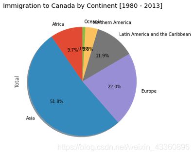
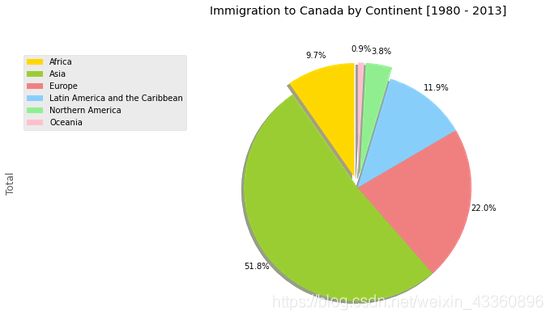
The above visual is not very clear, the numbers and text overlap in some instances. Let’s make a few modifications to improve the visuals:
- Remove the text labels on the pie chart by passing in
legendand add it as a seperate legend usingplt.legend(). - Push out the percentages to sit just outside the pie chart by passing in
pctdistanceparameter. - Pass in a custom set of colors for continents by passing in
colorsparameter. - Explode the pie chart to emphasize the lowest three continents (Africa, North America, and Latin America and Carribbean) by pasing in
explodeparameter.
colors_list = ['gold', 'yellowgreen', 'lightcoral', 'lightskyblue', 'lightgreen', 'pink']
explode_list = [0.1, 0, 0, 0, 0.1, 0.1] # ratio for each continent with which to offset each wedge.

df_continents['Total'].plot(kind='pie',
                            figsize=(15, 6),
                            autopct='%1.1f%%',
                            startangle=90,
                            shadow=True,
                            labels=None,         # turn off labels on pie chart
                            pctdistance=1.12,    # the ratio between the center of each pie slice and the start of the text generated by autopct
                            colors=colors_list,  # add custom colors
                            explode=explode_list # 'explode' lowest 3 continents
                            )

# scale the title up by 12% to match pctdistance
plt.title('Immigration to Canada by Continent [1980 - 2013]', y=1.12)

plt.axis('equal')

# add legend
plt.legend(labels=df_continents.index, loc='upper left')

# plt.show()
Box plots
A box plot is a way of statistically representing the distribution of the data through five main dimensions:
- Minimun: Smallest number in the dataset.
- First quartile: Middle number between the
minimumand themedian. - Second quartile (Median): Middle number of the (sorted) dataset.
- Third quartile: Middle number between
medianandmaximum. - Maximum: Highest number in the dataset.
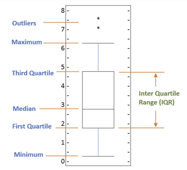
To make a box plot, we can use kind=box in plot method invoked on a pandas series or dataframe.
# to get a dataframe, place extra square brackets around 'Japan'.
df_japan = df_can.loc[['Japan'], years].transpose()
df_japan.head()

df_japan.plot(kind='box', figsize=(8, 6))

plt.title('Box plot of Japanese Immigrants from 1980 - 2013')
plt.ylabel('Number of Immigrants')

plt.show()
P.S. We can view the actual numbers by calling the describe() method on the dataframe.
df_japan.describe()
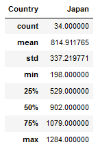
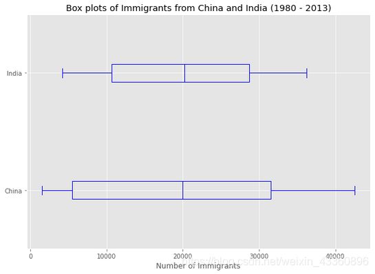
If you prefer to create horizontal box plots, you can pass the vert parameter in the plot function and assign it to False. You can also specify a different color in case you are not a big fan of the default red color.
horizontal box plots
df_CI= df_can.loc[['China', 'India'], years].transpose()
df_CI.head()

# horizontal box plots
df_CI.plot(kind='box', figsize=(10, 7), color='blue', vert=False)

plt.title('Box plots of Immigrants from China and India (1980 - 2013)')
plt.xlabel('Number of Immigrants')

plt.show()
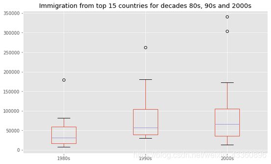
df_top15 = df_can.sort_values(['Total'], ascending=False, axis=0).head(15)

# create a list of all years in decades 80's, 90's, and 00's
years_80s = list(map(str, range(1980, 1990)))
years_90s = list(map(str, range(1990, 2000)))
years_00s = list(map(str, range(2000, 2010)))

# slice the original dataframe df_can to create a series for each decade
df_80s = df_top15.loc[:, years_80s].sum(axis=1)
df_90s = df_top15.loc[:, years_90s].sum(axis=1)
df_00s = df_top15.loc[:, years_00s].sum(axis=1)

# merge the three series into a new data frame
new_df = pd.DataFrame({'1980s': df_80s, '1990s': df_90s, '2000s':df_00s})

# display dataframe
new_df.head()

new_df.describe()

new_df.plot(kind='box', figsize=(10, 6))

plt.title('Immigration from top 15 countries for decades 80s, 90s and 2000s')

# plt.show()
The box plot is an advanced visualizaiton tool, and there are many options and customizations that exceed the scope of this lab. Please refer to Matplotlib documentation on box plots for more information.
Scatter plots
# we can use the sum() method to get the total population per year
df_tot = pd.DataFrame(df_can[years].sum(axis=0))

# change the years to type int (useful for regression later on)
df_tot.index = map(int, df_tot.index)

# reset the index to put in back in as a column in the df_tot dataframe
df_tot.reset_index(inplace = True)

# rename columns
df_tot.columns = ['year', 'total']

# view the final dataframe
df_tot.head()
We can create a scatter plot set by passing in kind='scatter' as plot argument. We will also need to pass in x and y keywords to specify the columns that go on the x- and the y-axis.
df_tot.plot(kind='scatter', x='year', y='total', figsize=(10, 6), color='darkblue')

plt.title('Total Immigration to Canada from 1980 - 2013')
plt.xlabel('Year')
plt.ylabel('Number of Immigrants')

plt.show()
Bubble plots
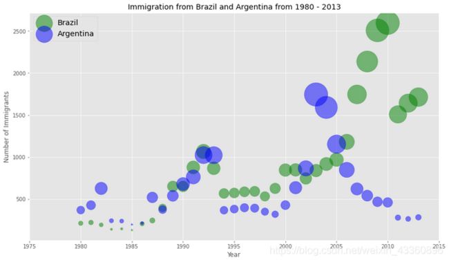
A bubble plot is a variation of the scatter plot that displays three dimensions of data (x, y, z). The datapoints are replaced with bubbles, and the size of the bubble is determined by the third variable ‘z’, also known as the weight. In maplotlib, we can pass in an array or scalar to the keyword s to plot(), that contains the weight of each point.
Let’s start by analyzing the effect of Argentina’s great depression.
Argentina suffered a great depression from 1998 - 2002, which caused widespread unemployment, riots, the fall of the government, and a default on the country’s foreign debt. In terms of income, over 50% of Argentines were poor, and seven out of ten Argentine children were poor at the depth of the crisis in 2002.
Let’s analyze the effect of this crisis, and compare Argentina’s immigration to that of it’s neighbour Brazil. Let’s do that using a bubble plot of immigration from Brazil and Argentina for the years 1980 - 2013. We will set the weights for the bubble as the normalized value of the population for each year.
Step 1: Get the data for Brazil and Argentina. Like in the previous example, we will convert the Years to type int and bring it in the dataframe.2Step 1: Get the data for Brazil and Argentina. Like in the previous example, we will convert the Years to type int and bring it in the dataframe.
df_can_t = df_can[years].transpose() # transposed dataframe

# cast the Years (the index) to type int
df_can_t.index = map(int, df_can_t.index)

# let's label the index. This will automatically be the column name when we reset the index
df_can_t.index.name = 'Year'

# reset index to bring the Year in as a column
df_can_t.reset_index(inplace=True)

# view the changes
df_can_t.head()
Step 2: Create the normalized weights.
There are several methods of normalizations in statistics, each with its own use. In this case, we will use feature scaling to bring all values into the range [0,1]. The general formula is:

where X is an original value, X' is the normalized value. The formula sets the max value in the dataset to 1, and sets the min value to 0. The rest of the datapoints are scaled to a value between 0-1 accordingly.
# normalize Brazil data
norm_brazil = (df_can_t['Brazil'] - df_can_t['Brazil'].min()) / (df_can_t['Brazil'].max() - df_can_t['Brazil'].min())

# normalize Argentina data
norm_argentina = (df_can_t['Argentina'] - df_can_t['Argentina'].min()) / (df_can_t['Argentina'].max() - df_can_t['Argentina'].min())
Step 3: Plot the data.
- To plot two different scatter plots in one plot, we can include the axes one plot into the other by passing it via the
axparameter. - We will also pass in the weights using the
sparameter. Given that the normalized weights are between 0-1, they won’t be visible on the plot. Therefore we will:- multiply weights by 2000 to scale it up on the graph, and,
- add 10 to compensate for the min value (which has a 0 weight and therefore scale with x2000).
# Brazil
ax0 = df_can_t.plot(kind='scatter',
                    x='Year',
                    y='Brazil',
                    figsize=(14, 8),
                    alpha=0.5,                  # transparency
                    color='green',
                    s=norm_brazil * 2000 + 10,  # pass in weights
                    xlim=(1975, 2015)
                   )

# Argentina
ax1 = df_can_t.plot(kind='scatter',
                    x='Year',
                    y='Argentina',
                    alpha=0.5,
                    color="blue",
                    s=norm_argentina * 2000 + 10,
                    ax = ax0
                   )

ax0.set_ylabel('Number of Immigrants')
ax0.set_title('Immigration from Brazil and Argentina from 1980 - 2013')
ax0.legend(['Brazil', 'Argentina'], loc='upper left', fontsize='x-large')
Seaborn - Regression plots
Seaborn is a Python visualization library based on matplotlib. It provides a high-level interface for drawing attractive statistical graphics. You can learn more about seaborn by following this link and more about seaborn regression plots by following this link.
# import library
import seaborn as sns

# we can use the sum() method to get the total population per year
df_tot = pd.DataFrame(df_can[years].sum(axis=0))

# change the years to type float (useful for regression later on)
df_tot.index = map(float, df_tot.index)

# reset the index to put in back in as a column in the df_tot dataframe
df_tot.reset_index(inplace=True)

# rename columns
df_tot.columns = ['year', 'total']

# view the final dataframe
df_tot.head()
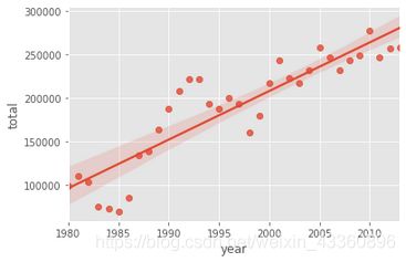
With seaborn, generating a regression plot is as simple as calling the regplot function.
import seaborn as sns
ax = sns.regplot(x='year', y='total', data=df_tot)
- blow up the plot a little bit so that it is more appealing to the sight.
- increase the size of markers so they match the new size of the figure, and add a title and x- and y-labels.
- increase the font size of the tickmark labels, the title, and the x- and y-labels so they don’t feel left out!
plt.figure(figsize=(15, 10))

sns.set(font_scale=1.5)

ax = sns.regplot(x='year', y='total', data=df_tot, color='green', marker='+', scatter_kws={'s': 200})
ax.set(xlabel='Year', ylabel='Total Immigration')
ax.set_title('Total Immigration to Canada from 1980 - 2013')
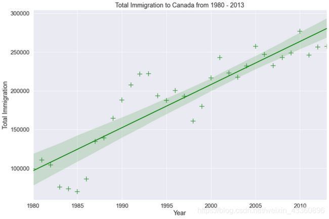
If you are not a big fan of the purple background, you can easily change the style to a white plain background.
plt.figure(figsize=(15, 10))

sns.set(font_scale=1.5)
sns.set_style('ticks') # change background to white background

ax = sns.regplot(x='year', y='total', data=df_tot, color='green', marker='+', scatter_kws={'s': 200})
ax.set(xlabel='Year', ylabel='Total Immigration')
ax.set_title('Total Immigration to Canada from 1980 - 2013')
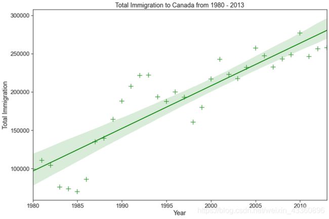
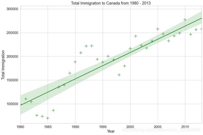
Or to a white background with gridlines.
plt.figure(figsize=(15, 10))

sns.set(font_scale=1.5)
sns.set_style('whitegrid')

ax = sns.regplot(x='year', y='total', data=df_tot, color='green', marker='+', scatter_kws={'s': 200})
ax.set(xlabel='Year', ylabel='Total Immigration')
ax.set_title('Total Immigration to Canada from 1980 - 2013')
Waffle charts
写到这里写到死机,然后忘保存了
为了防止这样的情况再次发生,以及(暂时)懒得重新修辞和组合语句,就另开一篇博客放上没仔细修改的原notebook,链接here 有时间会重新组织下语言
Word Clouds
链接here 有时间会重新组织下语言
Folium
For there are so many contents for Folium, so I will open a new bolg here.
