python双水平线双条形图,漂亮而直观!
投资金融产品(包括不限于基金)必须真金白银的投下去,才有更深刻的感悟。
同样,产品也必须深入的使用,才发现应该有更好的功能,匹配用户日益增长的需求。
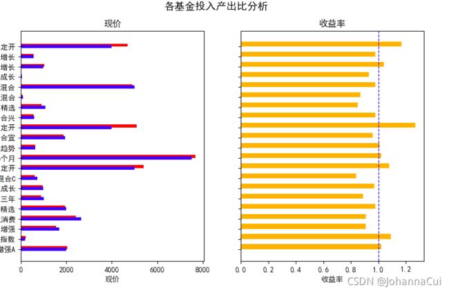
以图为例,上篇只介绍了左图,双线水平条形图——我在网上没有搜到,所以自己摸索了一下,果然画出来了!投入产出一目了然。但是,好像还缺点什么。在FUNDS.csv中,有收益率,这个KPI人见人爱。索性,画到一张图中,Y label用统一的。
贴代码:
    # 一行两列
    fig, (ax0, ax1) = plt.subplots(nrows=1,ncols=2, sharey=True, figsize=(7, 4))
    # 左侧的水平条形图
    ax0.barh(funds, returns, height=0.3, color='red',align='edge')
    ax0.barh(funds, my_input,height=0.3, color='blue', align='center')
    ax0.set(title='现价', xlabel='现价', ylabel='funds')

    # 右侧的水平条形图
    ax1.barh(funds, percent, height=0.5, color='orange', align='edge')
    avg = 1
    # Plot the average as a vertical line
    ax1.set(title='收益率', xlabel='收益率', ylabel='')
    ax1.axvline(x=avg, color='b', label='100%', linestyle='--', linewidth=1)

    # 写图表标题
    fig.suptitle('各基金投入产出比分析', fontsize=14, fontweight='bold');

    # Hide the legends
    ax1.legend().set_visible(False)
    ax0.legend().set_visible(False)
    plt.show()