matplotlib画柱状图、条形图、直方图(包括堆积多数据并列)
文章目录
-
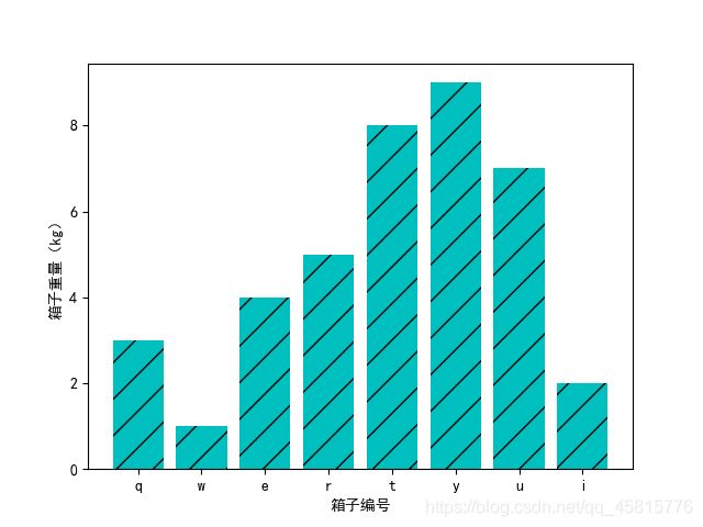
- 1. 在x轴上绘制定性数据分布特征(柱状图)
- 2.在y轴上绘制定性数据分布特征(条形图)
- 3.在x轴绘制定量数据分布特征(直方图)
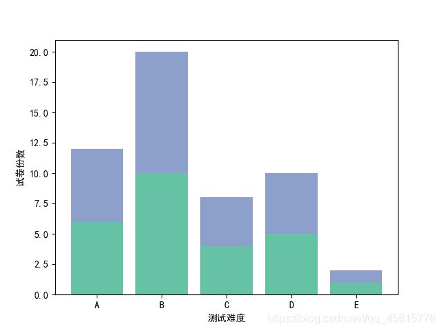
- 4.堆积柱状图
- 5.堆积条形图
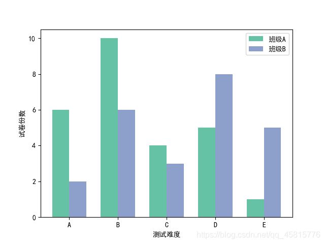
- 6.多数据并列柱状图
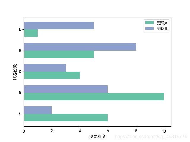
- 7.多数据平行条形图
- 8.间断条形图
- 9.堆积直方图
1. 在x轴上绘制定性数据分布特征(柱状图)
'''
直方图描述连续型数据分布,定量
柱状图描述离散数据分布,定性
'''
import matplotlib as mpl
import matplotlib.pyplot as plt
# 选择字体SimHei,如下完成配置任务
mpl.rcParams['font.sans-serif']=['SimHei']
# 不使用默认‘Unicode minus’模式处理坐标轴轴线颗度标签是负数的情况,而是使用‘ASCII hyphen’模式
mpl.rcParams['axes.unicode_minus']=False

x = [1, 2, 3, 4, 5, 6, 7, 8]
y = [3, 1, 4, 5, 8, 9, 7, 2]

# 在x轴上绘制定性数据分布特征(柱状图)
plt.bar(x,  # 柱状图柱体标签值
        y,  # 柱体高度
        align='center',  # 柱体对齐方式
        color='c', # 柱体颜色
        tick_label=['q', 'w', 'e', 'r', 't', 'y', 'u', 'i'],  # 刻度标签值
        hatch='/')   # 填充样式,越密集填充就越密

plt.xlabel("箱子编号")
plt.ylabel("箱子重量(kg)")
2.在y轴上绘制定性数据分布特征(条形图)
import matplotlib as mpl
import matplotlib.pyplot as plt
# 选择字体SimHei,如下完成配置任务
mpl.rcParams['font.sans-serif']=['SimHei']
# 不使用默认‘Unicode minus’模式处理坐标轴轴线颗度标签是负数的情况,而是使用‘ASCII hyphen’模式
mpl.rcParams['axes.unicode_minus']=False

x = [1, 2, 3, 4, 5, 6, 7, 8]
y = [3, 1, 4, 5, 8, 9, 7, 2]
# 在y轴上绘制定性数据分布特征(条形图)
plt.barh(x,
        y,
        align='center',
        color='c',
        tick_label=['q', 'w', 'e', 'r', 't', 'y', 'u', 'i'],
        hatch='/')
# 记得反过来
plt.ylabel("箱子编号")
plt.xlabel("箱子重量(kg)")

3.在x轴绘制定量数据分布特征(直方图)
import matplotlib.pyplot as plt
import numpy as np
# 在x轴绘制定量数据分布特征(直方图)
boxWeight = np.random.randint(0, 10, 100)
x = boxWeight
bins = range(0, 11, 1)
plt.hist(x,  # 输入连续性数据
         bins=bins,  # 柱体个数或者柱体边缘范围
         color='g',
         histtype='bar',  # 柱体类型
         rwidth=1,  # 柱体宽度
         alpha=0.6)
plt.xlabel("箱子编号")
plt.ylabel("箱子重量(kg)")

4.堆积柱状图
import matplotlib.pyplot as plt
import numpy as np
# 堆积柱状图
# x = [1, 2, 3, 4, 5]  # 为什么画这个要报错要用下面那个?
x = np.arange(5)
y = [6, 10, 4, 5, 1]
y1 = [2, 6, 3, 8, 5]
plt.bar(x, y, align='center', color='#66c2a5', tick_label=['A', 'B', 'C', 'D', 'E'], label='班级A')
plt.bar(x, y, align='center', bottom=y, color='#8da0cb', label='班级B')  # y没写成y1
plt.xlabel('测试难度')
plt.ylabel('试卷份数')
plt.legend()  # 不加这个是没有label显示的!

5.堆积条形图
import matplotlib.pyplot as plt
import numpy as np
x = np.arange(5)
y = [6, 10, 4, 5, 1]
y1 = [2, 6, 3, 8, 5]
# 堆积条形图
plt.barh(x, y, align='center', color='#66c2a5', tick_label=['A', 'B', 'C', 'D', 'E'], label='班级A')
plt.barh(x, y1, align='center', left=y, color='#8da0cb', label='班级B')  # 从bottom变为了left
plt.xlabel('测试难度')
plt.ylabel('试卷份数')
plt.legend()

6.多数据并列柱状图
import matplotlib.pyplot as plt
import numpy as np
x = np.arange(5)
y = [6, 10, 4, 5, 1]
y1 = [2, 6, 3, 8, 5]
# 多数据并列柱状图
bar_width = 0.35
tick_label=['A', 'B', 'C', 'D', 'E']
plt.bar(x, y, bar_width, align='center', color='#66c2a5', label='班级A')
plt.bar(x+bar_width, y1, bar_width, align='center', color='#8da0cb', label='班级B')
plt.xlabel('测试难度')
plt.ylabel('试卷份数')
plt.yticks(x+bar_width/2, tick_label)
plt.legend()
7.多数据平行条形图
import matplotlib.pyplot as plt
import numpy as np
x = np.arange(5)
y = [6, 10, 4, 5, 1]
y1 = [2, 6, 3, 8, 5]
# 多数据并列柱状图
bar_width = 0.35
tick_label=['A', 'B', 'C', 'D', 'E']
plt.barh(x, y, bar_width, align='center', color='#66c2a5', label='班级A')
plt.barh(x+bar_width, y1, bar_width, align='center', color='#8da0cb', label='班级B')
# 这里xy的label没有换过来,图就画错了。
plt.xlabel('测试难度')
plt.ylabel('试卷份数')
plt.yticks(x+bar_width/2, tick_label)
plt.legend()
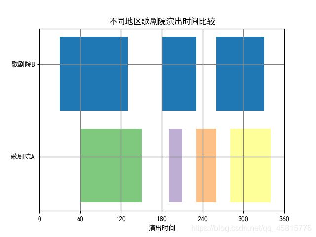
8.间断条形图
import matplotlib.pyplot as plt
# 间断条形图
plt.broken_barh([(30, 100), (180, 50), (260, 70)], (20, 8), facecolors='#1f78b4')
plt.broken_barh([(60, 90), (190, 20), (230, 30), (280, 60)], (10, 8), facecolors=('#7fc97f', '#beaed4', '#fdc086', '#ffff99'))
# (60, 90)起点为x轴60,并且沿正方向移动90个单位
# (10, 8)柱体y轴起点是10,沿y轴正方向移动8.就是每个柱体开始的高度和总的高度。
# facecolors每个柱体的填充颜色
plt.xlabel("演出时间")
plt.xticks(np.arange(0, 361, 60))
plt.yticks([15, 25], ["歌剧院A", '歌剧院B'])
plt.grid(ls='-', lw=1, color='gray')
plt.title('不同地区歌剧院演出时间比较')
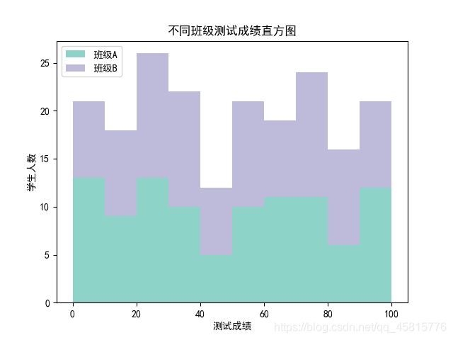
9.堆积直方图
# 堆积直方图
scoresT1 = np.random.randint(0, 100, 100)
scoresT2 = np.random.randint(0, 100, 100)
x = [scoresT1, scoresT2]
colors = ['#8dd3c7', '#bebada']
labels = ['班级A', '班级B']
bins = range(0, 101, 10)
plt.hist(x,
         bins=bins,
         color=colors,
         # histtype='bar',
         histtype='stepfilled',  # 阶梯型直方图,但是得是是否堆积为真
         rwidth=10,
         stacked=True,
         # stacked=False,
         label=labels)
plt.xlabel('测试成绩')
plt.ylabel('学生人数')
plt.title("不同班级测试成绩直方图")
plt.legend(loc='upper left')
参考书目《Python数据可视化之matplotlib实践》