Python中matplotlib.pyplot工具包总结
matplotlib.pyplot工具包总结
- 1 基础绘图
-
- 1.1 基础绘图模块导入
- 1.2 空白图绘制
-
- 1.2.1 空白图绘制方法一
- 1.2.2 空白图绘制方法二
- 1.3 图形绘制线的修改
-
- 1.3.1线条颜色设置
- 1.4 坐标轴设置
-
- 1.4.1 坐标轴名称
- 1.4.2 刻度设置
- 1.4.3 坐标轴的隐藏
- 1.4.4 原点设置
- 1.5 图例
-
- 1.5.1 图例名称
- 1.5.2 图例位置
- 1.6 图表标签
- 1.7 三维显示色条
- 2 绘图进阶画法
-
- 2.1 主次坐标轴绘制
- 2.2 某一点标注
- 2.3 多合一显示
- 2.4 分格显示
-
- 2.4.1 subplot2grid
- 2.4.2 gridspec
- 2.4.3 easy to define structure
- 2.5 画中画
- 2.6 动画绘图
- 3 三维绘图
-
- 3.1 基础三维图形绘制
- 3.2 三维投影绘图
- 4 其余绘图
-
- 4.1 散点图绘制
- 4.2 柱状图
- 4.3 等高线图
1 基础绘图
1.1 基础绘图模块导入
import matplotlib.pyplot as plt
import numpy as np
1.2 空白图绘制
1.2.1 空白图绘制方法一
fig = plt.figure()  #绘制一个空图
fig = plt.subplot()  #绘制一个带坐标的图
fig, ax = plt.subplots()  #绘制一个带坐标的图
subplot和subplots的区别在绘制多合一显示的图时有所区别
1.2.2 空白图绘制方法二
并不常用
plt.plot()
plt.show()
1.3 图形绘制线的修改
x = np.linspace(-1, 1, 10)
y = x
fig, ax = plt.subplots()

## 图形绘制线的总结,分别设置:线型、颜色、线宽、点样式、图例(显示的话需要再写一行代码)
ax.plot(x, y, linestyle='--', color='red', linewidth=2, marker='x', label='l1')
plt.show()
# 线型linestyle包括'-', '--', '-.', ':', 'None', ' ', '', 'solid', 'dashed', 'dashdot', 'dotted'
1.3.1线条颜色设置
b–blue c–cyan(青色)g–green k–black
m–magenta(紫红色) r–red w–white y–yellow
1.4 坐标轴设置
## 对轴上刻度tick的一系列设置
# 轴上刻度显示数值范围,进行设置后无法拖动
plt.xlim((-2, 2))
# plt.show()
1.4.1 坐标轴名称
# 轴的名称设置,加入r'$XXX$'可以进行优化,加入\可以识别空格和一些特殊的符号如α:r'$\alpha$'
plt.xlabel(r'$X\ Label$')
# plt.show()
1.4.2 刻度设置
tick
# 轴上坐标刻度设置,如果要隐藏plt.xticks(())
plt.xticks([-2, -1, 0, 1, 2], [r'$really\ bad$', r'$bad$', r'$normal$', r'$good$', r'$really\ good$'])
1.4.3 坐标轴的隐藏
# 隐藏某个刻度,上下左右'top', 'bottom', 'left', 'right'
# gca代表含义为‘get current axis’  获取当前坐标轴的句柄
ax = plt.gca()  #若是担心ax出现重复的情况,可以在最开始绘图时不进行传参
ax.spines['right'].set_color('none')
ax.spines['top'].set_color('none')
# 调整刻度ticks的显示位置,默认值是none,例:x的刻度默认在底部,可以修改到上部'top'
# plt.show()
1.4.4 原点设置
ax.xaxis.set_ticks_position('bottom')
ax.yaxis.set_ticks_position('left')
# 对坐标原点进行锁定设置,进行设置后无法拖动
ax.spines['bottom'].set_position(('data', -1))  # 锁定了坐标位置
ax.spines['left'].set_position(('data', 0))
# plt.show()
1.5 图例
1.5.1 图例名称
方法一
在绘图plot时进行编辑
方法二
l1, = plt.plt()在plt.legend(handles=[l1, l2], labels=(‘l1’, ‘l2’), loc=‘best’)中编辑
注:有时若无法完整画出图例,应转用方法二来设置图例
1.5.2 图例位置
图例位置设置
方法一,‘best’, ‘upper right’, ‘upper left’, ‘lower right’, ‘lower left’, ‘right’, ‘lower center’, ‘upper center’, ‘center’
方法二,前面对应数字0-10
通常默认应该为best,选择best会自动寻找合适位置
plt.legend(loc='best')
1.6 图表标签
## 图表标签
plt.title(r'$line\ of\ l1$')
plt.show()
1.7 三维显示色条
colorbar功能
3.1 基础三维图形绘制中左面绘制的图形有对colorbar的应用示例
fig.colorbar(surf, shrink=0.5, aspect=10)
#######################################
2 绘图进阶画法
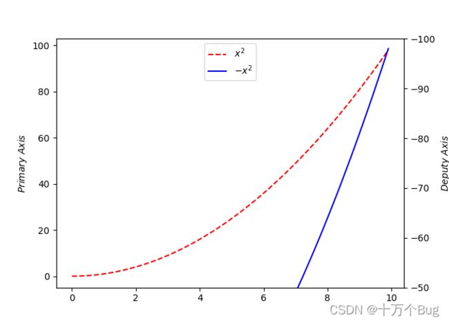
2.1 主次坐标轴绘制
x = np.arange(0, 10, 0.1)
y1 = x ** 2
y2 = -1 * y1
plt.figure()
y1, = plt.plot(x, y1, color='r', linestyle='--')
ax1 = plt.gca()
ax1.set_ylabel(r'$Primary\ Axis$')
ax2 = ax1.twinx()  #设置次坐标轴
y2, = ax2.plot(x, y2, 'b')
ax2.set_ylabel(r'$Deputy\ Axis$')
ax2.set_ylim(-50, -100)  #为了便于区分效果,将副坐标轴刻度范围进行修改
plt.legend(handles=[y1, y2], labels=[r'$x^2$', r'$-x^2$'], loc='upper center')
plt.show()
输出结果如图所示
2.2 某一点标注
绘制命令:plt.annotate
# 将图形绘制时的线改为点
x = np.linspace(-3, 3, 50)
y = 2*x + 1
plt.plot(x, y)
# plt.scatter(x, y)  #绘制的是点,并非线性的图
x0 = 1
y0 = 2*x0 + 1
plt.scatter(x0, y0, s=80, color='r')
plt.plot([x0, x0], [y0, 0], 'k--', lw=2.5)

# 方法一:plt.annotate
plt.annotate(r'$2x+1=3$', xy=(x0, y0), xycoords='data', xytext=(2, 2), fontsize=13,
             arrowprops=dict(arrowstyle='->', connectionstyle='arc3, rad=0.2'))
# 方法二:plt.text
plt.text(-3.7, 3, r'$This\ is\ the\ some\ text.\ \mu\ \sigma_i\ \alpha_t$', fontdict={'size':16, 'color':'r'})
plt.show()

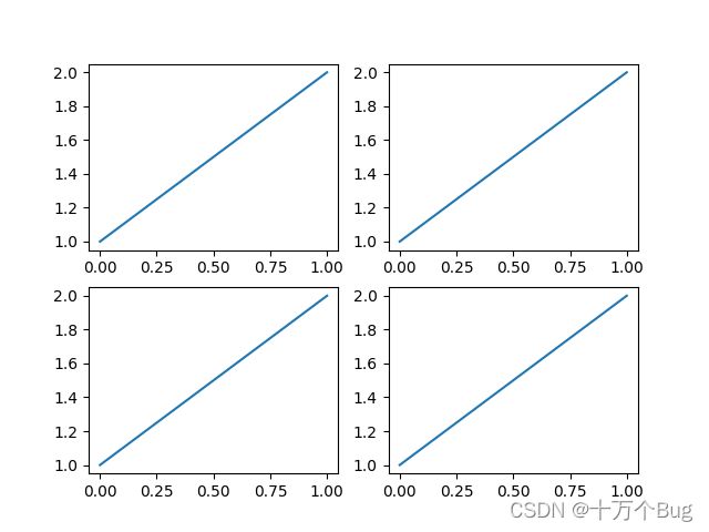
2.3 多合一显示
绘制命令:plt.subplot
注:命令同普通大致相同,只需要在绘图命令前加入set_
fig, (ax1, ax2) = plt.subplots(1, 2)
fig = plt.figure()
ax1 = plt.subplot(1, 2, 1)
ax2 = plt.subplot(1, 2, 2)
# subplot需要再对轴进行定义。subplots更为常用
# 在绘制多合一显示的图对其余参数进行修改时,需要加set来进行设置
示例:
plt.figure()
plt.subplot(2, 2, 1)  # 第一张图
plt.plot([0, 1], [1, 2])
plt.subplot(2, 2, 2)  # 第二张图
plt.plot([0, 1], [1, 2])
plt.subplot(2, 2, 3)  # 第三张图
plt.plot([0, 1], [1, 2])
plt.subplot(2, 2, 4)  # 第四张图
plt.plot([0, 1], [1, 2])
plt.show()
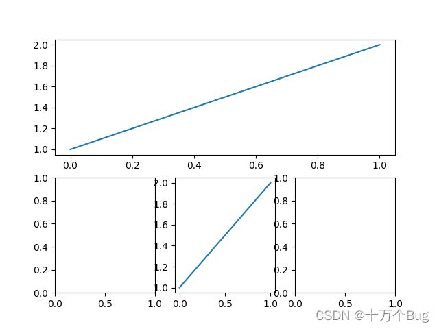
plt.figure()
plt.subplot(2, 1, 1)
plt.plot([0, 1], [1, 2])
plt.subplot(2, 3, 4)  # 位置编号需要修改
plt.subplot(2, 3, 5)
plt.plot([0, 1], [1, 2])
plt.subplot(2, 3, 6)
plt.show()
2.4 分格显示
创建多格显示的三种方法:
1.subplot2grid; 2.gridspec; 3.easy to define structure
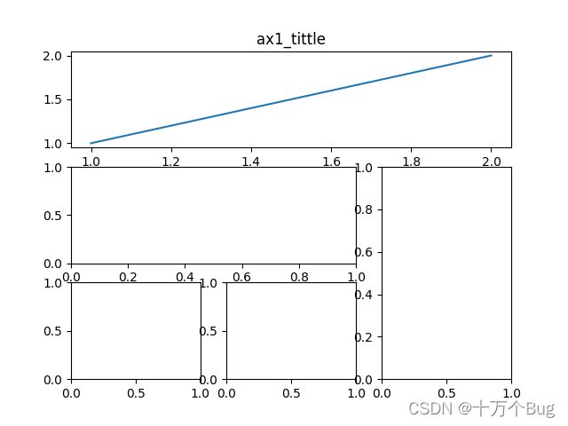
2.4.1 subplot2grid
plt.figure()
ax1 = plt.subplot2grid((3, 3), (0, 0), rowspan=1, colspan=3)  # 第一个参数划分为几个图 第二个参数从哪个开始画 colspan和rowspan是指该图占几行占几列,默认为1
ax1.plot([1, 2], [1, 2])
ax1.set_title('ax1_tittle')
ax2 = plt.subplot2grid((3, 3), (1, 0), colspan=2)
ax3 = plt.subplot2grid((3, 3), (2, 0))
ax4 = plt.subplot2grid((3, 3), (2, 1))
ax5 = plt.subplot2grid((3, 3), (1, 2), rowspan=2)
plt.show()
2.4.2 gridspec
## 需要导入额外模块
import matplotlib.gridspec as gridspec
plt.figure()
gs = gridspec.GridSpec(3, 3)
ax1 = plt.subplot(gs[0, :])
ax2 = plt.subplot(gs[1, :2])
ax3 = plt.subplot(gs[2, 0])
ax4 = plt.subplot(gs[2, 1])
ax5 = plt.subplot(gs[1:, 2])
plt.show()

2.4.3 easy to define structure
f, ((ax1, ax2), (ax3, ax4)) = plt.subplots(2, 2, sharex=True, sharey=True)
ax1.scatter([1, 2], [1, 2])
plt.show()

2.5 画中画
fig = plt.figure()
x = [1, 2, 3, 4, 5, 6, 7]
y = [1, 3, 4, 2, 5, 8, 6]

left, bottom, width, height = 0.1, 0.1, 0.8, 0.8
ax1 = fig.add_axes([left, bottom, width, height])
ax1.plot(x, y, c='r')
ax1.set_xlabel('x')
ax1.set_ylabel('y')
ax1.set_title('title')

left, bottom, width, height = 0.2, 0.6, 0.25, 0.25
ax2 = fig.add_axes([left, bottom, width, height])
ax2.plot(y, y, c='b')
ax2.set_xlabel('x')
ax2.set_ylabel('y')
ax2.set_title('inside_1')

plt.axes([0.6, 0.2, 0.25, 0.25])
plt.plot(y, x, 'g')
plt.xlabel('x')
plt.ylabel('y')
plt.title('inside_2')
plt.show()

2.6 动画绘图
from matplotlib import animation
fig, ax = plt.subplots()
x = np.arange(0, 2*np.pi, 0.01)
line, = ax.plot(x, np.sin(x))


def animate(i):
    line.set_ydata(np.sin(x + i/10))
    return line,


def init():
    line.set_ydata(np.sin(x))
    return line,


ani = animation.FuncAnimation(fig=fig, func=animate, frames=100, init_func=init, interval=20, blit=False)
plt.show()
绘图输出结果为一动态的正弦曲线图
#####################################################
3 三维绘图
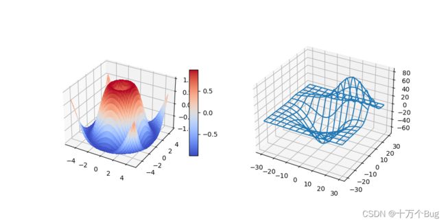
3.1 基础三维图形绘制
import matplotlib.pyplot as plt
from matplotlib import cm
import numpy as np
from mpl_toolkits.mplot3d.axes3d import get_test_data
# set up a figure twice as wide as it is tall
fig = plt.figure(figsize=plt.figaspect(0.5))
# =============
# First subplot
# =============
# set up the axes for the first plot
ax = fig.add_subplot(1, 2, 1, projection='3d')
# plot a 3D surface like in the example mplot3d/surface3d_demo
X = np.arange(-5, 5, 0.25)
Y = np.arange(-5, 5, 0.25)
X, Y = np.meshgrid(X, Y)
R = np.sqrt(X**2 + Y**2)
Z = np.sin(R)
surf = ax.plot_surface(X, Y, Z, rstride=1, cstride=1, cmap=cm.coolwarm, linewidth=0, antialiased=False)
# rstride, cstride 行和列的跨度改变
ax.set_zlim(-1.01, 1.01)
fig.colorbar(surf, shrink=0.5, aspect=10)
# Colorbars are a visualization of the mapping from scalar values to colors. In Matplotlib they are drawn into a dedicated Axes.
# ==============
# Second subplot
# ==============
# set up the axes for the second plot
ax = fig.add_subplot(1, 2, 2, projection='3d')
# plot a 3D wireframe like in the example mplot3d/wire3d_demo
X, Y, Z = get_test_data(0.05)
ax.plot_wireframe(X, Y, Z, rstride=10, cstride=10)
plt.show()
3.2 三维投影绘图
# step1 绘制3d图形
# 定义figure
fig = plt.figure()
# 创建3d图形
ax = fig.add_subplot(projection='3d')

# step2 生成数据
# X, Y value
X = np.arange(-4, 4, 0.25)
Y = np.arange(-4, 4, 0.25)
# 生成网格数据
X, Y = np.meshgrid(X, Y)
#计算每个点对应的长度
R = np.sqrt(X ** 2 + Y ** 2)
# 计算z轴的高度
Z = np.sin(R)

# step3 绘制3d曲面
# rstride,行之间的跨度; cstride,列之间的跨度, cmap 颜色类
# rcount,设置间隔个数,默认50个;ccount,列的间隔个数 不能与上面两个参数同时出现
ax.plot_surface(X, Y, Z, rstride=1, cstride=1, cmap=plt.get_cmap('rainbow'))
# zdir绘制从3d曲面到地步的投影, 可选x,y,z; offset 投影到选中方向面的位置
ax.contourf(X, Y, Z, zdir='z', offset=-2, cmap='rainbow')
# contourf在投影平面绘制出的是填充等高线。改用contour在投影平面绘制出的是等高线
# 设置z轴的维度
ax.set_zlim(-2, 2)
plt.show()

4 其余绘图
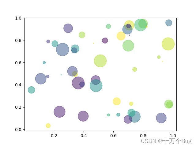
4.1 散点图绘制
绘制命令:plt.scatter()
n = 1024
X = np.random.normal(0, 1, n)
Y = np.random.normal(0, 1, n)
T = np.arctan2(Y, X)  # for color value
plt.scatter(X, Y, s=75, c=T, alpha=0.5)  # 绘制散点图
plt.xlim(-1.5, 1.5)
plt.ylim(-1.5, 1.5)
plt.xticks(())  # 隐藏ticks
plt.yticks(())
plt.show()

# Fixing random state for reproducibility
np.random.seed(19680801)
N = 50
x = np.random.rand(N)
y = np.random.rand(N)
colors = np.random.rand(N)
area = (30 * np.random.rand(N))**2  # 0 to 15 point radii
plt.scatter(x, y, s=area, c=colors, alpha=0.5)
plt.show()
# Fixing random state for reproducibility
np.random.seed(19680801)
N = 100
r0 = 0.6
x = 0.9 * np.random.rand(N)
y = 0.9 * np.random.rand(N)
area = (20 * np.random.rand(N))**2  # 0 to 10 point radii
c = np.sqrt(area)
r = np.sqrt(x ** 2 + y ** 2)
area1 = np.ma.masked_where(r < r0, area)
area2 = np.ma.masked_where(r >= r0, area)
plt.scatter(x, y, s=area1, marker='^', c=c)
plt.scatter(x, y, s=area2, marker='o', c=c)
# Show the boundary between the regions:
theta = np.arange(0, np.pi / 2, 0.01)
plt.plot(r0 * np.cos(theta), r0 * np.sin(theta))
plt.show()

4.2 柱状图
绘制命令:plt.bar()
n = 12
X = np.arange(n)
Y1 = (1 - X/float(n))*np.random.uniform(0.5, 1.0, n)
Y2 = (1 - X/float(n))*np.random.uniform(0.5, 1.0, n)
plt.bar(X, +Y1, facecolor='#9999ff', edgecolor='white')
plt.bar(X, -Y2, facecolor='#ff9999', edgecolor='white')
for x, y in zip(X, Y1):
    # ha = horizontal alignment : Set the horizontal alignment to one of
    # 'center', 'right', 'left'
    # va = vertical alignment : Set the vertical alignment.
    # 'center', 'top', 'bottom', 'baseline', 'center_baseline'
    plt.text(x + 0.04, y + 0.05, '%.2f' % y, ha='center', va='bottom')
for x, y in zip(X, Y2):
    plt.text(x - 0.04, -y - 0.05, '-%.2f' % y, ha='center', va='top')
    # 对下面的柱状条图进行标注时要注意,方向应该为反的,-(y+0.05)
plt.show()

4.3 等高线图
def f(x, y):
    # the heigth function
    return (1 - x/2 + x ** 5 + y ** 3)*np.exp(-x ** 2 - y ** 2)

n = 256
x = np.linspace(-3, 3, n)
y = np.linspace(-3, 3, n)
X, Y = np.meshgrid(x, y)
'''
contour and contourf draw contour lines and filled contours, respectively. Except as noted,
 function signatures and return values are the same for both versions.
contour和contourf分别绘制等高线和填充等高线。 除了前面提到的,两个函数特征和返回值是相同的。
'''
plt.contourf(X, Y, f(X, Y), 8, alpha=0.75, cmap=plt.cm.hot)  # 数字8表示填充等高线分成几块
C = plt.contour(X, Y, f(X, Y), 8, colors='g', linewidths=2)  # 对等高线中数字标识进行设置,8表示划分出的8档等高线存在标注
plt.clabel(C, inline=True, fontsize=10)  # inline=True 表示标注等高线中数字在线上绘制 fontsize数字显示的大小
plt.xticks(())
plt.yticks(())
plt.show()
