Python系列 之 matplotlib库 基础知识
Python系列 之 matplotlib库 基础知识学习
- Pyplot
-
- 简单示例
- 中文显示问题
-
- 注册全局字体
- font_manager.FontProperties注册字体
- Figure
-
- Figure的组成部分
- 创建Figure对象
- Axes
-
- 简单的例子
- 设置样式
-
- linewidths
- linestyles
- markersizes
- Axes对象的一些方法
-
- Axes.axis方法
- Axes.cla和Axes.clear方法
- Axes.set_axis_off和Axes.set_axis_on方法
- Axis labels, title, 和 legend的操作
- Axes.set_facecolor和Axes.get_facecolor方法
- Axes.grid方法
- Axes.invert_xaxis和Axes.invert_yaxis方法
- Ticks and tick labels
- 绘图示例
matplotlib属于第三方库需要另外进行安装才可以使用
pip install -i https://pypi.tuna.tsinghua.edu.cn/simple matplotlib
Matplotlib将数据绘制在Figure对象上,Figure对象应包含一个或多个Axes对象,Axes对象包含一组X-Y坐标或者更多维度坐标的区域
pyplot是matplotlib的绘图接口;对Figure对象进行管理
官方教程
# import
import matplotlib.pyplot as plt
Pyplot
matplotlib.pyplot是使 matplotlib 可以像MATLAB一样工作的函数集合;每个pyplot函数都会对图形进行一些更改:例如,创建图形、在图形中创建绘图区域、在绘图区域中绘制一些线、用标签装饰绘图等;
pyplot的API调用通常不如面向对象的 API 灵活;pyplot大多数的函数调用也可以用Axes对象的方法调用实现
简单示例
import matplotlib.pyplot as plt
import numpy as np
x = np.arange(0, 5, 0.1)
y = np.sin(x)
plt.plot(x, y)
plt.show()

中文显示问题
注册全局字体
import matplotlib.pyplot as plt
# 注册全局字体
plt.rcParams['font.sans-serif'] = ['simsun']
# plt.rcParams['font.family'] = ['simsun']
font_manager.FontProperties注册字体
# 注册字体
from matplotlib.font_manager import FontProperties
font_simsun = FontProperties(fname="./fonts/simsun.ttc")
# plt.xlabel("X 轴", fontproperties=font_simsun)
Figure
Figure就像一张空白的纸张可以在上画上图表的内容
Figure的组成部分

创建Figure对象
fig = plt.figure() # 创建一个空白的Figure对象 不包含Axes对象
fig, ax = plt.subplots() # 创建包含一个Axes对象的Figure对象
fig, ax = plt.subplots(2, 3) # 创建包含一组Axes对象的Figure对象 一组 2*3 的Axes对象 2行3列
plt.show()

Axes
Axes对象的属性和方法定义了大多部分的绘制方法以及绘制样式
Axes对象基于在Figure对象上的绘制区域,通常包括两个(在3D情况下为三个)Axis对象
简单的例子
Axes对象的plot方法
import matplotlib.pyplot as plt
import numpy as np
fit, ax = plt.subplots()
# ax.plot方法绘制
# 将y与x绘制为线/标记
# Axes.plot(*args, scalex=True, scaley=True, data=None, **kwargs)
# plot([x], y, [fmt], *, data=None, **kwargs)
# plot([x], y, [fmt], [x2], y2, [fmt2], ..., **kwargs)
# 参数fmt是定义颜色、标记和线型等基本格式的便捷方法
# fmt = '[marker][line][color]'
# 可以将Line2D特性用作关键字参数
# Line2D属性URL:https://matplotlib.org/stable/api/_as_gen/matplotlib.lines.Line2D.html#matplotlib.lines.Line2D
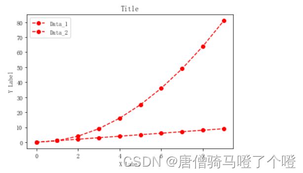
x = np.arange(10)
# 红色圆形标记虚线连接
ax.plot(x, 'ro--',label='Data_1')
ax.plot(x,x**2,label='Data_2', color='red',marker='o',linestyle='dashed')
# 设置X-Y坐标轴标签
ax.set_xlabel("X Label")
ax.set_ylabel("Y Label")
# 设置title
ax.set_title("Title")
# 显示legend 图例
ax.legend()
plt.show()
设置样式
- Colors
- Linewidths
- linestyles
- markersizes
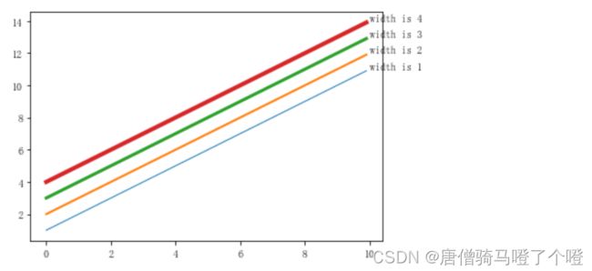
linewidths
# Linewidths
fig, ax = plt.subplots()
x = np.arange(0,10,0.1)
for width in range(1,5):
    ax.plot(x,x+width,linewidth=width)
    ax.text(x=10,y=10+width,s=f"width is {width}")
plt.show()
linestyles
| linestyle | description |
|---|---|
| ‘-’ or ‘solid’ | solid line |
| ‘–’ or ‘dashed’ | dashed line |
| ‘-.’ or ‘dashdot’ | dash-dotted line |
| ‘:’ or ‘dotted’ | dotted line |
| ‘none’, ‘None’, ’ ', or ‘’ | draw nothing |
#linestyles
linestyle = {'-':'solid', '--' : 'dashed','-.' : 'dashdot',
             ':' : 'dotted','none':"None"}

fig, ax = plt.subplots()
x = np.arange(0,10,2)
y = np.ones(5)
dy = 0.0
for style, val in linestyle.items():
    ax.plot(x,y+dy,linestyle=val)
    ax.annotate(val,(8.0,1+dy))
    dy+=5

plt.show()

markersizes
| marker | description |
|---|---|
| ‘.’ | point |
| ‘,’ | pixel |
| ‘o’ | circle |
| ‘v’ | triangle_down |
| ‘^’ | triangle_up |
| ‘<’ | triangle_left |
| ‘>’ | triangle_right |
| ‘1’ | tri_down |
| ‘2’ | tri_up |
| ‘3’ | tri_left |
| ‘4’ | tri_right |
| ‘8’ | octagon |
| ‘s’ | square |
| ‘p’ | pentagon |
| ‘*’ | star |
| ‘h’ | hexagon1 |
| ‘H’ | hexagon2 |
| ‘+’ | plus |
| ‘x’ | x |
| ‘D’ | diamond |
| d | thin_diamond |
| ‘|’ | vline |
| ‘_’ | hline |
| ‘P’ | plus_filled |
| ‘X’ | x_filled |
| 0 | tickleft |
| 1 | tickright |
| 2 | tickup |
| 3 | tickdown |
| 4 | caretleft |
| 5 | caretright |
| 6 | caretup |
| 7 | caretdown |
| 8 | caretleftbase |
| 9 | caretrightbase |
| 10 | caretupbase |
| 11 | caretdownbase |
| ‘None’ | nothing |
| None | nothing |
| ’ ’ | nothing |
| ‘’ | nothing |
Line2D.markers中存放了所有marker的取值
from matplotlib.lines import Line2D
print(Line2D.markers)
# {'.': 'point', ',': 'pixel', 'o': 'circle', 'v': 'triangle_down',
#  '^': 'triangle_up', '<': 'triangle_left', '>': 'triangle_right',
#  '1': 'tri_down', '2': 'tri_up', '3': 'tri_left', '4': 'tri_right',
#  '8': 'octagon', 's': 'square', 'p': 'pentagon', '*': 'star',
#  'h': 'hexagon1', 'H': 'hexagon2', '+': 'plus', 'x': 'x', 'D': 'diamond',
#  'd': 'thin_diamond', '|': 'vline', '_': 'hline', 'P': 'plus_filled',
# 'X': 'x_filled', 0: 'tickleft', 1: 'tickright', 2: 'tickup', 3: 'tickdown',
#  4: 'caretleft', 5: 'caretright', 6: 'caretup', 7: 'caretdown',
#  8: 'caretleftbase', 9: 'caretrightbase', 10: 'caretupbase',
#  11: 'caretdownbase', 'None': 'nothing', None: 'nothing', ' ': 'nothing', '': 'nothing'}
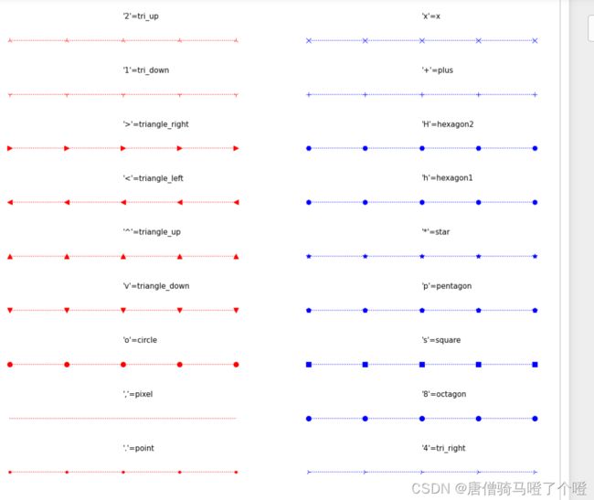
markers = Line2D.markers
fig, ax = plt.subplots(1,2,figsize=(20,20))
x = np.arange(0,10,2)
y = np.ones(5)
dy = 0.0
for marker in list(markers.keys())[:10]:
    ax[0].plot(x,y+dy,marker=marker,markersize=10,linestyle=":",color="red")
    ax[0].text(4,5+dy,f"{repr(marker)}={markers[marker]}",fontsize=15)
    #隐去坐标轴 axis
    ax[0].set_axis_off()
    dy+=10
for marker in list(markers.keys())[10:20]:
    ax[1].plot(x,y+dy,marker=marker,markersize=10,linestyle=":",color="blue")
    ax[1].text(4,5+dy,f"{repr(marker)}={markers[marker]}",fontsize=15)
    #隐去坐标轴 axis
    ax[1].set_axis_off()
    dy+=10

plt.show()
Axes对象的一些方法
Axes.axis方法
获取或设置一些轴属性
| 参数 | 说明 |
|---|---|
| [xmin, xmax, ymin, ymax] | 设置X-Y轴的最小最大刻度 |
| True | 显示X-Y轴以及X-Ylabel |
| False | 与True相反 |
| ‘on’ | 等于True |
| ‘off’ | 等于False |
| ‘equal’ | Set equal scaling (i.e., make circles circular) by changing axis limits. This is the same as ax.set_aspect(‘equal’, adjustable=‘datalim’). Explicit data limits may not be respected in this case. |
| ‘scaled’ | Set equal scaling (i.e., make circles circular) by changing dimensions of the plot box. This is the same as ax.set_aspect('equal', adjustable='box', anchor='C').Additionally, further autoscaling will be disabled. |
| ‘tight’ | Set limits just large enough to show all data, thendisable further autoscaling. |
| ‘auto’ | Automatic scaling (fill plot box with data). |
| ‘image’ | ‘scaled’ with axis limits equal to data limits. |
| ‘square’ | Square plot; similar to ‘scaled’, but initially forcing xmax-xmin == ymax-ymin. |
import matplotlib.pyplot as plt
# axis方法 快速获取或设置一些轴的属性
# axis(*args, emit=True, **kwargs)
# Call signatures:
# xmin, xmax, ymin, ymax = axis()
# xmin, xmax, ymin, ymax = axis([xmin, xmax, ymin, ymax])
# xmin, xmax, ymin, ymax = axis(option)
# xmin, xmax, ymin, ymax = axis(**kwargs)
# Parameters:
# [xmin, xmax, ymin, ymax] 设置X-Y坐标的最小最大刻度
# bool or Str
# bool 显示或隐藏X-Y轴以及X-Ylabe
# Str in ['on','off','equal', 'scaled', 'tight','auto','image','square']
# Returns  xmin, xmax, ymin, ymax  : float
fig, ax = plt.subplots()
ax.plot([0,1,2,3,4,5,6],[2,1,2,3,4,5,8])
# ax.axis([0,5,0,5])
print(ax.axis('equal'))
ax.grid()
plt.show()
# print(help(ax.axis))

Axes.cla和Axes.clear方法
清除 Axes区域
import matplotlib.pyplot as plt
fig, ax = plt.subplots()
ax.plot([10,11,10,11,12,13])
# ax.cla()
ax.clear()
plt.show()
Axes.set_axis_off和Axes.set_axis_on方法
隐藏或显示axis信息
包括 axis lines,ticks,ticklabels, grid and axis labels.
import matplotlib.pyplot as plt
fig, (ax0,ax1) = plt.subplots(ncols=2)
ax0.plot([10,11,10,11,12,13],label="data-1")
ax0.set_xlabel("X Label")
ax0.grid()
ax0.set_axis_off()
ax0.legend()
ax1.plot([10,11,10,11,12,13],label="data-1")
ax1.set_xlabel("X Label")
ax1.set_axis_on()
plt.show()

Axis labels, title, 和 legend的操作
设置axis的 labels, title, 和 legend
| 方法 | 说明 |
|---|---|
| Axes.set_xlabel | Set the label for the x-axis. |
| Axes.get_xlabel | Get the xlabel text string. |
| Axes.set_ylabel | Set the label for the y-axis. |
| Axes.get_ylabel | Get the ylabel text string. |
| Axes.set_title | Set a title for the Axes. |
| Axes.get_title | Get an Axes title. |
| Axes.legend | Place a legend on the Axes. |
| Axes.get_legend | Return the Legend instance, or None if no legend is defined. |
| Axes.get_legend_handles_labels | Return handles and labels for legend |
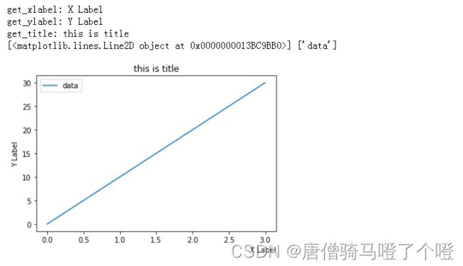
import matplotlib.pyplot as plt
fig, ax = plt.subplots()
# Axes.set_xlabel(xlabel, fontdict=None, labelpad=None, *, loc=None, **kwargs)
# Parameters:
# xlabel : str
# loc : {'left', 'center', 'right'}
# **kwargs : Text properties
fontdict = {"":"",}
ax.set_xlabel(xlabel="X Label",loc="right")
print("get_xlabel:", ax.get_xlabel())
ax.set_ylabel("Y Label")
print("get_ylabel:", ax.get_ylabel())
# Axes.set_title(label, fontdict=None, loc=None, pad=None, *, y=None, **kwargs)
ax.set_title("this is title")
print("get_title:",ax.get_title())
ax.plot([0,10,20,30],label="data")

# Axes.legend(*args, **kwargs)
# legend(handles, labels)
# legend(handles=handles)
# legend(labels)
ax.legend()
# get_legend_handles_labels 返回 handles 和 labels
handle,labels = ax.get_legend_handles_labels()
print(handle,labels)
plt.show()
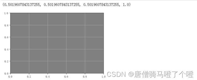
Axes.set_facecolor和Axes.get_facecolor方法
import matplotlib.pyplot as plt
fig, ax = plt.subplots()
ax.set_facecolor('gray')
ax.grid()
print(ax.get_facecolor())
plt.show()
Axes.grid方法
设置Axes的网格线条样式
# Axes.grid(visible=None, which='major', axis='both', **kwargs)
# Parameters:
# visible : bool or None
# which : {'major', 'minor', 'both'}
# axis : {'both', 'x', 'y'}
# **kwargs : Line2D properties
import matplotlib.pyplot as plt
x = [1,2,3,4,5,6]
fig, (ax0,ax1,ax2) = plt.subplots(ncols=3)
ax0.plot(x)
ax0.grid(False)
ax1.plot(x)
ax1.grid(which='major')
ax2.plot(x)
# 网格 红色 虚线 线宽 2
ax2.grid(**{'color':'r','ls':':','lw':2})
plt.show()

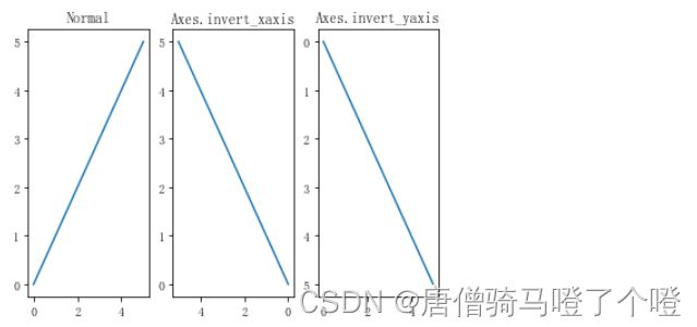
Axes.invert_xaxis和Axes.invert_yaxis方法
X-Y轴反转操作
# Axes.invert_xaxis 反转x轴
# Axes.invert_yaxis 反转y轴
import matplotlib.pyplot as plt
fig, (ax,ax0,ax1) = plt.subplots(ncols=3)
ax.plot([0,1,2,3,4,5])
ax.set_title("Normal")
ax0.plot([0,1,2,3,4,5])
ax0.invert_xaxis()
ax0.set_title('Axes.invert_xaxis')
ax1.plot([0,1,2,3,4,5])
ax1.invert_yaxis()
ax1.set_title('Axes.invert_yaxis')
plt.show()
Ticks and tick labels
import matplotlib.pyplot as plt
fig, ax = plt.subplots()
ax.plot([10,20,30,40,50],[10,20,30,40,50])
# Axes.set_xticks(ticks, labels=None, *, minor=False, **kwargs)
ax.set_xticks(ticks=range(10,100,50),labels=["A","B"])
# Axes.get_xticks
# Axes.set_xticklabels(labels, *, fontdict=None, minor=False, **kwargs)
ax.set_xticklabels(["C","D"])
# Axes.get_xticklabels
print(ax.get_xticklabels())
# Axes.set_yticks
# Axes.get_yticks
# Axes.set_yticklabels
# Axes.get_yticklabels
plt.show()

绘图示例
折线图:
import matplotlib.pyplot as plt
import numpy as np
data = {"male":{"2012":69660,"2013":70063,"2014":70522,"2015":70857,"2016":71307,"2017":71650,"2018":71864,"2019":72039,"2020":72357,"2021":72311},
        "female":{"2012":66262,"2013":66663,"2014":67124,"2015":67469,"2016":67925,"2017":68361,"2018":68677,"2019":68969,"2020":68855,"2021":68949}}
male = data["male"]
female = data["female"]
malex = list(male.keys())
maley = list(male.values())

fig, ax = plt.subplots()
ax.plot(maley,"ro:",label="male")

femalex = list(female.keys())
femaley = list(female.values())
ax.plot(femaley,"go--",label="female")

ax.set_xticks(np.arange(len(femalex)),malex)
ax.set_title("男女人数统计",size=20)
ax.set_xlabel("年份")
ax.set_ylabel("数量(万)")

ax.grid()
ax.legend()
plt.show()

柱形图:
import matplotlib.pyplot as plt
import numpy as np
data = {"male":{"2012":69660,"2013":70063,"2014":70522,"2015":70857,"2016":71307,"2017":71650,"2018":71864,"2019":72039,"2020":72357,"2021":72311},
        "female":{"2012":66262,"2013":66663,"2014":67124,"2015":67469,"2016":67925,"2017":68361,"2018":68677,"2019":68969,"2020":68855,"2021":68949}}
male = data["male"]
female = data["female"]
malex = list(male.keys())
maley = np.array(list(male.values()))

fig, (ax,ax0)= plt.subplots(figsize=(10,12),nrows=2)
width = 0.38
rects1 = ax.bar(np.arange(len(malex))-width/2,maley,width,label="male")

femalex = list(female.keys())
femaley = np.array(list(female.values()))
rects2 = ax.bar(np.arange(len(femaley))+width/2, femaley,width,label="female")

ax.bar_label(rects1,padding=3)
ax.bar_label(rects2, padding=3)
ax.set_xticks(np.arange(len(malex)),malex)
ax.set_title("男女人数统计",size=20)
ax.set_ylabel("数量(万)",size=18)
ax.set_yscale("log")
ax.grid()
ax.legend()


diff = maley-femaley
rect_plot = ax0.plot(np.arange(len(diff)),diff,'ro-.', label=" ")

rect_bar = ax0.bar(np.arange(len(diff)),diff, label=" ")
ax0.set_title("男女人数差值",size=20)
ax0.set_xlabel("年份",size=18)
ax0.set_ylabel("数量(万)",size=18)

ax0.bar_label(rect_bar,padding=3)
ax0.set_xticks(np.arange(len(diff)),malex)
ax0.set_yscale("log")
ax0.legend()
plt.subplots_adjust(hspace=0.2)

plt.show()

以上就是对 matplotlib库 基础知识的学习,
后续有时间再进行详细整理其他知识
参考:
matplotlib API