GDAL & Python Chapter 1. Introduction
This chapter covers
- Introducing basic types of spatial data
- What is geoprocessing?
- Using QGIS
Humans have been making maps for far longer than we’ve been writing, and even the famed Lascaux caves in France have a star map on their walls. We know that ancient peoples all over the world used maps, including the Babylonians, Greeks, and Chinese. The art of cartography has evolved over the millennia, from cave walls as mediums to clay tablets, parchment, paper, and now digital. Maps have also gotten much more detailed, as well as accurate, as technology has been developed and improved. In fact, most of us would probably have a hard time recognizing the most primitive maps as maps at all.
It took mankind a long time to go from cave walls to mass-produced road maps, but the degree of change in the last few decades has been staggering. Geographic Information Systems (GISs) became more common and easier to use, giving more people the ability to both analyze spatial data and produce their own high-quality maps. Then came web mapping and services that allow users to make custom maps online and share them with the world. Many of us even carry devices in our pockets that can display a map showing our current location and tell us how to get to a new restaurant that we want to try. Not only that, but the available data has also changed dramatically. Makers of those early maps would be blown away by our roadmaps overlaid on top of aerial photography and our talking GPS units.
Thanks to these recent advances in technology, along with free and open source tools, you have access to powerful software to work with your own data. This book aims to teach you the basic concepts of working with spatial data and how to do so with the Python programming language and a few open source tools. After reading this book, you’ll write Python scripts to solve basic data analysis problems and have the background knowledge to answer more-complicated questions.
1.1. Why use Python and open source?
Several compelling reasons exist for using Python and open source tools for processing spatial data. First, Python is a powerful programming language that has the advantage of being much easier to learn than some other languages, and it’s also easy to read. It’s a good language to start with if you’ve never programmed before, and if you’re coming from other languages, you’ll probably find Python easy to pick up.
Learning Python is a good move, even if you never again use it for spatial analysis after reading this book. Many different Python modules are available for a wide range of applications, including web development, scientific data analysis, and 3D animation. In fact, geospatial applications are only a small subset of what Python is used for.
In addition, Python is multiplatform, so unless you’ve used an extra module that’s specific to one operating system, a Python script that you write on one machine will run on any other machine, provided the required modules are installed. You can use your Linux box to develop a set of scripts and then give them to a colleague who uses Windows, and everything should work fine. You do need to install a Python interpreter to run the code, but those are freely available for major desktop operating systems.
Python ships with the core language and numerous modules that you can optionally use in your code. In addition, many more modules are available from other sources. For example, the Python Package Index (PyPI), available at https://pypi.python.org/pypi, lists more than 60,000 additional modules, all used for different purposes, and all free. That’s not to say that everything Python is free, however. Several of you coming from a GIS background are no doubt familiar with ArcPy, which is a Python module that comes with ArcGIS, and is not useable without an ArcGIS license.
Not only is there an abundance of free Python packages, but many of them are also open source. Although many people associate open source software with software that doesn’t cost money, that’s only part of it. The real meaning is that the source code is made available for you to use if you wish. The fact that you have access to the source code means that nothing is a “black box” (if you want to take the time to learn what’s inside the box), but also that you can modify the code to suit your needs. This is extremely liberating. I’ve used open source tools that didn’t quite do what I wanted, so I tweaked the source code, recompiled, and then had a utility that did exactly what I needed. This is impossible with proprietary software. These two types of freedom associated with open source software make it an attractive model.
Several different types of open source licenses exist, some of which not only allow you to modify the code as needed, but even allow you to turn around and sell your derived work without providing the source code and your modifications. Other licenses require that if you use the software, then your software must also be open source.
We’ll cover a few popular open source Python modules for geospatial data in this book. Several were originally developed in other languages, but became so common and well respected that they were either ported to other languages, or bindings were developed so that they could be used in other languages. For example, the Geospatial Data Abstraction Library (GDAL) is an extremely popular C/C++ library for reading and writing spatial data, and bindings have been developed for Python, .NET, Ruby, and other languages. The GDAL library is even used by many proprietary software packages. Because of the library’s widespread use, this book concentrates on GDAL/OGR. If you can learn to use this, then moving to other libraries shouldn’t be difficult. In fact, several nice libraries are built on top of GDAL/OGR that are probably easier to use, but don’t necessarily provide all of the functionality that’s present in GDAL. See appendix A for installation instructions for the modules used in this book.
Another advantage to going with open source tools is that active user communities exist for some of these packages, and you may find that bugs and other issues are addressed much more quickly than with many proprietary software packages. You can even discuss the finer points of the libraries with the actual developers via email lists.
1.2. Types of spatial data
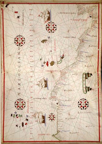
You’ll learn how to work with the two main types of spatial data, vector and raster. Vector data is made up of points, lines, and polygons, while raster data is a two- or three-dimensional array of data values such as the pixels in a photograph. A dataset containing country boundaries is an example of vector data. In this case, each country is generally represented as a polygon. Datasets that use lines to represent roads or rivers, or points to show the location of weather stations, are other examples. Early primitive maps, such as those drawn on cave walls, only showed the features themselves. Later maps contained labels for features of interest such as cities or seaports; for example, the Portolan map of northwest Africa shown in figure 1.1.
Figure 1.1. A Portolan map of the northwest coast of Africa, circa 1590
Using digital data, you have the advantage of attaching multiple attribute values to each feature, whether you plan to display the information on a map or not. For each road, you can store information such as its name, speed limit, number of lanes, or anything else you can think of. Figure 1.2 shows an example of data you might store with each country in a dataset.
Figure 1.2. You can store attributes such as name and population for each geographic feature in a dataset.
Of the several reasons why this is useful, the obvious one is that you can label features using one of the attributes. For example, figure 1.2 could show country names as well as outlines. All of this data can also help you make more-interesting maps that might even tell a story. The population counts stored for each feature in figure 1.2 could be used to symbolize countries based on population, so it’s evident at a glance which countries are most populated (figure 1.3).
Figure 1.3. Countries symbolized based on population
Spatial overlay analyses are also easy using vector data. Say you wanted to know what percentage of Lake Victoria was in Uganda, Kenya, and Tanzania. You could always guesstimate the answer based on figure 1.4, but you could also use GIS software to get more accurate numbers. You’ll do simple analyses like this by the time you finish this book.
Figure 1.4. Lake Victoria straddles Uganda, Kenya, and Tanzania. Spatial analysis could help you determine the proportion of the lake that falls in each country.
Attribute values attached to features can also add to the power of spatial operations. For example, say you had a dataset containing the locations of water wells with attributes that included depth and flow rate. If you also had a dataset for the same area containing geologic landforms or soil types, you could analyze this data to see if flow rate or required well depth was affected by landform or soil type.
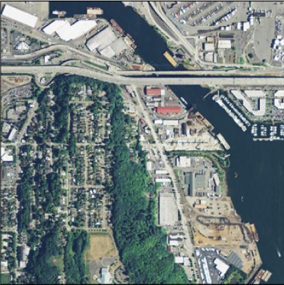
Unlike the early mapmakers, you also have access to raster data. Rasters, as the datasets are called, are two- or three-dimensional arrays of values, the way a photograph is a two-dimensional array of pixel values. In fact, aerial photographs such as the one shown in figure 1.5 are a commonly used type of raster data. Satellite images sometimes look similar, although they generally have lower resolutions. The cool thing about satellite imagery is that much of it is collected using nonvisible light so it can provide information that a simple photograph cannot.
Figure 1.5. An aerial photograph near Seattle, Washington
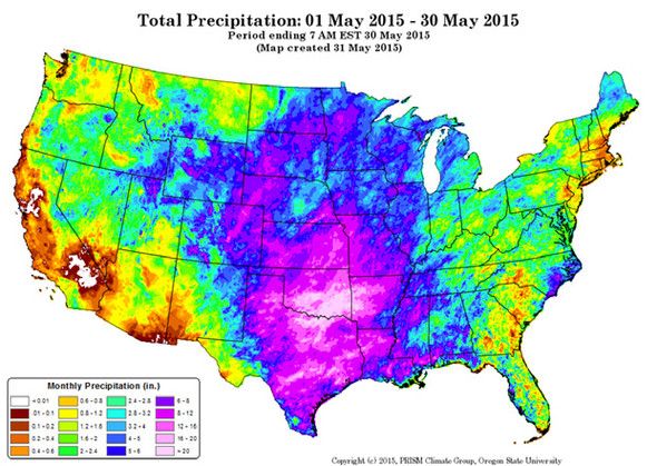
Raster datasets are well suited to any continuous data, not only photographs. Precipitation data like that shown in figure 1.6 is a good example. Rain doesn’t usually stop at a sudden boundary, so it’s hard to draw a polygon around it. Instead, a grid of precipitation amounts works much better and can capture local variation more easily. The same idea applies to temperature data, and many other variables, as well. Another example is a digital elevation model (DEM), in which each pixel contains an elevation value.
Figure 1.6. A raster dataset showing precipitation (PRISM Climate Group, Oregon State University, 2015)
Raster data is better suited for different types of analysis than vector data. Satellite imagery and aerial photos are commonly used for tasks such as vegetation mapping. Because water only flows downhill, elevation models can be used to determine watershed boundaries. Even simple math can be used to perform useful analyses with raster data. For example, simple ratios of one wavelength value to another can help identify healthy vegetation or measure soil moisture.
Blocks of adjacent pixels can also be used to calculate useful information. For example, you can use a DEM to calculate slope, which can then be used for runoff analysis, vegetation mapping, or planning a ski resort. But to calculate slope, you need the elevation of surrounding cells. In figure 1.7, you use all of the pixel values shown to calculate the slope of the center pixel. For any other pixel, you need the surrounding nine cells to calculate slope for it, too. These sets of pixels are called windows, and you can do many other kinds of analyses by moving a window around a raster so each pixel is in the center of its own window.
Figure 1.7. All nine elevation values shown here would be used to calculate the slope for the center pixel.
![]() 转存失败重新上传取消
转存失败重新上传取消
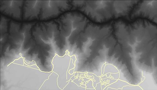
Vector and raster data can also be used together. Think of a hybrid web mapping application that shows a photographic basemap with roads drawn on top of it. The basemap is raster data and the roads shown on top are vectors. Figure 1.8 shows an example of a simple map that uses a raster DEM of the Grand Canyon as a basemap and shows a vector line dataset drawn on top.
Figure 1.8. Simple map of the Grand Canyon with vector roads layer drawn on top of a raster elevation dataset
1.3. What is geoprocessing?
Geoprocessing is a general term for manipulating spatial data, whether raster or vector. As you can imagine, that covers an awful lot of ground. I’ve always thought of using GIS with geoprocessing as a tool much like statistics in that it can be applied to pretty much everything. You even use geoprocessing in your daily life, whether you realize it or not. For example, I tend to take a different route to work depending on whether I’m driving or riding a bicycle because I prefer to avoid high-traffic roads with no shoulder when riding my bike. Steep hills are also not a concern while driving, but they are when I’m biking. Basing my route selection not only on spatial factors such as the direction of the road and elevation gain, but also on attributes such as the amount of traffic and road width is a type of geoprocessing. You probably make similar decisions every day.
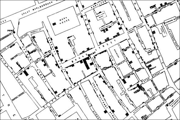
You have many reasons to be interested in geoprocessing, other than selecting a route to work. Let’s look at a few examples of applications. One famous example of early spatial analysis is the story of John Snow, an English physician who lived in the 1800s. Although parts of the story have been disputed, the gist of it is that he used spatial analysis to determine the cause of a cholera outbreak in 1854. A section of his map is shown in figure 1.9, with the Broad Street pump in the middle. You can see that it looks like bar charts are anchored on nearby streets. Each of these bars is made of horizontal lines, with one per cholera victim. Snow realized that most of the victims probably got their water from the pump on Broad Street, because that was the closest one, and he convinced authorities to shut the pump down. This is significant not only because it’s an early example of spatial analysis, but also because it wasn’t yet known that cholera was contracted from contaminated water. Because of this, Snow is considered one of the fathers of modern epidemiology.
Figure 1.9. Part of John Snow’s map of the Soho cholera outbreak of 1854
Spatial analysis is still an important part of epidemiology, but it’s used for many other things, too. I’ve worked on projects that include studying the habits of a threatened species, modeling vegetation cover over large areas, comparing data from pre- and post-flood events to see how the river channels changed, and modeling carbon sequestration in forests. You can probably find examples of spatial analysis wherever your interests lie. Let’s consider a few more examples.
Chinese researchers Luo et al.[1] used spatial analysis, along with historical records, to pinpoint the locations of missing courier stations along the Silk Road. The historical records contained descriptions of the route, including distance traveled and general direction between stations. The locations of several stations were already known, and the researchers knew that ancient travelers were unlikely to follow a straight line, but instead follow rivers or other landforms. They used all of this information to determine likely geographic areas for the still-missing stations. They then used high-resolution satellite imagery to search these areas for geometric shapes that could be station ruins. After visiting the sites in person, they determined that one, in fact, was an old courier station, and two others were likely military facilities during the Han Dynasty.
1Luo, L., X. Wang, C. Liu, H. Guo, and X. Du. 2014. Integrated RS, GIS and GPS approaches to archaeological prospecting in the Hexi Corridor, NW China: a case study of the royal road to ancient Dunhuang. Journal of Archaeological Science. 50: 178-190. doi:10.1016/j.jas.2014.07.009.
For a completely different application, Moody et al.[2] were interested in the potential for using microalgae as a biofuel. They used a microalgae growth model and meteorological data from various locations around the globe to simulate biomass productivity. Because the meteorological data was only from certain sites, the results were then spatially interpolated to provide a global map of productivity potential. It turns out that the most promising locations are in Australia, Brazil, Colombia, Egypt, Ethiopia, India, Kenya, and Saudi Arabia.
2Moody, J. W., C. M. McGinty, and J. C. Quinn. 2014. Global evaluation of biofuel potential from microalgae. Proceedings of the National Academy of Sciences of the United States of America. 111: 8691-8696. doi: 10.1073/pnas.1321652111.
This is interesting, but spatial analyses also affect your everyday life. Have you noticed that your automobile insurance premium differs depending on where you live? It’s likely that a sort of spatial analysis also affected the location of your favorite coffee shop or grocery store. Several new elementary and high schools are being built in my community, and their locations were determined in part by the spatial distribution of future students, along with the availability of suitable pieces of real estate.
Spatial analysis isn’t limited to geography, either. Rose et al.[3] demonstrated that GIS can be used to analyze the distribution of nano- and microstructures in bone. They could use this to see how bone remodeling events corresponded to parts of the bone that experience high levels of compression and tension.
3Rose, D. C., A. M. Agnew, T. P. Gocha, S. D. Stout, and J. S. Field. 2012. Technical note: The use of geographical information systems software for the spatial analysis of bone microstructure. American Journal of Physical Anthropology. 148: 648–654. doi: 10.1002/ajpa.22099.
You personally might need to make data more suitable for a map, such as eliminating unwanted features or simplifying complex lines so they display faster on a web map. Or you might analyze demographic data to plan for future transportation needs. Perhaps you’re interested in how vegetation responds to different land management practices, such as prescribed burns or mowing. Or maybe it’s something else entirely.
Although geoprocessing techniques can be rather complicated, many are fairly simple. It’s the simple ones that you’ll learn about in this book, but they’re the foundation for everything else. By the time you’re done, you’ll read and write spatial data in many formats, both vector and raster. You’ll subset vector data by attribute value or by spatial location. You’ll know how to perform simple vector geoprocessing, including overlay and proximity analyses. In addition, you’ll know how to work with raster datasets, including resizing pixels, performing calculations based on multiple datasets, and moving window analyses.
You’ll know how to do all of this with Python rather than by pushing buttons in a software package. The ability to script your processes like this is extremely powerful. Not only does it make it easy to batch process many datasets at once (something I do often), but it gives you the ability to customize your analysis instead of being limited to what the software user interface allows. You can build your own custom toolkits based on your workflow, and use these over and over. Automation is another big one, and it’s the reason I fell in love with scripting in the first place. I hate pushing buttons and doing the same thing over and over, but I’ll happily spend time figuring out how to automate something so I never have to think about it again. One last advantage that I’ll mention here is that you always know exactly what you did, as long as you don’t lose your script, because everything is right there.
1.4. Exploring your data
You’ll see ways to visualize your data as you work with it in Python, but the best way to explore the data is still to use a desktop GIS package. It allows you to easily visualize the data spatially in multiple ways, but also inspect the attributes included with the data. If you don’t have access to GIS software already, QGIS is a good open source option and is the one we’ll be using when needed in this book. It’s available from www.qgis.org, and it runs on Linux, Mac OS X, and Windows.
DOWNLOADABLE CODE AND SAMPLE DATA
The examples in this book use code and sample data that’s available for download from the following links. You’ll need to download these if you want to follow along. The code contains examples from the book but also custom utilities used by the examples, and all of the data used in the examples is included.
- Code: https://github.com/cgarrard/osgeopy-code and www.manning.com/books/geoprocessing-with-python
- Data: https://app.box.com/osgeopy and www.manning.com/books/geoprocessing-with-python
This isn’t a book on QGIS, so I won’t talk much about how to use it. Documentation is available on their website, and you can find one or two books published on the topic. However, I’ll briefly discuss how to load data and take a look. If you’ve never used a GIS before, then QGIS might look a bit daunting when you first open it up, but it’s not hard to use it to view data. For example, to load up one of the shapefiles in the example data for this book, select Add Vector Layer... from the Layer menu in QGIS. In the dialog that opens, make sure that the File button is selected and then use the Browse button to select a shapefile. A good choice to start out with is the countyp010.shp file in the US folder (figure 1.10).
Figure 1.10. The dialog for adding a vector layer to QGIS
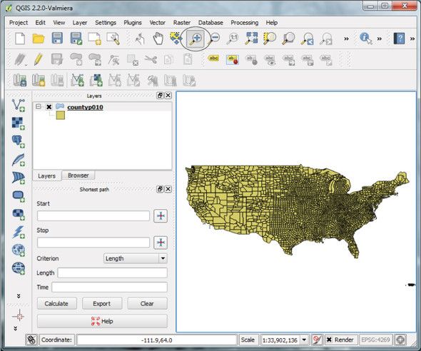
After selecting a file, click Open in the Add vector layer dialog, and the spatial data will draw in QGIS, as shown in figure 1.11. You can use the magnifying glass tool (circled in figure 1.11) to zoom in on part of the map.
Figure 1.11. QGIS window immediately after loading countyp010.shp
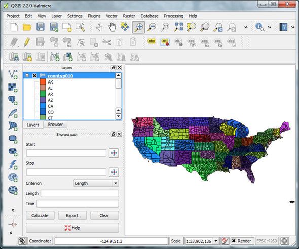
You’ll also see the name of the layer, countyp010 in this case, shown in the Layers list on the left. Double-click on a layer and you’ll get a Properties dialog. If you click on the Style tab, then you can change how the data is drawn. Let’s change the counties layer so that the counties are not all drawn with the same color, but instead the color depends on the state the county is in. To do this, choose Categorized from the dropdown list, set the column to STATE, select a Color ramp from the dropdown list, and then click Classify. You’ll see a list of all of the states and the colors they’ll be drawn with, as shown in figure 1.12. You can change the color ramp by selecting a new one from the list, clicking Delete All, and then clicking Classify again. You can also change a particular entry in the list by double-clicking on the color swatch next to the state abbreviation.
Figure 1.12. QGIS Style dialog configured to draw the counties in each state in a different color
![]() 转存失败重新上传取消
转存失败重新上传取消
NOTE TO PRINT BOOK READERS: COLOR GRAPHICS
Many graphics in this book are best viewed in color. The eBook versions display the color graphics, so they should be referred to as you read. To get your free eBook in PDF, ePub, and Kindle formats, go to https://www.manning.com/books/geoprocessing-with-python to register your print book.
Once you’re happy with your colors, click Apply, and the colors will be applied in the main QGIS window (figure 1.13).
Figure 1.13. Results of applying the symbology from figure 1.12 to the counties layer
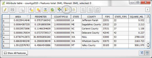
You can view the attribute data that’s attached to the spatial data by right-clicking on the layer name in the Layers list and selecting Open Attribute Table. Each row in the table shown in figure 1.14 corresponds to a county drawn on the map. In fact, try selecting a row by clicking on the number in the left-most column and then clicking on the Zoom map to selected rows button (circled in figure 1.14) and watch what happens.
Figure 1.14. Attribute table for the counties layer
Take time to play with QGIS and read at least part of the documentation on the website. The software is extremely powerful and worth getting to know. I’ll talk about it more throughout the book, but not a whole lot. You’ll want to use it to inspect the sample data and the results of any data you create, however.
1.5. Summary
- Python is a powerful multiplatform programming language that’s relatively easy to learn.
- Free and open source software is not only free with regard to price (free beer), but also allows for many freedoms with how it’s used (free speech).
- Many excellent open source Python modules exist for processing both vector and raster geospatial data.
- You don’t give up quality by using open source tools. In fact several of these packages are also used by proprietary software.
