Android前沿技术学习——Compose布局原理+配置布局+四大块技术全方面解析
一、简介
布局系统的 Jetpack Compose 实现有两个主要目标:一是实现高性能,二是让开发者能够轻松编写自定义布局。在 Compose 中,通过避免多次测量布局子级可实现高性能。如果需要进行多次测量,Compose 具有一个特殊系统,即固有特性测量。
注意:使用 Android View 系统时,在嵌套某些 View(如 RelativeLayout)时,可能会出现一些性能问题。由于 Compose 可以避免多次测量,因此可以根据需要进行深层次嵌套,而不会影响性能。
布局主要包括:布局基础知识、Material组件和布局、自定义布局、Compose中使用ConstraintLayout。

二、布局基础
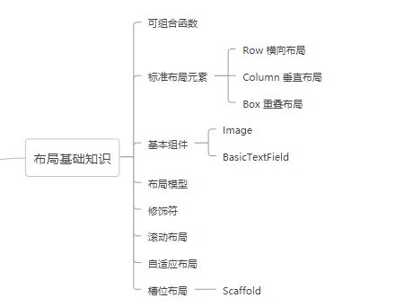
可组合函数
可组合函数是 Compose 的基本构建块,返回值是 Unit 的函数,用于描述界面中的某一部分,该函数可接收参数。
组合函数中可包含多个界面元素。
其基本格式为:
@Composable
fun xxx():Unit{
....
}
标准布局元素
在Compose中标准的布局元素有三个:Box、Column、Row。

标准布局元素特性示意图
Box
重叠布局,类似Android View系统中的FramLayout布局,元素会重叠显示,其原型定义如下:
@Composable
inline fun Box(
    modifier: Modifier = Modifier,                   //修饰符
    contentAlignment: Alignment = Alignment.TopStart,//内容的位置
    propagateMinConstraints: Boolean = false,       //是否应将传入的最小约束传递给内容
    content: @Composable BoxScope.() -> Unit    //内容,即界面元素
) {
    ......
}
例子
/**
 * 标准布局 - Box
 */
@Composable
fun BoxExample(){
    Box (
        modifier = Modifier.size(width = 230.dp,height = 100.dp),
        contentAlignment = Alignment.Center
    ){  //对应content参数 lambda表达上
        Text(text = "Text 1")
        Text(text = "Text 2")
    }
}

预览结果
Column
垂直布局,在界面元素垂直方向依次排列。源码中定义如下:
@Composable
inline fun Column(
    modifier: Modifier = Modifier,          //修饰符
    verticalArrangement: Arrangement.Vertical = Arrangement.Top,  //内容元素垂直方向分布方式
    horizontalAlignment: Alignment.Horizontal = Alignment.Start,    //内容元素水平方向分布方式
    content: @Composable ColumnScope.() -> Unit                      //内部元素
) {
    ......
}
实例
/**
 * 标准布局 - Column
 */
@Composable
fun ColumnExample(){
    Column (
        modifier = Modifier.size(width = 230.dp,height = 100.dp),
        verticalArrangement = Arrangement.Center,//垂直方向居中
        horizontalAlignment = Alignment.End      //水平方向靠右
    ){  //对应content参数 lambda表达上
        Text(text = "Text 111")
        Text(text = "Text 666666")
    }
}
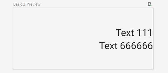
Column示例预览结果
Row
元素水平方向分布,源码中定义:
@Composable
inline fun Row(
    modifier: Modifier = Modifier,          //修饰符
    horizontalArrangement: Arrangement.Horizontal = Arrangement.Start,//水平方向排列方式
    verticalAlignment: Alignment.Vertical = Alignment.Top,      //垂直方向元素排列方式
    content: @Composable RowScope.() -> Unit          //内部子元素
) {
    ......
}
示例
/**
 * 标准布局 - Row
 */
@Composable
fun RowExample(){
    Row (
        modifier = Modifier.size(width = 230.dp,height = 100.dp),
        horizontalArrangement = Arrangement.SpaceAround,
        verticalAlignment = Alignment.Bottom
    ){  //对应content参数 lambda表达上
        Text(text = "Text 111")
        Text(text = "Text 666666")
    }
}
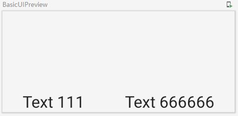
Row示例预览
基本组件
Jetpack Compose中组件库包括:compose-ui和material。很多常用基本组件都是在material库中,Compose-ui中组件很少:Image、BasicTextField(输入框)。
示例:
//添加一个图片
Image(
      //填充内容
      painter = painterResource(id = message.iconId),
      contentDescription = "logo",
      //尺寸及形状
      modifier= Modifier
          .padding(top = 2.dp)
          .size(40.dp)             //图像尺寸
          .clip(CircleShape)       //形状
          .border(1.5.dp, MaterialTheme.colors.secondary, CircleShape)//边框样式
  )
布局模型
在对标准布局元素和组件有了一定了解后,我们来看下Compose的布局流程。
首先Compose布局是一个界面树,从树的根节点开始依次要求其子节点对自身进行测量,然后递归完成所有子节点的测量,并将约束条件沿着树向下传递给子节点,并将测量的尺寸和放置指令依次向根节点传递。
以下面可组合函数为示例:
@Composable
fun SearchResult(...) {
  Row(...) {
    Image(...)
    Column(...) {
      Text(...)
      Text(..)
    }
  }
}
其布局过程如下图示:

image.png
修饰符
在Compose布局中修饰符至关重要,您可以使用修饰符来修饰或扩充可组合项。常用的修饰符如下:
background可组合元素的背景色;clickable使可组合项响应用户点击,并显示波纹效果;padding设置元素周围留出空间;size可组合元素的尺寸;clip可组合元素的形状;border可组合元素的边框及形状;fillMaxSize可组合元素尺寸按父布局的最大尺寸显示;fillMaxWidth可组合元素宽度按父布局的最大宽度显示;fillMaxHeight可组合元素高度按父布局的最大高度显示;
除以上外,还有width、height、wrapConentHeight等,用到的时候可以尝试看看效果。
下面展示一个圆形图像的示例
/**
 * 修饰符使用示例
 */
@Composable
fun ModifierExample(){
    //添加一个图片
    Image(
        //填充内容
        painter = painterResource(id = R.mipmap.ic_girl),
        contentDescription = "logo",
        //尺寸及形状
        modifier= Modifier
            .padding(top = 2.dp)
            .background(Color.Blue)//设置蓝色背景
            .size(40.dp)             //图像尺寸
            .clip(CircleShape)       //圆形形状
            .border(1.5.dp, MaterialTheme.colors.secondary, CircleShape)//边框样式
    )
}
效果如下:
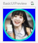
修饰符示例
修饰符扩展
除了使用Compose提供的修饰符外,我们也可以扩展函数自定义修饰符,具体方式可以参考Jetpack Compose布局(三)一文中讲的扩展布局修饰符。
强调:修饰符的使用是有顺序的
强调:修饰符的使用是有顺序的
强调:修饰符的使用是有顺序的
例如,将上例的background和padding顺序调换下,就会如下图效果,仔细看两图的顶部边距,会发现区别

调换background和padding顺序的效果图
槽位布局
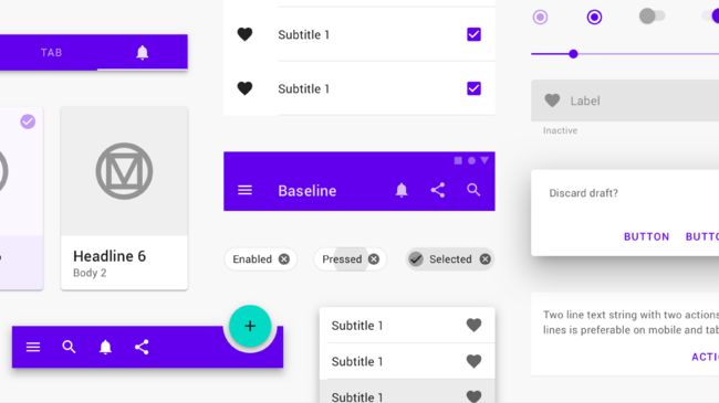
Compose中提供了固定槽位的可组合项,以简化界面元素,这些主要在androidx.compose.material:material库中,如:Drawer、FloatingActionButton、TopAppBar等。
Material 组件大量使用槽位 API,这是 Compose 引入的一种模式,它在可组合项之上带来一层自定义设置。这种方法使组件变得更加灵活,因为它们接受可以自行配置的子元素,而不必公开子元素的每个配置参数。槽位会在界面中留出空白区域,让开发者按照自己的意愿来填充。如下图TopAppBar的槽位。

三、Material 组件和布局
Jetpack Compose 提供了 Material Design 的实现,后者是一个用于创建数字化界面的综合设计系统。Material 组件(按钮、卡片、开关等)和布局(如 Scaffold)可作为可组合函数提供。
Material 组件是用于创建界面的交互式构建块。Compose 提供了许多此类组件,开箱即可使用。如需了解提供了哪些组件,请参阅 Compose Material API 参考文档。
Material 组件会使用应用中 MaterialTheme 提供的值:
@Composable
fun MyApp() {
    MaterialTheme {
        // Material Components like Button, Card, Switch, etc.
    }
}
如需详细了解主题,请参阅“Compose 中的主题”指南。
内容槽
支持内部内容(文本标签、图标等)的 Material 组件往往会提供“槽”(即接受可组合内容的通用 lambda),而且还会提供尺寸和内边距等公共常量,从而支持设置内部内容的布局,使之符合 Material 规范。
例如 Button:
Button(
    onClick = { /* ... */ },
    // Uses ButtonDefaults.ContentPadding by default
    contentPadding = PaddingValues(
        start = 20.dp,
        top = 12.dp,
        end = 20.dp,
        bottom = 12.dp
    )
) {
    // Inner content including an icon and a text label
    Icon(
        Icons.Filled.Favorite,
        contentDescription = "Favorite",
        modifier = Modifier.size(ButtonDefaults.IconSize)
    )
    Spacer(Modifier.size(ButtonDefaults.IconSpacing))
    Text("Like")
}

图 1. 使用 content 槽和默认内边距的 Button(左),以及使用提供自定义 contentPadding 的 content 槽的 Button(右)。
Button 有一个通用 content 尾随 lambda 槽,该槽使用 RowScope 将内容可组合项的布局设为行。此外,它还有一个 contentPadding 参数,用于将内边距应用于内部内容。您可以使用通过 ButtonDefaults 提供的常量,也可以使用自定义值。
再比如 ExtendedFloatingActionButton:
ExtendedFloatingActionButton(
    onClick = { /* ... */ },
    icon = {
        Icon(
            Icons.Filled.Favorite,
            contentDescription = "Favorite"
        )
    },
    text = { Text("Like") }
)
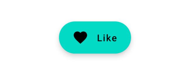
图 2. 使用 icon 槽和 text 槽的 ExtendedFloatingActionButton。
ExtendedFloatingActionButton 有两个槽,分别针对 icon 和 text 标签,而没有通用 content lambda。虽然每个槽都支持通用的可组合内容,但该组件会自行判断这些内部内容的布局方式。它会在内部处理内边距、对齐方式和大小。
Scaffold
Compose 提供了便捷的布局,用于将 Material 组件组合成常见的屏幕图案。可组合项(例如 Scaffold)提供了适用于各种组件和其他屏幕元素的槽。
屏幕内容
Scaffold 有一个通用 content 尾随 lambda 槽。lambda 会收到应该应用于内容根目录(例如,通过 Modifier.padding)的 PaddingValues 实例,以便偏移顶部栏和底部栏(如果存在的话)。
Scaffold(/* ... */) { contentPadding ->
    // Screen content
    Box(modifier = Modifier.padding(contentPadding)) { /* ... */ }
}
应用栏
Scaffold 为顶部应用栏或底部应用栏提供了槽。系统将在内部处理可组合项的放置位置。

您可以使用 topBar 槽和 TopAppBar:
Scaffold(
    topBar = {
        TopAppBar { /* Top app bar content */ }
    }
) {
    // Screen content
}

您可以使用 bottomBar 槽和 BottomAppBar:
Scaffold(
    bottomBar = {
        BottomAppBar { /* Bottom app bar content */ }
    }
) {
    // Screen content
}
这些槽可用于 BottomNavigation 等其他 Material 组件。 此外,您还可以使用自定义可组合项 - 例如,查看 Owl 示例中的初始配置屏幕。
悬浮操作按钮

Scaffold 为悬浮操作按钮提供了槽。
您可以使用 floatingActionButton 槽和 FloatingActionButton:
Scaffold(
    floatingActionButton = {
        FloatingActionButton(onClick = { /* ... */ }) {
            /* FAB content */
        }
    }
) {
    // Screen content
}
注意:floatingActionButton 槽接受任何可组合内容。例如,您可以将展开式悬浮操作按钮与 ExtendedFloatingActionButton 结合使用。
系统将在内部处理 FAB 可组合项的底部放置位置。您可以使用 floatingActionButtonPosition 参数来调整水平位置:
Scaffold(
    floatingActionButton = {
        FloatingActionButton(onClick = { /* ... */ }) {
            /* FAB content */
        }
    },
    // Defaults to FabPosition.End
    floatingActionButtonPosition = FabPosition.Center
) {
    // Screen content
}
如果您使用的是 Scaffold 可组合项的 bottomBar 槽,则可以使用 isFloatingActionButtonDocked 参数将悬浮操作按钮与底部应用栏重叠:
Scaffold(
    floatingActionButton = {
        FloatingActionButton(onClick = { /* ... */ }) {
            /* FAB content */
        }
    },
    // Defaults to false
    isFloatingActionButtonDocked = true,
    bottomBar = {
        BottomAppBar { /* Bottom app bar content */ }
    }
) {
    // Screen content
}
图 3. 使用 floatingActionButton 槽和 bottomBar 槽的 Scaffold。isFloatingActionButtonDocked 参数设为 false(顶部)和 true(底部)。
BottomAppBar 支持带有 cutoutShape 参数的 FAB 刘海屏,它接受任何 Shape。最好提供停靠组件所使用的同一 Shape。例如,FloatingActionButton 使用 MaterialTheme.shapes.small,并将 50% 的边角大小作为其 shape 参数的默认值:
Scaffold(
    floatingActionButton = {
        FloatingActionButton(onClick = { /* ... */ }) {
            /* FAB content */
        }
    },
    isFloatingActionButtonDocked = true,
    bottomBar = {
        BottomAppBar(
            // Defaults to null, that is, No cutout
            cutoutShape = MaterialTheme.shapes.small.copy(
                CornerSize(percent = 50)
            )
        ) {
            /* Bottom app bar content */
        }
    }
) {
  // Screen content
}
图 4. 具有 BottomAppBar 和停靠 FloatingActionButton 的 Scaffold。BottomAppBar 的自定义 cutoutShape 与 FloatingActionButton 所使用的 Shape 一致。
信息提示控件

Scaffold 提供了一种显示信息提示控件的方式。
这是通过 ScaffoldState 提供的,其中包含一个 SnackbarHostState 属性。您可以使用 rememberScaffoldState 创建一个 ScaffoldState 实例,并通过 scaffoldState 参数将其传递给 Scaffold。SnackbarHostState 可提供对 showSnackbar 函数的访问权限。该挂起函数需要 CoroutineScope(例如,使用 rememberCoroutineScope),并可被调用以响应界面事件,从而在 Scaffold 中显示 Snackbar。
val scaffoldState = rememberScaffoldState()
val scope = rememberCoroutineScope()
Scaffold(
    scaffoldState = scaffoldState,
    floatingActionButton = {
        ExtendedFloatingActionButton(
            text = { Text("Show snackbar") },
            onClick = {
                scope.launch {
                    scaffoldState.snackbarHostState
                        .showSnackbar("Snackbar")
                }
            }
        )
    }
) {
    // Screen content
}
您可以提供可选操作,并调整 Snackbar 的时长。snackbarHostState.showSnackbar 函数可接受额外的 actionLabel 和 duration 参数,并返回 SnackbarResult。
val scaffoldState = rememberScaffoldState()
val scope = rememberCoroutineScope()
Scaffold(
    scaffoldState = scaffoldState,
    floatingActionButton = {
        ExtendedFloatingActionButton(
            text = { Text("Show snackbar") },
            onClick = {
                scope.launch {
                    val result = scaffoldState.snackbarHostState
                        .showSnackbar(
                            message = "Snackbar",
                            actionLabel = "Action",
                            // Defaults to SnackbarDuration.Short
                            duration = SnackbarDuration.Indefinite
                        )
                    when (result) {
                        SnackbarResult.ActionPerformed -> {
                            /* Handle snackbar action performed */
                        }
                        SnackbarResult.Dismissed -> {
                            /* Handle snackbar dismissed */
                        }
                    }
                }
            }
        )
    }
) {
    // Screen content
}
您可以使用 snackbarHost 参数提供自定义 Snackbar。如需了解详情,请参阅 SnackbarHost API reference docs。
抽屉式导航栏

Scaffold 为模态抽屉式导航栏提供了槽。系统将在内部处理可组合项的可拖动动作条和布局。
您可以使用 drawerContent 槽,该槽使用 ColumnScope 将抽屉式导航栏内容可组合项的布局设为列:
Scaffold(
    drawerContent = {
        Text("Drawer title", modifier = Modifier.padding(16.dp))
        Divider()
        // Drawer items
    }
) {
    // Screen content
}
Scaffold 接受一些额外的抽屉式导航栏参数。例如,您可以使用 drawerGesturesEnabled 参数来切换抽屉式导航栏是否响应拖动:
Scaffold(
    drawerContent = {
        // Drawer content
    },
    // Defaults to true
    drawerGesturesEnabled = false
) {
    // Screen content
}
您可以通过 ScaffoldState 完成以编程方式打开和关闭抽屉式导航栏的操作,其中包含一个 DrawerState 属性,该属性应使用 scaffoldState 参数传递给 Scaffold。DrawerState 可提供对 open 和 close 函数的访问权限,以及对与当前抽屉式导航栏状态相关的属性的访问权限。这些挂起函数需要 CoroutineScope(例如,使用 rememberCoroutineScope),并且可被调用以响应界面事件。
val scaffoldState = rememberScaffoldState()
val scope = rememberCoroutineScope()
Scaffold(
    scaffoldState = scaffoldState,
    drawerContent = {
        // Drawer content
    },
    floatingActionButton = {
        ExtendedFloatingActionButton(
            text = { Text("Open or close drawer") },
            onClick = {
                scope.launch {
                    scaffoldState.drawerState.apply {
                        if (isClosed) open() else close()
                    }
                }
            }
        )
    }
) {
    // Screen content
}
模态抽屉式导航栏
如果您想实现不含 Scaffold 的模态抽屉式导航栏,可以使用 ModalDrawer 可组合项。它接受与 Scaffold 类似的抽屉式导航栏参数。
val drawerState = rememberDrawerState(DrawerValue.Closed)
ModalDrawer(
    drawerState = drawerState,
    drawerContent = {
        // Drawer content
    }
) {
    // Screen content
}

如果您要实现底部抽屉式导航栏,可以使用 BottomDrawer 可组合项:
val drawerState = rememberBottomDrawerState(BottomDrawerValue.Closed)
BottomDrawer(
    drawerState = drawerState,
    drawerContent = {
        // Drawer content
    }
) {
    // Screen content
}
底部动作条
如果您要实现标准底部动作条,可以使用 BottomSheetScaffold 可组合项。它接受与 Scaffold 类似的参数,例如 topBar、floatingActionButton 和 snackbarHost。其中包含额外的参数,这些参数可提供底部动作条的显示方式。
您可以使用 sheetContent 槽,该槽使用 ColumnScope 将动作条内容可组合项的布局设为列:
BottomSheetScaffold(
    sheetContent = {
        // Sheet content
    }
) {
    // Screen content
}
BottomSheetScaffold 接受一些额外的动作条参数。例如,您可以使用 sheetPeekHeight 参数设置动作条的窥视高度。此外,您还可以使用 sheetGesturesEnabled 参数来切换抽屉式导航栏是否响应拖动。
BottomSheetScaffold(
    sheetContent = {
        // Sheet content
    },
    // Defaults to BottomSheetScaffoldDefaults.SheetPeekHeight
    sheetPeekHeight = 128.dp,
    // Defaults to true
    sheetGesturesEnabled = false

) {
    // Screen content
}
您可以通过 BottomSheetScaffoldState 完成以编程方式展开和收起动作条的操作,其中包含一个 BottomSheetState 属性。您可以使用 rememberBottomSheetScaffoldState 创建一个 BottomSheetScaffoldState 实例,并通过 scaffoldState 参数将其传递给 BottomSheetScaffold。BottomSheetState 可提供对 expand 和 collapse 函数的访问权限,以及对与当前动作条状态相关的属性的访问权限。这些挂起函数需要 CoroutineScope(例如,使用 rememberCoroutineScope),并且可被调用以响应界面事件。
val scaffoldState = rememberBottomSheetScaffoldState()
val scope = rememberCoroutineScope()
BottomSheetScaffold(
    scaffoldState = scaffoldState,
    sheetContent = {
        // Sheet content
    },
    floatingActionButton = {
        ExtendedFloatingActionButton(
            text = { Text("Expand or collapse sheet") },
            onClick = {
                scope.launch {
                    scaffoldState.bottomSheetState.apply {
                        if (isCollapsed) expand() else collapse()
                    }
                }
            }
        )
    }
) {
    // Screen content
}

如果您要实现模态底部动作条,可以使用 ModalBottomSheetLayout 可组合项:
val sheetState = rememberModalBottomSheetState(
    ModalBottomSheetValue.Hidden
)
ModalBottomSheetLayout(
    sheetState = sheetState,
    sheetContent = {
        // Sheet content
    }
) {
    // Screen content
}
背景幕
如果您要实现背景幕,可以使用 BackdropScaffold 可组合项。
BackdropScaffold(
    appBar = {
        // Top app bar
    },
    backLayerContent = {
        // Back layer content
    },
    frontLayerContent = {
        // Front layer content
    }
)
BackdropScaffold 接受一些额外的背景幕参数。例如,您可以使用 peekHeight 和 headerHeight 参数来设置后层的窥视高度和前层的最小非活动高度。此外,您还可以使用 gesturesEnabled 参数来切换背景幕是否响应拖动。
BackdropScaffold(
    appBar = {
        // Top app bar
    },
    backLayerContent = {
        // Back layer content
    },
    frontLayerContent = {
        // Front layer content
    },
    // Defaults to BackdropScaffoldDefaults.PeekHeight
    peekHeight = 40.dp,
    // Defaults to BackdropScaffoldDefaults.HeaderHeight
    headerHeight = 60.dp,
    // Defaults to true
    gesturesEnabled = false
)
您可以通过 BackdropScaffoldState 完成以编程方式显示和隐藏背景幕的操作。您可以使用 rememberBackdropScaffoldState 创建一个 BackdropScaffoldState 实例,并通过 scaffoldState 参数将其传递给 BackdropScaffold。BackdropScaffoldState 可提供对 reveal 和 conceal 函数的访问权限,以及对与当前背景幕状态相关的属性的访问权限。这些挂起函数需要 CoroutineScope(例如,使用 rememberCoroutineScope),并且可被调用以响应界面事件。
val scaffoldState = rememberBackdropScaffoldState(
    BackdropValue.Concealed
)
val scope = rememberCoroutineScope()
BackdropScaffold(
    scaffoldState = scaffoldState,
    appBar = {
        TopAppBar(
            title = { Text("Backdrop") },
            navigationIcon = {
                if (scaffoldState.isConcealed) {
                    IconButton(
                        onClick = {
                            scope.launch { scaffoldState.reveal() }
                        }
                    ) {
                        Icon(
                            Icons.Default.Menu,
                            contentDescription = "Menu"
                        )
                    }
                } else {
                    IconButton(
                        onClick = {
                            scope.launch { scaffoldState.conceal() }
                        }
                    ) {
                        Icon(
                            Icons.Default.Close,
                            contentDescription = "Close"
                        )
                    }
                }
            },
            elevation = 0.dp,
            backgroundColor = Color.Transparent
        )
    },
    backLayerContent = {
        // Back layer content
    },
    frontLayerContent = {
        // Front layer content
    }
)
四、自定义布局
在实际开发中会出于各种原因进行自定义布局,所以这里简单记录下使用Compose进行自定义布局的方式
二、使用布局修饰符
本段参考代码是google的代码
我们可以使用layout修饰符来元素的测量和布局方式,大概方式如下:
fun Modifier.customLayoutModifier(...) = Modifier.layout { measurable, constraints ->
  ...
})
不过实际应用中通常使用以下写法:
fun Modifier.customLayoutModifier(...) =
    this.layout { measurable, constraints ->
        ...
    })
比如想控制显示的Text顶部到第一行基线的位置,示例如下:
fun Modifier.firstBaselineToTop(
    firstBaselineToTop: Dp
) = layout { measurable, constraints ->
    // Measure the composable
    val placeable = measurable.measure(constraints)

    // 检查是否包含基线,如果不包含则会引发异常
    check(placeable[FirstBaseline] != AlignmentLine.Unspecified)
    val firstBaseline = placeable[FirstBaseline]

    // Height of the composable with padding - first baseline
    val placeableY = firstBaselineToTop.roundToPx() - firstBaseline
    val height = placeable.height + placeableY
    layout(placeable.width, height) {
        // Where the composable gets placed
        placeable.placeRelative(0, placeableY)
    }
}
三、创建自定义布局
layout 修饰符仅更改调用可组合项。如需测量和布置多个可组合项,请改用 Layout 可组合项。此可组合项允许您手动测量和布置子项。Column 和 Row 等所有较高级别的布局都使用 Layout 可组合项构建而成。大都数自定义布局遵循以下方式:
@Composable
fun MyBasicColumn(
    modifier: Modifier = Modifier,
    content: @Composable () -> Unit
) {
    Layout(
        modifier = modifier,
        children = content
    ) { measurables, constraints ->
        // measure and position children given constraints logic here
    }
}
比如我们自定义一个Column布局,示例如下:
@Composable
fun MyBasicColumn(
    modifier: Modifier = Modifier,
    content: @Composable () -> Unit
) {
    Layout(
        modifier = modifier,
        content = content
    ) { measurables, constraints ->
        // Don't constrain child views further, measure them with given constraints
        // List of measured children
        val placeables = measurables.map { measurable ->
            // Measure each children
            measurable.measure(constraints)
        }

        // Set the size of the layout as big as it can
        layout(constraints.maxWidth, constraints.maxHeight) {
            // Track the y co-ord we have placed children up to
            var yPosition = 0

            // Place children in the parent layout
            placeables.forEach { placeable ->
                // Position item on the screen
                placeable.placeRelative(x = 0, y = yPosition)

                // Record the y co-ord placed up to
                yPosition += placeable.height
            }
        }
    }
}
四、固有特性测量
一般来说,在自定义布局中使用默认测量方式就可以了,但是有时候可能并不能满足需求。因此要指定自定义 Layout 的固有特性测量,则在创建该布局时替换 MeasurePolicy的 minIntrinsicWidth、minIntrinsicHeight、maxIntrinsicWidth 和 maxIntrinsicHeight。
代码结构如下:
@Composable
fun MyCustomComposable(
    modifier: Modifier = Modifier,
    content: @Composable () -> Unit
) {
    return object : MeasurePolicy {
        override fun MeasureScope.measure(
            measurables: List<Measurable>,
            constraints: Constraints
        ): MeasureResult {
            // Measure and layout here
        }

        override fun IntrinsicMeasureScope.minIntrinsicWidth(
            measurables: List<IntrinsicMeasurable>,
            height: Int
        ) = {
            // Logic here
        }

        // Other intrinsics related methods have a default value,
        // you can override only the methods that you need.
    }
}
而在创建自定义 layout 修饰符时,替换 LayoutModifier 界面中的相关方法。
fun Modifier.myCustomModifier(/* ... */) = this.then(object : LayoutModifier {

    override fun MeasureScope.measure(
        measurable: Measurable,
        constraints: Constraints
    ): MeasureResult {
        // Measure and layout here
    }

    override fun IntrinsicMeasureScope.minIntrinsicWidth(
        measurable: IntrinsicMeasurable,
        height: Int
    ): Int = {
        // Logic here
    }

    // Other intrinsics related methods have a default value,
    // you can override only the methods that you need.
})
五、分析修饰符
这里分析下Modifier.padding的原理,代码如下(以下代码源自Google,不过已经修改为更易懂的方式):
// How to create a modifier
@Stable
fun Modifier.padding(all: Dp) =
    this.then(
        PaddingModifier(start = all, top = all, end = all, bottom = all, rtlAware = true)
    )

// Implementation detail
private class PaddingModifier(
    val start: Dp = 0.dp,
    val top: Dp = 0.dp,
    val end: Dp = 0.dp,
    val bottom: Dp = 0.dp,
    val rtlAware: Boolean,
) : LayoutModifier {

    override fun MeasureScope.measure(
        measurable: Measurable,
        constraints: Constraints
    ): MeasureResult {

        val horizontal = start.roundToPx() + end.roundToPx() //获取padding的横向长度
        val vertical = top.roundToPx() + bottom.roundToPx() //获取padding的垂直长度

        // val placeable = measurable.measure(constraints.offset(horizontal, vertical)) //偏移horizontal、vertical距离后进行测量,偏移只会更改内容位置,不会影响测量大小,因为下面已经进行偏移了,所以可以不用这么麻烦
 		val placeable = measurable.measure(constraints)
        val width = constraints.constrainWidth(placeable.width + horizontal)
        val height = constraints.constrainHeight(placeable.height + vertical)
        return layout(width, height) {//定义父布局宽高
            if (rtlAware) {
                placeable.placeRelative(start.roundToPx(), top.roundToPx()) //将组件在现有位置上进行移动,该移动是在布局里面,所以并不会超出布局宽高
            } else {
                placeable.place(start.roundToPx(), top.roundToPx())
            }
        }
    }
}
这里面有一个有意思的问题,就是调用placeable.placeRelative偏移后为什么不会超出设置的宽高?
这里解释下Placeable,文档上解释的意思是:Placeable对应于可以由其父布局定位的子布局。大多数Placeable是Measurable.measure调用的结果。Placeable不应该在测量调用之间存储。其中placeable.width是父布局所需要留出的宽度,placeable.height是父布局所需要留出的高度。而placeable.measuredWidth才是控件真正的测量宽度,placeable.measuredHeight是控件真正的测量高度。因此调用placeable.placeRelative函数并不会导致组件超出布局。
五、ConstraintLayout使用
ConstraintLayout VS RelativeLayout
相信当我们进行布局的时候,使用最多的应该是LinearLayout与RelativeLayout。而对于复杂一点的布局来说,他们之间的嵌套使用就最正常不过了。所以为了减少不必要的嵌套布局,Google特意开发的ConstraintLayout。它同时支持LinearLayout与RelativeLayout的所用特性。同时它完全通过约束来减少布局的嵌套。意思就是基本上最外层只需要一个ConstraintLayout节点就可以了。下面先从RelativeLayout开始,看它是如何来实现RelativeLayout的特性。
这里我列举一些RelativeLayout的特性:
android:layout_alignStart="@id/view"
android:layout_alignLeft="@id/view"
android:layout_alignEnd="@id/view"
android:layout_alignRight="@id/view"
android:layout_alignTop="@id/view"
android:layout_alignBaseline="@id/view"
android:layout_alignBottom="@id/view"

android:layout_toStartOf="@id/view"
android:layout_toLeftOf="@id/view"
android:layout_toEndOf="@id/view"
android:layout_toRightOf="@id/view"
android:layout_above="@id/view"
android:layout_below="@id/view"

android:layout_alignParentStart="true"
android:layout_alignParentLeft="true"
android:layout_alignParentEnd="true"
android:layout_alignParentRight="true"
android:layout_alignParentTop="true"
android:layout_alignParentBottom="true"

android:layout_centerInParent="true"
android:layout_centerHorizontal="true"
android:layout_centerVertical="true"
相信上面的特性大家再熟悉不过了。对于layout_align*的属性在ConstraintLayout中可以通过以下方式替代。
app:layout_constraintStart_toStartOf="@id/view"
app:layout_constraintLeft_toLeftOf="@id/view"
app:layout_constraintEnd_toEndOf="@id/view"
app:layout_constraintRight_toRightOf="@id/view"
app:layout_constraintTop_toTopOf="@id/view"
app:layout_constraintBaseline_toBaselineOf="@id/view"
app:layout_constraintBottom_toBottomOf="@id/view"
而对于layout_to*的属性ConstraintLayout也有与之完美替代的特性:
app:layout_constraintStart_toEndOf="@id/view"
app:layout_constraintLeft_toRightOf="@id/view"
app:layout_constraintEnd_toStartOf="@id/view"
app:layout_constraintRight_toLeftOf="@id/view"
app:layout_constraintTop_toBottomOf="@id/view"
app:layout_constraintBottom_toTopOf="@id/view"
接下来是layout_alignParent*的替代实现:
app:layout_constraintStart_toStartOf="parent"
app:layout_constraintLeft_toLeftOf="parent"
app:layout_constraintEnd_toEndOf="parent"
app:layout_constraintRight_toRightOf="parent"
app:layout_constraintTop_toTopOf="parent"
app:layout_constraintBottom_toBottomOf="parent"
这里与之前的layout_align*基本类似,只不过它的所以约束的对象不同而已,为了实现对父布局的依赖,这里统一都是parent。
最后是layout_center*属性,本质与上面的基本类似。下面直接通过实例来展示
通过上面的代码相信不难理解,要想实现水平居中只需设置left与right分别约束parent,而要想实现竖直居中则只需设置top与bottom分别约束parent。
为了巩固上面的特性,我这里写了一个示例代码与效果图,方便大家理解
<android.support.constraint.ConstraintLayout xmlns:android="http://schemas.android.com/apk/res/android"
    xmlns:app="http://schemas.android.com/apk/res-auto"
    android:layout_width="match_parent"
    android:layout_height="match_parent">

    <Button
        android:layout_width="wrap_content"
        android:layout_height="wrap_content"
        android:text="left" />

    <Button
        android:layout_width="wrap_content"
        android:layout_height="wrap_content"
        android:text="right"
        app:layout_constraintRight_toRightOf="parent" />

    <Button
        android:layout_width="wrap_content"
        android:layout_height="wrap_content"
        android:text="bottom"
        app:layout_constraintBottom_toBottomOf="parent" />

    <Button
        android:id="@+id/center"
        android:layout_width="wrap_content"
        android:layout_height="wrap_content"
        android:text="center"
        app:layout_constraintBottom_toBottomOf="parent"
        app:layout_constraintLeft_toLeftOf="parent"
        app:layout_constraintRight_toRightOf="parent"
        app:layout_constraintTop_toTopOf="parent" />

    <Button
        android:layout_width="wrap_content"
        android:layout_height="wrap_content"
        android:text="center top"
        app:layout_constraintBottom_toTopOf="@+id/center"
        app:layout_constraintLeft_toLeftOf="parent"
        app:layout_constraintRight_toRightOf="parent" />

    <Button
        android:layout_width="wrap_content"
        android:layout_height="wrap_content"
        android:text="center bottom"
        app:layout_constraintLeft_toLeftOf="parent"
        app:layout_constraintRight_toRightOf="parent"
        app:layout_constraintTop_toBottomOf="@+id/center" />

    <Button
        android:layout_width="wrap_content"
        android:layout_height="wrap_content"
        android:text="center left"
        app:layout_constraintRight_toLeftOf="@+id/center"
        app:layout_constraintTop_toTopOf="@+id/center" />

    <Button
        android:layout_width="wrap_content"
        android:layout_height="wrap_content"
        android:text="center right"
        app:layout_constraintLeft_toRightOf="@+id/center"
        app:layout_constraintTop_toTopOf="@+id/center" />

android.support.constraint.ConstraintLayout>

点击查看源码
在ConstraintLayout中没有match_parent,而与之替代的是match_constraint,在使用中通过0dp来代表。一旦你使用了match_parent那么它的约束将会失效。
ConstraintLayout VS LinearLayout
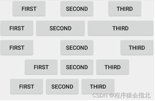
为了能够达到LinearLayout的效果,ConstraintLayout引入了Chain Style.通过以下代码来设置:
app:layout_constraintHorizontal_chainStyle=""
app:layout_constraintVertical_chainStyle=""
它主要有三个属性分别为:
- spread_inside:两边不留空间,中间间距平分
- spread:完全均分
- packed:完全不留间距
解释的有点生硬,下面通过一张官方图来更直观的了解

需要注意的是:要达到上的的chain效果,他们之间必须完全相互约束,同时chain style的设置都是以第一个view为基点。同时默认chain style为spread。
同样的下面是一个示例代码与效果图
<android.support.constraint.ConstraintLayout
xmlns:android="http://schemas.android.com/apk/res/android"
    xmlns:app="http://schemas.android.com/apk/res-auto"
    android:layout_width="match_parent"
    android:layout_height="match_parent">

    <Button
        android:id="@+id/first"
        android:layout_width="wrap_content"
        android:layout_height="wrap_content"
        android:text="first"
        app:layout_constraintLeft_toLeftOf="parent"
        app:layout_constraintRight_toLeftOf="@+id/second" />

    <Button
        android:id="@+id/second"
        android:layout_width="wrap_content"
        android:layout_height="wrap_content"
        android:text="second"
        app:layout_constraintLeft_toRightOf="@+id/first"
        app:layout_constraintRight_toLeftOf="@+id/third"
        app:layout_constraintTop_toTopOf="@+id/first" />

    <Button
        android:id="@+id/third"
        android:layout_width="wrap_content"
        android:layout_height="wrap_content"
        android:text="third"
        app:layout_constraintLeft_toRightOf="@+id/second"
        app:layout_constraintRight_toRightOf="parent"
        app:layout_constraintTop_toTopOf="@+id/first" />

    <Button
        android:id="@+id/match_first"
        android:layout_width="wrap_content"
        android:layout_height="wrap_content"
        android:text="first"
        app:layout_constraintLeft_toLeftOf="parent"
        app:layout_constraintRight_toLeftOf="@+id/match_second"
        app:layout_constraintTop_toBottomOf="@+id/first" />

    <Button
        android:id="@+id/match_second"
        android:layout_width="0dp"
        android:layout_height="wrap_content"
        android:text="second"
        app:layout_constraintHorizontal_weight="3"
        app:layout_constraintLeft_toRightOf="@+id/match_first"
        app:layout_constraintRight_toLeftOf="@+id/match_third"
        app:layout_constraintTop_toTopOf="@+id/match_first" />

    <Button
        android:id="@+id/match_third"
        android:layout_width="0dp"
        android:layout_height="wrap_content"
        android:text="third"
        app:layout_constraintHorizontal_weight="4"
        app:layout_constraintLeft_toRightOf="@+id/match_second"
        app:layout_constraintRight_toRightOf="parent"
        app:layout_constraintTop_toTopOf="@+id/match_first" />

    <Button
        android:id="@+id/spread_first"
        android:layout_width="wrap_content"
        android:layout_height="wrap_content"
        android:text="first"
        app:layout_constraintHorizontal_chainStyle="spread_inside"
        app:layout_constraintLeft_toLeftOf="parent"
        app:layout_constraintRight_toLeftOf="@+id/spread_second"
        app:layout_constraintTop_toBottomOf="@+id/match_first" />

    <Button
        android:id="@+id/spread_second"
        android:layout_width="wrap_content"
        android:layout_height="wrap_content"
        android:text="second"
        app:layout_constraintLeft_toRightOf="@+id/spread_first"
        app:layout_constraintRight_toLeftOf="@+id/spread_third"
        app:layout_constraintTop_toTopOf="@+id/spread_first" />

    <Button
        android:id="@+id/spread_third"
        android:layout_width="wrap_content"
        android:layout_height="wrap_content"
        android:text="third"
        app:layout_constraintLeft_toRightOf="@+id/spread_second"
        app:layout_constraintRight_toRightOf="parent"
        app:layout_constraintTop_toTopOf="@+id/spread_first" />

    <Button
        android:id="@+id/packed_first"
        android:layout_width="wrap_content"
        android:layout_height="wrap_content"
        android:text="first"
        app:layout_constraintHorizontal_chainStyle="packed"
        app:layout_constraintLeft_toLeftOf="parent"
        app:layout_constraintRight_toLeftOf="@+id/packed_second"
        app:layout_constraintTop_toBottomOf="@+id/spread_first" />

    <Button
        android:id="@+id/packed_second"
        android:layout_width="wrap_content"
        android:layout_height="wrap_content"
        android:text="second"
        app:layout_constraintLeft_toRightOf="@+id/packed_first"
        app:layout_constraintRight_toLeftOf="@+id/packed_third"
        app:layout_constraintTop_toTopOf="@+id/packed_first" />

    <Button
        android:id="@+id/packed_third"
        android:layout_width="wrap_content"
        android:layout_height="wrap_content"
        android:text="third"
        app:layout_constraintLeft_toRightOf="@+id/packed_second"
        app:layout_constraintRight_toRightOf="parent"
        app:layout_constraintTop_toTopOf="@+id/packed_first" />

    <Button
        android:id="@+id/bias_first"
        android:layout_width="wrap_content"
        android:layout_height="wrap_content"
        android:text="first"
        app:layout_constraintHorizontal_bias="0.2"
        app:layout_constraintHorizontal_chainStyle="packed"
        app:layout_constraintLeft_toLeftOf="parent"
        app:layout_constraintRight_toLeftOf="@+id/bias_second"
        app:layout_constraintTop_toBottomOf="@+id/packed_first" />

    <Button
        android:id="@+id/bias_second"
        android:layout_width="wrap_content"
        android:layout_height="wrap_content"
        android:text="second"
        app:layout_constraintLeft_toRightOf="@+id/bias_first"
        app:layout_constraintRight_toLeftOf="@+id/bias_third"
        app:layout_constraintTop_toTopOf="@+id/bias_first" />

    <Button
        android:id="@+id/bias_third"
        android:layout_width="wrap_content"
        android:layout_height="wrap_content"
        android:text="third"
        app:layout_constraintLeft_toRightOf="@+id/bias_second"
        app:layout_constraintRight_toRightOf="parent"
        app:layout_constraintTop_toTopOf="@+id/bias_first" />

android.support.constraint.ConstraintLayout>
点击查看源码
通过效果图,我们会发现第二行他们占的比例不同,返回看代码发现其实与LinearLayout类似,使用了app:layout_constraintHorizontal_weight=""权重属性。当然要使得其生效必须layout_width与layout_height其中一个为0dp。
我们再来看第4、5行,如果chain style的值为packed,那么它默认是居中排列的,如果想改变的话可以通过设置app:layout_constraintHorizontal_bias="0.2"与app:layout_constraintVertical_bias="0.2"。
margin & goneMargin
margin
ConstraintLayout的margin与原来的使用区别主要为两点:其一android:layout_margin*效果不变,但它的值不能为负值;其二相应方向的margin设置必须要有约束,否则不生效。
首先我们来看第二个TextView,它的marginLeft会生效,因为它有left方向的约束:app:layout_constraintLeft_toRightOf=“@+id/tv1”;而对于第一个TextView,它的marginRight不会生效,因为它的right方向上没有约束,所以如果要生效可以加入:app:layout_constraintRight_toRightOf="parent约束。
这些都是相对于原来布局margin使用的区别,如果你觉得不习惯可以使用padding代替,这也是ConstraintLayout所推荐的方式。
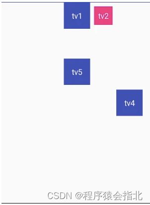
goneMargin
在ConstraintLayout中还增加了另外一种goneMargin,它的作用主要是:一旦某个方向上的约束view不可以见,这时如果设置了该属性,该方向将自动增加margin值。即目标必须不可见。
<android.support.constraint.ConstraintLayout xmlns:android="http://schemas.android.com/apk/res/android"
    xmlns:app="http://schemas.android.com/apk/res-auto"
    android:layout_width="match_parent"
    android:layout_height="match_parent">

    <TextView
        android:id="@+id/tv1"
        android:layout_marginTop="100dp"
        android:text="tv1"
        ...
        app:layout_constraintLeft_toLeftOf="parent"
        app:layout_constraintRight_toRightOf="parent" />

    <TextView
        android:layout_marginLeft="10dp"
        android:text="tv2"
        ....
        app:layout_constraintBaseline_toBaselineOf="@+id/tv1"
        app:layout_constraintLeft_toRightOf="@+id/tv1" />

    <TextView
        android:id="@+id/tv3"
        ...
        android:text="tv3"
        android:visibility="gone"
        app:layout_constraintBottom_toBottomOf="parent"
        app:layout_constraintLeft_toLeftOf="parent"
        app:layout_constraintRight_toRightOf="parent"
        app:layout_constraintTop_toTopOf="parent" />

    <TextView
        android:id="@+id/tv4"
        android:layout_marginLeft="10dp"
        android:text="tv4"
        ...
        app:layout_constraintBottom_toBottomOf="parent"
        app:layout_constraintLeft_toRightOf="@+id/tv3"
        app:layout_constraintTop_toTopOf="parent"
        app:layout_goneMarginLeft="100dp" />

    <TextView
        android:id="@+id/tv5"
        ...
        android:layout_marginBottom="10dp"
        android:text="tv5"
        app:layout_constraintBottom_toBottomOf="parent"
        app:layout_constraintLeft_toLeftOf="parent"
        app:layout_constraintRight_toRightOf="parent"
        app:layout_constraintTop_toTopOf="parent"
        app:layout_constraintVertical_bias="0.33" />

android.support.constraint.ConstraintLayout>
点击查看源码
Circle
在ConstraintLayout中你不仅可以对任意view进行水平与竖直方向的约束,同时你还可以居于约束view的中心点进行不同角度方向的约束。主要属性有如下三种:
- layout_constraintCircle: 代表约束的view的id
- layout_constraintCircleAngle: 代表约束的角度
- layout_constraintCircleRadius: 代表约束的半径大小

<android.support.constraint.ConstraintLayout
    xmlns:app="http://schemas.android.com/apk/res-auto"
 ...
 >

    <TextView
        android:id="@+id/tv1"
        android:text="tv1"
        ...
        app:layout_constraintBottom_toBottomOf="parent"
        app:layout_constraintLeft_toLeftOf="parent"
        app:layout_constraintRight_toRightOf="parent"
        app:layout_constraintTop_toTopOf="parent" />

    <TextView
        android:text="tv2"
        ...
        app:layout_constraintCircle="@id/tv1"
        app:layout_constraintCircleAngle="45"
        app:layout_constraintCircleRadius="100dp" />

android.support.constraint.ConstraintLayout>

点击查看源码
GuideLine
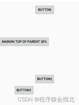
GuideLine也是ConstraintLayout特有的属性,它相当于一个参考线,且它的布局中不会展示。
GuidLine有水平与竖直方法的设置:
android:orientation="horizontal|vertical"
主要设置属性为:
- layout_constraintGuide_begin: 代表距离GuideLine左边或者底部的距离
- layout_constraintGuide_end: 代表距离GuideLine右边或者底部的距离
- layout_constraintGuide_percent:代表GuideLine相对于parent的位置百分比
<android.support.constraint.ConstraintLayout
    xmlns:app="http://schemas.android.com/apk/res-auto"
   ...
    >

    <android.support.constraint.Guideline
        android:id="@+id/vertical_guide_line"
        android:layout_width="wrap_content"
        android:layout_height="wrap_content"
        android:orientation="vertical"
        app:layout_constraintGuide_begin="150dp" />

    <Button
        android:id="@+id/button"
        android:layout_width="wrap_content"
        android:layout_height="wrap_content"
        android:layout_marginTop="16dp"
        android:text="Button"
        app:layout_constraintLeft_toLeftOf="@+id/vertical_guide_line"
        app:layout_constraintTop_toTopOf="parent" />

    <android.support.constraint.Guideline
        android:id="@+id/horizontal_guide_line"
        android:layout_width="wrap_content"
        android:layout_height="wrap_content"
        android:orientation="horizontal"
        app:layout_constraintGuide_end="150dp" />

    <Button
        android:id="@+id/button1"
        android:layout_width="wrap_content"
        android:layout_height="wrap_content"
        android:text="Button1"
        app:layout_constraintRight_toLeftOf="@+id/vertical_guide_line"
        app:layout_constraintTop_toTopOf="@+id/horizontal_guide_line" />

    <Button
        android:id="@+id/button2"
        android:layout_width="wrap_content"
        android:layout_height="wrap_content"
        android:text="Button2"
        app:layout_constraintBottom_toBottomOf="@+id/horizontal_guide_line"
        app:layout_constraintLeft_toRightOf="@+id/vertical_guide_line" />

    <android.support.constraint.Guideline
        android:id="@+id/percent_guide_Line"
        android:layout_width="wrap_content"
        android:layout_height="wrap_content"
        android:orientation="horizontal"
        app:layout_constraintGuide_percent="0.3" />

    <Button
        android:layout_width="wrap_content"
        android:layout_height="wrap_content"
        android:text="margin top of parent 30%"
        app:layout_constraintTop_toBottomOf="@+id/percent_guide_Line" />

android.support.constraint.ConstraintLayout>
点击查看源码
Barrier & Group
Barrier
Barrier与GuideLine有点类似,也是布局不可见的,不同的是它就约束对象的,看如下图:
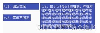
如果有这么一种需求:tv3始终在tv1与tv2的最近右边,但tv1与tv2的宽度的不看预期的,即可能tv1更长或者tv2更长。这时Barrier就能很好的解决这问题。
在Barrier中有两个属性,分别为:
- barrierDirection:控制其方向
- constraint_referenced_ids:约束的view的参考id
Group
细心的你可能会发现,既然ConstraintLayout中能减少布局的嵌套,那么对于同一模块的UI对其进行整体操作,是否只能逐一进行操作(显隐操作)?ConstraintLayout给出了它的答案,就是Group。它的作用就是对多个view进行分组操作,当然在布局中也是不可见的。主要属性是:
constraint_referenced_ids: 约束的view的参考id
就拿上面Barrier的示例来说。
    <android.support.constraint.Group
        android:id="@+id/group"
        android:layout_width="wrap_content"
        android:layout_height="wrap_content"
        android:visibility="visible"
        app:constraint_referenced_ids="tv1,tv2" />
如果加了如上代码,那么对group进行VISIBLE操作时,对同时作用于tv1与tv2。
点击查看源码
other
下面来说一下使用ConstraintLayout时,一些需要注意的点。这样可以帮助你在使用做少走弯路。
wrap_content
如果你的View中对宽高使用了wrap_content,那么你要时刻注意,它的约束可能并不会很好的生效。例如如下实例:
    <TextView
        android:id="@+id/tv1"
        android:layout_width="wrap_content"
        android:layout_height="wrap_content"
        android:background="@color/colorPrimary"
        android:padding="10dp"
        android:text="tv1"
        android:textColor="@android:color/white" />

    <TextView
        android:id="@+id/tv2"
        android:layout_width="wrap_content"
        android:layout_height="wrap_content"
        android:layout_marginLeft="10dp"
        android:background="@color/colorPrimary"
        android:padding="10dp"
        android:text="@string/other_tv2"
        android:textColor="@android:color/white"
        app:layout_constrainedWidth="true"
        app:layout_constraintLeft_toRightOf="@+id/tv1"
        app:layout_constraintRight_toRightOf="parent" />
![[外链图片转存失败,源站可能有防盗链机制,建议将图片保存下来直接上传(img-x0b0ybAF-1657530268095)(https://segmentfault.com/img/bVbaAgD?w=297&h=58)]](http://img.e-com-net.com/image/info8/835b0f0ec5214a3d8382063762d62124.jpg)
如果将app:layout_constrainedWidth="true"这行代码删除,那么你将会看到如下效果
![[外链图片转存失败,源站可能有防盗链机制,建议将图片保存下来直接上传(img-fkY9NeRL-1657530268095)(https://segmentfault.com/img/bVbaAgv?w=303&h=62)]](http://img.e-com-net.com/image/info8/f4f0fa9d8c514f89a11305028ee628f2.jpg)
在代码注释中已经说明,在使用wrap_content时,还可以使用minWith等属性。它们之间的优先级为 min/max > constraintWith/Height
MATCH_CONSTRAIN
当使用了MATCH_CONSTRAIN,即0dp来展示宽高时,可以通过如下方式来进行约束相应宽高值。
    <TextView
        android:id="@+id/tv3"
        android:layout_width="0dp"
        android:layout_height="wrap_content"
        android:layout_marginTop="50dp"
        android:background="@color/colorPrimary"
        android:padding="10dp"
        android:text="tv3"
        android:textColor="@android:color/white"
        app:layout_constraintTop_toBottomOf="@+id/tv1"
        app:layout_constraintWidth_percent="0.5" />
![[外链图片转存失败,源站可能有防盗链机制,建议将图片保存下来直接上传(img-MHP4mI4P-1657530268096)(https://segmentfault.com/img/bVbaAgG?w=172&h=46)]](http://img.e-com-net.com/image/info8/5ab81586459c4b9e8c2cb88b129ea589.jpg)
如果将app:layout_constraintWidth_percent="0.5"去掉的话,你将看到如下效果:
![[外链图片转存失败,源站可能有防盗链机制,建议将图片保存下来直接上传(img-g4bEIYrC-1657530268097)(https://segmentfault.com/img/bVbaAgH?w=95&h=35)]](http://img.e-com-net.com/image/info8/5e781c055c7f46ecabcfc5ce0f3c7d8f.jpg)
注意它们之间的优先级为parent > min/max > constraint_min/max
Ratio
如果你的需要是对View进行固定宽高比展示时,那么Ratio的这个特性将非常适合你。你只需设置它的layout_constraintDimensionRatio属性即可。
如果layout_width与layout_height其中一个为MATCH_CONSTRAIN(0dp), MATCH_CONSTRAIN(0dp)的值将根据layout_constraintDimensionRatio所设的值来计算(w:h)
![[外链图片转存失败,源站可能有防盗链机制,建议将图片保存下来直接上传(img-HM2U6ca8-1657530268097)(https://segmentfault.com/img/bVbaAgJ?w=106&h=43)]](http://img.e-com-net.com/image/info8/037e4ed782704d5aace2ee56e2e3298c.jpg)
如果layout_width与layout_height都为MATCH_CONSTRAIN(0dp), 那么可以对layout_constraintDimensionRatio添加前缀W/H(H,w:h,来对其进行宽高方向的约束,从而形成比例。
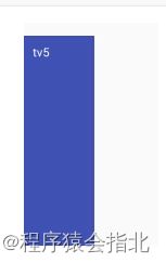
根据效果图展示的宽高比为1:3。即对应了H,3:1。
六、文末
由于布局这块涉及内容较多 ,文章篇幅很长。全文全方面讲解了Compose布局的各方面知识。更多Android前言技术进阶,我自荐一套完整的Android的资料,以及一些视频课讲解》》》