数据下载
Day6-data.PNG
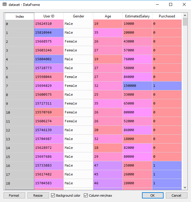
这个数据集是某社交网络的用户信息,有Uesr ID、Gender、Age、EstimatedSalary。某汽车公司生产了新型豪华SUV,我们试图找出社交网络中的哪些用户会买这款新车。数据最后一列Purchased表示用户是否购买了这款车。我们希望通过Age和EstimatedSalary两个变量,建立一个模型,来预测用户是否会购买这款车。所以我们的特征矩阵只包含这两列,来研究Age、EstimatedSalary和是否购买之间的关系。
一、数据预处理
- 导入库
import numpy as np
import pandas as pd
import matplotlib.pyplot as plt
%matplotlib inline
- 导入数据
df = pd.read_csv('D:\\data\\Day6-Social_Network_Ads.csv')
X = df.iloc[:,2:4]
Y = df.iloc[:,-1]
- 分割数据集
from sklearn.cross_validation import train_test_split
X_train, X_test, Y_train, Y_test = train_test_split(X, Y, test_size = 0.25)
- 数据标准化
from sklearn.preprocessing import StandardScaler
ss = StandardScaler()
ss = ss.fit(X_train)
X_train = ss.transform(X_train)
X_test = ss.transform(X_test)
二、建立逻辑回归模型
from sklearn.linear_model import LogisticRegression
lr = LogisticRegression()
lr = lr.fit(X_train, Y_train)

#模型效果
r = lr.score(X_train, Y_train)
print('R值(准确率):', r)
print('theta:', lr.coef_)
print('截距(theta0):', lr.intercept_ )
R值(准确率): 0.836666666667
theta: [[ 2.1449592 1.20554969]]
截距(theta0): [-1.07651256]
三、预测结果
Y_pred = lr.predict(X_test)
四、结果评估
- 混淆矩阵
from sklearn.metrics import confusion_matrix
cm = confusion_matrix(Y_test, Y_pred, labels=[0,1])
array([[64, 3],
[12, 21]], dtype=int64)
- 可视化
训练集可视化
from matplotlib.colors import ListedColormap
X_set, y_set = X_train, Y_train
X1, X2 = np.meshgrid(np.arange(start = X_set[:, 0].min() - 1, stop = X_set[:, 0].max() + 1, step = 0.01),
                     np.arange(start = X_set[:, 1].min() - 1, stop = X_set[:, 1].max() + 1, step = 0.01))
plt.contourf(X1, X2, lr.predict(np.array([X1.ravel(), X2.ravel()]).T).reshape(X1.shape),
             alpha = 0.75, cmap = ListedColormap(('red', 'green')))
plt.xlim(X1.min(), X1.max())
plt.ylim(X2.min(), X2.max())
for i, j in enumerate(np.unique(y_set)):
    plt.scatter(X_set[y_set == j, 0], X_set[y_set == j, 1],
                c = ListedColormap(('red', 'green'))(i), label = j)
plt.title('Logistic Regression (Training set)')
plt.xlabel('Age')
plt.ylabel('Estimated Salary')
plt.legend()
测试集可视化
from matplotlib.colors import ListedColormap
X_set, y_set = X_test, Y_test
X1, X2 = np.meshgrid(np.arange(start = X_set[:, 0].min() - 1, stop = X_set[:, 0].max() + 1, step = 0.01),
                     np.arange(start = X_set[:, 1].min() - 1, stop = X_set[:, 1].max() + 1, step = 0.01))
plt.contourf(X1, X2, lr.predict(np.array([X1.ravel(), X2.ravel()]).T).reshape(X1.shape),
             alpha = 0.75, cmap = ListedColormap(('red', 'green')))
plt.xlim(X1.min(), X1.max())
plt.ylim(X2.min(), X2.max())
for i, j in enumerate(np.unique(y_set)):
    plt.scatter(X_set[y_set == j, 0], X_set[y_set == j, 1],
                c = ListedColormap(('red', 'green'))(i), label = j)
plt.title('Logistic Regression (Test set)')
plt.xlabel('Age')
plt.ylabel('Estimated Salary')
plt.legend()