html + css 基础总结
html + css 基础总结
文章目录
- html + css 基础总结
-
- 模板介绍
- Demo01-写一篇博客
- Demo02-超链接和列表
- Demo03-图片使用
- Demo04-知识补充
- Demo05-百度云盘制作
- Demo06-简单表格制作
- Demo07-简历制作
- Demo08-登录表单(京东登陆界面上的账户、密码及隐私协议勾选)
- Demo09- get 请求和 post 请求的区别(表单和服务器通讯补充)
- Demo10-认识 CSS
- Demo11-容器 div 的作用
- Demo12-布局与选择器
- Demo13-样式表的层叠
- Demo14-选择器的权重
- Demo15-CSS文本属性
- Demo16-背景图的使用
- Demo17-元素浮动(上)
- Demo18-元素浮动(中)
- Demo19-元素浮动(下)
- Demo20-盒模型(上)
- Demo21-盒模型(下)
- Demo22-布局练习
- Demo23-CSS属性的缩写
- Demo24-鼠标划入效果
本文档根据【千锋教育_HTML+CSS新手快速入门全套教程-千锋前端-bilibili】整理,主要用于制作网页时能对相应属性进行快速查阅。
模板介绍
- 声明,告诉浏览器,使用HTML5标准来解析该网页。
- 表示网页的头部,这里的信息是对网页的整体说明。
- 表示网页的身体,网页的内容写在这里。
DOCTYPE html>
<html>
	<head>
		<meta charset="utf-8" />
		<title>网页标题title>
	head>
	<body>
		<p>P标签代表段落,因此这里的内容会独占一行p>

	body>
html>
Demo01-写一篇博客
命令介绍:
<h1>...h1>
<h2>...h2>
<h3>...h3>
<h4>...h4>
<h5>...h5>
<h6>...h6>
<p>...p>
<i>...i>
<b>...b>
<br>
<hr>
案例实践:
DOCTYPE html>
<html>
<head>
<meta charset="utf-8" />
<meta name="viewport" content="width=device-width, initial-scale=1">
<title>title>
head>
<body>
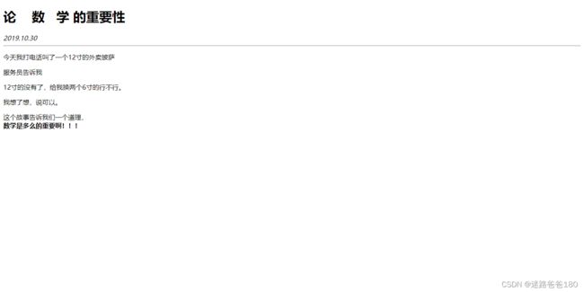
<h1>论 数 学 的重要性h1>
<i>2019.10.30i>
<hr >
<p>
今天我打电话叫了一个12寸的外卖披萨
p>
<p>
服务员告诉我
p>
<p>12寸的没有了,给我换两个6寸的行不行。p>
<p>
我想了想,说可以。
p>
<p>这个故事告诉我们一个道理,<br><b>数学是多么的重要啊!!!b>p>
body>
html>
实际效果:
Demo02-超链接和列表
命令介绍:
<a href="http://bussniess.com/242321.html">全球首例3D打印眼角膜a>
<a href="xxxx" target="_blank">点我a>


<ul>
	<li>无序列表项目li>
ul>
<ul type="disc">
	<li>无序列表项目li>
ul>
<ul type="circle">
	<li>无序列表项目li>
ul>
<ul type="square">
	<li>无序列表项目li>
ul>

<ol>
	<li>有序列表项目li>
ol>
<ol type="1">
	<li>有序列表项目li>
ol>
<ol type="a">
	<li>有序列表项目li>
ol>
<ol type="i">
	<li>有序列表项目li>
ol>
案例实践:
DOCTYPE html>
<html>
	<head>
		<meta charset="utf-8" />
		<title>百度新闻列表title>
	head>
	<body>
		<h1>科技 <img src="img/icon-mark.png" >h1>
		<hr >
		<ul>
			<li>
				<a href="http://scitech.people.com.cn/n1/2018/0925/c1057-30310849.html">中子星内“核面食”比钢硬100亿倍a>
			li>
			<li>
				<a href="http://www.cnbeta.com/articles/tech/771233.html">蒂姆·库克分享新iPhone XS用户拍摄样张a>
			li>
		ul>

		<ol>
			<li>
				<a href="http://scitech.people.com.cn/n1/2018/0925/c1057-30310849.html">中子星内“核面食”比钢硬100亿倍a>
			li>
			<li>
				<a href="http://www.cnbeta.com/articles/tech/771233.html">蒂姆·库克分享新iPhone XS用户拍摄样张a>
			li>
		ol>
	body>
html>

<ul>
	<li>无序列表项目li>
ul>
<ul type="disc">
	<li>海底捞上市了!li>
	<li>我又吃上市了一个?!li>
ul>
<ul type="circle">
	<li>海底捞上市了!li>
	<li>我又吃上市了一个?!li>
ul>
<ul type="square">
	<li>海底捞上市了!li>
	<li>我又吃上市了一个?!li>
ul>

<ol>
	<li>有序列表项目li>
ol>
<ol type="1">
	<li>北冥有鱼li>
	<li>其名为鲲li>
ol>
<ol type="a">
	<li>北冥有鱼li>
	<li>其名为鲲li>
ol>
<ol type="A">
	<li>北冥有鱼li>
	<li>其名为鲲li>
ol>
<ol type="i">
	<li>北冥有鱼li>
	<li>其名为鲲li>
ol>
<ol type="I">
	<li>北冥有鱼li>
	<li>其名为鲲li>
ol>
实际效果:

Demo03-图片使用
总结:
图片在网页上的顺序是从左到右依次排放,底部对齐,右侧空间不足以摆放下一张图片的时候,图片 会自动下一行排序。
命令介绍:
<img src="images/1.png">
<img src="images/1.png" title="鼠标划上去的提示" alt="图片加载失败后的文字">
<img src="images/1.png" width="100px">
<img src="images/1.png" width="100px" height="100px">

<img src="images/1.png" width="100%">
案例实践:
DOCTYPE html>
<html lang="en">
<head>
	<meta charset="UTF-8">
	<title>图片的使用title>
head>
	<body>
		<img src="images/1.png">
		<img src="images/1.png" title="鼠标划上去的提示" alt="图片加载失败后的文字">
		<img src="images/1.png" width="100px">
		<img src="images/1.png" width="100px" height="100px">

		<img src="images/1.png" width="100%">
	body>
html>
实际效果:
Demo04-知识补充
命令总结:
<del>...del>
<sup>2sup>
<u>...u>
<center>...center>
案例实践:
DOCTYPE html>
<html lang="en">
<head>
<meta charset="UTF-8">
<title>知识点补充title>
head>
<body>
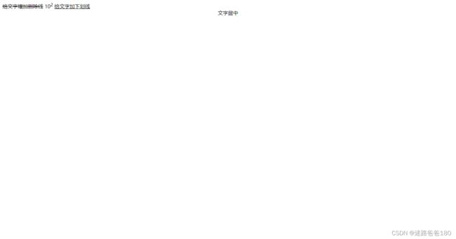
<del>给文字增加删除线del>
10<sup>2sup>
<u>给文字加下划线u>
<center>文字居中center>
body>
html>
实际效果:
Demo05-百度云盘制作
绝对地址: 任何情况下都可以找到的地址
相对地址: 而相对地址,必须知道当前所在,才能找到
代码命令:
<img src="https://www.baidu.com/img/PCtm_d9c8750bed0b3c7d089fa7d55720d6cf.png">
<a href="pages/articles/xishuo.html">相对路径a>
案例实践:
百度网盘文件结构如下:

demo.html 内容:
DOCTYPE html>
<html lang="en">
    <head>
        <meta charset="utf-8">
    head>
    <body>
      <img src="img/baidu.jpg" width="100%">
	  <p>
		  <a href="one/one.html">
			  <img src="img/file.png" width="60px">one
		  a>
		  <a href="two/two.html">
		  	<img src="img/file.png" width="60px">two
		  a>
		  <img src="https://www.baidu.com/img/PCtm_d9c8750bed0b3c7d089fa7d55720d6cf.png">
	  p>
    body>
html>
one.html 内容:
DOCTYPE html>
<html>
	<head>
		<meta charset="utf-8" />
		<meta name="viewport" content="width=device-width, initial-scale=1">
		<title>title>
	head>
	<body>
		<img src="../img/baidu.jpg" >
		<p>
			<a href="../demo.html">
				<img src="../img/return.jpg" height="25px">
			a>
		p>
		<p>
			<img src="../img/ai.png" width="60px">
			<img src="../img/doc.png" width="60px">
			<img src="../img/ai.png" width="60px">
			<img src="../img/doc.png" width="60px">
		p>
	body>
html>
two.html 内容:
DOCTYPE html>
<html>
	<head>
		<meta charset="utf-8" />
		<meta name="viewport" content="width=device-width, initial-scale=1">
		<title>title>
	head>
	<body>
		<img src="../img/baidu.jpg" >
		<p>
			<a href="../demo.html">
				<img src="../img/return.jpg" height="25px">
			a>
		p>
		<p>
			<a href="three/three.html">
				<img src="../img/file.png" width="60px">three
			a>

			<img src="../img/ai.png" width="60px">
			<img src="../img/doc.png" width="60px">
			<img src="../img/ai.png" width="60px">
			<img src="../img/doc.png" width="60px">
		p>
	body>
html>
three.html 内容:
DOCTYPE html>
<html>
	<head>
		<meta charset="utf-8" />
		<meta name="viewport" content="width=device-width, initial-scale=1">
		<title>title>
	head>
	<body>
		<img src="../../img/baidu.jpg" >
		<p>
			<a href="../two.html">
				<img src="../../img/return.jpg" height="25px">
			a>
		p>
		<p>
			<img src="../../img/ai.png" width="60px">
			<img src="../../img/doc.png" width="60px">
			<img src="../../img/ai.png" width="60px">
			<img src="../../img/doc.png" width="60px">
		p>
	body>
html>
Demo06-简单表格制作
命令介绍:
<table>
	<tbody>
		<tr>
			<td>...td>
			<td>...td>
			<td>...td>
		tr>
		<tr>
			<td>...td>
			<td>...td>
			<td>...td>
		tr>
	tbody>
table>

<tr>...tr>
<td>...td>
<col>
border="1px"
cellspacing="0"
align="center"
<table width="1000px" border="1px" cellspacing="0">...table>
<tr align="center">...tr>
<col width="200px">
案例实践:
DOCTYPE html>
<html>
	<head>
		<meta charset="utf-8" />
		<title>前端技术阶段划分标准title>
	head>
	<body>
		<h3>前端技术阶段划分标准h3>
		<table border="1px" cellspacing="0">
			<tbody>
				<col width="200px">
				<col width="200px">
				<col width="200px">
				<col width="200px">
				<col width="200px">
				<tr align="center">
					<td>td>
					<td>初级td>
					<td>中级td>
					<td>高级td>
					<td>专家td>
				tr>
				<tr align="center">
					<td>标准td>
					<td>被产品怼的说不出话td>
					<td>跟产品互怼不相上下td>
					<td>怼的产品没话说td>
					<td>直接将产品怼辞职td>
				tr>
				<tr align="center">
					<td>用户Atd>
					<td>td>
					<td>td>
					<td>td>
					<td>td>
				tr>
				<tr align="center">
					<td>用户Btd>
					<td>td>
					<td>td>
					<td>td>
					<td>td>
				tr>
				<tr align="center">
					<td>用户Ctd>
					<td>td>
					<td>td>
					<td>td>
					<td>td>
				tr>
			tbody>
		table>
	body>
html>
实际效果:

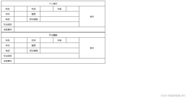
Demo07-简历制作
命令介绍:
<td colspan="7">...td>
<td rowspan="4">...td>
<th>...th>
<colgroup span="6" width="100px">...colgroup>
<colgroup span="1" width="200px">...colgroup>
案例实践:
DOCTYPE html>
<html>
	<head>
		<meta charset="utf-8">
		<title>title>
	head>
	<body>
		<tbody>
			<table border="1px" cellspacing="0">
				<col width="100px">
				<col width="100px">
				<col width="100px">
				<col width="100px">
				<col width="100px">
				<col width="100px">
				<col width="200px">
				<tr height="40px" align="center">
					<td colspan="7">个人简历td>
				tr>
				<tr height="40px" align="center">
					<td>姓名td>
					<td>td>
					<td>性别td>
					<td>td>
					<td>年龄td>
					<td>td>
					<td rowspan="4">照片td>
				tr>
				<tr height="40px" align="center">
					<td>学历td>
					<td>td>
					<td>籍贯td>
					<td colspan="3">td>
				tr>
				<tr height="40px" align="center">
					<td>电话td>
					<td>td>
					<td>面貌td>
					<td colspan="3">td>
				tr>
				<tr height="40px" align="center">
					<td>毕业院校td>
					<td colspan="5">td>
				tr>
				<tr height="40px" align="center">
					<td>求职意向td>
					<td colspan="6">td>
				tr>
			tbody>
		table>


		<table border="1px" cellspacing="0">
			<tbody>
				<colgroup span="6" width="100px">colgroup>
				<colgroup span="1" width="200px">colgroup>
				<tr height="40px" align="center">
					<th colspan="7">个人简历th>
				tr>
				<tr height="40px" align="center">
					<td>姓名td>
					<td>td>
					<td>性别td>
					<td>td>
					<td>年龄td>
					<td>td>
					<td rowspan="4">照片td>
				tr>
				<tr height="40px" align="center">
					<td>学历td>
					<td>td>
					<td>籍贯td>
					<td colspan="3">td>
				tr>
				<tr height="40px" align="center">
					<td>电话td>
					<td>td>
					<td>面貌td>
					<td colspan="3">td>
				tr>
				<tr height="40px" align="center">
					<td>毕业院校td>
					<td colspan="5">td>
				tr>
				<tr height="40px" align="center">
					<td>求职意向td>
					<td colspan="6">td>
				tr>
			tbody>
		table>
	body>
html>
实际效果:
Demo08-登录表单(京东登陆界面上的账户、密码及隐私协议勾选)
命令总结:
<form action="https://www.baidu.com">
	<table>
		<tbody>
			<tr>


				<td><input type="text" name="loginname">td>
				<td><input type="password" name="pwd">td>
			tr>
			<tr>

				<td><input type="submit" value="提交">td>
				<td><input type="reset" value="重置">td>
			tr>
		tbody>
	table>
form>


<input type="text" name="loginname">
<input type="password" name="pwd">


<table width="400px">...table>
案例实践:
DOCTYPE html>
<html>
	<head>
		<meta charset="utf-8">
		<title>title>
	head>
	<body>
		<form action="https://www.baidu.com">

			<table width="600px" border="1px" cellspacing="0">
				<tbody>
					<tr height="40px">
						<td rowspan="4" align="center">总体信息td>
						<td colspan="2">td>
					tr>
					<tr height="40px">
						<td align="right">用户名:td>


						<td><input type="text" name="loginname">td>
					tr>
					<tr height="40px">
						<td align="right">密码:td>
						<td><input type="password" name="pwd">td>
					tr>
					<tr height="40px">
						<td colspan="2" align="center">


							<input type="submit"  value="提交">
							<input type="reset" value="重置">

							<input type="file">
						td>
					tr>
				tbody>
			table>
		form>
	body>
html>
实际效果:

Demo09- get 请求和 post 请求的区别(表单和服务器通讯补充)
表单和服务器通讯的两种方式和差别
post:提交数据
get:获取数据
form表单在请求服务器时也提供了两种方式:
<form method="get">
<form method="post">
案例实践:
DOCTYPE html>
<html>
	<head>
		<meta charset="utf-8" />
		<title>title>
	head>
	<body>
		<form action="http://www.baidu.com" method="post">
			<p>
				<input type="text" name="login">
			p>
			<p>
				<input type="password" name="pass">
			p>
			<p>
				<input type="submit">
			p>
		form>
	body>
html>
实际效果:
get 请求中地址栏包含提交的信息,如图所示,地址栏中显示了提交的账号和密码:
post 请求中地址栏中没有提交的信息(可以是账户和密码,也可以是搜索内容):
既然 get 和 post 只是在传递数据的方式上不同,那是否意味着,无论获取数据还是提交数据两种方式可以混用呢?答:可以混用,但不建议混用。
Demo10-认识 CSS
用来修饰网页样式的语法叫做 层叠样式表(CSS,Cascading Style Sheet)
案例实践:
DOCTYPE html>
<html>
	<head>
		<meta charset="utf-8" />
		<title>title>
	head>
	<body>
		<form action="https://www.miaodongketang.cn">
			<table width="600px" border="1px" cellspacing="0">
				<tbody>
					<tr height="40px">
						<td rowspan="4" align="center" style="color:red;">总体信息td>
						<td colspan="2">td>
					tr>
					<tr height="40px">
						<td align="right">用户名:td>
						<td>
							<input type="text" name="loginname">
						td>
					tr>
					<tr height="40px">
						<td align="right">密码:td>
						<td>
							<input type="password" name="pwd">
						td>
					tr>
					<tr height="40px">
						<td colspan="2" align="center">
							<input type="submit" value="提交" style="width: 80px; height:30px; background-color: #41A863;">
							<input type="reset" value="重置" style="width: 80px; height:30px; background-color: #41A863;">
						td>
					tr>
				tbody>
			table>
		form>
	body>
html>
Demo11-容器 div 的作用
命令总结:
<p align="center">...p>
<p style="text-align: center;">...p>
span,一个容器标签,不具备任何特殊功能,仅当作容器来使用。``用于包裹一段文字``,便于给文本增加样式。
div,一个通用的容器标签,不具备任何特殊功能,仅当作容器来使用。可以包裹任何内容,也可以容器直接互相包裹。
text-align:center; 让容器内部元素水平居中(让内部元素水平居中)
margin:auto; 让容器本身水平居中(让元素本身水平居中)
background-color:gray; 设定背景颜色
font-size:24px; 设定字体大小
color:white; 设定文字颜色
案例实践:
DOCTYPE html>
<html>
	<head>
		<meta charset="utf-8" />
		<title>title>
	head>
	<body>

		<div style="color:#555; margin: auto; width: 500px;">
			<p style="text-align: center;">
				<span style="background-color: gray; color:white; font-size:24px;">千锋简介span>
			p>
			<p>
				<b>北京千锋互联科技有限公司(简称千锋)b>
				成立于2011年1月。公司总部位于北京,目前已在
				<span style="color:#41A863;">
					深圳、上海、郑州、广州、大连、武汉、成都、西安、杭州、青岛、重庆、长沙、哈尔滨、南京、太原
				span>
				建立分公司。
			p>
			<p>
				千锋旗下现有
				<b>教育培训、人才服务、项目研发、创业孵化等业务。b>
				教育培训业务主要为大学生、企业提供技术培训服务;人才服务业务主要为企业提供优秀的互联网研发人才;
				项目研发业务主要为企业提供APP解决方案及APP项目研发;
				创业孵化业务为有创业梦想的学员设立,为其提供创业辅导及天使投资等服务。
			p>
			<p>
				千锋秉承着
				<span style="color: #F40;">“用良心做教育”span>
				的理念踏踏实实的做事,
				<span style="color: #F40;">创办7年,现已成为业内口碑好、规模大、教学强的移动互联网研发培训机构。span>
				目前累计与国内
				<b>超过8200多家b>
				IT相关企业建立人才输送合作,与
				<b>562所大学b>
				建立实训就业合作,每年为中国IT企业输送上万名移动开发工程师。计划未来5年内实现年营收过10亿,为中国教育行业贡献一份力量。
			p>
		div>
	body>
html>
实际效果:

Demo12-布局与选择器
命令介绍:
#box:ID选择器,id表示身份,在页面中元素的id不允许重复,因此id选择器只能选择单个元素,所以用来写banner,navigation和bottom等大的框架。
div:标签选择器,根据标签名称,选择对应的所有标签。
.nav:类别选择器,选择拥有该类别的多个元素。
*:通用选择器,针对页面上所有的标签都生效。
案例实践:
DOCTYPE html>

<html style="background=#ddd;">
	<head>
		<meta charset="utf-8" />
		<title>title>
	head>

	<body style="margin:0;">


		<div id="banner">

			<img src="images/banner.jpg" style="width:100%;">
		div>

		<div id="navigation" style="height:80px; line-height:80px; text-align:center; background-color:white;">

			<a href="#" style="text-decoration:none; color:black; margin:0 15px;">首页a>
			<a href="#" style="text-decoration:none; color:black; margin:0 15px;">关于王力a>
			<a href="#" style="text-decoration:none; color:black; margin:0 15px;">产品世界a>
			<a href="#" style="text-decoration:none; color:black; margin:0 15px;">新闻中心a>
			<a href="#" style="text-decoration:none; color:black; margin:0 15px;">网络事件a>
			<a href="#" style="text-decoration:none; color:black; margin:0 15px;">联系我们a>
			<a href="#" style="text-decoration:none; color:black; margin:0 15px;">关于我们a>
			<a href="#" style="text-decoration:none; color:black; margin:0 15px;">网络新闻a>
		div>

		<div id="bottom" style="height:40px; line-height:40px; text-align:center; font-size:17px; color:gray;">
			版权所有:浙江王力门业有限公司 技术支持派桑网络
		div>
	body>
html>
- 根据上边的代码可以看到,当页面内容越来越多时,页面难以阅读;且有很多重复样式,让工作量非常大,为此,采用样式和内容分离形式,具体如下:
- 我们管写在标签身上的的叫行内样式,写在style内部的叫内部样式。
- 接下来我们尝试把行内样式转化为内部样式:
DOCTYPE html>
<html>
	<head>
		<meta charset="utf-8" />
		<title>title>


		<style>
			/* 整个html网页的背景设置为灰色 */
			html {
				background-color: #ddd;
			}
			/* body本身和两侧有一条白色空隙,使用 margin:0; 使得body左右紧贴着网页两边 */
			body {
				margin: 0;
			}
			/* html和body都只有一个,但是div有很多个,所以不能用div作为选择器,而应该使用唯一的id,banner,navigation和botom,id */
			#navigation {
				height: 80px; line-height: 80px; text-align: center; background-color: white;
			}
			#bottom {
				height: 40px; line-height: 40px; text-align: center; font-size:14px; color: gray;
			}
			/* html和body都只有一个,但是a有很多个,所以也不能用a作为选择器否则针对所有超链接生效,因此此处在navigation中的a加上类别属性:class="nav",此处针对nav这个类别设定样式 */
			.nav {
				text-decoration: none; color:black; margin: 0 15px;
			}
			/* 针对在banner下边的img设定样式,如果直接使用img {width:100%},则针对所有img生效。*/
			#banner img {
				width: 100%;
			}
		style>
	head>
	<body>
		<div id="banner">
			<img src="images/banner.jpg">
		div>
		<div id="navigation">
			<a href="#" class="nav">首页a>
			<a href="#" class="nav">关于王力a>
			<a href="#" class="nav">产品世界a>
			<a href="#" class="nav">新闻中心a>
			<a href="#" class="nav">网络事件a>
			<a href="#" class="nav">联系我们a>
			<a href="#" class="nav">关于我们a>
			<a href="#" class="nav">网络新闻a>
		div>
		<div id="bottom">
			版权所有:浙江王力门业有限公司 技术支持派桑网络
		div>
	body>
html>
Demo13-样式表的层叠
命令介绍:
类别可以定义多个,比如下边给同一项定义了两个类别:
<a href="#" class="item last">秒杀活动a>
不同类别组合出来不同的权重,样式生效优先顺序不一样。
DOCTYPE html>
<html>
	<head>
		<meta charset="utf-8" />
		<title>title>
		<style>
			#navigation {
				text-align: center;
			}
			/* 此处 #navigation 和 .last 是两个样式叠加,保证其权重优先生效。*/
			#navigation .last {
				border:none;
			}
			.item {
				text-decoration: none;
				color: black;
				border-right: solid 1px #808080;
				padding: 0 15px;
			}
		style>
	head>
	<body>
		<div id="navigation">
			<a href="#" class="item">首页a>
			<a href="#" class="item">办公家居a>
			<a href="#" class="item">数码科技a>
			<a href="#" class="item">母婴a>
			<a href="#" class="item">团购a>

			<a href="#" class="item last">秒杀活动a>
		div>
	body>
html>
实际效果:

Demo14-选择器的权重
命令介绍:
行内样式(1000)>ID选择器(100)>类选择器(10)>标签选择器(1)>通用选择器(0)
<...style="..."> > #box{...} > .con{...} > div{...} > *{...}
不同样式选择器的权重可叠加,当样式发生冲突时,谁的权重高,谁就生效。
案例实践:
DOCTYPE html>
<html>
    <head>
        <meta charset="UTF-8">
        <title>title>

        <style type="text/css">
        	/* #p1,这个ID选择器第2个生效,是蓝色。权重100 */
            #p1{
				color: blue;
			}
			/* 这个通用选择器第5个生效,是橘黄色。权重0 */
			*{
				color: orange;
			}
			/* .pp,这个类别选择器第3个生效,是绿色。权重10 */
            .pp{
				color: green;
			}
			/* p,这个标签选择器第4个生效,是红色。权重1 */
            p{
				color: red;
			}
        style>
    head>
    <body>

        <p class="pp" id="p1" style="color: slateblue;">
            猜猜我是什么颜色
        p>
    body>
html>
DOCTYPE html>
<html>
	<head>
		<meta charset="utf-8" />
		<title>title>

		<style type="text/css">

			a{color: yellow;} /* 1 */

			div a{color: green;} /* 1 + 1 */

			.demo a{color: black;} /* 10 + 1 */

			#demo a{color: orange;}  /* 100 + 1 */

			div#demo a{color: red;}  /* 1+100 + 1 */

		style>
	head>
	<body>
		<a href="">应该是黄色a>
		<div class="demo">
			<a href="">应该是黑色a>
		div>
		<div id="demo">
			<a href="">应该是红色a>
		div>
	body>
html>
DOCTYPE html>
<html>
	<head>
		<meta charset="utf-8" />
		<title>title>
		<style type="text/css">
			/* 权重100,第4生效 */
			#news {
				list-style: none;
				width: 370px;
			}
			/* 权重101,第3生效 */
			#news li {
				height: 40px; line-height: 40px;
				/* dashed:下边框是虚线,1px:宽度1px;grey:灰色; */
				border-bottom: dashed 1px grey;
			}
			/* 权重102,第2生效 */
			#news li a {
				color: gray;
				text-decoration: none;
			}
			/* 权重110,第1生效 */
			#news .last {
				border: none;
			}
		style>
	head>
	<body>
		<ul id="news">
			<li><a href="">深圳欢乐谷“欢乐干线”架空单轨车追尾事件初步调a>li>
			<li><a href="">呼和浩特市公安局局长自杀身亡a>li>
			<li><a href="">参加完民企座谈会的这24位企业家怎么说?a>li>
			<li><a href="">吉林大学校长李元元调任华中科技大学校长a>li>
			<li><a href="">父亲在坠江公交遇难,儿子含泪救援80小时a>li>
			<li class="last"><a href="">结束15年旅美生涯 大熊猫“高高”回国养老a>li>
		ul>
	body>
html>
Demo15-CSS文本属性
命令介绍:
文字:
	颜色
	字体
	行高
	大小
	加粗
	倾斜
	首行缩进
	水平对齐
	文字修饰
案例实践:
<!DOCTYliE html>
<html>
	<head>
		<meta charset="utf-8" />
		<title>title>
	head>
	<style tylie="text/css">
		.p1 { color:red } /* 文字颜色 */
		.p2 { font-family: "华文中宋" } /* 字体类型 */
		.p3 { font-size: 26px; } /* 文字大小 */
		.p4 { font-weight: bold; } /* 文字加粗 */
		.p5 { font-style: italic; } /* 文字倾斜 */
		.p6 { text-indent: 60px; } /* 首行缩进 */
		.p7 { text-align: center; } /* 水平对齐方式 */
		.p8 { line-height: 100px; } /* 行高 */
		.p9 { height: 100px; background-color: gray; line-height: 100px;}  /* 垂直居中 */
		.p10 { text-decoration: underline; } /* 文本修饰 */
	style>
	head>
	<body>
	<body>
		<ul>
			<li class="p1">1 “双十一”过去将近一个月,各大电商、物流平台和物流企业纷纷晒出今年的成绩单,li>
			<li class="p1 p6">1 “双十一”过去将近一个月,各大电商、物流平台和物流企业纷纷晒出今年的成绩单,li>
			<li class="p2">2 其中物流平台和物流企业的成绩单直接关乎消费者享受的服务,因而更加引人注目。li>
			<li class="p3">3 国家邮政局监测信息显示,11月11日至16日业务高峰期间,全国邮政、快递企业共处理邮(快)件18.82亿件,li>
			<li class="p4">4 截至21日20时,除边远地区外,主要寄递企业揽收的邮(快)件已妥投18.3亿件,妥投率超过97%。li>
			<li class="p5">5 来自物流平台的统计数据同样具有说服力:今年天猫“双十一”当日物流订单量突破10亿。li>
			<li class="p6">6 2009年天猫“双十一”当日物流订单为26万,2010年这个数字达100万,2011年达2200万,2012年达到7200万时,li>
			<li class="p7">7 单点运行的传统物流体系已不堪重负,爆仓时有发生。li>
			<li class="p8">8 2013年5月,阿里巴巴联合“三通一达”等企业成立菜鸟网络,li>
			<li class="p9">9 着手打造智能物流骨干网,显著的改变和提升由此产生,li>
			<li class="p10">10 2013年天猫“双十一”当日物流订单达1.52亿,此后一路飙升,今年突破10亿大关,li>
		ul>
	body>
html>
Demo16-背景图的使用
html是最大的父元素,默认宽度撑满整个屏幕,默认高度为0。
元素的宽高占比,是相对于父元素而言的,若父元素高度为0,则子元素高度即使设置100%,大小也是0。
html元素大小是相对于浏览器窗口而言的。

body是html的子元素。
body标签也是一个容器,也会独占一行,默认宽度撑满整个屏幕,默认高度为0。
DOCTYPE html>
<html>
	<head>
		<meta charset="utf-8" />
		<title>title>
	head>
	<style type="text/css">
		/* 可以对html和body同时设置共同属性,使html父元素和body子元素高度都铺满屏幕。 */
		html,body {
			margin: 0; /* 消除滚动条 */
			height: 100%; /* 高度占比100%,使html父元素和body子元素撑满整个屏幕 */
		}
		/* body标签也是一个容器,也会独占一行,默认宽度撑满整个屏幕 */
		body {
			background-image: url(imgs/dong.gif); /* 设置背景图片用url命令 */
			/*
			设置背景图片时,图片默认以平铺方式展现,也就是一张图无限复制,铺满屏幕。
			若不希望图片平铺重复出现,则设置平铺方式为 no-repeat。
			*/
			background-repeat: no-repeat;
			/* 设置背景的位置,第一个参数是水平位置,第二个参数是垂直位置 */
			background-position: center top;
		}
	style>
	<body>

	body>
html>
Demo17-元素浮动(上)
命令总结:
容器类元素,无论大小如何,都是独占一行的。正常情况排列由上至下。
浮动元素会脱离网页文档,与其他元素发生重叠如上图所示。
但是,浮动元素不会与文字内容发生重叠,文字自动环绕浮动元素。

正常的div容器每个容器独占一行,即使宽度很小也会从上至下排版。
为实现三个div横向排列,则需要设置三个div浮动即可。
案例实践:
DOCTYPE html>
<html>
	<head>
		<meta charset="utf-8">
		<title>title>
	head>
	<style type="text/css">
		/* 设置类green的宽度、高度、背景颜色和左浮动,因此类green将浮动在类red之上 */
		.green {
			width: 100px; height: 100px;
			background-color: green;
			float: left;
		}
		/* 设置类red的宽度、高度和背景颜色 */
		.red {
			width: 200px; height: 150px;
			background-color: red;
		}
		/* 设置类a的宽度和背景颜色 */
		.a {
			width: 200px;
			background-color: green;
		}
		/* 设置类b的宽度和背景颜色 */
		.b {
			width: 700px;
			background-color: red;
		}
		/* 设置类c的宽度和背景颜色 */
		.c {
			width: 300px;
			background-color: blue;
		}
		/* 设置类a,b,c均为左浮动,高度均为200px,则会出现从网页左端开始横向排列效果。 */
		.a,.b,.c {
			float: left; height: 200px;
		}

	style>
	<body>
		<p>文字环绕效果p>
		<div class="green">div>
		<div class="red">
			文字环绕文字环绕文字环绕文字环绕文字环绕文字环绕文字环绕文字环绕文字环绕文字环绕文字环绕文字环绕文字环绕
		div>

		<p>横向排版布局p>

		<div class="a">div>
		<div class="b">div>
		<div class="c">div>
	body>
html>
实际效果:

Demo18-元素浮动(中)
前两种要有父元素包裹子元素。
clear: left/right/both 则不需要父元素,直接作用到当前元素使其不受浮动的影响。
命令总结:
第一种:
分别对父元素和子元素设定相同的高度:
<style>
	.a,.b,.c {
		float: left;
		height: 200px;
	}
	.outer {
		height: 200px;
	}
style>
<div class="outer">
			<div class="a">div>
			<div class="b">div>
			<div class="c">div>
		div>

第二种:
overflow:auto 忽略子元素浮动的影响,父元素可以被子元素撑开:
<style>
	.outer {
		overflow:auto;
	}
style>

第三种:
clear: left/right/both
当前元素不受左/右/(左和右)浮动的影响。
案例实践:
DOCTYPE html>
<html>
	<head>
		<meta charset="utf-8">
		<title>title>
	head>
	<style type="text/css">
		/* 类a的宽度占屏幕的20%,背景颜色为橘红色。 */
		.a {
			width: 20%;
			/*
			此处没有用backgroud-color是因为background-color限制死了只设置背景颜色。
			而background可以设置关于背景的所有属性,包括颜色,背景图是否重复等。
			如:background: orangered url(xxx.png) no-repeat.
			 */
			background: orangered;
		}
		/* 类b的宽度占屏幕的60%,背景颜色为绿色。 */
		.b {
			width: 60%;
			background: green;
		}
		/* 类c的宽度占屏幕的20%,背景颜色为蓝色。 */
		.c {
			width: 20%;
			background: blue;
		}
		/* 类a,b,c均设置为左浮动,高度为200px,此操作让a,b,c横向水平排列 */
		.a,.b,.c {
			float: left;
			height: 200px;
		}
		/* 类hh高度为360px,背景为灰色 */
		.hh {
			height: 360px; background: #222222;
		}
		/*
		类a,b,c外部的父类设置为和a,b,c一样的高度,这样下边的类hh就不会被浮动的a,b,c遮挡。
		从而实现a,b,c和hh的上下排列。
		*/
		.outer {
			/*
			正常来说子元素可以将父元素撑开,不需要设置父元素的高度了。
			但是由于子元素a,b,c是浮动的,不占据空间,所以无法撑开父元素的高度。
			因此必须要设定父元素的高度和子元素高度一致为200px。。
			*/
			height: 200px;
		}
	style>
	<body>

		<div class="outer">
			<div class="a">div>
			<div class="b">div>
			<div class="c">div>
		div>


		<div class="hh">

		div>
	body>
html>
实际效果:
案例实践:
DOCTYPE html>
<html>
	<head>
		<meta charset="utf-8" />
		<title>聊天对话框title>
		<style type="text/css">
			* {
				padding: 0;
				margin: 0; /*这行样式必须写,后面的章节会介绍*/
			}

			.content {
				list-style: none; /*将无序列表的默认样式去掉*/
				width: 260px;
				height: 380px;
				margin: auto; /*这个样式可以让对话框居中,不信删掉试试看?*/
				border: 1px dotted black; /*合并的写法,对border多个属性进行设置*/
			}

			.content .msg {
				clear: both;
			}
			/*此处写了两个类.content和.left,就比一个类.contentdd的样式优先级高*/
			.content .left {
				float: left;
				background: lightgrey;
			}

			.content .right {
				float: right;
				background: yellowgreen;
			}
		style>
	head>

	<body>
		<ul class="content">
			<li class="msg left">你好?li>
			<li class="msg right">你好li>
			<li class="msg left">祝你幸福li>
			<li class="msg right">??li>
			<li class="msg left">再见li>
			<li class="msg right">纳尼?li>
			<li class="msg right">。。。。。li>
		ul>
	body>
html>
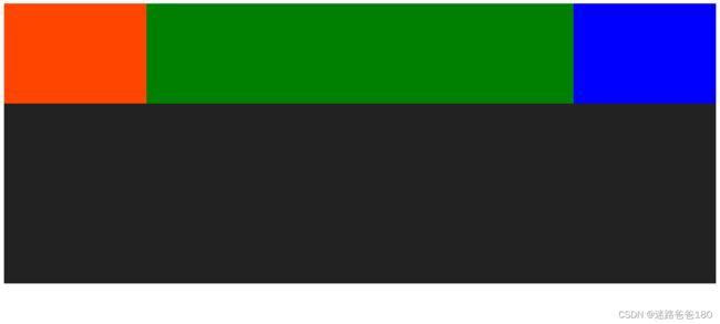
Demo19-元素浮动(下)
命令总结:
浮动元素在排列时,只参考前一个元素位置即可。
右浮动的话第一个元素会在最右边,第二个挨着第一个在其左侧。

浮动元素的重叠问题:
1. 浮动元素不会覆盖文字内容。
2. 浮动元素不会覆盖图片内容(因为图片本身也属于文本,可以把图片看作时特殊的文字)。
3. 浮动元素不会覆盖表单元素(输入框、单选按钮、复选框、按钮、下拉选择框等)。
案例实践:
DOCTYPE html>
<html>
	<head>
		<meta charset="utf-8">
		<title>title>
	head>
	<style type="text/css">
		* {
			padding: 0; margin: 0;
		}
		.item {
			width: 30%; float: left;
			font-size: 60px;
		}
	style>
	<body>
		<div class="item" style="height: 300px; background: #008000;">1div>
		<div class="item" style="height: 150px; background: #0000FF;">2div>
		<div class="item" style="height: 100px; background: red;">3div>
		<div class="item" style="height: 150px; background: #4682B4;">4div>
		<div class="item" style="height: 250px; background: #9ACD32;">5div>
		<div class="item" style="height: 300px; background: sandybrown;">6div>
		<div class="item" style="height: 300px; background: lightcoral;">7div>
	body>
html>
实际效果:

Demo20-盒模型(上)
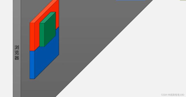
css定义所有的元素都可以拥有像盒子一样的外形和平面空间。即都包含内容区、补白(填充)、边框、边界(外边距)这就是盒模型。
盒模型的组成部分=content(内容区)+padding(填充区)+border(边框区)+margin(外边界区)
运行在浏览器按F12进入控制台我们会看到下图这样的区域:

content:就是元素的宽和高
border:就是盒子的边缘(边宽)
Padding:就是元素的内边距
margin:就是元素的外边距
什么是盒模型-wenqianqian1-CSDN
命令总结:
margin:0; 所有边距都为0
margin:auto; 自动设置边距,默认左右边距相等,即可达到居中效果,水平方向有效。
margin-top: 10px;
margin-right: 20px;
margin-bottom: 20px;
margin-left: 30px;
案例实践:
DOCTYPE html>
<html>
	<head>
		<meta charset="utf-8">
		<title>title>
		<style type="text/css">
			* {
				/*
				在浏览器当中,有一些元素,天生默认会自带边距,而这些边距我们大部分时候用不到。
				所以一开始要所有元素边距全设置为0
				*/
				margin: 0; /*将所有的元素边距都设置为0*/
			}
			#box {
				/*设置父元素的宽度使其恰好等于三个子元素的宽度和,否则父元素本身就是左右撑满,无法居中显示*/
				width: 750px;
				/*父元素box忽略浮动子元素的浮动,使得父元素高度可以被子元素撑开*/
				overflow: auto;
				/*margin:auto; 让父元素自动设置边距,默认左右边距相等,即可达到居中效果,水平方向有效。*/
				margin: auto;
			}
			.item {
				/*设置每张图片的宽度和高度*/
				width: 210px; height: 136px;
				/*三张图片设置左浮动,横向排列*/
				float:left;
				/*每个图的周围边距设置为20px*/
				margin: 20px;
			}
		style>
	head>
	<body>
		<div id="box">
			<div class="item" style="background: url(imgs/01.png);">div>
			<div class="item" style="background: url(imgs/02.png);">div>
			<div class="item" style="background: url(imgs/03.png);">div>
		div>
	body>
html>
Demo21-盒模型(下)
命令总结:
padding: 0px; /*将所有的元素内边距都设置为0*/
padding-top: 10px;
padding-right: 20px;
padding-bottom: 20px;
padding-left: 30px;
案例实践:
DOCTYPE html>
<html>
	<head>
		<meta charset="utf-8">
		<title>title>
		<style type="text/css">
			* {
				margin: 0; /*将所有的元素边距都设置为0*/
			}
			#box {
				/*宽度设置的和三个图片宽度和一致,是为了使三个图片的父元素能居中,即三张图片整体居中*/
				width: 870px;
				overflow: auto;
				/*由于本身box左右铺满,而margin:auto; 让父元素自动设置边距,左右边距相等,即可达到居中效果,水平方向有效。*/
				margin: auto;
			}
			.item {
				float:left;
				/*外边距设置为20px*/
				margin: 20px;
				border: 5px solid black;
				/*内边距设置为15px*/
				padding: 15px;
			}

		style>
	head>
	<body>
		<div id="box">
			<div class="item">
				<img src="imgs/01.png"><br>
				测试文字内容
			div>
			<div class="item">
				<img src="imgs/02.png" ><br>
				测试文字内容
			div>
			<div class="item">
				<img src="imgs/03.png" ><br>
				测试文字内容
			div>
		div>
	body>
html>
Demo22-布局练习
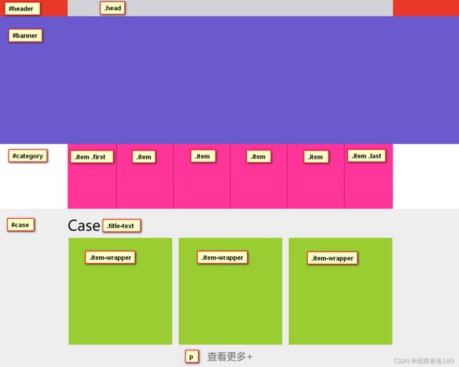
网页设计总结:
- ID选择器 #box 定从上到下的大结构分几个主体部分,比如: #head,#body 和 #bottom 等。
- 类选择器 .con 定每个主体部分的小类别,比如:.body_item,.body_item_first 和 .body_item_last 等。
案例实践:
DOCTYPE html>
<html>
	<head>
		<meta charset="utf-8">
		<title>title>
		<style>
			/* 通用设置,所有元素内外边距均设置为0 */
			* {
				margin: 0; padding: 0;
			}
			/* IDhead 高 50px,背景颜色设置为 #E83828 */
			#header {
				height: 50px;
				background: #E83828;
			}
			/* #header .head 两个放一块是为了让其权重大于一个 #header,样式优先生效。*/
			#header .head {
				width: 1005px; height: 50px;
				background: #D1D3D6;
				margin: auto; /*居中显示*/
			}

			#banner {
				/* ID banner 高度设置为500px,背景颜色设置为 slateblue */
				height: 500px;
				background: slateblue;
			}

			#category {
				/* ID category 宽度设置为1005px,高度设置为 200px,设置了宽度这样才能居中*/
				width: 1005px; height: 200px;
				margin: auto; /*居中显示*/
				background: #FF359A; /*背景颜色*/
			}
			/* #category .item 两个放一块是为了让其权重大于一个 #category,样式优先生效。*/
			#category .item {
				/* 宽度设置为 125px,高度设置为 165px */
				width: 125px; height: 165px; /*设置大小*/
				padding-left: 25px; /*左填充*/
				padding-right:25px; /*右填充*/
				padding-bottom: 25px; /*下填充*/
				padding-top: 10px; /*上填充*/
				border-right: 1px dashed black; /*右边框,1像素,虚线 ,黑色*/
				float: left; /*左浮动*/
			}
			#category .item.first {
				padding-left: 0; /*取消左填充*/
			}
			#category .item.last {
				padding-right: 0;  /*取消右填充*/
				border: 0;  /*取消边框*/
			}
			/* ID case 的高度设置为 490px,如果宽度不设置,实际上是默认的左右铺满,背景颜色设置为 #eeeeee*/
			#case { height: 490px; background: #eeeeee; }
			#case .title-text {
				/* title 设置宽度为 1005px,设置完宽度才可以设置左右居中 */
				width: 1005px;
				margin: auto; /*水平居中*/
				padding-top: 20px;  /*上填充*/
				padding-bottom: 10px; /*下填充*/
				font-size: 45px; /*字体大小*/
			}
			#case .item-wrapper {
				width: 1000px;
				margin: auto; /*水平居中*/
				overflow: auto;  /*自动设置高度,防止因子元素浮动而高度塌陷*/
			}
			#case .item-wrapper .item {
				width: 320px; height: 330px; background: #9ACD32;
				float: left; /*左浮动*/
			}
			#case .item-wrapper .item.mg { margin-left:20px; margin-right:20px; /*左右边距*/ }
			#case p {
				width: 1005px; height: 40px;
				margin-left: auto; margin-right: auto; /*水平居中*/
				margin-top: 15px; /*上边距*/
				line-height: 40px; /*行高和高度一致时,文字垂直居中*/
				text-align: center; /*文字水平居中*/
				font-size: 30px; /*字体大小*/
				color: dimgray; /*字体颜色*/
			}
		style>
	head>
	<body>
		<div id="header">
			<div class="head">div>
		div>
		<div id="banner">div>
		<div id="category">
			<div class="item first">div>
			<div class="item">div>
			<div class="item">div>
			<div class="item">div>
			<div class="item">div>
			<div class="item last">div>
		div>
		<div id="case">
			<div class="title-text">
				Case
			div>
			<div class="item-wrapper">
				<div class="item">div>
				<div class="item mg">div>
				<div class="item">div>
			div>
			<p>查看更多+p>
		div>
	body>
html>
Demo23-CSS属性的缩写
注意缩写顺序不能乱
(div) 背景缩写:
background-color /*背景色*/
background-image /*背景图片*/
background-repeat /*背景图平铺方式*/
background: gray url(xxx/xx.png) no-repeat;
background: 颜色 背景图片 平铺方式;
border 边框缩写
border-width /*边框宽度*/
border-style /*边框样式,solid实线,dashed虚线,dotted点线*/
border-color /*边框颜色*/
border: 1px solid #D3f402;
border: 边框宽度 边框样式 边框颜色;
border: 3px dashed; /*颜色默认为黑色,只有颜色可以省略*/
font 字体缩写:
font-style: italic; /*斜体*/
font-weight: bold; /*加粗*/
font-family: arial, sans-serif; /*字体种类*/
font-size: 20px; /*字号大小*/
line-height: 35px; /*行高*/
font: italic bold 20px/35px arial,sans-serif,"微软雅黑";
font: 斜体字 加粗 字号大小/行高 默认字体,备用字体,备用字体;
font: 20px "微软雅黑";
margin 外边距缩写:
margin-top
margin-right
margin-bottom
margin-left
margin: 10px 15px 10px 15px;
margin: 上 右 下 ;
关于颜色:
color: DarkGoldenRod;
color: rgb(184,134,11);
color: rgb(红,绿,蓝);
color: #B8860B /*十六进制表示*/
Demo24-鼠标划入效果
DOCTYPE html>
<html>
	<head>
		<meta charset="utf-8">
		<title>title>
	head>
	<style type="text/css">
		/* 类 test 是一个空的 div,设置长宽分别为 100px,背景为黑色 */
		.test{
			width: 100px; height: 100px;
			background: black;
		}
		/* 类 test 矩形的鼠标划入效果是:长宽分别变为 90px,背景为粉红色 */
		.test:hover{
			width: 90px; height: 90px;
			background: pink;
		}
		/* 鼠标划入前没有下划线。*/
		.info{
			color: steelblue;
			text-decoration: none;
		}
		.info:hover{
			/* 鼠标划入后出现下划线。*/
			text-decoration: underline;
		}
	style>
	<body>
		<div class="test">

		div>

		<a href="http://www.baidu.com" class="info">百度官网a>

	body>
html>