前端学习之CSS
CSS是什么
CSS是层叠样式表(Cascading Style Sheets)的简称。
CSS也是一种标记语言。
他是用来美化HTML的,让布局变的更简单。
CSS最大的价值就是:由HTML去专注网页的结构,样式转交给CSS,实现结构(HTML)与样式(CSS)相分离。
CSS的规则
CSS的规则主要由两大部分组成:选择器和一条或多条声明。
<style>
/* 选择器 {样式; 样式} */
/* 选择器就是给谁改样式 {改什么样式} */
P { color: red;
    font-size:28px;
};
style>
CSS选择器
CSS的选择器分为基础选择器和复合选择器
CSS基础选择器
基础选择器是由单个选择器组成的。
基础选择器又包括:标签选择器、类选择器、id选择器和通配符选择器。
标签选择器
标签选择器是指用HTML的标签名作为选择器,所有的被选中的标签都为同种样式。
类选择器
<style>
    .red {
        color: red;
    }
style>
<div class = "red">变红色div>
类命名有规则,尽量先查阅资料。比如导航栏:class = “nav”
类选择器之多类名
简单理解为一个标签有多个名字。
<div class = "name1 name2">多类名div>
为什么要使用多类名
当某一些标签有公共的样式时,可以将这些样式放在一个类名里,方便查看和后期的维护。
例如:
DOCTYPE html>
<html lang="en">
<head>
    <meta charset="UTF-8">
    <meta http-equiv="X-UA-Compatible" content="IE=edge">
    <meta name="viewport" content="width=device-width, initial-scale=1.0">
    <title>Documenttitle>
    <style>
        .box {
            width: 100px;
            height: 150px;
            font-size: larger;
        }
        .red {
            background-color: red;
        }
        .green {
            background-color: green;
        }
    style>
head>
<body>
    <div class="box red">红色div>
    <div class="box green">绿色div>
    <div class="box red">红色div>
body>
html>
id选择器
 #id名 {
     属性: 属性值;
 }
id选择器与类选择器的区别:id只有一个,但是类可以有多个相同的
id选择器一般与js相搭配。
通配符选择器
在CSS中使用 * 来定义,它表示选取页面中所有元素(标签)。
    * {
        属性: 属性值;
    }
通配符选择器不需要手动调用。
一些常用单位
DOCTYPE html>
<html lang="en">
<head>
    <meta charset="UTF-8">
    <meta name="viewport" content="width=device-width, initial-scale=1.0">
    <meta http-equiv="X-UA-Compatible" content="ie=edge">
    <title>Documenttitle>
    <style>

        html{
            font-size: 30px;
        }

        .box1{

            /*
                长度单位:
                    像素
                        - 屏幕(显示器)实际上是由一个一个的小点点构成的
                        - 不同屏幕的像素大小是不同的,像素越小的屏幕显示的效果越清晰
                        - 所以同样的200px在不同的设备下显示效果不一样

                    百分比
                        - 也可以将属性值设置为相对于其父元素属性的百分比
                        - 设置百分比可以使子元素跟随父元素的改变而改变

                    em
                        - em是相对于元素的字体大小来计算的
                        - 1em = 1font-size,一般浏览器默认字体为16px
                        - em会根据字体大小的改变而改变

                    rem
                        - rem是相对于根元素(html)的字体大小来计算

             */
            width:300px;
            height: 100px;
            background-color: orange;
        }

        .box2{
            width: 50%;
            height: 50%;
            background-color:aqua;
        }

        .box3{
            font-size: 50px;
            /* width: 10em;
            height: 10em; */
            width: 10rem;
            height: 10rem;
            background-color: greenyellow;
        }
    style>
head>
<body>

    <div class="box1">

        <div class="box2">div>

    div>

    <div class="box3">div>

body>
html>
颜色
DOCTYPE html>
<html lang="en">
<head>
    <meta charset="UTF-8">
    <meta name="viewport" content="width=device-width, initial-scale=1.0">
    <meta http-equiv="X-UA-Compatible" content="ie=edge">
    <title>Documenttitle>
    <style>
        .box1{
            width: 100px;
            height: 100px;
            /*
                颜色单位:
                    在CSS中可以直接使用颜色名来设置各种颜色
                        比如:red、orange、yellow、blue、green ... ...
                        但是在css中直接使用颜色名是非常的不方便

                    RGB值:
                        - RGB通过三种颜色的不同浓度来调配出不同的颜色
                        - R red,G green ,B blue
                        - 每一种颜色的范围在 0 - 255 (0% - 100%) 之间
                        - 语法:RGB(红色,绿色,蓝色)

                    RGBA:
                        - 就是在rgb的基础上增加了一个a表示不透明度
                        - 需要四个值,前三个和rgb一样,第四个表示不透明度
                            1表示完全不透明   0表示完全透明  .5半透明

                    十六进制的RGB值:
                        - 语法:#红色绿色蓝色
                        - 颜色浓度通过 00-ff
                        - 如果颜色两位两位重复可以进行简写
                            #aabbcc --> #abc

                    HSL值 HSLA值
                        H 色相(0 - 360)
                        S 饱和度,颜色的浓度 0% - 100%
                        L 亮度,颜色的亮度 0% - 100%

             */
            background-color: red;
            background-color: rgb(255, 0, 0);
            background-color: rgb(0, 255, 0);
            background-color: rgb(0, 0, 255);
            background-color: rgb(255,255,255);
            background-color: rgb(106,153,85);
            background-color: rgba(106,153,85,.5);
            background-color: #ff0000;
            background-color: #ffff00;
            background-color: #ff0;
            background-color: #bbffaa;
            background-color: #9CDCFE;
            background-color: rgb(254, 156, 156);
            background-color: hsla(98, 48%, 40%, 0.658);
        }
    style>
head>
<body>

    <div class="box1">div>

body>
html>
CSS字体属性
DOCTYPE html>
<html lang="en">
<head>
    <meta charset="UTF-8">
    <meta name="viewport" content="width=device-width, initial-scale=1.0">
    <meta http-equiv="X-UA-Compatible" content="ie=edge">
    <title>Documenttitle>
    <style>

        /*
        font-face可以将服务器中的字体直接提供给用户去使用
            问题:
                1.加载速度
                2.版权
                3.字体格式

        */
        @font-face {
                /* 指定字体的名字 */
            font-family:'myfont' ;
            /* 服务器中字体的路径 */
            src: url('./font/ZCOOLKuaiLe-Regular.ttf') format("truetype");
        }

        p{
            /*
            字体相关的样式
                color 用来设置字体颜色
                font-size 字体的大小
                    和font-size相关的单位
                    em 相当于当前元素的一个font-size
                    rem 相对于根元素的一个font-size
                font-family 字体族(字体的格式)
                    可选值:
                        serif  衬线字体
                        sans-serif 非衬线字体
                        monospace 等宽字体
                            - 指定字体的类别,浏览器会自动使用该类别下的字体

                    - font-family 可以同时指定多个字体,多个字体间使用,隔开
                        字体生效时优先使用第一个,第一个无法使用则使用第二个 以此类推

                        Microsoft YaHei,Heiti SC,tahoma,arial,Hiragino Sans GB,"\5B8B\4F53",sans-serif


            */
            color: blue;
            font-size: 40px;

            /* font-family: 'Courier New', Courier, monospace; */
            font-family: myfont;
        }
    style>
head>
<body>
    <p>
        今天天气真不错,Hello Hello How are you!
    p>
body>
html>
定义字体的样式。
字体系列
    p {
      font-family: "Microsoft YaHei", Arial;
    }
注意:
(1):各个字体之间使用英文的逗号隔开。
(2):一般情况下,如果有多个空格隔开的多个单词组成的字体,加引号。
(3):尽量使用系统默认自带的字体,保证在任何用户的浏览器上都能使用
指定多个字体的意义:
当浏览器读到设定字体的代码时,会依次判断该用户系统中是否有该字体,若有则使用该字体。若全部设定字体都没有则使用用户系统自带的字体。
字体大小
body {
    font-size: 16px;
}

h1 {
    font-size: 16px;
}
字体粗细
CSS使用font-weight来设置字体的粗细
font-weight: bold;
font-weight: 700;
文字样式(如斜体)
font-style
P {

    font-style: normal;

    font-style: italic;
}
这个可以让倾斜字体不倾斜
em {
    font-style: normal;
}
行高
DOCTYPE html>
<html lang="en">
<head>
    <meta charset="UTF-8">
    <meta name="viewport" content="width=device-width, initial-scale=1.0">
    <meta http-equiv="X-UA-Compatible" content="ie=edge">
    <title>Documenttitle>
    <style>
        div{
            font-size: 50px;

            /* 可以将行高设置为和高度一样的值,使单行文字在一个元素中垂直居中 */
            line-height: 200px;

            /*
                行高(line height)
                    - 行高指的是文字占有的实际高度
                    - 可以通过line-height来设置行高
                        行高可以直接指定一个大小(px em)
                        也可以直接为行高设置一个整数
                            如果是一个整数的话,行高将会是字体的指定的倍数
                    - 行高经常还用来设置文字的行间距
                        行间距 = 行高 - 字体大小

                字体框
                    - 字体框就是字体存在的格子,设置font-size实际上就是在设置字体框的高度

                行高会在字体框的上下平均分配

            */

            border: 1px red solid;

            /* line-height: 1.33; */
            /* line-height: 1; */
            /* line-height: 10 */
        }
    style>
head>
<body>

    <div>今天天气这不错 Hello hello 今天天气这不错 Hello hello 今天天气这不错 Hello hello 今天天气这不错 Hello hellodiv>

body>
html>
字体的复合属性
这样来节约代码。
p {
    font: font-style font-weight font-size/line-height font-family;
}
CSS文本属性
CSS的文本属性可定义文本的外观,比如文本的颜色、对齐文本、装饰文本、文本缩进、行间距等。
文本颜色
使用color进行定义
div{
    color: red;


}
对齐文本
text-align用来设定元素内文本的水平对齐方式(其实是相对于盒子来说。)
div {
    text-align: center;


}
装饰文本
text-decoration文字装饰。可以给文本添加下划线、删除线、上划线等。
div {

    text-decoration: none;

    text-decoration: underline;

    text-decoration: overline;

    text-decoration: line-through;
}
我们可以通过此方式对超链接的下划线进行删除。
a {
    text-decoration: none;
}
重点需要记住:如和添加下划线和如何和删除下划线。
文本缩进
通常指定于文本的第一行缩进,通常时将段落进行缩进。
p {
    text-indent: 10px;
}
通常在开发中使用em单位(就是当前元素1个文字的大小)
P {
    text-decoration: 2em;
}
行间距
line-height:控制文字行与行之间的间距。
line-height: 26px;
文字默认为16像素。
重点:所谓的行高包括文字高度、上间距和下间距。
CSS的引入方式
三大类:行内样式表、内部样式表和外部样式表
内部样式表
把所需要的CSS文件放在html页面内书写
<head>
    <style>
        div {
            color: red;
        }
    style>
head>
这种种方式可以控制整个html页面。
行内样式表
在元素标签的内部使用
<p style="color: red; font-size: 12px;">p>
此方法适合于修改样式比较少的情况下
外部样式表
推荐使用,特别是样式特别多的时候。
在html外单独建立一个CSS文件,html引用即可。
使用标签引用到html页面
<link rel="stylesheet" href="CSS的文件路径">
综合小练习-新闻案例
想让图片居中对齐,给它的父节点加text-align: center;
Emmet语法
CSS复合选择器
复合选择器是建立在基础选择器之上的,对基础选择器进行组合形成的。
交集选择器
交集选择器
作用:选中同时符合多个条件的元素
语法:选择器1选择器2选择器3选择器n{}
注意点:
交集选择器中如果有元素选择器,必须使用元素选择器开头
DOCTYPE html>
<html lang="en">
<head>
    <meta charset="UTF-8">
    <meta name="viewport" content="width=device-width, initial-scale=1.0">
    <meta http-equiv="X-UA-Compatible" content="ie=edge">
    <title>Documenttitle>
    <style>
        /* 将class为red的元素设置为红色(字体) */
        .red{
            color: red;
        }

        /* 将class为red的div字体大小设置为30px */
        /*
            交集选择器
                作用:选中同时符合多个条件的元素
                语法:选择器1选择器2选择器3选择器n{}
                注意点:
                    交集选择器中如果有元素选择器,必须使用元素选择器开头
        */
        div.red{
            font-size: 30px;
        }

        .a.b.c{
            color: blue
        }

        /* div#box1{} */

        /*
            选择器分组(并集选择器)
                作用:同时选择多个选择器对应的元素
                语法:选择器1,选择器2,选择器3,选择器n{}

                #b1,.p1,h1,span,div.red{}
         */
        h1, span{
            color: green
        }

    style>
head>
<body>
    <div class="red">我是divdiv>

    <p class="red">我是p元素p>

    <div class="red2 a b c">我是div2div>

    <h1>标题h1>

    <span>哈哈span>


body>
html>
后代选择器
可以选择父元素里面的子元素。比例有序列表中的li
ol li {
    color: red;
}
兄弟选择器
/*
            选择下一个兄弟
                语法:前一个 + 下一个
            选择下边所有的兄弟
                语法:兄 ~ 弟
          */

          p + span{
              color: red;
          }


          p ~ span{
              color: red;
          }
子选择器
子选择器只能选择作为某一元素的最近一级子元素。简单来说就是选亲儿子元素。
<div class="nav">
    <a href="#">我是儿子a>
    <p>
        <a href="#">我是孙子a>
    p>
div>
如果在这里使用后代选择器,那么”我是儿子“和我是孙子都是变为红色。
<style>
    .nav a{
        color: red;
    }
style>
如果使用子选择器,那么只有”我是儿子“会变成红色。
<style>
    .nav > a{
        color: red;
    }
style>
并集选择器
并集选择器可以选择多组标签,同时为他们定义相同的样式。通常用于集体声明。
元素1,元素2 {
    样式
}
属性选择器
DOCTYPE html>
<html lang="en">
<head>
    <meta charset="UTF-8">
    <meta name="viewport" content="width=device-width, initial-scale=1.0">
    <meta http-equiv="X-UA-Compatible" content="ie=edge">
    <title>Documenttitle>

    <style>
        /*
            [属性名] 选择含有指定属性的元素
            [属性名=属性值] 选择含有指定属性和属性值的元素
            [属性名^=属性值] 选择属性值以指定值开头的元素
            [属性名$=属性值] 选择属性值以指定值结尾的元素
            [属性名*=属性值] 选择属性值中含有某值的元素的元素
         */
        /* p[title]{ */
        /* p[title=abc]{ */
        /* p[title^=abc]{ */
        /* p[title$=abc]{ */
        p[title*=e]{
            color: orange;
        }
    style>
head>
<body>
        <p title="abc">少小离家老大回p>
        <p title="abcdef">乡音无改鬓毛衰p>
        <p title="helloabc">儿童相见不相识p>
        <p>笑问客从何处来p>
        <p>秋水共长天一色p>
        <p>落霞与孤鹜齐飞p>
body>
html>
伪类选择器
伪类选择器用于向某些选择器加特殊的效果,比如给链接添加特殊的效果,或者选择第1个,第n个元素。
伪类选择器最大书写规范使用:来表示,:hover、:first-child
元素的伪类选择器
DOCTYPE html>
<html lang="en">
<head>
    <meta charset="UTF-8">
    <meta name="viewport" content="width=device-width, initial-scale=1.0">
    <meta http-equiv="X-UA-Compatible" content="ie=edge">
    <title>Documenttitle>
    <style>
        /*
            将ul里的第一个li设置为红色
         */

/*
        伪类(不存在的类,特殊的类)
            - 伪类用来描述一个元素的特殊状态
                比如:第一个子元素、被点击的元素、鼠标移入的元素...
            - 伪类一般情况下都是使用:开头
                :first-child 第一个子元素
                :last-child 最后一个子元素
                :nth-child() 选中第n个子元素
                    特殊值:
                        n 第n个 n的范围0到正无穷
                        2n 或 even 表示选中偶数位的元素
                        2n+1 或 odd 表示选中奇数位的元素

                    - 以上这些伪类都是根据所有的子元素进行排序

                :first-of-type
                :last-of-type
                :nth-of-type()
                    - 这几个伪类的功能和上述的类似,不通点是他们是在同类型元素中进行排序

            - :not() 否定伪类
                - 将符合条件的元素从选择器中去除
 */
        /* ul > li:first-child{
            color: red;
        } */

        /* ul > li:last-child{
            color: red;
        } */

        /* ul > li:nth-child(2n+1){
            color: red;
        } */

        /* ul > li:nth-child(even){
            color: red;
        } */

        /* ul > li:first-of-type{
            color: red;
        } */

        ul > li:not(:nth-of-type(3)){
            color: yellowgreen;
        }
    style>
head>
<body>

    <ul>
        <span>我是一个spanspan>
        <li>第〇个li>
        <li>第一个li>
        <li>第二个li>
        <li>第三个li>
        <li>第四个li>
        <li>第五个li>
    ul>


body>
html>
链接伪类选择器
DOCTYPE html>
<html lang="en">
<head>
    <meta charset="UTF-8">
    <meta name="viewport" content="width=device-width, initial-scale=1.0">
    <meta http-equiv="X-UA-Compatible" content="ie=edge">
    <title>Documenttitle>
    <style>

        /*
            :link 用来表示没访问过的链接(正常的链接)
         */
        a:link{
            color: red;

        }

        /*
            :visited 用来表示访问过的链接
            由于隐私的原因,所以visited这个伪类只能修改链接的颜色
        */
        a:visited{
            color: orange;
            /* font-size: 50px;   */
        }

        /*
            :hover 用来表示鼠标移入的状态
         */
         a:hover{
             color: aqua;
             font-size: 50px;
         }

         /*
            :active 用来表示鼠标点击
         */
         a:active{
             color: yellowgreen;

         }

    style>
head>
<body>


    <a href="https://www.baidu.com">访问过的链接a>

    <br><br>

    <a href="https://www.baidu123.com">没访问过的链接a>

body>
html>
a:link {
    color: black;
    text-decoration: none;
}

a:visited {
    color: orange;
    text-decoration: none;
}

a:hover {
    color: skyblue;
    text-decoration: none;
}

a:active {
    color: green;
    text-decoration: none;
}
链接伪类的书写注意点
1.为了确保链接伪类生效,必须按照:link、visited、hover、active的顺序书写。(但也不必全部写完,只需要按照相对顺序即可)
因为a在浏览器中有默认默认的样式,对body的样式修改并不会改变a的样式,所以需要对a的样式进行单独的定义
focus 伪类选择器
这是用于获得焦点的的表单元素
焦点就是光标,一般来说,对于表单只用input才能获取
input:focus {
    background-color: yellow;
}
伪元素选择器
DOCTYPE html>
<html lang="en">
<head>
    <meta charset="UTF-8">
    <meta name="viewport" content="width=device-width, initial-scale=1.0">
    <meta http-equiv="X-UA-Compatible" content="ie=edge">
    <title>Documenttitle>

    <style>
        p{
            font-size: 20px;
        }

       /*
            伪元素,表示页面中一些特殊的并不真实的存在的元素(特殊的位置)
                伪元素使用 :: 开头

                ::first-letter 表示第一个字母
                ::first-line 表示第一行
                ::selection 表示选中的内容
                ::before 元素的开始
                ::after 元素的最后
                    - before 和 after 必须结合content属性来使用
        */
        p::first-letter{
            font-size: 50px;
        }

        p::first-line{
            background-color: yellow;
        }

        p::selection{
            background-color: greenyellow;
        }

        /* div::before{
            content: 'abc';
            color: red;
        }

        div::after{
            content: 'haha';
            color: blue;
        } */

        div::before{
            content: '『';
            /*
                content中的内容无法被选中
            */
         }

        div::after{
            content: '』';
        }

    style>
head>
<body>


    <div>Hello Hello How are youdiv>

    <p>
        Lorem ipsum dolor sit amet consectetur adipisicing elit. Atque velit modi veniam nisi veritatis tempore laborum nemo ipsa itaque optio. Id odit consequatur mollitia excepturi, minus saepe nostrum vel porro.
    p>


body>
html>
CSS的元素显示模式
了解了显示模式可以使得网页的布局更加简单和清晰。
文档流
DOCTYPE html>
<html lang="en">
<head>
    <meta charset="UTF-8">
    <meta name="viewport" content="width=device-width, initial-scale=1.0">
    <meta http-equiv="X-UA-Compatible" content="ie=edge">
    <title>Documenttitle>
    <style>
        .box1{
            width: 100px;
            background-color: yellow;
        }

        .box2{
            width: 100px;
            background-color: red;
        }

        span{
            background-color: #bfa;
        }
    style>
head>
<body>


     <div class="box1">我是div1div>
     <div class="box2">我是div2div>

     <span>我是span1span>
     <span>我是span2span>
     <span>我是span2span>
     <span>我是span2span>
     <span>我是span2span>
     <span>我是span2span>
     <span>我是span2span>
     <span>我是span2span>
     <span>我是span2span>
     <span>我是span2span>
body>
html>
什么是元素的显示模式
标签在浏览器中到底以什么方式进行显示,比如
自己占一行,比如在一行中可以放多个.HTML中的元素一般可以分为两大类:块元素和行元素。
块元素
常见的块元素有: <h1>-<h6>,<p>,<div>,<ul>,<ol>,<li>等,其中<div>是最典型的块元素块元素的特点
(1) 自己独战一行
(2) 高度,宽度,外边距,内边距都可以控制
(3) 宽度默认是容器(父级宽度)的100%
(3) 是一个容器及盒子,里面可以放行内或块级元素特别注意:
文字类的块级元素里不能使用块级元素,比如:p,h1这些。如p里面不能放div行内元素
常见的行内元素有<a>,<strong>,<b>,<em>,<i>,<del>,<s>,<ins>,<u>,<span>等,其中<span>是最典型的行内元素。行内元素也可以称为内联元素。行内元素的特点
(1) 相邻的行内元素在一行上,一行可以显示多个。
(2) 高、宽的设置是无效的。
(3) 默认宽度就是它内容的宽度。
(4) 行内元素只能容纳文本或者其他行内元素。特别注意
(1) 链接中不能再放链接。
(2) 链接里可以放块级元素,比如行内块元素
在行内元素中有几个特俗的标签:<img/> <input/> <td>,他们同时具有块元素和行内元素的特点。行内块元素的特点
(1) 和相邻行内元素(行内块)在一行上,但是他们会有空白间隙。一行可以显示多个(行内元素的特点)。
(2) 默认宽度就是他们本身内容的宽度(行内元素特点)。
(3) 高度、行高、外边距以及内边距都可以控制(块元素特点)。元素显示模式的转换
特俗情况下,我们需要元素显示模式的转换,简单理解为:一个模式的元素需要另一个模式的特性。比如想要增加链接的出发范围。
display: block;转换为块级元素
display: inline;转换为行内元素
display: inline-block;转换为行内块元素

a {
    display: block;
}
CSS的背景
DOCTYPE html>
<html lang="en">
<head>
    <meta charset="UTF-8">
    <meta name="viewport" content="width=device-width, initial-scale=1.0">
    <meta http-equiv="X-UA-Compatible" content="ie=edge">
    <title>Documenttitle>

    <style>
        .box1{
            width: 500px;
            height: 500px;
            overflow: auto;
            background-color: #bfa;
            background-image: url("./img/2.jpg");
            background-repeat: no-repeat;
            background-position: 0 0;
            padding: 10px;

            /*
                 设置背景的范围
                    background-clip
                        可选值:
                            border-box 默认值,背景会出现在边框的下边
                            padding-box 背景不会出现在边框,只出现在内容区和内边距
                            content-box 背景只会出现在内容区

                    background-origin 背景图片的偏移量计算的原点
                            padding-box 默认值,background-position从内边距处开始计算
                            content-box 背景图片的偏移量从内容区处计算
                            border-box 背景图片的变量从边框处开始计算
            */
            /* background-origin: border-box;
            background-clip: content-box; */

            /*
                background-size 设置背景图片的大小
                    第一个值表示宽度
                    第二个值表示高度
                    - 如果只写一个,则第二个值默认是 auto

                    cover 图片的比例不变,将元素铺满
                    contain 图片比例不变,将图片在元素中完整显示
            */
            background-size: contain;

            /*
                background-color
                background-image
                background-repeat
                background-position
                background-size
                background-origin
                background-clip
                background-attachment

                - backgound 背景相关的简写属性,所有背景相关的样式都可以通过该样式来设置
                    并且该样式没有顺序要求,也没有哪个属性是必须写的

                    注意:
                        background-size必须写在background-position的后边,并且使用/隔开
                            background-position/background-size

                        background-origin background-clip 两个样式 ,orgin要在clip的前边


             */


        }

        .box2{
            width: 300px;
            height: 1000px;
            background-image: url('./img/1.png');
            background-repeat: no-repeat;
            background-position: 100px 100px;

            /*
            background-attachment
                - 背景图片是否跟随元素移动
                - 可选值:
                    scroll 默认值 背景图片会跟随元素移动
                    fixed 背景会固定在页面中,不会随元素移动
             */
            background-attachment: fixed;
        }

        .box3{
            border: 10px red double;
            padding: 50px;
            width: 500px;
            height: 500px;
            background: url('./img/2.jpg') #bfa  center center/contain border-box content-box no-repeat ;
        }

    style>
head>
<body>
    <div class="box3">

    div>

body>
html>
背景颜色
一般的背景颜色默认为transparent(透明)
div{
    background-color: red;
}
背景图片
DOCTYPE html>
<html lang="en">
<head>
    <meta charset="UTF-8">
    <meta name="viewport" content="width=device-width, initial-scale=1.0">
    <meta http-equiv="X-UA-Compatible" content="ie=edge">
    <title>Documenttitle>

    <style>
        .box1{
            width: 500px;
            height: 500px;
            /*
                background-color 设置背景颜色
             */
            background-color: #bfa;

            /*
                background-image 设置背景图片
                    - 可以同时设置背景图片和背景颜色,这样背景颜色将会成为图片的背景色
                    - 如果背景的图片小于元素,则背景图片会自动在元素中平铺将元素铺满
                    - 如果背景的图片大于元素,将会一个部分背景无法完全显示
                    - 如果背景图片和元素一样大,则会直接正常显示

            */
            background-image: url("./img/1.png");

            /*
                background-repeat 用来设置背景的重复方式
                    可选值:
                        repeat 默认值 , 背景会沿着x轴 y轴双方向重复
                        repeat-x 沿着x轴方向重复
                        repeat-y 沿着y轴方向重复
                        no-repeat 背景图片不重复
             */
            background-repeat: no-repeat;

            /*
                background-position 用来设置背景图片的位置
                    设置方式:
                        通过 top left right bottom center 几个表示方位的词来设置背景图片的位置
                            使用方位词时必须要同时指定两个值,如果只写一个则第二个默认就是center

                        通过偏移量来指定背景图片的位置:
                            水平方向的偏移量 垂直方向变量
            */
            /* background-position: center; */
            background-position: -50px 300px;


        }
    style>
head>
<body>
    <div class="box1">div>
body>
html>
在实际应用中用于logo或者一些小装饰的小图片或者大的背景图片。比插入图片更好控制位置。
div{
    background-image: none|url(图片地址);
}
默认情况下背景图片是平铺的(做动画的时候可用到sprite animation)
背景平铺
div{
    background-repeat: repeat|no-repeat|repeat-x|repeat-y;
}
页面元素即可以添加背景颜色,也可以添加背景图片 只不过背景图片会压住背景颜色
背景位置
background-position: x y;
其中x y代表的是x坐标,y坐标。可以使用方位名词或者精确单位。
其中方位名词有:top,center,bottom,left,right(top,bottom只有y轴有)注意
如果两个值都是方位名词,那么两个则的顺序无关
如果只直嘀咕一个方位名词,那么第二值默认为居中对齐使用方位名词实现一个效果图
如图:
待更新精确单位
若是使用精确单位那么x,y必须要有严格的顺序。
如果只写一个值,那么这个值一定是x,另一个值是y居中。背景固定
background-attachment属性可以设置背景图像是否固定或者随着页面的其余部分滚动。
可以用来制作时差滚动的效果。background-attachment: scroll | fixed;
背景属性的复合写法
不想用
书写的顺序不想font那样有顺序的要求背景颜色透明
background: rgba(x,x,x,x);
其中a是alpha透明度,取值范围为0~1之间
这是CSS3新增的属性,只对IE9+版本的浏览器支持。
案例-五彩导航栏
效果图:
DOCTYPE html>
<html lang="zh-CN">
<head>
    <meta charset="UTF-8">
    <meta http-equiv="X-UA-Compatible" content="IE=edge">
    <meta name="viewport" content="width=device-width, initial-scale=1.0">
    <title>Documenttitle>
    <style>
        a{
            display: inline-block;
            text-decoration: none;
            color: white;
        }
    style>
head>
<body>


    <a href="#">五彩导航栏a>
    <a href="#">五彩导航栏a>
    <a href="#">五彩导航栏a>
    <a href="#">五彩导航栏a>
body>
html>
背景渐变(线性渐变)
DOCTYPE html>
<html lang="en">
<head>
    <meta charset="UTF-8">
    <meta name="viewport" content="width=device-width, initial-scale=1.0">
    <meta http-equiv="X-UA-Compatible" content="ie=edge">
    <title>Documenttitle>
    <style>
        .box1{
            width: 200px;
            height: 200px;
            /* background-color: #bfa; */
            /*
                通过渐变可以设置一些复杂的背景颜色,可以实现从一个颜色向其他颜色过渡的效果
                !!渐变是图片,需要通过background-image来设置

                线性渐变,颜色沿着一条直线发生变化
                    linear-gradient()

                    linear-gradient(red,yellow) 红色在开头,黄色在结尾,中间是过渡区域
                    - 线性渐变的开头,我们可以指定一个渐变的方向
                        to left
                        to right
                        to bottom
                        to top
                        deg deg表示度数
                        turn 表示圈

                    - 渐变可以同时指定多个颜色,多个颜色默认情况下平均分布,
                        也可以手动指定渐变的分布情况

                    repeating-linear-gradient() 可以平铺的线性渐变
             */

            /* background-image: linear-gradient(red,yellow,#bfa,orange); */
            /* background-image: linear-gradient(red 50px,yellow 100px, green 120px, orange 200px); */
            background-image: repeating-linear-gradient(to right ,red, yellow 50px);

        }
    style>
head>
<body>
    <div class="box1">div>
body>
html>
径向渐变
DOCTYPE html>
<html lang="en">
<head>
    <meta charset="UTF-8">
    <meta name="viewport" content="width=device-width, initial-scale=1.0">
    <meta http-equiv="X-UA-Compatible" content="ie=edge">
    <title>Documenttitle>
    <style>
        .box1{
            width: 300px;
            height: 300px;

/*
            radial-gradient() 径向渐变(放射性的效果) */
            /*
                 默认情况下径向渐变的形状根据元素的形状来计算的
                    正方形 --> 圆形
                    长方形 --> 椭圆形
                    - 我们也可以手动指定径向渐变的大小
                    circle
                    ellipse

                    - 也可以指定渐变的位置
                    - 语法:
                        radial-gradient(大小 at 位置, 颜色 位置 ,颜色 位置 ,颜色 位置)
                            大小:
                                circle 圆形
                                ellipse 椭圆
                                closest-side 近边
                                closest-corner 近角
                                farthest-side 远边
                                farthest-corner 远角

                            位置:
                                top right left center bottom


             */

            background-image: radial-gradient(farthest-corner at 100px 100px, red , #bfa)
        }
    style>
head>
<body>
    <div class="box1">div>
body>
html>
CSS三大特性
层叠性、继承性和优先级。
层叠行
如果样式出现冲突的情况,遵循就近原则,哪个样式结构,就用哪个。
样式不冲突则,不会层叠。DOCTYPE html> <html lang="en"> <head> <meta charset="UTF-8"> <meta http-equiv="X-UA-Compatible" content="IE=edge"> <meta name="viewport" content="width=device-width, initial-scale=1.0"> <title>Documenttitle> <style> div { font-size: 20px; color: red; } div { color: blue; } /* 在这里覆盖了red,但是没有覆盖font-size */ style> head> <body> <div> aaaaaaaaaaaaaaaaaa div> body> html>继承性
CSS中的继承:
后代标签会继承父标签的某些样式,如文本字体颜色和字号。
子元素可以继承的样式有:text-, font-,line-,color。DOCTYPE html> <html lang="en"> <head> <meta charset="UTF-8"> <meta name="viewport" content="width=device-width, initial-scale=1.0"> <meta http-equiv="X-UA-Compatible" content="ie=edge"> <title>Documenttitle> <style> /* body{ font-size: 12px; } */ /* 样式的继承,我们为一个元素设置的样式同时也会应用到它的后代元素上 继承是发生在祖先后后代之间的 继承的设计是为了方便我们的开发, 利用继承我们可以将一些通用的样式统一设置到共同的祖先元素上, 这样只需设置一次即可让所有的元素都具有该样式 注意:并不是所有的样式都会被继承: 比如 背景相关的,布局相关等的这些样式都不会被继承。 */ p{ color: red; background-color: orange; } div{ color: yellowgreen } style> head> <body> <p> 我是一个p元素 <span>我是p元素中的spanspan> p> <span>我是p元素外的spanspan> <div> 我是div <span> 我是div中的span <em>我是span中的emem> span> div> body> html>优先级(重点)
当一个元素指定了多个选择器,就有了优先级之分。
选择器 选择器权重 继承或者* 0,0,0,0 元素选择器 0,0,0,1 类选择器,伪类选择器 0,0,1,0 ID选择器 0,1,0,0 行内样式 1,0,0,0 !important(在属性后面加) 无穷大 范围越小,权重越大。
继承的权值为0,不管父权重有多高,继承过来都是0DOCTYPE html> <html lang="en"> <head> <meta charset="UTF-8"> <meta name="viewport" content="width=device-width, initial-scale=1.0"> <meta http-equiv="X-UA-Compatible" content="ie=edge"> <title>Documenttitle> <style> /* #box1{ background-color: orange; } div#box1{ background-color: yellow; } */ .d1{ background-color: purple !important; } .red{ background-color: red; /* font-size: 20px; */ } /* div,p,span{ background-color:yellowgreen; } */ /* 样式的冲突 - 当我们通过不同的选择器,选中相同的元素,并且为相同的样式设置不同的值时,此时就发生了样式的冲突。 发生样式冲突时,应用哪个样式由选择器的权重(优先级)决定 选择器的权重 内联样式 1,0,0,0 id选择器 0,1,0,0 类和伪类选择器 0,0,1,0 元素选择器 0,0,0,1 通配选择器 0,0,0,0 继承的样式 没有优先级 比较优先级时,需要将所有的选择器的优先级进行相加计算,最后优先级越高,则越优先显示(分组选择器是单独计算的), 选择器的累加不会超过其最大的数量级,类选择器在高也不会超过id选择器 如果优先级计算后相同,此时则优先使用靠下的样式 可以在某一个样式的后边添加 !important ,则此时该样式会获取到最高的优先级,甚至超过内联样式, 注意:在开发中这个玩意一定要慎用! */ *{ font-size: 50px; } div{ font-size: 20px; } style> head> <body> <div id="box1" class="red d1 d2 d3 d4" style="background-color: chocolate;">我是一个div <span>我是div中的spanspan>div> body> html>所以为什么给body指定样式对a没有用,就是因为浏览器给a指定了一个样式(蓝色 有下划线)。
权重叠加的问题(重点)
如果使用复合选择器,则会权重叠加,需要计算权重。
需要注意的是这里的权重不是二进制,不会进位
div ul li :0,0,0,3
.nav ul li : 0,0,1,2
a:hover: 0,0,1,1
.nav a :0,0,1,1CSS 盒子模型
页面布局要学习的三大核心,盒子模型,浮动和定位。
面试题:简述一下盒子模型
盒子大小(box-sizing)
DOCTYPE html>
<html lang="en">
<head>
    <meta charset="UTF-8">
    <meta name="viewport" content="width=device-width, initial-scale=1.0">
    <meta http-equiv="X-UA-Compatible" content="ie=edge">
    <title>Documenttitle>
    <style>
        .box1{
            width: 100px;
            height: 100px;
            background-color: #bfa;
            padding: 10px;
            border: 10px red solid;
            /*
                默认情况下,盒子可见框的大小由内容区、内边距和边框共同决定

                    box-sizing 用来设置盒子尺寸的计算方式(设置width和height的作用)
                        可选值:
                            content-box 默认值,宽度和高度用来设置内容区的大小
                            border-box 宽度和高度用来设置整个盒子可见框的大小
                                width 和 height 指的是内容区 和 内边距 和 边框的总大小,但是如果padding和magin变大,内容区就会变小。
             */

            box-sizing: border-box;
        }

    style>
head>
<body>

    <div class="box1">div>

body>
html>
网页布局的本质
- 准备好网页的素材,网页元素基本上都是盒子。
- 使用CSS给其设定好样式,然后放到相应的位置。
- 往盒子里面装内容
所以网页布局的核心就是:利用CSS来确定盒子的位置。```DOCTYPE html> <html lang="en"> <head> <meta charset="UTF-8"> <meta name="viewport" content="width=device-width, initial-scale=1.0"> <meta http-equiv="X-UA-Compatible" content="ie=edge"> <title>Documenttitle> <style> .box1{ /* 内容区(content),元素中的所有的子元素和文本内容都在内容区中排列 内容区的大小由width 和 height两个属性来设置 width 设置内容区的宽度 height 设置内容区的高度 */ width: 200px; height: 200px; background-color: #bfa; /* 边框(border),边框属于盒子边缘,边框里边属于盒子内部,出了边框都是盒子的外部 边框的大小会影响到整个盒子的大小 要设置边框,需要至少设置三个样式: 边框的宽度 border-width 边框的颜色 border-color 边框的样式 border-style */ border-width: 10px; border-color: red; border-style: solid; } style> head> <body> <div class="box1">div> body> html>DOCTYPE html> <html lang="en"> <head> <meta charset="UTF-8"> <meta name="viewport" content="width=device-width, initial-scale=1.0"> <meta http-equiv="X-UA-Compatible" content="ie=edge"> <title>Documenttitle> <style> header, main, footer{ width: 1000px; margin: 0 auto; } /* 设置头部 */ header{ height: 150px; background-color: silver; } /* 设置主体 */ main{ height: 500px; background-color: #bfa; margin: 10px auto; } nav, article, aside{ float: left; height: 100%; } /* 设置左侧的导航 */ nav{ width: 200px; background-color: yellow; } /* 设置中间的内容 */ article{ width: 580px; background-color: orange; margin: 0 10px; } /* 设置右侧的内容 */ aside{ width: 200px; background-color: pink; } /* 设置底部 */ footer{ height: 150px; background-color: tomato; } style> head> <body> <header>header> <main> <nav>nav> <article>article> <aside>aside> main> <footer>footer> body> html>
盒子模型的组成
边框、外边框、内边框和实际内容。
边框(border)
边框有三种样式:边框的宽度(粗细)、边框样式和边框颜色。
属性 作用 border-width 定义边框的粗细,单位是px border-style 边框的样式 border-color 边框的颜色 DOCTYPE html> <html lang="en"> <head> <meta charset="UTF-8"> <meta name="viewport" content="width=device-width, initial-scale=1.0"> <meta http-equiv="X-UA-Compatible" content="ie=edge"> <title>Documenttitle> <style> .box1{ width: 200px; height: 200px; background-color: #bfa; /* 边框 边框的宽度 border-width 边框的颜色 border-color 边框的样式 border-style */ /* border-width: 10px; 默认值,一般都是 3个像素 border-width可以用来指定四个方向的边框的宽度 值的情况 四个值:上 右 下 左 三个值:上 左右 下 两个值:上下 左右 一个值:上下左右 除了border-width还有一组 border-xxx-width xxx可以是 top right bottom left 用来单独指定某一个边的宽度 */ /* border-width: 10px; */ /* border-top-width: 10px; border-left-width: 30px; */ color: red; /* border-color用来指定边框的颜色,同样可以分别指定四个边的边框 规则和border-width一样 border-color也可以省略不写,如果省略了则自动使用color的颜色值 */ /* border-color: orange red yellow green; border-color: orange; */ /* border-style 指定边框的样式 solid 表示实线 dotted 点状虚线 dashed 虚线 double 双线 border-style的默认值是none 表示没有边框 */ /* border-style: solid dotted dashed double; border-style: solid; */ /* border-width: 10px; border-color: orange; border-style: solid; */ /* border简写属性,通过该属性可以同时设置边框所有的相关样式,并且没有顺序要求 除了border以外还有四个 border-xxx border-top border-right border-bottom border-left */ /* border: solid 10px orange; */ /* border-top: 10px solid red; border-left: 10px solid red; border-bottom: 10px solid red; */ border: 10px red solid; border-right: none; } style> head> <body> <div class="box1">div> body> html><style> div { width: 300px; height: 200px; border: 5px; /* 实现边框,其他的样式查阅资料查看 */ border-style: solid; /* border-style: dashed; 虚线边框 */ /* border-style: dotted; 点线边框 */ border-color: red; } style>边框属性的复合写法
border:1px solid red;没有顺序
边框四边的设定
border-top border-left border-right border-bottom
border-top: 2px solid red;
表格边框合并
border-collapse:collapse 相邻的边框合并在一起
DOCTYPE html>
<html lang="zh-CN">
<head>
    <meta charset="UTF-8">
    <meta http-equiv="X-UA-Compatible" content="IE=edge">
    <meta name="viewport" content="width=device-width, initial-scale=1.0">
    <title>小说排行榜title>
    <style>
        table{
            width: 500px;
            height: 249px;
        }
        table,
        td ,
        th {
            border:1px solid;
            border-collapse: collapse;
        }
    style>
head>
<body>
    <table align="center" cellspacing="0px">
        <tr>
            <th>排名th> <th>关键词th> <th>趋势th> <th>今日搜索th> <th>最近七日th> <th>相关链接th>
        tr>
        <tr>
            <td>1td> <td>鬼吹灯td> <td>上升td> <td>345td> <td>123td> <td><a href="https://tieba.baidu.com/f?kw=%B9%ED%B4%B5%B5%C6&fr=ala0&loc=rec">贴吧a> <a href="./img/鬼吹顶.jpeg">图片a> <a href="https://baike.baidu.com/item/%E9%AC%BC%E5%90%B9%E7%81%AF/10790?fr=aladdin">百科a>td>
        tr>
    table>
body>
html>
边框会影响盒子的实际大小
确实是这样的。
内边框(padding)
DOCTYPE html>
<html lang="en">
<head>
    <meta charset="UTF-8">
    <meta name="viewport" content="width=device-width, initial-scale=1.0">
    <meta http-equiv="X-UA-Compatible" content="ie=edge">
    <title>Documenttitle>
    <style>
        .box1{
            width: 200px;
            height: 200px;
            background-color: #bfa;
            border: 10px orange solid;

            /*
                内边距(padding)
                    - 内容区和边框之间的距离是内边距
                    - 一共有四个方向的内边距:
                        padding-top
                        padding-right
                        padding-bottom
                        padding-left

                    - 内边距的设置会影响到盒子的大小
                    - 背景颜色会延伸到内边距上

                一共盒子的可见框的大小,由内容区 内边距 和 边框共同决定,
                    所以在计算盒子大小时,需要将这三个区域加到一起计算
             */

             /* padding-top: 100px;
             padding-left: 100px;
             padding-right: 100px;
             padding-bottom: 100px; */

             /*
                padding 内边距的简写属性,可以同时指定四个方向的内边距
                    规则和border-width 一样
              */
              padding: 10px 20px 30px 40px;
              padding: 10px 20px 30px ;
              padding: 10px 20px ;
              padding: 10px ;
        }

        .inner{
            width: 100%;
            height: 100%;
            background-color: yellow;
        }
    style>
head>
<body>
    <div class="box1">
        <div class="inner">div>
    div>
body>
html>
padding 属于内边距,即边框与内容之间的距离。使用内右边可以是的盒子中的字数不一样,但是用他来设置宽度
属性 作用 padding-left 左内边框 padding-right 右内边框 padding-top 上内边框 padding-bottom 下内边框 padding的复合属性
值的个数 说明 padding: 50px 一个值,代表四周的像素都是5 padding: 5px 10px 两个值,代表上下的像素都是5和10 padding: 5px 10px 20px 三值,上像素是5,下像素是20,左右都是10 padding: 5px 10px 20px 30px 四个值,上:5,右10,下20,左30.顺时针 padding会影响盒子的大小(重点把握)
- 内容和边框加入padding之后,添加了内边距.(内容的大小并没有变)
- 所以会撑大盒子.
- 若没有指定width和height就不会变大
外边距(margin)
DOCTYPE html>
<html lang="en">
<head>
    <meta charset="UTF-8">
    <meta name="viewport" content="width=device-width, initial-scale=1.0">
    <meta http-equiv="X-UA-Compatible" content="ie=edge">
    <title>Documenttitle>
    <style>
        .box1{
            width: 200px;
            height: 200px;
            background-color: #bfa;
            border: 10px red solid;

            /*
                外边距(margin)
                    - 外边距不会影响盒子可见框的大小
                    - 但是外边距会影响盒子的位置
                    - 一共有四个方向的外边距:
                        margin-top
                            - 上外边距,设置一个正值,元素会向下移动
                        margin-right
                            - 默认情况下设置margin-right不会产生任何效果
                        margin-bottom
                            - 下外边距,设置一个正值,其下边的元素会向下移动
                        margin-left
                            - 左外边距,设置一个正值,元素会向右移动

                        - margin也可以设置负值,如果是负值则元素会向相反的方向移动

                    - 元素在页面中是按照自左向右的顺序排列的,(重点)
                        所以默认情况下如果我们设置的左和上外边距则会移动元素自身
                        而设置下和右外边距会移动其他元素

                    - margin的简写属性
                        margin 可以同时设置四个方向的外边距 ,用法和padding一样

                    - margin会影响到盒子实际占用空间
             */

             /* margin-top: 100px;
             margin-left: 100px;
             margin-bottom: 100px; */

             /* margin-bottom: 100px; */
             /* margin-top: -100px; */
             /* margin-left: -100px; */
             /* margin-bottom: -100px; */

             /* margin-right: 0px; */

             margin: 100px;
        }

        .box2{
            width: 220px;
            height: 220px;
            background-color: yellow
        }
    style>
head>
<body>
    <div class="box1">div>
    <div class="box2">div>
body>
html>
margin-left,margin-top,margin-right,margin-bottom.
margin的简写与padding是一样的
外边距的水平布局(重点)
DOCTYPE html>
<html lang="en">
<head>
    <meta charset="UTF-8">
    <meta name="viewport" content="width=device-width, initial-scale=1.0">
    <meta http-equiv="X-UA-Compatible" content="ie=edge">
    <title>Documenttitle>
    <style>
        .outer{
            width: 800px;
            height: 200px;
            border: 10px red solid;
        }

        .inner{
            /* width: auto;  width的值默认就是auto,magin默认值是0*/
            width: 200px;
            height: 200px;
            background-color: #bfa;
            margin-right: auto;
            margin-left: auto;
            /* margin-left: 100px;
            margin-right: 400px */
            /*
                元素的水平方向的布局:
                    元素在其父元素中水平方向的位置由以下几个属性共同决定“
                        margin-left
                        border-left
                        padding-left
                        width
                        padding-right
                        border-right
                        margin-right

                    一个元素在其父元素中,水平布局必须要满足以下的等式
margin-left+border-left+padding-left+width+padding-right+border-right+margin-right = 其父元素内容区的宽度 (必须满足)

                0 + 0 + 0 + 200 + 0 + 0 + 0 = 800
                0 + 0 + 0 + 200 + 0 + 0 + 600 = 800


                100 + 0 + 0 + 200 + 0 + 0 + 400 = 800
                100 + 0 + 0 + 200 + 0 + 0 + 500 = 800
                    - 以上等式必须满足,如果相加结果使等式不成立,则称为过度约束,则等式会自动调整
                        - 调整的情况:
                            - 如果这七个值中没有为 auto 的情况,则浏览器会自动调整margin-right值以使等式满足
                    - 这七个值中有三个值可设置为auto
                        width
                        margin-left
                        maring-right
                        - 如果某个值为auto,则会自动调整为auto的那个值以使等式成立
                            0 + 0 + 0 + auto + 0 + 0 + 0 = 800  auto = 800
                            0 + 0 + 0 + auto + 0 + 0 + 200 = 800  auto = 600
                            200 + 0 + 0 + auto + 0 + 0 + 200 = 800  auto = 400

                            auto + 0 + 0 + 200 + 0 + 0 + 200 = 800  auto = 400


                            auto + 0 + 0 + 200 + 0 + 0 + auto = 800  auto = 300

                        - 如果将一个宽度和一个外边距设置为auto,则宽度会调整到最大,设置为auto的外边距会自动为0
                        - 如果将三个值都设置为auto,则外边距都是0,宽度最大
                        - 如果将两个外边距设置为auto,宽度固定值,则会将外边距设置为相同的值
                            所以我们经常利用这个特点来使一个元素在其父元素中水平居中
                            示例:
                                width:xxxpx;
                                margin:0 auto;

  						- 如果width超过了父盒子的widht,那么margin就会设置为负数,从而超出父元素的范围。

             */
        }
    style>
head>
<body>

    <div class="outer">

        <div class="inner">div>

    div>

body>
html>
盒子模型垂直方向上的布局
DOCTYPE html>
<html lang="en">
<head>
    <meta charset="UTF-8">
    <meta name="viewport" content="width=device-width, initial-scale=1.0">
    <meta http-equiv="X-UA-Compatible" content="ie=edge">
    <title>Documenttitle>

    <style>

        .outer{
            background-color: #bfa;
            height: 600px;
            /*
                默认情况下父元素的高度被内容撑开
             */
        }

        .inner{
            width: 100px;
            background-color: yellow;
            height: 100px;
            margin-bottom: 100px;

        }

        .box1{
            width: 200px;
            height: 200px;
            background-color: #bfa;
            /*
                子元素是在父元素的内容区中排列的,
                    如果子元素的大小超过了父元素,则子元素会从父元素中溢出
                    使用 overflow 属性来设置父元素如何处理溢出的子元素

                    可选值:
                        visible,默认值 子元素会从父元素中溢出,在父元素外部的位置显示
                        hidden 溢出内容将会被裁剪不会显示
                        scroll 生成两个滚动条,通过滚动条来查看完整的内容
                        auto 根据需要生成滚动条

                overflow-x:
                overflow-y:
             */
            overflow: auto;


        }

        .box2{
            width: 100px;
            height: 400px;
            background-color: orange;
        }

    style>
head>
<body>


    <div class="box1">
            在我的后园,可以看见墙外有两株树,一株是枣树,还有一株也是枣树。 这上面的夜的天空,奇怪而高,我生平没有见过这样奇怪而高的天空。他仿佛要离开人间而去,使人们仰面不再看见。然而现在却非常之蓝,闪闪地䀹着几十个星星的眼,冷眼。他的口角上现出微笑,似乎自以为大有深意,而将繁霜洒在我的园里的野花草上。 我不知道那些花草真叫什么名字,人们叫他们什么名字。我记得有一种开过极细小的粉红花,现在还开着,但是更极细小了,她在冷的夜气中,瑟缩地做梦,梦见春的到来,梦见秋的到来,梦见瘦的诗人将眼泪擦在她最末的花瓣上,告诉她秋虽然来,冬虽然来,而此后接着还是春,蝴蝶乱飞,蜜蜂都唱起春词来了。她于是一笑,虽然颜色冻得红惨惨地,仍然瑟缩着。 枣树,他们简直落尽了叶子。先前,还有一两个孩子来打他们,别人打剩的枣子,现在是一个也不剩了,连叶子也落尽了。他知道小粉红花的梦,秋后要有春;他也知道落叶的梦,春后还是秋。他简直落尽叶子,单剩干子,然而脱了当初满树是果实和叶子时候的弧形,欠伸得很舒服。但是,有几枝还低亚着,护定他从打枣的竿梢所得的皮伤,而最直最长的几枝,却已默默地铁似的直刺着奇怪而高的天空,使天空闪闪地鬼䀹眼;直刺着天空中圆满的月亮,使月亮窘得发白。 鬼䀹眼的天空越加非常之蓝,不安了,仿佛想离去人间,避开枣树,只将月亮剩下。然而月亮也暗暗地躲到东边去了。而一无所有的干子,却仍然默默地铁似的直刺着奇怪而高的天空,一意要制他的死命,不管他各式各样地䀹着许多蛊惑的眼睛。 哇的一声,夜游的恶鸟飞过了。 我忽而听到夜半的笑声,吃吃地,似乎不愿意惊动睡着的人,然而四围的空气都应和着笑。夜半,没有别的人,我即刻听出这声音就在我嘴里,我也即刻被这笑声所驱逐,回进自己的房。灯火的带子也即刻被我旋高了。 后窗的玻璃上丁丁地响,还有许多小飞虫乱撞。不多久,几个进来了,许是从窗纸的破孔进来的。他们一进来,又在玻璃的灯罩上撞得丁丁地响。一个从上面撞进去了,他于是遇到火,而且我以为这火是真的。两三个却休息在灯的纸罩上喘气。那罩是昨晚新换的罩,雪白的纸,折出波浪纹的叠痕,一角还画出一枝猩红色的栀子。 猩红的栀子开花时,枣树又要做小粉红花的梦,青葱地弯成弧形了……我又听到夜半的笑声;我赶紧砍断我的心绪,看那老在白纸罩上的小青虫,头大尾小,向日葵子似的,只有半粒小麦那么大,遍身的颜色苍翠得可爱,可怜。 我打一个呵欠,点起一支纸烟,喷出烟来,对着灯默默地敬奠这些苍翠精致的英雄们。 一九二四年九月十五日。

    div>
body>
html>
外边距的折叠(垂直)
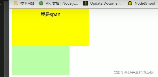
DOCTYPE html>
<html lang="en">
<head>
    <meta charset="UTF-8">
    <meta name="viewport" content="width=device-width, initial-scale=1.0">
    <meta http-equiv="X-UA-Compatible" content="ie=edge">
    <title>Documenttitle>
    <style>
        .box1 , .box2{
            width: 200px;
            height: 200px;
            font-size: 100px;
        }

        /*
            垂直外边距的重叠(折叠)
                - 相邻的垂直方向外边距会发生重叠现象
                - 兄弟元素
                    - 兄弟元素间的相邻垂直外边距会取两者之间的较大值(两者都是正值)
                    - 特殊情况:
                        如果相邻的外边距一正一负,则取两者的和
                        如果相邻的外边距都是负值,则取两者中绝对值较大的

                    - 兄弟元素之间的外边距的重叠,对于开发是有利的,所以我们不需要进行处理


                - 父子元素
                    - 父子元素间相邻外边距,子元素的会传递给父元素(上外边距)
                    - 父子外边距的折叠会影响到页面的布局,必须要进行处理

         */

        .box1{
            background-color: #bfa;

            /* 设置一个下外边距 */
            margin-bottom: 100px;
        }

        .box2{
            background-color: orange;

            /* 设置一个上外边距 */
            margin-top: 100px;
        }

        .box3{
            width: 200px;
            height: 200px;
            background-color: #bfa;
            /* padding-top: 100px; */
            /* border-top: 1px #bfa solid; */
        }

        .box4{
            width: 100px;
            height: 100px;
            background-color: orange;
            margin-top: 100px;
        }
    style>
head>
<body>

    <div class="box3">
        <div class="box4">div>
    div>


body>
html>
行内元素的盒模型
DOCTYPE html>
<html lang="en">
<head>
    <meta charset="UTF-8">
    <meta name="viewport" content="width=device-width, initial-scale=1.0">
    <meta http-equiv="X-UA-Compatible" content="ie=edge">
    <title>Documenttitle>
    <style>
        .s1{
            background-color: yellow;

            /*
                行内元素的盒模型
                    - 行内元素不支持设置宽度和高度
                    - 行内元素可以设置padding,但是垂直方向padding不会影响页面的布局
                    - 行内元素可以设置border,垂直方向的border不会影响页面的布局
                    - 行内元素可以设置margin,垂直方向的margin不会影响布局
             */
             /* width: 100px;
             height: 100px; */

             /* padding: 100px; */

             /* border: 100px solid red; */

             margin: 100px;
        }

        .box1{
            width: 200px;
            height: 200px;
            background-color: #bfa;
        }

        a{
            /*
                display 用来设置元素显示的类型
                    可选值:
                        inline 将元素设置为行内元素
                        block 将元素设置为块元素
                        inline-block 将元素设置为行内块元素
                                行内块,既可以设置宽度和高度又不会独占一行
                        table 将元素设置为一个表格
                        none 元素不在页面中显示

                visibility 用来设置元素的显示状态
                    可选值:
                        visible 默认值,元素在页面中正常显示
                        hidden 元素在页面中隐藏 不显示,但是依然占据页面的位置
             */
            display: block;

            visibility: hidden;

            width: 100px;
            height: 100px;
            background-color: orange;
        }
    style>
head>
<body>

    <a href="javascript:;">超链接a>
    <a href="javascript:;">超链接a>


    <span class="s1">我是spanspan>
    <span class="s1">我是spanspan>

    <div class="box1">div>
body>
html>
span设置了向下的padding,但是他不会影响布局,只不过是将下面那个盒子盖住了。
浏览器默认样式
DOCTYPE html>
<html lang="en">
<head>
    <meta charset="UTF-8">
    <meta name="viewport" content="width=device-width, initial-scale=1.0">
    <meta http-equiv="X-UA-Compatible" content="ie=edge">
    <title>Documenttitle>

    <link rel="stylesheet" href="./css/normalize.css">


    <style>
        /*
            默认样式:
                - 通常情况,浏览器都会为元素设置一些默认样式
                - 默认样式的存在会影响到页面的布局,
                    通常情况下编写网页时必须要去除浏览器的默认样式(PC端的页面)
         */

        /* body{
            margin: 0;
        }

        p{
            margin: 0;
        }

        ul{
            margin: 0;
            padding: 0;
            /* 去除项目符号 * /
            list-style:none;
        } */

        /* *{
            margin: 0;
            padding: 0;
        } */


        .box1{
            width: 100px;
            height: 100px;
            border: 1px solid black;
        }
    style>
head>
<body>

<div class="box1">div>

<p>我是一个段落p>
<p>我是一个段落p>
<p>我是一个段落p>

<ul>
    <li>列表项1li>
    <li>列表项2li>
    <li>列表项3li>
ul>

body>
html>
外边距的典型应用
外边距可以使块级盒子水平居中
满足两个条件:
- 盒子必须设定宽度,因为块元素会独占一行,不设定width的话,width的默认值就是auto,那么它会根据盒子的水平布局原理来变化,无法实现居中的效果。(参考盒子的水平布局)
- 盒子左右的外边距都设定为auto.
行类元素和行类块元素水平居中
给它的父亲添加text-align: center; 即可
嵌套外边距塌陷的问题
对于两个嵌套(父子关系)的块元素,父元素右上外边距和子元素右上外边距,此时父元素会塌陷较大的外边距值(父元素和子元素无法分开)
解决方案:
- 为父元素添加上边距
- 为父元素添加上内边距
- 为父元素添加overflow:hidden
还有其它方法:浮动,固定,绝对定位的盒子不会塌陷.清除内外边距
网页元素一般都自带内外边距,而且不同的浏览器也不同。因此在布局的时候应该先清除内外边距。
* {
    padding: 0;
    margin: 0;
}
注意:行内元素一般只设定左右边距。上下边距没用。如果需要设定,只需要将它转为块元素或者行内块元素。
轮廓和圆角
DOCTYPE html>
<html lang="en">
<head>
    <meta charset="UTF-8">
    <meta name="viewport" content="width=device-width, initial-scale=1.0">
    <meta http-equiv="X-UA-Compatible" content="ie=edge">
    <title>Documenttitle>
    <style>
        .box1{
            width: 200px;
            height: 200px;
            background-color: #bfa;

            /* box-shadow 用来设置元素的阴影效果,阴影不会影响页面布局
                第一个值 水平偏移量 设置阴影的水平位置 正值向右移动 负值向左移动
                第二个值 垂直偏移量 设置阴影的水平位置 正值向下移动 负值向上移动
                第三个值 阴影的模糊半径
                第四个值 阴影的颜色
            */

            box-shadow: 0px 0px 50px rgba(0, 0, 0, .3) ;

/*

            outline 用来设置元素的轮廓线,用法和border一模一样
                轮廓和边框不同的点,就是轮廓不会影响到可见框的大小
 */

        }

        /* .box1:hover{
            outline: 10px red solid;
        } */

        .box2{
            width: 200px;
            height: 200px;
            background-color: orange;

            /* border-radius: 用来设置圆角 圆角设置的圆的半径大小*/

            /* border-top-left-radius:  */
            /* border-top-right-radius */
            /* border-bottom-left-radius:  */
            /* border-bottom-right-radius:  */
            /* border-top-left-radius:50px 100px;
																											z
	 */

            /*
                border-radius 可以分别指定四个角的圆角
                    四个值 左上 右上 右下 左下
                    三个值 左上 右上/左下 右下
                    两个个值 左上/右下 右上/左下
              */
            /* border-radius: 20px / 40px; */ 椭圆

            /* 将元素设置为一个圆形 */
            border-radius: 50%;
        }
    style>
head>
<body>


    <div class="box2">div>
body>
html>
圆角边框(CSS3)
border-radius: length;实现原理待更新。
实现左右两边都为圆形
DOCTYPE html>
<html lang="en">

<head>
    <meta charset="UTF-8">
    <meta http-equiv="X-UA-Compatible" content="IE=edge">
    <meta name="viewport" content="width=device-width, initial-scale=1.0">
    <title>Documenttitle>
    <style>
        div {
            height: 200px;
            width: 300px;
            background-color: red;
            border-radius: 100px;
        }
    style>
head>

<body>
    <div>
    div>
body>

html>
实现圆形盒子
DOCTYPE html>
<html lang="en">

<head>
    <meta charset="UTF-8">
    <meta http-equiv="X-UA-Compatible" content="IE=edge">
    <meta name="viewport" content="width=device-width, initial-scale=1.0">
    <title>Documenttitle>
    <style>
        div {
            height: 200px;
            width: 200px;
            background-color: red;
            border-radius: 50%;
        }
    style>
head>

<body>
    <div>
    div>
body>

html>
该属性简写
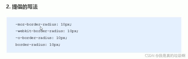
可以跟4个值:左上角,右上角,右下角,左下角。 border-top-left-radius, border-top-right-radius, border-bottom-left-radius, border-bottom-left-radius,
盒子阴影
CSS3为我们新增了box-shadow: h-shadow v-shadow blur spread color inset
值 描述 h-shadow 必需。水平阴影的位置。允许负值 v-shadow 必需。垂直阴影的位置。允许负值 blur 可选,模糊距离 spread 可选,阴影尺寸 color 可选.阴影颜色 inset 可选。将外部阴影(outset)改为内部阴影 DOCTYPE html> <html lang="en"> <head> <meta charset="UTF-8"> <meta http-equiv="X-UA-Compatible" content="IE=edge"> <meta name="viewport" content="width=device-width, initial-scale=1.0"> <title>Documenttitle> <style> div { height: 200px; width: 200px; background-color: red; margin: 100px auto; /* 默认为outset,这里千万不要写 */ /* 影子是不占用空间的 */ box-shadow: 10px 10px 10px 10px rgba(0, 0, 0, 0.5); } style> head> <body> <div> div> body> html>盒子阴影
CSS3为我们新增了text-shadow: h-shadow v-shadow blur
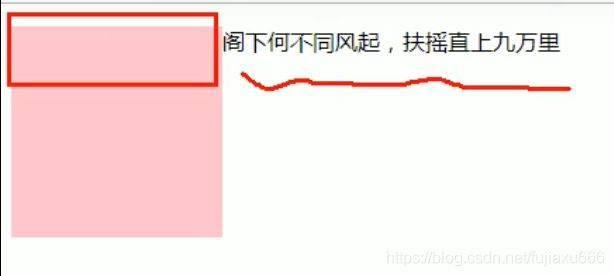
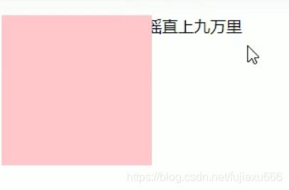
浮动模型
网页布局第一准则:多个块内元素纵向排列使用标准流,多个块级元素横向排列使用浮动
什么是浮动
需要注意的是设置了浮动之后,文字会环绕在浮动体的周围
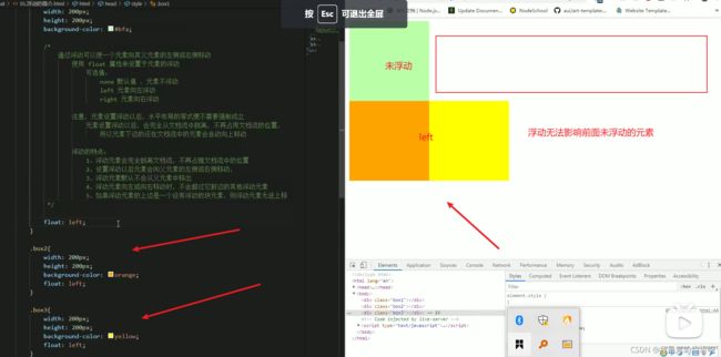
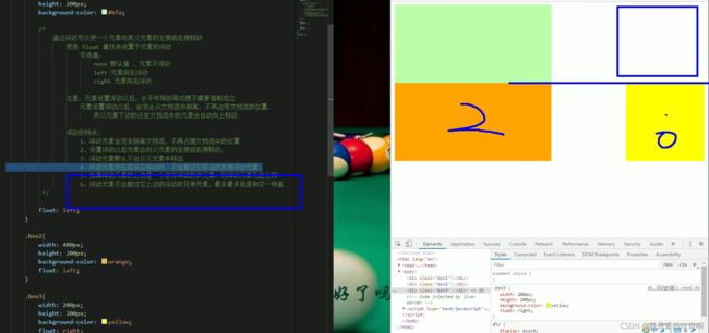
DOCTYPE html>
<html lang="en">
<head>
    <meta charset="UTF-8">
    <meta name="viewport" content="width=device-width, initial-scale=1.0">
    <meta http-equiv="X-UA-Compatible" content="ie=edge">
    <title>Documenttitle>
    <style>
        .box1{
            width: 400px;
            height: 200px;
            background-color: #bfa;

            /*
                通过浮动可以使一个元素向其父元素的左侧或右侧移动
                    使用 float 属性来设置于元素的浮动
                        可选值:
                            none 默认值 ,元素不浮动
                            left 元素向左浮动
                            right 元素向右浮动

                    注意,元素设置浮动以后,水平布局的等式便不需要强制成立
                        元素设置浮动以后,会完全从文档流中脱离,不再占用文档流的位置,
                            所以元素下边的还在文档流中的元素会自动向上移动

                    浮动的特点:
                        1、浮动元素会完全脱离文档流,不再占据文档流中的位置
                        2、设置浮动以后元素会向父元素的左侧或右侧移动,
                        3、浮动元素默认不会从父元素中移出
                        4、浮动元素向左或向右移动时,不会超过它前边的其他浮动元素
                        5、如果浮动元素的上边是一个没有浮动的块元素,则浮动元素无法上移
                        6、浮动元素不会超过它上边的浮动的兄弟元素,最多最多就是和它一样高

                    简单总结:
                        浮动目前来讲它的主要作用就是让页面中的元素可以水平排列,
                            通过浮动可以制作一些水平方向的布局
             */

            float: left;
        }

        .box2{
            width: 400px;
            height: 200px;
            background-color: orange;
            float: left;
        }

        .box3{
            width: 200px;
            height: 200px;
            background-color: yellow;
            float: right;
        }
    style>
head>
<body>
    <div class="box1">div>
    <div class="box2">div>
    <div class="box3">div>


body>
html>
如果需要让黄色的box在上面,就需要与box2交换位置
DOCTYPE html>
<html lang="en">
<head>
    <meta charset="UTF-8">
    <meta name="viewport" content="width=device-width, initial-scale=1.0">
    <meta http-equiv="X-UA-Compatible" content="ie=edge">
    <title>Documenttitle>
    <style>

        *{
            margin: 0;
            padding: 0;
        }

        .box1{
            width: 100px;
            height: 100px;
            background-color: #bfa;
            /*
                浮动元素不会盖住文字,文字会自动环绕在浮动元素的周围,
                    所以我们可以利用浮动来设置文字环绕图片的效果
             */
            float: left;
        }

        .box2{
            background-color: yellowgreen;

            /*
                元素设置浮动以后,将会从文档流中脱离,从文档流中脱离后,元素的一些特点也会发生变化

                脱离文档流的特点:
                    块元素:
                        1、块元素不在独占页面的一行
                        2、脱离文档流以后,块元素的宽度和高度默认都被内容撑开

                    行内元素:
                        行内元素脱离文档流以后会变成块元素,特点和块元素一样

                    脱离文档流以后,不需要再区分块和行内了
              */


            float: left;
        }

        .box3{
            background-color: orange
        }

        .s1{
            float: left;
            width: 200px;
            height: 200px;
            background-color: yellow;
        }
    style>
head>
<body>


    <span class="s1">我是一个spanspan>


body>
html>
float属性用于创建浮动框,将其移动到一边,直到左边缘或者右边缘触及包含块或着另外一个浮动框的边缘。
选择器 {fl oat: 属性值;}
属性值 描述 none 元素不浮动(默认值) left 元素向左浮动 right 元素向右浮动 DOCTYPE html> <html lang="en"> <head> <meta charset="UTF-8"> <meta http-equiv="X-UA-Compatible" content="IE=edge"> <meta name="viewport" content="width=device-width, initial-scale=1.0"> <title>Documenttitle> <style> .left, .right{ height: 200px; width: 200px; background-color: red; float: left; } .right { float: right; } style> head> <body> <div class="left"> 1 div> <div class="left"> 2 div> <div class="right"> 3 div> body> html>浮动的特性(很难 )
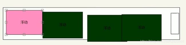
- 浮动元素会脱离标准流(脱标)。
- 浮动的元素会在一行内显示并且元素顶部对齐。
- 浮动的元素会具有行内块元素的特性。
浮动元素会脱离标准流(脱标)
- 脱离标准普通流的控制(浮)移动到指定的位置(动)。(脱标)
- 浮动的盒子不在保留原来的位置。(其他的标准流的盒子会占有)
例如:
图
在这里红色的盒子浮动了起来,那么位置就留给了蓝色的盒子DOCTYPE html> <html lang="en"> <head> <meta charset="UTF-8"> <meta http-equiv="X-UA-Compatible" content="IE=edge"> <meta name="viewport" content="width=device-width, initial-scale=1.0"> <title>Documenttitle> <style> .left { height: 200px; width: 200px; background-color: red; float: left; } .right { height: 300px; width: 300px; background-color: blue; } style> head> <body> <div class="left"> 1 div> <div class="right"> 2 div> body> html>浮动的元素会在一行内显示并且元素顶部对齐
注意:浮动的元素是互相贴靠在一起的(不会有间隙),如果父级宽度装不下这些盒子,多出的盒子会另起一行对齐。
若浮动的盒子遇到前面的标准流的左右边缘,那么还是会换行。浮动的元素会具有行内块元素的特性
任何元素都可以添加浮动属性的。不管是什么模式的元素,添加浮动之后具有行内块相似的属性。
浮动元素经常和标准流的父级一起搭配使用
先用标准流的父级排列上下位置,之后内部子元素采取浮动排列左右位置。
浮动的盒子不会影响前面的标准流盒子,只会影响后面的标准流盒子。(重难点)
所以一般一个孩子加浮动,那么他的兄弟也要加浮动。要不然不会出现一些问题。
所有的父级盒子都要给高度吗?
不是,内容可能很多很多,不可能给定一个确定的高度。所以不是所有的父级盒子都有高度的。
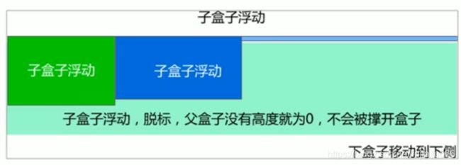
高度塌陷和BFC
BFC是什么
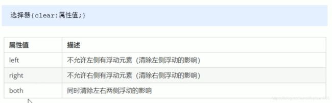
DOCTYPE html>
<html lang="en">
<head>
    <meta charset="UTF-8">
    <meta name="viewport" content="width=device-width, initial-scale=1.0">
    <meta http-equiv="X-UA-Compatible" content="ie=edge">
    <title>Documenttitle>
    <style>
        .outer{
            border: 10px red solid;

            /*
                BFC(Block Formatting Context) 块级格式化环境
                    - BFC是一个CSS中的一个隐含的属性,可以为一个元素开启BFC
                        开启BFC该元素会变成一个独立的布局区域
                    - 元素开启BFC后的特点:
                        1.开启BFC的元素不会被浮动元素所覆盖
                        2.开启BFC的元素子元素和父元素外边距不会重叠
                        3.开启BFC的元素可以包含浮动的子元素

                    - 可以通过一些特殊方式来开启元素的BFC:
                        1、设置元素的浮动(不推荐)
                        2、将元素设置为行内块元素(不推荐)
                        3、将元素的overflow设置为一个非visible的值
                            - 常用的方式 为元素设置 overflow:hidden 开启其BFC 以使其可以包含浮动元素

             */

             /* float: left; */
             /* display: inline-block; */
             overflow: hidden;
        }

        .inner{
            width: 100px;
            height: 100px;
            background-color: #bfa;

            /*
                高度塌陷的问题:
                    在浮动布局中,父元素的高度默认是被子元素撑开的,
                        当子元素浮动后,其会完全脱离文档流,子元素从文档流中脱离
                        将会无法撑起父元素的高度,导致父元素的高度丢失

                    父元素高度丢失以后,其下的元素会自动上移,导致页面的布局混乱

                    所以高度塌陷是浮动布局中比较常见的一个问题,这个问题我们必须要进行处理!
             */
            float: left;
        }
    style>
head>
<body>

    <div class="outer">

        <div class="inner">div>

    div>

    <div style="width: 200px;height: 200px;background-color:yellow;">div>

body>
html>
clear
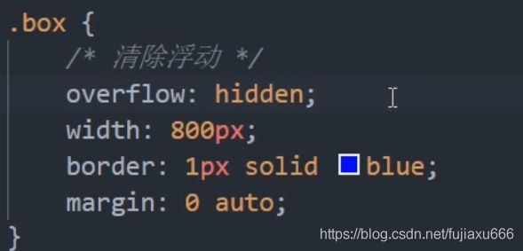
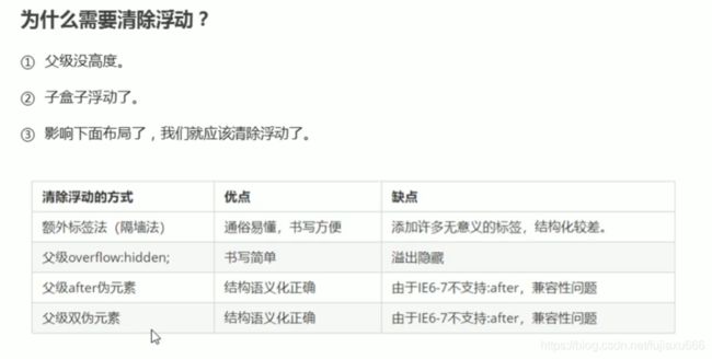
DOCTYPE html>
<html lang="en">
<head>
    <meta charset="UTF-8">
    <meta name="viewport" content="width=device-width, initial-scale=1.0">
    <meta http-equiv="X-UA-Compatible" content="ie=edge">
    <title>Documenttitle>
    <style>

        div{
            font-size: 50px;
        }

        .box1{
            width: 200px;
            height: 200px;
            background-color: #bfa;
            float: left;
        }

        .box2{
            width: 400px;
            height: 150px;
            background-color: #ff0;
            float: right;
        }

        .box3{
            width: 200px;
            height: 200px;
            background-color: orange;
            /*
                由于box1的浮动,导致box3位置上移
                    也就是box3收到了box1浮动的影响,位置发生了改变

                如果我们不希望某个元素因为其他元素浮动的影响而改变位置,
                    可以通过clear属性来清除浮动元素对当前元素所产生的影响

                clear
                    - 作用:清除浮动元素对当前元素所产生的影响
                    - 可选值:
                        left 清除左侧浮动元素对当前元素的影响
                        right 清除右侧浮动元素对当前元素的影响
                        both 清除两侧中最大影响的那侧

                    原理:
                        设置清除浮动以后,浏览器会自动为元素添加一个上外边距,
                            以使其位置不受其他元素的影响
             */

             clear: both;
        }
    style>
head>
<body>

    <div class="box1">1div>
    <div class="box2">2div>
    <div class="box3">3div>

body>
html>
为什么需要清除浮动?
由于父级盒子再很多情况下,不方便给高度,但是子盒子浮动又不占位置(不会撑大父盒子),最后父子盒子的高度为0,就会影响下面标准流盒子。
清除浮动
清楚浮动就是清楚浮动元素造成的影响,如果父级盒子有高度,那么就不需要清楚浮动。
清除浮动的方法。
- 额外标签法也称为隔墙法,W3C推荐方法。
- 父级添加overflow 的方法。
- 父级添加after伪元素。
- 父级添加双伪元素。
DOCTYPE html>
<html lang="en">
<head>
    <meta charset="UTF-8">
    <meta name="viewport" content="width=device-width, initial-scale=1.0">
    <meta http-equiv="X-UA-Compatible" content="ie=edge">
    <title>Documenttitle>
    <style>
        .box1{
            border: 10px red solid;

            /* overflow: hidden; */
        }

        .box2{
            width: 100px;
            height: 100px;
            background-color: #bfa;
            float: left;
        }

        .box3{ /*额外标签*/
            clear: both;
        }

        .box1::after{
            content: '';
            display: block;
            clear: both;
        }

    style>
head>
<body>

    <div class="box1">
        <div class="box2">div>

    div>

body>
html>
额外标签法
额外标签法是在浮动元素的末尾添加一个空的标签.
<div style='clear: both'><div>优点:简单
缺点:添加无意义的标签,结构化差。
注意:这里加的空标签一定要是块内元素才行。总结:清除浮动的本质:清除浮动元素脱离标准流造成的影响。
给父级添加overflow
可以给父级添加overflow属性,将其属性值设置为hidden, auto, scroll.
优点:代码简洁
缺点:无法显示溢出的部分。:after 伪元素法
:after方式是额外标签的升级版。也是给元素添加的。
.clearfix:after {
	content:'';
	display: block;
	height: 0;
	clear: both;
	visibility: hidden;
}
.clearfix:after {
	/*IE6、7专有*/
	*zoom: 1;
}
在后面都插入盒子(所以说是额外标签法的升级)
优点:没有增加额外的标签,结构简单
缺点:照顾低版本的浏览器双伪元素清除浮动
/*尚硅谷的版本*/
DOCTYPE html>
<html lang="en">
<head>
    <meta charset="UTF-8">
    <meta name="viewport" content="width=device-width, initial-scale=1.0">
    <meta http-equiv="X-UA-Compatible" content="ie=edge">
    <title>Documenttitle>
    <style>
        .box1{
            width: 200px;
            height: 200px;
            background-color: #bfa;
        }

        /* .box1::before{
            content: '';
            display: table;
        } */

        .box2{
            width: 100px;
            height: 100px;
            background-color: orange;
            margin-top: 100px;
        }

/* clearfix 这个样式可以同时解决高度塌陷和外边距重叠的问题,当你在遇到这些问题时,直接使用clearfix这个类即可 */
        .clearfix::before,
        .clearfix::after{
            content: '';
            display: table;
            clear: both;
        }
    style>
head>
<body>

    <div class="box1 clearfix">
        <div class="box2">div>
    div>

body>
html>
给父元素添加
.clearfix:before,.clearfix:after{
	content:"";
	display: block;
}
.clearfix:after{
	clear: both;
}
.clearfix{
	zoom:1;
}
在前后都插入盒子
清楚浮动总结
定位
为什么学习定位呢?
下面几种情况如果用标准流或者浮动很难实现:
1.某个元素可以自由的在盒子内部移动,并且压住其他盒子
2.当我们滚动窗口的时候,盒子是固定在屏幕的某个位置的。所以
1.浮动可以让多块盒子在一行没有缝隙的排列显示,经常用于横向排列盒子。
2.定位则可以使得盒子自由的在某个盒子内部移动或者固定在屏幕中的某个位置,并且压住盒子。定位组成
定位:将盒子定在某一个位置,所以定位也是在摆盒子,按照定位的方式移动盒子。
定位 = 定位模式 + 边偏移
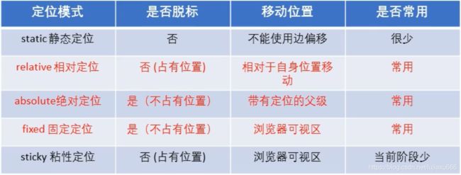
定位模式:元素在文档中的定位方式.
边偏移决定了该元素的最终位置定位模式
DOCTYPE html>
<html lang="en">
<head>
    <meta charset="UTF-8">
    <meta name="viewport" content="width=device-width, initial-scale=1.0">
    <meta http-equiv="X-UA-Compatible" content="ie=edge">
    <title>Documenttitle>
    <style>
        body{
            font-size: 60px;
        }
        .box1{
            width: 200px;
            height: 200px;
            background-color: #bfa;
        }

        .box2{
            width: 200px;
            height: 200px;
            background-color: orange;

            /*
                定位(position)
                    - 定位是一种更加高级的布局手段
                    - 通过定位可以将元素摆放到页面的任意位置
                    - 使用position属性来设置定位
                        可选值:
                            static 默认值,元素是静止的没有开启定位
                            relative 开启元素的相对定位
                            absolute 开启元素的绝对定位
                            fixed 开启元素的固定定位
                            sticky 开启元素的粘滞定位

                    - 相对定位:
                        - 当元素的position属性值设置为relative时则开启了元素的相对定位
                        - 相对定位的特点:
                            1.元素开启相对定位以后,如果不设置偏移量元素不会发生任何的变化
                            2.相对定位是参照于元素在文档流中的位置进行定位的
                            3.相对定位会提升元素的层级
                            4.相对定位不会使元素脱离文档流
                            5.相对定位不会改变元素的性质块还是块,行内还是行内

                    - 偏移量(offset)
                        - 当元素开启了定位以后,可以通过偏移量来设置元素的位置
                            top
                                - 定位元素和定位位置上边的距离
                            bottom
                                - 定位元素和定位位置下边的距离

                                - 定位元素垂直方向的位置由top和bottom两个属性来控制
                                    通常情况下我们只会使用其中一
                                - top值越大,定位元素越向下移动
                                - bottom值越大,定位元素越向上移动
                            left
                                - 定位元素和定位位置的左侧距离
                            right
                                - 定位元素和定位位置的右侧距离

                                - 定位元素水平方向的位置由left和right两个属性控制
                                    通常情况下只会使用一个
                                - left越大元素越靠右
                                - right越大元素越靠左

              */

            position: relative;

            left: 100px;
            top: -200px;

        }

        .box3{
            width: 200px;
            height: 200px;
            background-color: yellow;

        }
    style>
head>
<body>

    <div class="box1">1div>
    <div class="box2">2div>
    <div class="box3">3div>

body>
html>
通过CSS的
position属性的来设定的.
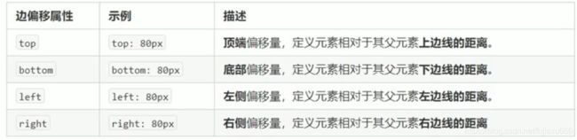
边偏移
边偏移就是盒子移动到的最终位置.有4种属性
静态定位static
静态定位是元素默认的定位方式,
无定位的意思.选择器 {position: static;}静态定位按照标准流摆放的位置,它没有边偏移.
布局中很少使用.相对定位(重要)
相对定位是元素在移动位置时,是相对于
他原来的位置来说的.选择器 {position: relative;}相对定位的特点
- 它是相对于自己原来的位置移动的
原来在标准流的位置继续占有,后面的盒子仍然已标准流的盒子对待它.(不脱标,继续保持原来的位置).其他盒子的位置保持不表.如:
这里粉色盒子top:100px ; left :100px; 得出了上图.
相对定位最典型的应用就是给决定定位当爹的
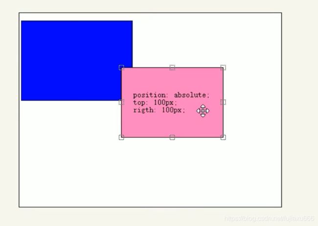
绝对定位 absolute(重要)
DOCTYPE html> <html lang="en"> <head> <meta charset="UTF-8"> <meta name="viewport" content="width=device-width, initial-scale=1.0"> <meta http-equiv="X-UA-Compatible" content="ie=edge"> <title>Documenttitle> <style> body{ font-size: 60px; } .box1{ width: 200px; height: 200px; background-color: #bfa; } .box2{ width: 200px; height: 200px; background-color: orange; /* 绝对定位 - 当元素的position属性值设置为absolute时,则开启了元素的绝对定位 - 绝对定位的特点: 1.开启绝对定位后,如果不设置偏移量元素的位置不会发生变化 2.开启绝对定位后,元素会从文档流中脱离 3.绝对定位会改变元素的性质,行内变成块,块的宽高被内容撑开 4.绝对定位会使元素提升一个层级 5.绝对定位元素是相对于其包含块进行定位的 包含块( containing block ) - 正常情况下: 包含块就是离当前元素最近的祖先块元素hello- 绝对定位的包含块: 包含块就是离它最近的开启了定位的祖先元素, 如果所有的祖先元素都没有开启定位则根元素就是它的包含块 - html(根元素、初始包含块) */ position: absolute; /* left: 0; top: 0; */ bottom: 0; right: 0; } .box3{ width: 200px; height: 200px; background-color: yellow; } .box4{ width: 400px; height: 400px; background-color: tomato; position: relative; } .box5{ width: 300px; height: 300px; background-color: aliceblue; /* position: relative; */ } style> head> <body> <div class="box1">1div> <div class="box4"> 4 <div class="box5"> 5 <div class="box2">2div> div> div> <div class="box3">3div> body> html>绝对定位的元素在移动时是相对于
祖先元素(不一定是父元素)来说的.选择器 {position: absolute;}绝对定位的特点
- 如果
没有祖先元素或者祖先元素没有定位,则已浏览器为准定位(Document文档)- 如果祖先元素有定位(相对 绝对 固定定位),则以最近一级的有定位的祖先元素位参考点移动位置.
- 绝对定位
不在占有原来的位置(脱标)
子绝父相
在定位中:子级使用
绝对定位的话,父盒子必须是要相对定位。这是因为
- 子级绝对定位,不占有位置,可以放在父盒子的任何一盒地方,不影响其他的兄弟盒子。
- 父盒子需要加定位来限制子盒子在父盒子内显示。
- 父盒子 布局时,需要占有位置且位置不能变化,所以不选择绝对定位而是用相对定位。
所以相对定位经常用来当作绝对定位的父子。
固定定位(重要)
固定定位是元素固定在浏览器的可视区的位置。主要的应用场景是:可以在网页滚动的时候元素的位置不变。
选择器 {position: fixed;}固定定位的特点
- 以
浏览器的可视窗口为参照点移动元素的(当窗口变小,位置也会随之改变。)。- 不占有原来的位置,也就是脱离文档流
固定定位小技巧: 固定在版心得右侧位置
定位方法总结
定位叠放次序
在使用定位布局得时候,可能会出现定位盒子重叠的情况。此时,可以使用
z-index来控制盒子的前后次序(z轴)选择器 {z-index: 1;} 数值可以是正整数、复数、或0,默认为auto,数值越大,盒子越靠上。 如果z-index的值相同,后面的盒子压住前面的盒子。 数字后面不能加单位 只有定位的盒子才有z-index属性定位的拓展
绝对定位的盒子水平居中
加了绝对定位的盒子是不能通过
margin:0 auto ;来实现水平居中的。
那为什么不能这样用呢?这是因为决定的定位的盒子已经脱离了标准文档流。方法
定位的特殊性
与浮动的特殊性相似
- 行内元素添加决定或者相对定位,可以直接设定高度和宽度。
- 块级元素添加绝对或相对定位,如果不给定高度和宽度,默认大小是内容的大小。
- 脱标的盒子是不会触发外边界合并的(浮动也是一样)
绝对定位(固定定位)会完全压住盒子
浮动的元素不同,只会压住它下面标准流的盒子,但是不会压住下面标准流盒子的文字(图片)。
但是绝对定位(固定定位)会压住标准流的所有内容。
浮动不会压住文字是因为浮动最初是要做文字环绕效果的。定位案例-淘宝轮播图(无js)
效果:
DOCTYPE html>
<html lang="en">
<head>
    <meta charset="UTF-8">
    <meta http-equiv="X-UA-Compatible" content="IE=edge">
    <meta name="viewport" content="width=device-width, initial-scale=1.0">
    <title>淘宝轮播图title>
    <style>
        * {
            margin: 0;
            padding: 0;
        }
        .tb-promo {
            position: relative;
            width: 520px;
            height: 260px;
            margin: 100px auto;
        }
        .tb-promo img {
            width: 100%;
            height: 100%;
        }
        /* 并集选择器,节约代码 */
        .prev,
        .next {
            position: absolute;
            top: 50%;
            margin-top: -15px;
            width: 20px;
            height: 30px;
            background-color: rgba(0, 0, 0, 0.3);
            text-decoration: none;
            line-height: 30px;
            color: #fff;
            text-align: center;
        }
        .tb-promo .prev{
            left: 0;
            border-top-right-radius: 15px;
            border-bottom-right-radius: 15px;
        }
        .tb-promo .next {
            right: 0;
            border-top-left-radius: 15px;
            border-bottom-left-radius: 15px;
        }
        .promo-nav {
            position: absolute;
            height: 13px;
            width: 70px;
            left: 50%;
            margin-left: -35px;
            bottom: 15px;
            background-color: rgba(255, 255, 255, .3);
            border-radius: 7px;
        }
        .promo-nav li {
            float: left;
            list-style: none;
            margin: 3px;
            width: 8px;
            height: 8px;
            border-radius: 50%;
            background-color: #fff;
        }
        .promo-nav .selected {
            background-color: #ff5000;
        }
    style>
head>
<body>
    <div class="tb-promo">
        <img src="./淘宝轮播图.jpg">
        <a href="#" class="prev"><a>
        <a href="#" class="next">>a>
        <ul class="promo-nav">
            <li class="selected">li>
            <li>li>
            <li>li>
            <li>li>
            <li>li>
        ul>
    div>
body>
html>
元素的显示与隐藏
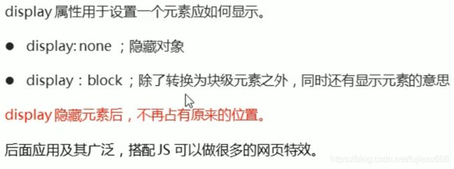
类似广告网站,当我们点击关闭时就不见了,但是重新刷新页面又会重新出现。
本质:让一个元素隐藏或显示出来display属性(非常重要)
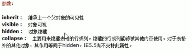
visibility
overflow 溢出
overflow属性指定了如果内容超出边框(高度及宽度),会发生什么
属性值 描述 visible 不剪切内容也不添加滚动条 hidden 不显示超出的内容,超出的部分隐藏 scroll 不管内容是否超出,总是显示滚动条 auto 内容超出时自动显示滚动条,不超出则不显示滚动条 一般情况下,我们都不希望超出的部分显示出来从而影响布局。
但是如果是对于有定位的盒子,请慎用overflow: hidden;因为它会隐藏多余的部分。CSS高级技巧
图片属于网页中的外部资源,外部资源都需要浏览器单独发送请求加载, 浏览器加载外部资源时是按需加载的,用则加载,不用则不加载 像我们上边的练习link会首先加载,而hover和active会在指定状态触发时才会加载。所以图片会闪烁。
    解决图片闪烁的问题:
        可以将多个小图片统一保存到一个大图片中,然后通过调整background-position来显示的图片
        这样图片会同时加载到网页中 就可以有效的避免出现闪烁的问题
        这个技术在网页中应用十分广泛,被称为CSS-Sprite,这种图我们称为雪碧图
          雪碧图的使用步骤:
        1.先确定要使用的图标
        2.测量图标的大小
        3.根据测量结果创建一个元素
        4.将雪碧图设置为元素的背景图片
        5.设置一个偏移量以显示正确的图片

    雪碧图的特点:
        一次性将多个图片加载进页面,降低请求的次数,加快访问速度,提升用户的体验
通过背景图片 这样就可以做出那种按钮按下的效果
精灵图
使用精灵图的目的是有效的减少与服务器的频繁交互的次数,提高页面的加载速度和降低服务器的压力。
精灵图的使用(sprites)
核心:
- 它的使用猪是要应用于
背景图片的使用的。就是把多个小的背景图片整合到一张大的图片中。- 主要借助于背景土片的位置
background-position来实现- 一般情况下x,y 都去负值(于数学的xy轴不太同,x右走为正值,y向下走为负值。)
字体图标
字体图标的使用场景:主要用于显示网页中通用的、常用的一些小图标。
精灵图也有许多缺点:
- 图片较大。
- 图片本身放大和缩小会失真。而文字放大不会,好像是因为矢量图的原因
- 一旦图片制作完成想要更换什么麻烦。
所以出现了
字体图标iconfont很好的解决了以上的问题
字体图标的优点
字体图标的下载
下载网站:http:icomoon.io 和 http://www.icofont.com
字体图标的使用
DOCTYPE html>
<html lang="en">
<head>
    <meta charset="UTF-8">
    <meta name="viewport" content="width=device-width, initial-scale=1.0">
    <meta http-equiv="X-UA-Compatible" content="ie=edge">
    <title>Documenttitle>
    <link rel="stylesheet" href="./fa/css/all.css">
head>
<body>


    <i class="fas fa-bell" style="font-size:80px; color:red;">i>
    <i class="fas fa-bell-slash">i>
    <i class="fab fa-accessible-icon">i>
    <i class="fas fa-otter" style="font-size: 160px; color:green;">i>
body>
html>
DOCTYPE html> <html lang="en"> <head> <meta charset="UTF-8"> <meta name="viewport" content="width=device-width, initial-scale=1.0"> <meta http-equiv="X-UA-Compatible" content="ie=edge"> <title>Documenttitle> <link rel="stylesheet" href="./fa/css/all.css"> <style> li{ list-style: none; } li::before{ /* 通过伪元素来设置图标字体 1.找到要设置图标的元素通过before或after选中 2.在content中设置字体的编码 3.设置字体的样式 fab font-family: 'Font Awesome 5 Brands'; fas font-family: 'Font Awesome 5 Free'; font-weight: 900; */ content: '\f1b0'; /* font-family: 'Font Awesome 5 Brands'; */ font-family: 'Font Awesome 5 Free'; font-weight: 900; color: blue; margin-right: 10px; } style> head> <body> <ul> <li>锄禾日当午li> <li>汗滴禾下土li> <li>谁知盘中餐li> <li>粒粒皆辛苦li> ul> <span class="fas">span> body> html>CSS三角
边框的交界处会呈现以下这种情况
DOCTYPE html>
<html lang="en">
<head>
    <meta charset="UTF-8">
    <meta http-equiv="X-UA-Compatible" content="IE=edge">
    <meta name="viewport" content="width=device-width, initial-scale=1.0">
    <title>Documenttitle>
    <style>
        div {
            height: 10px;
            width: 10px;
            border-top: 10px solid red;
            border-right: 10px solid blue;
            border-bottom: 10px solid yellow;
            border-left: 10px solid pink;
        }
    style>
head>
<body>
    <div>div>
body>
html>
当height 和 width 为 0 px时DOCTYPE html> <html lang="en"> <head> <meta charset="UTF-8"> <meta http-equiv="X-UA-Compatible" content="IE=edge"> <meta name="viewport" content="width=device-width, initial-scale=1.0"> <title>Documenttitle> <style> div { height: 0px; width: 0px; border-top: 10px solid red; border-right: 10px solid blue; border-bottom: 10px solid yellow; border-left: 10px solid pink; } style> head> <body> <div>div> body> html>
所以当其他三个边框设置为透明就可以设置三角形了DOCTYPE html> <html lang="en"> <head> <meta charset="UTF-8"> <meta http-equiv="X-UA-Compatible" content="IE=edge"> <meta name="viewport" content="width=device-width, initial-scale=1.0"> <title>Documenttitle> <style> div { height: 0px; width: 0px; border: 10px solid transparent; border-top-color: red; } style> head> <body> <div>div> body> html>
京东案例
思路一个大盒子,里面加一个绝对定位的小三角即可。
DOCTYPE html>
<html lang="en">
<head>
    <meta charset="UTF-8">
    <meta http-equiv="X-UA-Compatible" content="IE=edge">
    <meta name="viewport" content="width=device-width, initial-scale=1.0">
    <title>Documenttitle>
    <style>
        div {
            position: relative;
            height: 250px;
            width: 120px;
            background-color: red;
        }
        span {
            position: absolute;
            width: 0;
            height: 0;
            top: -10px;
            right: 15px;
            /* 这里为了兼容性 */
            line-height: 0;
            font-size: 0;
            border: 5px solid transparent;
            border-bottom-color: red;
        }
    style>
head>
<body>
    <div>
        <span>span>
    div>
body>
html>
CSS用户界面样式
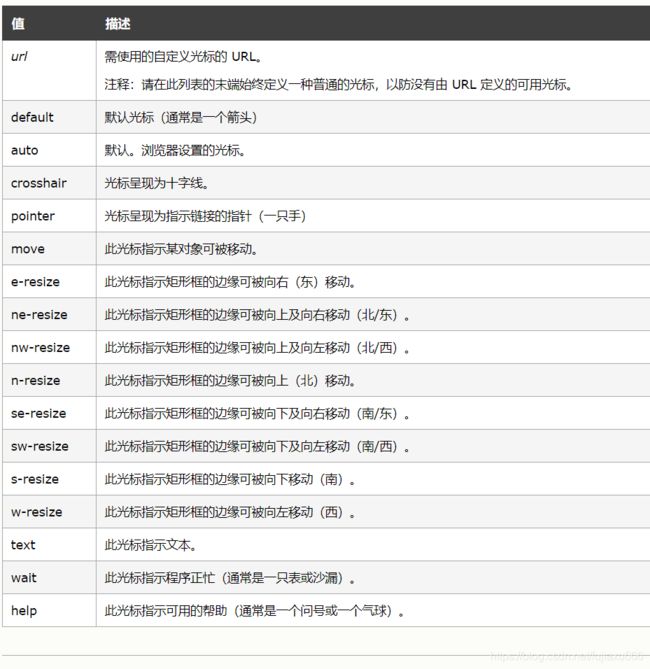
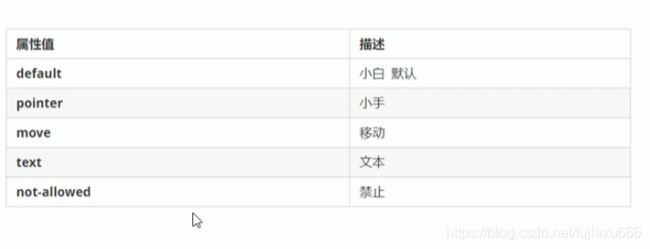
更改用户的鼠标样式
使用
cursor属性来定义鼠标的样式选择器 {cursor: 值}
常用的
轮廓线
表单或其他的轮廓线
使用input { outline: none; }来改变轮廓线
使用后
防止拖拽文本域
textarea {
	resize: none;
}
而且textarea一般写成一行,不然在文本域中会有空出一行
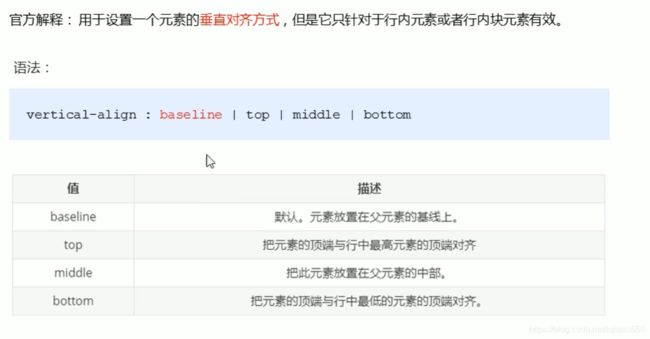
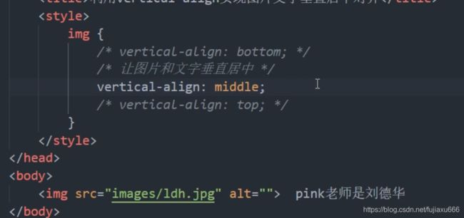
vertical-align 属性的应用
CSS的
vertical-align属性使用的场景:常用于设置图片或表单(行内块元素)和文字垂直对齐。
对于块级元素没用
图片和文字居中对齐
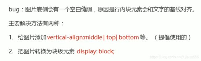
解决图片下方默认空白间隙的问题
溢出文字使用省略号来显示
单行文字省略号
三个步骤
- 是文字强制在一行显示。使用white-space: nowrap; (normal是自动换行)。
- 溢出的部分隐藏起来。overflow: hidden;
- 文字溢出对的时候用省略号代替。 text-overflow: ellipsis;
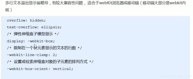
white-space: nowrap;
overflow: hidden;
text-overflow: ellipsis;
多行文字省略号
使用这个一定要设定好盒子的高度常用的布局技巧
margin负值的应用
使得两个边框不会排在一起
鼠标经过边框的时候边框颜色发生变化
文字围绕浮动元素
因为浮动的部分不会压住文字,我们利用这个特点来达到一下效果:
DOCTYPE html>
<html lang="en">
<head>
    <meta charset="UTF-8">
    <meta name="viewport" content="width=device-width, initial-scale=1.0">
    <meta http-equiv="X-UA-Compatible" content="ie=edge">
    <title>文字围绕浮动元素的妙用title>
    <style>
        * {
            margin: 0;
            padding: 0;
        }
        .box {
            width: 300px;
            height: 70px;
            /* background-color: pink; */
            margin: 0 auto;
            padding: 5px;
        }
        .pic {
            float: left;
            width: 120px;
            height: 60px;
            margin-right: 5px;
        }
        .pic img {
            width: 100%;
        }
    style>
head>
<body>
    <div class="box">
        <div class="pic">
            <img src="images/img.png" alt="">
        div>
        <p>【集锦】热身赛-巴西0-1秘鲁 内马尔替补两人血染赛场p>
    div>
body>
html>
这样就可以不使用左右浮动了
行内块元素的妙用
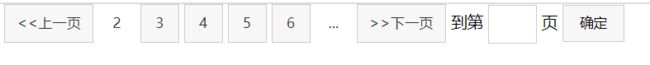
如果添加text-align: center; 那么里面的行元素和行内块元素都是水平居中的。
DOCTYPE html>
<html lang="en">
<head>
    <meta charset="UTF-8">
    <meta name="viewport" content="width=device-width, initial-scale=1.0">
    <meta http-equiv="X-UA-Compatible" content="ie=edge">
    <title>行内块的巧妙运用title>
    <style>
        * {
            margin: 0;
            padding: 0;
        }
        .box {
            text-align: center;
        }
        .box a {
            display: inline-block;
            width: 36px;
            height: 36px;
            background-color: #f7f7f7;
            border: 1px solid #ccc;
            text-align: center;
            line-height: 36px;
            text-decoration: none;
            color: #333;
            font-size: 14px;
        }
       .box .prev,
        .box .next {
            width: 85px;
        }
        .box .current,
        .box .elp {
            background-color: #fff;
            border: none;
        }
        .box input {
            height: 36px;
            width: 45px;
            border: 1px solid #ccc;
            outline: none;
        }
        .box button {
           width: 60px;
           height: 36px;
           background-color: #f7f7f7;
            border: 1px solid #ccc;

        }
    style>
head>
<body>
    <div class="box">
        <a href="#" class="prev"><<上一页a>
        <a href="#" class="current">2a>
        <a href="#">3a>
        <a href="#">4a>
        <a href="#">5a>
        <a href="#">6a>
        <a href="#" class="elp">...a>
        <a href="#" class="next">>>下一页a>
        到第
        <input type="text">
        页
        <button>确定button>
    div>
body>
html>
CSS三角强化
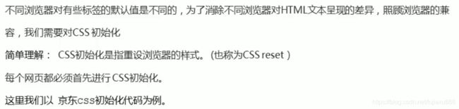
CSS的初始化
我们以京东的初始化为例/* 把我们所有标签的内外边距清零 */ * { margin: 0; padding: 0 } /* em 和 i 斜体的文字不倾斜 */ em, i { font-style: normal } /* 去掉li 的小圆点 */ li { list-style: none } img { /* border 0 照顾低版本浏览器 如果 图片外面包含了链接会有边框的问题 */ border: 0; /* 取消图片底侧有空白缝隙的问题 */ vertical-align: middle } button { /* 当我们鼠标经过button 按钮的时候,鼠标变成小手 */ cursor: pointer } a { color: #666; text-decoration: none } a:hover { color: #c81623 } button, input { /* "\5B8B\4F53" 就是宋体的意思 这样浏览器兼容性比较好 */ font-family: Microsoft YaHei, Heiti SC, tahoma, arial, Hiragino Sans GB, "\5B8B\4F53", sans-serif } body { /* CSS3 抗锯齿形 让文字显示的更加清晰 */ -webkit-font-smoothing: antialiased; background-color: #fff; font: 12px/1.5 Microsoft YaHei, Heiti SC, tahoma, arial, Hiragino Sans GB, "\5B8B\4F53", sans-serif; color: #666 } .hide, .none { display: none } /* 清除浮动 */ .clearfix:after { visibility: hidden; clear: both; display: block; content: "."; height: 0 } .clearfix { *zoom: 1 }CSS动画
过渡
DOCTYPE html>
<html lang="en">
<head>
    <meta charset="UTF-8">
    <meta name="viewport" content="width=device-width, initial-scale=1.0">
    <meta http-equiv="X-UA-Compatible" content="ie=edge">
    <title>Documenttitle>

    <style>
        *{
            margin: 0;
            padding: 0;
        }

        .box1{
            width: 800px;
            height: 800px;
            background-color: silver;
            overflow: hidden;
        }

        .box1 div{
            width: 100px;
            height: 100px;
            margin-bottom: 100px;
            margin-left: 0;

        }

        .box2{
            background-color: #bfa;
            /* margin-left: auto; */
            /* transition:all 2s; */
            /*
                过渡(transition)
                    - 通过过渡可以指定一个属性发生变化时的切换方式
                    - 通过过渡可以创建一些非常好的效果,提升用户的体验
             */

             /*
             transition-property: 指定要执行过渡的属性
                多个属性间使用,隔开
                如果所有属性都需要过渡,则使用all关键字
                大部分属性都支持过渡效果,注意过渡时必须是从一个有效数值向另外一个有效数值进行过渡
             */
            /* transition-property: height , width; */
            /* transition-property: all; */

             /*
              transition-duration: 指定过渡效果的持续时间
                时间单位:s 和 ms  1s = 1000ms
              */
             /* transition-duration: 100ms, 2s; */
             /* transition-duration: 2s; */

             /*
             transition-timing-function: 过渡的时序函数
                指定过渡的执行的方式
                可选值:
                    ease 默认值,慢速开始,先加速,再减速
                    linear 匀速运动
                    ease-in 加速运动
                    ease-out 减速运动
                    ease-in-out 先加速 后减速
                    cubic-bezier() 来指定时序函数,贝塞尔曲线
                        https://cubic-bezier.com
                    steps() 分步执行过渡效果
                        可以设置一个第二个值:
                            end , 在时间结束时执行过渡(默认值)
                            start , 在时间开始时执行过渡
             */
             /* transition-timing-function: cubic-bezier(.24,.95,.82,-0.88); */
             /* transition-timing-function: steps(2, start); */


             /*
             transition-delay: 过渡效果的延迟,等待一段时间后在执行过渡
             */
             /* transition-delay: 2s; */


             /* transition 可以同时设置过渡相关的所有属性,只有一个要求,如果要写延迟,则两个时间中第一个是持续时间,第二个是延迟 */
             transition:2s margin-left 1s cubic-bezier(.24,.95,.82,-0.88);
        }

        .box3{
            background-color: orange;
            transition-property: all;
            transition-duration: 2s;
        }

        .box1:hover div{
            /* width: 200px;
            height: 200px; */
            /* background-color: orange; */
            margin-left: 700px;
        }
    style>

head>
<body>

    <div class="box1">
        <div class="box2">div>
        <div class="box3">div>
    div>

body>
html>
动画
DOCTYPE html>
<html lang="en">
<head>
    <meta charset="UTF-8">
    <meta name="viewport" content="width=device-width, initial-scale=1.0">
    <meta http-equiv="X-UA-Compatible" content="ie=edge">
    <title>Documenttitle>

    <style>
        *{
            margin: 0;
            padding: 0;
        }

        .box1{
            width: 800px;
            height: 800px;
            background-color: silver;
            overflow: hidden;
        }

        .box1 div{
            width: 100px;
            height: 100px;
            margin-bottom: 100px;
            margin-left: 10px;

        }

        .box2{
            background-color: #bfa;


            /* 设置box2的动画 */
            /* animation-name: 要对当前元素生效的关键帧的名字 */
            /* animation-name: test; */

            /* animation-duration: 动画的执行时间 */
            /* animation-duration: 4s; */


            /* 动画的延时 */
            /* animation-delay: 2s; */

            /* animation-timing-function: ease-in-out; */

            /*
            animation-iteration-count 动画执行的次数
                可选值:
                    次数
                    infinite 无限执行
            */
            /* animation-iteration-count: 1; */

            /*
             animation-direction
                指定动画运行的方向
                    可选值:
                    normal 默认值  从 from 向 to运行 每次都是这样
                    reverse 从 to 向 from 运行 每次都是这样
                    alternate 从 from 向 to运行 重复执行动画时反向执行
                    alternate-reverse 从 to 向 from运行 重复执行动画时反向执行

            */
            /* animation-direction: alternate-reverse; */

            /*
                animation-play-state: 设置动画的执行状态
                可选值:
                    running 默认值 动画执行
                    paused 动画暂停
            */
            /* animation-play-state: paused; */

            /*
            animation-fill-mode: 动画的填充模式
                可选值:
                    none 默认值 动画执行完毕元素回到原来位置
                    forwards 动画执行完毕元素会停止在动画结束的位置
                    backwards 动画延时等待时,元素就会处于开始位置
                    both 结合了forwards 和 backwards
            */
            /* animation-fill-mode: both; */
            animation: test 2s 2 1s alternate;


        }

        .box1:hover div{
            animation-play-state: paused;
        }

        /*
        动画
            动画和过渡类似,都是可以实现一些动态的效果,
                不同的是过渡需要在某个属性发生变化时才会触发
                动画可以自动触发动态效果

            设置动画效果,必须先要设置一个关键帧,关键帧设置了动画执行每一个步骤
        */
        @keyframes test {
            /* from表示动画的开始位置 也可以使用 0% */
            from{
                margin-left: 0;
                background-color: orange;
            }

            /* to动画的结束位置 也可以使用100%*/
            to{
                background-color: red;
                margin-left: 700px;
            }
        }
    style>

head>
<body>

    <div class="box1">
        <div class="box2">div>

    div>

body>
html>
DOCTYPE html> <html lang="en"> <head> <meta charset="UTF-8"> <meta name="viewport" content="width=device-width, initial-scale=1.0"> <meta http-equiv="X-UA-Compatible" content="ie=edge"> <title>Documenttitle> <style> .outer{ height: 500px; border-bottom: 10px black solid; margin: 50px auto; overflow: hidden; } .outer div{ float: left; width: 100px; height: 100px; border-radius: 50%; background-color: #bfa; animation: ball .5s forwards linear infinite alternate; } div.box2{ background-color: orange; animation-delay: .1s; } div.box3{ background-color: yellow; animation-delay: .2s; } div.box4{ background-color: yellowgreen; animation-delay: .3s; } div.box5{ background-color: blue; animation-delay: .4s; } div.box6{ background-color: pink; animation-delay: .5s; } div.box7{ background-color: tomato; animation-delay: .6s; } div.box8{ background-color: skyblue; animation-delay: .7s; } div.box9{ background-color: chocolate; animation-delay: .8s; } /* 创建小球下落的动画 */ @keyframes ball { from{ margin-top: 0; } to{ margin-top: 400px; } /* 2 to{ margin-top: 400px; animation-timing-function: ease-in; } 40%{ margin-top: 100px; } 80%{ margin-top: 200px; } */ } style> head> <body> <div class="outer"> <div class="box1">div> <div class="box2">div> <div class="box3">div> <div class="box4">div> <div class="box5">div> <div class="box6">div> <div class="box7">div> <div class="box8">div> <div class="box9">div> div> body> html>在谷歌搜索sprite animation可以得到一些用来做动画的图片。
变形
平移
DOCTYPE html>
<html lang="en">
<head>
    <meta charset="UTF-8">
    <meta name="viewport" content="width=device-width, initial-scale=1.0">
    <meta http-equiv="X-UA-Compatible" content="ie=edge">
    <title>Documenttitle>
    <style>
        body{
            background-color: rgb(236, 236, 236);
        }
        .box1{
            width: 200px;
            height: 200px;
            background-color: #bfa;
            margin: 0 auto;
            margin-top: 200px;

            /*
                变形就是指通过CSS来改变元素的形状或位置
                -   变形不会影响到页面的布局
                - transform 用来设置元素的变形效果
                    - 平移:
                        translateX() 沿着x轴方向平移
                        translateY() 沿着y轴方向平移
                        translateZ() 沿着z轴方向平移
                            - 平移元素,百分比是相对于自身计算的
            */
            /* transform: translateY(-100px); */
            transform: translateX(100%);
        }

        /* .box2{
            width: 200px;
            height: 200px;
            background-color: orange;
            margin: 0 auto;
        } */

        .box3{
            background-color: orange;
            position: absolute;
            /*
                这种居中方式,只适用于元素的大小确定
            top: 0;
            left: 0;
            bottom: 0;
            right: 0;
            margin: auto; */

            left: 50%;
            top: 50%;
            transform: translateX(-50%) translateY(-50%);

        }

        .box4, .box5{
            width: 220px;
            height: 300px;
            background-color: #fff;
            float: left;
            margin: 0 10px;
            transition:all .3s;
        }

        .box4:hover,.box5:hover{
            transform: translateY(-4px);
            box-shadow: 0 0 10px rgba(0, 0, 0, .3)
        }
    style>
head>
<body>

    <div class="box1">div>

    <div class="box2">div>


    <div class="box4">

    div>

    <div class="box5">

        div>

body>
html>
z轴平移
DOCTYPE html>
<html lang="en">
<head>
    <meta charset="UTF-8">
    <meta name="viewport" content="width=device-width, initial-scale=1.0">
    <meta http-equiv="X-UA-Compatible" content="ie=edge">
    <title>Documenttitle>
    <style>
        html{
            /* 设置当前网页的视距为800px,人眼距离网页的距离 */
            perspective: 800px;
        }

        body{
            border: 1px red solid;
            background-color: rgb(241, 241, 241);
        }
        .box1{
            width: 200px;
            height: 200px;
            background-color: #bfa;
            margin: 200px auto;
            /*
                z轴平移,调整元素在z轴的位置,正常情况就是调整元素和人眼之间的距离,
                    距离越大,元素离人越近
                z轴平移属于立体效果(近大远小),默认情况下网页是不支持透视,如果需要看见效果
                    必须要设置网页的视距
            */

            transition:2s;
        }

        body:hover .box1{
            transform: translateZ(800px);
        }
    style>
head>
<body>

    <div class="box1">div>

body>
html>
旋转
DOCTYPE html>
<html lang="en">
<head>
    <meta charset="UTF-8">
    <meta name="viewport" content="width=device-width, initial-scale=1.0">
    <meta http-equiv="X-UA-Compatible" content="ie=edge">
    <title>Documenttitle>
    <style>
        html{
            perspective: 800px;
        }

        body{
            border: 1px red solid;
            background-color: rgb(241, 241, 241);
        }
        .box1{
            width: 320px;
            height: 320px;
            background-color: #bfa;
            margin: 200px auto;

            transition:2s;
        }

        body:hover .box1{

            /*
                通过旋转可以使元素沿着x y 或 z旋转指定的角度
                    rotateX()
                    rotateY()
                    rotateZ()
            */
            /* transform: rotateZ(.25turn); */
            /* transform: rotateY(180deg) translateZ(400px); */
            /* transform: translateZ(400px) rotateY(180deg) ; */
            transform: rotateY(180deg);
            /* 是否显示元素的背面 */
            backface-visibility: hidden;


        }
    style>
head>
<body>

    <div class="box1">
        <img src="an.jpg" alt="">
    div>

body>
html>
缩放
DOCTYPE html>
<html lang="en">
<head>
    <meta charset="UTF-8">
    <meta name="viewport" content="width=device-width, initial-scale=1.0">
    <meta http-equiv="X-UA-Compatible" content="ie=edge">
    <title>Documenttitle>
    <style>
        html{
            perspective:800px;

        }
        .box1{
            width: 100px;
            height: 100px;
            background-color: #bfa;
            transition:2s;
            margin: 100px auto;


            /* 变形的原点 默认值 center*/
            /* transform-origin:20px 20px;  */
        }

        .box1:hover{
            /*
                对元素进行缩放的函数:
                    scaleX() 水平方向缩放
                    scaleY() 垂直方向缩放
                    scale() 双方向的缩放
            */
            transform:scale(2)
        }


        .img-wrapper{
            width: 200px;
            height: 200px;
            border: 1px red solid;
            overflow: hidden;
        }

        img{
            transition: .2s;
        }

        .img-wrapper:hover img{
            transform:scale(1.2);
        }

    style>
head>
<body>

    <div class="box1">div>

    <div class="img-wrapper">
        <img src="an.jpg" width="100%">
    div>


body>
html>
浏览器的私有前缀
浏览器的私有前缀是为了兼容老版本的浏览器,新版的浏览器是无需添加的。


