css详解
1.CSS概述
1.1什么是CSS
Cascading Style Sheet 层叠级联样式表
css:表现(美化网页)
字体,颜色,边距,高度,宽度,背景图片,网页定位,网页浮动
1.2快速入门
 css的优势:
1.内容表现分离
2.网页结构表现统一
3.样式十分丰富
4.建议使用独立于html的css文件
5.利用SEO,容易被搜索引擎收录
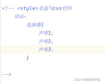
1.3 CSS的三种导入方式
Title
张功铭
拓展:外部样式两种写法
-
链接式
-
导入式
2.选择器
作用:选择页面上的某一个或某一类元素
2.1 基本选择器
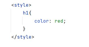
1.标签选择器:选择一类标签
标签{}
"UTF-8">
Title
; ;张功铭
张彬
张康妮