Pandas+Pyecharts | 新冠疫情数据动态时序可视化
文章目录
- ️ 1. 导入模块
- ️ 2. Pandas数据处理
-
- 2.1 读取数据
- 2.2 按月统计数据
- ️ 3. Pyecharts数据可视化
-
- 3.1 疫情动态时序地图
- 3.2 疫情动态时序折线图
- 3.3 疫情动态时序柱状图
- 3.4 疫情动态时序扇形图
- ️ 可视化项目源码+数据
大家好,我是 【Python当打之年(点击跳转)】
本期利用 python 的 pyecharts 可视化库绘制 疫情动态时序地图、动态时序柱状图、动态时序折线图、动态时序饼图等来展示疫情情况,希望对你有所帮助,如有疑问或者需要改进的地方可以私信小编。
️ 1. 导入模块
import pandas as pd
from pyecharts.charts import Bar
from pyecharts.charts import Map
from pyecharts.charts import Pie
from pyecharts.charts import Line
from pyecharts.charts import Timeline
from pyecharts import options as opts
import warnings
warnings.filterwarnings('ignore')
️ 2. Pandas数据处理
2.1 读取数据
df = pd.read_excel('./2020-2022疫情数据.xlsx')
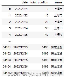
数据日期范围2020/1/21~2022/12/27。
2.2 按月统计数据
df1 = df.copy()
df1['month'] = pd.DatetimeIndex(df1["date"]).month
df1['year'] = pd.DatetimeIndex(df1["date"]).year
df1['month'] = df1['month'].astype('str')
df1['year'] = df1['year'].astype('str')
df1['year_month'] = df1['year']+'_'+df1['month']

️ 3. Pyecharts数据可视化
3.1 疫情动态时序地图
# 地图
def get_year_m(year_month,df_t):
    map_chart = (
        Map(init_opts=opts.InitOpts(width="1000px", height="600px", theme='dark', bg_color='#0d0735'))
        .add(
            series_name="",
            data_pair=map_data,
            zoom=1,
            center=[119.5, 34.5],
            is_map_symbol_show=False,
            label_opts=opts.LabelOpts(is_show=False),
        )
        .set_global_opts(
            title_opts=opts.TitleOpts(
                title=f"{year_month}月全国分地区疫情确诊情况",
                pos_top="2%",
                pos_left="2%",
                title_textstyle_opts=opts.TextStyleOpts(font_size=24,color="#fff200")
            ),
            tooltip_opts=opts.TooltipOpts(
                is_show=True,
            ),
            visualmap_opts=opts.VisualMapOpts(
                is_calculable=True,
                pos_left="5%",
                pos_top="center",
                max_=max_data,
            ),
        )
    )
    return map_chart

3.2 疫情动态时序折线图
# 折线图
def get_year_l(year_month,df_t, total_num):
    line_chart = (
        Line(init_opts=opts.InitOpts(theme='dark', width="1000px", height="600px", bg_color='#0d0735'))
        .add_xaxis(time_list)
        .add_yaxis(
            "",
            total_num,
            label_opts=opts.LabelOpts(is_show=False)
        )
        .set_global_opts(
            xaxis_opts=opts.AxisOpts(axislabel_opts=opts.LabelOpts(rotate=30)),
            visualmap_opts=opts.VisualMapOpts(
                is_show=False,
                is_calculable=True,
                pos_left="5%",
                pos_top="center",
                max_=200000,
            ),
            title_opts=opts.TitleOpts(
                title=f"{year_month}月全国疫情",
                pos_top="2%",
                pos_left="2%",
                title_textstyle_opts=opts.TextStyleOpts(font_size=24,color="#fff200"),
            ),
        )
    )
    return line_chart

3.3 疫情动态时序柱状图
# 柱状图
def get_year_b(year_month,df_t):
    bar_chart = (
        Bar(init_opts=opts.InitOpts(theme='dark', width="1000px", height="600px", bg_color='#0d0735'))
        .add_xaxis(xaxis_data=names)
        .add_yaxis(
            series_name="",
            y_axis=total_confirms,
            label_opts=opts.LabelOpts(
                is_show=True, position="right", formatter="{b} : {c}"
            ),
        )
        .reversal_axis()
        .set_global_opts(
            title_opts=opts.TitleOpts(
                title=f"{year_month}月全国疫情",
                pos_top="2%",
                pos_left="2%",
                title_textstyle_opts=opts.TextStyleOpts(font_size=24,color="#fff200")
            ),
            xaxis_opts=opts.AxisOpts(max_=80000),
            yaxis_opts=opts.AxisOpts(axislabel_opts=opts.LabelOpts(is_show=False)),
            visualmap_opts=opts.VisualMapOpts(
                is_calculable=True,
                textstyle_opts=opts.TextStyleOpts(color="#ddd"),
                min_=0,
                max_=10000 ,
            ),
        )
    )
    return bar_chart
3.4 疫情动态时序扇形图
# 扇形图
def get_year_p(year_month,df_t):
    pie_chart = (
        Pie(init_opts=opts.InitOpts(theme='dark', width="1000px", height="600px", bg_color='#0d0735'))
        .add(
            series_name="",
            data_pair=pie_data,
            radius=["25%", "50%"],
            center=["50%", "55%"],
            label_opts=opts.LabelOpts(formatter="{b} {c}")
        )
        .set_global_opts(
            legend_opts=opts.LegendOpts(is_show=False),
            title_opts=opts.TitleOpts(
                title=f"{year_month}月全国疫情",
                pos_top="2%",
                pos_left="2%",
                title_textstyle_opts=opts.TextStyleOpts(font_size=24,color="#fff200")
            ),
            visualmap_opts=opts.VisualMapOpts(
                is_show=False,
                min_=0,
                max_=10000 ,
            ),
        )
    )
    return pie_chart
️ 可视化项目源码+数据
点击跳转:【全部可视化项目源码+数据】
以上就是本期为大家整理的全部内容了,赶快练习起来吧,原创不易,喜欢的朋友可以点赞、收藏也可以分享(注明出处)让更多人知道。