matplotlib入门记录--基于Hands on Machine Learning 2配套文件

本文是基于《机器学习实战》配套的tools_matplotlib 的notebook文件写的
具体可查看
https://homl.info/kaggle/

Table of Contents
1 Plotting your first graph
2 Line style and color
3 Saving a figure
4 Subplots
5 Multiple figures
6 Pyplot’s state machine: implicit vs explicit
7 Pylab vs Pyplot vs Matplotlib
8 Drawing text
9 Legends
10 Non linear scales
11 Ticks and tickers
12 Polar projection
13 3D projection
14 Scatter plot
15 Lines
16 Histograms
17 Images
18 Animations
19 Saving animations to video files
20 What next?
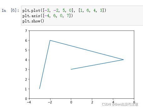
Plotting your first graph
首先我们需要导入 matplotlib 这个库
import matplotlib
Matplotlib可以使用各种后端图形库(如Tk、wxPython等)输出图形。使用命令行运行python时,图形通常显示在单独的窗口中。在Jupyter笔记本中,我们可以通过运行%matplotlib inline 魔法命令简单地在notebook中输出图形。
%matplotlib inline
# matplotlib.use("TKAgg")  # use this instead in your program if you want to use Tk as your graphics backend.

两个函数:
plt.plot()
plt.show()
如果给plot函数一个数据数组,它将使用该数组作为纵轴上的坐标,并且只使用数组中每个数据点的索引作为水平坐标。还可以提供两个阵列:一个用于水平轴x,另一个用于垂直轴y:

plt.plot(x的数组,y的数组)
轴自动匹配数据的范围。如果我们想给这个图多一点空间,所以让我们调用axis函数来改变每个轴的范围[xmin,xmax,ymin,ymax]。
plt.axis([xmin, xmax, ymin, ymax])
还可以利用之前Numpy中学到的linspace函数,生成等间距的ndarray。

plt.title(“标题”)
plt.xlabel(“x轴的标签”)
plt.ylabel(“y轴的标签”)
plt.grid(True) #画图时候显示网格

Line style and color(线条的样式和颜色)
一般地,matplotlib在连续两个点之间连线

可以在plt.plot(x轴数组,y轴数组,“g–”)传递第三个参数来更改线条的样式和颜色。例如,“g–”表示“绿色虚线”。

你甚至可以在一幅图同时画多条线
调用plt.plot(x1, y1, [style1], x2, y2, [style2], …)

或者多次调用plt.plot()然后再调用plt.show()

你也可以画点

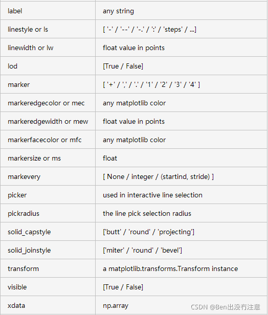
接受以下格式字符来控制线条样式或标记
character description
‘-’ solid line style
‘–’ dashed line style
‘-.’ dash-dot line style
‘:’ dotted line style
‘.’ point marker
‘,’ pixel marker
‘o’ circle marker
‘v’ triangle_down marker
‘^’ triangle_up marker
‘<’ triangle_left marker
‘>’ triangle_right marker
‘1’ tri_down marker
‘2’ tri_up marker
‘3’ tri_left marker
‘4’ tri_right marker
‘s’ square marker
‘p’ pentagon marker
‘*’ star marker
‘h’ hexagon1 marker
‘H’ hexagon2 marker
‘+’ plus marker
‘x’ x marker
‘D’ diamond marker
‘d’ thin_diamond marker
’ ’
‘_’ hline marker
支持以下颜色缩写
character color
‘b’ blue
‘g’ green
‘r’ red
‘c’ cyan
‘m’ magenta
‘y’ yellow
‘k’ black
‘w’ white
plt.plot()会返回一个Line2D对象列表。你可以在这些线上设置额外属性,例如线宽,虚线样式或者alpha级别。详细参考:https://matplotlib.org/2.0.2/users/pyplot_tutorial.html


Saving a figure(保存图像)
形式:plt.savefig(保存的路径)

transparent=True代表意思是保存的图像背景为透明。
保存的图像格式取决于你使用的图形后端。

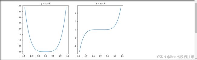
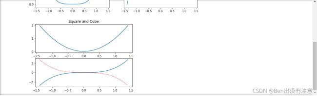
Subplots
matplotlib图可能包含多个子图。这些子图组合在一个网格中。要创建子图,只需要调用plt.subplot(总行数,总列数,当前绘制的序号) 序号是从左到右,从上到下来算。需要注意的是,pyplot会跟踪当前活动的subplot(因此你可以通过调用plt.gca()来获取对它的引用),因此当你调用plt.plot()函数时候,它会在活动的subplot上绘制。

提示:subplot(2,2,3)可以写成subplot(223)
可以创建跨越多个网格单元的subplot

如果你需要更复杂的子图定位,你可以选择使用subplot2grid而不是subplot。你先指定在网格中的行数和列数,然后就是子图在网格中的位置,左上角是(0,0)

更多例子:https://blog.csdn.net/weixin_38656890/article/details/79956977
Multiple figures(多个图)
你也可以同时画多个Figure。每个Figure可能包含一个或多个subplot。默认情况下,matplotlib会自动创建Figure1。当你切换Figure时,pyplot会跟踪当前活动的Figure,你也可以通过调用pplt.gcf()来获取当前该图形的引用,然后那张Figure活动的subplot变成了当前subplot。

分析 一下:
首先,当前active的是Figure1,然后运行代码之后active的subplot是212。接着,创建Figure2,并分别在subplot(121)和subplot(122)上绘制,然后又切换到Figure1上绘制,所以是接着在Figure1上的subplot212上绘制。
Pyplot’s state machine: implicit vs explicit
前面使用Pyplot的状态机来跟踪当前活动的subplot。每次调用plot函数时,pyplot只是在当前active的subplot上进行绘制。如果Figure和subplot不存在的时候,当你调用plot的时候,它就会自动地创建一个Figure和subplot。
当你在写程序的时候,显示表达总比隐式表达好。
只需要地调用subplot函数,并使用返回的Figure对象和axis对象列表。


Pylab vs Pyplot vs Matplotlib
pylab、pyplot和matplotlib之间的关系有些混乱。很简单:matplotlib是完整的库,它包含了包括pylab和pyplot在内的所有内容。
Pyplot提供了许多绘制图形的工具,包括底层面向对象绘图库的状态机接口。
Pylab是一个方便的模块,它在一个名字空间中导入matplotlib.pyplot和NumPy。您会发现许多使用pylab的例子,但不再推荐使用它(因为显式导入比隐式导入更好)。
Drawing text
你可以调用plt.text()来添加文本到图表中的任意位置。只要指定横纵坐标和文本内容,然后选择性地添加额外的属性。

ha就是horizontalalignment的别名
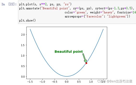
对图形的元素进行注释是非常常见的,例如上面的Beautiful point。annotate函数使这变得简单:只需指示感兴趣点的位置和文本的位置,还可以选择为文本和箭头添加一些额外的属性。

只是为了好玩,如果你想要一个xkcd风格的图,只需要在一个带有plt.xkcd()的区域内绘制即可:

Legends(图例)
形式:plt.legend()

Non-linear scales
Matplotlib支持非线性标度,如对数或逻辑标度。
形式:plt.yscale()


Ticks and tickers(刻度)
形式:
ax.xaxis.set_ticks([数组])
ax.yaxis.set_ticklabels([数组])

Polar projection(极坐标投影)
首先在plt.subplot(…,projection=‘polar’) 指定投影方式为’polar’


3D projection (三维投影)
首先需要导入Axes3D
from mpl_toolkits.mplot3d import Axes3D
然后生成网格点坐标矩阵

再然后调用plt.subplot(…, projection=‘3d’)
![]()
最后调用plt_surface()


另一种显示相同数据的方法是通过等高线图。
形式:plt.contourf(X,Y,Z,…)

Scatter plot
要绘制散点图,只需提供点的x和y坐标。
调用形式:plt.scatter(x, y)

您也可以选择提供每个点的比例。

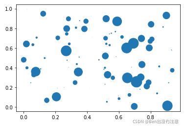
像往常一样,您可以设置许多其他属性,例如填充和边缘颜色以及alpha级别。


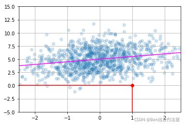
Lines
您可以简单地使用绘图功能画线,就像我们到目前为止所做的那样。然而,在给定斜率和截距的情况下,创建一个在图上画出一条(看似)无限线的效用函数通常是方便的。您也可以使用绘制水平和垂直线段的hline()和vline()。例如:

调用形式:
plt.vlines(x, ymin, ymax, colors=‘k’, label=’’)
plt.hlines(y, xmin, xmax, colors=‘k’, label=’’)
Histograms(直方图)
调用形式:plt.hist(data,bins,rwidth)
data就是要绘制的数据点,bins=10就是把数据分成10组,rwidth=0.8就是柱子宽度占bins宽的比例为0.8


Images
在matplotlib中读取、生成和绘制图像非常简单。要读取图像,只需导入matplotlib.image模块,并调用其imread函数,将文件名(或文件对象)传递给它。这会以NumPy数组的形式返回图像数据。让我们用之前保存的my_square_function.png图像来尝试一下。
import matplotlib.image as mpimg
img = mpimg.imread('图片路径')
plt.imshow(使用imread函数后返回的对象)
plt.show()
如果你想在显示图片的时候隐藏axes,你可以调用
plt.axis('off')

自己生成属于自己的image
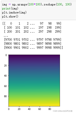
由于我们没有提供RGB级别,imshow函数会自动将值映射到颜色渐变。默认情况下,颜色渐变从蓝色(对于低值)变为红色(对于高值),但您可以选择另一个颜色映射。例如:

您也可以直接生成RGB图像:
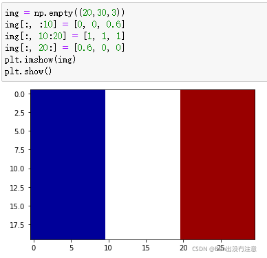
由于img数组非常小(20x30),当imshow函数显示它时,它会将图像放大到图形的大小。想象一下拉伸原始图像,在原始像素之间留下空白。imshow如何填空?默认情况下,它只是使用最近的非空白像素的颜色来给每个空白像素着色。这种技术可以产生像素化的图像。如果您愿意,可以使用不同的插值方法,例如双线性插值来填充空白像素。这会导致边缘模糊,在某些情况下,这可能会更好:
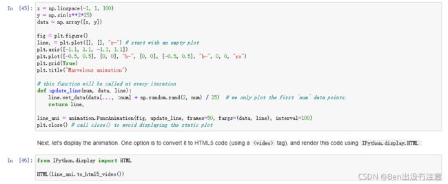
Animations(动画片)
首先,导入
import matplotlib.animation as animation
在下面的例子中,我们从创建数据点开始,然后创建一个空的绘图,我们定义将在动画的每次迭代中调用的更新函数,最后我们通过创建function实例向绘图中添加动画。
FuncAnimation构造函数采用一个图形、一个更新函数和可选参数。我们指定我们想要一个50帧长的动画,每帧之间有100毫秒。在每次迭代中,FuncAnimation都会调用我们的更新函数,并将帧号(在我们的例子中是从0到49)传递给它,后跟我们用fargs指定的额外参数。
我们的更新函数只是将线条数据设置为第一个num数据点(因此数据会逐渐绘制出来),为了好玩,我们还会为每个数据点添加一个小的随机数,这样线条看起来会摆动


Saving animations to video files
