matplotlib绘制位置-时序甘特图
文章目录
- 1 前言
- 2 知识点
-
- 2.1 matplotlib.pyplot.barh
- 2.2 matplotlib.legend的handles参数
- 3 代码实现
- 4 绘制效果
- 5 总结
- 参考
1 前言
这篇文章的目的是,总结记录一次使用matplotlib绘制时序甘特图的经历。之所以要绘制这个时序甘特图,是因为22年数模研赛C题需要用到,用于更好地呈现求解的车身缓冲区调序优化结果。
首先,我们觉得在这篇博客中出现的下面这张图展示效果很好,于是也想绘制一张。
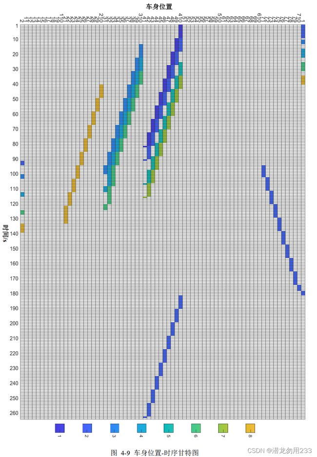
这张图中,横坐标是递增变化的时间,纵坐标是PBS中的区域编号,其中不同的颜色代表不同的车身,如果某个时间段车身达到了某个区域,那么图中所对应的矩形区块将填充为该车身对应的颜色。
在知道上述信息后,我们开始在网上查找甘特图的绘制方法,因为我个人习惯用python的matplotlib库绘制图表,于是根据关键词搜索到了如下的文章: Python实现生产过程可视化(甘特图)。看着比较像我们想要的那种效果,于是琢磨了一下代码怎么写的。
2 知识点
拜读完代码后,我总结了使用matplotlib绘制甘特图的一些知识点。
2.1 matplotlib.pyplot.barh
该函数的作用是绘制横向的柱状图。
官方文档函数定义如下:
matplotlib.pyplot.barh(y, width, height=0.8, left=None, *, align='center', data=None, **kwargs)
使用到的参数详解:
| 参数名称 | 解释 |
|---|---|
| y | 可传入float类型,决定柱状图的y轴坐标 |
| width | 可传入float类型,决定柱状图的宽带(可以理解为横跨x轴的长度) |
| height | 可传入float类型,默认0.8,决定柱状图的高度(可以理解为横跨y轴的长度) |
| left | 可传入float类型,默认0,决定柱状图最左侧与y轴的距离 |
| align | 可选’center’或’edge’, 默认 ‘center’,柱状图与y坐标的对齐方式,默认居中 |
| color | 柱状图的颜色 |
| edgecolor | 柱状图边缘的颜色 |
| linewidth | 柱状图边缘的宽度,如果为0则不绘制边缘 |
| zorder | float类型,控制artist对象的绘制顺序,zorder越小越先绘制(有点图层的意思) |
2.2 matplotlib.legend的handles参数
我也是第一次见往plt.legend函数中传入handles参数的(没有系统学过matplotlib库),这里也不详细解释了,直接说怎么用吧。当我们想要自定义图例时,使用下面代码:
patches = [mpatches.Patch(color = m_colors[i], label = m_labels[i]) for i in range(m)]
plt.legend(handles = patches)
其中,color参数是图例(matplotlib.patches对象)对应的颜色,label为图例对应的标签。
3 代码实现
绘制代码如下:
import numpy as np
import matplotlib.pyplot as plt
import matplotlib.patches as mpatches

plt.rcParams['font.sans-serif'] = ['SimHei']  # 用来正常显示中文标签
plt.rcParams['axes.unicode_minus'] = False  # 用来正常显示负号

def gantt_chart(wt, x_labels, y_labels, m_labels):
    """
    wt: 工作矩阵,大小为mxnx2,m为车身数,n为区域编号数,第三维中
        第1个元素为车身进入区域的时间,第2个元素为停留时间。
    color_list:代表各车身的颜色矩阵,大小为nx4。
    """
    m, n = wt.shape[0], wt.shape[1]
    m_colors = plt.colormaps['terrain'](np.linspace(0, 0.95, m))
    for i in range(n):
        for j in range(m):
            if wt[j, i, 1] != 0:
                plt.barh(y = i, width = wt[j, i, 1], left = wt[j, i, 0], height = 1, edgecolor = (0, 0, 0),
                         color = m_colors[j], zorder = 10)

    # 图例绘制
    patches = [mpatches.Patch(color = m_colors[i], label = m_labels[i]) for i in range(m)]
    plt.legend(handles = patches, bbox_to_anchor = (1.005, 0), loc = 3, borderaxespad = 0)
    plt.xticks(x_labels, fontsize = 7)
    plt.yticks(list(range(n)), y_labels)
    plt.xlabel("时间/s")
    plt.ylabel("区域编号")
    plt.title('车身位置-时序甘特图')
    plt.grid(axis = 'x', zorder = 0)
    # plt.savefig('result21_车身位置-时序甘特图.jpg', dpi = 200)
    plt.show()

def custom_gantt_chart(path = 'result21.csv', car_num = 25, T = 180):
    data = np.loadtxt(open(path, "rb"), delimiter = ",", encoding = 'utf-8-sig', dtype = object)[1:car_num + 1, 1:T + 1]
    car_label = [f'car{i}' for i in range(1, 26)]
    region_code = ['1', '410', '49', '48', '47', '46', '45', '44', '43', '42', '41',
                   '310', '39', '38', '37', '36', '35', '34', '33', '32', '31',
                   '210', '29', '28', '27', '26', '25', '24', '23', '22', '21', '2']
    car_num, T_num, region_num = data.shape[0], data.shape[1], len(region_code)
    T_range = [t for t in range(0, T_num + 1, 3)]
    Wt = np.zeros((car_num, region_num, 2))
    Wt[:, :, 0] = -1
    for i in range(car_num):
        for j in range(T_num):
            if data[i, j] == '' or data[i, j] == '3':
                continue
            idx = region_code.index(data[i, j])
            if Wt[i, idx, 0] == -1:
                Wt[i, idx, 0] = j
            Wt[i, idx, 1] += 1

    gantt_chart(Wt, T_range, region_code, car_label)


if __name__ == '__main__':
    custom_gantt_chart('result21.csv', car_num = 25, T = 200)
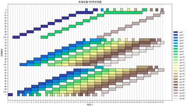
4 绘制效果
5 总结
可以从绘制效果中看到,有些柱状图的颜色两两之间不仔细看根本分不出来。对于这个问题,主要是这条代码m_colors = plt.colormaps['terrain'](np.linspace(0, 0.95, m))在色条上均匀取色时,因为色条颜色数量太少(即使是渐变色条,随着取色数量增多也不容易分辨)造成的。terrain颜色条包含的颜色如下图:
![]()
关于更多的颜色条种类及使用方法参见:https://matplotlib.org/stable/tutorials/colors/colormaps.html
参考
[1] https://zhuanlan.zhihu.com/p/106787569
[2] https://matplotlib.org/stable/api/_as_gen/matplotlib.pyplot.barh.html
[3] https://matplotlib.org/stable/api/legend_api.html
[4] https://matplotlib.org/stable/tutorials/colors/colormaps.html