好的图表展示页
Communication is one of the most valued interpersonal skills of employees, based on research in psychology. The same research demonstrates that visual cues have in most cases a greater influence than vocalic ones. Incorporating storytelling onto visual images is, in my opinion, the easiest, yet most efficient way to communicate concisely and uniquely facts, ideas and concepts, as well as develop your personal brand as a great employee at the same time.
基于心理学的研究,沟通是员工最重视的人际交往能力之一。 相同的研究表明,视觉提示在大多数情况下比语音提示具有更大的影响力。 在我看来,将叙事结合到视觉图像上是最简洁,最有效的方式,可以简洁,独特地交流事实,想法和概念,并同时发展自己的品牌,成为一名出色的员工。
I do want to preface this article by saying — I am not a graphic designer, nor am I an artist. I did create upwards of 50 individual infographics for various occasions over the course of a few months, using the format as a way to convey complex information in an engaging format. As a result, I observed improved communication between involved stakeholders on a company-level, as well as between members from different occupations within the team I was placed in.
我确实想通过说“我不是平面设计师,也不是艺术家”作为本文的开头。 在过去的几个月中,我确实为各种场合创建了多达50个单独的信息图表,使用该格式作为一种以引人入胜的格式传达复杂信息的方法。 结果,我观察到公司级相关利益相关者之间以及与我所在团队中来自不同职业的成员之间的沟通得到了改善。
我为什么热衷于信息图表? (Why am I raving about infographics?)
A 2012 academic study in the Learning & Leading with Technology journal demonstrates that the concept of infographic information transmission engages more parts of the brain as it challenges both the reader and the creator of content to look at a problem from more than one angle. In addition, the author of the study (Jane Krauss) argues that the practice of creation and curation of infographics develops critical thinking.
2012年《 学习与技术领先 》杂志上的一项学术研究表明,信息图表信息传输的概念吸引了大脑的更多部分,因为它挑战了读者和内容创建者从多个角度审视问题。 此外,该研究的作者(简·克劳斯(Jane Krauss))认为,信息图表的创建和管理实践会发展批判性思维。
As the old adage goes, a picture is worth a thousand words, and pictures can be essential when complex relationships are difficult to convey with words alone. — Jane Krauss
就像古老的谚语所说的那样,一张图片价值一千个单词,而当很难用单词来表达复杂的关系时,图片就必不可少。 —简·克劳斯
Another academic study highlights the importance of using infographics as communication tools in a digital age, emphasising the benefits that the content has on increasing traffic to the corporate website or social media, and generating engagement.
另一项学术研究强调了在数字时代使用信息图表作为交流工具的重要性,强调了内容对增加访问公司网站或社交媒体的流量以及产生参与度的好处。
From my personal experience of creating infographics as part of my role, I have encountered that having this skill instantly boosts your personal brand. Over the course of a six months placement, I have generated a ton of comments and compliments for my work, even though it was a very tiny fraction of my day-to-day activities as an IT project assistant. It was never a requirement for me to create my first infographic, but once I did, it became standard practice and an opportunity for me to demonstrate that my skill-set is multi-dimensional. This applied even to people that I was meeting for the first time during our corporate meetings. In time, I noticed that my boss started asking me to create infographics in a variety of areas, which became a great way for starting our meetings, communicating SOPs (standard operating procedures), or reporting the progress of our projects to clients. Personally, I viewed these instances as the perfect opportunity to make myself known, contribute to the work of the team, and generate some gratitude within myself that through the creation of that content, I have helped create a more enjoyable meeting dynamic.
从我作为角色的一部分创建信息图表的亲身经历中,我发现拥有此技能可立即提升您的个人品牌。 在六个月的工作中,尽管我作为IT项目助理的日常活动只占很小的一部分,但我对我的工作还是提出了很多意见和赞美。 创建我的第一个信息图表从来都不是必需的,但是一旦我创建了它,它就成为了标准实践,并且是我展示自己的技能是多维的机会。 这甚至适用于我在公司会议期间第一次见面的人。 随着时间的流逝,我注意到老板开始要求我在各个领域创建信息图表,这成为开始会议,传达SOP(标准操作程序)或向客户报告项目进度的好方法。 就我个人而言,我认为这些实例是一个绝佳的机会,可以让我自己广为人知,为团队的工作做出贡献,并在我内部产生一点感激,即通过创建这些内容,我帮助创造了一个更加愉快的会议氛围。
So, in terms of personal branding, creating infographics shows you have put some additional effort into making your ideas digestible and your presentation notable. From a presentation standpoint, they are a tool for capturing your audience’s attention. For the corporate brand, they are tools for building brand awareness, yet it is also recognised that they are useful for placement of subtle calls to action.
因此,就个人品牌而言,创建信息图表表明您已经付出了额外的努力,以使您的想法易于理解并且引人注目。 从演示的角度来看,它们是吸引观众注意力的工具。 对于企业品牌来说,它们是建立品牌知名度的工具,但也被认为,它们对于发出微妙的行动呼吁很有用。
优质信息图的剖析以及如何以您的喜好使用它 (The anatomy of a good infographic and how you should use it in your favour)
The essence of a good infographic is the message it communicates. This should be done through the use of:
一个好的信息图表的本质是它传达的信息。 这应该通过使用以下内容来完成:
- a descriptive title (and subtitle, if needed) 描述性标题(和字幕,如果需要)
- information (statistics, ideas, facts) 信息(统计,想法,事实)
- a storyline 故事情节
- colours 颜色
- eye-catching visual elements 醒目的视觉元素
- branding 品牌化
In the example below, the task was making a 9-page document (The University’s Assessment and Feedback Policy) digestible. The information portrayed is the holistic process academic staff needs to follow, with the visual storyline incorporating both text and image in a manner that is easy to digest. While the visual approach and concept have been done by probably a million creators, it is evident that the infographic is unique due to the branding applied, which features the corporate colours (dark blue and white), as well as the logo. As the document was distributed through e-mail, a link to the policy document was added (at the bottom left), as a way to improve the interactivity of the content.
在下面的示例中,任务是使9页的文档 (大学的评估和反馈政策)易于消化。 所描绘的信息是学术人员需要遵循的整体过程,视觉故事情节以易于消化的方式结合了文本和图像。 虽然视觉方法和概念已经由大约一百万名创作者完成,但很明显,该信息图表是独特的,因为所应用的品牌具有公司颜色(深蓝色和白色)以及徽标。 由于通过电子邮件分发了文档,因此添加了指向策略文档的链接(在左下方),以改善内容的交互性。

Later on, this became part of a collection of infographics (featured below), which delved deeper into the group of policies the University has in the area, with each image communicating the essence of an individual policy (e.g. Assessment, Marking, etc). Here is what our Vice-Dean said at the time, illustrating the power of infographics:
后来,这成为了信息图表集合的一部分(如下所示),该图表深入研究了大学在该地区制定的政策组,每个图像都传达了个别政策的实质(例如评估,评分等)。 这是我们的副院长当时所说的,说明了信息图表的力量:
This is a great resource, which our academics and staff can just print out and put on their desk. Instead of having to search through pages of bland text, they can just brouse through 5 pages of beautiful visual content.
这是一个很好的资源,我们的学者和员工可以将其打印出来并放在办公桌上。 不必搜索乏味的文本页面,他们只需浏览5页的精美视觉内容即可。

So, how can this be used in your favour? When communicating an idea, process or practice, do it through an infographic. Use the colour scheme to both signify the corporate (or personal, if you are a freelancer) brand, as well as to illustrate the content’s belonging (e.g. part of a series). Apply colour theory to enhance its visual appeal and generate emotional associations. The key is to use the content as a tool for illustrating importance and relation to different elements or ideas. As Mark Smiciklas states in his book ‘The Power of Infographics: Using Pictures to Communicate and Connect With Your Audiences’:
那么,如何使用它对您有利? 在交流想法,过程或实践时,请通过信息图进行。 使用配色方案既可以表示公司(或个人,如果您是自由职业者)品牌,也可以说明内容的归属(例如,系列的一部分)。 应用色彩理论以增强其视觉吸引力并产生情感联想。 关键是将内容用作说明重要性和与不同元素或想法的关系的工具。 正如Mark Smiciklas在他的书“ 信息图表的力量:使用图片进行交流并与观众联系 ”中指出的那样:
Using infographics to visualize how people, concepts or entities are connected helps spark discussion and accelerates understanding of the relationships that are important to your organisation or industry.
使用信息图表可视化人,概念或实体的连接方式有助于引发讨论并加速对对组织或行业重要的关系的理解。
Finally, use visuals (such as icons, process arrows and images) as means of communicating other non-vital, yet important aspects of your subject matter. For example, the puzzle illustrates overall complexity and de-composition, but also intellectual stimulation, while something as simple as a notebook and pen can be used for communication of lists, comments and informal notes. Arrows and lines are typically used for indicating direction. Overall, these visual elements should be used to generate subconscious emotions and associations in the recipient.
最后,将视觉效果(例如图标,过程箭头和图像)用作传达主题的其他非重要但重要方面的方法。 例如,拼图不仅说明了整体的复杂性和分解性,而且还说明了智力上的刺激,而诸如笔记本和笔之类的简单内容可用于列表,评论和非正式笔记的交流。 箭头和线通常用于指示方向。 总体而言,这些视觉元素应用于在接受者中产生潜意识的情感和联想。
入门 (Getting Started)
If you are just starting your infographic journey, the best software to use is Canva. They have some good templates, which can be easily adapted to suit your needs. If you do wish to create an infographic from scratch yourself, Canva is also suitable, as it is beginner-friendly and has a straightforward user interface with a gentle learning curve. For a more advanced user, Photoshop and Illustrator are two of Adobe’s products that can be very useful in the creation of a decent infographic.
如果您刚刚开始信息图表之旅,那么最好使用的软件是Canva 。 他们有一些好的模板,可以轻松地调整以满足您的需求。 如果您确实希望自己从头开始创建图表,则Canva也很适合,因为它对初学者很友好,并且具有直观的用户界面和轻松的学习曲线。 对于更高级的用户, Photoshop和Illustrator是Adobe的两个产品,它们在创建体面的信息图时非常有用。
Considering you might already have a topic or message you want to convey, (as with any creative process) you might come across a block at first or become overwhelmed by the choices available to you. To get a bit of inspiration, simply type ‘infographic’ in Pinterest to see what creators before you have opted for in terms of structure, colours and text. Set aside those infographics that are you are impressed by. While completing this stage do think about what your message is and how you might convey it, using the format of the infographics you like. Then it is time for action!
考虑到您可能已经有了要传达的主题或消息(与任何创作过程一样),您可能首先遇到一个障碍,或者可能因您的选择不知所措。 为了获得一些启发,只需在Pinterest中键入“ infographic”,就可以在创建者选择结构,颜色和文本之前查看创建者。 抛开那些让您印象深刻的信息图表。 完成此阶段后,请使用所需的信息图表格式考虑一下您的信息是什么以及如何传达。 然后是时候采取行动了!
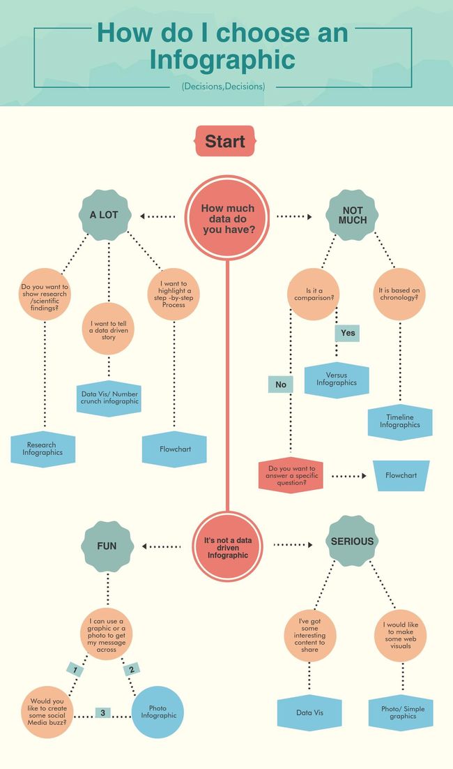
Use the flowchart above to choose the infographic type you want. Get a piece of paper and draft the key messages you would like to communicate, as well as some visuals, if you already have something in mind. Don’t worry about this being artistic or remotely perfect — nobody expects you to be Picasso, everything will later be transferred to a digital format. This step is important though, as it helps to manifest your ideas quickly and to remember all design-related thoughts that you might want to look back on when you begin creating your infographic. Having this guide is also useful to keep you on track with what you aim to achieve. Then, check out this amazing article by Sara McGuire, where she shows an example of each of the 9 most popular infographic types you can create. Considering your colour scheme, text and infographic type, open Canva and start creating. If you struggle to find visuals for your infographics, browse for free icons with transparent backgrounds (remember, Canva also has a ton of those, too!), but remember to credit the authors of the images in your presentations and in your work.
使用上面的流程图选择所需的信息图类型。 如果您已有想法,请拿一张纸草稿并草拟要传达的关键信息以及一些视觉效果。 不必担心这是艺术性的还是遥不可及的-没有人期望您成为毕加索,以后一切都会转换为数字格式。 但是,此步骤很重要,因为它有助于快速表达您的想法并记住您在开始创建信息图时可能想回顾的所有与设计有关的想法。 拥有本指南对于使您保持追踪目标也很有用。 然后,查看一下Sara McGu ire 撰写的这篇精彩文章 ,她在其中展示了您可以创建的9种最流行的信息图表类型中的每一个的示例。 考虑您的配色方案,文本和图表类型,打开Canva并开始创建。 如果您很难找到图表的视觉效果,请浏览具有透明背景的免费图标(请记住,Canva也有大量的图标!),但请记住在演示文稿和工作中将图像的作者视为功劳。
Like most things, visual content creation is a skill, hence — practice makes perfect. Nobody expects you to develop the skillset of a graphic designer overnight, but in time, you will develop your own style and things will become easier, with this process only taking a minute to do. The results, though, will speak for themselves as presenting an infographic instead of a bland sheet of paper will for sure get you many nods of approval during your presentation, if executed with good fashion.
像大多数事物一样,视觉内容创建是一种技能,因此-实践使完美。 没有人期望您在一夜之间培养出图形设计师的技能,但是随着时间的推移,您将发展自己的风格,事情将变得更加容易,而此过程只需一分钟即可完成。 但是,结果将是不言而喻的,因为如果以良好的方式执行,呈现一个信息图而不是平淡的纸片肯定会在演示过程中获得许多认可。
最后的想法… (Final Thoughts…)
Visual storytelling undoubtedly enhances communication as it can simultaneously make concepts more easily-digestible and conversations (based on those concepts) easier to start. Thorugh crafting the skill of visual storytelling, your value as an employee will increase as your efficiency in communicating ideas and concepts will be improved, leaving more time for valuable discussions to be held, based on what you present.
视觉叙事无疑增强了交流,因为它可以同时使概念更易于理解,并且对话(基于这些概念)更容易启动。 Thorugh精通视觉讲故事的技能,随着您交流思想和观念的效率得到提高,您作为员工的价值将不断提高,从而根据您的表现留出更多时间进行有价值的讨论。
Whether it is for pitching a small idea you have to your boss or a large corporate presentation you have coming up — infographics are a great tool to convey complex ideas in a visually-engaging yet simple manner.
无论是向老板提出一个小主意还是要向您提出一个大型公司演讲,信息图表都是一种出色的工具,可以以视觉吸引人的简单方式传达复杂的想法。
You will be surprised at how unique and impressive this skill is, exactly as it is so multifaced and beneficial for team communication. I hope I have convinced you to at least give infographics a chance… trust me, your boss would be grateful that you have!
您会惊讶于这项技能的独特性和令人印象深刻,因为它是如此多方面的,并且有利于团队沟通。 我希望我已经说服了您至少给信息图表一个机会……相信我,您的老板将不胜感激!
翻译自: https://medium.com/swlh/become-a-better-employee-through-leveraging-the-power-of-infographics-b04d3d60d78a
好的图表展示页