css布局教程 — 这一篇足够了
一、display属性
display 是CSS中最重要的用于控制布局的属性。每个元素都有一个默认的 display 值,这与元素的类型有关。对于大多数元素它们的默认值通常是 block 或 inline 。一个 block 元素通常被叫做块级元素。一个 inline 元素通常被叫做行内元素。
1.1、 block(块元素)
div是一个标准的块级元素。一个块级元素会新开始一行并且尽可能撑满容器。其他常用的块级元素包括 p 、form和HTML5中的新元素:header、footer、section等等。
1.2、inline(行内元素)
span是一个标准的行内元素。一个行内元素可以在段落中 , 像这样 包裹一些文字而不会打乱段落的布局。a元素是最常用的行内元素,它可以被用作链接。
1.3、none
另一个常用的display值是none。一些特殊元素的默认 display 值是它,例如script。display:none通常被 JavaScript 用来在不删除元素的情况下隐藏或显示元素。
它和visibility属性不一样。把display设置成 none元素不会占据它本来应该显示的空间,但是设置成 visibility: hidden;还会占据空间。
二、margin:auto
设置块级元素的 width 可以防止它从左到右撑满整个容器。然后你就可以设置左右外边距为 auto 来使其水平居中。元素会占据你所指定的宽度,然后剩余的宽度会一分为二成为左右外边距。
唯一的问题是,当浏览器窗口比元素的宽度还要窄时,浏览器会显示一个水平滚动条来容纳页面。让我们再来改进下这个方案…
<style>
    #test{
        width: 600px;
        margin: 0 auto;
    }
style>

<body>
    <div id="test">
        测试
    div>
body>
三、max-width
在这种情况下使用 max-width 替代 width 可以使浏览器更好地处理小窗口的情况。这点在移动设备上显得尤为重要,调整下浏览器窗口大小检查下吧!
顺便提下, 所有的主流浏览器包括IE7+在内都支持max-width,所以放心大胆的用吧。
<style>
    #test{
        max-width: 600px;
        margin: 0 auto;
    }
style>

<body>
    <div id="test">
        测试
    div>
body>
四、盒模型
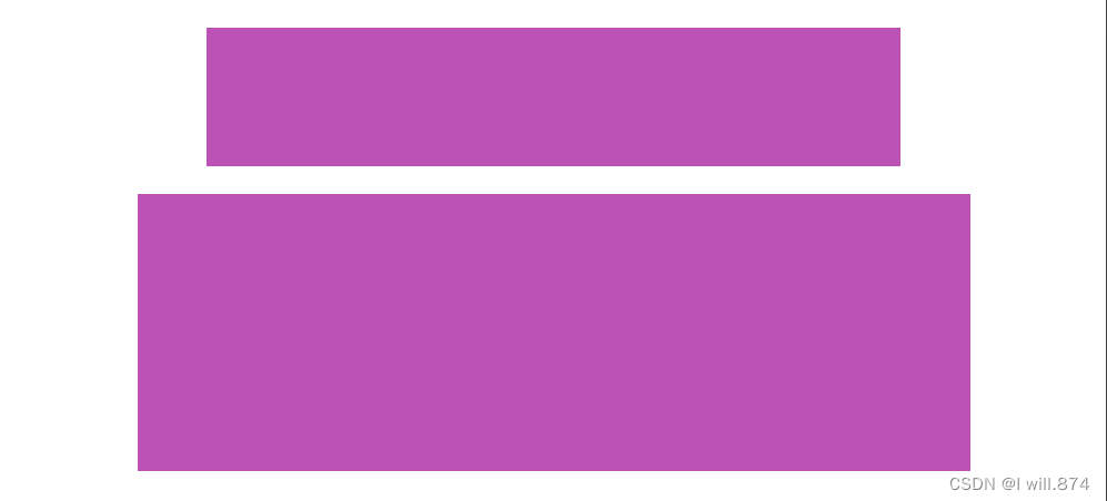
在我们讨论宽度的时候,我们应该讲下与它相关的另外一个重点知识:盒模型。当你设置了元素的宽度,实际展现的元素却超出你的设置:这是因为元素的边框和内边距会撑开元素。看下面的例子,两个相同宽度的元素显示的实际宽度却不一样。
<style>
    #simple {
    width: 500px;
    height: 100px;
    margin: 20px auto;
    background-color: rgb(189, 82, 182);
    }

    #fancy {
      width: 500px;
      height: 100px;
      margin: 20px auto;
      padding: 50px;
      border-width: 10px;
      background-color: rgb(189, 82, 182);
    }
style>

<body>
    <div id="simple">div>
    <div id="fancy">div>
body>
五、box-sizing
人们慢慢的意识到传统的盒子模型不直接,所以他们新增了一个叫做box-sizing的CSS属性。当你设置一个元素为box-sizing: border-box;时,此元素的内边距和边框不再会增加它的宽度。这里有一个与盒子模型相同的例子,唯一的区别是两个元素都设置了box-sizing: border-box;
<style>
    #simple {
        width: 500px;
        height: 100px;
        margin: 20px auto;
        background-color: rgb(189, 82, 182);
        -webkit-box-sizing: border-box;
        -moz-box-sizing: border-box;
        box-sizing: border-box;
    }

    #fancy {
        width: 500px;
        height: 100px;
        margin: 20px auto;
        padding: 50px;
        border: solid blue 10px;
        background-color: rgb(189, 82, 182);
        -webkit-box-sizing: border-box;
        -moz-box-sizing: border-box;
        box-sizing: border-box;
    }
style>

<body>
    <div id="simple">div>
    <div id="fancy">div>
body>
既然没有比这更好的方法,一些CSS开发者想要页面上所有的元素都有如此表现。所以开发者们把以下CSS代码放在他们页面上:
* {
  -webkit-box-sizing: border-box;
     -moz-box-sizing: border-box;
          box-sizing: border-box;
}

六、position
为了制作更多复杂的布局,我们需要讨论下position属性。它有一大堆的值,名字还都特抽象,别提有多难记了。让我们先一个个的过一遍。
- static
- relative
- fixed
- absolute
6.1、static
static是默认值。任意position: static;的元素不会被特殊的定位。一个static元素表示它不会被“positioned”,一个position属性被设置为其他值的元素表示它会被“positioned”。
6.2、relative
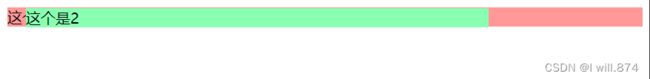
relative表现的和static一样,除非你添加了一些额外的属性。
在一个相对定位(position属性的值为relative)的元素上设置top、right、bottom和left属性会使其偏离其正常位置。其他的元素的位置则不会受该元素的影响发生位置改变来弥补它偏离后剩下的空隙,具体演示可以看下面的例子。
<style>
.relative1 {
  position: relative;
  background-color: rgb(255, 152, 152);
}
.relative2 {
  position: relative;
  top: -20px;
  left: 20px;
  background-color: rgb(137, 255, 178);
  width: 500px;
}
style>

<body>
    <div class="relative1">这个是1div>
    <div class="relative2">这个是2div>
6.3、fixed
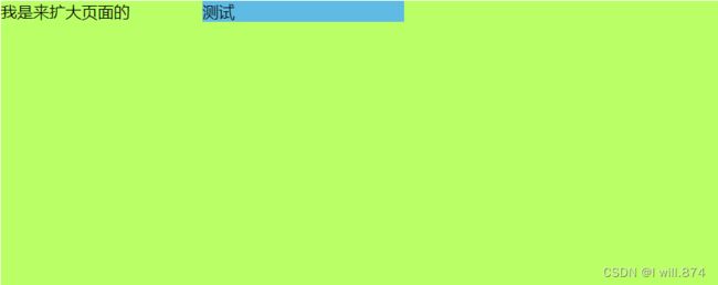
一个固定定位(position属性的值为fixed)元素会相对于视窗来定位,这意味着即便页面滚动,它还是会停留在相同的位置。和relative一样,top、right、bottom和left属性都可用。一个固定定位元素不会保留它原本在页面应有的空隙,即之后添加的元素会占用他之前的位置。
<style>
.fixed {
  position: fixed;
  margin-left: 200px;
  width: 200px;
  background-color: rgb(95, 187, 227);
}
.a{
    margin: 0 auto;
    width: 100%;
    height: 2000px;
    background-color: rgb(186, 255, 101);
}
style>
<body>
    <div class="fixed">测试div>
    <div class="a">我是来扩大页面的div>
body>
6.4、absolute
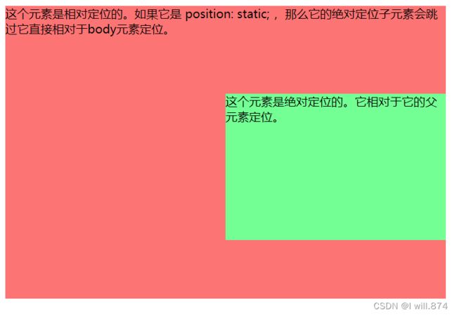
absolute是最棘手的position值。 absolute与fixed的表现类似,但是它不是相对于视窗而是相对于最近的“positioned”祖先元素*。如果绝对定位(position属性的值为absolute)的元素没有“positioned”祖先元素,那么它是相对于文档的 body 元素,并且它会随着页面滚动而移动。记住一个“positioned”元素是指 position 值不是static的元素。
<style>
.relative {
  position: relative;
  width: 600px;
  height: 400px;
  background-color: rgb(253, 116, 116);
}
.absolute {
  position: absolute;
  top: 120px;
  right: 0;
  width: 300px;
  height: 200px;
  background-color: rgb(116, 255, 148);
}
style>

<body>
    <div class="relative">
        这个元素是相对定位的。如果它是 position: static; ,那么它的绝对定位子元素会跳过它直接相对于body元素定位。
        <div class="absolute">
            这个元素是绝对定位的。它相对于它的父元素定位。
        div>
    div>
body>
七、float
在学习该属性前,首先要了解到浮动的属性,该性质会使元素向左或向右移动,其周围的元素也会重新排列。
7.1、clear
float属性被用于控制浮动。即元素浮动之后,周围的元素会重新排列,为了避免这种情况,使用clear属性,clear属性指定元素两侧不能出现浮动元素。
来看一下下面的例子:
首先这个是正常的浮动:
<style>
.box {
  float: left;
  width: 200px;
  height: 100px;
  margin: 1em;
  background-color: rgb(143, 255, 112);
}
section{
  background-color: rgb(255, 134, 134);
  width: 200px;
}
.after-box {
  clear: left;
}
style>

<body>
    <div class="box">1111111111div>
    <section>22222222section>
body>
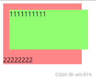
接下来使用clear属性,来指定该元素附近不能出现浮动元素
<style>
.box {
  float: left;
  width: 200px;
  height: 100px;
  margin: 1em;
  background-color: rgb(143, 255, 112);
}
.after-box {
  clear: left;
}
section{
  background-color: rgb(255, 134, 134);
  width: 200px;
}
style>

<body>
    <div class="box">1111111111div>
    <section class="after-box">22222222section>
body>

7.2、清除浮动(clearfix hack)
在一个div中放一张图片,有时候图片会超出div的范围,这个时候我们需要这样做,给div加上此属性
.clearfix {
  overflow: auto;
}
八、百分比宽度
百分比是一种相对于包含块的计量单位。它对图片很有用:如下我们实现了图片宽度始终是容器宽度的50%。
article img {
  float: right;
  width: 50%;
}
九、媒体查询
可以针对不同的媒体类型(包括显示器、便携设备、电视机,等等)设置不同的样式规则。但是这些多媒体类型在很多设备上支持还不够友好。可以理解为该元素在某一区间是什么样式、什么状态,是否显示等。
@media (min-width:600px) {
  nav {
    float: left;
    width: 25%;
  }
  section {
    margin-left: 25%;
  }
}
@media (max-width:599px) {
  nav li {
    display: inline;
  }
}
十、inline-block
你可以创建很多网格来铺满浏览器。在过去很长的一段时间内使用 float 是一种选择,但是使用 inline-block 会更简单。让我们看下使用这两种方法的例子:
10.1、这是使用普通的float方法
<style>
    .a{
        width: 300px;
        height: 180px;
        float: left;
        margin-left: 10px;
        margin-top: 10px;
        background-color: rgb(206, 93, 251);
        color: #000;
        font-size: 12;
    }
    .b{
        clear: left;
    }
style>
<body>
    <div class="a"> <h1>1h1> div>
    <div class="a"> <h1>2h1> div>
    <div class="a"> <h1>3h1> div>
    <div class="a"> <h1>4h1> div>
    <div class="a"> <h1>5h1> div>
    <div class="a"> <h1>6h1> div>
    <div class="a"> <h1>7h1> div>
    <div class="a"> <h1>8h1> div>
    <div class="a"> <h1>9h1> div>
    <div class="a"> <h1>10h1> div>
    <div class="a b"><h1>我得使用clear才能不浮动h1>div>
body>

10.2、使用inline-block方法
<style>
    .a{
        display: inline-block;
        width: 300px;
        height: 180px;
        /* float: left; */
        margin-left: 10px;
        margin-top: 10px;
        background-color: rgb(206, 93, 251);
        color: #000;
        font-size: 12;
    }
    .b{
        display: inline-block;
        width: 1800px;
        height: 180px;
        margin-left: 10px;
        margin-top: 10px;
        background-color: rgb(206, 93, 251);
        color: #000;
        font-size: 12;
        clear: left;
    }
style>
<body>
    <div class="a"> <h1>1h1> div>
    <div class="a"> <h1>2h1> div>
    <div class="a"> <h1>3h1> div>
    <div class="a"> <h1>4h1> div>
    <div class="a"> <h1>5h1> div>
    <div class="a"> <h1>6h1> div>
    <div class="a"> <h1>7h1> div>
    <div class="a"> <h1>8h1> div>
    <div class="a"> <h1>9h1> div>
    <div class="a"> <h1>10h1> div>
    <div class="b"><h1>我没有使用clearh1>div>
body>

10.3、inline-block 布局
你可以使用inline-block来布局(大多数用于有图片的布局)。有一些事情需要你牢记:
vertical-align属性会影响到inline-block元素,你可能会把它的值设置为top 。
你需要设置每一列的宽度
如果HTML源代码中元素之间有空格,那么列与列之间会产生空隙
十一、column
CSS 多列布局(CSS Multi-column Layout)是一种定义了多栏布局的模块,可支持在布局中建立列(column)的数量,以及内容如何在列之间流动(flow)、列之间的间距(gap)大小,以及列的分隔线(column rules)。
column-count:指定了需要分割的列数column-gap:指定了列与列间的间隙column-rule-style:指定了列与列间的边框样式column-rule-width:指定了两列的边框厚度column-rule-color:指定了两列的边框颜色column-rule:是 column-rule-* 所有属性的简写,直接设置了列的边框的厚度,样式及颜色column-span:指定元素要跨越多少列column-width:指定了列的宽度
十二、flexbox
新的flexbox布局模式被用来重新定义CSS中的布局方式。很遗憾的是最近规范变动过多,导致各个浏览器对它的实现也有所不同。不过我仍旧想要分享一些例子,来让你知道即将发生的改变
<style>
.container {
  width: 100%;
  display: flex;
}
.initial {
  flex: initial;
  width: 200px;
  min-width: 100px;
  background-color: rgb(255, 103, 103);
}
.none {
  flex: none;
  width: 200px;
  background-color: rgb(223, 249, 106);
}
.flex1 {
  flex: 1;
  background-color: rgb(104, 225, 255);
}
.flex2 {
  flex: 2;
  background-color: rgb(161, 85, 255);
}


.center {
    height: 300px;
    display:flex;
    align-items: center;
    justify-content: center;
    background-color: aqua;
    border: 1px solid #000;
}

style>

<body>
    <div class="container">
        <div class="initial">
            空间足够的时候,我的宽度是200px,如果空间不足,我会变窄到100px,但不会再窄了。
        div>

        <div class="none">
            无论窗口如何变化,我的宽度一直是200px。
        div>

        <div class="flex1">
            我会占满剩余宽度的1/3。
        div>

        <div class="flex2">
            我会占满剩余宽度的2/3。
        div>
    div>


    <div class="center">
        我是内容,我直接居中
    div>
body>
border: 1px solid #000;
}
        无论窗口如何变化,我的宽度一直是200px。


        我会占满剩余宽度的1/3。


        我会占满剩余宽度的2/3。
