css linear-gradient 设置背景颜色渐变
CSS3 渐变能够让背景颜色在两个或多个颜色之间平滑过渡。
基本语法:
background: linear-gradient(direction, color-stop1, color-stop2, …)
direction 是指渐变的方向, color-stop1为起始点, color-stop2为终点,最少要设置两个颜色。
线性渐变
线性渐变 —— 从上向下(默认情况):
<!DOCTYPE html>
<html lang="en">
  <head>
    <meta charset="UTF-8">
    <title>css 渐变</title>
    <style>
      .content {
        width: 300px;
        height: 200px;
        background: pink; /* 针对不支持渐变的浏览器 */
        background: -webkit-linear-gradient(#DC1010, #90ED5A, #2F57E8);
        /*  Safari 5.1 到 6.0 */
        background: -o-linear-gradient(#DC1010, #90ED5A, #2F57E8);
        /*  Opera 11.6 到 12.0 */
        background: -moz-linear-gradient(#DC1010, #90ED5A, #2F57E8);
        /*  Fx 3.6 到 15 */
        background: linear-gradient(#DC1010, #90ED5A, #2F57E8);
        /* 标准语法(必须是最后一个) */
      }
</style>
  </head>
  <body>
    <div class="content"></div>
  </body>
</html>
页面效果如下:

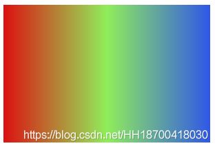
线性渐变 —— 从左到右渐变:
<!DOCTYPE html>
<html lang="en">
  <head>
    <meta charset="UTF-8">
    <title>css 渐变</title>
    <style>
      .content {
        width: 300px;
        height: 200px;
        background: pink; /* 针对不支持渐变的浏览器 */
        background: -webkit-linear-gradient(left, #DC1010, #90ED5A, #2F57E8);
        /*  Safari 5.1 到 6.0 */
        background: -o-linear-gradient(right, #DC1010, #90ED5A, #2F57E8);
        /*  Opera 11.6 到 12.0 */
        background: -moz-linear-gradient(right, #DC1010, #90ED5A, #2F57E8);
        /*  Fx 3.6 到 15 */
        background: linear-gradient(to right,#DC1010, #90ED5A, #2F57E8);
        /* 标准语法(必须是最后一个) */
      }
</style>
  </head>
  <body>
    <div class="content"></div>
  </body>
</html>
页面效果如下:
线性渐变 —— 对角线:
<!DOCTYPE html>
<html lang="en">
  <head>
    <meta charset="UTF-8">
    <title>css 渐变</title>
    <style>
      .content {
        width: 300px;
        height: 200px;
        background: pink; /* 针对不支持渐变的浏览器 */
        background: -webkit-linear-gradient(left top, #DC1010, #90ED5A, #2F57E8);
        /*  Safari 5.1 到 6.0 */
        background: -o-linear-gradient(bottom right, #DC1010, #90ED5A, #2F57E8);
        /*  Opera 11.6 到 12.0 */
        background: -moz-linear-gradient(bottom right, #DC1010, #90ED5A, #2F57E8);
        /*  Fx 3.6 到 15 */
        background: linear-gradient(to bottom right,#DC1010, #90ED5A, #2F57E8);
        /* 标准语法(必须是最后一个) */
      }
</style>
  </head>
  <body>
    <div class="content"></div>
  </body>
</html>
页面效果如下:

线性渐变 —— 自定义角度渐变:
<!DOCTYPE html>
<html lang="en">
  <head>
    <meta charset="UTF-8">
    <title>css 渐变</title>
    <style>
      .content {
        width: 300px;
        height: 200px;
        background: pink; /* 针对不支持渐变的浏览器 */
        background: -webkit-linear-gradient(180deg, #DC1010, #90ED5A, #2F57E8);
        /*  Safari 5.1 到 6.0 */
        background: -o-linear-gradient(180deg, #DC1010, #90ED5A, #2F57E8);
        /*  Opera 11.6 到 12.0 */
        background: -moz-linear-gradient(180deg, #DC1010, #90ED5A, #2F57E8);
        /*  Fx 3.6 到 15 */
        background: linear-gradient(180deg,#DC1010, #90ED5A, #2F57E8);
        /* 标准语法(必须是最后一个) */
      }
</style>
  </head>
  <body>
    <div class="content"></div>
  </body>
</html>
页面效果如下:

-90deg 度:
<!DOCTYPE html>
<html lang="en">
  <head>
    <meta charset="UTF-8">
    <title>css 渐变</title>
    <style>
      .content {
        width: 300px;
        height: 200px;
        background: pink; /* 针对不支持渐变的浏览器 */
        background: -webkit-linear-gradient(-90deg, #DC1010, #90ED5A, #2F57E8);
        /*  Safari 5.1 到 6.0 */
        background: -o-linear-gradient(-90deg, #DC1010, #90ED5A, #2F57E8);
        /*  Opera 11.6 到 12.0 */
        background: -moz-linear-gradient(-90deg, #DC1010, #90ED5A, #2F57E8);
        /*  Fx 3.6 到 15 */
        background: linear-gradient(-90deg,#DC1010, #90ED5A, #2F57E8);
        /* 标准语法(必须是最后一个) */
      }
</style>
  </head>
  <body>
    <div class="content"></div>
  </body>
</html>
页面效果如下:

75deg :
<!DOCTYPE html>
<html lang="en">
  <head>
    <meta charset="UTF-8">
    <title>css 渐变</title>
    <style>
      .content {
        width: 300px;
        height: 200px;
        background: pink; /* 针对不支持渐变的浏览器 */
        background: -webkit-linear-gradient(75deg, #DC1010, #90ED5A, #2F57E8);
        /*  Safari 5.1 到 6.0 */
        background: -o-linear-gradient(75deg, #DC1010, #90ED5A, #2F57E8);
        /*  Opera 11.6 到 12.0 */
        background: -moz-linear-gradient(75deg, #DC1010, #90ED5A, #2F57E8);
        /*  Fx 3.6 到 15 */
        background: linear-gradient(75deg,#DC1010, #90ED5A, #2F57E8);
        /* 标准语法(必须是最后一个) */
      }
</style>
  </head>
  <body>
    <div class="content"></div>
  </body>
</html>
页面效果如下:

145deg 度:
<!DOCTYPE html>
<html lang="en">
  <head>
    <meta charset="UTF-8">
    <title>css 渐变</title>
    <style>
      .content {
        width: 300px;
        height: 200px;
        background: pink; /* 针对不支持渐变的浏览器 */
        background: -webkit-linear-gradient(145deg, #DC1010, #90ED5A, #2F57E8);
        /*  Safari 5.1 到 6.0 */
        background: -o-linear-gradient(145deg, #DC1010, #90ED5A, #2F57E8);
        /*  Opera 11.6 到 12.0 */
        background: -moz-linear-gradient(145deg, #DC1010, #90ED5A, #2F57E8);
        /*  Fx 3.6 到 15 */
        background: linear-gradient(145deg,#DC1010, #90ED5A, #2F57E8);
        /* 标准语法(必须是最后一个) */
      }
</style>
  </head>
  <body>
    <div class="content"></div>
  </body>
</html>
页面效果如下:

线性渐变 —— 使用多个颜色结点
<!DOCTYPE html>
<html lang="en">
  <head>
    <meta charset="UTF-8">
    <title>css 渐变</title>
    <style>
      .content {
        width: 300px;
        height: 200px;
        background: pink; /* 针对不支持渐变的浏览器 */
        background: -webkit-linear-gradient( rgba(255,0,0,1),rgba(255,165,0,1),rgba(255,255,0,1),rgba(0, 255, 0,1),rgba(0, 127, 255,1),rgba(0, 0, 255 ,1),rgba(139, 0, 255 ,1));
        /*  Safari 5.1 到 6.0 */
        background: -o-linear-gradient( rgba(255,0,0,1),rgba(255,165,0,1),rgba(255,255,0,1),rgba(0, 255, 0,1),rgba(0, 127, 255,1),rgba(0, 0, 255 ,1),rgba(139, 0, 255 ,1));
        /*  Opera 11.6 到 12.0 */
        background: -moz-linear-gradient(rgba(255,0,0,1),rgba(255,165,0,1),rgba(255,255,0,1),rgba(0, 255, 0,1),rgba(0, 127, 255,1),rgba(0, 0, 255 ,1),rgba(139, 0, 255 ,1));
        /*  Fx 3.6 到 15 */
        background: linear-gradient(rgba(255,0,0,1),rgba(255,165,0,1),rgba(255,255,0,1),rgba(0, 255, 0,1),rgba(0, 127, 255,1),rgba(0, 0, 255 ,1),rgba(139, 0, 255 ,1));
        /* 标准语法(必须是最后一个) */
      }
</style>
  </head>
  <body>
    <div class="content"></div>
  </body>
</html>
页面效果如下:
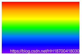
rgba 设置颜色时,同时也可以设置透明度。
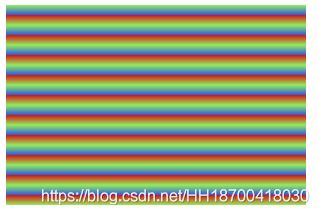
线性渐变 —— 重复线性渐变
<!DOCTYPE html>
<html lang="en">
  <head>
    <meta charset="UTF-8">
    <title>css 径向渐变</title>
    <style>
      .content {
        width: 300px;
        height: 200px;
        background: pink; /* 针对不支持渐变的浏览器 */
        background: -webkit-repeating-linear-gradient(#DC1010 5%, #90ED5A 10%, #2F57E8 15%);
        /*  Safari 5.1 到 6.0 */
        background: -o-repeating-linear-gradient(#DC1010 5%, #90ED5A 10%, #2F57E8 15%);
        /*  Opera 11.6 到 12.0 */
        background: -moz-repeating-linear-gradient(#DC1010 5%, #90ED5A 10%, #2F57E8 15%);
        /*  Fx 3.6 到 15 */
        background: repeating-linear-gradient(#DC1010 5%, #90ED5A 10%, #2F57E8 15%);
        /* 标准语法(必须是最后一个) */
      }
</style>
  </head>
  <body>
    <div class="content"></div>
  </body>
</html>
页面效果:
椭圆径向渐变:
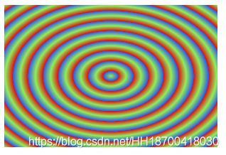
径向渐变 —— 颜色结点均匀分布
<!DOCTYPE html>
<html lang="en">
  <head>
    <meta charset="UTF-8">
    <title>css 径向渐变</title>
    <style>
      .content {
        width: 300px;
        height: 200px;
        background: pink; /* 针对不支持渐变的浏览器 */
        background: -webkit-radial-gradient(#DC1010, #90ED5A, #2F57E8);
        /*  Safari 5.1 到 6.0 */
        background: -o-radial-gradient(#DC1010, #90ED5A, #2F57E8);
        /*  Opera 11.6 到 12.0 */
        background: -moz-radial-gradient(#DC1010, #90ED5A, #2F57E8);
        /*  Fx 3.6 到 15 */
        background: radial-gradient(#DC1010, #90ED5A, #2F57E8);
        /* 标准语法(必须是最后一个) */
      }
</style>
  </head>
  <body>
    <div class="content"></div>
  </body>
</html>
页面效果:

径向渐变 - 颜色结点不均匀分布
<!DOCTYPE html>
<html lang="en">
  <head>
    <meta charset="UTF-8">
    <title>css 渐变</title>
    <style>
      .content {
        width: 300px;
        height: 200px;
        background: pink; /* 针对不支持渐变的浏览器 */
        background: -webkit-radial-gradient( #DC1010 5%, #90ED5A 30%, #2F57E8 60%);
        /*  Safari 5.1 到 6.0 */
        background: -o-radial-gradient( #DC1010 5%, #90ED5A 30%, #2F57E8 60%);
        /*  Opera 11.6 到 12.0 */
        background: -moz-radial-gradient( #DC1010 5%, #90ED5A 30%, #2F57E8 60%);
        /*  Fx 3.6 到 15 */
        background: radial-gradient( #DC1010 5%, #90ED5A 30%, #2F57E8 60%);
        /* 标准语法(必须是最后一个) */
      }
</style>
  </head>
  <body>
    <div class="content"></div>
  </body>
</html>
页面效果如下:

径向渐变 —— 设置形状:
shape 参数定义了形状。它可以是值 circle 或 ellipse。其中,circle 表示圆形,ellipse 表示椭圆形;默认值是 ellipse。
<!DOCTYPE html>
<html lang="en">
  <head>
    <meta charset="UTF-8">
    <title>css 径向渐变</title>
    <style>
      .content {
        width: 300px;
        height: 200px;
        background: pink; /* 针对不支持渐变的浏览器 */
        background: -webkit-radial-gradient(circle,#DC1010, #90ED5A, #2F57E8);
        /*  Safari 5.1 到 6.0 */
        background: -o-radial-gradient(circle,#DC1010, #90ED5A, #2F57E8);
        /*  Opera 11.6 到 12.0 */
        background: -moz-radial-gradient(circle,#DC1010, #90ED5A, #2F57E8);
        /*  Fx 3.6 到 15 */
        background: radial-gradient(circle,#DC1010, #90ED5A, #2F57E8);
        /* 标准语法(必须是最后一个) */
      }
</style>
  </head>
  <body>
    <div class="content"></div>
  </body>
</html>
页面效果:

径向渐变 —— 重复径向渐变
<!DOCTYPE html>
<html lang="en">
  <head>
    <meta charset="UTF-8">
    <title>css 径向渐变</title>
    <style>
      .content {
        width: 300px;
        height: 200px;
        background: pink; /* 针对不支持渐变的浏览器 */
        background: -webkit-repeating-radial-gradient(#DC1010 5%, #90ED5A 10%, #2F57E8 15%);
        /*  Safari 5.1 到 6.0 */
        background: -o-repeating-radial-gradient(#DC1010 5%, #90ED5A 10%, #2F57E8 15%);
        /*  Opera 11.6 到 12.0 */
        background: -moz-repeating-radial-gradient(#DC1010 5%, #90ED5A 10%, #2F57E8 15%);
        /*  Fx 3.6 到 15 */
        background: repeating-radial-gradient(#DC1010 5%, #90ED5A 10%, #2F57E8 15%);
        /* 标准语法(必须是最后一个) */
      }
</style>
  </head>
  <body>
    <div class="content"></div>
  </body>
</html>
页面效果:
径向渐变 —— 设置大小
size 参数定义了渐变的大小。它有以下四个值:closest-side, farthest-side, closest-corner, farthest-corner。
例子:
<!DOCTYPE html>
<html lang="en">
  <head>
    <meta charset="UTF-8">
    <title>css 径向渐变</title>
    <style>
      .content {
        width: 300px;
        height: 200px;
        background: pink; /* 针对不支持渐变的浏览器 */
        background: -webkit-radial-gradient(60% 55%, closest-side,#DC1010, #90ED5A, #2F57E8);
        /*  Safari 5.1 到 6.0 */
        background: -o-radial-gradient(60% 55%, closest-side,#DC1010, #90ED5A, #2F57E8);
        /*  Opera 11.6 到 12.0 */
        background: -moz-radial-gradient(60% 55%, closest-side,#DC1010, #90ED5A, #2F57E8);
        /*  Fx 3.6 到 15 */
        background: radial-gradient(60% 55%, closest-side,#DC1010, #90ED5A, #2F57E8);
        /* 标准语法(必须是最后一个) */
      }
</style>
  </head>
  <body>
    <div class="content"></div>
  </body>
</html>
页面效果:

<!DOCTYPE html>
<html lang="en">
  <head>
    <meta charset="UTF-8">
    <title>css 径向渐变</title>
    <style>
      .content {
        width: 300px;
        height: 200px;
        background: pink; /* 针对不支持渐变的浏览器 */
        background: -webkit-radial-gradient(60% 55%, farthest-corner,#DC1010, #90ED5A, #2F57E8);
        /*  Safari 5.1 到 6.0 */
        background: -o-radial-gradient(60% 55%, farthest-corner,#DC1010, #90ED5A, #2F57E8);
        /*  Opera 11.6 到 12.0 */
        background: -moz-radial-gradient(60% 55%, farthest-corner,#DC1010, #90ED5A, #2F57E8);
        /*  Fx 3.6 到 15 */
        background: radial-gradient(60% 55%, farthest-corner,#DC1010, #90ED5A, #2F57E8);
        /* 标准语法(必须是最后一个) */
      }
</style>
  </head>
  <body>
    <div class="content"></div>
  </body>
</html>
页面效果如下:

<!DOCTYPE html>
<html lang="en">
  <head>
    <meta charset="UTF-8">
    <title>css 径向渐变</title>
    <style>
      .content {
        width: 300px;
        height: 200px;
        background: pink; /* 针对不支持渐变的浏览器 */
        background: -webkit-radial-gradient(60% 55%, farthest-side,#DC1010, #90ED5A, #2F57E8);
        /*  Safari 5.1 到 6.0 */
        background: -o-radial-gradient(60% 55%, farthest-side,#DC1010, #90ED5A, #2F57E8);
        /*  Opera 11.6 到 12.0 */
        background: -moz-radial-gradient(60% 55%, farthest-side,#DC1010, #90ED5A, #2F57E8);
        /*  Fx 3.6 到 15 */
        background: radial-gradient(60% 55%, farthest-side,#DC1010, #90ED5A, #2F57E8);
        /* 标准语法(必须是最后一个) */
      }
</style>
  </head>
  <body>
    <div class="content"></div>
  </body>
</html>
页面效果如下:

<!DOCTYPE html>
<html lang="en">
  <head>
    <meta charset="UTF-8">
    <title>css 径向渐变</title>
    <style>
      .content {
        width: 300px;
        height: 200px;
        background: pink; /* 针对不支持渐变的浏览器 */
        background: -webkit-radial-gradient(60% 55%, closest-side,#DC1010, #90ED5A, #2F57E8);
        /*  Safari 5.1 到 6.0 */
        background: -o-radial-gradient(60% 55%, closest-side,#DC1010, #90ED5A, #2F57E8);
        /*  Opera 11.6 到 12.0 */
        background: -moz-radial-gradient(60% 55%, closest-side,#DC1010, #90ED5A, #2F57E8);
        /*  Fx 3.6 到 15 */
        background: radial-gradient(60% 55%, closest-side,#DC1010, #90ED5A, #2F57E8);
        /* 标准语法(必须是最后一个) */
      }
</style>
  </head>
  <body>
    <div class="content"></div>
  </body>
</html>
页面效果如下:

vue 项目中使用背景颜色渐变:
给 div 设置 style:
<div class="middle-container" :style="{background:mainBgColor}">
</div>
data 中声明 mainBgColor 变量:
  data () {
    return {
      mainBgColor: ''
    }
  },
触发方法时设置:
setMainBackgroundColor (col1,col2) {
   this.mainBgColor = `linear-gradient(${col1},${col2})`
}