这图怎么画| 相关性热图+柱状图
写在前面
【这图怎么画】系列的图都来自VIP群里同学的提问。推文只是对图片的复现,不代表作者对图片展现形式的认同。欢迎同学们在群里分析有意思的图片。
本期图片

❝Title:Nitrogen stabilizers mitigate nitrous oxide emissions across maize production areas of China: A multi-agroecosystems evaluation
期刊:European Journal of Agronomy
Doi:https://doi.org/10.1016/j.eja.2022.126692
❞
读图
 fig
fig
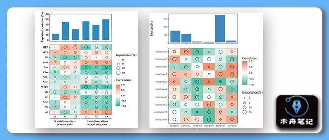
热图展示的是相关分析和随机森林回归模型的结果。圆圈大小代表变量重要性( variable importance),颜色代表 Pearson’s correlation coefficients。图难度较小,只需注意一些小细节即可。
复现结果
 result
示例数据和代码领取
点赞、在看 本文,分享至朋友圈集赞25个并保留30分钟,截图发至微信mzbj0002领取。
「木舟笔记2022年度VIP可免费领取」。
木舟笔记2022年度VIP企划
「权益:」
「2022」年度木舟笔记所有推文示例数据及代码(「在VIP群里实时更新」)。
 资源合集
资源合集 木舟笔记「科研交流群」。
「半价」购买
跟着Cell学作图系列合集(免费教程+代码领取)|跟着Cell学作图系列合集。
「收费:」
「99¥/人」。可添加微信:mzbj0002 转账,或直接在文末打赏。

绘图
# data pre
df_cor <- matrix(runif(60,-1,1),
nrow=10,
ncol=6,
dimnames=list( paste0('indictator',1:10),
paste0('sample',1:6)))
df_cor <- data.frame(df_cor)
head(df_cor)
df_cor$indicator <- row.names(df_cor)
library(tidyr)
df_cor_long <- gather(df_cor, sample, value,-indicator)
head(df_cor_long)
df_imp <- matrix(runif(60,0,15),
nrow=10,
ncol=6,
dimnames=list( paste0('indictator',1:10),
paste0('sample',1:6)))
df_imp <- data.frame(df_imp)
head(df_imp)
df_imp$indicator <- row.names(df_imp)
library(tidyr)
df_imp_long <- gather(df_imp, sample, value,-indicator)
head(df_imp_long)
df_var <- data.frame(sample = paste0('sample',1:6),
var =round( runif(6,0,100),0) )
head(df_var)
# plot heatmap
library(ggplot2)
p1 <- ggplot()+
geom_tile(data = df_cor_long,
mapping = aes(sample,indicator,fill = value))+
scale_fill_gradient2(name = 'Correlation',
limit = c(-1.001,1.001),
breaks = c(-1.0,-0.5,0.0,0.5,1.0),
low = '#2ab49b',
mid = 'white',
high = '#ea7f58')+
geom_point(data = df_imp_long,
mapping = aes(sample,indicator,size = value),
shape = 1,
stroke = 0.6,
color = 'black')+
scale_size_continuous(name = 'Importance(%)',
limit = c(-0.001,15.1),
breaks = c(0,5,10,15))+
scale_y_discrete(expand = c(0,0))+
scale_x_discrete(expand = c(0,0))+
theme_bw()+
xlab(NULL) +
ylab(NULL)+
theme(panel.border = element_rect(fill=NA,color="black", size=0.5, linetype="solid"))
p1
# plot barplot
p2 <- ggplot(df_var,aes(sample,var))+
geom_bar(stat = 'identity',
fill = '#2d89bf')+
xlab(NULL) +
ylab('Exp var(%)')+
theme_bw()+
theme(panel.grid.major=element_blank(),
panel.grid.minor=element_blank(),
axis.text.x = element_blank())
p2
# patch
library(patchwork)
p2/p1+plot_layout(ncol = 1,
heights = c(0.8, 2))
ggsave('heatmap.pdf',width = 6,height = 6)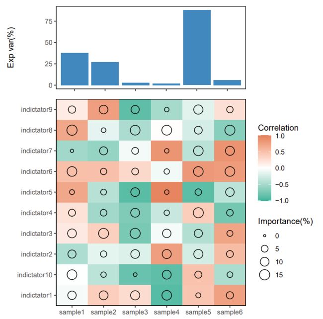 result
往期内容
CNS图表复现|生信分析|R绘图 资源分享&讨论群!
这图怎么画| 有点复杂的散点图
这图怎么画 | 相关分析棒棒糖图
组学生信| Front Immunol |基于血清蛋白质组早期诊断标志筛选的简单套路
(免费教程+代码领取)|跟着Cell学作图系列合集
Q&A | 如何在论文中画出漂亮的插图?
跟着 Cell 学作图 | 桑葚图(ggalluvial)
R实战 | Lasso回归模型建立及变量筛选
跟着 NC 学作图 | 互作网络图进阶(蛋白+富集通路)(Cytoscape)
R实战 | 给聚类加个圈圈(ggunchull)
R实战 | NGS数据时间序列分析(maSigPro)
跟着 Cell 学作图 | 韦恩图(ggVennDiagram)
 木舟笔记矩阵