matplotlib:子图的绘制及坐标轴共享
目录
章节概括
绘制固定区域的子图和自定义区域的子图
共享子图的坐标轴
折线图、圆环图案例
条形图案例
直方图和饼图案例
堆积柱形图、折线图案例
直方图、折线图、堆积图案例
章节编程题
章节概括
绘制固定区域的子图和自定义区域的子图
- 固定区域的子图
-
## 绘制固定区域的子图
import matplotlib.pyplot as plt

# 绘制单子图
plt.subplot(2, 3, 6) # subplot( 行,列,索引号) # 逗号可省略
plt.xlim(0,100)
plt.ylim(0,100)
plt.plot([1,2,3],[1,2,3])
plt.subplot(1, 3, 1)
plt.plot([1,2,3],[1,2,3])
plt.xlim(-5,5)
plt.ylim(-5,5)
# plt.subplot(3, 1, 1) # 有重叠会把之前的图形覆盖 ( 相当于之前画的那个部分不存在)

# fig = plt.figure()
# add_subplot() == subplot()
# set_xticks() == xticks()
# ax = fig.add_subplot()

# 绘制多子图
# subplots(行, 列, #一次性画多个子图
#             sharex=False,
#             sharey=False # 是否共享子图的x轴和y轴
#            )

fig, axeses =  plt.subplots(2, 3) # 直接画出2行3列的所有6幅图形
axeses[1, 1].plot([1,2,3],[1,2,3]) #指定 第二行第二列的图形绘制(下标决定)
axeses[1, 1].set_xlim(0,10) # set_ + 参数,修改某幅子图的参数
plt.show()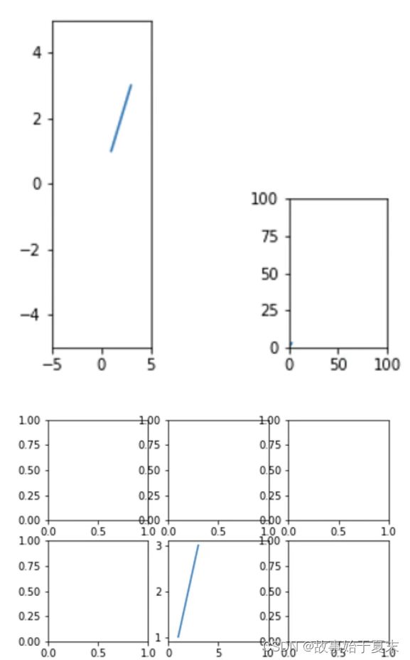
-
- 绘制自定义区域的子图
-
# 绘制自定义区域的子图
import matplotlib.pyplot as plt
# axes = plt.subplot(424)
# plt.subplot(427)
# plt.subplot(221)
# fig, axes = plt.subplots(2,2)

# subplot2grid()
plt.subplot2grid((3,3), (0,2)) # plt.subplot(333)
plt.subplot2grid((3,3), # shape (nrows,ncols) 规划画布区域
                 (1,0), # loc (row, loc)绘图区域的位置,行数从0行列数从0列开始
                 rowspan=2, # rowspan从绘图位置开始,往下延伸的行数,默认为1
                 colspan=2, # colspan 从绘图位置开始,往右延伸的列数,默认为1
                 fig=None # 表示放置子图的画布,默认为当前画布
                ) # subplot 切不出来
plt.show()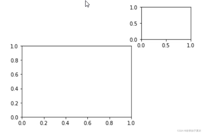
-
共享子图的坐标轴
- 共享相邻子图的坐标轴
-
import matplotlib.pyplot as plt
import numpy as np

# 使用subplots() 参数
# sharex、sharey默认False,可取值True, 'all', 'row', 'col'
# plt.subplots(3, 3,sharex='all', sharey='row')
# fig1, ax1 = plt.subplots(2, 2, sharex='all')  # all 或 True 表示所有子图之间共享x轴或者y轴
# fig2, ax2 = plt.subplots(2, 2, sharex='row')  # row 表示每一行的子图之间共享x轴或y轴
# fig3, ax3 = plt.subplots(2, 2, sharex='col')  # col 表示每一列的子图之间共享x轴或y轴
# fig4, ax4 = plt.subplots(2, 2, sharex='none') # none 或 False 表示所有子图之间不共享x轴或者y轴

# 共享相邻子图的坐标轴
fig, ax = plt.subplots(2, 2, # 2行2列
                       sharex='col' # 共享每一列x轴
                      )
x1 = np.linspace(0, 2*np.pi, 256)
x2 = np.linspace(0.1, 10, 256)
x3 = np.random.rand(10)
x4 = np.arange(0, 6, 0.5)

y1 = np.cos(x1)
y2 = np.sin(x2)
y3 = np.linspace(0,5, 10)
y4 = np.power(x4,2)

ax[0,0].plot(x1, y1) # ax[0,0] 第一行第一列
ax[0,1].plot(x2, y2)
ax[1,0].scatter(x3, y3)
ax[1,1].scatter(x4, y4) # ax[1,1] 第二行第二列

plt.show()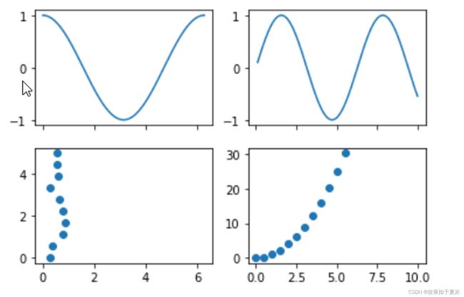
-
- 共享非相邻子图的坐标轴
-
ax1 = plt.subplot(333)
ax1.plot([10, 20, 30],[1, 2, 3])
ax3 = plt.subplot(337)
ax3.plot([1, 2, 3],[10, 20, 30])
ax2 = plt.subplot(335, # 索引为5的图形
                  sharex=ax1, # 共享ax1的x轴
                  sharey=ax3 # 共享ax3的y轴
                 )
ax2.plot([5, 6, 7],[12, 14, 16])

plt.show()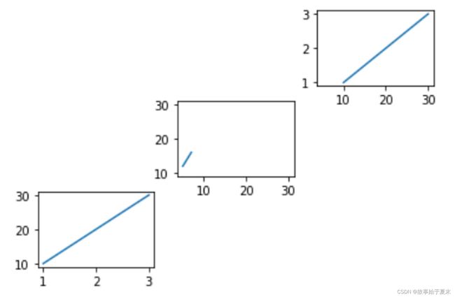
-
- 共享同一子图的坐标轴
-
# twinx() 和 twiny()
ax_left = plt.subplot(111)
ax_right = ax_left.twinx()
ax_left.plot([10, 20, 30],[1, 2, 3])
ax_right.plot([1, 2, 3],[10, 20, 30])# 根据参数共享坐标轴的范围
plt.show()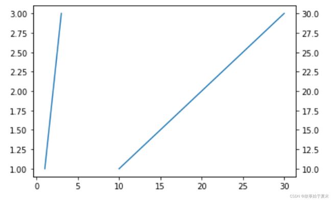
-
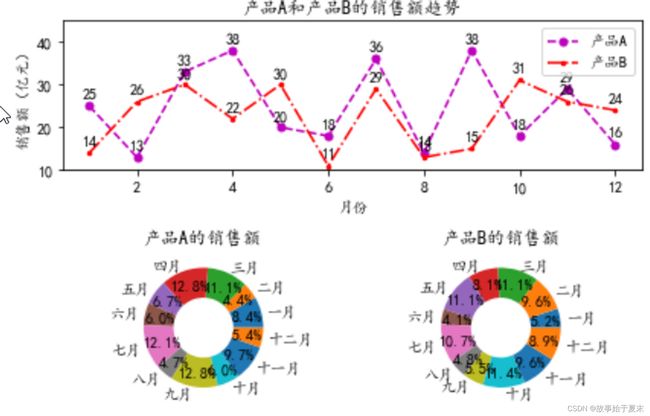
折线图、圆环图案例
-
import matplotlib.pyplot as plt
import numpy as np

plt.rcParams['font.sans-serif'] = ['KaiTi']
plt.rcParams['axes.unicode_minus'] = False

x = np.arange(1,13)
y1 = np.random.randint(10,40,12)
y2 = np.random.randint(10,38,12)

labels = ['一月', '二月', '三月', '四月', '五月','六月',
          '七月', '八月', '九月', '十月', '十一月', '十二月']
ax = plt.subplot(211)
ax.plot(x, y1, # x,y轴数据
        'm--o',# fmt,在数据的后面,可任意更换位置,标记、颜色、线型
        label='产品A',# 标签
        ms=5 # 表示标记的大小
       )
ax.plot(x, y2, 'r.-.',label="产品B", ms=5)
ax.set_title("产品A和产品B的销售额趋势")
ax.set_ylim(10,45)
ax.set_ylabel("销售额(亿元)")
ax.set_xlabel("月份")
ax.legend()# 显示标签的图例

# 指向注释文本zip # 方法一
for xy1 in zip(x, y1):
    ax.annotate('%s' % xy1[1],# 注释文本内容
                xy=xy1,# 迭代出的坐标(1, 18)、(2, 12)......
                xytext=(-5,5), # 自定义坐标系
                textcoords='offset points'# "偏移点" 相对于xy值的偏移(以点为单位),加上这个条件才能显示数据在点上
               )
for xy2 in zip(x, y2):
    ax.annotate('%s' % xy2[1], xy=xy2, xytext=(-5,5), textcoords='offset points')

# 无指向注释文本zip # 方法二
# for xy1 in zip(x,y1):
#     plt.text(xy1[0],xy1[1],xy1[1],va='bottom',ha='left')
# for xy2 in zip(x,y2):
#     plt.text(xy2[0],xy2[1],xy2[1],va='bottom',ha='right')

# 子图2*2 索引3
ax1 = plt.subplot(223)
ax1.set_title('产品A的销售额')
ax1.pie(y1,# 圆环图数据
        radius=1,# 外圆半径
        wedgeprops={'width':0.5},# 楔形宽度
        labels=labels,# 标签
        autopct='%3.1f%%',# 转换百分数
        pctdistance=0.75 # 扇形数值距离圆心的距离
       )
# 子图2*2 索引4
ax1 = plt.subplot(224)
ax1.set_title('产品B的销售额')
ax1.pie(y2, radius=1, wedgeprops={'width':0.5},labels=labels,autopct='%3.1f%%',pctdistance=0.75)

plt.tight_layout()# 调整布局
plt.show()
条形图案例
-
import numpy as np
import matplotlib.pyplot as plt

plt.rcParams['font.sans-serif'] = ['KaiTi']
plt.rcParams['axes.unicode_minus'] = False

y = np.arange(12)

x1 = np.random.randint(5,40,12)
x2 = np.random.randint(10,60,12)

labels = ['中国', '加拿大', '巴西', '澳大利亚', '日本', '墨西哥',
          '俄罗斯', '韩国', '瑞士', '土耳其', '英国', '美国']

# 编写方法以便注释文本
def auto(ax,rects):
    for rect in rects:
        width = rect.get_width() # 获取矩形条的宽度
        ax.text(width+3, # x 轴坐标
                rect.get_y(), # y 轴坐标
                s = '{}'.format(width),# 注释文本
                va = 'bottom', # 反着来放,例如ha="right",va="top",就是左下的位置
                ha = 'center'
                )

# 第一幅子图
ax1 = plt.subplot(121)

ax1.set_title("部分国家养猫人群的比例")
ax1.set_xlabel("人群比例(%)")
ax1.set_xlim(0, x1.max()+10)
barh1 = ax1.barh(y, x1,tick_label=labels, color='r', height=0.5)
auto(ax1,barh1)
# 第二幅子图
ax2 = plt.subplot(122)

ax2.set_title("部分国家养狗人群的比例")
ax2.set_xlabel("人群比例(%)")
ax2.set_xlim(0, x2.max()+10)
barh2 = ax2.barh(y, x1,tick_label=labels, color='b')
auto(ax2,barh2)

plt.tight_layout() # 调整布局

plt.show()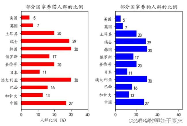
直方图和饼图案例
-
# 实例三
import numpy as np
import pandas as pd
import matplotlib.pyplot as plt

plt.rcParams['font.sans-serif'] = ['KaiTi']
plt.rcParams['axes.unicode_minus'] = False

data = pd.read_excel("./5.2.2.xlsx")
data_2017 = np.array(data['2017年用户比例(%)'])
data_2018 = np.array(data['2018年用户比例(%)'])

x = np.arange(5)
y = np.array(data['人群增长倍数'])
labels = np.array(data['Unnamed: 0'])

# 第一个子图
ax1 = plt.subplot2grid((3,2), (0,0), rowspan=2, colspan=2)
ax1.bar(x, y, tick_label=labels, color='r', width=0.5)
# 用zip方法 写无指向型注释文本
for xy in zip(x,y):
    ax1.text(xy[0],xy[1]+3,xy[1], va='bottom', ha='center')
ax1.set_title('抖音2018VS2017人群增长倍数')
ax1.set_ylabel('增长倍数')
ax1.set_ylim(0,y.max()+20)

# 添加参考线
ax1.axhline(75,# 参考线位置
           ls='--',# 线条类型
           linewidth=1.6,# 线条宽度
          )
# 第二个字图
ax2 = plt.subplot2grid((3,2), (2,0)) # 3*2矩阵,第3行第1列
ax2.pie(data_2017, radius=1.5, labels=labels, autopct='%3.1f%%',colors=['r','b','y','c'])
ax2.set_title('2017年抖音用户地区分布的比例')
# 第三个字图
ax3 = plt.subplot2grid((3,2), (2,1))
ax3.pie(data_2017, # 饼图数据
        radius=1.5, # 圆半径
        labels=labels, # 标签
        autopct='%3.1f%%', # 百分数转换
        colors=['r','b','y','c'] # 颜色
       )
ax3.set_title('2018年抖音用户地区分布的比例')

# 调整子图之间的距离
plt.tight_layout()
plt.show()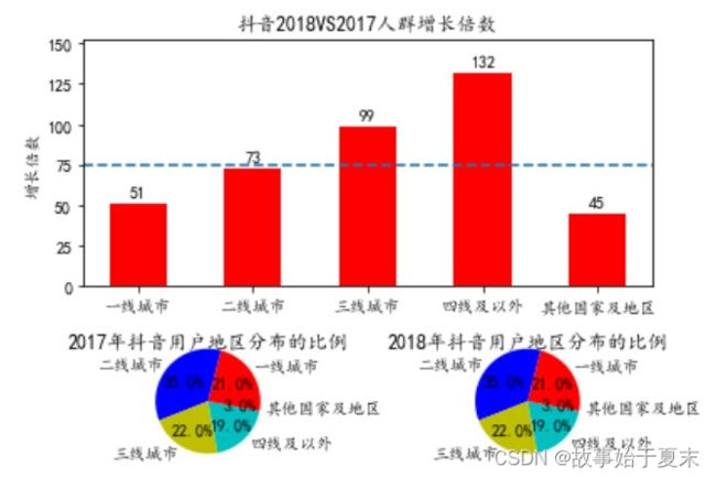
- 注释文本的方法拓展
-
x = np.arange(5)
y = np.array(data['人群增长倍数'])
labels = np.array(data['Unnamed: 0'])
bar_width = 0.5
def auto(rects):
    for rect in rects:
        height = rect.get_height()
        plt.text(rect.get_x() + bar_width / 2,
                 height+3,
                 s='{}'.format(height),
                 va='bottom',ha='center'
                )
ax1 = plt.subplot2grid((3,2), (0,0), rowspan=2, colspan=2)
ax1.set_title('抖音2018VS2017人群增长倍数')
ax1.set_ylabel('增长倍数')
ax1.set_ylim(0,y.max()+20)

# 添加参考线
ax1.axhline(75,# 参考线位置
           ls='--',# 线条类型
           linewidth=1.6,# 线条宽度
          )
a = ax1.bar(x, y,  width=bar_width, tick_label=labels, color='r')
auto(a)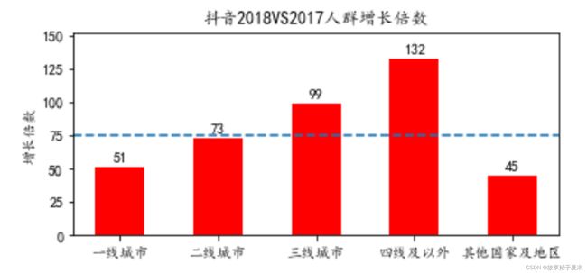
-
堆积柱形图、折线图案例
-
import numpy as np
import matplotlib.pyplot as plt

plt.rcParams['font.sans-serif'] = ['KaiTi']
plt.rcParams['axes.unicode_minus'] = False

month_x = np.arange(1, 13)

# 平均气温
data_avg = np.array([2.0, 2.2, 3.3, 4.5, 6.3, 10.2,
                     20.3, 33.4, 23.0, 16.5, 12.0, 6.2])
# 降水量
data_dw = np.array([2.0, 5.9, 9.0, 26.4, 28.7, 70.7,
                    175.6, 182.2, 48.7, 18.8, 6.0, 2.3])
# 蒸发量
data_up = np.array([2.0, 4.9, 7.0, 23.2, 25.6, 76.7,
                    135.6, 162.2, 32.6, 20.0, 6.4, 3.3])

label = ['1月', '2月', '3月', '4月', '5月', '6月',
         '7月', '8月', '9月', '10月', '11月', '12月']

ax = plt.subplot()
data1 = ax.bar(month_x, data_up, tick_label=label, color='r')
data2 = ax.bar(month_x, data_dw, tick_label=label, color='c',
               bottom=data_up # 堆积图
              )
ax_right = ax.twinx()
data3 = ax_right.plot(month_x, data_avg, 'o--r') # 同一子图共享坐标轴
ax.set_ylabel('水量(ml)')
ax_right.set_ylabel('气温($\circ$C)')
ax.set_title('平均气温与降水量、蒸发量的关系')

# 添加图例
plt.legend([data1, data2, data3[0]],['蒸发量', '降水量', '平均气温'])
plt.show()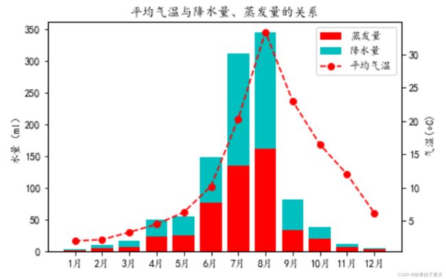
直方图、折线图、堆积图案例
-
import numpy as np
import matplotlib.pyplot as plt
import matplotlib.gridspec as gridspec

fig = plt.figure()
plt.rcParams['font.sans-serif'] = ['KaiTi']
plt.rcParams['axes.unicode_minus'] = False

x = np.arange(1,7)
y_sales = np.random.randint(1000,2200,6)
y_sale_counts = np.random.randint(38000,85000,6)
label1 = ['1月', '2月', '3月', '4月', '5月', '6月']
label2 = ['北京', '上海', '广州', '深圳', '浙江', '山东']

spec = gridspec.GridSpec(2, 2, fig)
# 第一幅子图
ax1 = fig.add_subplot(spec[0,:])
ax1.set_title('2018年上半年某品牌汽车的销售额')
ax1.bar(x, y_sales, tick_label=label1, color='r')
ax1.set_ylabel('销售额(亿元)')
ax1.set_ylim(0,2500)
# 第二幅子图
ax2 = fig.add_subplot(spec[1,0])
ax2.set_title('分公司某品牌汽车的销量')
ax2.plot(label2, y_sale_counts, 'o--r')
ax2.set_ylabel('销量(辆)')
# 第三幅子图
ax3 = fig.add_subplot(spec[1,1])
ax3.set_title("分公司某品牌汽车的销量")
ax3.stackplot(label2, y_sale_counts, color='r')
ax3.set_ylabel('销量(辆)')
plt.tight_layout() # 调整布局
plt.show()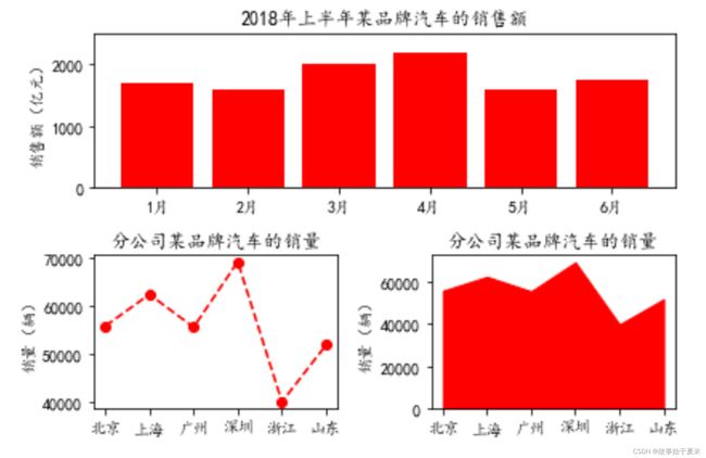
章节编程题
- 子图共享相邻坐标轴
-
import numpy as np
import matplotlib.pyplot as plt

plt.rcParams['font.sans-serif'] = ['KaiTi']
plt.rcParams['axes.unicode_minus'] = False

x = np.linspace(-np.pi, np.pi, 256, endpoint=True)
y1 = np.sin(x)
y2 = np.cos(x)

fig, ax = plt.subplots(2,3,sharex='col')

ax1 = ax[0,2]
ax1.plot(x, y1)
ax1.set_xticks([-np.pi, -np.pi/2, 0, np.pi/2, np.pi]) # 设置刻度线位置
ax1.set_xticklabels([r'$-\pi$', r'$-\pi/2$', r'$0$', r'$-\pi/2$', r'$-\pi$']) # 设置刻度标签
ax1.set_title("正弦曲线")

ax2 = ax[1,2]
ax2.plot(x, y2,color='r')
ax2.set_title("余弦曲线")
plt.tight_layout()
plt.show()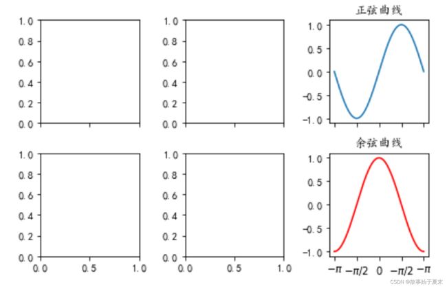
-
- 自定义布局
-
# 方法一
import matplotlib.pyplot as plt
import matplotlib.gridspec as gridspec

fig = plt.figure()
spec = gridspec.GridSpec(3,4,fig)

ax1 = fig.add_subplot(spec[0,:])
ax2 = fig.add_subplot(spec[1,:2])
ax3 = fig.add_subplot(spec[1,2:])
ax4 = fig.add_subplot(spec[2,0])
ax5 = fig.add_subplot(spec[2,1:])
plt.tight_layout()
plt.show()
# 方法二 import matplotlib.pyplot as plt ax1 = plt.subplot2grid((3,4),(0,0),colspan=4) ax2 = plt.subplot2grid((3,4),(1,0),colspan=2) ax3 = plt.subplot2grid((3,4),(1,2),colspan=2) ax4 = plt.subplot2grid((3,4),(2,0)) ax5 = plt.subplot2grid((3,4),(2,1),colspan=3) plt.tight_layout() # 调整布局 plt.show()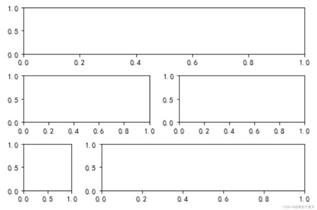
-