vue3 + vite项目使用SVG图标
我们在开发一个项目时常会用到一些图标,有些图标在有限的图标库中却是没有,因此少数的图标需要我们去网上查找,或是自定义一些专用的图标。一般很少有图标库满足现实的项目开发,这时将推荐使用 iconify 这个图标库,几乎包含我们常见全部的图标,使用也非常简单。废话不多说咱们开始真刀实战。
引入vite插件
- unplugin-icons
- unplugin-vue-components
- vite-plugin-svg-icons
- @iconify/json
- @iconify/vue
# npm

npm i -D @iconify/json @iconify/vue unplugin-icons vite-plugin-svg-icons unplugin-vue-components

#yarn

yarn add -D @iconify/json @iconify/vue unplugin-icons vite-plugin-svg-icons unplugin-vue-components

#pnpm

pnpm add -D @iconify/json @iconify/vue unplugin-icons vite-plugin-svg-icons unplugin-vue-components
使用方式
第一种:unplugin-icons
配置vite插件:
 // 配置图标- unplugin-icons
Icons({
    compiler: "vue3",
    customCollections: {
       ["local"]: FileSystemIconLoader(LOCAL_PATH, (svg: string) =>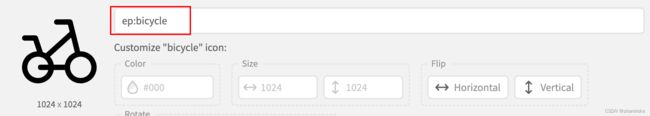
svg.replace(/^- 使用iconify图标作为载体显示:
效果:
图标解释:
icon 为我们自定义的前缀
ep-bicycle 为图标的名字,可以去iconify查询,将冒号 :更换横杠 - 。
2. 使用本地svg图标作为载体显示
下载svg图标文件,放在项目的 src/assets/icons/svg 目录下

效果:
图标的样式部分可自行调整,演示的样式是我自定义的
图标解释:
icon-local-acrobat
icon 为我们自定义的前缀
local 为我们自定义的集合容器名,在配置vite时指定的
acrobat 为图标文件的名字
第二种:vite-plugin-svg-icons
配置vite插件
// 配置图标- vite-plugin-svg-icons
createSvgIconsPlugin({
    // 指定需要缓存的图标文件夹
    iconDirs: [LOCAL_PATH],
    // 指定symbolId格式
    symbolId: `icon-[dir]-[name]`,
    inject: "body-last",
    customDomId: "__SVG_ICON_LOCAL__",
})
在main.ts中引入样式
import "virtual:svg-icons-register";自定义SvgIcon组件方便图标的使用,这里我使用的是jsx的形式定义的组件,用vue定义的组件可以自行参照下面的形式写即可。
import type {CSSProperties, PropType} from "vue";
import {computed, defineComponent} from "vue";
import {Icon} from "@iconify/vue";
// horizontal: 水平翻转 ,vertical:垂直翻转
type FlipType = "horizontal" | "vertical";
// 数字代表旋转角度 0° 90° 180° 270°
type RotateType = 0 | 1 | 2 | 3;
/**
* SvgIcon 组件
* @date 2023/9/26
*/
export default defineComponent({
name: "SvgIcon",
props: {
// 图标名字
icon: {
type: String,
required: true,
default: "",
},
// 是否为本地 svg 图标
isLocal: {
type: Boolean,
default: false,
},
// 图标大小
size: {
type: [Number, String],
default: 14,
},
// 旋转角度
rotate: {
type: Number as PropType,
default: 0,
},
// 图标翻转(水平翻转、垂直翻转)
flip: String as PropType,
// 图标旋转动画效果
spin: {
type: Boolean,
default: false,
},
// 单独图标样式
iconStyle: Object as PropType,
// 图标颜色
color: String,
// 点击图标触发事件
onClick: Function as PropType<(e: MouseEvent) => void>,
},
setup(props, {attrs}) {
const bindAttrs = computed<{ class: string; style: string }>(() => ({
class: (attrs.class as string) || "",
style: (attrs.style as string) || "",
}));
const symbolId = () => `#icon-${props.icon}`;
const rotate = [0, 90, 180, 270];
const localIconStyle = {
width: "1em",
height: "1em",
lineHeight: "1em",
fontSize: `${`${props.size}`.replace("px", "")}px`,
animation: props.spin ? "circle 3s infinite linear" : "",
transform: (() => {
const scale = props.flip
? props.flip == "vertical"
? "scaleY(-1)"
: props.flip == "horizontal"
? "scaleX(-1)"
: ""
: "";
return `rotate(${rotate[props.rotate]}deg) ${scale}`;
})(),
};
const iconStyles = {outline: "none", animation: props.spin ? "circle 3s infinite linear" : ""};
return () => (
{
props.onClick?.(e);
}}
class={["inline-block", bindAttrs.value.class, props.onClick ? "cursor-pointer" : ""]}
style={bindAttrs.value.style}
>
{props.isLocal ? (
) : (
使用iconify图标
使用本地图标
区别是使用本地svg图标时需要 isLocal 设置为true,其他的属性可自行摸索,在组件中也有相应的代码注释
完整代码
vite配置:
import {fileURLToPath, URL} from 'node:url'

import {defineConfig} from 'vite'
import path from "path";
import vue from '@vitejs/plugin-vue'
import vueJsx from '@vitejs/plugin-vue-jsx'
import Icons from "unplugin-icons/vite";
import {FileSystemIconLoader} from "unplugin-icons/loaders";
import {createSvgIconsPlugin} from "vite-plugin-svg-icons";
import Components from "unplugin-vue-components/vite";
import IconsResolver from 'unplugin-icons/resolver';

/**
 * 获取项目根路径
 * @descrition 末尾不带斜杠
 */
export function getRootPath() {
    return path.resolve(process.cwd());
}

/**
 * 获取项目src路径
 * @param srcName - src目录名称(默认: "src")
 * @descrition 末尾不带斜杠
 */
export function getSrcPath(srcName = "src") {
    const rootPath = getRootPath();
    return `${rootPath}/${srcName}`;
}

const LOCAL_PATH = `${getSrcPath()}/assets/icons/svg`
const COLLECTION_NAME = "local"

// https://vitejs.dev/config/
export default defineConfig({
    plugins: [
        vue(),
        vueJsx(),
        // 配置unplugin-vue-components
        Components({
            resolvers: [
                IconsResolver({
                    prefix: "icon",
                    customCollections: COLLECTION_NAME,
                }),
            ],
        }),
        // 配置图标- unplugin-icons
        Icons({
            compiler: "vue3",
            customCollections: {
                [COLLECTION_NAME]: FileSystemIconLoader(LOCAL_PATH, (svg: string) =>
                    svg.replace(/^
SvgIcon组件:
import type {CSSProperties, PropType} from "vue";
import {computed, defineComponent} from "vue";
import {Icon} from "@iconify/vue";
// horizontal: 水平翻转 ,vertical:垂直翻转
type FlipType = "horizontal" | "vertical";
// 数字代表旋转角度 0° 90° 180° 270°
type RotateType = 0 | 1 | 2 | 3;
/**
* SvgIcon 组件
* @date 2023/9/26
*/
export default defineComponent({
name: "SvgIcon",
props: {
// 图标名字
icon: {
type: String,
required: true,
default: "",
},
// 是否为本地 svg 图标
isLocal: {
type: Boolean,
default: false,
},
// 图标大小
size: {
type: [Number, String],
default: 14,
},
// 旋转角度
rotate: {
type: Number as PropType,
default: 0,
},
// 图标翻转(水平翻转、垂直翻转)
flip: String as PropType,
// 图标旋转动画效果
spin: {
type: Boolean,
default: false,
},
// 单独图标样式
iconStyle: Object as PropType,
// 图标颜色
color: {
type: String,
default: "#000",
},
// 点击图标触发事件
onClick: Function as PropType<(e: MouseEvent) => void>,
},
setup(props, {attrs}) {
const bindAttrs = computed<{ class: string; style: string }>(() => ({
class: (attrs.class as string) || "",
style: (attrs.style as string) || "",
}));
const symbolId = () => `#icon-${props.icon}`;
const rotate = [0, 90, 180, 270];
const localIconStyle = {
width: "1em",
height: "1em",
lineHeight: "1em",
fontSize: `${`${props.size}`.replace("px", "")}px`,
animation: props.spin ? "circle 3s infinite linear" : "",
transform: (() => {
const scale = props.flip
? props.flip == "vertical"
? "scaleY(-1)"
: props.flip == "horizontal"
? "scaleX(-1)"
: ""
: "";
return `rotate(${rotate[props.rotate]}deg) ${scale}`;
})(),
};
const iconStyles = {outline: "none", animation: props.spin ? "circle 3s infinite linear" : ""};
return () => (
{
props.onClick?.(e);
}}
class={["inline-block", bindAttrs.value.class, props.onClick ? "cursor-pointer" : ""]}
style={bindAttrs.value.style}
>
{props.isLocal ? (
) : (
main.ts 引入
import "virtual:svg-icons-register";使用: