antv/g6 节点、及自定义节点
节点
AntV G6 中内置节点支持的通用属性通常包括以下几个:
-
id:节点的唯一标识符。
-
x 和 y:节点的位置坐标。
-
label:节点的标签文本。
-
style:节点的样式,用于设置节点的外观,可以包括填充颜色、边框颜色、线宽等。
-
size:节点的大小。
-
type:节点的形状,表示节点的外观,可以是圆形、矩形等。
-
anchorPoints:指定边连入节点的连接点的位置(相对于该节点而言)。
-
labelCfg:用于定义标签文本的样式和位置,可以包括字体大小、颜色、位置偏移等。
样式属性:
AntV G6 中的节点样式属性(style)用于定义节点的外观,包括填充颜色、边框颜色、线宽等。以下是一些常见的节点样式属性:
-
fill:填充颜色,用于定义节点的背景颜色。
-
stroke:边框颜色,用于定义节点的边框颜色。
-
lineWidth:线宽,用于定义节点的边框宽度。
-
opacity:不透明度,用于定义节点的透明度,取值范围在 0 到 1 之间。
-
radius:节点的半径,仅适用于圆形节点。
-
width 和 height:节点的宽度和高度,仅适用于矩形节点。
-
symbol:节点的图标形状,可以是图标的名称或路径。
-
size:节点的大小,表示节点的半径或宽度/高度,具体取决于节点的形状。
-
endArrow:定义边的末端箭头样式,可以设置箭头的形状和颜色。
-
startArrow:定义边的起始箭头样式,同样可以设置箭头的形状和颜色。
-
lineDash:定义边框的虚线样式,可以创建虚线边框。
这些节点样式属性允许你自定义节点的外观,以满足你的可视化需求。你可以根据节点的形状和具体的设计来设置这些属性。在节点数据中,你可以通过在 style 对象中定义这些属性来自定义节点的样式。例如:
const data = {
  nodes: [
    {
      id: 'node1',
      x: 100,
      y: 100,
      size: 20,
      label: 'Node 1',
      labelCfg: {
        style: {
          fontSize: 12,
        },
        position: 'bottom',
        offset: 1,
      },
      style: {
        fill: '#5B8FF9', // 填充颜色
        stroke: '#5B8FF9', // 边框颜色
        lineWidth: 2, // 线宽
        opacity: 0.8, // 不透明度
        size: 40, // 节点大小
        endArrow: {
          path: 'M 0,0 L 10,5 L 10,-5 Z', // 箭头形状
          fill: '#999', // 箭头颜色
        },
      },
    },
  ],
};
内置节点
G6 提供了一些内置的节点类型,这些节点类型具有不同的形状和样式。以下是一些常见的内置节点类型:
- circle:圆形节点。
const graph = new G6.Graph({
  container: 'mountNode',
  width: 800,
  height: 600,
  defaultNode: {
    type: 'circle', // 节点类型
    // ... 其他配置
  },
});
- rect:矩形节点。
const graph = new G6.Graph({
  container: 'mountNode',
  width: 800,
  height: 600,
  defaultNode: {
    type: 'rect',
    // 其他配置
  },
});
- ellipse:椭圆形节点。
const graph = new G6.Graph({
  container: 'mountNode',
  width: 800,
  height: 600,
  defaultNode: {
    type: 'ellipse',
    // 其他配置
  },
});
- diamond:菱形节点。
const graph = new G6.Graph({
  container: 'mountNode',
  width: 800,
  height: 600,
  defaultNode: {
    type: 'diamond',
    // 其他配置
  },
});
- triangle:三角形节点。
const graph = new G6.Graph({
  container: 'mountNode',
  width: 800,
  height: 600,
  defaultNode: {
    type: 'triangle',
    // 其他配置
  },
});
- star:星形节点。
const graph = new G6.Graph({
  container: 'mountNode',
  width: 800,
  height: 600,
  defaultNode: {
    type: 'star',
    // 其他配置
  },
});
- modelRect:带标签的矩形节点。
const graph = new G6.Graph({
  container: 'mountNode',
  width: 800,
  height: 600,
  defaultNode: {
    type: 'modelRect',
    // 其他配置
  },
});
- Image:图片类型节点。
const graph = new G6.Graph({
  container: 'mountNode',
  width: 800,
  height: 600,
  defaultNode: {
    type: 'image',
    label: 'AntV Team',
    // 其他配置
  },
});
- dount:标签文本位于圆形中央,圆形周围根据给定字段的占比绘制甜甜圈统计图。
const graph = new G6.Graph({
  container: 'mountNode',
  width: 800,
  height: 600,
  defaultNode: {
    type: 'donut', // 节点类型
    donutAttrs: {  // 甜甜圈字段,每个字段必须为 [key: string]: number
      prop1: 10,
      prop2: 20,
      prop3: 25,
      prop5: 10,
      prop6: 20,
    },
    // donutColorMap: { // 甜甜圈颜色映射,字段名与 donutAttrs 中的字段名对应。不指定则使用默认色板
    //   prop1: '#8eaade',
    //   prop2: '#55a9f2',
    //   prop3: '#0d47b5'
    // },
    // ... 其他配置
  },
});
自定义节点
若内置节点无法满足需求,还可以通过 G6.registerNode(typeName: string, nodeDefinition: object, extendedNodeType?: string) 进行自定义节点,方便开发更加定制化的节点,包括含有复杂图形的节点、复杂交互的节点、带有动画的节点等。
import G6 from "@antv/g6";
import rightImg from '../images/1.svg'
const Util = G6.Util;

const getStarPoints = (cx: any, cy: any, r: any, n: any) => {
  const angle = (360 / n) * (Math.PI / 180); // 计算五角星每个角的弧度
  const starPoints = [];

  for (let i = 0; i < n; i++) {
    const x = cx + r * Math.cos(i * angle);
    const y = cy + r * Math.sin(i * angle);
    starPoints.push([x, y]);
  }
  return starPoints;
};

export const registerCustomNode = (name: any, options?: any) => {
  G6.registerNode(name, {
    draw(cfg: any, group: any) {
      const size = cfg.size || 40; // 节点的大小
      const shape: any = group.addShape("polygon", {
        attrs: {
          points: getStarPoints(cfg.x, cfg.y, size, 5), // 获取五角星的顶点坐标
          stroke: "#999",
          fill: "#fff",
        },
        name: "star-shape",
      });

      // 添加节点文本
      group.addShape("text", {
        attrs: {
          x: cfg.x,
          y: cfg.y + size + 10, // 调整 label 的位置
          textAlign: "center",
          text: cfg.label || "", // 节点文本
          fill: "#333",
        },
        name: "text-shape",
      });

      // 添加svg图标
      group.addShape('image',{
        attrs:{
          x: cfg.x,
          y:cfg.y,
          width:20,
          height:20,
          img: rightImg,
          file:'#52C41A'
        },
        id:'image-shape',
        name: 'image-shape'
      })

      return shape;
    },

    setState(name: any, value: any, item: any) {
      const group = item.getContainer();
      const shape = group.get("children")[0]; // 顺序根据 draw 时确定
      console.log("旋转角度", item?._cfg);

      if (name === "active") {
        if (value) {
          // 悬停样式
          shape.attr("fill", "red");
        } else {
          shape.attr("fill", "#1890ff");
        }
      }
      if (name === "selected") {
        if (value) {
          // 选中样式
          shape.attr("stroke", "red");
        } else {
          shape.attr("stroke", "#1890ff");
        }
      }
    },
  });
};
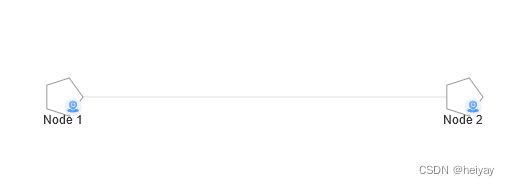
上面的代码注册了一个自定义节点类型,该节点以五角星的形状展示,并包括了以下功能:
节点形状为五角星,通过 draw 方法绘制。支持节点的悬停和选中样式(悬停active和选中selected的名字是可以自己定的),通过 setState 方法实现。可以修改 label 的位置,通过在 draw 方法中调整文本元素的位置来实现。添加了图片也可以根据自己需求添加其他图片,甚至是icon图标。
使用:
import React, { useEffect, useRef } from "react";
import G6 from "@antv/g6";
import { registerCustomNode } from "../customer/registerNodes";
import _ from "lodash";

export default function GraphInstance() {
  const containerRef = useRef<HTMLDivElement>(null);
  const graphRef = useRef<any>();

  useEffect(() => {
    initDraw();
  }, []);

  const initDraw = () => {
    registerCustomNode("mynode");
    graphRef.current = new G6.Graph({
      linkCenter: true,
      container: containerRef.current || "",
      height: 800,
      modes: {
        default: ["drag-node", "drag-canvas"],
      },
      layout: {
        type: "gforce",
      },
    });

    const data = {
      nodes: [
        {
          id: "node1",
          x: 100,
          y: 100,
          size: 20,
          label: "Node 1",
          type: "mynode",
        },
        {
          id: "node2",
          x: 300,
          y: 100,
          size: 20,
          label: "Node 2",
          type: "mynode",
        },
      ],
      edges: [{ source: "node1", target: "node2", label: "", type: "cosline" }],
    };

    // 渲染图表
    graphRef.current.data(data);
    graphRef.current.render();

    graphRef.current.on("node:mouseenter", (evt: any) => {
      const { item } = evt;
      graphRef.current.setItemState(item, "active", true);
    });

    graphRef.current.on("node:mouseleave", (evt: any) => {
      const { item } = evt;
      graphRef.current.setItemState(item, "active", false);
    });

    graphRef.current.on("node:click", (evt: any) => {
      const { item } = evt;
      graphRef.current.setItemState(item, "selected", true);
    });

    graphRef.current.on("canvas:click", (evt: any) => {
      const nodes = graphRef.current.findAllByState("node", "selected");
      const edges = graphRef.current.findAllByState("edge", "selected");

      _.forEach(nodes, (item) => {
        graphRef.current.setItemState(item, "selected", false);
      });
      _.forEach(edges, (item) => {
        graphRef.current.setItemState(item, "selected", false);
      });
    });
  };

  return (
    <div
      ref={containerRef}
      id="graphContainer"
      style={{ height: "100%", width: "100%" }}
    ></div>
  );
}