css 各种特效实现方法
图片背景渐隐
通过伪元素 线性渐变背景 遮盖掉一部分内容
div::before {
  content: '';
  position: absolute;
  bottom: 0;
  width: 100%;
  height: 100px;
  background: linear-gradient(to top, black, transparent);
  z-index: 100;
}
要求遮盖颜色与外部背景色相同
视差滚动实现方式:
- 监听浏览器滚动事件
- 分别改变各个层的top值,实现错落(视差)效果
近慢远快 如仰视到俯视
近快远慢 如镜头跟随行驶载具
环形进度条
- svg circle
- stroke-dasharray
环绕边框动画
- 四个单向运动的动画
- 父框
overflow: hidden; - 设置延迟可表现循环
渐变炫光动画边框
<div style="width: 400px; height: 300px; position: relative;">
 <div class="main" style="height: 100%; background-color: white;">div>
div>
div.main::after {
  content: "";
  position: absolute;
  /* 通过left负值和top负值,使伪元素盒子遮盖父盒子 */
  top: calc(-1 * 5px);
  left: calc(-1 * 5px);
  /* 设置宽高为父盒子的宽高加上左右上下边框值 */
  height: calc(100% + 10px);
  width: calc(100% + 10px);
  /* 设置线性渐变色 */
  background: linear-gradient(60deg, #f79533, #f37055, #ef4e7b, #a166ab, #5073b8, #1098ad, #07b39b, #6fba82);
  /* 设置伪元素位于父盒子之下 */
  z-index: -1;
  /* 设置伪元素盒子背景色尺寸便于位移 */
  background-size: 200% 200%;
  /* 设置动画位移背景图,也就是背景色 */
  animation: animatedGradient 1s linear alternate infinite;
}

@keyframes animatedGradient {
  0% {
    background-position: 0% 50%;
  }

  50% {
    background-position: 100% 50%;
  }

  100% {
    background-position: 0% 50%;
  }
}
inset 背景扩展收缩
可以在显示上变化而不影响布局?
可以做渐变色边框,
通过
border-image属性会更方便的实现渐变边框
文字颜色渐变
- background-clip: text
- color: transparent
  background: linear-gradient(to bottom, white, rgb(194, 203, 245), rgb(58, 123, 245));
  background-clip: text;
  -webkit-background-clip: text;
  color: transparent;
一些旋转曲线的图形
就是模拟类似ps的重复变换操作
自定义属性设置偏转角度更方便
镜像显示 -webkit-box-reflect
-webkit-box-reflect: below 1px linear-gradient(transparent, transparent, #0004);
边缘融合效果
- 子盒子
filter: blur(25px) - 父容器
filter: constrast(50) - 多个子盒子会出现液态融合效果
光晕效果
多层阴影叠加,调低各自不透明度
外角圆弧化
内角可以用 border-radius
外角可以使用伪元素去遮盖
蒙版
clip-path 裁剪显示
clip-path: circle(30%);
// 注意此处设的是圆的半径
// ellipse(rx ry at x y); 椭圆
// polygon(x0 y0, x1 y1, x2 y2, x3 y3; 多边形
// path
正方形可以用多边形代替
basic-shape
mask 为标记的区域遮盖
// 实现图片渐隐效果
{
    background: url(image.png) ;
    mask: linear-gradient(90deg, transparent, #fff);
}
一些例子
行内元素的环绕效果
shape-outside
图层混合模式
mix-blend-mode 元素的内容应该与元素的直系父元素的内容和元素的背景如何混合
| 值 | 作用 |
|---|---|
| plus-darker | (没有支持?) |
| plus-lighter | (支持性不太好) |
| /-/-/- | |
| normal | |
| multiply | |
| screen | |
| overlay | |
| darken | |
| lighten | |
| color-dodge | |
| color-burn | |
| hard-light | |
| soft-light | |
| difference | |
| exclusion | |
| hue | |
| saturation | |
| color | |
| luminosity |
叠加部分处理
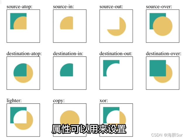
CanvasRenderingContext2D.globalCompositeOperation
层叠模糊滤镜
backdrop-filter 为一个元素后面区域添加图形效果(如模糊或颜色偏移)
使用时通常使元素或其背景至少部分透明
磨砂效果
方法一: filter: blur(20px)
后代元素会继承属性
通常放于伪元素
方法二:backdrop-filter
给元素后图形添加图形效果
方法三:svg.image.filter
colorthief 提取图片的主要颜色
canvas getImageData获取图像像素信息 StackBlur
img.crossOrigin = ‘anonymus’
纸张折痕
.fold-left {
  background-image: linear-gradient(to right,#bbb 50%, #efefef 100%);
}
.fold-right {
  background-image: linear-gradient(to right, #bbb, #efefef 25%);
}

控制兼容性 @supports(特性查询)
@supports(特性查询) {
  兼容代码
}
