plt绘制表格
目录
1、绘制简单表格
2、将字体居中
3、为每个表格添加背景
4、添加透明度
5、不显示表格标题
6、将pandas的表格列转行显示
7、关闭表格边框
8、设置表格长宽、字体大小
9、利用色系指定表格颜色
10、修改字体颜色、边框粗细
1、绘制简单表格
import pandas as pd
import matplotlib.pyplot as plt

# 创建一个DataFrame
data = {'Name': ['Alice', 'Bob', 'Charlie', 'David'],
        'Age': [25, 30, 35, 40],
        'City': ['New York', 'San Francisco', 'Los Angeles', 'Chicago']}
df = pd.DataFrame(data)

# 打印DataFrame
print(df)

# 绘制表格
fig, ax = plt.subplots()
ax.axis('off')
ax.table(cellText=df.values, colLabels=df.columns, loc='center')

plt.show()
2、将字体居中
import pandas as pd
import matplotlib.pyplot as plt

# 创建一个DataFrame
data = {'Name': ['Alice', 'Bob', 'Charlie', 'David'],
        'Age': [25, 30, 35, 40],
        'City': ['New York', 'San Francisco', 'Los Angeles', 'Chicago']}
df = pd.DataFrame(data)

# 绘制表格
fig, ax = plt.subplots()
ax.axis('off')
table = ax.table(cellText=df.values, colLabels=df.columns, cellLoc='center', colLoc='center', loc='center')

# 调整表格字体大小
# table.auto_set_font_size(True)
table.set_fontsize(12)
table.scale(1.3, 1.3)  # 调整表格大小

plt.show()
3、为每个表格添加背景
import pandas as pd
import matplotlib.pyplot as plt
import numpy as np

# 创建一个DataFrame
data = {'Name': ['Alice', 'Bob', 'Charlie', 'David'],
        'Age': [25, 30, 35, 40],
        'City': ['New York', 'San Francisco', 'Los Angeles', 'Chicago']}
df = pd.DataFrame(data)

# 随机生成每个单元格的背景颜色
cell_colors = np.random.choice(['lightblue', 'lightgreen', 'lightpink', 'lightyellow'], size=(len(df), len(df.columns)))

# 绘制表格
fig, ax = plt.subplots()
ax.axis('off')
table = ax.table(cellText=df.values, colLabels=df.columns, cellLoc='center', colLoc='center', loc='center', cellColours=cell_colors)

# 调整表格字体大小
table.auto_set_font_size(False)
table.set_fontsize(14)
table.scale(1.5, 1.5)  # 调整表格大小

plt.show()
4、添加透明度
import pandas as pd
import matplotlib.pyplot as plt
import numpy as np

# 创建一个DataFrame
data = {'Name': ['Alice', 'Bob', 'Charlie', 'David'],
        'Age': [25, 30, 35, 40],
        'City': ['New York', 'San Francisco', 'Los Angeles', 'Chicago']}
df = pd.DataFrame(data)

# 随机生成每个单元格的背景颜色和透明度
cell_colors = np.random.choice(['lightblue', 'lightgreen', 'lightpink', 'lightyellow'], size=(len(df), len(df.columns)))
cell_alphas = np.random.uniform(0.5, 1, size=(len(df), len(df.columns)))  # 随机生成透明度

# 绘制表格
fig, ax = plt.subplots()
ax.axis('off')
table = ax.table(cellText=df.values, colLabels=df.columns, cellLoc='center', colLoc='center', loc='center')

for i in range(len(df)):
    for j in range(len(df.columns)):
        cell = table.get_celld()[(i, j)]
        cell.set_facecolor(cell_colors[i, j])
        cell.set_alpha(cell_alphas[i, j])

# 调整表格字体大小
table.auto_set_font_size(False)
table.set_fontsize(14)
table.scale(1.5, 1.5)  # 调整表格大小

plt.show()
5、不显示表格标题
import pandas as pd
import matplotlib.pyplot as plt
import numpy as np

# 创建一个DataFrame
data = {'Name': ['Alice', 'Bob', 'Charlie', 'David'],
        'Age': [25, 30, 35, 40],
        'City': ['New York', 'San Francisco', 'Los Angeles', 'Chicago']}
df = pd.DataFrame(data)

# 随机生成每个单元格的背景颜色和透明度
cell_colors = np.random.choice(['lightblue', 'lightgreen', 'lightpink', 'lightyellow'], size=(len(df), len(df.columns)))
cell_alphas = np.random.uniform(0.5, 1, size=(len(df), len(df.columns)))  # 随机生成透明度

# 绘制表格
fig, ax = plt.subplots()
ax.axis('off')
table = ax.table(cellText=df.values, cellLoc='center', loc='center', cellColours=cell_colors)

for i in range(len(df)):
    for j in range(len(df.columns)):
        cell = table.get_celld()[(i, j)]
        cell.set_alpha(cell_alphas[i, j])

# 调整表格字体大小
table.auto_set_font_size(False)
table.set_fontsize(14)
table.scale(1.5, 1.5)  # 调整表格大小

plt.show()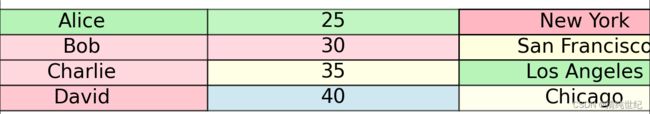
6、将pandas的表格列转行显示
import pandas as pd
import matplotlib.pyplot as plt
import numpy as np

# 创建一个DataFrame
data = {'Name': ['Alice', 'Bob', 'Charlie', 'David'],
        'Age': [25, 30, 35, 40],
        'City': ['New York', 'San Francisco', 'Los Angeles', 'Chicago']}
df = pd.DataFrame(data)

# 转置DataFrame
df = df.transpose()

# 随机生成每个单元格的背景颜色和透明度
cell_colors = np.random.choice(['lightblue', 'lightgreen', 'lightpink', 'lightyellow'], size=(len(df), len(df.columns)))
cell_alphas = np.random.uniform(0.5, 1, size=(len(df), len(df.columns)))  # 随机生成透明度

# 绘制表格
fig, ax = plt.subplots()
ax.axis('off')
table = ax.table(cellText=df.values, cellLoc='center', loc='center', cellColours=cell_colors)

for i in range(len(df)):
    for j in range(len(df.columns)):
        cell = table.get_celld()[(i, j)]
        cell.set_alpha(cell_alphas[i, j])

# 调整表格字体大小
table.auto_set_font_size(False)
table.set_fontsize(14)
table.scale(1.5, 1.5)  # 调整表格大小

plt.show()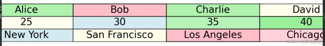
7、关闭表格边框
import pandas as pd
import matplotlib.pyplot as plt
import numpy as np

# 创建一个DataFrame
data = {'Name': ['Alice', 'Bob', 'Charlie', 'David'],
        'Age': [25, 30, 35, 40],
        'City': ['New York', 'San Francisco', 'Los Angeles', 'Chicago']}
df = pd.DataFrame(data)

# 转置DataFrame
transposed_df = df.transpose()

# 随机生成每个单元格的背景颜色和透明度
cell_colors = np.random.choice(['lightblue', 'lightgreen', 'lightpink', 'lightyellow'], size=(len(transposed_df), len(transposed_df.columns)))
cell_alphas = np.random.uniform(0.5, 1, size=(len(transposed_df), len(transposed_df.columns)))  # 随机生成透明度

# 绘制表格
fig, ax = plt.subplots()
ax.axis('off')  # 关闭边框
table = ax.table(cellText=transposed_df.values, cellLoc='center', loc='center', cellColours=cell_colors)

for i in range(len(transposed_df)):
    for j in range(len(transposed_df.columns)):
        cell = table.get_celld()[(i, j)]
        cell.set_alpha(cell_alphas[i, j])
        cell.set_edgecolor('white')  # 设置边框颜色为白色,达到关闭边框的效果。或者直接设置None,不显示

# 调整表格字体大小
table.auto_set_font_size(False)
table.set_fontsize(14)
table.scale(1.5, 1.5)  # 调整表格大小

plt.show()
8、设置表格长宽、字体大小
import pandas as pd
import matplotlib.pyplot as plt
import numpy as np

# 创建一个DataFrame
data = {'Name': ['Alice', 'Bob', 'Charlie', 'David'],
        'Age': [25, 30, 35, 40],
        'City': ['New York', 'San Francisco', 'Los Angeles', 'Chicago']}
df = pd.DataFrame(data)

# 转置DataFrame
transposed_df = df.transpose()

# 随机生成每个单元格的背景颜色和透明度
cell_colors = np.random.choice(['lightblue', 'lightgreen', 'lightpink', 'lightyellow'], size=(len(transposed_df), len(transposed_df.columns)))
cell_alphas = np.random.uniform(0.5, 1, size=(len(transposed_df), len(transposed_df.columns)))  # 随机生成透明度

# 绘制表格
fig, ax = plt.subplots(figsize=(8, 4))  # 设置表格的长和宽
ax.axis('off')  # 关闭边框
table = ax.table(cellText=transposed_df.values, cellLoc='center', loc='center', cellColours=cell_colors)

for i in range(len(transposed_df)):
    for j in range(len(transposed_df.columns)):
        cell = table.get_celld()[(i, j)]
        cell.set_alpha(cell_alphas[i, j])
        cell.set_edgecolor('white')  # 设置边框颜色为白色,达到关闭边框的效果。或者直接设置None,不显示

# 调整表格字体大小
table.auto_set_font_size(False)
table.set_fontsize(12)  # 设置表格字体大小
table.scale(1, 1.5)  # 调整表格大小

plt.show()
9、利用色系指定表格颜色
import pandas as pd
import matplotlib.pyplot as plt
import numpy as np
import matplotlib.cm as cm

# 创建一个DataFrame
data = {'Name': ['Alice', 'Bob', 'Charlie', 'David']*4}
df = pd.DataFrame(data)

# 转置DataFrame
transposed_df = df.transpose()

# 使用nipy_spectral色系
colors = cm.nipy_spectral(np.linspace(0, 1, len(transposed_df.columns)))
# colors = cm.jet(np.linspace(0, 1, len(transposed_df.columns)))

# 绘制表格
fig, ax = plt.subplots(figsize=(8, 4))  # 设置表格的长和宽
ax.axis('off')  # 关闭边框
table = ax.table(cellText=transposed_df.values, cellLoc='center', loc='center')

for i in range(len(transposed_df.columns)):
    table.get_celld()[(0, i)].set_facecolor(colors[i])

# 调整表格字体大小
table.auto_set_font_size(False)
table.set_fontsize(7)  # 设置表格字体大小
table.scale(1, 1.2)  # 调整表格大小

plt.show()![]()
10、修改字体颜色、边框粗细
import pandas as pd
import matplotlib.pyplot as plt
import numpy as np
import matplotlib.cm as cm

# 创建一个DataFrame
data = {'Name': ['Alice', 'Bob', 'Charlie', 'David'] * 4}
df = pd.DataFrame(data)

# 转置DataFrame
transposed_df = df.transpose()

# 使用nipy_spectral色系
colors = cm.nipy_spectral(np.linspace(0, 1, len(transposed_df.columns)))
# colors = cm.jet(np.linspace(0, 1, len(transposed_df.columns)))

# 绘制表格
fig, ax = plt.subplots(figsize=(8, 4))  # 设置表格的长和宽
ax.axis('off')  # 关闭边框
table = ax.table(cellText=transposed_df.values, cellLoc='center', loc='center')

for i in range(len(transposed_df.columns)):
    table.get_celld()[(0, i)].set_facecolor(colors[i])

# 调整表格字体大小
table.auto_set_font_size(False)
table.set_fontsize(7)  # 设置表格字体大小
table.scale(1, 1.2)  # 调整表格大小

# 设置表格字体颜色
for i in range(len(transposed_df.columns)):
    table.get_celld()[(0, i)].set_text_props(fontsize=7, color='white')

# 调整表格边框粗细
for key, cell in table.get_celld().items():
    cell.set_linewidth(0.5)

"""
mpl_table = table.properties()
mpl_table['cell.linewidth'] = 0.5  # 设置表格边框粗细
mpl_table['cell.fontsize'] = 7  # 设置表格字体大小
mpl_table['cell.text.color'] = 'white'  # 设置表格文字颜色
"""

plt.show()![]()