Flutter教程
我的共享笔记地址:印象笔记
本篇博客属于笔记整理形式,且站在java开发和js开发角度来阐述,有些是直接说和什么类似,一致,不会阐述太多!
一.flutter 支持的数据类型
1. number类型: int 和double
注意:double类型的值可以是整形也可以是浮点类型
double d=13.5;
d=12;
2.String 类型
String nullStr;
print(nullStr==null);//true
nullStr="";
print(nullStr.isEmpty);//true 字符串的isEmpty代表对象内容为空3.Boolean类型 声明语法bool
4.List类型 ,两种写法:
var list=["11","21","31"];
int length=list.length;
print("list=$list"+ " length:"+length.toString());
print("list="+list[2]);


for(int i=0;i();
for(int i=0;i<100;i++)
{
list2.add(i.toString());
}
print("list2:${list2}");
5. Map类型,与js不太一样的点事key 必须要用双引号包裹
void main() {
  /**

   */
  var map = new Map();
  map["name"] = "张三";

  /**
   * Json 对象式写法
   */
  var map2 = {"id": 1, "name": "张三", "age": 27};
  print(map2); //{id: 1, name: 张三, age: 27}
  print(map2.keys.toList()); //[id, name, age]
  print(map2.values.toList()); //[1, 张三, 27]

  print(map2.isEmpty); //false
  print(map2.isNotEmpty); //true
  print(map2.length); //3

  map2.addAll({"sex": "男"});
  print(map2); //{id: 1, name: 张三, age: 27, sex: 男}

  /**
   * 遍历
   */
  map2.forEach((key, value) {
    print(key + ":" + value.toString());
  });

  /**
   * list查找wehre语法
   */
  var s = [1, 2];
  print(s
      .where((element) => element >= 2)
      .toList()); //[2] 注意s.where((element) 返回的是迭代器对象
}
二:运算符
与java语言基本一致,但是dart语言可以不同类型的数据做比较,编译能通过,如下
String name = "12";
double d=12;
if(name==d) {
print("s==d");
}else{
print("s!=d");
}
显然不同一种大类型(如都不是number类型) 判断永远是false
?? 双问号预算符,语法a??=b 意思是如果a为空那么僵b赋值给a
var a;
a??=10;
print(a);//输出10

var b=1;
b??=10;
print(b);//输出1
swith 语法与java的区别,java switch(value)参数不能为null,而dart语言是可以为null
三:类型判断 is语法
/**
* 判断类型 is
*/
var test="hh";
if(test is String)
{
print("test 类型 是string");
}
四:类型转换
1.Number和String之间的转换
number转换成String 可以用toString()方法
String转换number可以用int.parse(),double.parse()方法;parse跟java语言一样 会出现转换异常的情况
String str="1243";
print(int.parse(str));//1243
print(double.parse(str));//1243/0
五:dart语言循环运算
循环运算与java一致
六: dart集合 list set map
/**
* list常见属性
* length 长度
* reversed 反转,可以使用list.reversed.toList() 获取反转的List
* isEmpty 是否为空
* isNotEmpty 是否不为空
*
* 常见方法
* add 添加
* addAll 拼接数组
* remove 移除
* removeAt 移除 参数:索引值
* fillRange 修改
* insert 插入
* insertAll 批量插入
* toList 其他类型转换为list
* join list转换成字符串
* split 字符串转换成list
*/
var list=[1,4,6];
list.add(7);
print(list);

print(list.reversed);

/**
*获取反转的list
*/
var reversedList = list.reversed.toList();
print(reversedList);//[7, 6, 4, 1]

print(list.indexOf(8));//-1
print(list.indexOf(4));//1

list.fillRange(1,3, 9);//将index=1和index=2的值替换为9 [1, 4, 6, 7]=>[1, 9, 9, 7]
print(list);//[1, 9, 9, 7]


Set set=new Set();
set.add("苹果");
set.add("苹果");
set.add("三星");
print(set);
/**
*/
var map = new Map();
map["name"] = "张三";
/**
* Json 对象式写法
*/
var map2 = {"id": 1, "name": "张三", "age": 27};
print(map2);//{id: 1, name: 张三, age: 27}
print(map2.keys.toList());//[id, name, age]
print(map2.values.toList());//[1, 张三, 27]
print(map2.isEmpty);//false
print(map2.isNotEmpty);//true
print(map2.length);//3
map2.addAll({
"sex":"男"
});
print(map2);//{id: 1, name: 张三, age: 27, sex: 男}
/**
* 遍历
*/
map2.forEach((key, value) {
print(key+":"+value.toString());
});
/**
* list查找wehre语法
*/
var s=[1,2];
print(s.where((element) => element>=2).toList());//[2] 注意s.where((element) 返回的是迭代器对象七:dart函数;和java基本一致,但是可以方法嵌套方法方法传参
void test() {
int innerFunction() {
return 1;
}

print(innerFunction());//输出1
}
void main() {
test();
print(printUserInfo("张三", 25));//name:张三 age:25
print(printUserInfo2("张三"));//name:张三
print(printUserInfo3("李四"));//name:李四 age:88
print(printUserInfo4("王五",age: 21,desc: "我是一个美女"));
print(printUserInfo5(printUserInfo("张三", 25)));//name:王五 age:21 我是一个美女
}
String printUserInfo(String name, int age) {
return "name:$name age:$age";
}
/**
* 可选参数语法 [类型 形参名字]
*/
String printUserInfo2(String name, [int age]) {
if (age != null) {
return "name:$name age:$age";
}
return "name:$name";
}
/**
* 默认参数 [类型 形参名字=默认值]
*/
String printUserInfo3(String name, [int age=88]) {
return "name:$name age:$age";
}
/**
* 命名参数 调用式 参数必须强制写且一样
*/
String printUserInfo4(String name, {int age,String desc}) {
return "name:$name age:$age $desc";
}
/**
* 把方法当做参数
*/
String printUserInfo5(fn) {
return fn();
}
void test() {
int innerFunction() {
return 1;
}
print(innerFunction()); //输出1
}箭头函数,匿名函数,闭包
这个有点像java
/**
* 箭头函数
*/
var list=[1,2,4,6];
var list2 = list.map((e) => e*2).toList();
print(list2);//[2, 4, 8, 12]
匿名函数:
/**
* 匿名函数
*/
var noNameFun=(){
return "hello";
};
print(noNameFun());


/**
* 自执行方法
*/
(){ print("这是一个自执行方法");}();//输出 这是一个自执行方法
八:类和构造函数
类的声明跟java一样,class关键字,构造函数分为默认构造函数和命名构造函数,等价于java构造函数重载,但是语法不太一样;用类名.方法名 进行初始化; 而且dart的类构造函数还有简写模式,这个的确比java简洁很多,实例代码如下:
void main() {
Person p = new Person("张三",24);
p.say();


Person p2=new Person.now("李四");
p2.age=26;
p2.say();
}

class Person {
String name;

/**
* 默认构造函数,简写模式: Person(this.name, this.age);
*/
Person(this.name, this.age){
this.name=name;
this.age=age;
}

/**
* 命名构造函数,简写模式 Person.now(this.name);
*/
Person.now(this.name){
this.name=name;
}

int age;

void say() {
print("我是${this.name} 今年${this.age}岁");
}
}
类方法字段的修饰符,java有public private protocted等等,但是dart语言并没有,但是我们可以可以通过下划线开头命名方法和字段将方法和字段变成私有;
class Student {
String name;
int _age; //私有属性 用_下划线语法标识

Student(this.name, this._age);

/**
* 私有属性的getter方法
* 简写模式:int get age => _age;
* 一般编译器插件生成都是这个简写模式
*/

int get age {
return this._age;
}

/**
* 私有属性的setter方法
*/
set age(int value) {
this._age = value;
}

@override
String toString() {
return 'Student{name: $name, _age: $_age}';
}
}

Student student = new Student("王五", 23);
// print(student._age);//编译不过 Try correcting the name to the name of an existing getter, or defining a getter or field named '_age'.
print(student.age); //通过get方法可以获取对应属性//输出 23
student.age = 13; //是通过set方法赋值
print(student); //输出:Student{name: 王五, _age: 13}
有没有注意到 私有字段的get 和set方法 跟java不太一样 是:返回值+get/set关键字+私有字段去除下划线前缀命名,
一般情况get方法没有返回值不用写,写void 编译器有警告;
dart中的静态成员跟Java一致 static关键字
dart中的对象操作符:
? 条件运算符;语法:obj?.function() 如果obj为null 就不执行这个function
as 类型转换
is 类型判断
.. 级联操作(连缀) 类似builder设计模式 可以一致调对象的方法
void main() {
Test test;
test.show(); //Unhandled exception:NoSuchMethodError: The method 'show' was called on null.

//test?.show();//如果test对象为空就不执行show
}

class Test {
void show() {
print("hello");
}
级联调用:
void main() {
Test test2 = new Test();
test2
..show()//输出:hello
..show2()//输出:hello2
..toString();
}

class Test {
void show() {
print("hello");
}

void show2() {
print("hello2");
}
}
dart的继承:extends跟java一致
void main() {
print(new Child("child name", 19));
}

class Parent{
String name;
Parent(this.name);
}
class Child extends Parent{
int age;
Child(String name,int age) : super(name){
this.age=age;
}

@override
String toString() {
return 'Child{age: $age} ${this.age}';
}
}
dart中没有接口定义关键字,但是有抽象类的概念:abstract关键字
1.如果要复用抽象类里面的方法,并且要用抽象方法约束自类的话我们就用extends基础抽象类
2.如果只是把抽象类当做标准的话我们就用implements实现抽象类
3.抽象类同样跟java类一样可以拥有非抽象方法;
void main() {
Person t = new Teacher();
t.say();

Person s = new Student();
s.say();
}

abstract class Person {
void say();
}

class Teacher extends Person {
@override
void say() {
print("我是老师");
}
}

class Student extends Person {
@override
void say() {
print("我是学生");
}
}
dart可以通过普通类或者抽象类实现接口定义,implements方式
void main() {
Worker worker = new Worker();
worker.say();
}

abstract class Person {
/**
* 如果子类是用implements方式 那么子类需要主动声明一遍遍
*/
String name;

void say();
}

class Worker implements Person {
@override
void say() {
print("我是工人");
}

@override
String name;
}
dart多继承:其实是一个伪继承,所继承的类不能再是继承类,也就是被继承类必须是object直接子类,且被继承的类不能包含构造函数
九: dart 中的泛型:集合泛型(跟java一致),方法泛型(跟java略有差别),类泛型跟java一致),接口泛型跟java一致);实例代码如下:
List list = new List();
list.add("1");
list.add(2);
print(list);

/**
* 元素只能是指定类型
* new List();则代表元素只能是int
*/
List list2 = new List();
list2.add(1);
list2.add(2);
print(list2);
void main() {
int data = getData(10);
print(data);
String s = getData("hello");
print(s);
}
T getData(T value) {
return value;
}
void main() {
new Action("hello");
new Action(20);
}
/**
* 泛型类
*/
class Action {
T t;

Action(this.t);
}
/**
* 泛型接口
*/
abstract class Consumer {
void accept(T t);
}
class StringConsumer extends Consumer {
@override
void accept(String t) {
// TODO: implement accept
}
}
class IntConsumer extends Consumer {
@override
void accept(int t) {
// TODO: implement accept
}
} aync和await 关键字
只有async方法才能使用await关键字调用方法
如果调用别的async方法必须使用await关键字
async 是让方法变异步
await是等待异步方法执行完成
MateriaApp 是android Meterial Design的设计风格组件,包含,标题,样式,路由等等;
源码如下:
class MaterialApp extends StatefulWidget {
  /// Creates a MaterialApp.
  ///
  /// At least one of [home], [routes], [onGenerateRoute], or [builder] must be
  /// non-null. If only [routes] is given, it must include an entry for the
  /// [Navigator.defaultRouteName] (`/`), since that is the route used when the
  /// application is launched with an intent that specifies an otherwise
  /// unsupported route.
  ///
  /// This class creates an instance of [WidgetsApp].
  ///
  /// The boolean arguments, [routes], and [navigatorObservers], must not be null.
  const MaterialApp({
    Key key,
    this.navigatorKey,
    this.home,
    this.routes = const {},
    this.initialRoute,
    this.onGenerateRoute,
    this.onGenerateInitialRoutes,
    this.onUnknownRoute,
    this.navigatorObservers = const [],
    this.builder,
    this.title = '',
    this.onGenerateTitle,
    this.color,
    this.theme,
    this.darkTheme,
    this.highContrastTheme,
    this.highContrastDarkTheme,
    this.themeMode = ThemeMode.system,
    this.locale,
    this.localizationsDelegates,
    this.localeListResolutionCallback,
    this.localeResolutionCallback,
    this.supportedLocales = const [Locale('en', 'US')],
    this.debugShowMaterialGrid = false,
    this.showPerformanceOverlay = false,
    this.checkerboardRasterCacheImages = false,
    this.checkerboardOffscreenLayers = false,
    this.showSemanticsDebugger = false,
    this.debugShowCheckedModeBanner = true,
    this.shortcuts,
    this.actions,
  })
可以看见里面封装了很多属性与方法,且是命名参数形式的;
这里列举几个常见属性和方法
| title | 页面标题,通常app的页面都有一个标题,类似android ActionBar或者titleBar |
| theme | 主题 |
| color | 应用的主题颜色 |
| home | 定义当前页面打开时显示的页面 |
| routes | 页面跳转路由 |
| initialRoute | 初始化路由 |
| onGenerateRoute | 路由回调 |
class MyApp extends StatelessWidget {
  // This widget is the root of your application.
  @override
  Widget build(BuildContext context) {
    return MaterialApp(
      title: 'Flutter Demo',
      theme: ThemeData(
        // This is the theme of your application.
        //
        // Try running your application with "flutter run". You'll see the
        // application has a blue toolbar. Then, without quitting the app, try
        // changing the primarySwatch below to Colors.green and then invoke
        // "hot reload" (press "r" in the console where you ran "flutter run",
        // or simply save your changes to "hot reload" in a Flutter IDE).
        // Notice that the counter didn't reset back to zero; the application
        // is not restarted.
        primarySwatch: Colors.yellow,
        // This makes the visual density adapt to the platform that you run
        // the app on. For desktop platforms, the controls will be smaller and
        // closer together (more dense) than on mobile platforms.
        visualDensity: VisualDensity.adaptivePlatformDensity,
      ),
      home: MyHomePage(title: '小旋风博客论坛'),
    );
  }
}
container组件:是一个公共容器,控制边距,子组件如何摆放到容器中等等
| 属性名 | 类型 | 说明 |
| Key | Key | container唯一标识,用于查找更新,类型android layout id |
| alignment | AlignmentGeometry | 控制child的对齐方式,如果container或者container父节点尺寸大于child尺寸m这个设置会起作用,且有很多对齐方式 |
| padding | EdgeInsetsGeometry | 控制内边距 类似:android:padding |
| color | Color | 用来设置Container背景色,如果设置了foregroundDecoration的话,可能会覆盖color颜色 |
| decoraition | Decoration | 绘制在child后面的装饰,设置了Decoration的话就不能设置color属性,否则会报错,此时应该通过Decoration进行颜色设置 |
| foregroundDecroration | Decoration | 绘制在child前面的装饰 |
| width | double | Container的宽度,设置会double.infinity为无穷 可以强制让宽度撑满,不设置 则根据child和父节点两次一起布局,跟android view树一致 |
| hieght | double | 如width属性,只不过控制的是高度 |
| constrains | BoxConstranins | 添加到child的额外的约束条件 |
| margin | EdgeInsetsGeometry | 如同android:margin |
| transform | Matrix4 | 变化矩阵 |
| child | Widget | 子组件 |
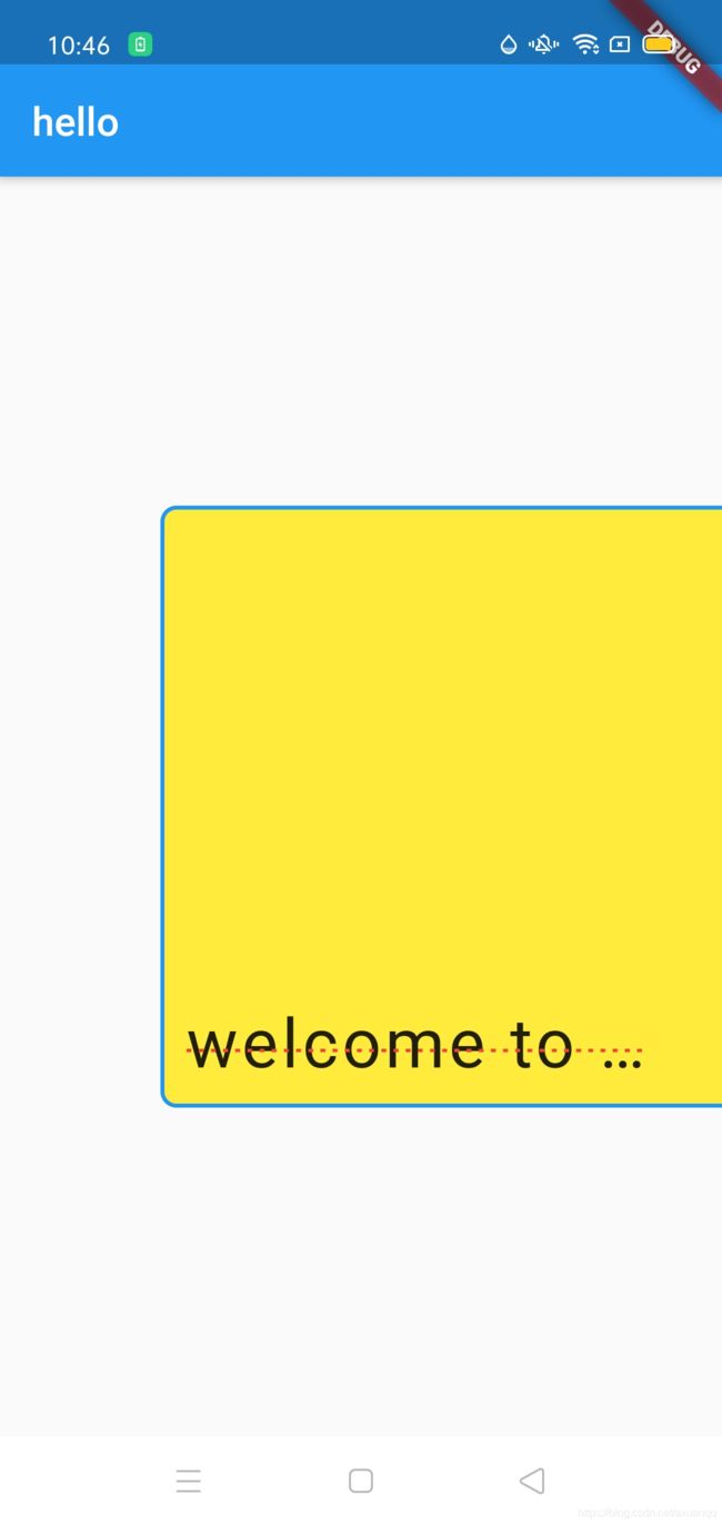
class HomeContent extends StatelessWidget {
  @override
  Widget build(BuildContext context) {
    return new Scaffold(
        appBar: new AppBar(title: new Text("hello")),
        body: Center(
            child: new Container(
                child: new Text(
                  "welcome to beigin,或胡姬花规定和规范的后果符合规定和规范化规定",
                  textAlign: TextAlign.left,
                  style: TextStyle(
                      fontSize: 34,
                      decoration: TextDecoration.lineThrough,
                      decorationColor: Colors.red,
                      letterSpacing: 2.0,
                      decorationStyle: TextDecorationStyle.dotted),
                  maxLines: 1,
                  overflow: TextOverflow.ellipsis,
                ),
                width: 300,
                //容器宽度
                height: 300,
                //容器高度
                padding: EdgeInsets.all(10),
                //控制子元素的位置,如居中
                alignment: Alignment.bottomCenter,
                //对容器进行变换,如位移
                transform: Matrix4.translationValues(50, 0, 0),
                //设置边距;单独设置某个边: EdgeInsets.fromLTRB(0,10,0,0)
                decoration: new BoxDecoration(
                    borderRadius: BorderRadius.all(Radius.circular(8)), //边框圆角
                    color: Colors.yellow, //容器背景
                    border: Border.all(
                        color: Colors.blue, width: 2))))); //边框大小和颜色设置
  }
}
flutter 之Text组件:
 const Text(
    this.data,//文本内容
   {
    Key key,//id
    this.style,//TextStyle 设置文本样式:如文字颜色,字体,粗细,背景等等
    this.strutStyle,
    this.textAlign,//文本对齐方式 center 居中,left 左对齐,right 右对齐,justfy 两端对齐
    this.textDirection,//文字方向 ltr 从左至右,rtl 从右至左
    this.locale,//国际化
    this.softWrap,
    this.overflow,//文本截断方式 clip裁剪,fade 渐隐,ellipsis 省略号
    this.textScaleFactor,//文字大小缩放倍数
    this.maxLines,//文本最大行数
    this.semanticsLabel,
    this.textWidthBasis,
    this.textHeightBehavior,
  })
而其中设置文字样式的TextStyle,常见属性 我备注如下:
 const TextStyle({
    this.inherit = true,
    this.color,//文字颜色
    this.backgroundColor,//文字背景色
    this.fontSize,//文字大小
    this.fontWeight,//字重
    this.fontStyle,//文字样式,(italic 斜体,normal 正常体)
    this.letterSpacing,//字母间隙(如果是负值,会让字母变得更紧凑)
    this.wordSpacing,//单词间距,(如果是负值,会让字母变得更紧凑)
    this.textBaseline,
    this.height,//特别注意 行高,比例值
    this.locale,
    this.foreground,
    this.background,
    this.shadows,
    this.fontFeatures,
    this.decoration,//装饰线 none没有线,lineThrough 删除线,overLine上划线,underLine下划线
    this.decorationColor,//装饰线的颜色
    this.decorationStyle,//装饰线的风格,dashed,dotted虚线,double两根线,solid实线,wavy波浪线
    this.decorationThickness,
    this.debugLabel,
    String? fontFamily,
    List? fontFamilyFallback,
    String? package,
}) 
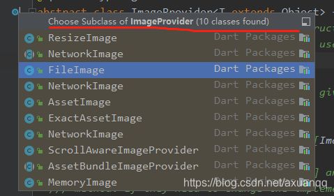
flutter之图片组件:Image
Flutter imgae支持的图片格式为:JPEG, PNG, GIF, Animated GIF, WebP, Animated WebP, BMP, and WBMP。Flutter Image是显示图片的一个Widget。这倒是android 弥补了android 原生不支持gif的短板!
| Image() | 从imageProvider中获取图片,从本质上看,下面几个方法都是其具体实现 |
| Image.asset(String name) | 从AssetBundler中获取图片 |
| Image.network(String src) | 显示网络图片 |
| Image.file(File file) | 从File中获取图片 |
| Image.memory(Uint8List bytes) | 从Unit8List中显示图片 |
常见属性:
| alignment | 图片的对齐格式 |
| colorBlendMode | 设置图片的背景颜色,通常和colorBlendMode配合一起使用,这样可以是图片颜色和背景色混合 |
| fit | 设置图片的拉伸和挤压形态,这是根据父容器来的 BoxFit.fill全图显示 图片会被拉伸,并充满父容器 如同Android:scaleType="fitXY"; BoxFit.contain:全图显示,显示原比例,可能会有空隙; BoxFit.cover:显示可能拉伸,可能裁切,充满(图片要充满整个容器,还不变形) |
| repeat | 平铺,ImageRepeat.repeat:横向和纵向都进行重复,直到铺满整个画布. ImageRepeat,repeatY:纵向重复,横向不重复。 |
| width,height | 宽度 高度 一般结合clipOval才能看到效果 |
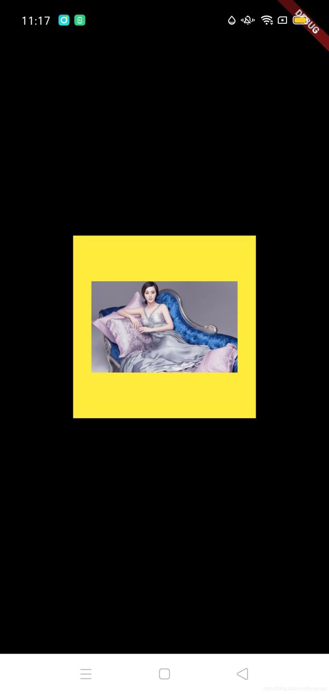
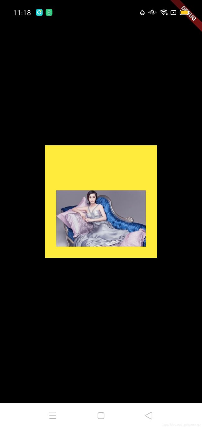
class ImageContent extends StatelessWidget {
  @override
  Widget build(BuildContext context) {
    return new Center(
        child: new Container(
      decoration: BoxDecoration(color: Colors.yellow),
      width: 200,
      height: 200,
      padding: EdgeInsets.all(20),
      child: new Image.network(
        "https://ss1.bdstatic.com/70cFvXSh_Q1YnxGkpoWK1HF6hhy/it/u=3022430276,1439132295&fm=26&gp=0.jpg",
      ),
    ));
  }
}
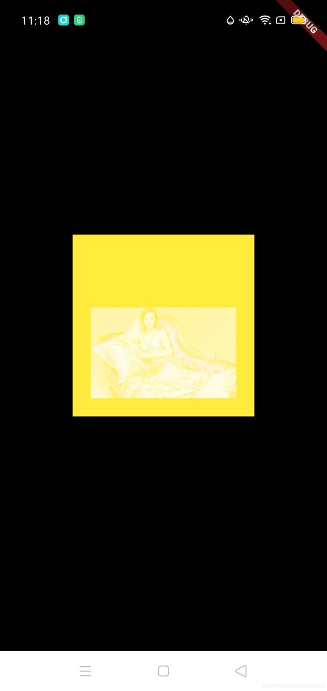
class ImageContent extends StatelessWidget {
  @override
  Widget build(BuildContext context) {
    return new Center(
        child: new Container(
      decoration: BoxDecoration(color: Colors.yellow),
      width: 200,
      height: 200,
      padding: EdgeInsets.all(20),
      child: new Image.network(
        "https://ss1.bdstatic.com/70cFvXSh_Q1YnxGkpoWK1HF6hhy/it/u=3022430276,1439132295&fm=26&gp=0.jpg",
         alignment: Alignment.bottomRight,
      ),
    ));
  }
}
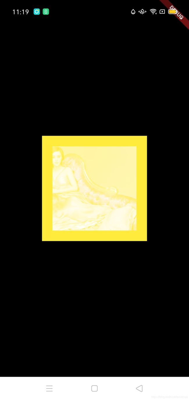
class ImageContent extends StatelessWidget {
  @override
  Widget build(BuildContext context) {
    return new Center(
        child: new Container(
      decoration: BoxDecoration(color: Colors.yellow),
      width: 200,
      height: 200,
      padding: EdgeInsets.all(20),
      child: new Image.network(
        "https://ss1.bdstatic.com/70cFvXSh_Q1YnxGkpoWK1HF6hhy/it/u=3022430276,1439132295&fm=26&gp=0.jpg",
         alignment: Alignment.bottomRight,
         color: Colors.yellow,//类似Android:tint着色
         colorBlendMode: BlendMode.screen,
      ),
    ));
  }
}
class ImageContent extends StatelessWidget {
  @override
  Widget build(BuildContext context) {
    return new Center(
        child: new Container(
      decoration: BoxDecoration(color: Colors.yellow),
      width: 200,
      height: 200,
      padding: EdgeInsets.all(20),
      child: new Image.network(
        "https://ss1.bdstatic.com/70cFvXSh_Q1YnxGkpoWK1HF6hhy/it/u=3022430276,1439132295&fm=26&gp=0.jpg",
         alignment: Alignment.bottomRight,
         color: Colors.yellow,//类似Android:tint着色
         colorBlendMode: BlendMode.screen,
         fit: BoxFit.cover,
      ),
    ));
  }
}
在常见的业务中除了着色 还有圆角,原角矩形;圆角图片实现可以通过decroation的方式
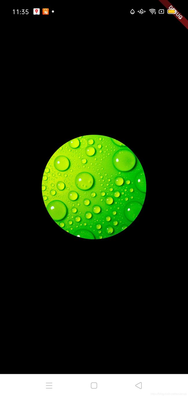
class CircleImageContent extends StatelessWidget {
  @override
  Widget build(BuildContext context) {
    return new Center(
        child: new Container(
            width: 200,
            height: 200,
            decoration: BoxDecoration(
                borderRadius: BorderRadius.circular(360),
                color: Colors.blue,
                image: DecorationImage(
                    fit: BoxFit.cover,
                    image: Image.network(
                            "https://timgsa.baidu.com/timg?image&quality=80&size=b9999_10000&sec=1603174658176&di=752704c8a2c730ec183014c70ab21397&imgtype=0&src=http%3A%2F%2Fattach.bbs.miui.com%2Fforum%2F201308%2F23%2F220651x9b0h4kru904ozre.jpg")
                        .image))));
  }
}
圆角矩形:
class CircleImageContent extends StatelessWidget {
  @override
  Widget build(BuildContext context) {
    return new Center(
        child: new Container(
            width: 200,
            height: 200,
            decoration: BoxDecoration(
                borderRadius: BorderRadius.circular(8),
                color: Colors.blue,
                image: DecorationImage(
                    fit: BoxFit.cover,
                    image: Image.network(
                            "https://timgsa.baidu.com/timg?image&quality=80&size=b9999_10000&sec=1603174658176&di=752704c8a2c730ec183014c70ab21397&imgtype=0&src=http%3A%2F%2Fattach.bbs.miui.com%2Fforum%2F201308%2F23%2F220651x9b0h4kru904ozre.jpg")
                        .image))));
  }
}
但是你会发现上面的实现方式过于复杂,其实flutter本身有圆角任何组件的一个容器,只要包裹一下就好了,类似Android 的CardView 包裹任何子组件 实现原角度
class ClipOvalContent extends StatelessWidget {
  @override
  Widget build(BuildContext context) {
    return new Center(
        child: new Container(
            width: 200,
            height: 200,
            child: new ClipOval(
                child: Image.network(
              "http://dwz.date/cSNt",
              fit: BoxFit.cover,
            ))));
  }
}
同样可以实现圆角组件,这个时候需要设置container的宽高一致,否则就变成了椭圆,同时Image的fit 也需要设置自动cover
加载项目工程的文件,相对于其他端项目比较麻烦
1.需要创建规范文件夹,如images,名字可自定义,但是子文件必须是2.0x 3.0x 40.x 以及默认图片文件,这样是为了适配不同分辨率的图片
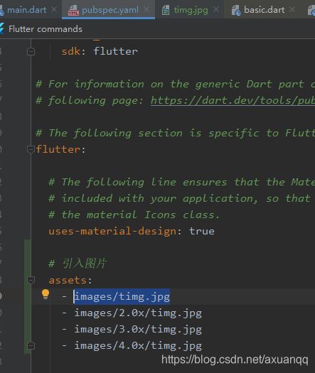
第二步:需要在pubspec.yaml中引入
第三步:使用
class LocalImageContent extends StatelessWidget {
@override
Widget build(BuildContext context) {
return new Center(
child: new Container(
width: 200,
height: 300,
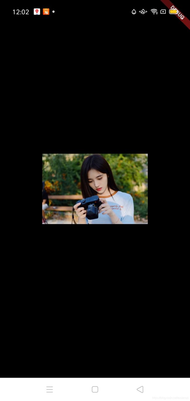
child: Image.asset("images/timg.jpg"),
));
}
}
Flutter ListView组件:
列表参数:
| scrollDirection | Axis.horizontal 水平列表 Axis.vertical 垂直列表,默认 |
| padding | 内边距 |
| reverse | bool 组件反向排序 |
| children | List |
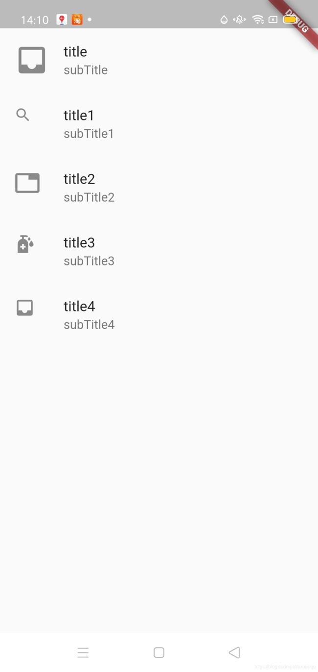
ListTile作为ListView标准的item根布局,其作用是模板代码,类似android 原生ListView 模板布局 simple_list_item_1、simple_list_item_2、simple_list_item_checked
class ListViewListTileContent extends StatelessWidget {
  @override
  Widget build(BuildContext context) {
    return new Scaffold(
        body: new ListView(
      children: [
        ListTile(title: Text("title"), subtitle: Text("subTitle"),leading: Icon(Icons.inbox,size: 40,)),
        ListTile(title: Text("title1"), subtitle: Text("subTitle1"),leading: Icon(Icons.search,size: 20,)),
        ListTile(title: Text("title2"), subtitle: Text("subTitle2"),leading: Icon(Icons.tab,size: 30,)),
        ListTile(title: Text("title3"), subtitle: Text("subTitle3"),leading: Icon(Icons.sanitizer)),
        ListTile(title: Text("title4"), subtitle: Text("subTitle4"),leading: Icon(Icons.inbox))
      ],
    ));
  }
}
注意ListView 是md设计,必须要scaffold容器包裹,否则会报错:
No Material widget found.
The ancestors of this widget were:
  : ListView
    scrollDirection: vertical
    primary: using primary controller
    AlwaysScrollableScrollPhysics
    dependencies: [MediaQuery]
  : ListViewListTileContent
  : MaterialApp
    state: _MaterialAppState#2e418
  : MyApp
  ...
实例代码如下:
class ListViewListTileContent extends StatelessWidget {
  @override
  Widget build(BuildContext context) {
    return new Scaffold(
        body: new ListView(children: [
      ListTile(
          title: Text("title"),
          subtitle: Text("subTitle"),
          leading: Icon(
            Icons.inbox,
            size: 40,
          )),
      ListTile(
          title: Text("title1"),
          subtitle: Text("subTitle1"),
          leading: Icon(
            Icons.search,
            size: 20,
          )),
      ListTile(
          title: Text("title2"),
          subtitle: Text("subTitle2"),
          leading: Icon(
            Icons.tab,
            size: 30,
          )),
      ListTile(
          title: Text("title3"),
          subtitle: Text("subTitle3"),
          leading: Icon(Icons.sanitizer)),
      ListTile(
          title: Text("title4"),
          subtitle: Text("subTitle4"),
          leading: Icon(Icons.inbox))
    ]));
  }
}
可以看到ListTile是模板布局,在实际项目中并不能满足实际项目需要,ListView本身的children泛型是Widget,所以是支持任意组件的
class CustomListViewContent extends StatelessWidget {
  @override
  Widget build(BuildContext context) {
    return new Scaffold(
      body: ListView(
        padding: EdgeInsets.all(10),
        children: [
          Image.network(
              "https://ss0.bdstatic.com/70cFvHSh_Q1YnxGkpoWK1HF6hhy/it/u=1365563952,1327431768&fm=26&gp=0.jpg"),
          Container(height: 10),//占位,起分割作用
          Image.network(
              "https://ss2.bdstatic.com/70cFvnSh_Q1YnxGkpoWK1HF6hhy/it/u=1930662946,3376692344&fm=26&gp=0.jpg"),
          Container(height: 10),
          Image.network(
              "https://ss0.bdstatic.com/70cFuHSh_Q1YnxGkpoWK1HF6hhy/it/u=3353166494,2700282750&fm=26&gp=0.jpg")
        ],
      ),
    );
  }
}
ListView 动态装载数据
方式1:提供一个函数,函数返回List
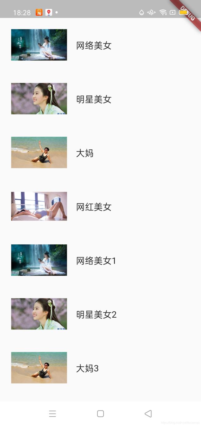
这里我们先定义一个常量集合,方便测试列表
ListData.dartList list = [
{
"title": "网络美女",
"url":
"https://ss1.bdstatic.com/70cFvXSh_Q1YnxGkpoWK1HF6hhy/it/u=3097946610,3683154407&fm=26&gp=0.jpg"
},
{
"title": "明星美女",
"url":
"https://ss2.bdstatic.com/70cFvnSh_Q1YnxGkpoWK1HF6hhy/it/u=3802653641,1514041303&fm=26&gp=0.jpg"
},
{
"title": "大妈",
"url":
"https://ss1.bdstatic.com/70cFuXSh_Q1YnxGkpoWK1HF6hhy/it/u=3049104007,1212242596&fm=26&gp=0.jpg"
},
{
"title": "网红美女",
"url":
"https://ss1.bdstatic.com/70cFuXSh_Q1YnxGkpoWK1HF6hhy/it/u=3705826265,1376024962&fm=26&gp=0.jpg"
},
{
"title": "网络美女1",
"url":
"https://ss1.bdstatic.com/70cFvXSh_Q1YnxGkpoWK1HF6hhy/it/u=3097946610,3683154407&fm=26&gp=0.jpg"
},
{
"title": "明星美女2",
"url":
"https://ss2.bdstatic.com/70cFvnSh_Q1YnxGkpoWK1HF6hhy/it/u=3802653641,1514041303&fm=26&gp=0.jpg"
},
{
"title": "大妈3",
"url":
"https://ss1.bdstatic.com/70cFuXSh_Q1YnxGkpoWK1HF6hhy/it/u=3049104007,1212242596&fm=26&gp=0.jpg"
},
{
"title": "网红美女4",
"url":
"https://ss1.bdstatic.com/70cFuXSh_Q1YnxGkpoWK1HF6hhy/it/u=3705826265,1376024962&fm=26&gp=0.jpg"
}
];
import 'const/ListData.dart' as ListData;

class CustomListViewContent extends StatelessWidget {
  List _getListItem() {
    var map = ListData.list.map((e) {
      return ListTile(
          contentPadding: EdgeInsets.all(20),
          leading: Image.network(
            e["url"],
            width: 100,
            fit: BoxFit.cover,
          ),
          title: Text(e["title"]));
    });
    return map.toList();
  }

  @override
  Widget build(BuildContext context) {
    return Scaffold(body: new ListView(children: _getListItem()));
  }
}
方式2:通过fluuter本身提供的ListView.Builder来构建
class CustomListViewContent extends StatelessWidget {
  List list = ListData.list;

  Widget _getListItem(BuildContext context, int index) {
    return new ListTile(
        title: new Text(list[index]["title"]),
        contentPadding: EdgeInsets.all(10),
        leading: Image.network(
          list[index]["url"],
          width: 200,
          fit: BoxFit.cover,
        ));
  }

  @override
  Widget build(BuildContext context) {
    return Scaffold(
        body: new ListView.builder(
            itemCount: list.length, itemBuilder: _getListItem));
  }
}
flutter 只网格布局GridView
1.可以通过GridView.count实现网格布局
2.通过GirdView.Builder实现网格布局
常见属性如下:
| scrollDirection | Axis | 滚动方向 |
| padding | EdgeInsetsGeometry | 内边距 |
| reverse | bool | 组件反向 |
| crossAxisSpacing | double | 水平子Widget之间的距离 |
| mainAxisSpaing | double | 垂直子Widget之间的距离 |
| crossAxisCount | int | 一行的Widget数量 |
| childAspectRation | double | 子widget宽高比例,相对于GridView |
| children | Widget[] | 子组件集合 |
| gridDelegate | SliverGirdDelegateWithFixedCorssAxisCount SliverGirdDelegateWithFixedCorssAxisExtent |
控制布局主要在GridView.Builder里面 |
class GridViewContent extends StatelessWidget {
  List _getChilds() {
    return ListData.list.map((e) {
      return new Column(children: [
        Image.network(
          e["url"],
          fit: BoxFit.cover,
        ),
        SizedBox(height: 10),
        Text(e["title"])
      ]);
    }).toList();
  }

  @override
  Widget build(BuildContext context) {
    return new Scaffold(
      body: new GridView.count(
        crossAxisCount: 3,

        padding: EdgeInsets.all(10),
        crossAxisSpacing: 10,//副轴方向的间隔,跟scrollDirection相关
        mainAxisSpacing: 10,//主轴方向的间隔,跟scrollDirection相关
        children: _getChilds(),
      ),
    );
  }
}
同样可以通过builder创建
class GridViewContent2 extends StatelessWidget {
  Widget getItemView(BuildContext context, int index) {
    return new Column(children: [
      Image.network(
        ListData.list[index]["url"],
        fit: BoxFit.cover,
      ),
      SizedBox(height: 10),
      Text(ListData.list[index]["title"])
    ]);
  }

  @override
  Widget build(BuildContext context) {
    return new Scaffold(
        body: GridView.builder(
      itemCount: ListData.list.length,
      itemBuilder: getItemView,
      gridDelegate:
          SliverGridDelegateWithFixedCrossAxisCount(crossAxisCount: 3),
    ));
  }
}
flutter页面布局 Padding row cloumn expand组件
在flutter中很多widget是没有padding属性的,这个时候可以用Padding组件来实现内边距
class Padding extends SingleChildRenderObjectWidget {
  /// Creates a widget that insets its child.
  ///
  /// The [padding] argument must not be null.
  const Padding({
    Key key,
    @required this.padding,
    Widget child,
  }) : assert(padding != null),
       super(key: key, child: child);

  /// The amount of space by which to inset the child.
  final EdgeInsetsGeometry padding;
...
}
从源码中可以看出Padding组件只允许有一个child,其常见属性如下:
| padding | 内边距,EdgeInsetss设置填充的值 |
| child | 子组件 |
Flutter Row水平布局组件
| mainAxisAlignment | 主轴的排序方式 |
| crossAxisAlignment | 次轴的排序方式 |
| children | 组件子元素 |
Flutter Expand组件 类似Android:weight 设置组件的权重
| flex | 元素站整个row/clumn的比例 |
| child | 子元素 |
实际例子如下:
class RowColumnExpandContent extends StatelessWidget {
  @override
  Widget build(BuildContext context) {
    return Scaffold(
        body: new Column(children: [
          Image.network(
              "https://ss0.bdstatic.com/94oJfD_bAAcT8t7mm9GUKT-xh_/timg?image&quality=100&size=b4000_4000&sec=1603251542&di=74a1c850422f31af7b82e6adf1fa4469&src=http://img.tupianzj.com/uploads/Bizhi/mn1_1366.jpg"),
          SizedBox(
            height: 10,
          ),
          Row(
            children: [
              Expanded(
                  flex: 2,
                  child: Container(
                      height: 180,
                      child: Image.network(
                        "https://timgsa.baidu.com/timg?image&quality=80&size=b9999_10000&sec=1603261687687&di=86b18e2e5341e8ddc75a41701d0d2d9b&imgtype=0&src=http%3A%2F%2Fwww.wfuyu.com%2Fuploadfile%2Fcj%2F20141130%2Fcd70ec786aa669ee4d472073cf52c76a.jpg",
                        fit: BoxFit.cover,
                      ))),
              SizedBox(
                width: 10,
              ),
              Expanded(
                  flex: 1,
                  child: Container(
                      height: 180,
                      child: Column(
                          mainAxisAlignment: MainAxisAlignment.center,
                          children: [
                            Image.network(
                                "https://ss2.bdstatic.com/70cFvnSh_Q1YnxGkpoWK1HF6hhy/it/u=3605135345,833828983&fm=26&gp=0.jpg"),
                            SizedBox(
                              height: 10,
                            ),
                            Image.network(
                                "https://ss2.bdstatic.com/70cFvnSh_Q1YnxGkpoWK1HF6hhy/it/u=3605135345,833828983&fm=26&gp=0.jpg")
                          ])))
            ],
          )
        ]));
  }
}
Flutter Stack组件 实现绝对布局
Stack表示堆的意思,我们可以用Stack或者Stack结合的Align或者Stack结合的Positioned来实现页面的定位布局,说得白一点就是Android 的FrameLayout
stack组件的属性如下:
| alignment | 配置所有子元素的显示文字,类似Android:Grivity |
| children | 子组件集合 |
Flutter Stack Align
Stack组件结合Align组件可以控制每个元素的显示位置
class StackContent extends StatelessWidget {
  @override
  Widget build(BuildContext context) {
    return Scaffold(
        appBar: AppBar(title: Text("Stack组件")),
        body: Stack(
            alignment: Alignment.center,
            children: [Text("hello"), Text("我是小明")]));
  }
}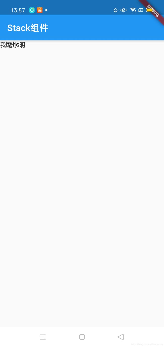
可以看到重叠了,这个时候我们可以用Align组件来控制子组件相对于父容器的位置,如:
class StackContent extends StatelessWidget {
  @override
  Widget build(BuildContext context) {
    return Scaffold(
        appBar: AppBar(title: Text("Stack组件")),
        body: Stack(
            // alignment: Alignment.center,
            children: [
              Align(alignment: Alignment.topRight, child: Text("hello")),
              Align(alignment: Alignment.bottomLeft, child: Text("我是小明"))
            ]));
  }
}
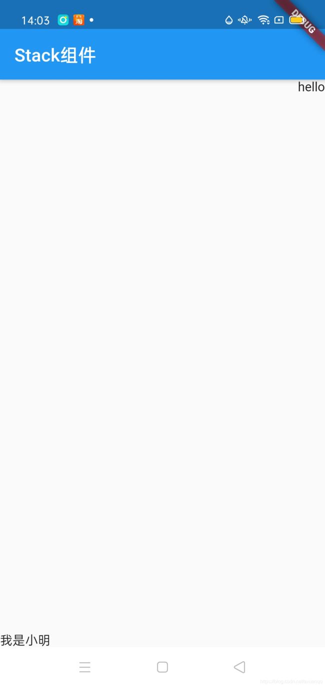
这个例子只能粗略的控制 东南西北中的5个大致方位,但还是无法精确控制显示在哪个点,我们这时可以通过Positioned组件来实现精确控制在定位哪个点位置:
class StackContent extends StatelessWidget {
  @override
  Widget build(BuildContext context) {
    return Scaffold(
        appBar: AppBar(title: Text("Stack组件")),
        body: Stack(
            // alignment: Alignment.center,
            children: [
              // Align(alignment: Alignment.topRight, child: Text("hello")),
              // Align(alignment: Alignment.bottomLeft, child: Text("我是小明"))
              Positioned(
                  right: 0,
                  top: 20,
                  child: Icon(Icons.add,
                      size: 40, color: Colors.red, semanticLabel: "添加")),
              Positioned(
                  left: 20,
                  bottom: 20,
                  child: Icon(Icons.search,
                      size: 30, color: Colors.blue, semanticLabel: "搜索"))
            ]));
  }
}
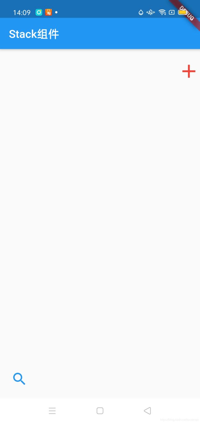
注意:Align和Postioned组件不能脱离Stack容器来使用
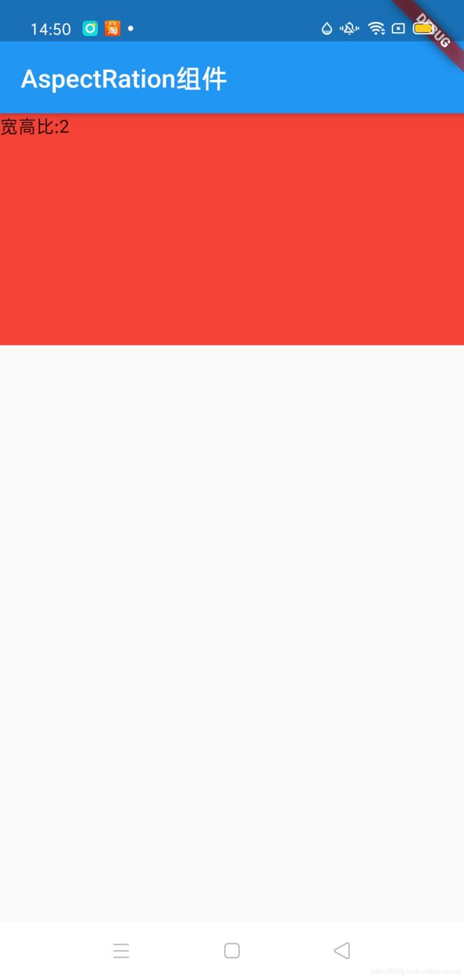
Flutter AspectRation组件
AspectRation的作用是根据设置调整元素的child的宽高比
aspectRation首先会在布局允许的范围内尽可能的扩展,widget的高度是由宽度和高度的比率决定的,类似于BoxFit中的contain,按照固定比率去尽量占满区域,如果再满足所有的限制条件后无法找到一个可行的尺寸,AspectRation最终将优先适应布局条件限制,而忽略所设置的比率;
class AspectRationContent extends StatelessWidget {
  @override
  Widget build(BuildContext context) {
    return Scaffold(
        appBar: AppBar(title: Text("AspectRation组件")),
        body: AspectRatio(
          aspectRatio: 2,
          child: Container(
            color: Colors.red,
            child: Text("宽高比:2"),
          ),
        ));
  }
}
Flutter Card组件
Card是卡片组件,内容可以由大多数类型的Widget构成,Card有圆角和影音,这让他看起来更有立体感
常见属性如下:
| margin | 外边距 |
| child | 子组件 |
| Shape | Card的影音效果,默认为带阴影的圆角长方形边 |
class ListCardContent extends StatelessWidget {
  List list = ListData.list;

  @override
  Widget build(BuildContext context) {
    return ListView.builder(
        itemCount: list.length,
        itemBuilder: (BuildContext context, int index) {
          return Card(
            margin: EdgeInsets.all(10),
            child: Padding(
                padding: EdgeInsets.all(10),
                child: Column(
                  children: [
                    AspectRatio(
                        aspectRatio: 16 / 9,
                        child: Image.network(list[index]["url"],
                            fit: BoxFit.cover)),
                    SizedBox(
                      height: 10,
                      width: 10,
                    ),
                    Row(
                      children: [
                        ClipOval(
                            child: Image.network(
                          list[index]["url"],
                          width: 20,
                          height: 20,
                          fit: BoxFit.cover,
                        )),
                        CircleAvatar(
                          backgroundImage: NetworkImage(list[index]["url"]),
                        ),
                        SizedBox(
                          height: 10,
                          width: 10,
                        ),
                        Text(list[index]["title"])
                      ],
                    )
                  ],
                )),
          );
        });
  }
}
card默认原角度是4dp,请看源码:
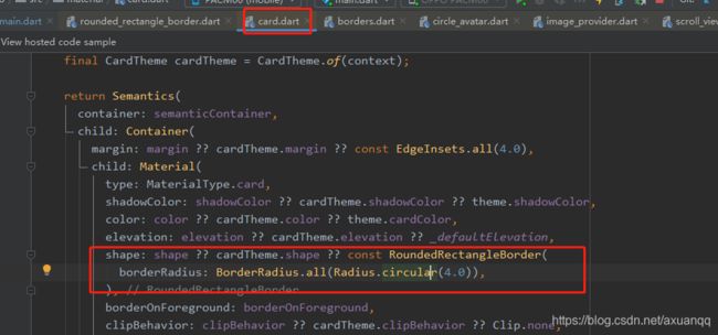
同时我们可以自定义圆角度
class ListCardContent extends StatelessWidget {
  List list = ListData.list;

  @override
  Widget build(BuildContext context) {
    return ListView.builder(
        itemCount: list.length,
        itemBuilder: (BuildContext context, int index) {
          return Card(
            //自定义原角度
            shape: RoundedRectangleBorder(
                borderRadius: BorderRadius.all(Radius.circular(30))),
            margin: EdgeInsets.all(10),
            child: Padding(
                padding: EdgeInsets.all(10),
                child: Column(
                  children: [
                    AspectRatio(
                        aspectRatio: 16 / 9,
                        child: Image.network(list[index]["url"],
                            fit: BoxFit.cover)),
                    SizedBox(
                      height: 10,
                      width: 10,
                    ),
                    Row(
                      children: [
                        ClipOval(
                            child: Image.network(
                          list[index]["url"],
                          width: 20,
                          height: 20,
                          fit: BoxFit.cover,
                        )),
                        CircleAvatar(
                          backgroundImage: NetworkImage(list[index]["url"]),
                        ),
                        SizedBox(
                          height: 10,
                          width: 10,
                        ),
                        Text(list[index]["title"])
                      ],
                    )
                  ],
                )),
          );
        });
  }
}
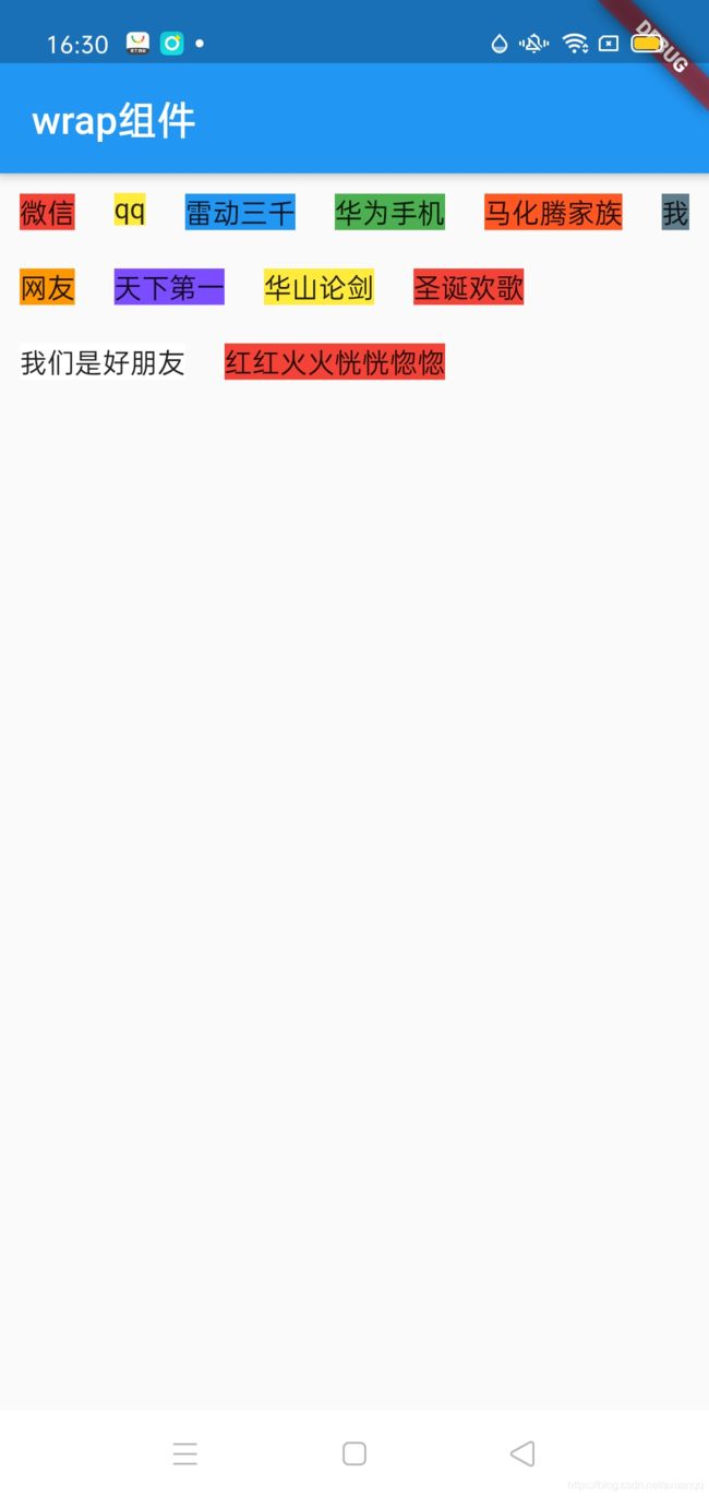
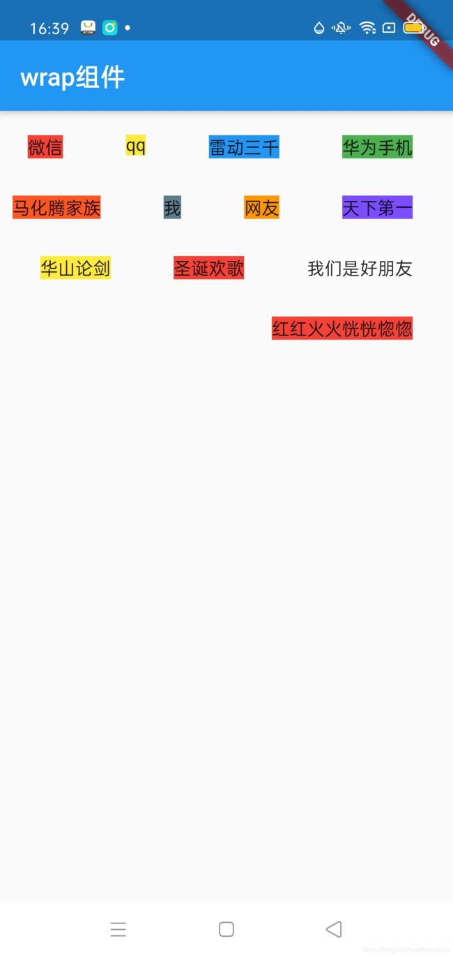
Flutter Wrap组件
Wrap可以实现流式布局,单行的Warp跟Row表现几乎一致,单列的Wrap则Row表现一周,但是Row和Cloumn都是单例的,无法跨行跨列,Wrap组件则突破了这个限制,mainAxis上空间不足时,则向crossAxis上去扩展
常见属性如下:
| direction | 主轴方向,默认水平方向 |
| alignment | 主轴的对齐方式 |
| spacing | 主轴方向上的间距 |
| textDirection | 文本方向 |
| verticalDirection | children的摆放顺序,默认是down,见Flex相关属性介绍 |
| runAlignment | run的对齐方式,run可以理解为新的行或者列,如果是水平方向布局的话,run可以理解为新的一行,次轴 |
| runSpacing | 次轴的间距 |
class WrapContent extends StatelessWidget {
  @override
  Widget build(BuildContext context) {
    return Scaffold(
        appBar: AppBar(
          title: Text("wrap组件"),
        ),
        body: Wrap(children: [
          Padding(
              padding: EdgeInsets.all(10),
              child: Text(
                "微信",
                style: TextStyle(backgroundColor: Colors.red),
              )),
          Padding(
              padding: EdgeInsets.all(10),
              child: Text(
                "qq",
                style: TextStyle(backgroundColor: Colors.yellow),
              )),
          Padding(
              padding: EdgeInsets.all(10),
              child: Text(
                "雷动三千",
                style: TextStyle(backgroundColor: Colors.blue),
              )),
          Padding(
              padding: EdgeInsets.all(10),
              child: Text(
                "华为手机",
                style: TextStyle(backgroundColor: Colors.green),
              )),
          Padding(
              padding: EdgeInsets.all(10),
              child: Text(
                "马化腾家族",
                style: TextStyle(backgroundColor: Colors.deepOrange),
              )),
          Padding(
              padding: EdgeInsets.all(10),
              child: Text(
                "我",
                style: TextStyle(backgroundColor: Colors.blueGrey),
              )),
          Padding(
              padding: EdgeInsets.all(10),
              child: Text(
                "网友",
                style: TextStyle(backgroundColor: Colors.orange),
              )),
          Padding(
              padding: EdgeInsets.all(10),
              child: Text(
                "天下第一",
                style: TextStyle(backgroundColor: Colors.deepPurpleAccent),
              )),
          Padding(
              padding: EdgeInsets.all(10),
              child: Text(
                "华山论剑",
                style: TextStyle(backgroundColor: Colors.yellow),
              )),
          Padding(
              padding: EdgeInsets.all(10),
              child: Text(
                "圣诞欢歌",
                style: TextStyle(backgroundColor: Colors.red),
              )),
          Padding(
              padding: EdgeInsets.all(10),
              child: Text(
                "我们是好朋友",
                style: TextStyle(backgroundColor: Colors.white),
              )),
          Padding(
              padding: EdgeInsets.all(10),
              child: Text(
                "红红火火恍恍惚惚",
                style: TextStyle(backgroundColor: Colors.red),
              )),
        ]));
  }
}
我们调整一下主轴方向 让先纵向排列 然后再横向排列
class WrapContent extends StatelessWidget {
  @override
  Widget build(BuildContext context) {
    return Scaffold(
        appBar: AppBar(
          title: Text("wrap组件"),
        ),
        body: Container(
            height: 200,
            child: Wrap(direction: Axis.vertical, children: [
              Padding(
                  padding: EdgeInsets.all(10),
                  child: Text(
                    "微信",
                    style: TextStyle(backgroundColor: Colors.red),
                  )),
            ...
            ])));
  }
}
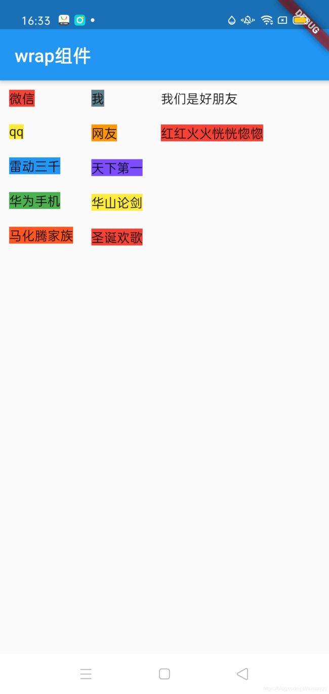
常见属性用法示例:
class WrapContent extends StatelessWidget {
  @override
  Widget build(BuildContext context) {
    return Scaffold(
        appBar: AppBar(
          title: Text("wrap组件"),
        ),
        body: Container(
            height: 200,
            child: Wrap(
                direction: Axis.horizontal, //设置主轴方向
                spacing: 30, //主轴间距
                alignment: WrapAlignment.end,//右对齐
                runSpacing: 10,//次轴方向间距
                runAlignment: WrapAlignment.center,//次轴方向的对齐
                children: [
              Padding(
                  padding: EdgeInsets.all(10),
                  child: Text(
                    "微信",
                    style: TextStyle(backgroundColor: Colors.red),
                  )),
            ...
            ])));
  }
}
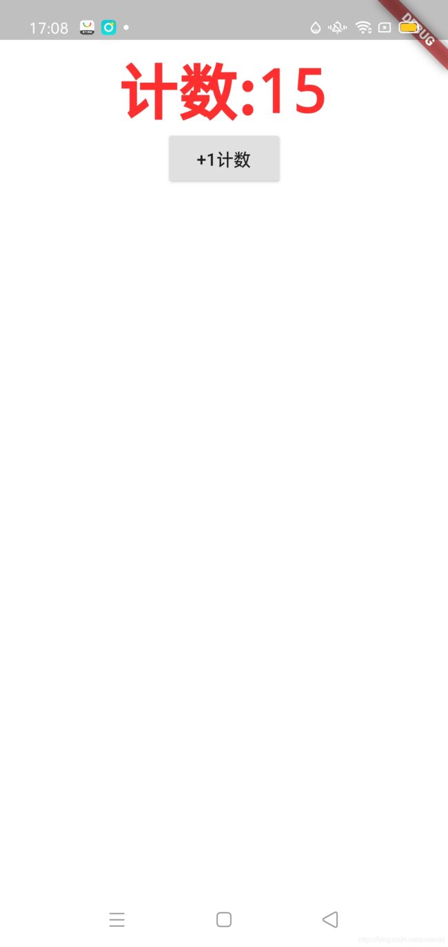
Flutter 状态组件
StatelessWidget 是吴状态组件,状态是不可变的
StatefulWidget 是有状态的组件,持有状态可能在widget的声明周期中改变,跟RN state类似,说的白一点能动态改变这个组件形态
更新语法跟RN或者说Rect一致 通过调用内置函数 setState()来更新变量
Flutter 创建工程的时候 都会给一个计数模板代码,这里我们手动模拟一下,加深有状态组件的的语法
/**
 * 创建statelessWidget 快捷键 stless
 * 创建statefullWidget  快捷键 stfull
 */
class CountWidget extends StatefulWidget {
  @override
  _CountWidgetState createState() => _CountWidgetState();
}

class _CountWidgetState extends State {
  int count = 0;

  @override
  Widget build(BuildContext context) {
    return Container(
      padding: EdgeInsets.all(40),
      color: Colors.white,
      child: Column(
        children: [
          Text(
            "计数:${this.count}",
            style: TextStyle(decoration: TextDecoration.none),
          ),
          RaisedButton(
              child: Text("+1计数"),
              onPressed: () {
                //点击 更新变量,这里++
                this.setState(() {
                  this.count++;
                });
              })
        ],
      ),
    );
  }
}
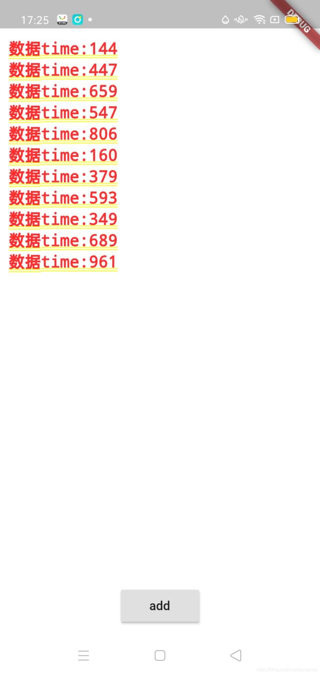
我们再来一个例子 很常见的 比如通过网络获取数据 然后展示在list列表中
先分享一个错误:
'package:flutter/src/rendering/box.dart':
Failed assertion: line 1785 pos 12: 'hasSize'
我是Column嵌套了ListView 这个是不允许嵌套的,不跟Android一致
class ListViewStatefullWidget extends StatefulWidget {
  @override
  _ListViewStatefullWidgetState createState() =>
      _ListViewStatefullWidgetState();
}

class _ListViewStatefullWidgetState extends State {
  List list = new List();

  @override
  Widget build(BuildContext context) {
    return Container(
        padding: EdgeInsets.all(10),
        color: Colors.white,
        child: Stack(children: [
          ListView.builder(
              itemCount: list.length,
              itemBuilder: (BuildContext context, int index) {
                return Text(
                  list[index],
                  style: TextStyle(fontSize: 18),
                );
              }),
          Align(
            alignment: Alignment.bottomCenter,
            child: RaisedButton(
                onPressed: () => {
                      this.setState(() {
                        this.list.add("数据time:" +
                            new DateTime.now().millisecond.toString());
                      })
                    },
                child: Text("add")),
          )
        ]));
  }
} 
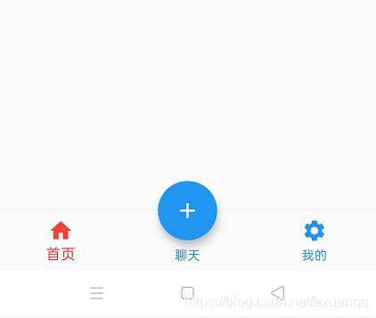
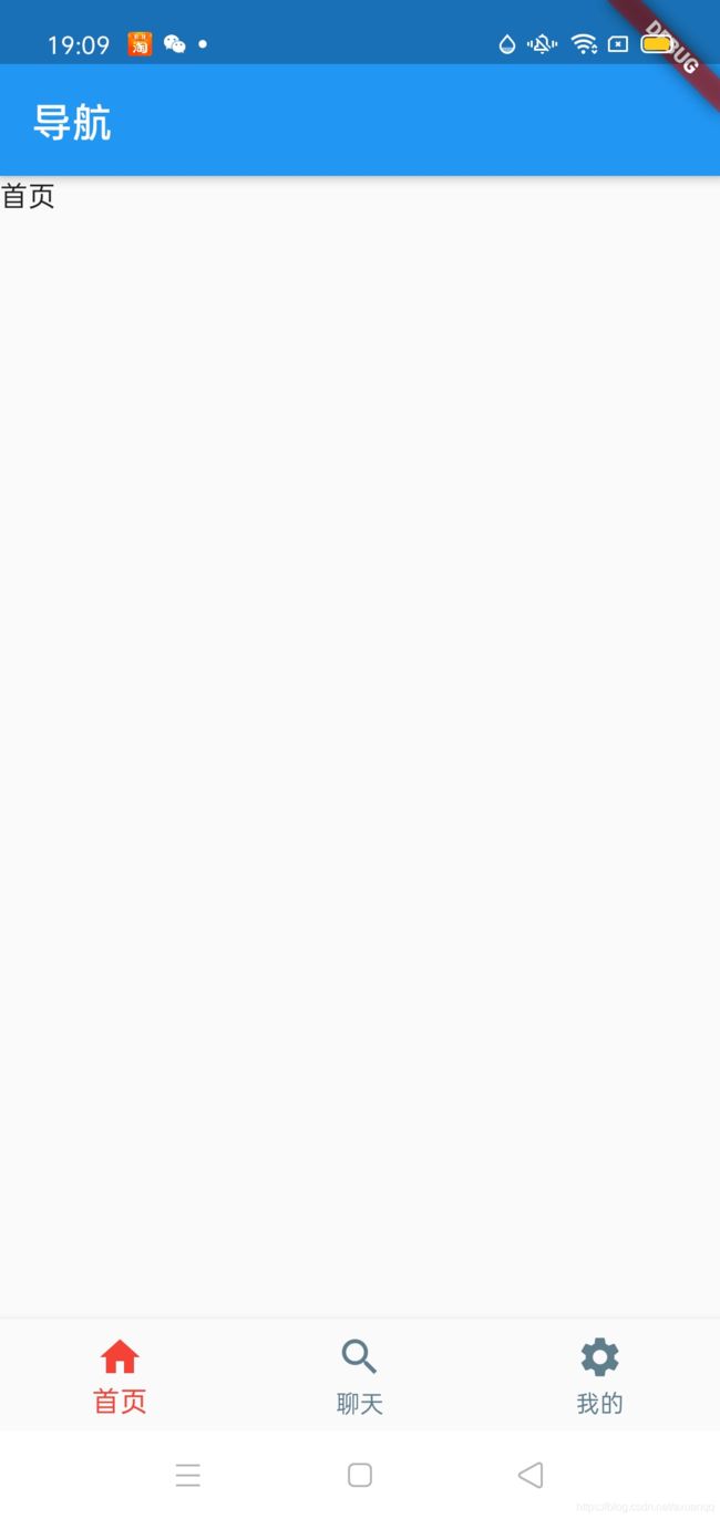
Flutter BottomNavigationBar 底部导航,类似Android TabFragmentHost
其常见属性如下:
| items | List |
| iconSize | icon大小 |
| currentIndex | 默认选中第几个 |
| onTap | 选中变化回调函数 |
| fixedColor | 选中的颜色 |
| type | BottomNavigationBarType.fixed BottiomNavigationBarType,shifting |
示例如下:
HomeTab.dart
import 'package:flutter/cupertino.dart';
class HomeTab extends StatefulWidget {
@override
_HomeTabState createState() => _HomeTabState();
}
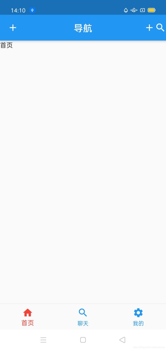
class _HomeTabState extends State {
@override
Widget build(BuildContext context) {
return Container(child:Text("首页"));
}
}
NewsTab.dart
import 'package:flutter/cupertino.dart';

class NewsTab extends StatefulWidget {
  @override
  _NewsTabState createState() => _NewsTabState();
}

class _NewsTabState extends State {
  @override
  Widget build(BuildContext context) {
    return Container(child:Text("聊天"));
  }
}
MineTab.dart
import 'package:flutter/cupertino.dart';

class MineTab extends StatefulWidget {
  @override
  _MineTabState createState() => _MineTabState();
}

class _MineTabState extends State {
  @override
  Widget build(BuildContext context) {
    return Container(child:Text("我的"));
  }
}
三个tab 动态链接起来:
class HomeContent extends StatefulWidget {
  @override
  _HomeContentState createState() => _HomeContentState();
}

class _HomeContentState extends State {
  List tabWidget = [HomeTab(),NewsTab(),MineTab()];
  int currentTab = 0;

  @override
  Widget build(BuildContext context) {
    return Scaffold(
      appBar: AppBar(title: Text("导航")),
      body: tabWidget[currentTab],
      bottomNavigationBar: BottomNavigationBar(
        /**
         * 选中的颜色
         */
        fixedColor: Colors.red,
        /**
         * 未选中颜色
         */
        unselectedItemColor:Colors.blue,
        /**
         * 当前tab索引
         */
        currentIndex: currentTab,
        onTap: (int index) {
          /**
           * 点击事件更新tab索引
           */
          this.setState(() {
            this.currentTab = index;
          });
        },
        items: [
          BottomNavigationBarItem(label: "首页",icon: Icon(Icons.home)),
          BottomNavigationBarItem(label: "聊天",icon: Icon(Icons.search)),
          BottomNavigationBarItem(label: "我的",icon: Icon(Icons.settings))
        ],
      ),
    );
  }
}
Flutter 路由导航
路由 大家并不陌生,就是一个有规律的uri 跳转到指定页面,Android 中的Arouter
在Flutter 中通过Navigator组件管理路由导航,并提供了管理堆栈的方法,如:Navigator.push和Navigator.pop,且Flutter中给我们提供了两种配置路由跳转的方式 1.基本路由 2.命名路由
基本路由例子:其实就是应用绝对类,new 一个新的页面
ChatRoomPage.dart
import 'package:flutter/cupertino.dart';
import 'package:flutter/material.dart';
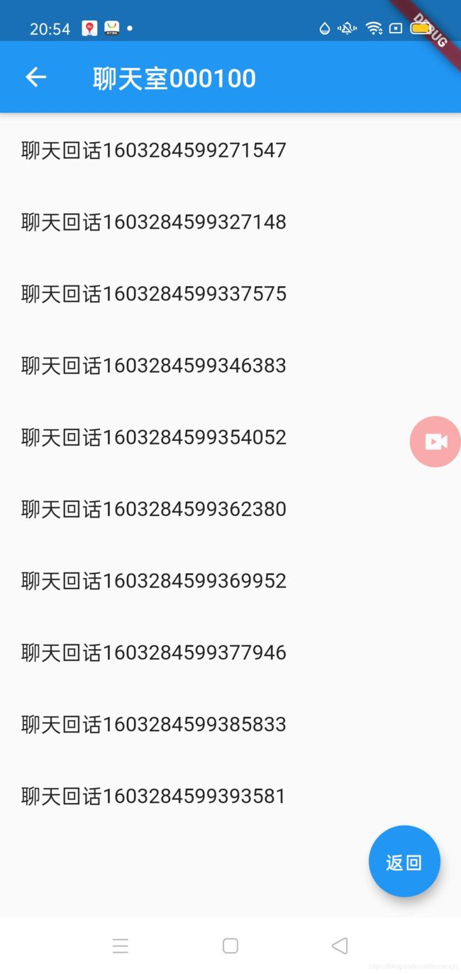
class ChatRoomPage extends StatelessWidget {
String id;
ChatRoomPage({this.id = "000"});
@override
Widget build(BuildContext context) {
return Scaffold(
appBar: AppBar(title: Text("聊天室${this.id}")),
body: ListView.builder(
itemCount: 10,
itemBuilder: (BuildContext context, int index) {
return ListTile(
title: Text(
"聊天回话" + DateTime.now().microsecondsSinceEpoch.toString()));
}),
floatingActionButton: FloatingActionButton(
child: Text("返回"),
onPressed: () {
Navigator.pop(context);
},
),
);
}
}
import 'package:flutter/cupertino.dart';
import 'package:flutter/material.dart';

import '../chat/ChatRoomPage.dart';

class NewsTab extends StatefulWidget {
  @override
  _NewsTabState createState() => _NewsTabState();
}

class _NewsTabState extends State {
  @override
  Widget build(BuildContext context) {
    return Container(
        child: Column(
      children: [
        RaisedButton(
          onPressed: () => {
            Navigator.of(context)
                .push(MaterialPageRoute(builder: (BuildContext context) {
              return ChatRoomPage(id: "001");
            }))
          },
          child: Text("聊天室1"),
        ),
        RaisedButton(
          onPressed: () => {
            Navigator.of(context)
                .push(MaterialPageRoute(builder: (BuildContext context) {
              return ChatRoomPage(id: "003");
            }))
          },
          child: Text("聊天室2"),
        ),
        RaisedButton(
          onPressed: () => {
            Navigator.of(context)
                .push(MaterialPageRoute(builder: (BuildContext context) {
              return ChatRoomPage(id: "002");
            }))
          },
          child: Text("聊天室3"),
        )
      ],
    ));
  }
}
这种方式跳转局限性很小,只适合小项目,迫切需要uri支持的方式跳转
第一步:需要在main()入口的MaterialApp中注册,具体注册属性是routes
void main() {
  runApp(MyApp());
}

class MyApp extends StatelessWidget {
  @override
  Widget build(BuildContext context) {
    return new MaterialApp(
        title: "Stack",
        home: HomeContent(),
        initialRoute: "/",
        routes: {
          "/chatRoomPage": (BuildContext context) => ChatRoomPage(),
        });
  }
}
跳转api:
Navigator.pushNamed(context, '/chatRoomPage')这种通过uri跳转的方式极大得提高了代码的灵活性 和全局管理路由跳转的问题,下面演示如何传递参数
Routes.dart
import 'package:flutter/cupertino.dart';
import 'package:flutter/material.dart';
import 'package:flutter_xxf/chat/ChatRoomPage.dart';

final Map routes = {
  "/chatRoomPage": (BuildContext context, {argments}) => ChatRoomPage(argments: argments),
};

/**
 * =固定生成写法
 */
PageRoute myOnGenerateRoutes(RouteSettings settings) {
  var name = settings.name;
  Function routeBuilder = routes[name];
  if (routeBuilder != null) {
    return MaterialPageRoute(builder: (BuildContext context) {
      return routeBuilder(context, argments: settings.arguments);
    });
  } else {
    return MaterialPageRoute(builder: (BuildContext context) {
      return routeBuilder(context);
    });
  }
}
void main() {
  runApp(MyApp());
}

class MyApp extends StatelessWidget {
  @override
  Widget build(BuildContext context) {
    return new MaterialApp(
        title: "Stack",
        home: HomeContent(),
        initialRoute: "/",
        onGenerateRoute: myOnGenerateRoutes,
    /*    routes: {
          "/chatRoomPage": (BuildContext context) => ChatRoomPage(),
        }*/
        );
  }
}
注意这里 我们不是使用routes传递一个map,而是通过onGenrateRoute方法属性传递Routes.dart中生成路由的方法,并且传递了argments map参数,
import 'package:flutter/cupertino.dart';
import 'package:flutter/material.dart';

class ChatRoomPage extends StatelessWidget {
  String id;
  Map argments;

  ChatRoomPage({this.id = "000", this.argments});

  @override
  Widget build(BuildContext context) {
    return Scaffold(
      appBar: AppBar(title: Text("聊天室${this.id}${ this.argments["id"]}")),
      body: ListView.builder(
          itemCount: 10,
          itemBuilder: (BuildContext context, int index) {
            return ListTile(
                title: Text(
                    "聊天回话" + DateTime.now().microsecondsSinceEpoch.toString()));
          }),
      floatingActionButton: FloatingActionButton(
        child: Text("返回"),
        onPressed: () {
          Navigator.pop(context);
        },
      ),
    );
  }
}
这里我们也接收了argments 这个map参数,好到了跳转传参代码了
// Navigator.pushNamed(context, '/chatRoomPage')
Navigator.pushNamed(context, '/chatRoomPage',arguments: {
                "id":"100",
              })
Flutter 中返回上一级页面
Navigator.of(context).pop()
Flutter 中替换路由
有时候我们跳转到某个页面之前可能想要关闭当前页面,那么返回就返回到了上一个页面,路线图
A->B->C
A<--C
这时我们可以用路由替换当前页面,类似Android Fragment stack 管理栈的FragmentTransaction.replace
Navigator.of(context).pushReplacementNamed('/xxxPage');
返回到根路由,比如登录成功后返回首页,类似Annoid Activity启动模式的singleTask
Navigator.of(context).pushAndRemoveUtil(new MaterialPageRouter(builder:(context)=>new HomePage(index:1),
(route)=>route==null
);
AppBar组件: 类似Android ToolBar ActionBar
常见属性
| leading | 在标题前面显示的一个控件,在首页通常显示应用的log:在其他页面通常显示为返回按钮 |
| title | 标题,通常显示未当前界面的标题文字,可以放组件 |
| actions | 通常使用IconButton来表示,可以放按钮组 |
| backgroundColor | 导航与背景颜色 |
| iconTheme | 图标样式 |
| textTheme | 文字样式 |
| centerTitle | 标题是否居中 |
| bottom | 通常放tabBar,标题栏下面显示一个Tab导航栏 |
| centerTitle | 标题是否居中 |
AppBar(
        title: Text("导航"),
        /**
         * 标题居中
         */
        centerTitle: true,
        /**
         * icon button是包裹icon组件 且有点击事件的容器
         */
        leading: IconButton(
          icon: Icon(Icons.add),
          onPressed: () => {Navigator.pop(context)},
        ),
        actions: [Icon(Icons.add), Icon(Icons.search)],
      ))
TabBar
类似Android com.google.android.material.tabs.TabLayout
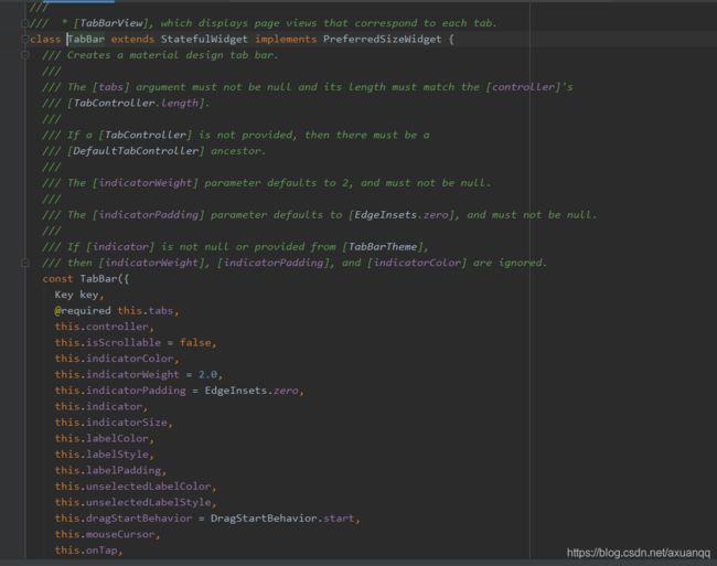
| tabs | 可以是任意widget,一般是Tab组件 |
| controller | TabController对象 |
| isScrollable | 是否可以滚动 |
| indicatorColor | 指示器颜色 |
| indicatorWeight | 指示器厚度 |
| indicatorPadding | 底部指示器的padding |
| indicatorPadding | 底部指示器的padding |
| indicator | 指示器decoration,例如边框等 |
| indicatorSize | 指示器大小 |
| labelColor | 选中Tab文字Style |
| unselectedLableColor | 未选中Tab中文字颜色 |
| unselectedLabelStyle | 未选中Tab中文字style |
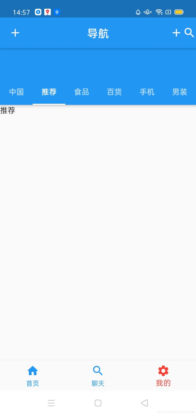
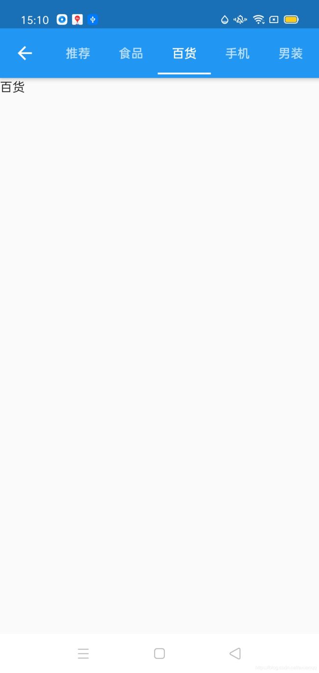
class MineTab extends StatefulWidget {
  @override
  _MineTabState createState() => _MineTabState();
}

class _MineTabState extends State {
  List tabs = [
    Tab(text: "中国"),
    Tab(text: "推荐"),
    Tab(text: "食品"),
    Tab(text: "百货"),
    Tab(text: "手机"),
    Tab(text: "男装"),
    Tab(text: "内衣"),
    Tab(text: "电器"),
  ];

  @override
  Widget build(BuildContext context) {
    return DefaultTabController(
        length: tabs.length,
        child: Scaffold(
          appBar: AppBar(
            bottom: TabBar(
              tabs: tabs,
              isScrollable: true,
            ),
          ),
          body: TabBarView(
            children: tabs.map((Tab tab) {
              return Text(tab.text);
            }).toList(),
          ),
        ));
    return Container(child: Text("我的"));
  }
}
同样我们可以覆盖AppBar,把TabBar搞到title布局里面去
import 'package:flutter/cupertino.dart';
import 'package:flutter/material.dart';

class TabBarPage extends StatefulWidget {
  @override
  _TabBarPageState createState() => _TabBarPageState();

  Map argments;

  TabBarPage({this.argments});
}

class _TabBarPageState extends State {
  List tabs = [
    Tab(text: "中国"),
    Tab(text: "推荐"),
    Tab(text: "食品"),
    Tab(text: "百货"),
    Tab(text: "手机"),
    Tab(text: "男装"),
    Tab(text: "内衣"),
    Tab(text: "电器"),
  ];

  @override
  Widget build(BuildContext context) {
    return DefaultTabController(
        length: tabs.length,
        child: Scaffold(
          appBar: AppBar(
            title: TabBar(
              isScrollable: true,
              tabs: tabs,
            ),
          ),
          body: TabBarView(
            children: tabs.map((Tab e) {
              return Text(e.text);
            }).toList(),
          ),
        ));
  }
}
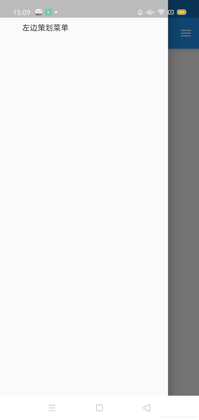
Flutter 侧滑菜单
类似Android Drawer效果
核心语法:Scaffold 组件提供drawer属性
import 'package:flutter/cupertino.dart';
import 'package:flutter/material.dart';

class DrawerPage extends StatefulWidget {
  Map argments;

  DrawerPage({this.argments});

  @override
  _DrawerPageState createState() => _DrawerPageState();
}

class _DrawerPageState extends State {
  @override
  Widget build(BuildContext context) {
    return Scaffold(
        appBar: AppBar(
          title: Text("注册"),
        ),
        drawer: Drawer(
          child: Container(
            child: Text("左边策划菜单"),
            padding: EdgeInsets.all(40),
          ),
        ),
        endDrawer: Drawer(
          child: Container(
            child: Text("右侧划菜单"),
            padding: EdgeInsets.all(40),
          ),
        ),
    );
  }
}
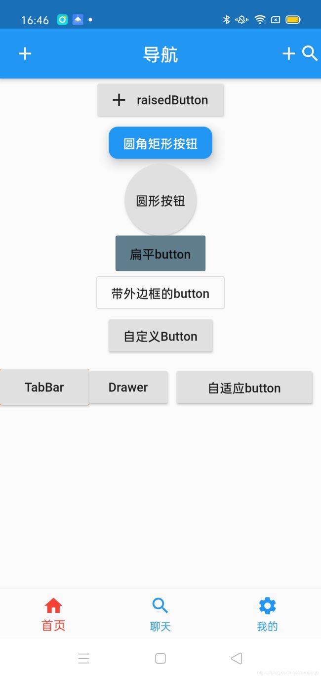
Flutter 中的button
flutter扩展了许多button
RaisedButton 默认带阴影和背景的Button
FlatButton 默认不带阴影和背景
OutlineButton: 默认带外边框的button
RaisedButton.Icon 带图标的button
FloatActionButton 悬浮按钮
注意:目测flutter的Button 都不支持设置大小,需要在外面套一层Container来解决问题
例子如下:
class _HomeTabState extends State {
  @override
  Widget build(BuildContext context) {
    return Column(children: [
      RaisedButton.icon(
          onPressed: () => {},
          icon: Icon(Icons.add),
          label: Text("raisedButton")),
      RaisedButton(
        onPressed: () => {},
        color: Colors.blue,
        textColor: Colors.white,
        elevation: 10,
        shape: RoundedRectangleBorder(borderRadius: BorderRadius.circular(10)),
        child: Text("圆角矩形按钮"),
      ),
      Container(
        height: 80,
        child: RaisedButton(
            /**
           * 设置水波纹颜色
           */
            splashColor: Colors.red,
            onPressed: () => {},
            child: Text("圆形按钮"),
            shape: CircleBorder(side: BorderSide(color: Colors.transparent))),
      ),
      Container(
        height: 40,
        child: FlatButton(
          color: Colors.blueGrey,
          onPressed: () => {},
          child: Text("扁平button"),
        ),
      ),
      OutlineButton(
        onPressed: () => {},
        child: Text("带外边框的button"),
      ),
      MyButton(text: "自定义Button", onPress: () => {}),
      Container(
          child: Row(
        children: [
          Container(
            width: 100,
            height: 40,
            color: Colors.orange,
            child: RaisedButton(
              onPressed: () => {Navigator.pushNamed(context, "/tabBar")},
              child: Text("TabBar"),
            ),
          ),
          RaisedButton(
            onPressed: () => {Navigator.pushNamed(context, "/drawer")},
            child: Text("Drawer"),
          ),
          Expanded(
              child: Container(
            margin: EdgeInsets.all(10),
            child: RaisedButton(
              child: Text("自适应button"),
              onPressed: () => {},
            ),
          ))
        ],
      ))
    ]);
  }
}

class MyButton extends StatelessWidget {
  var text = null;
  final onPress;

  MyButton({this.text = "button", this.onPress}) {}

  @override
  Widget build(BuildContext context) {
    return Container(
      child: RaisedButton(
        child: Text(this.text),
        onPressed: this.onPress,
      ),
    );
  }
}
FloatingActionButton 跟android 命名 效果一致 悬浮按钮
| child | 子视图,一般为Icon,不推荐使用文字 |
| tooltip | FAB被长按时显示,也是无障碍功能 |
| backgroundColor | 背景颜色 |
| elevation | 未点击的时候的阴影 |
| hignlightEleevation | 点击时阴影值,默认12.0 |
| onPressed | 点击事件回调 |
| shape | 定义button的形状 |
| mini | 是否是mini类型 默认false |
 Scaffold(

      body: tabWidget[currentTab],
      floatingActionButton: FloatingActionButton(child: Icon(Icons.add),),
      floatingActionButtonLocation: FloatingActionButtonLocation.centerDocked,
)