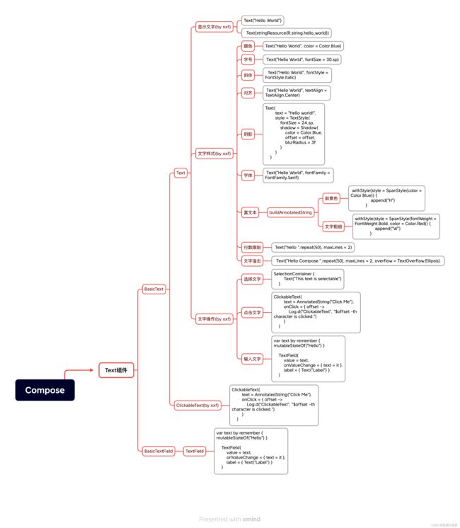
Jetpack Compose 入门教程之Text
这个文本显示组件应该是我们最常用的组件,下面会非常细
归纳
实例
下面一一演示这些属性与控制逻辑
文本的展示
Text组件 所有构造方法都是text:String,要想用string.xml里面的字符串资源 得使用
stringResource方法,其相似方法如下
/*
 * Copyright 2019 The Android Open Source Project
 *
 * Licensed under the Apache License, Version 2.0 (the "License");
 * you may not use this file except in compliance with the License.
 * You may obtain a copy of the License at
 *
 *      http://www.apache.org/licenses/LICENSE-2.0
 *
 * Unless required by applicable law or agreed to in writing, software
 * distributed under the License is distributed on an "AS IS" BASIS,
 * WITHOUT WARRANTIES OR CONDITIONS OF ANY KIND, either express or implied.
 * See the License for the specific language governing permissions and
 * limitations under the License.
 */

package androidx.compose.ui.res

import androidx.annotation.ArrayRes
import androidx.annotation.PluralsRes
import androidx.annotation.StringRes
import androidx.compose.runtime.Composable
import androidx.compose.runtime.ReadOnlyComposable

/**
 * Load a string resource.
 *
 * @param id the resource identifier
 * @return the string data associated with the resource
 */
@Composable
@ReadOnlyComposable
fun stringResource(@StringRes id: Int): String {
    val resources = resources()
    return resources.getString(id)
}

/**
 * Load a string resource with formatting.
 *
 * @param id the resource identifier
 * @param formatArgs the format arguments
 * @return the string data associated with the resource
 */
@Composable
@ReadOnlyComposable
fun stringResource(@StringRes id: Int, vararg formatArgs: Any): String {
    val resources = resources()
    return resources.getString(id, *formatArgs)
}

/**
 * Load a string resource.
 *
 * @param id the resource identifier
 * @return the string data associated with the resource
 */
@Composable
@ReadOnlyComposable
fun stringArrayResource(@ArrayRes id: Int): Array {
    val resources = resources()
    return resources.getStringArray(id)
}

/**
 * Load a plurals resource.
 *
 * @param id the resource identifier
 * @param count the count
 * @return the pluralized string data associated with the resource
 */
@Composable
@ReadOnlyComposable
fun pluralStringResource(@PluralsRes id: Int, count: Int): String {
    val resources = resources()
    return resources.getQuantityString(id, count)
}

/**
 * Load a plurals resource with provided format arguments.
 *
 * @param id the resource identifier
 * @param count the count
 * @param formatArgs arguments used in the format string
 * @return the pluralized string data associated with the resource
 */
@Composable
@ReadOnlyComposable
fun pluralStringResource(@PluralsRes id: Int, count: Int, vararg formatArgs: Any): String {
    val resources = resources()
    return resources.getQuantityString(id, count, *formatArgs)
}
| 作用 | 方法 |
|---|---|
stringResource(@StringRes id: Int) |
获取xml指定id字符串资源 |
stringResource(@StringRes id: Int, vararg formatArgs: Any) |
获取xml指定id字符串资源,且格式化占位符号 |
stringArrayResource(@ArrayRes id: Int) |
获取xml指定id字符串资源数组,返回是数组 |
pluralStringResource(@PluralsRes id: Int, count: Int) |
根据数字的不同自动选择不同的字符串显示,特别是单复数。 特别是不同国家的语言对应不同的单复数。 |
pluralStringResource(@PluralsRes id: Int, count: Int, vararg formatArgs: Any) |
根据数字的不同自动选择不同的字符串显示,特别是单复数。 |
@Composable
fun showXMLString(){
Text(text = stringResource(id = R.string.app_name))
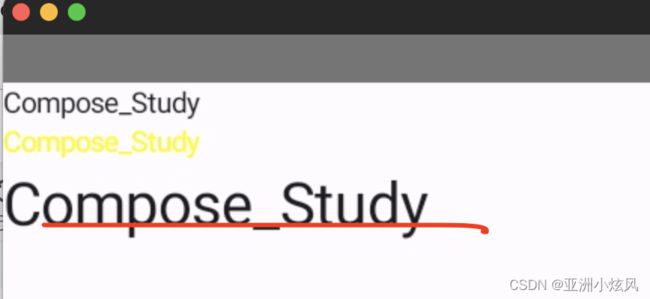
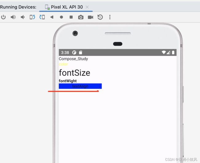
}文字颜色
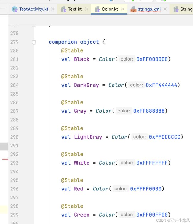
color属性,但是是Color对象,暂时没看到支持resource的 得转换,估计也是md设计的原因 希望使用CompositionLocal来嫁接,其内置了很多常用色
  @Composable
    fun showTextColor(){
        Text(text = stringResource(id = R.string.app_name), color = Color.Yellow)
    }
文字大小
fontSize:UnitType类型
UnitType 支持sp 和em,app一般用sp,em 网页用得多,估计是为跨平台考虑,kotlin在数字上的拓展转化单位
 @Composable
    fun showTextSize(){
        Text(text = stringResource(id = R.string.app_name), fontSize =30.sp )
    }
文字粗细
fontWeight属性
类型是FontWeight,已经提前预置了很多static常量,当然也可以自己new,常用的
FontWeight.Bold
FontWeight.Medium
FontWeight.Normal
class FontWeight(val weight: Int) : Comparable {

    companion object {
        /** [Thin] */
        @Stable
        val W100 = FontWeight(100)
        /** [ExtraLight] */
        @Stable
        val W200 = FontWeight(200)
        /** [Light] */
        @Stable
        val W300 = FontWeight(300)
        /** [Normal] / regular / plain */
        @Stable
        val W400 = FontWeight(400)
        /** [Medium] */
        @Stable
        val W500 = FontWeight(500)
        /** [SemiBold] */
        @Stable
        val W600 = FontWeight(600)
        /** [Bold] */
        @Stable
        val W700 = FontWeight(700)
        /** [ExtraBold] */
        @Stable
        val W800 = FontWeight(800)
        /** [Black] */
        @Stable
        val W900 = FontWeight(900)

        /** Alias for [W100] */
        @Stable
        val Thin = W100
        /** Alias for [W200] */
        @Stable
        val ExtraLight = W200
        /** Alias for [W300] */
        @Stable
        val Light = W300
        /** The default font weight - alias for [W400] */
        @Stable
        val Normal = W400
        /** Alias for [W500] */
        @Stable
        val Medium = W500
        /** Alias for [W600] */
        @Stable
        val SemiBold = W600
        /**
         * A commonly used font weight that is heavier than normal - alias for [W700]
         */
        @Stable
        val Bold = W700
        /** Alias for [W800] */
        @Stable
        val ExtraBold = W800
        /** Alias for [W900] */
        @Stable
        val Black = W900

        /** A list of all the font weights. */
        internal val values: List = listOf(
            W100,
            W200,
            W300,
            W400,
            W500,
            W600,
            W700,
            W800,
            W900
        )
    }

    init {
        require(weight in 1..1000) {
            "Font weight can be in range [1, 1000]. Current value: $weight"
        }
    }

}
    @Composable
    fun showFontWeight(){
        Text(text = stringResource(id = R.string.app_name), fontWeight = FontWeight.Bold )
    }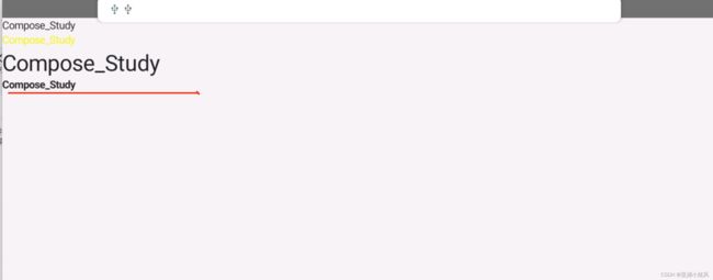
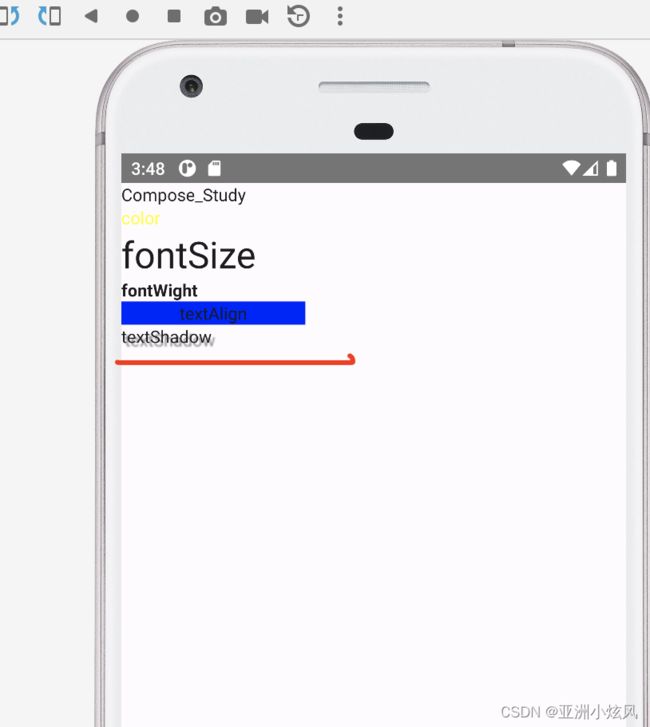
文字对齐方式
textAlign属性,类型TextAlign对象,固定五6个常量对象
文字居中实例
  @Composable
    fun showTextAlign(){
        Text(text = "textAlign", textAlign = TextAlign.Center, modifier = Modifier.width(150.dp).background(Color.Blue))
    }
文字阴影
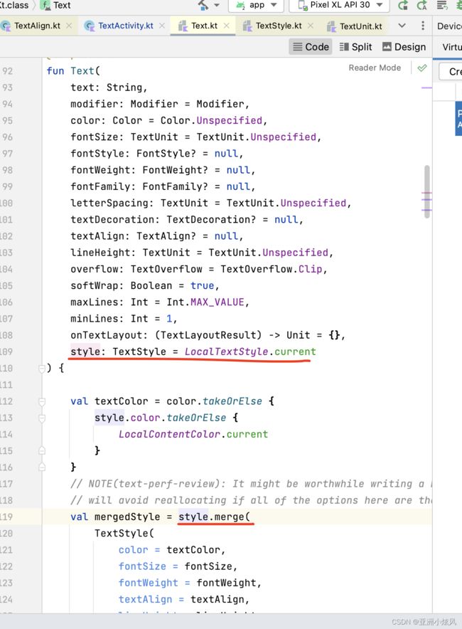
文字阴影没有一级属性,估计也是不常用,放在了style里面,style的类型是TextStyle,其实所有控制样式的一级属性最后都会merge到TextStyle对象里面,所以能通过一级属性控制的 也基本能通过TextStyle来控制
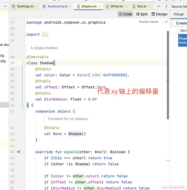
  @Composable
    fun showTextShadow(){
        Text(text = "textShadow",
            style = TextStyle(shadow = Shadow(color = Color.Gray,
            offset = Offset(10.0f,10.0f),
            blurRadius=3f)))
    }
文字字体
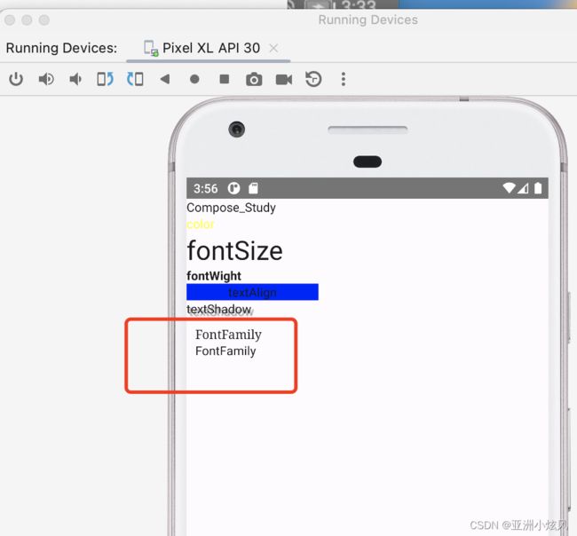
fontFamily属性,内置了6种字体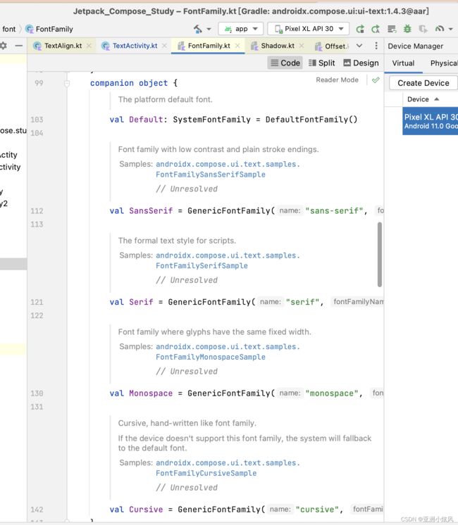
 @Composable
    fun showFontFamily(){
        Column(modifier = Modifier.padding(10.dp)) {
            Text(text = "FontFamily", fontFamily = FontFamily.Serif)
            Text(text = "FontFamily", fontFamily = FontFamily.SansSerif)
        }
    }
您可以使用 fontFamily 属性来处理 res/font 文件夹中定义的自定义字体和字型:
font 文件夹的图示" class="l10n-absolute-url-src screenshot" l10n-attrs-original-order="src,alt,width,class" src="https://developer.android.com/static/images/jetpack/compose/text-font-folder.png" width="400" />
此示例展示了如何根据这些字体文件以及使用 Font 函数定义 fontFamily:
val firaSansFamily = FontFamily(
        Font(R.font.firasans_light, FontWeight.Light),
        Font(R.font.firasans_regular, FontWeight.Normal),
        Font(R.font.firasans_italic, FontWeight.Normal, FontStyle.Italic),
        Font(R.font.firasans_medium, FontWeight.Medium),
        Font(R.font.firasans_bold, FontWeight.Bold)
)
富文本样式
AnnotatedString类型,类型Android spanString,ios attributeString
通过spanStyle 来可以控制文字样式 字重 颜色,背景色等等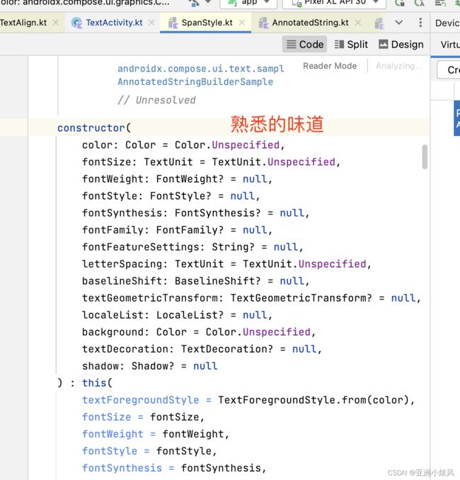
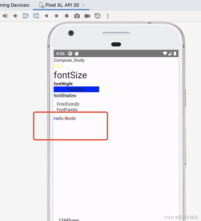
 @Composable
    fun MultipleStylesInText() {
        Text(
            buildAnnotatedString {
                withStyle(style = SpanStyle(color = Color.Blue)) {
                    append("H")
                }
                append("ello ")

                withStyle(style = SpanStyle(fontWeight = FontWeight.Bold, color = Color.Red)) {
                    append("W")
                }
                append("orld")
            }
        )
    }
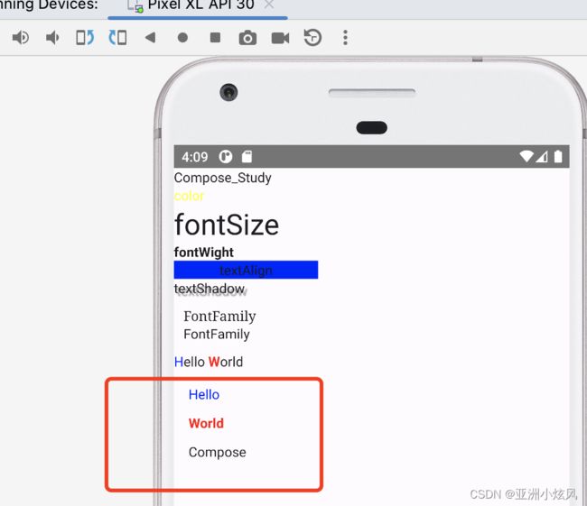
还可以设置段落样式,如下设置段落间距
@Composable
    fun ParagraphStyleDemo() {
        Text(
            buildAnnotatedString {
                withStyle(style = ParagraphStyle(lineHeight = 30.sp)) {
                    withStyle(style = SpanStyle(color = Color.Blue)) {
                        append("Hello\n")
                    }
                    withStyle(
                        style = SpanStyle(
                            fontWeight = FontWeight.Bold,
                            color = Color.Red
                        )
                    ) {
                        append("World\n")
                    }
                    append("Compose")
                }
            }
        )
    }
行数限制
maxLines,android 开发用得比较常见,不多说,看效果
 @Composable
    fun showMaxLine(){
        Box(modifier = Modifier.width(100.dp)) {
            Text("床前明月光,疑是地上双,举头望明月,低头思故乡", maxLines = 2, modifier = Modifier
                .padding(15.dp)
                .background(Color.Gray))
        }
    }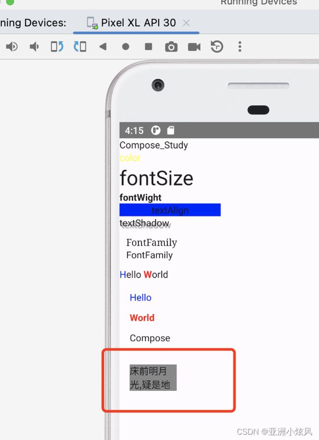
文字溢出
用于控制文字截断得时候表现形式,如尾部三个点 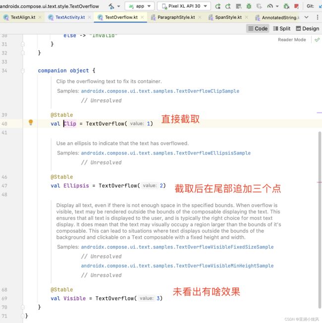
相比于Android 还是特别少
   Text("床前明月光,疑是地上双,举头望明月,低头思故乡",
                maxLines = 2,
                overflow = TextOverflow.Ellipsis,
                modifier = Modifier
                .padding(15.dp)
                .background(Color.Gray))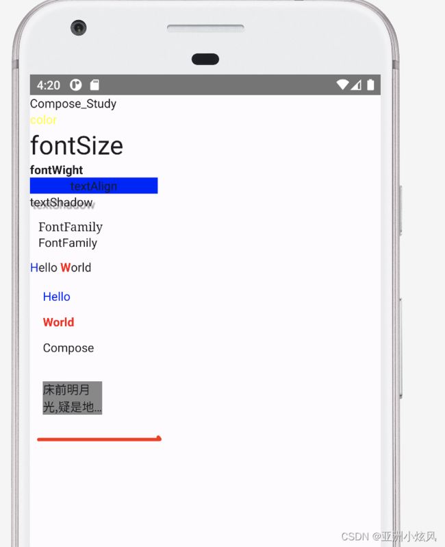
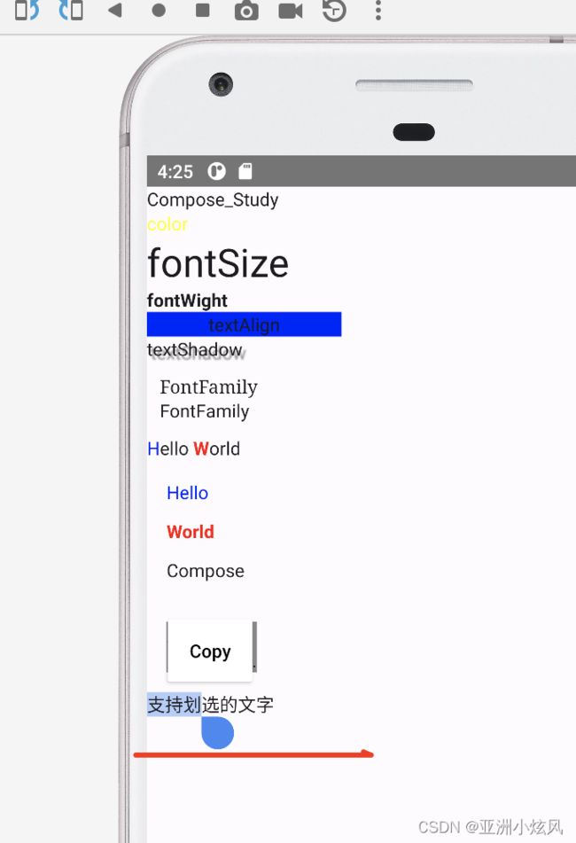
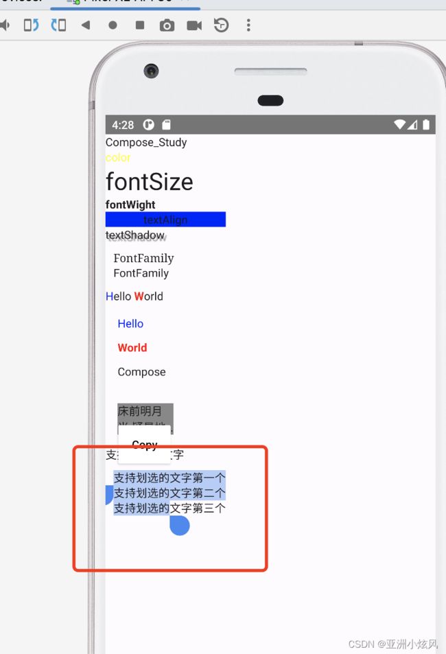
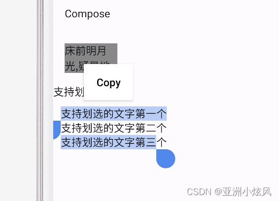
文字选中
compose 需要套一个SelectionContainer才能实现长按划选文字
    @Composable
    fun showSelectableText() {
        SelectionContainer {
            Text("支持划选的文字")
        }
    }
而且还支持多个Text组件实现划选
  @Composable
    fun showMutiSelectableText() {
        SelectionContainer(modifier = Modifier.padding(10.dp)) {
            Column {
                Text("支持划选的文字第一个")
                Text("支持划选的文字第二个")
                Text("支持划选的文字第三个")
            }
        }
    }
当然也支持局部屏蔽 不让划选
   @Composable
    fun showMutiSelectableText() {
        SelectionContainer(modifier = Modifier.padding(10.dp)) {
            Column {
                Text("支持划选的文字第一个")
                DisableSelection {
                    Text("支持划选的文字第二个")
                }
                Text("支持划选的文字第三个")
            }
        }
    }
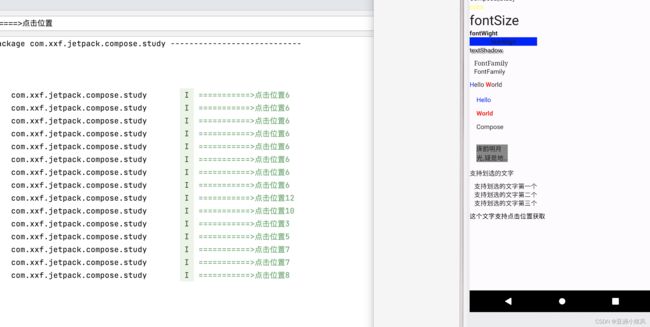
点击文字的位置
ClickableText可以获取点击文字的位置
@Composable
    fun showClickableText(){
        ClickableText(text = AnnotatedString("这个文字支持点击位置获取"), onClick ={ offset->
            println("===========>点击位置${offset}");
            Toast.makeText(this,"点击未知${offset}",Toast.LENGTH_SHORT);
        })
    }
所有实例demo地址