【QML-Quick组件】
Qt编程指南-VX:hao541022348
- ■ 输入类
-
- ■ Slider
- ■ TextArea
- ■ Dial
- ■ ComboBox
- ■ RangeSlider
- ■ TextField
- ■ Tumbler
- ■
- ■
■ 输入类
提供了基于 数字 和 文本 输入的各种输入控件
■ Slider
示例一:
ColumnLayout{
        anchors.fill: parent;

        RowLayout{
            Label{
                text: "音量值:"
            }
            Label{
                id: musicLoud
                text: "0"
            }
            Layout.alignment: Qt.AlignHCenter
        }

        Slider{
            from: 1
            value: 20
            to: 100
            stepSize:1

            Layout.alignment: Qt.AlignHCenter
            onMoved: {
                musicLoud.text = value/1;
            }
        }
}

示例二:
  Slider {
      id: control
      value: 0.5

      background: Rectangle {
          x: control.leftPadding
          y: control.topPadding + control.availableHeight / 2 - height / 2
          implicitWidth: 200
          implicitHeight: 4
          width: control.availableWidth
          height: implicitHeight
          radius: 2
          color: "#bdbebf"

          Rectangle {
              width: control.visualPosition * parent.width
              height: parent.height
              color: "#21be2b"
              radius: 2
          }
      }

      handle: Rectangle {
          x: control.leftPadding + control.visualPosition * (control.availableWidth - width)
          y: control.topPadding + control.availableHeight / 2 - height / 2
          implicitWidth: 26
          implicitHeight: 26
          radius: 13
          color: control.pressed ? "#f0f0f0" : "#f6f6f6"
          border.color: "#bdbebf"
      }
  }

■ TextArea
TextArea是一个多行文本编辑器。
TextArea扩展了TextEdit,添加了一个占位文本功能,并添加了装饰。
注意这个文本编辑器是没有边框之类的,只有一个输入区域而已。
如果你想让一个文本区域可滚动
  ScrollView {
      id: view
      anchors.fill: parent

      TextArea {
          text: "TextArea\n...\n...\n...\n...\n...\n...\n"
      }
  }
■ Dial
Dial 表盘类似于音响或工业设备上的传统表盘旋钮。它允许用户在一个范围内指定一个值。
import QtQuick 2.12
import QtQuick.Window 2.12
import QtQuick.Layouts 1.3
import QtQuick.Controls 2.5
import QtQuick.Extras 1.4

Window {
    id: window
    visible: true
    width: 640
    height: 480
    title: qsTr("Hello World")

    Dial{
        id: dial
        x: 233
        y: 167
        anchors.verticalCenter: parent.verticalCenter
        anchors.horizontalCenter: parent.horizontalCenter
        maximumValue: 100
        minimumValue: 0

        stepSize: 1
    }

    Label {
        id: label
        x: 245
        y: 308
        text: qsTr("转盘值:")
        anchors.horizontalCenterOffset: -24
        anchors.horizontalCenter: parent.horizontalCenter
        horizontalAlignment: Text.AlignHCenter

        Label {
            id: label1
            x: 53
            y: 2
            width: 30
            height: 9
            text: dial.value
            horizontalAlignment: Text.AlignHCenter
        }
    }
}

■ ComboBox
ComboBox是一个组合按钮和弹出列表。它提供了一种以占用最小屏幕空间的方式向用户显示选项列表的方法。
ComboBox用数据模型填充。数据模型通常是JavaScript数组、ListModel或整数,但也支持其他类型的数据模型。
  ComboBox {
      model: ["First", "Second", "Third"]
  }
**示例一:**
```c
import QtQuick 2.12
import QtQuick.Window 2.12
import QtQuick.Layouts 1.3
import QtQuick.Controls 2.5

Window {
    id: window
    visible: true
    width: 640
    height: 480
    title: qsTr("Hello World")

    ComboBox{
        id: comhbox
        y: 71
        anchors.horizontalCenterOffset: 0
        anchors.horizontalCenter: parent.horizontalCenter
        model: ["Item1", "Item2", "Item3", "Item4"]

        onCurrentIndexChanged: {
            display.text = model[currentIndex];
        }
    }

    RowLayout {
        id: rowLayout
        x: 264
        y: 134
        width: 100
        height: 62
        anchors.horizontalCenterOffset: 0
        anchors.horizontalCenter: parent.horizontalCenter

        Label {
            id: label2
            text: qsTr("选择的值:")
        }

        Label {
            id: display
        }
    }
}

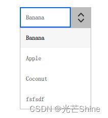
示例一:可编辑的组合框
  ComboBox {
      editable: true
      model: ListModel {
          id: model
          ListElement { text: "Banana" }
          ListElement { text: "Apple" }
          ListElement { text: "Coconut" }
      }
      onAccepted: {
          if (find(editText) === -1)
              model.append({text: editText})
      }
  }
**示例二 美化:
  import QtQuick 2.12
  import QtQuick.Controls 2.12

  ComboBox {
      id: control
      model: ["First", "Second", "Third"]

      delegate: ItemDelegate {
          width: control.width
          contentItem: Text {
              text: modelData
              color: "#21be2b"
              font: control.font
              elide: Text.ElideRight
              verticalAlignment: Text.AlignVCenter
          }
          highlighted: control.highlightedIndex === index
      }

      indicator: Canvas {
          id: canvas
          x: control.width - width - control.rightPadding
          y: control.topPadding + (control.availableHeight - height) / 2
          width: 12
          height: 8
          contextType: "2d"

          Connections {
              target: control
              onPressedChanged: canvas.requestPaint()
          }

          onPaint: {
              context.reset();
              context.moveTo(0, 0);
              context.lineTo(width, 0);
              context.lineTo(width / 2, height);
              context.closePath();
              context.fillStyle = control.pressed ? "#17a81a" : "#21be2b";
              context.fill();
          }
      }

      contentItem: Text {
          leftPadding: 0
          rightPadding: control.indicator.width + control.spacing

          text: control.displayText
          font: control.font
          color: control.pressed ? "#17a81a" : "#21be2b"
          verticalAlignment: Text.AlignVCenter
          elide: Text.ElideRight
      }

      background: Rectangle {
          implicitWidth: 120
          implicitHeight: 40
          border.color: control.pressed ? "#17a81a" : "#21be2b"
          border.width: control.visualFocus ? 2 : 1
          radius: 2
      }

      popup: Popup {
          y: control.height - 1
          width: control.width
          implicitHeight: contentItem.implicitHeight
          padding: 1

          contentItem: ListView {
              clip: true
              implicitHeight: contentHeight
              model: control.popup.visible ? control.delegateModel : null
              currentIndex: control.highlightedIndex

              ScrollIndicator.vertical: ScrollIndicator { }
          }

          background: Rectangle {
              border.color: "#21be2b"
              radius: 2
          }
      }
  }

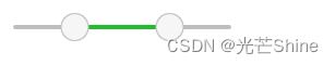
■ RangeSlider
RangeSlider 通过沿着轨道滑动每个滑块来选择由两个值指定的范围。区域值嘛
示例一
        RowLayout{
            Label{
                text: "下限:"
            }
            Label{
                id:lowIndex
                text: "0"
            }
            Label{
                text: "  -  "
            }
            Label{
                text: "上限:"
            }
            Label{
                id:highIndex
                text: "0"
            }
            Layout.alignment: Qt.AlignHCenter
        }

        RangeSlider {
            transformOrigin: Item.Center
            from: 1
            to: 100
            first.value: 0
            second.value: 100
            stepSize: 1
            Layout.alignment: Qt.AlignHCenter

            first.onMoved: {
                lowIndex.text = first.value.toString()
            }

            second.onMoved: {
                highIndex.text = second.value;
            }
        }

示例二
  RangeSlider {
      from: 1
      to: 100
      first.value: 25
      second.value: 75
  }
示例三
  import QtQuick 2.12
  import QtQuick.Controls 2.12

  RangeSlider {
      id: control
      first.value: 0.25
      second.value: 0.75

      background: Rectangle {
          x: control.leftPadding
          y: control.topPadding + control.availableHeight / 2 - height / 2
          implicitWidth: 200
          implicitHeight: 4
          width: control.availableWidth
          height: implicitHeight
          radius: 2
          color: "#bdbebf"

          Rectangle {
              x: control.first.visualPosition * parent.width
              width: control.second.visualPosition * parent.width - x
              height: parent.height
              color: "#21be2b"
              radius: 2
          }
      }

      first.handle: Rectangle {
          x: control.leftPadding + control.first.visualPosition * (control.availableWidth - width)
          y: control.topPadding + control.availableHeight / 2 - height / 2
          implicitWidth: 26
          implicitHeight: 26
          radius: 13
          color: control.first.pressed ? "#f0f0f0" : "#f6f6f6"
          border.color: "#bdbebf"
      }

      second.handle: Rectangle {
          x: control.leftPadding + control.second.visualPosition * (control.availableWidth - width)
          y: control.topPadding + control.availableHeight / 2 - height / 2
          implicitWidth: 26
          implicitHeight: 26
          radius: 13
          color: control.second.pressed ? "#f0f0f0" : "#f6f6f6"
          border.color: "#bdbebf"
      }
  }
■ TextField
TextField 其实就是是一个单行文本编辑器
TextField扩展了TextInput的功能,添加了占位文本功能,并添加了装饰的功能,这里的装饰主要就是只添加了边框和聚焦输入的时候的高亮,不像TextInput就只管输入,没有修饰的功能。
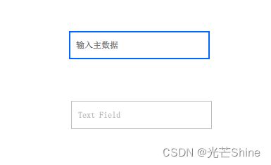
TextField {
      placeholderText: qsTr("占位符")
  }
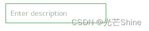
  import QtQuick 2.12
  import QtQuick.Controls 2.12

  TextField {
      id: control
      placeholderText: qsTr("Enter description")

      background: Rectangle {
          implicitWidth: 200
          implicitHeight: 40
          color: control.enabled ? "transparent" : "#353637"
          border.color: control.enabled ? "#21be2b" : "transparent"
      }
  }
■ Tumbler
Tumbler 其实就是一个类似类似 手机上 的滚动选项卡的东西
Tumbler 添加很多的 TumblerColumn ,我们获取一些索引位置信息通过 TumblerColumn 的方式来获取每一个TumblerColumn的索引。

    Tumbler {
        id: tumbler
        x: 314
        width: 180
        height: 77
        anchors.top: dial.bottom
        anchors.topMargin: 60
        anchors.horizontalCenterOffset: 0
        anchors.horizontalCenter: parent.horizontalCenter

        TumblerColumn {
            id:column1
            model: 5
            onCurrentIndexChanged: {
                selectValue.text = column1.currentIndex.toString() + column2.model[column2.currentIndex] + column3.model[column3.currentIndex];
            }

        }
        TumblerColumn {
            id:column2
            model: [0, 1, 2, 3, 4]
            onCurrentIndexChanged: {
                selectValue.text = column1.currentIndex.toString() + column2.model[column2.currentIndex] + column3.model[column3.currentIndex];
            }
        }
        TumblerColumn {
            id:column3
            model: ["A", "B", "C", "D", "E"]
            onCurrentIndexChanged: {
                selectValue.text = column1.currentIndex.toString() + column2.model[column2.currentIndex] + column3.model[column3.currentIndex];
            }
        }
    }
■
■