echarts自定义折线图填充色、折线点、折线颜色
效果如下:

对比官网折线图案例,我所做的变化有以下几点:
1、x、y轴轴线颜色设置、字体颜色 大小设置;
2、折线颜色设置、折线转折点样式设置;
3、填充色样式设置
关于第一点我上条博客有写方法,有需要的朋友可以去看一下,在这里我就不多做声明了;
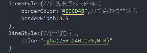
第二点的实现方法:在配置项series:{}里配置
第三点实现方法:在配置项series:{}里配置

这样我们的折线图效果就实现啦,下面是完整代码:
<template>
	<div id="data-lf-body" class="data-lf-top" style="width: 430px; height: 200px;"></div>
</template>
<script>
	var echarts = require('echarts');
	export default {
	data() {
		return {}
	},
	methods:{
		brokenChart(){
			let myChart = this.$echarts.init(document.getElementById('data-lf-body'));
			// 指定图表的配置项和数据
			let option = {
				grid: {
					//坐标系地板的定位
					left:60,
					bottom:50
				},
				 xAxis: {
				        type: 'category',
				        data: ['3', '4', '5', '6', '7', '8', '9','10'],
						axisLine: {
							//坐标轴轴线相关设置
							lineStyle: {
								color: '#262571'
							}
						},
						axisLabel: {
							// 坐标轴刻度标签的相关设置
							show: true,
							textStyle: {
								color: '#6FCEFF',
								fontSize: 20 // 让字zhi体变大dao
							}
						},
						axisTick: {//刻度相关设置
							show: false//让刻度隐藏
						},
				    },
				    yAxis: {
				        type: 'value',
						axisLine: {
							//坐标轴轴线相关设置
							lineStyle: {
								color: '#262571'
							}
						},
						axisLabel: {
							// 坐标轴刻度标签的相关设置
							show: true,
							textStyle: {
								color: '#CFD4EB',
								fontSize: 20 // 让字体变大
							}
						},
						axisTick: {
							//y轴刻度相关设置
							show: false
						},
						splitLine: {
							//网格线
							lineStyle: {
								color: '#262571'
							}
						}
				    },
				    series: [{
				        data: [25, 40, 60, 55, 35, 80, 30,25],
				        type: 'line',
				        areaStyle: {//填充的颜色
							color: {//线性渐变前四个参数分别是 x0, y0, x2, y2, 范围从 0 - 1,相当于在图形包围盒中的百分比,如果 globalCoord 为 `true`,则该四个值是绝对的像素位置
							    type: 'linear',
							    x: 0,
							    y: 1,
							    x2: 0,
							    y2: 0,
							    colorStops: [{
							        offset: 0, color: 'rgba(255,240,170,0)' // 0% 处的颜色
							    }, {
							        offset: 1, color: 'rgba(255,240,170,1)' // 100% 处的颜色
							    }],
							    globalCoord: false// 缺省为 false
							}
						},
						itemStyle:{//折线拐点标志的样式
							borderColor:"#E9CD4B",//拐点的边框颜色
							borderWidth:3.5
						},
						lineStyle:{//折线的样式
							color:"rgba(255,240,170,0.8)"
						}
				    }],

			}
			// 使用刚指定的配置项和数据显示图表。
			myChart.setOption(option);
		}
	},
	mounted() {
		this.brokenChart();
	}
}
</script>