鸿蒙开发Flex、栅格布局详解
Flex弹性布局
一、direction
- 1、FlexDirection.Row 主轴为水平方向,子组件从起始端沿着水平方向开始排布
- 2、FlexDirection.RowReverse:主轴为水平方向,子组件从终点端沿着FlexDirection. Row相反的方向开始排布。
- 3、FlexDirection.Column:主轴为垂直方向,子组件从起始端沿着垂直方向开始排布。
- 4、FlexDirection.ColumnReverse:主轴为垂直方向,子组件从终点端沿着FlexDirection. Column相反的方向开始排布。
Flex({ direction: FlexDirection.ColumnReverse }) {
  Text('1').width('100%').height(50).backgroundColor(0xF5DEB3)
  Text('2').width('100%').height(50).backgroundColor(0xD2B48C)
  Text('3').width('100%').height(50).backgroundColor(0xF5DEB3)
}
.height(70)
.width('90%')
.padding(10)
.backgroundColor(0xAFEEEE)
二、布局换行
- 1、FlexWrap. NoWrap(默认值):不换行。如果子组件的宽度总和大于父元素的宽度,则子组件会被压缩宽度
- 2、FlexWrap. Wrap:换行,每一行子组件按照主轴方向排列
- 3、FlexWrap. WrapReverse:换行,每一行子组件按照主轴反方向排列。
Flex({ wrap: FlexWrap.WrapReverse}) {
  Text('1').width('50%').height(50).backgroundColor(0xF5DEB3)
  Text('2').width('50%').height(50).backgroundColor(0xD2B48C)
  Text('3').width('50%').height(50).backgroundColor(0xF5DEB3)
}
.width('90%')
.padding(10)
.backgroundColor(0xAFEEEE)
三、主轴对齐方式 – 通过justifyContent参数设置在主轴方向的对齐方式
- 1、FlexAlign.Start(默认值):子组件在主轴方向起始端对齐, 第一个子组件与父元素边沿对齐,其他元素与前一个元素对齐。
- 2、FlexAlign.Center:子组件在主轴方向居中对齐
- 3、 FlexAlign.End:子组件在主轴方向终点端对齐, 最后一个子组件与父元素边沿对齐,其他元素与后一个元素对齐。
- 4、FlexAlign.SpaceBetween:Flex主轴方向均匀分配弹性元素,相邻子组件之间距离相同。第一个子组件和最后一个子组件与父元素边沿对齐。
- 5、FlexAlign.SpaceAround:Flex主轴方向均匀分配弹性元素,相邻子组件之间距离相同。第一个子组件到主轴起始端的距离和最后一个子组件到主轴终点端的距离是相邻元素之间距离的一半。
- 6、FlexAlign.SpaceEvenly:Flex主轴方向元素等间距布局,相邻子组件之间的间距、第一个子组件与主轴起始端的间距、最后一个子组件到主轴终点端的间距均相等。
四、容器组件设置交叉轴对齐–可以通过Flex组件的alignItems参数设置子组件在交叉轴的对齐方式。
- 1、ItemAlign.Auto:使用Flex容器中默认配置
- 2、ItemAlign.Start:交叉轴方向首部对齐。
- 3、ItemAlign.Center:交叉轴方向居中对齐。
- 4、ItemAlign.End:交叉轴方向底部对齐。
- 5、ItemAlign.Stretch:交叉轴方向拉伸填充,在未设置尺寸时,拉伸到容器尺寸。
- 6、ItemAlign. Baseline:交叉轴方向文本基线对齐。
五、子组件设置交叉轴对齐 --子组件的alignSelf属性也可以设置子组件在父容器交叉轴的对齐格式,且会覆盖Flex布局容器中alignItems配置
Flex({ direction: FlexDirection.Row, alignItems: ItemAlign.Center }) { // 容器组件设置子组件居中
  Text('alignSelf Start').width('25%').height(80)
    .alignSelf(ItemAlign.Start)
    .backgroundColor(0xF5DEB3)
  Text('alignSelf Baseline')
    .alignSelf(ItemAlign.Baseline)
    .width('25%')
    .height(80)
    .backgroundColor(0xD2B48C)
  Text('alignSelf Baseline').width('25%').height(100)
    .backgroundColor(0xF5DEB3)
    .alignSelf(ItemAlign.Baseline)
  Text('no alignSelf').width('25%').height(100)
    .backgroundColor(0xD2B48C)
  Text('no alignSelf').width('25%').height(100)
    .backgroundColor(0xF5DEB3)

}.width('90%').height(220).backgroundColor(0xAFEEEE)
六、内容对齐–可以通过alignContent参数设置子组件各行在交叉轴剩余空间内的对齐方式,只在多行的flex布局中生效
- 1、FlexAlign.Start:子组件各行与交叉轴起点对齐
- 2、FlexAlign.Center:子组件各行在交叉轴方向居中对齐。
- 3、FlexAlign.End:子组件各行与交叉轴终点对齐。
- 4、FlexAlign.SpaceBetween:子组件各行与交叉轴两端对齐,各行间垂直间距平均分布。
- 5、FlexAlign.SpaceAround:子组件各行间距相等,是元素首尾行与交叉轴两端距离的两倍。
- 6、FlexAlign.SpaceEvenly: 子组件各行间距,子组件首尾行与交叉轴两端距离都相等。
七、自适应拉伸-- 在弹性布局父组件尺寸不够大的时候,通过子组件的下面几个属性设置其在父容器的占比,达到自适应布局能力
- 1、flexBasis:设置子组件在父容器主轴方向上的基准尺寸。如果设置了该值,则子项占用的空间为设置的值;如果没设置该属性,那子项的空间为width/height的值
- 2、flexGrow:设置父容器的剩余空间分配给此属性所在组件的比例。用于“瓜分”父组件的剩余空间。
- 3、flexShrink: 当父容器空间不足时,子组件的压缩比例
demo
Flex({ direction: FlexDirection.Row }) {
  Text('flexShrink(3)')
    .fontSize(15)
    .flexShrink(3)
    .width(200)
    .height(100)
    .backgroundColor(0xF5DEB3)

  Text('no flexShrink')
    .width(200)
    .height(100)
    .backgroundColor(0xD2B48C)

  Text('flexShrink(2)')
    .flexShrink(2)
    .width(200)
    .height(100)
    .backgroundColor(0xF5DEB3)
}.width(400).height(120).padding(10).backgroundColor(0xAFEEEE)
栅格布局(GridRow/GridCol)
概述:
栅格布局是一种通用的辅助定位工具,对移动设备的界面设计有较好的借鉴作用。主要优势包括:
- 提供可循的规律:栅格布局可以为布局提供规律性的结构,解决多尺寸多设备的动态布局问题。通过将页面划分为等宽的列数和行数,可以方便地对页面元素进行定位和排版。
- 统一的定位标注:栅格布局可以为系统提供一种统一的定位标注,保证不同设备上各个模块的布局一致性。这可以减少设计和开发的复杂度,提高工作效率。
- 灵活的间距调整方法:栅格布局可以提供一种灵活的间距调整方法,满足特殊场景布局调整的需求。通过调整列与列之间和行与行之间的间距,可以控制整个页面的排版效果。
- 自动换行和自适应:栅格布局可以完成一对多布局的自动换行和自适应。当页面元素的数量超出了一行或一列的容量时,他们会自动换到下一行或下一列,并且在不同的设备上自适应排版,使得页面布局更加灵活和适应性强。
====GridRow为栅格容器组件,需与栅格子组件GridCol在栅格布局场景中联合使用。
栅格容器GridRow
- 栅格系统断点 :
栅格系统以设备的水平宽度(屏幕密度像素值,单位vp)作为断点依据,定义设备的宽度类型,形成了一套断点规则。开发者可根据需求在不同的断点区间实现不同的页面布局效果
1、栅格系统默认断点将设备宽度分为xs、sm、md、lg四类
2、在GridRow栅格组件中,允许开发者使用breakpoints自定义修改断点的取值范围,最多支持6个断点,除了默认的四个断点外,还可以启用xl,xxl两个断点,支持六种不同尺寸(xs, sm, md, lg, xl, xxl)设备的布局设置
breakpoints: {value: ['100vp', '200vp']}
表示启用xs、sm、md共3个断点,小于100vp为xs,100vp-200vp为sm,大于200vp为md。
例如,使用栅格的默认列数12列,通过断点设置将应用宽度分成六个区间,在各区间中,每个栅格子元素占用的列数均不同。
@State bgColors: Color[] = [Color.Red, Color.Orange, Color.Yellow, Color.Green, Color.Pink, Color.Grey, Color.Blue, Color.Brown];
...
GridRow({
  breakpoints: {
    value: ['200vp', '300vp', '400vp', '500vp', '600vp'],
    reference: BreakpointsReference.WindowSize
  }
}) {
   ForEach(this.bgColors, (color, index) => {
     GridCol({
       span: {
         xs: 2, // 在最小宽度类型设备上,栅格子组件占据的栅格容器2列。
         sm: 3, // 在小宽度类型设备上,栅格子组件占据的栅格容器3列。
         md: 4, // 在中等宽度类型设备上,栅格子组件占据的栅格容器4列。
         lg: 6, // 在大宽度类型设备上,栅格子组件占据的栅格容器6列。
         xl: 8, // 在特大宽度类型设备上,栅格子组件占据的栅格容器8列。
         xxl: 12 // 在超大宽度类型设备上,栅格子组件占据的栅格容器12列。
       }
     }) {
       Row() {
         Text(`${index}`)
       }.width("100%").height('50vp')
     }.backgroundColor(color)
   })
}
- 布局的总列数,默认12列
@State bgColors: Color[] = [Color.Red, Color.Orange, Color.Yellow, Color.Green, Color.Pink, Color.Grey, Color.Blue, Color.Brown];
@State currentBp: string = 'unknown';
...
Row() {
  GridRow({ columns: 4 }) { // 4列
    ForEach(this.bgColors, (item, index) => {
      GridCol() {
        Row() {
          Text(`${index + 1}`)
        }.width('100%').height('50')
      }.backgroundColor(item)
    })
  }
  .width('100%').height('100%')
  .onBreakpointChange((breakpoint) => {
    this.currentBp = breakpoint
  })
}
.height(160)
.border({ color: Color.Blue, width: 2 })
.width('90%')
}
.height(160)
.border({ color: Color.Blue, width: 2 })
.width('90%')
- 排列方向
栅格布局中,可以通过设置GridRow的direction属性来指定栅格子组件在栅格容器中的排列方向。该属性可以设置为GridRowDirection.Row(从左往右排列)或GridRowDirection.RowReverse(从右往左排列)
GridRow({ direction: GridRowDirection.Row }){}
- 子组件间距
GridRow中通过gutter属性设置子元素在水平和垂直方向的间距
GridRow({ gutter: 10 }){}
子组件GridCol
GridCol组件作为GridRow组件的子组件,通过给GridCol传参或者设置属性两种方式,设置span(占用列数),offset(偏移列数),order(元素序号)的值
- span:子组件占栅格布局的列数,决定了子组件的宽度,默认为1
GridCol({ span: 2 }){}
- offset: 栅格子组件相对于前一个子组件的偏移列数,默认为0。
@State bgColors: Color[] = [Color.Red, Color.Orange, Color.Yellow, Color.Green, Color.Pink, Color.Grey, Color.Blue, Color.Brown];
...
GridRow() {
  ForEach(this.bgColors, (color, index) => {
    GridCol({ offset: 2 }) {
      Row() {
        Text('' + index)
      }.width('100%').height('50vp')
    }
    .backgroundColor(color)
  })
}
- order :栅格子组件的序号,决定子组件排列次序。当子组件不设置order或者设置相同的order, 子组件按照代码顺序展示。当子组件设置不同的order时,order较小的组件在前,较大的在后
GridRow() {
  GridCol({ order: 4 }) {
    Row() {
      Text('1')
    }.width('100%').height('50vp')
  }.backgroundColor(Color.Red)
  GridCol({ order: 3 }) {
    Row() {
      Text('2')
    }.width('100%').height('50vp')
  }.backgroundColor(Color.Orange)
  GridCol({ order: 2 }) {
    Row() {
      Text('3')
    }.width('100%').height('50vp')
  }.backgroundColor(Color.Yellow)
  GridCol({ order: 1 }) {
    Row() {
      Text('4')
    }.width('100%').height('50vp')
  }.backgroundColor(Color.Green)
}
最后
小编特此分享一份由前三星项目经理,其现任腾讯课堂特聘讲师,联合鸿蒙官方发布笔记整理收纳的《鸿蒙开发学习笔记》,内容包含ArkTS、ArkUI、Web开发、应用模型、资源分类…等知识点。
【扫描下方二维码即可免费领取!!!】

《鸿蒙开发学习笔记》
快速入门
- 开发准备
- 构建第一个ArkTS应用(Stage模型)
- 构建第一个ArkTS应用(FA模型)
- 构建第一个JS应用(FA模型)

开发基础知识
- 应用程序包基础知识
- 应用配置文件(Stage模型)
- 应用配置文件概述(FA模型)

资源分类与访问
- 资源分类与访问
- 创建资源目录和资源文件
- 资源访问

学习ArkTs语言
- 初识ArkTS语言
- 基本语法
- 状态管理
- 其他状态管理
- 渲染控制
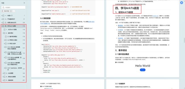
基于ArkTS声明式开发范式
- UI开发(ArkTS声明式开发范式)概述
- 开发布局
- 添加组件
- 显示图片
- 使用动画
- 支持交互事件
- 性能提升的推荐方法

兼容JS的类Web开发范式
- 概述
- 框架说明
- 构建用户界面
- 常见组件开发指导
- 动效开发指导
- 自定义组件
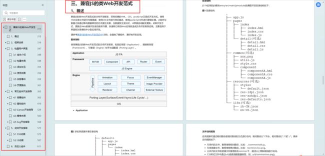
Web组件
- 概述
- 设置基本属性和事件
- 并发
- 窗口管理
- WebGL
- 媒体
- 安全
- 网络与连接
- 电话服务
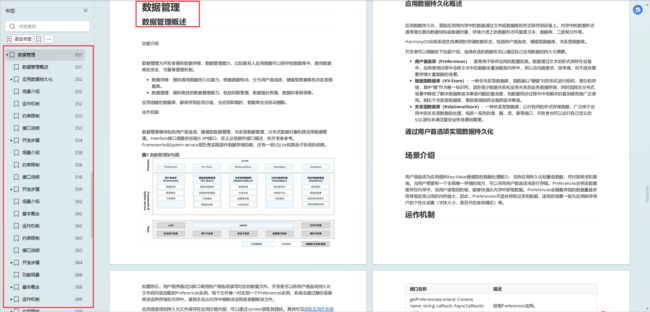
- 数据管理
- …
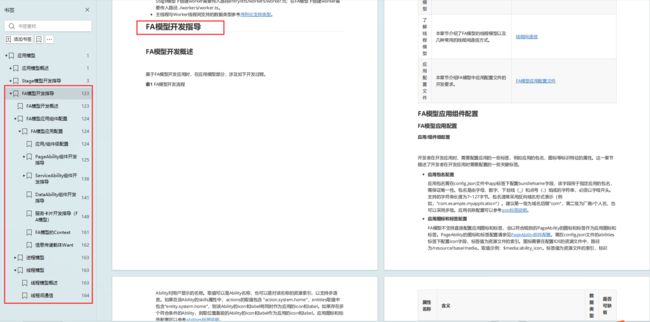
应用模型
- 概述
- Stage模型开发指导
- FA模型开发指导
有需要完整学习资料的朋友,可以扫描下方二维码免费领取!!!