使用px2rem不生效
菜鸟最近做项目,正好需要使用到px2rem,但是网上搜的都是有问题的,可能是菜鸟太菜了!!!
每次菜鸟都希望读者交流指点,但是都是每次评论区都没人,(T~T)
文章目录
- webpack配置
-
- 正确的配置,兼容现在的vuecli
- 下载的包
- 使用问题
-
- 1、不兼容scss
- 2、大写、style里面不会被解析
- 3、prettier 保持大写
- lib-flexible
-
- 1、兼容pad
- 2、配合媒体查询 --》 避免 pc 端字太大
webpack配置
首先第一个坑就是vue.config.js,很多博主都说配置是这样的:
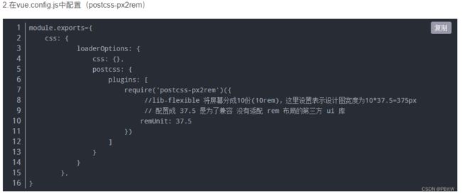
但是菜鸟实测表示会报错,报错这个东西:
ERROR Failed to compile with 1 error 17:18:34

error in ./src/views/HomeView.vue?vue&type=style&index=0&id=9ea40744&scoped=true&lang=css&

Syntax Error: ValidationError: Invalid options object. PostCSS Loader has been initialized using an options object that does not match the API schema.
- options has an unknown property 'plugins'. These properties are valid:
object { postcssOptions?, execute?, sourceMap?, implementation? }


ERROR in ./src/views/HomeView.vue?vue&type=style&index=0&id=9ea40744&scoped=true&lang=css& (./node_modules/css-loader/dist/cjs.js??clonedRuleSet-12.use[1]!./node_modules/@vue/vue-loader-v15/lib/loaders/stylePostLoader.js!./node_modules/@vue/cli-service/node_modules/postcss-loader/dist/cjs.js??clonedRuleSet-12.use[2]!./node_modules/@vue/vue-loader-v15/lib/index.js??vue-loader-options!./src/views/HomeView.vue?vue&type=style&index=0&id=9ea40744&scoped=true
不知道怎么解决!!!(希望读者多多交流)
正确的配置,兼容现在的vuecli
(webpack 创建的 vue3也支持)
module.exports = defineConfig({
  chainWebpack: config => {
    config.module
      .rule("css")
      .test(/\.css$/)
      .oneOf("vue")
      .resourceQuery(/\?vue/)
      .use("px2rem-loader")
      .loader("px2rem-loader")
      .before('postcss-loader')
      .options({
        // 设计稿宽度 / 10
        remUnit: 75
      });
  },
})
创建的模板里面有没有 defineConfig() 都一样的复制过去用,不会报错!!!
下载的包
看别的博主,有的安装包都不说,说的有的不全,这里菜鸟就把需要用到的都列出来了
- npm i px2rem-loader -D
- npm i postcss-loader -D
- npm i postcss-px2rem -D
使用问题
1、不兼容scss
这个postcss-px2rem是不兼容scss的,反正菜鸟只要在style上加上lang=‘scss’,这个就直接失效了!!!
网上搜的办法也是一个比一个不靠谱,建议就不要使用scss了,反正其实也不是很影响!!!
2、大写、style里面不会被解析
写在style里面的px不会被解析成rem;大写的PX依旧生效,且不会被解析成rem
3、prettier 保持大写
在使用 prettier 的时候,大写会被转换成小写,需要加上:
.fromname {
  /* prettier-ignore */
  font-size: 40PX;
}
lib-flexible
如果你想让rem自动跟随屏幕变化而变化就需要下载该插件
安装命令
npm install lib-flexible --save-dev
安装后需要在 main.js 中进行导入(或者哪里要用哪里引入)
// 引入lib-flexible
import "lib-flexible/flexible.js";
1、兼容pad
兼容pad要修改源码,在node_modules/lib-flexible/flexible.js,注释这一行代码!
2、配合媒体查询 --》 避免 pc 端字太大
@media screen and (max-width: 690px) {
  .contentBox {
    width: 365px;
    font-size: 12px;
  }

  .fromname {
    font-size: 20px;
  }

  .el-input,
  .el-select {
    width: 160px;
  }

  .FormBox {
    overflow-y: auto;
  }

  .tabletitle,
  .content {
    width: 200vw;
    min-width: 100vw;
  }
  .contentItem .el-input {
    width: 100px !important;
  }
  .tabletitle p {
    width: 110px !important;
  }
}

@media screen and (min-width: 691px) {
  .contentBox {
    width: 80%;
  }

  .fromname {
    /* prettier-ignore */
    font-size: 40PX;
  }

  .el-input,
  .el-select {
    width: 140px;
  }

  .upload-demo,
  .tip,
  .GroupForm,
  .environmentalForm,
  .sortBox {
    /* prettier-ignore */
    font-size: 16PX;
  }

  .title {
    /* prettier-ignore */
    font-size: 30PX;
  }
}
不然 pc 端的字会非常大!!!