微信小程序- 基础学习
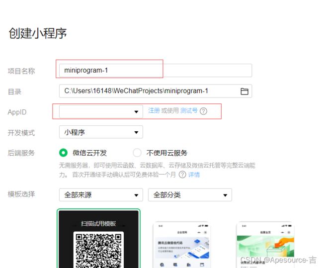
创建一个小程序
1.设置项目名称
2.设置路径
3.AppID (在微信公众号平台申请)
注册登录以后,开发–> 开发设置中查看APPID


4.开发模式
5.选择模板(一般为JavaScript)
目录结构

窗口配置
| 属性 | 类型 | 默认值 | 描述 |
|---|---|---|---|
| navigationBarBackgroundColor | HexColor | #000000 | 导航栏背景颜色,如 #000000 |
| navigationBarTextStyle | string | white | 导航栏标题、状态栏颜色,仅支持 black / white |
| navigationBarTitleText | string | 导航栏标题文字内容 | |
| navigationStyle | string | default | 导航栏样式,仅支持以下值: default 默认样式 custom 自定义导航栏,只保留右上角胶囊按钮。 |
| homeButton | boolean | default | 在非首页、非页面栈最底层页面或非tabbar内页面中的导航栏展示home键 |
| backgroundColor | HexColor | #ffffff | 窗口的背景色 |
| backgroundTextStyle | string | dark | 下拉 loading 的样式,仅支持 dark / light |
| backgroundColorTop | string | #ffffff | 顶部窗口的背景色,仅 iOS 支持 |
| backgroundColorBottom | string | #ffffff | 底部窗口的背景色,仅 iOS 支持 |
| enablePullDownRefresh | boolean | false | 是否开启全局的下拉刷新。 |
| onReachBottomDistance | number | 50 | 页面上拉触底事件触发时距页面底部距离,单位为 px。 |
"window": {
    "navigationBarTextStyle": "white",
    "navigationBarTitleText": "我的微信小程序",
    "navigationStyle": "default",
    "backgroundColor": "#ffffff",
    "backgroundColorTop": "red"
  },
小程序wxml组件
1.view
视图容器 类似html中的div
<view>Aview>
2.scroll-view
可滚动视图区域。使用竖向滚动时,需要给scroll-view一个固定高度,通过 WXSS 设置 height。
| 属性 | 类型 | 默认值 | 必填 | 说明 |
|---|---|---|---|---|
| scroll-x | boolean | false | 否 | 允许横向滚动 |
| scroll-y | boolean | false | 否 | 允许纵向滚动 |
<scroll-view scroll-x scroll-y class="container2">
  <view>Aview>
  <view>Bview>
  <view>Cview>
scroll-view>
3.swiper
滑块视图容器(主要用来实现轮播图)。其中只可放置swiper-item组件,否则会导致未定义的行为,出现错误。
| 属性 | 类型 | 默认值 | 必填 | 说明 |
|---|---|---|---|---|
| indicator-dots | boolean | false | 否 | 是否显示面板指示点 |
| indicator-color | color | rgba(0, 0, 0, .3) | 否 | 指示点颜色 |
| indicator-active-color | color | #000000 | 否 | 当前选中的指示点颜色 |
| autoplay | boolean | false | 否 | 是否自动切换 |
| current | number | 0 | 否 | 当前所在滑块的 index |
| interval | number | 5000 | 否 | 自动切换时间间隔 |
| duration | number | 500 | 否 | 滑动动画时长 |
| circular | boolean | false | 否 | 是否采用衔接滑动 |
<swiper class="swiper-container"
    indicator-dots
    indicator-color="rgba(0, 0, 0, .3)"
    indicator-active-color="green"
    autoplay
    current="1"
    interval="2000"
    duration="2000"
    circular>
  <swiper-item>
    <view class="item">Aview>
  swiper-item>
  <swiper-item>
    <view class="item">Bview>
  swiper-item>
  <swiper-item>
    <view class="item">Cview>
  swiper-item>
swiper>
4.文本
- text
| 属性 | 类型 | 默认值 | 必填 | 说明 |
|---|---|---|---|---|
| selectable | boolean | false | 否 | 文本是否可选 (已废弃) |
| user-select | boolean | false | 否 | 文本是否可选,该属性会使文本节点显示为 inline-block |
- rich-text 富文本
可以使用nodes属性 来使用html组件
| 属性 | 类型 | 默认值 | 必填 | 说明 |
|---|---|---|---|---|
| nodes | array/string | [] | 否 | 节点列表/HTML String |
<text selectable>15101230564text>
<rich-text nodes="只是表头
">rich-text>
5.button 按钮
| 属性 | 类型 | 默认值 | 必填 | 说明 |
|---|---|---|---|---|
| size | string | default | 否 | 按钮的大小 (default默认大小、mini小尺寸) |
| type | string | default | 否 | 按钮的样式类型(primary绿色、default白色、warn红色) |
| plain | boolean | false | 否 | 按钮是否镂空,背景色透明 |
| disabled | boolean | false | 否 | 是否禁用 |
| loading | boolean | false | 否 | 名称前是否带 loading 图标 |
| form-type | string | 否 | 用于form组件,点击分别会触发 form组件的 submit/reset事件 |
<button type="default">按钮button>
<button type="primary">绿按钮button>
<button type="warn"> 红按钮button>
<button size="default" type="primary">默认大小button>
<button size="mini" type="primary">小按钮button>
<button size="mini" type="primary">小按钮button>
<button plain type="primary">镂空按钮button>
<button disabled plain type="primary">禁用按钮button>
<button loading type="primary">加载按钮button>
6.image 图片
支持 JPG、PNG、SVG、WEBP、GIF 等格式
| 属性 | 类型 | 默认值 | 必填 | 说明 |
|---|---|---|---|---|
| src | string | 否 | 图片资源地址 | |
| mode | string | scaleToFill | 否 | 图片裁剪、缩放的模式 |
mode的参数
| scaleToFill | 缩放模式,不保持纵横比缩放图片,使图片的宽高完全拉伸至填满 image 元素 |
|---|---|
| aspectFit | 缩放模式,保持纵横比缩放图片,使图片的长边能完全显示出来。也就是说,可以完整地将图片显示出来。 |
| aspectFill | 缩放模式,保持纵横比缩放图片,只保证图片的短边能完全显示出来。也就是说,图片通常只在水平或垂直方向是完整的,另一个方向将会发生截取。 |
| widthFix | 缩放模式,宽度不变,高度自动变化,保持原图宽高比不变 |
| heightFix | 缩放模式,高度不变,宽度自动变化,保持原图宽高比不变 |
常用语法
插值表达式
1.js文件中声明参数
data: {
    msg: '这是一个消息',
    randomNum: Math.random() * 10
  },
2.页面使用
<view>
 {{msg}}
 {{randomNum}}
 {{ randomNum > 5?'大于5':'小于5'}}
view>
条件渲染
1.wx:if 创建或移除
wx:if ---- wx:else 结构不能打断
<view wx:if="{{false}}">Aview>
<view wx:elif="{{false}}">Bview>
<view wx:elif="{{false}}">Cview>
<view wx:else>Eview>
多个元素嵌套时,使用block
<block wx:if="{{false}}">
<view>helloview>
<view>worldview>
<view>!!!!!!!view>
block>
2.hidden 隐藏元素 true 隐藏 false 显示
<view hidden="{{true}}">大家好,欢迎来到这里view>
<view hidden="{{false}}">高哥,我会想念你的view>
3.hidden 和wx:if 的区别
- hidden属性的隐藏和显示,wx:if是通过样式(display: none;)来创建或移除元素
- hidden属性 – true 隐藏 false 显示,wx:if – true 显示 false 隐藏
列表渲染
wx:for 循环
- wx:key=“id” 默认使用index,用来索引集合元素
- wx:for-item=“user” 对item 重新命名
- wx:for-index=“idx” 对index重新命名
<view wx:for="{{userList}}" wx:key="id" wx:for-item="user" wx:for-index="idx" >{{idx}} -- {{user.id}} -- {{user.name}}view>
事件
1.bindinput 输入框输入事件
<input bindinput="getInput" type="text" />
2.bind:tap=“” (bindtap=) 触摸事件
<button bind:tap="showMsg" type="primary">点击button>
传参
data-*='参数值' *参数名
数据同步
1.设置输入事件,并将获取的数据赋值给参数
  setMsg(e) {
    // console.log(e.detail.value);
    this.setData({
      msg: e.detail.value
    })
  }
2.页面渲染
<rich-text nodes="{{msg}}
">rich-text>
<input bindinput="setMsg" type="text"/>