40张python图表
1. 条形图
import numpy as np
import matplotlib.pyplot as plt
height = [3, 12, 5, 18, 45]
bars = ('A', 'B', 'C', 'D', 'E')
x_pos = np.arange(len(bars))
plt.bar(x_pos, height)
plt.xticks(x_pos, bars)
plt.show()

import matplotlib.pyplot as plt
import numpy as np
height = [3, 12, 5, 18, 45]
bars = ('A', 'B', 'C', 'D', 'E')
y_pos = np.arange(len(bars))
plt.barh(y_pos, height)
plt.yticks(y_pos, bars)
plt.show()

import numpy as np
import matplotlib.pyplot as plt
from matplotlib import rc
import pandas as pd
rc('font', weight='bold')
bars1 = [12, 28, 1, 8, 22]
bars2 = [28, 7, 16, 4, 10]
bars3 = [25, 3, 23, 25, 17]
bars = np.add(bars1, bars2).tolist()
r = [0,1,2,3,4]
names = ['A','B','C','D','E']
barWidth = 1
plt.bar(r, bars1, color='#7f6d5f', edgecolor='white', width=barWidth)
plt.bar(r, bars2, bottom=bars1, color='#557f2d', edgecolor='white', width=barWidth)
plt.bar(r, bars3, bottom=bars, color='#2d7f5e', edgecolor='white', width=barWidth)
plt.xticks(r, names, fontweight='bold')
plt.xlabel("group")
plt.show()

2.散点图
import matplotlib.pyplot as plt
import numpy as np
rng = np.random.default_rng(1234)
x = rng.lognormal(size=200)
y = x + rng.normal(scale=5 * (x / np.max(x)), size=200)
fig, ax = plt.subplots(figsize = (9, 6))
ax.scatter(x, y, s=60, alpha=0.7, edgecolors="k");
3.折线图
import matplotlib.pyplot as plt
import numpy as np
import pandas as pd
df=pd.DataFrame({'x_values': range(1,11), 'y_values': np.random.randn(10) })
plt.plot( 'x_values', 'y_values', data=df, color='skyblue')
plt.show()
plt.plot( 'x_values', 'y_values', data=df, color='skyblue', alpha=0.3)
plt.show()


4.面积图和刻面
import numpy as np
import seaborn as sns
import pandas as pd
import matplotlib.pyplot as plt
my_count=["France","Australia","Japan","USA","Germany","Congo","China","England","Spain","Greece","Marocco","South Africa","Indonesia","Peru","Chili","Brazil"]
df = pd.DataFrame({
"country":np.repeat(my_count, 10),
"years":list(range(2000, 2010)) * 16,
"value":np.random.rand(160)
})
g = sns.FacetGrid(df, col='country', hue='country', col_wrap=4, )
g = g.map(plt.plot, 'years', 'value')
g = g.map(plt.fill_between, 'years', 'value', alpha=0.2).set_titles("{col_name} country")
g = g.set_titles("{col_name}")
plt.subplots_adjust(top=0.92)
g = g.fig.suptitle('Evolution of the value of stuff in 16 countries')
plt.show()

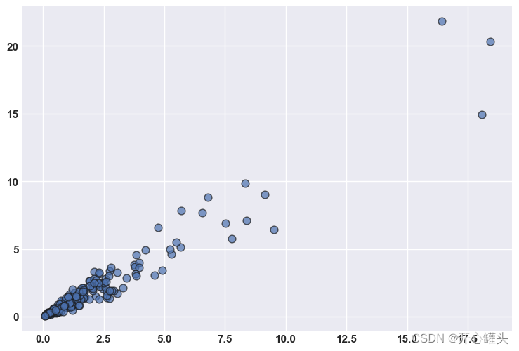
5.散点图
import matplotlib.pyplot as plt
import numpy as np
import pandas as pd
df=pd.DataFrame({'x_values': range(1,101), 'y_values': np.random.randn(100)*15+range(1,101) })
plt.plot( 'x_values', 'y_values', data=df, linestyle='none', marker='o')
plt.show()
6. 基本饼图
import pandas as pd
import matplotlib.pyplot as plt
df = pd.DataFrame([8,8,1,2], index=['a', 'b', 'c', 'd'], columns=['x'])
df.plot(kind='pie', subplots=True, figsize=(8, 8))
plt.show()

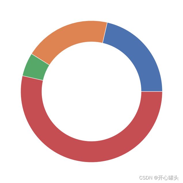
6.基本甜甜圈图
import matplotlib.pyplot as plt
size_of_groups=[12,11,3,30]
plt.pie(size_of_groups)
my_circle=plt.Circle( (0,0), 0.7, color='white')
p=plt.gcf()
p.gca().add_artist(my_circle)
plt.show()
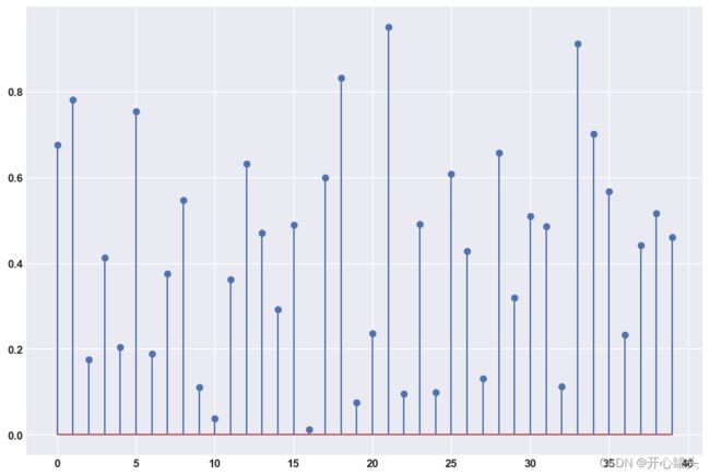
7.棒棒糖图
import matplotlib.pyplot as plt
import numpy as np
x=range(1,41)
values=np.random.uniform(size=40)
plt.stem(x, values)
plt.ylim(0, 1.2)
plt.show()
plt.stem(values)
plt.show()

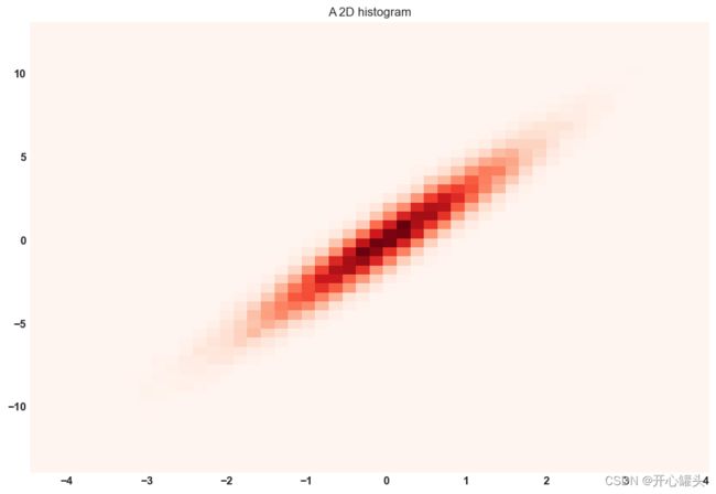
8. 2D马赛克
import matplotlib.pyplot as plt
import numpy as np
x = np.random.normal(size=50000)
y = x * 3 + np.random.normal(size=50000)
plt.hist2d(x, y, bins=(50, 50), cmap=plt.cm.Reds)
plt.title("A 2D histogram")
plt.show()
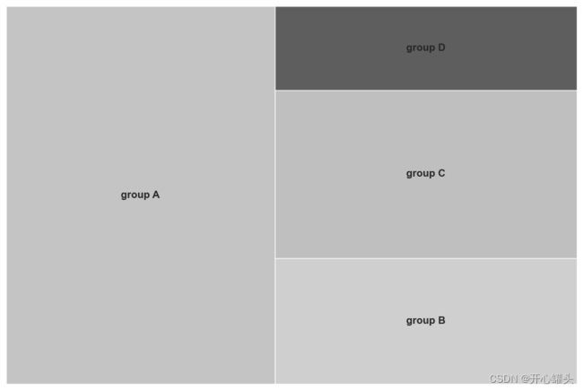
9.树形图
import pandas as pd
import matplotlib.pyplot as plt
import squarify
squarify.plot(sizes=[13,22,35,5], label=["group A", "group B", "group C", "group D"], alpha=.7 )
plt.axis('off')
plt.show()
df = pd.DataFrame({'nb_people':[8,3,4,2], 'group':["group A", "group B", "group C", "group D"] })
squarify.plot(sizes=df['nb_people'], label=df['group'], alpha=.8 )
plt.axis('off')
plt.show()

10.带有颜色映射值的树状图
import matplotlib
import matplotlib.pyplot as plt
import squarify
my_values=[i**3 for i in range(1,100)]
cmap = matplotlib.cm.Blues
mini=min(my_values)
maxi=max(my_values)
norm = matplotlib.colors.Normalize(vmin=mini, vmax=maxi)
colors = [cmap(norm(value)) for value in my_values]
squarify.plot(sizes=my_values, alpha=.8, color=colors )
plt.axis('off')
plt.show()

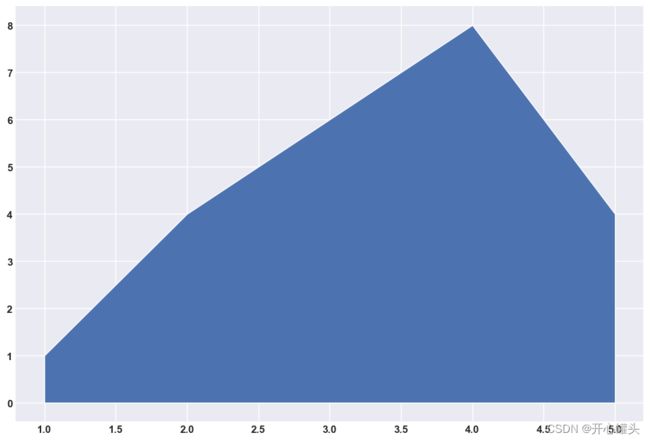
11.基本面积图
import numpy as np
import matplotlib.pyplot as plt
x=range(1,6)
y=[1,4,6,8,4]
plt.fill_between(x, y)
plt.show()
12.数据帧
import pandas as pd
import numpy as np
import networkx as nx
import matplotlib.pyplot as plt
df = pd.DataFrame({ 'from':['A', 'B', 'C','A'], 'to':['D', 'A', 'E','C']})
G=nx.from_pandas_edgelist(df, 'from', 'to')
nx.draw(G, with_labels=True)
plt.show()

13.3D散点图
from mpl_toolkits.mplot3d import Axes3D
import matplotlib.pyplot as plt
import numpy as np
import pandas as pd
df=pd.DataFrame({'X': range(1,101), 'Y': np.random.randn(100)*15+range(1,101), 'Z': (np.random.randn(100)*15+range(1,101))*2 })
fig = plt.figure()
ax = fig.add_subplot(111, projection='3d')
ax.scatter(df['X'], df['Y'], df['Z'], c='skyblue', s=60)
plt.show()

14.基本雷达图
import matplotlib.pyplot as plt
import pandas as pd
from math import pi
df = pd.DataFrame({
'group': ['A','B','C','D'],
'var1': [38, 1.5, 30, 4],
'var2': [29, 10, 9, 34],
'var3': [8, 39, 23, 24],
'var4': [7, 31, 33, 14],
'var5': [28, 15, 32, 14]
})
categories=list(df)[1:]
N = len(categories)
values=df.loc[0].drop('group').values.flatten().tolist()
values += values[:1]
values
angles = [n / float(N) * 2 * pi for n in range(N)]
angles += angles[:1]
ax = plt.subplot(111, polar=True)
plt.xticks(angles[:-1], categories, color='grey', size=8)
ax.set_rlabel_position(0)
plt.yticks([10,20,30], ["10","20","30"], color="grey", size=7)
plt.ylim(0,40)
ax.plot(angles, values, linewidth=1, linestyle='solid')
ax.fill(angles, values, 'b', alpha=0.1)
plt.show()

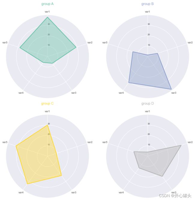
15.雷达分面图
import matplotlib.pyplot as plt
import pandas as pd
from math import pi
df = pd.DataFrame({
'group': ['A','B','C','D'],
'var1': [38, 1.5, 30, 4],
'var2': [29, 10, 9, 34],
'var3': [8, 39, 23, 24],
'var4': [7, 31, 33, 14],
'var5': [28, 15, 32, 14]
})
def make_spider( row, title, color):
categories=list(df)[1:]
N = len(categories)
angles = [n / float(N) * 2 * pi for n in range(N)]
angles += angles[:1]
ax = plt.subplot(2,2,row+1, polar=True, )
ax.set_theta_offset(pi / 2)
ax.set_theta_direction(-1)
plt.xticks(angles[:-1], categories, color='grey', size=8)
ax.set_rlabel_position(0)
plt.yticks([10,20,30], ["10","20","30"], color="grey", size=7)
plt.ylim(0,40)
values=df.loc[row].drop('group').values.flatten().tolist()
values += values[:1]
ax.plot(angles, values, color=color, linewidth=2, linestyle='solid')
ax.fill(angles, values, color=color, alpha=0.4)
plt.title(title, size=11, color=color, y=1.1)
my_dpi=96
plt.figure(figsize=(1000/my_dpi, 1000/my_dpi), dpi=my_dpi)
my_palette = plt.cm.get_cmap("Set2", len(df.index))
for row in range(0, len(df.index)):
make_spider( row=row, title='group '+df['group'][row], color=my_palette(row))
16.基本箱线图
import seaborn as sns
import matplotlib.pyplot as plt
sns.set(style="darkgrid")
df = sns.load_dataset('iris',cache=True,data_home="../seaborn-data-master")
sns.boxplot(y=df["sepal_length"])
plt.show()

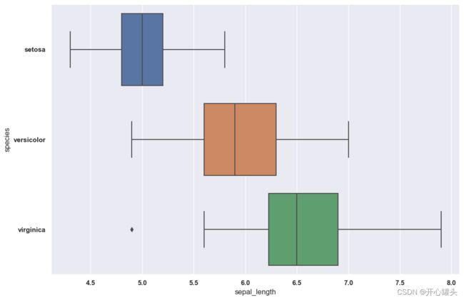
17.水平箱线图
import seaborn as sns
import matplotlib.pyplot as plt
sns.set(style="darkgrid")
df = sns.load_dataset('iris',cache=True,data_home="../seaborn-data-master")
sns.boxplot(y=df["species"], x=df["sepal_length"])
plt.show()
18.组箱线图
import seaborn as sns
import matplotlib.pyplot as plt
sns.set(style="darkgrid")
df = sns.load_dataset('tips',cache=True,data_home="../seaborn-data-master")
sns.boxplot(x="day", y="total_bill", hue="smoker", data=df, palette="Set1", width=0.5)
plt.show()

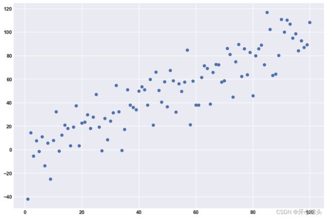
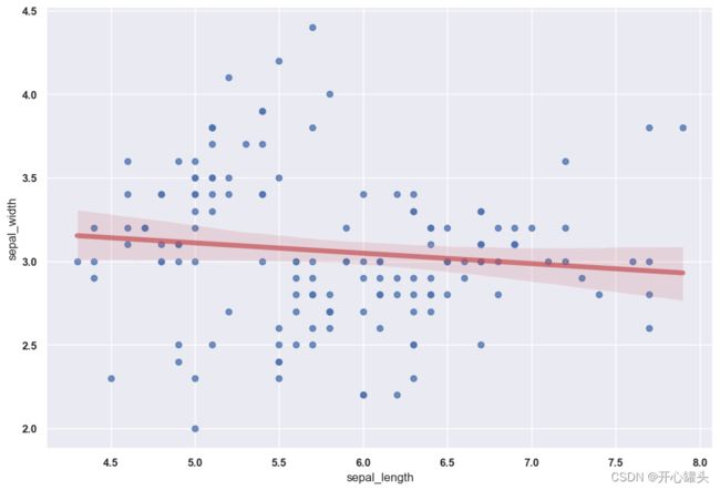
19.散点图
import seaborn as sns
import matplotlib.pyplot as plt
df = sns.load_dataset('iris',cache=True,data_home="../seaborn-data-master")
sns.regplot(x=df["sepal_length"], y=df["sepal_width"], line_kws={"color":"r","alpha":0.7,"lw":5})
plt.show()
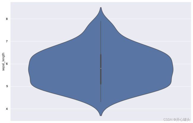
20.小提琴绘图
import seaborn as sns
import matplotlib.pyplot as plt
sns.set(style="darkgrid")
df = sns.load_dataset('iris',cache=True,data_home="../seaborn-data-master")
sns.violinplot(y=df["sepal_length"])
plt.show()
21.basic-density-plot-with-seaborn
import seaborn as sns
import matplotlib.pyplot as plt
sns.set(style="darkgrid")
df = sns.load_dataset('iris',cache=True,data_home="../seaborn-data-master")
sns.kdeplot(df['sepal_width'], shade=True, bw=0.5, color="olive")
plt.show()
C:\ProgramData\Anaconda3\lib\site-packages\seaborn\distributions.py:1699: FutureWarning: The `bw` parameter is deprecated in favor of `bw_method` and `bw_adjust`. Using 0.5 for `bw_method`, but please see the docs for the new parameters and update your code.
  warnings.warn(msg, FutureWarning)

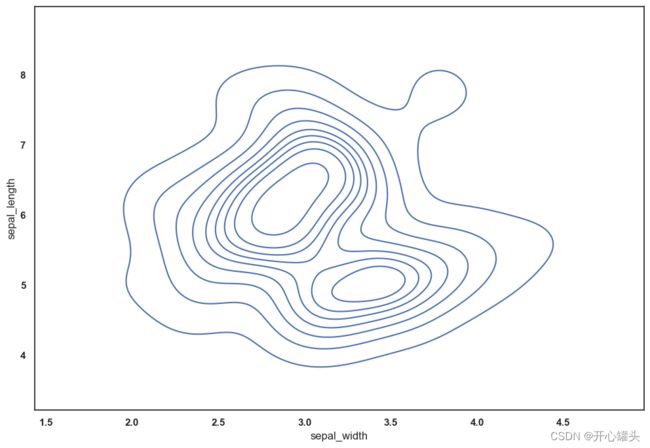
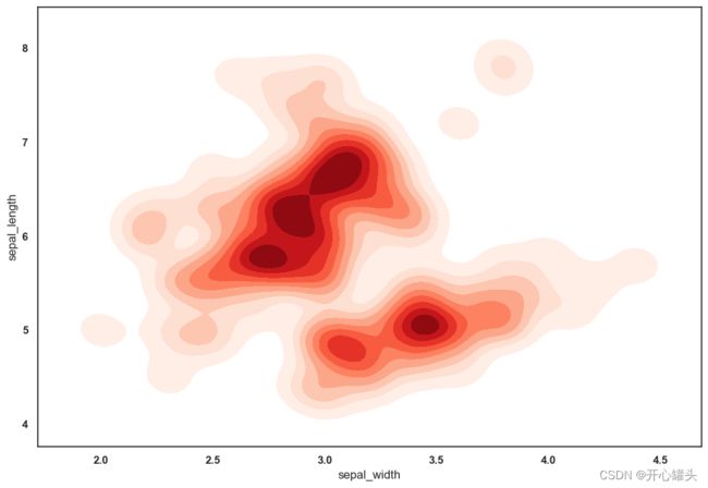
21.地形图
import seaborn as sns
import matplotlib.pyplot as plt
df = sns.load_dataset('iris',cache=True,data_home="../seaborn-data-master")
sns.set_style("white")
sns.kdeplot(x=df.sepal_width, y=df.sepal_length)
plt.show()
sns.kdeplot(x=df.sepal_width, y=df.sepal_length, cmap="Reds", shade=True, bw_adjust=.5)
plt.show()
sns.kdeplot(x=df.sepal_width, y=df.sepal_length, cmap="Blues", shade=True, thresh=0)
plt.show()

22.具有各种输入格式的 90 热图
import seaborn as sns
import pandas as pd
import numpy as np
df = pd.DataFrame(np.random.random((5,5)), columns=["a","b","c","d","e"])
sns.heatmap(df)

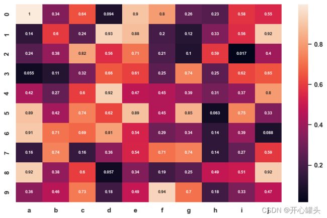
23.控制颜色热图
import seaborn as sns
import matplotlib.pyplot as plt
import pandas as pd
import numpy as np
df = pd.DataFrame(np.random.random((10,10)), columns=["a","b","c","d","e","f","g","h","i","j"])
sns.heatmap(df, cmap="YlGnBu")
plt.show()
sns.heatmap(df, cmap="Blues")
plt.show()
sns.heatmap(df, cmap="BuPu")
plt.show()
sns.heatmap(df, cmap="Greens")
plt.show()


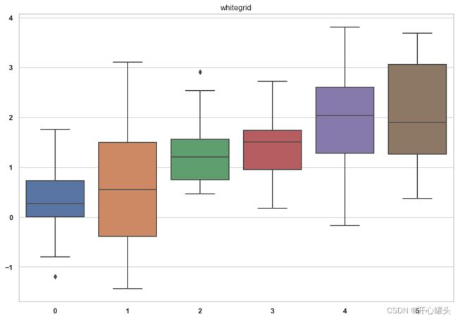
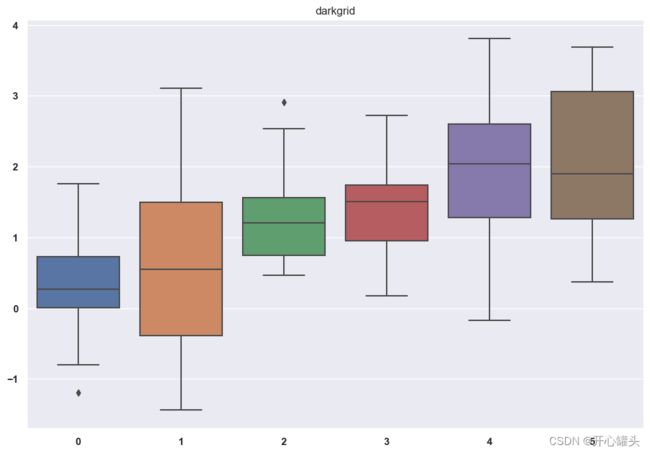
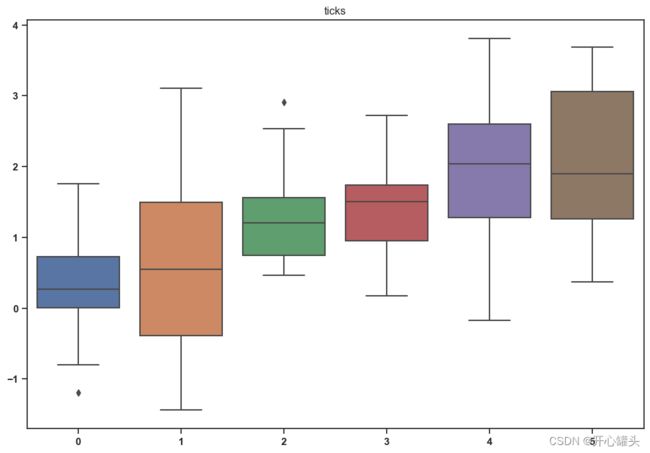
24.
import seaborn as sns
import numpy as np
import matplotlib.pyplot as plt
data = np.random.normal(size=(20, 6)) + np.arange(6) / 2
sns.set_style("whitegrid")
sns.boxplot(data=data)
plt.title("whitegrid")
plt.show()
sns.set_style("darkgrid")
sns.boxplot(data=data);
plt.title("darkgrid")
plt.show()
sns.set_style("white")
sns.boxplot(data=data);
plt.title("white")
plt.show()
sns.set_style("dark")
sns.boxplot(data=data);
plt.title("dark")
plt.show()
sns.set_style("ticks")
sns.boxplot(data=data);
plt.title("ticks")
plt.show()


25.seaborn-style-on-matplotlib-plot
from matplotlib import pyplot as plt
import pandas as pd
import numpy as np
df=pd.DataFrame({'x_axis': range(1,101), 'y_axis': np.random.randn(100)*15+range(1,101), 'z': (np.random.randn(100)*15+range(1,101))*2 })
plt.plot( 'x_axis', 'y_axis', data=df, marker='o', color='mediumvioletred')
plt.show()

26.折线标点图
import matplotlib.pyplot as plt
import numpy as np
import pandas as pd
plt.rcParams["figure.figsize"] = (10, 6)
rng = np.random.default_rng(1111)
x = np.array(range(10))
y = rng.integers(10, 100, 10)
z = y + rng.integers(5, 20, 10)
plt.plot(x, z, linestyle="-", marker="o", label="Income")
plt.plot(x, y, linestyle="-", marker="o", label="Expenses")
plt.legend()
plt.show()

27.折折折线线线图
import pandas
import matplotlib.pyplot as plt
import seaborn as sns
from pandas.plotting import parallel_coordinates
data = sns.load_dataset('iris',cache=True,data_home="../seaborn-data-master")
parallel_coordinates(data, 'species', colormap=plt.get_cmap("Set2"))
plt.show()

28.提琴图
import seaborn as sns
import matplotlib.pyplot as plt
sns.set(style="darkgrid")
df = sns.load_dataset('tips',cache=True,data_home="../seaborn-data-master")
sns.violinplot(x="day", y="total_bill", hue="smoker", data=df, palette="Pastel1")
plt.show()

29.自定义热图
import seaborn as sns
import pandas as pd
import numpy as np
df = pd.DataFrame(np.random.random((10,10)), columns=["a","b","c","d","e","f","g","h","i","j"])
sns.heatmap(df, annot=True, annot_kws={"size": 7})
30.甜甜圈图与子图
import matplotlib.pyplot as plt
group_names=['groupA', 'groupB', 'groupC']
group_size=[12,11,30]
subgroup_names=['A.1', 'A.2', 'A.3', 'B.1', 'B.2', 'C.1', 'C.2', 'C.3', 'C.4', 'C.5']
subgroup_size=[4,3,5,6,5,10,5,5,4,6]
a, b, c=[plt.cm.Blues, plt.cm.Reds, plt.cm.Greens]
fig, ax = plt.subplots()
ax.axis('equal')
mypie, _ = ax.pie(group_size, radius=1.3, labels=group_names, colors=[a(0.6), b(0.6), c(0.6)] )
plt.setp( mypie, width=0.3, edgecolor='white')
mypie2, _ = ax.pie(subgroup_size, radius=1.3-0.3, labels=subgroup_names, labeldistance=0.7, colors=[a(0.5), a(0.4), a(0.3), b(0.5), b(0.4), c(0.6), c(0.5), c(0.4), c(0.3), c(0.2)])
plt.setp( mypie2, width=0.4, edgecolor='white')
plt.margins(0,0)
plt.show()

31.区域图
import numpy as np
import seaborn as sns
import matplotlib.pyplot as plt
sns.set_style("whitegrid")
blue, = sns.color_palette("muted", 1)
x = np.arange(23)
y = np.random.randint(8, 20, 23)
fig, ax = plt.subplots()
ax.plot(x, y, color=blue, lw=3)
ax.fill_between(x, 0, y, alpha=.3)
ax.set(xlim=(0, len(x) - 1), ylim=(0, None), xticks=x)
plt.show()

32.堆积面积图
import numpy as np
import matplotlib.pyplot as plt
import seaborn as sns
X = np.arange(0, 10, 1)
Y = X + 5 * np.random.random((5, X.size))
baseline = ["zero", "sym", "wiggle", "weighted_wiggle"]
for n, v in enumerate(baseline):
if n<3 :
plt.tick_params(labelbottom='off')
plt.subplot(2 ,2, n + 1)
plt.stackplot(X, *Y, baseline=v)
plt.title(v)
plt.tight_layout()

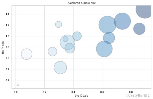
33.气泡图
import matplotlib.pyplot as plt
import numpy as np
import seaborn as sns
x = np.random.rand(15)
y = x+np.random.rand(15)
z = x+np.random.rand(15)
z=z*z
plt.scatter(x, y, s=z*2000, c=x, cmap="Blues", alpha=0.4, edgecolors="grey", linewidth=2)
plt.xlabel("the X axis")
plt.ylabel("the Y axis")
plt.title("A colored bubble plot")
plt.show()
34.雷达图
import matplotlib.pyplot as plt
import pandas as pd
from math import pi
df = pd.DataFrame({
'group': ['A','B','C','D'],
'var1': [38, 1.5, 30, 4],
'var2': [29, 10, 9, 34],
'var3': [8, 39, 23, 24],
'var4': [7, 31, 33, 14],
'var5': [28, 15, 32, 14]
})
categories=list(df)[1:]
N = len(categories)
angles = [n / float(N) * 2 * pi for n in range(N)]
angles += angles[:1]
ax = plt.subplot(111, polar=True)
ax.set_theta_offset(pi / 2)
ax.set_theta_direction(-1)
plt.xticks(angles[:-1], categories)
ax.set_rlabel_position(0)
plt.yticks([10,20,30], ["10","20","30"], color="grey", size=7)
plt.ylim(0,40)
values=df.loc[0].drop('group').values.flatten().tolist()
values += values[:1]
ax.plot(angles, values, linewidth=1, linestyle='solid', label="group A")
ax.fill(angles, values, 'b', alpha=0.1)
values=df.loc[1].drop('group').values.flatten().tolist()
values += values[:1]
ax.plot(angles, values, linewidth=1, linestyle='solid', label="group B")
ax.fill(angles, values, 'r', alpha=0.1)
plt.legend(loc='upper right', bbox_to_anchor=(0.1, 0.1))
plt.show()

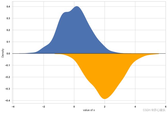
35.密度镜图
import numpy as np
from numpy import linspace
import pandas as pd
import seaborn as sns
import matplotlib.pyplot as plt
from scipy.stats import gaussian_kde
df = pd.DataFrame({
'var1': np.random.normal(size=1000),
'var2': np.random.normal(loc=2, size=1000) * -1
})
plt.rcParams["figure.figsize"]=12,8
sns.kdeplot(data=df, x="var1", fill=True, alpha=1)
kde = gaussian_kde(df.var2)
x_range = linspace(min(df.var2), max(df.var2), len(df.var2))
sns.lineplot(x=x_range*-1, y=kde(x_range) * -1, color='orange')
plt.fill_between(x_range*-1, kde(x_range) * -1, color='orange')
plt.xlabel("value of x")
plt.axhline(y=0, linestyle='-',linewidth=1, color='black')
plt.show()
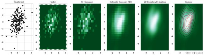
36.避免重叠散点图
import numpy as np
import matplotlib.pyplot as plt
from scipy.stats import kde
data = np.random.multivariate_normal([0, 0], [[1, 0.5], [0.5, 3]], 200)
x, y = data.T
fig, axes = plt.subplots(ncols=6, nrows=1, figsize=(21, 5))
axes[0].set_title('Scatterplot')
axes[0].plot(x, y, 'ko')
nbins = 20
axes[1].set_title('Hexbin')
axes[1].hexbin(x, y, gridsize=nbins, cmap=plt.cm.BuGn_r)
axes[2].set_title('2D Histogram')
axes[2].hist2d(x, y, bins=nbins, cmap=plt.cm.BuGn_r)
k = kde.gaussian_kde(data.T)
xi, yi = np.mgrid[x.min():x.max():nbins*1j, y.min():y.max():nbins*1j]
zi = k(np.vstack([xi.flatten(), yi.flatten()]))
axes[3].set_title('Calculate Gaussian KDE')
axes[3].pcolormesh(xi, yi, zi.reshape(xi.shape), shading='auto', cmap=plt.cm.BuGn_r)
axes[4].set_title('2D Density with shading')
axes[4].pcolormesh(xi, yi, zi.reshape(xi.shape), shading='gouraud', cmap=plt.cm.BuGn_r)
axes[5].set_title('Contour')
axes[5].pcolormesh(xi, yi, zi.reshape(xi.shape), shading='gouraud', cmap=plt.cm.BuGn_r)
axes[5].contour(xi, yi, zi.reshape(xi.shape) )
C:\Users\Administrator\AppData\Local\Temp\ipykernel_10484\129967845.py:28: DeprecationWarning: Please use `gaussian_kde` from the `scipy.stats` namespace, the `scipy.stats.kde` namespace is deprecated.
  k = kde.gaussian_kde(data.T)
37.重点折线图
import matplotlib.pyplot as plt
import numpy as np
import pandas as pd
df=pd.DataFrame({'x': range(1,11), 'y1': np.random.randn(10), 'y2': np.random.randn(10)+range(1,11), 'y3': np.random.randn(10)+range(11,21), 'y4': np.random.randn(10)+range(6,16), 'y5': np.random.randn(10)+range(4,14)+(0,0,0,0,0,0,0,-3,-8,-6), 'y6': np.random.randn(10)+range(2,12), 'y7': np.random.randn(10)+range(5,15), 'y8': np.random.randn(10)+range(4,14) })
plt.style.use('seaborn-darkgrid')
my_dpi=96
plt.figure(figsize=(480/my_dpi, 480/my_dpi), dpi=my_dpi)
for column in df.drop('x', axis=1):
plt.plot(df['x'], df[column], marker='', color='grey', linewidth=1, alpha=0.4)
plt.plot(df['x'], df['y5'], marker='', color='orange', linewidth=4, alpha=0.7)
plt.xlim(0,12)
num=0
for i in df.values[9][1:]:
num+=1
name=list(df)[num]
if name != 'y5':
plt.text(10.2, i, name, horizontalalignment='left', size='small', color='grey')
plt.text(10.2, df.y5.tail(1), 'Mr Orange', horizontalalignment='left', size='small', color='orange')
plt.title("Evolution of Mr Orange vs other students", loc='left', fontsize=12, fontweight=0, color='orange')
plt.xlabel("Time")
plt.ylabel("Score")
plt.show()

38.分散折线图
import matplotlib.pyplot as plt
import numpy as np
import pandas as pd
df=pd.DataFrame({'x': range(1,11), 'y1': np.random.randn(10), 'y2': np.random.randn(10)+range(1,11), 'y3': np.random.randn(10)+range(11,21), 'y4': np.random.randn(10)+range(6,16), 'y5': np.random.randn(10)+range(4,14)+(0,0,0,0,0,0,0,-3,-8,-6), 'y6': np.random.randn(10)+range(2,12), 'y7': np.random.randn(10)+range(5,15), 'y8': np.random.randn(10)+range(4,14), 'y9': np.random.randn(10)+range(4,14) })
plt.style.use('seaborn-darkgrid')
palette = plt.get_cmap('Set1')
num=0
for column in df.drop('x', axis=1):
num+=1
plt.subplot(3,3, num)
plt.plot(df['x'], df[column], marker='', color=palette(num), linewidth=1.9, alpha=0.9, label=column)
plt.xlim(0,10)
plt.ylim(-2,22)
if num in range(7) :
plt.tick_params(labelbottom='off')
if num not in [1,4,7] :
plt.tick_params(labelleft='off')
plt.title(column, loc='left', fontsize=12, fontweight=0, color=palette(num) )
plt.suptitle("How the 9 students improved\nthese past few days?", fontsize=13, fontweight=0, color='black', style='italic', y=1.02)
plt.text(0.5, 0.02, 'Time', ha='center', va='center')
plt.text(0.06, 0.5, 'Note', ha='center', va='center', rotation='vertical')
plt.show()

39. 标记形状图
import matplotlib.pyplot as plt
import numpy as np
import pandas as pd
df=pd.DataFrame({'x_values': range(1,101), 'y_values': np.random.randn(100)*80+range(1,101) })
plt.plot( 'x_values', 'y_values', data=df, linestyle='none', marker='*')
plt.show()
all_poss=['.','o','v','^','>','<','s','p','*','h','H','D','d','1','','']
plt.xlim(0.5,4.5)
plt.ylim(0.5,4.5)
plt.xticks([])
plt.yticks([])
num=0
for x in range(1,5):
for y in range(1,5):
num += 1
plt.plot(x,y,marker=all_poss[num-1], markerfacecolor='orange', markersize=23, markeredgecolor="black")
plt.text(x+0.2, y, all_poss[num-1], horizontalalignment='left', size='medium', color='black', weight='semibold')


40.基本堆积面积图
import numpy as np
import matplotlib.pyplot as plt
x=range(1,6)
y=[ [1,4,6,8,9], [2,2,7,10,12], [2,8,5,10,6] ]
plt.stackplot(x,y, labels=['A','B','C'])
plt.legend(loc='upper left')
plt.show()
x=range(1,6)
y1=[1,4,6,8,9]
y2=[2,2,7,10,12]
y3=[2,8,5,10,6]
plt.stackplot(x,y1, y2, y3, labels=['A','B','C'])
plt.legend(loc='upper left')
plt.show()

