React-Native官方组件的效果探究以及一些优秀的组件推荐
本篇文章主要是对官方组件的一些效果的探讨,旨在深入理解官方组件的一些表现形式和使用方法以及在不同平台下的适配问题方便以后的工作中来选取合适的组件或者类库来完成UI视图的搭建。
本篇文章使用的React-Native版本是0.55.3,文档版本是0.51。
本篇文章只会罗列一些常用的组件,并不会全篇覆盖,关于详细的用法还请阅读官方文档
- 英文文档
- 中文文档
暂时只上IOS端的表现效果,Android端等IOS端测试完毕后补在对应的组件下方。
ActivityIndicator
一个圆形的loading指示器
IOS端显示效果:

一个很正常的loading效果,不是特别好看,但也过得去。适合需要有加载动画并且对动画要求不高的场景。
核心代码片段:
/*@params:
* animating bool 是否要显示指示器,默认为true,表示显示。
* color string   滚轮的前景颜色(默认为灰色)。
* size enum('small', 'large') 指示器的大小。small的高度为20,large为36。
* (ios) hidesWhenStopped bool  在没有动画的时候,是否要隐藏指示器(默认为true)。
*/

<ActivityIndicator
   animating={this.state.animating}
   style={{ height: 80 }}
   size="large"
/>
Button
一个简单的跨平台的按钮组件。可以进行一些简单的定制
IOS端效果:
IOS端并不会显示按钮的背景色,只会显示按钮的文字颜色,并且在按钮按下的过程中会有颜色透明度的变化。

/*@params:
* accessibilityLabel string 用于给残障人士显示的文本(比如读屏器软件可能会读取这一内容)
* color color 文本的颜色(iOS),或是按钮的背景色(Android)
* disabled bool 设置为true时此按钮将不可点击
* onPress function 用户点击此按钮时所调用的处理函数
* title string 按钮内显示的文本
*/

<Button
   onPress={()=>{}}
   title="我是react-native自带的Button按钮"
   color="#841584"
   disabled={false}
   accessibilityLabel="我是一个按钮"
/>;
CheckBox
渲染一个Boolean输入
这是一个“受控组件”(controlled component)。你必须使用onValueChange回调来更新value属性以响应用户的操作。如果不更新value属性,组件只会按一开始给定的value值来渲染且保持不变。 注意:CheckBox只在Android端实现,IOS端暂未实现
要实现复选框效果并不推荐使用自带的CheckBox组件,推荐使用Image标签或者第三方库来实现这个功能。
使用自定义示例:
export default class TestScreen extends React.Component {
    state = {
        checked: false
    }
    checkToggle = () => {
        this.setState({
            checked: !this.state.checked
        })
    }
	render() {
		const { checked } = this.state;
		return (
			<TouchableWithoutFeedback onPress={this.checkToggle}>
			   <View
				   style={{
					  flexDirection:'row',
					  alignItems:'center',
					   justifyContent:'center'
			       }}
			   >
			   {
				   checked ?
			          <Image
				          style={{
					          width: 15,
					          height: 15,
					          marginRight: 5
					      }}
			              source={require('../assets/1.3/choose_yes_beika.png')}
			          /> :
			          <View style={{
			                   width: 15,
			                   height: 15,
			                   marginRight: 5,
			                   borderColor: '#FE5338',
			                   borderRadius: 8,
			                   borderWidth:0.5 }}
			          >
			          </View>
			  }
			    <Text>我是自定义CheckBox</Text>
			  </View>
			</TouchableWithoutFeedback>
		)
	  }
}
FlatLIst
渲染列表数据推荐使用此组件
import React from 'react'
import { connect } from 'react-redux'
import {
    View,
    Image,
    Text,
    TouchableWithoutFeedback,
    Platform,
    AccessibilityInfo,
    ActivityIndicator,
    Button,
    CheckBox,
    DatePickerIOS,
    FlatList
} from 'react-native'
import EStyleSheet from 'react-native-extended-stylesheet'
import { deviceW } from '../libs/commont'


export default class TestScreen extends React.Component {

    state = {
        dataSource: [],
        refreshing: false,
        tip: false,
        fHeight:0
    }
    staticData = [];
    copyStateData = [];
    propsData = [];
    componentDidMount = () => {
        //构造本地props传过来的数据
        for (let i = 1; i < 20; i++) {
            this.propsData.push(i)
        }
        this.staticData = [1, 2, 3, 4, 5];
        this.copyStateData = [1, 2, 3, 4, 5];
        setTimeout(() => {
            this.setState({
                dataSource: this.staticData
            })
        }, 1500);

    }

    //渲染的不同的key
    _keyExtractor = (item, index) => String(index);

    // 渲染每一列的函数
    _renderItem = ({ item }) => (
        <View style={{ flexDirection: 'row', alignItems: 'center', height: 55, backgroundColor: "#FFF", paddingLeft: 15 }}>
            <Text>{`我是渲染的第${item}行内容`}</Text>
        </View>
    )
    // 每行之间的分隔组件 不会出现在第一行之前和最后一行之后 默认我们使用的都是线
    _ItemSeparatorComponent = () => (
        <View style={{ height: 0.5, width: deviceW, backgroundColor: '#E5E5E5' }}>

        </View>
    )
    //列表为空时渲染的组件
    _ListEmptyComponent = () => (
        <View style={{ flex: 1, alignItems: 'center', justifyContent: 'center' }}>
            <ActivityIndicator color="#aa00aa" />
            <Text>正在加载数据</Text>
        </View>
    )
    // 渲染的列表头部元素
    _ListHeaderComponent = (
        <View style={{ height: 45 }}>
            <Text style={{ fontSize: 20 }}>我是列表的头部元素</Text>
        </View>
    )
    // 渲染的列表底部元素
    _ListFooterComponent = (
        <View style={{ flexDirection: 'row', justifyContent: 'center', alignItems: 'center', height: 40 }}>
            {this.state.tip ?
                <Text style={{ fontSize: 12, color: '#999' }}>即将加载剩余数据</Text>
                :
                this.state.dataSource.length > 0 ?
                    <Text style={{ fontSize: 12, color: '#999' }}>已经全部加载了呢~</Text>
                    : null
            }
        </View>
    )
    // 初次渲染的元素数量,最好刚刚够填满一个屏幕,这样保证了用最短的时间给用户呈现可见的内容。
    _initialNumToRender = 2;
    // 当列表被滚动到距离内容最底部不足onEndReachedThreshold的距离时调用
    // 当第一次渲染时,如果数据不足一屏(比如初始值是空的),这个事件也会被触发,请自行做标记过滤
    _onEndReached = (e) => {
        let len = this.state.dataSource.length;
        if (len == 0  ) {
            return
        }
        else {
            // 调用接口请求
        }
    }
    // 决定当距离内容最底部还有多远时触发onEndReached回调。注意此参数是一个比值而非像素单位。
    // 比如,0.5表示距离内容最底部的距离为当前列表可见长度的一半时触发。
    _onEndReachedThreshold = 0.1;
    //
    _onRefresh = () => {
        this.setState({
            refreshing: true,
            dataSource: this.staticData
        })
        setTimeout(() => {
            this.setState({
                refreshing: false
            })
        }, 1500)
    }
    render() {
        const { dataSource, refreshing,fHeight } = this.state;
        return (
            <View style={styles.container}>
                <MyHeader
                    title="测试页面"
                    navigation={this.props.navigation}
                    backgroundColor="#fff"
                    leftClick={() => this.$goBack()}
                />
                <View style={{ flex: 1 }}>
                    <FlatList
                        ref={node => this.faltList = node}
                        style={{ height:fHeight,backgroundColor:"red"}}
                        data={dataSource}
                        extraData={this.state}
                        keyExtractor={this._keyExtractor}
                        renderItem={this._renderItem}
                        ItemSeparatorComponent={this._ItemSeparatorComponent}
                        ListEmptyComponent={this._ListEmptyComponent}
                        ListHeaderComponent={this._ListHeaderComponent}
                        ListFooterComponent={this._ListFooterComponent}
                        initialNumToRender={this._initialNumToRender}
                        onEndReached={this._onEndReached}
                        onEndReachedThreshold={this._onEndReachedThreshold}
                        onRefresh={this._onRefresh}
                        refreshing={refreshing}
                        onLayout={e => {
                            let height = e.nativeEvent.layout.height;
                            if (this.state.fHeight < height) {
                                this.setState({fHeight: height})
                            }
                        }}
                    />
                </View>
            </View>
        )
    }
}

const styles = EStyleSheet.create({
    container: {
        flex: 1,
        backgroundColor: '#E5E5E5'
    },
})
Image
显示图片或者背景图都只能使用Image组件
在Android上支持GIF和WebP格式图片
默认情况下Android是不支持GIF和WebP格式的。你需要在android/app/build.gradle文件中根据需要手动添加以下模块:
dependencies {
	// 如果你需要支持Android4.0(API level 14)之前的版本
	compile 'com.facebook.fresco:animated-base-support:1.3.0'

	// 如果你需要支持GIF动图
	compile 'com.facebook.fresco:animated-gif:1.3.0'

	// 如果你需要支持WebP格式,包括WebP动图
	compile 'com.facebook.fresco:animated-webp:1.3.0'
	compile 'com.facebook.fresco:webpsupport:1.3.0'

	// 如果只需要支持WebP格式而不需要动图
	compile 'com.facebook.fresco:webpsupport:1.3.0'
}
如果你在使用GIF的同时还使用了ProGuard,那么需要在proguard-rules.pro中添加如下规则 :
-keep class com.facebook.imagepipeline.animated.factory.AnimatedFactoryImpl {
  public AnimatedFactoryImpl(com.facebook.imagepipeline.bitmaps.PlatformBitmapFactory, com.facebook.imagepipeline.core.ExecutorSupplier);
}
图片的引入参数是:source
uri是一个表示图片的资源标识的字符串,它可以是一个http地址或是一个本地文件路径(使用require(相对路径)来引用)
KeyboardAvoidingView
用于解决一个常见的尴尬问题:手机上弹出的键盘常常会挡住当前的视图。本组件可以自动根据键盘的位置,调整自身的position或底部的padding,以避免被遮挡。
Modal
可以用来覆盖包含React Native根视图的原生视图(如UIViewController,Activity)
Modal可以使你应用中RN编写的那部分内容覆盖在原生视图上显示 简单说就是可以帮助我们遮住底部tabbar和其他视图
import React from 'react'
import {
    View,
    Image,
    Text,
    TouchableWithoutFeedback,
    TouchableOpacity,
    Platform,
    AccessibilityInfo,
    ActivityIndicator,
    Button,
    CheckBox,
    DatePickerIOS,
    FlatList,
    Modal,
    TouchableHighlight,
    StyleSheet
} from 'react-native'
import MyHeader from '../components/MyHeader'
import { deviceW } from '../libs/commont'

export default class TestScreen extends React.Component {

    state = {
        modalVisible: false
    }
    setModalVisible(visible) {
        this.setState({ modalVisible: visible });
    }
    render() {
        const { modalVisible } = this.state;
        return (
            <View style={styles.container}>
                <MyHeader
                    title="测试页面"
                    navigation={this.props.navigation}
                    backgroundColor="#fff"
                    leftClick={() => this.$goBack()}
                />
                <View style={{ alignItems:'center',justifyContent:'center',flex:1 }}>
                    <Modal

                        animationType={"fade"}
                        transparent={false}
                        visible={this.state.modalVisible}
                        onRequestClose={() => { alert("Modal has been closed.") }}
                    >
                        <View style={{ flex:1,alignItems:'center',justifyContent:'center',backgroundColor:'rgba(0,0,0,.6)'}}>
                            <View>
                                <Text>Hello World!</Text>

                                <TouchableOpacity onPress={() => {
                                    this.setModalVisible(!this.state.modalVisible)
                                }}>
                                    <Text style={{fontSize:24}}>Hide Modal</Text>
                                </TouchableOpacity>

                            </View>
                        </View>
                    </Modal>

                    <TouchableOpacity onPress={() => {
                        this.setModalVisible(true)
                    }}>
                        <Text style={{fontSize:24}}>Show Modal</Text>
                    </TouchableOpacity>

                </View>
            </View>
        )
    }
}

const styles = StyleSheet.create({
    container: {
        flex: 1,
        backgroundColor: '#E5E5E5'
    },
})
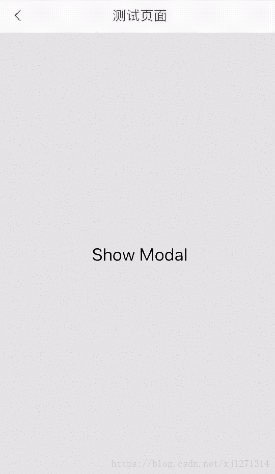
注意:使用此组件的话,再遮住tabbar的同时,我们的头部组件也被遮挡了,不是很适用
推荐方案:
- react-native-popup-dialog
…未完待续