【定位·HTML】
定位布局可以分为以下四种:
静态定位(inherit)
相对定位(relative)
绝对定位(absolute)
固定定位(fixed)
- 一般的标签元素不加任何定位属性时,默认都属于静态定位,静态定位在页面的最底层属于标准流(普通流),在页面中没有特殊的操作方式和显示效果
固定定位fixed 属性
用于固定定位,被固定的元素不会随着滚动条的拖动而改变位置。position: fixed;
   .ad-l {
        position: fixed;
        top: 100px;
        left: 0;
      }
相对定位 relative 属性
相对定位是该元素的位置相对于它原始的位置(正常位置)来计算。
position: relative;
绝对定位 absolute 属性
绝对定位,能把元素精确地放在任意位置。
  .ad-l {
        position: absolute;
        left: 50px;
        top: 150px;
      }
浮动
使用 float 属性指定元素沿其容器的左侧或右侧放置
float: left|right;
CSS3新特性
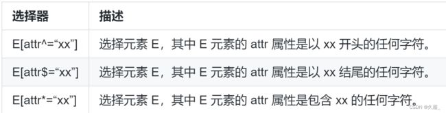
属性选择器
属性选择器就是通过正则的方式去匹配指定属性的元素,为其设置样式。
 <style>
 //^开头
      a[href^="#"] {
        color: rgb(179, 255, 0);
      }
//$结尾
      a[href$="org"] {
        color: rgb(195, 0, 255);
      }
//*包含
      a[href*="un"] {
        background-color: rgb(0, 255, 149);
        color: white;
      }
    </style>
  <body>
    <ul>
      <li><a href="#">本地链接</a></li>
      <li><a href="https://www.lanqiao.cn">蓝桥云课</a></li>
      <li><a href="https://developer.mozilla.org">MDN</a></li>
      <li><a href="https://unsplash.com">Unsplash</a></li>
    </ul>
  </body>
子元素伪类选择器
子元素伪类选择器:选择某元素的子元素

 div:nth-child(2) {
        background-color: rgb(0, 255, 128);
      }
      div:nth-of-type(4) {
        background-color: rgb(111, 0, 255);
      }
UI 伪类选择器

  /*格式错误*/
      input:invalid {
        background-color: red;
      }
      /*格式正确*/
      input:valid {
        background-color: green;
      }

  电子邮箱:<input type="email" />
文本阴影
某些时候我们想让字体看起来更立体,更具艺术性,让人眼前一亮,可以给文字使用文本阴影属性。
使用 text-shadow 属性来给文本内容添加阴影的效果。
text-shadow: x-offset y-offset blur color;
x-offset 是沿 x 轴方向的偏移距离,允许负值,必须参数。
y-offset 是沿 y 轴方向的偏移距离,允许负值,必须参数。
blur 是阴影的模糊程度,可选参数。
color 是阴影的颜色,可选参数。
文本溢出
text-overflow 属性可以设置超长文本省略显示
text-overflow: clip|ellipsis;

 p {
        border: 1px solid blue;
        width: 100px;
        height: 50px;
        overflow: hidden; /*隐藏超出文本*/
        white-space: nowrap; /*强制单行显示*/
      }
      .poem1 {
        text-overflow: clip;
      }
      .poem2 {
        text-overflow: ellipsis;
      }
圆角边框
border-radius 属性的值表示圆角的直径,可以设置四个值,其值的顺序为:左上角,右上角,右下角,左下角。
border-radius: 取值;
//分开设置
border-top-left-radius: 取值;
border-top-right-radius: 取值;
border-bottom-right-radius: 取值;
border-bottom-left-radius: 取值;
border-radius: 140px 20px 30px 40px; /*四个圆角直径不同*/
盒子阴影
box-shadow: h-shadow v-shadow blur spread color inset;

注意
给body,div标签元素加样式时,前面不加.
body{background-color: black;}
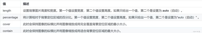
背景图像尺寸
background-size: length|percentage|cover|contain;
多图背景
 #content1 {
        background-image: url("icons8-rat-96.png"), url("nemuel.jpg");
        background-position: right bottom, left top; /*相对于父元素大小,老鼠图片右下角显示,大背景图片在左上角显示*/
        background-repeat: no-repeat, no-repeat; /*两张图片不重复*/
        padding: 15px;
        width: 400px;
        height: 260px;
      }